|
| Group |
Round |
C/R |
Comment |
Date |
Image |
| 34 |
Apr 23 |
Reply |
Steve, thanks for your comments. |
Apr 28th |
| 34 |
Apr 23 |
Comment |
Mike, your image has made me began to try Distort filter Rectangular to Polar that I have never use before. Thanks for sharing imaginative image with us in this group. |
Apr 23rd |
| 34 |
Apr 23 |
Comment |
Jan, I only have one single comment here. I would steal your idea shamelessly because I love it so much! |
Apr 23rd |
| 34 |
Apr 23 |
Comment |
Steve, this image really strike my eyes. I double check by reviewing your previous images. To ensure, if it was your image. I agree with you not to put any eye. As a viewer, I love to see different style of your creations and imaginations. I like to see how you transform a simple original to become a unique design. I hope you would create some more for us to learn. Good job Steve. |
Apr 23rd |
| 34 |
Apr 23 |
Comment |
Gunter, I have seen many composite images employing the same technique. What makes your image different (to me) is how you tweak the angle the tree background with Ferrary as the main element. You might want to add a bit of movement effect for the Ferrary to make it like the car moving from the above following the tree angles. |
Apr 23rd |
| 34 |
Apr 23 |
Comment |
Candy, I have tried different method of converting my images to poster with line edges like this. All in PS. You give me a lesson to learn with this image. That was how you adjust tonality of the flower petal lines. To me, it brings a specific mood to the overall image. Awesome work. |
Apr 23rd |
| 34 |
Apr 23 |
Comment |
Steve, I appreciate your imagination and creativity. I can feel how you enjoy your time when composing this image. I might want to keep all background buildings upright perpendicular to the horizon. |
Apr 23rd |
| 34 |
Apr 23 |
Reply |
Hi Candy. Thanks for your comments and suggestions. Please review my response to Mike message. |
Apr 23rd |
| 34 |
Apr 23 |
Reply |
Jan, thanks for your nice words. |
Apr 23rd |
| 34 |
Apr 23 |
Reply |
Mike, thanks for your comments. I agree with you. Our eyes tend get attracted by the brightest elements in the image. Candy also mentioned the same. |
Apr 23rd |
| 34 |
Apr 23 |
Reply |
Steve, thanks for nice words. I appreciate you are having fun with my image. Good ideas! |
Apr 23rd |
| 34 |
Apr 23 |
Reply |
Gunter, thanks for your comments and suggestions. |
Apr 23rd |
6 comments - 6 replies for Group 34
|
| 70 |
Apr 23 |
Comment |
Hi Kirk, this is an ideal example of a landscape image with 4 Essential Ingredients for Great Landscape Photograph. Good Light, Main Subject, Clean background and interesting composition. Job well done. |
Apr 14th |
| 70 |
Apr 23 |
Comment |
Hi Kathryn, I started to see your images in this group years ago. I really appreciate your photography skills progress. I love the tone. It looks so natural, to me. I suggest you make a bit of perspective adjustment. |
Apr 14th |
| 70 |
Apr 23 |
Comment |
Hi Geoff. It's really a 'wow milky way' to me. No input. No suggestion. This image shows your caliber in nature photography. Awesome work! |
Apr 14th |
| 70 |
Apr 23 |
Comment |
Hi Terina, I love the color mood. I like how you include a ship at the background. It helps tell a story that this scene is not a swimming pool. My only suggestion is to tune down the black part above number blocks 10 to 6.
I just realize the power of Color Grading tool in LR to bring the mood of our images. I practiced to my image this month to get warm morning tone. I have seen many tutorial videos. The key secret I found to color grade landscape image is start from highlight then shadow. Adjust the balance if necessary. In many cases I did not touch the midtones. |
Apr 14th |
| 70 |
Apr 23 |
Comment |
Hi Pierre, since I know you from the beginning of my membership in this group. I appreciate you as a landscape photography geek. You go every where to get your landscape images. I just get to know famous landscape photographer from Holland - Albert Dros. Albert also run editing class. His edit is a bit 'too spicy', to me. But I am referring a lot to his editing style. https://www.albertdros.com/ |
Apr 14th |
| 70 |
Apr 23 |
Comment |
Your efforts is well awarded Tami. Awesome city scape. You might consider cloning the land at the left corner to make consistent reflection from left to right. Another point to consider. I wonder if you shot only with one opening (f/3.5). I would normally like to take several shots with opening variation (f/8, f/11, f/16). You would get star burst effect at f/8 up ward. |
Apr 14th |
| 70 |
Apr 23 |
Reply |
Hi Geoff, thanks for your good words. |
Apr 14th |
| 70 |
Apr 23 |
Reply |
Hi Pierre. I like your word ... cropping remains a big puzzle for you ... I have learned photography for years but cropping is still an issue to me. Therefore, unlike others, cropping is always my final step. I started to edit my RAW images in LR then PS (if necessary) then back to LR for cropping and resize for export! |
Apr 14th |
| 70 |
Apr 23 |
Comment |
Hi Kirk, You have given me important lesson learn here. I should have done several crops and compare which one is most effective. Honestly, your crop is more effective than my original edit. Thanks. I really learn a lesson from you. |
Apr 2nd |
7 comments - 2 replies for Group 70
|
| 90 |
Apr 23 |
Comment |
Awesome shot. I agree with David's suggestions. I would darkening the white portion (and desaturate a bit) the background to improve separation of the subject. |
Apr 24th |
| 90 |
Apr 23 |
Comment |
It's a nature plus group. The peaceful sign is an outstanding plus in this shot. Nice shot Ginny. |
Apr 24th |
| 90 |
Apr 23 |
Comment |
David. It's a unique and unusual nature shot. Like I said previously. Photography is so much personal taste. I agree with you our taste might also vary by time.
|
Apr 24th |
| 90 |
Apr 23 |
Comment |
I enjoy our group discussion here. Everybody agree this is a nice image and perfectly captured. To me, photography is so much personal taste. I like LC's composition. To attract my viewer's to the main subjects, my default would be applying less sharpening and saturation of the whole image except the birds. |
Apr 24th |
| 90 |
Apr 23 |
Comment |
This image indeed shows your caliber. I would normally apply a bit of less sharpening for the waves infront of the subject to get my viewer attention not to get away from my main subject. |
Apr 24th |
| 90 |
Apr 23 |
Reply |
Jack. Thanks for your comments and suggestions. After so many years of learning photography. I managed to understand that our eyes tend to get attracted by the outstanding sharpness, brightness, saturated and contrast part of our images. |
Apr 24th |
| 90 |
Apr 23 |
Reply |
I hope you don't mind if I called you LC. I live in Indonesia so English is my second language. You even make me learn the word kvetch. :) I wrote this response after reviewing your BIO and profiles. To me, you are in the level of my guru. My shot was too tight so I have to expand my canvas a bit to allow negative space as you suggested. |
Apr 23rd |
 |
| 90 |
Apr 23 |
Reply |
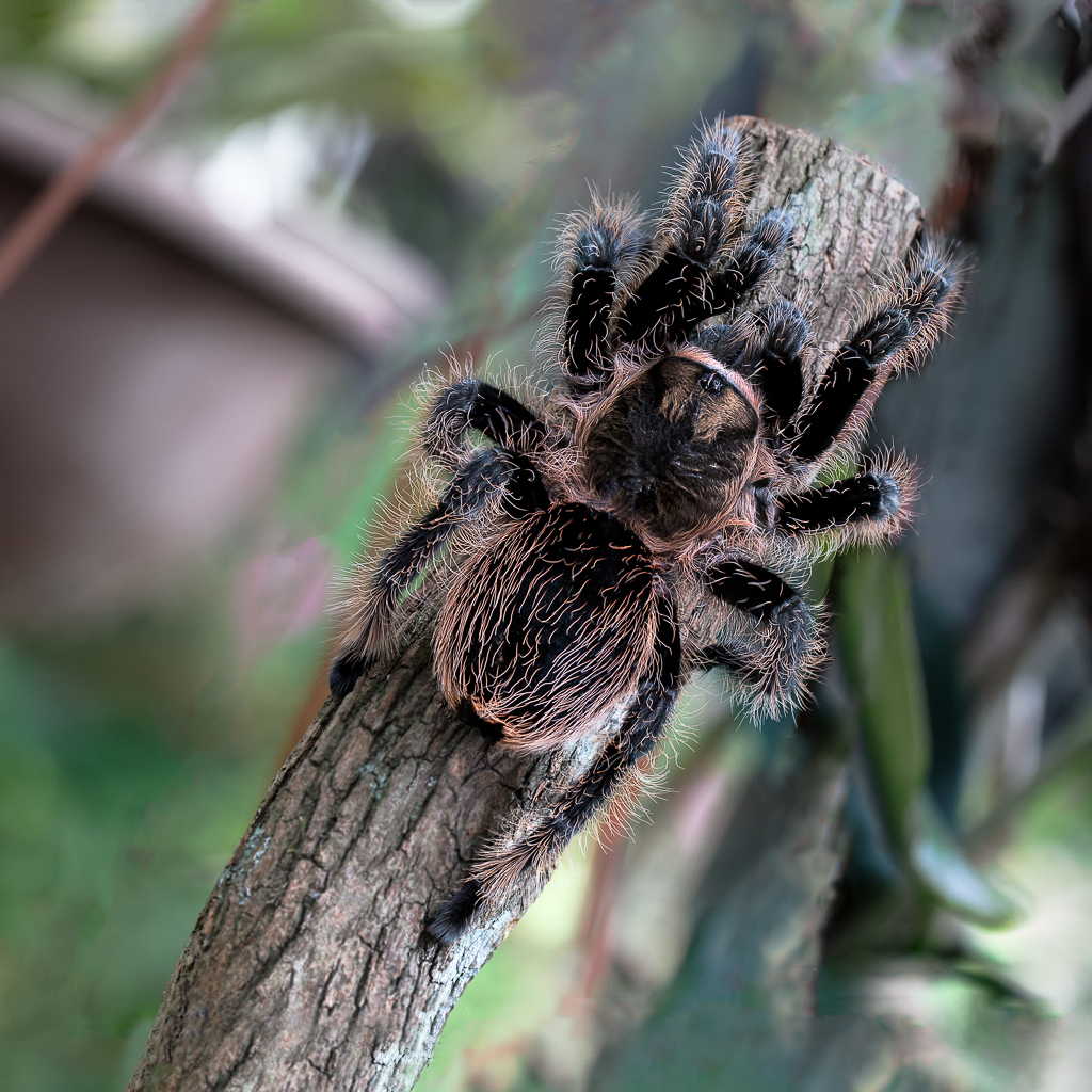
I follow 3 DDG. So, I make individual folders with rules for my inbox. I would immediately notice when there is any activity from one of our DDGs. Please remove Tarantula image for May 2023. I will send you another image.
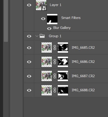
I don't get a good reference to answer your question about focus stacking. But from layer masks generated by focus stacking in PS. See attached screen shot. PS obviously did not stack the blur background. |
Apr 23rd |
 |
5 comments - 3 replies for Group 90
|
18 comments - 11 replies Total
|