|
| Group |
Round |
C/R |
Comment |
Date |
Image |
| 24 |
Feb 18 |
Comment |
I like this picture alot. the colors are nice and the rocks in the foreground are detailed. I also like the reflection of the bridge poles on the water.
If possible, I would open up the are in the middle left where the two bridges meet. There seem to be some Orange Cone shape structures there that I would want to see more details of.
Nice picture. |
Feb 11th |
| 24 |
Feb 18 |
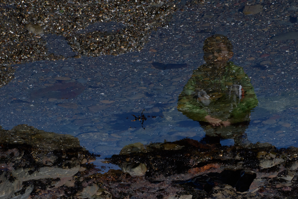
Comment |
I agree with others. The choice of black and white gives some depth to the picture and dramatizes it.
One thing that grabbed my eyes is the fact that both the girl in the middle and the sitting boy are looking at something that is happening outside the frame. |
Feb 11th |
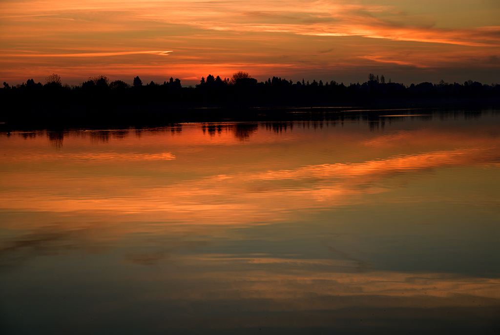
| 24 |
Feb 18 |
Comment |
as others have mentioned the colors pop out. It is very nice and good framing. One thing that I noticed is that the sky is darker blue at the top but washes out as you move down. Given that this was on a Samsung, I am assuming you did not use a filter. Just curious to know if this was PS modification? it feels like a graduated filter.
nice work. |
Feb 10th |
| 24 |
Feb 18 |
Reply |
thanks Kim. I warmed up the scene but that is it. I will copy an original version for reference. Not sure if this is going to show as an attachment.
What I liked about the picture (realized it AFTER I took it) was that the reflection of the clouds looked like brush stroke. I think that is caused by the ripples. |
Feb 10th |
 |
| 24 |
Feb 18 |
Reply |
agreed. Truth be told, I got distracted by other subjects and didn't get a chance to setup properly. By the time I realized the sun was going down, I had to rush down a steep hill, trying to get close to the water. ;-) I should have prepared earlier. |
Feb 8th |
| 24 |
Feb 18 |
Comment |
Just curious: I noticed the flares are going down but not up! what that by design or did you remove them? |
Feb 4th |
| 24 |
Feb 18 |
Reply |
I think you are right Jim. The left side of the frame is closer to the camera than the left side. If you look closely (and I think you have) you see the white reflection at the middle-right.
thanks for the feed back. |
Feb 4th |
| 24 |
Feb 18 |
Reply |
I know I struggled with this when I was framing it. Do you think it is tilted or the trees are getting longer towards the left? it feels to me the trees are shorter on the right and get taller as you move to the left. |
Feb 4th |
| 24 |
Feb 18 |
Reply |
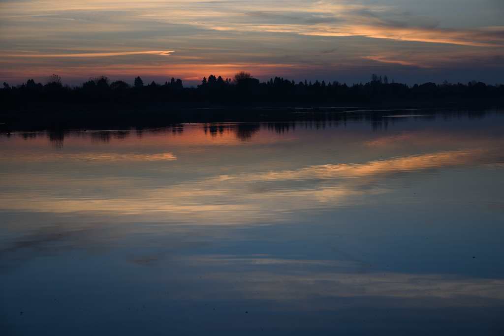
the place itself is not much to look at. The silhouette makes it more appealing than it really is. But, I'll take it. ;-) |
Feb 2nd |
| 24 |
Feb 18 |
Reply |
yeah, I see that now. thanks |
Feb 2nd |
| 24 |
Feb 18 |
Comment |
nice balance of cool and warmth. The rays of sun is grabbing the attention and make you move up to the sun and than follow the cloud to the right.
I like how the colors go from blue to orange, and back to blue again. |
Feb 2nd |
| 24 |
Feb 18 |
Comment |
I agree that B&W is the right approach here. It does bring out the highlight on the animals. What grabbed my attention was the darker colored fur (hair?) on their shoulders.
It looks to me there is some sort of filter applied to the picture. Maybe sepia!? |
Feb 2nd |
| 24 |
Feb 18 |
Comment |
I like it, specially the reflection of the birds. To me, this picture is about the waves and reflection of the birds. Not to get too technical here, but if you think you need to reduce the highlights regionally, LR has a function for it, assuming you have it. you can mask the region that you want modified.
In my opinion though, it is not that pronounced. |
Feb 2nd |
7 comments - 6 replies for Group 24
|
7 comments - 6 replies Total
|