|
| Group |
Round |
C/R |
Comment |
Date |
Image |
| 77 |
Mar 26 |
Comment |
Sorry for this late post. I started to comment early, but got distracted by a new dog, followed by my husband's surgery. He just got out of the hospital 2 days ago and needs almost complete care for a while! |
Mar 27th |
| 77 |
Mar 26 |
Comment |
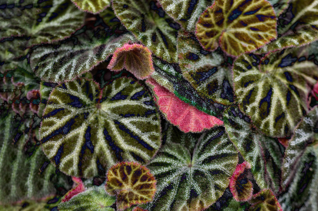
Denise, I love the way you captured and emphasized nature's patterns in this image.
To me, the original, in color, is my favorite. I like the various shades of green in the leaves. I played with the image a bit, to somehow compromise the monochrome treatment with the variation in colors of the leaves.
I placed your monochrome image on top of the original image, with a blending layer of Difference at 98% opacity. Using a mask, I blocked out the monochrome image over the red leaves and then duplicated that layer. This top duplicate I set to Hard Light blending layer, at 11 % opacity. After stamping up, I cropped out the overlap and used the crop tool's Content Aware Fill option to extend the image to the left.
As an aside, I believe that the patterns in this image would make for a beautiful accent wallpaper! |
Mar 27th |
 |
| 77 |
Mar 26 |
Comment |
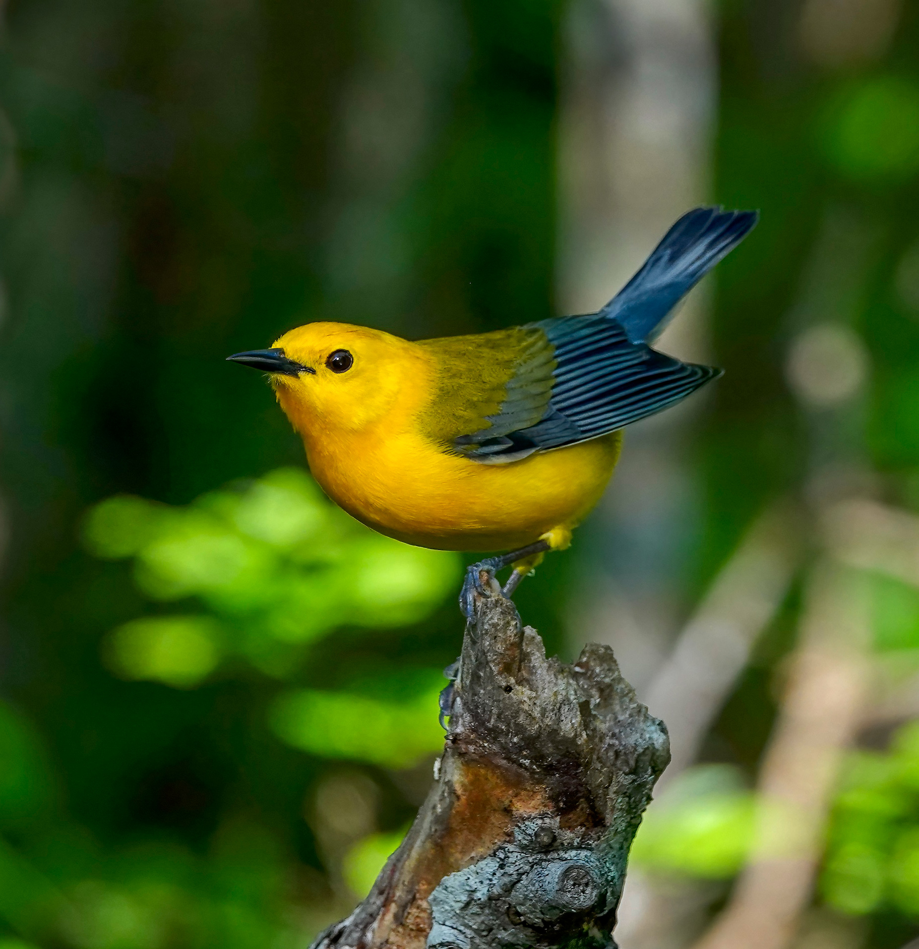
Rita, you have a beautiful, clear image of this lovely bird. What type of lens did you use to get such a beautiful, clear closeup of this tiny bird?
Like previous comments, I found the bright spots too distracting. At first I dulled them out, but then they still seemed to compete with the bird. Hence, I just burned the branches on the right, then cropped the image so that the bird's eye was at the top left power point.
|
Mar 27th |
 |
| 77 |
Mar 26 |
Comment |
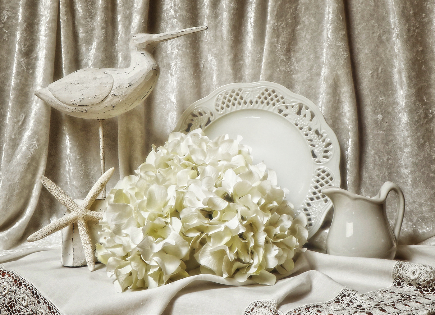
Jan, I love your choice of white on white. To me, it is an alluring artistic touch.
My only suggestion is to give this image a bit more dimensionality. So I simply used NIK Color Efex Pro Darken/Lighten Center to focus on the plate. Back in PS, I added a Grightness/Darkness adjustment layer, took down the brightness even more, and painted black over the plate. It might be too dark with my adjustments, but I have a doctor's appointment to get to! |
Mar 19th |
 |
| 77 |
Mar 26 |
Comment |
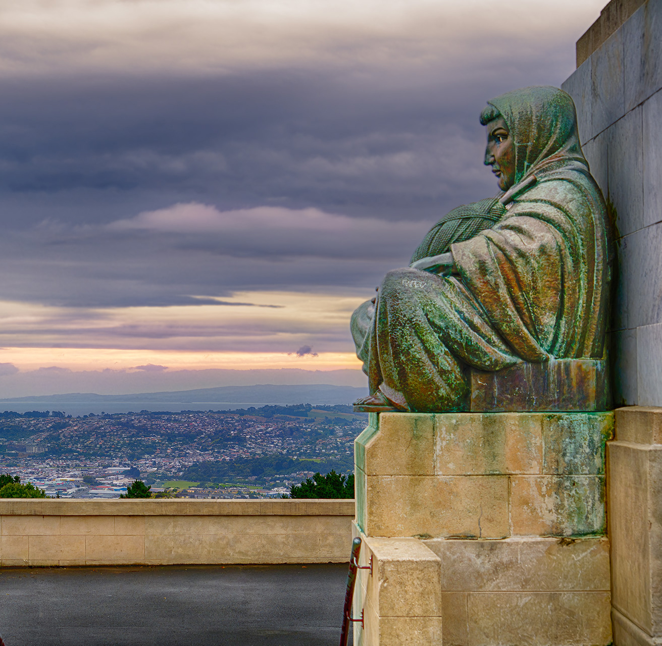
You did a great job in bringing out the color and details in the statue, as well as the cityscape and sky. The purpleish color of the sky is perfect with the greenish colors in the statue. I do perfer this colored version to the black and white.
I agree with Denise. The railing and the people seem to distract from the statue and its backdrop, as the subject of the image. I cropped it into a square. Hope that is suitable. |
Mar 19th |
 |
| 77 |
Mar 26 |
Comment |
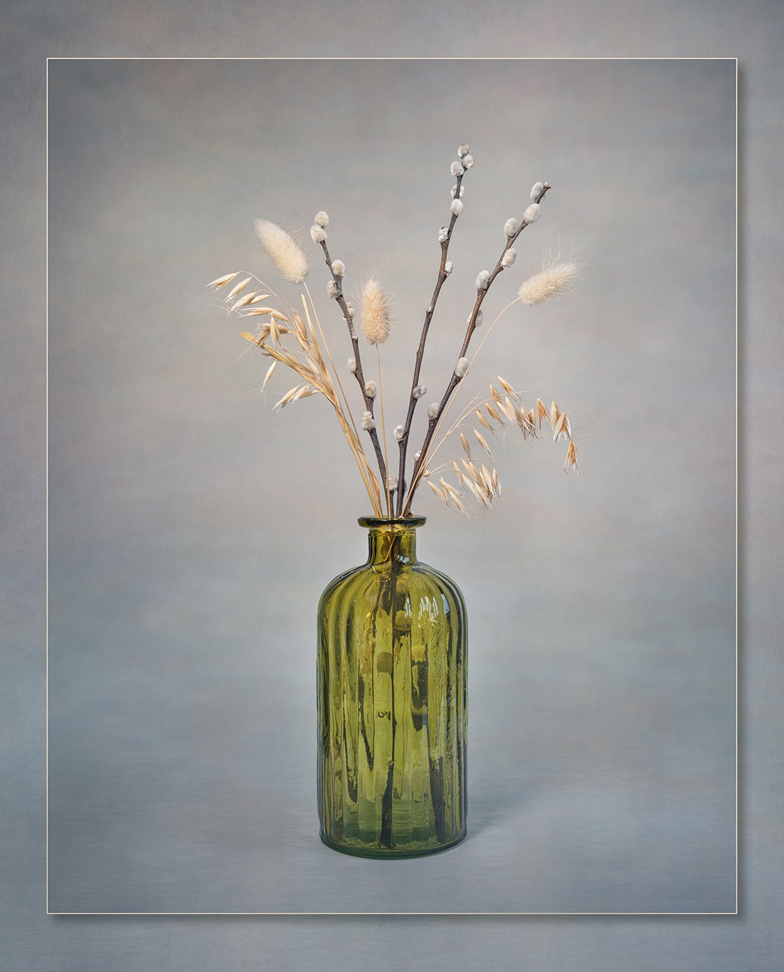
This is a lovely work of art, Carol. It is simplistic, as well as artistic as it focuses in on the vase and plants.
My only suggestion would be to give the image a bit more 3-dimensional look, more depth.
To show you what I mean, I copied your finished image. Then I applied a Hue/Saturation adjustment layer and took down the lightness, CNTL i to invert the adjustment layer to black, and then painted white with a very soft brush, over the bottom part of the image, do dampen down the foreward background and bring out the shadow a bit more. Then I applied a Brightness/Contrast adjustment layer, upped the brightness, changed it to black, and painted with white over the bottle (ommitting the base), enough to make the bottle shine more by contrast to the table on which it sat. |
Mar 19th |
 |
| 77 |
Mar 26 |
Reply |
Thanks Jan. I love Denise's rendition also. She managed to capture the effect I tried to capture, but mine was not sufficient in the way Denise's take is. However, I could not find "Dream Cloud" in my version of Topaz Studio. |
Mar 19th |
| 77 |
Mar 26 |
Reply |
Wow, Denise. I love, love it! I have Topaz Studio, but don't use it. Now I'll have to investigate that dreamy addition to a workflow! Thank you so much! |
Mar 14th |
6 comments - 2 replies for Group 77
|
6 comments - 2 replies Total
|


