|
| Group |
Round |
C/R |
Comment |
Date |
Image |
| 77 |
Sep 25 |
Reply |
Jan, thanks for maintaining that crop that Connie suggested. It does nelp.
I'm not sure about flipping the right image. With Connie's left image flip, both the right and the left images embrace the center image, like arms reaching out to hug! To my eye, that is better than the pointing on the right perspective flip.
Thanks for your perspective, however. I find it fun to play with the excellent images on our board. I'm glad you played with mine! |
Sep 20th |
| 77 |
Sep 25 |
Reply |
Connie, I like the flip of the left image. I really hadn't noticed that particular perspective of pointing to the center image. Thanks! |
Sep 20th |
| 77 |
Sep 25 |
Comment |
What a wonderful catch! I did not see that spiderweb, though I believe that a spiderweb enhances the image of nature, which you caught. In the original, it is even more prevalent and extensive. I believe it would be nice to see the more extended web accentuated in the final image. You also did a good job on the background.
Your image is a good illustration of nature's Golden Ration! |
Sep 10th |
| 77 |
Sep 25 |
Comment |
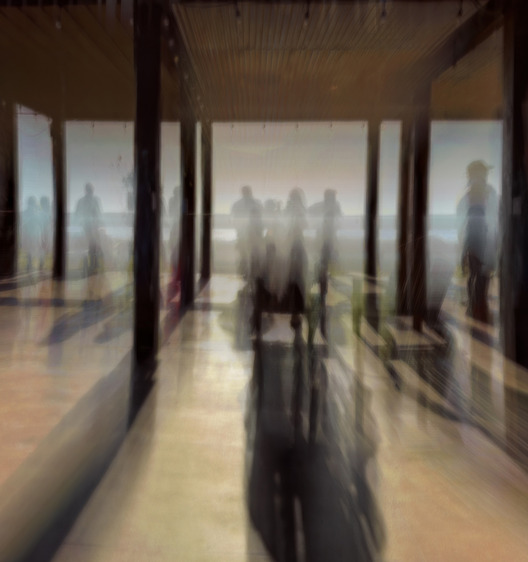
I agree with the previous comments and crop. It is a good ICM, in my opinion. The lines of the image are also effective.
Jan's crop helps the story a lot. I added a crop of the front most part of the ceiling, as I found that distracting. Other than that, the image seems quite effective to me. |
Sep 10th |
 |
| 77 |
Sep 25 |
Comment |
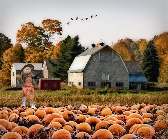
Jan, this is a beautiful fall image. I appreciated the addition of the birds. It really makes the sky rather than a replacement sky image! I do love the scarecrow also, as it is so typical of a farm scene. The lines of the image are also intriguing to me. It would make a great painting.
Your image makes me nostalgic for the farmland in the fall. I'm not looking forward to the cooler temps though, since here in Oregon it is much cooler than I am used to in SC and AZ!
I was troubled by the size of the scarecrow. It seems out of proportion to me. A scarecrow should be adult sized. So I went to the original and cut out the scarecrow. I resized it, desaturated it a bit, and pasted it on your image. It didn't look right on the right, so I flipped it horizontally and placed it on the left. Here is the result. What do you think? |
Sep 10th |
 |
| 77 |
Sep 25 |
Comment |
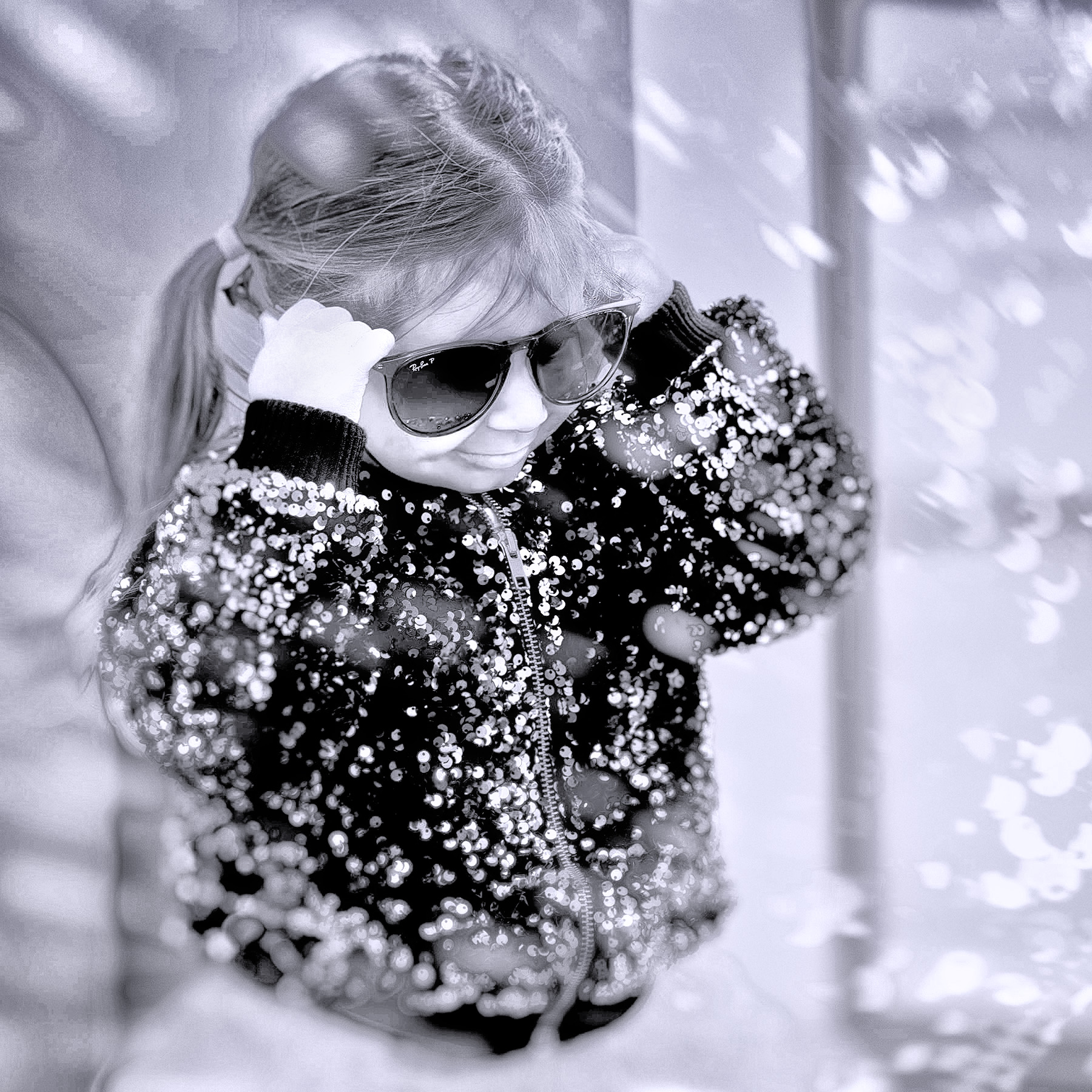
Rylee is adorable and your image of her tells a good story. I like the effect of light rays on her.
Just for fun, I tried your image in B/W. In PS, I added a B/W adjustment layer and pushed the color sliders up, to bring out the glitter on her sweater. The B/W layer sort of decreased the contrast on Rylee's face, so I went into NIK Viveza and hadded a point adjustment, in which I darkened the blacks and upped the structure. What all of that did was to make the light rays turn into driving snow! Anyhow, I admire your image and had fun trying an alternative presentation.Thank you! |
Sep 9th |
 |
| 77 |
Sep 25 |
Comment |
This is a beautiful image. You did such a nice job with the background, the shadows, and the light rays. Congratulations! I wouldn't change a thing! |
Sep 3rd |
| 77 |
Sep 25 |
Comment |
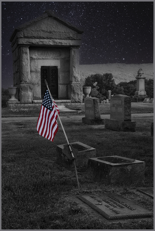
Connie, what you did was a very good idea. Changing the scene to nighttime was perfect to give this image a more telling look.
There are a lot of stars from the sky replacement over the non-sky part of the image, so I played with it and took them out with the Spot Healing Brush in PS. There were also a lot of bright spots from the original on the cement areas, which would not be scene in a nighttime setting. The flag was also too bright for my liking, for a nighttime scene.
To darken the bright spots and enhance the nighttime feeling, I opened NIK Color Efex Pro in PS and chose the Midnight preset. I put that at 50% opacity. Back in PS, the effect mitigated some of the contrast. To bring it back, I added an Exposure adjustment layer at Multiply blending mode and reduced exposure to .50%. Then I inverted the mask on that layer to black, to remove the exposure effect from most of the image. I then selected the areas that were to bright in the original and painted white over the those areas on the mask, to dull them down a bit.
Hope those adjustments are okay with you. In my opinion, that Midnight NIK preset brings out a real nighttime feeling, since it softens the image as well as darkening it, which reflects what the human eye does.
Your choice of a starry sky and a nighttime scene is perfect for this image, in my opinion. |
Sep 3rd |
 |
6 comments - 2 replies for Group 77
|
6 comments - 2 replies Total
|


