|
| Group |
Round |
C/R |
Comment |
Date |
Image |
| 77 |
Mar 24 |
Comment |
I really love that most of you have downloaded my image and done various alterations with it! What fun! I love all of your variations. Thank you! |
Mar 26th |
| 77 |
Mar 24 |
Reply |
Hope all is well with Steve. He was an excellent administrator. But I couldn't imagine anyone better to take over that task than you! |
Mar 25th |
| 77 |
Mar 24 |
Reply |
Wow Denise! I love what you did. It really captures the soft light of early morning. I don't have Topaz Studio, though I have most of their earlier presets and the AI software. The Studio software looks interesting. I love the soft look, which is exactly how low light would appear. |
Mar 25th |
| 77 |
Mar 24 |
Comment |
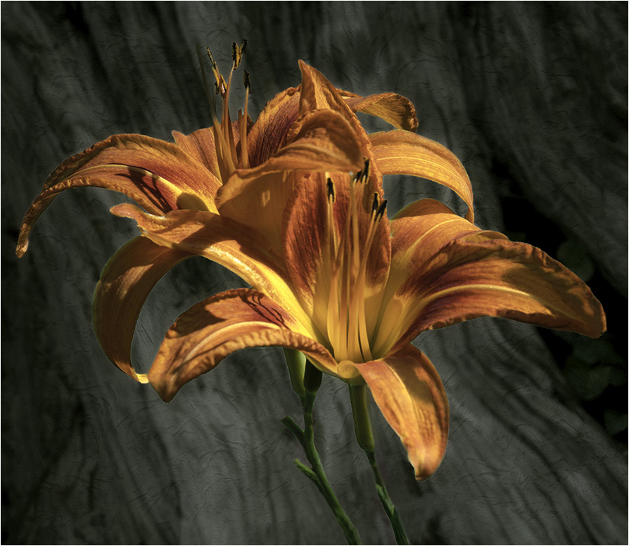
This is a lovely image of a flower. I do love the way you pulled out the gold and lavender tones. Like the others have said, in my opinion you have just the right number of petals. I also like Connie's version, with the one petal position changed. I think the changed position of the petal offers an appealing diagonal line in the image. |
Mar 13th |
| 77 |
Mar 24 |
Comment |
Wow! I didn't know that Camera Raw had a masking feature! I have been mostly away from PS and photography over the last 2 years. Your original photo gave me a chance to try Camera Raw masking and I almost duplicated what you did, using that feature. It is amazing to me! So thank you for telling us that you used that feature.
I do love those pelicans. I have a high key image of a pelican that I took at Mt. Pleasant, SC. That silly bird spent almost an hour posing for me and waiting for a handout! (which he didn't get!)
The gold tones in your image are very attractive, as is the pose and the way you developed this image! |
Mar 13th |
| 77 |
Mar 24 |
Comment |
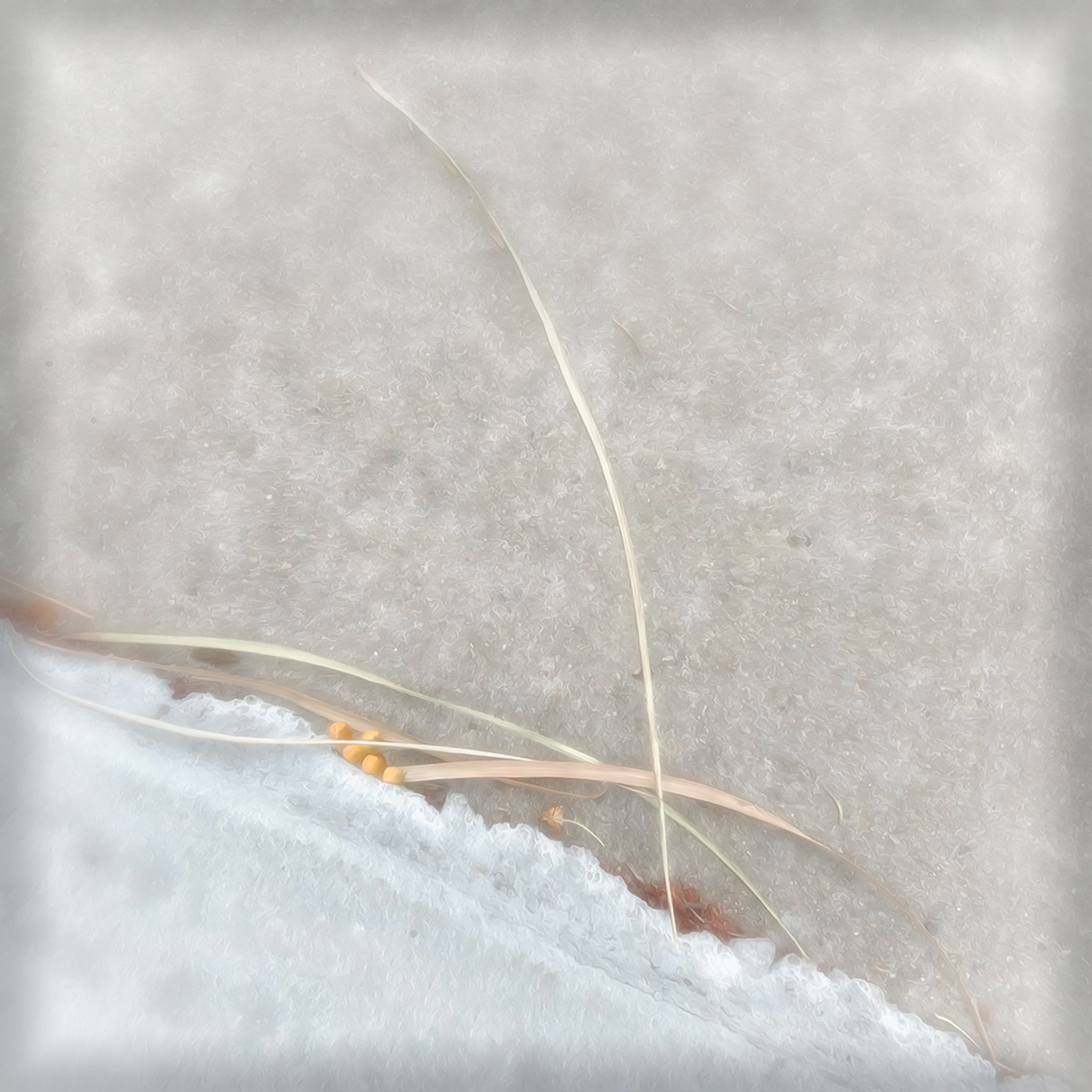
I do love the simplicity of this image, as well as the high key. You turned ordinary concreat into an icy snow patch and gave the organic reads and pods as a hint of the coming spring! Also, the vignette adds a focusing effect which I find appealing.
I think I like a slightly larger Color Efex Pro Vignette Blur, so that it would focus even more on the lines in the image. Here is an example. |
Mar 13th |
 |
| 77 |
Mar 24 |
Comment |
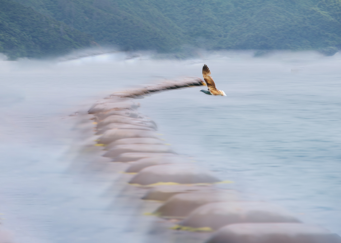
Mary, you chose an interesting subject. I was attracted to the way you put rays on the mountains and how you put motion into the image.
I do like the rays in the image. However, the entire upper part of the image bothered me, when taken as part of the whole. What caught my eye was the straight thick line at the shore. It seems it was introduced by the processing. I also preferred the placement of the bird to be at a right power point. I added the original mountains back to your finished image, and then cropped and added a slight motion blur to mountains. I used Content Aware Fill and the Healing Brush to add interest to the shore line. |
Mar 13th |
 |
| 77 |
Mar 24 |
Reply |
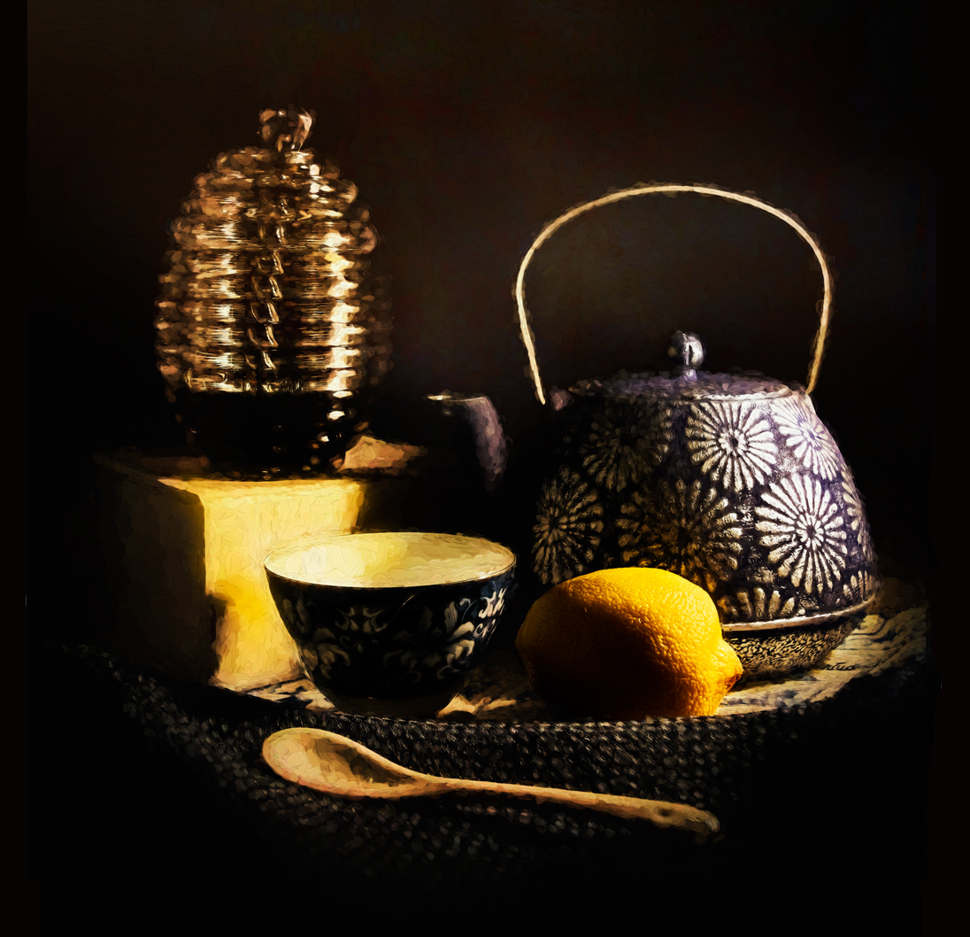
Hello again Jan. It's good to see you here. I always admired your work! What happened to Steve Estelle? I notice he is no longer leading that wonderful Creative Group 34?
I took your advise and inserted the original lemon over the painted lemon. It really made the lemon pop!
To tone down the glare, I sampled the lemon color and then created a color adjustment layer with that color, inverted its mask, and painted white over the spots that needed toning down. PS Burn Tool seldom works for me, as it turns colors grayish.
Following Linda's suggestion, I enlarged and darkened the background slightly. I believe the color noise that Linda noticed was actually part of the Monnetish painting technique. The background was darkened by increasing contrast on the Brightness/Contrast adjustment layer. So I painted black over the area aroung the tea pot, to emulate steam.
Thanks for your suggestion. |
Mar 13th |
 |
| 77 |
Mar 24 |
Reply |
Thank you Linda. I do like your treatment of my image. Thanks for the alert about that background noise. I had not noticed it before. I appreciate your comments!
|
Mar 13th |
| 77 |
Mar 24 |
Comment |
I prefer Linda's edit on this image.
The flower is lovely and the clean background Helps it to stand out in all its glory!
I found myself liking the green background in the original, so I'm wondering if you experiemented with a slightly o�paque green gray overlay on your background?
I used Linda's version and put a Color adjustment layer of deep grey-green at 50% opacity. I cut out the subject on the layer below the Color layer, and used the outline on the Color layer mask, on which I painted black within the flower outline. |
Mar 9th |
 |
6 comments - 4 replies for Group 77
|
6 comments - 4 replies Total
|


