|
| Group |
Round |
C/R |
Comment |
Date |
Image |
| 34 |
Oct 21 |
Comment |
wonderful work. I love the colors and composition.
My only suggestion is that you rotate the center flower orb so the the brighter edge on the right is on the top. Also, I'd darken it a bit, as has been suggested. It appears that the light is above and behind, so that is why I suggest that orb rotation.
This is a very beautiful creation, in my opinion! |
Oct 26th |
| 34 |
Oct 21 |
Comment |
As usual, you have come through with a masterpiece! I love how you put everything together and your final treatment of the image. I haven't used On1 for a long time and did not realize that they had textures. Thanks for cheering me up with such an amazing image! |
Oct 26th |
| 34 |
Oct 21 |
Comment |
Fun! This is a very creative idea. I actually prefer Original 3 with the wispy lines guiding the flying pigs! It makes the second pig from the bottom look like he is flying out of formation! |
Oct 26th |
| 34 |
Oct 21 |
Comment |
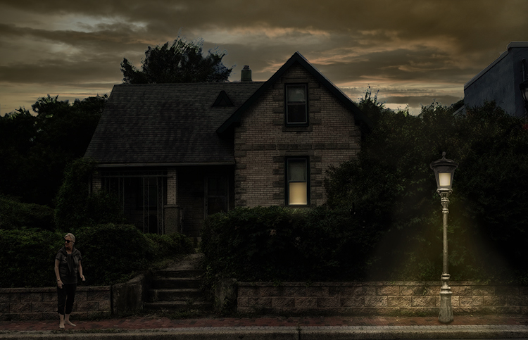
This is not my favorite image of one of my favorite artists, Alan! I agree with Jan about the sky.
To me, discomfort in an image should not come from technical aspects of the image, as your sky does. Rather, it should come from the contents/story of the image itself. Dissonance, in the sense of your story, comes from the woman, stopped and turning in the image. Dissonance in the sky only distracts from the main story you are conveying, in my opinion.
To me, there should be some light on the hedge in front of the illuminated sky. Also, there should be softer light at the edges of the illumination from the street lamp. I added those and used Edit > Sky Replacement to select a new sky. I changed its brightness to about zero and upped the yellows in it. In PS, I also picked the green color from your street illumination, and added a Solid Color adjustment in Color blend mode at 47%, to change the sky to a foreboding stormy green color at dusk. |
Oct 26th |
 |
| 34 |
Oct 21 |
Comment |
I agree with the previous comments and really prefer Brian's rework. Aside from that, to me this is an excellent image. I love the story it tells, of 'religiousity' coming from both the trained religious person and the man on the street, both in rather equal context! |
Oct 26th |
| 34 |
Oct 21 |
Reply |
Excellent rework, Brian!
|
Oct 26th |
| 34 |
Oct 21 |
Comment |
This is a very creative, imaginary story. I love the way you put together a story. You do so with real class and expertise!
After reading your explanation, I downloaded Redfield Fractalius 2, and am eager to try it out. As to your image for this month, the only suggestion I have regards the shadows. My eyes do not perceive any. The sun is at the top left, so should there be some shadows opposite that direction? |
Oct 26th |
6 comments - 1 reply for Group 34
|
| 77 |
Oct 21 |
Comment |
This is a true work of art. I love both your version and Witta's version. The color, softness, and technique are impressive. Great job! |
Oct 18th |
| 77 |
Oct 21 |
Comment |
Agree, the sky replacement is great. I'd like to learn more about how the reflection was generated. I agree with Michael that I like your slightly blurred version. It tells the story of still waters in the evening, when everything can be slightly blurred to the eyes, especially with a bright reflection. I also like Witta's version. To me, the two versions just reflect different situations. |
Oct 18th |
| 77 |
Oct 21 |
Comment |
Michael, this is a fantastic image, in my opinion. I love the composition, with the fallen flower, as it tells a story. The colors and lighting are lovely. Joel Grimes is a terrific image maker. I'm glad you have an opportunity to take his classes. |
Oct 18th |
| 77 |
Oct 21 |
Comment |
I preferred the monotone of Denise's version, so I tried taking your original into Topaz BW, Opalotype, Hand Tinted Cream and played with the various sliders until I got most of the hot spots to dim a bit. I also liked the original red tones, so I applied a blue filter on pinkish paper.
This is an adorable image. I can see why the parents liked it. The important part of the image is the children, not the supporting stuff! Love it! |
Oct 18th |
 |
| 77 |
Oct 21 |
Comment |
Connie, I much prefer your second version, with the live flower brightest. It shows the darkness of the dying and the lightness of the living parts of the plant. That seems to tell a stronger story, to me. I also like Michael's background a bit better.
I agree with you about Wabi Sabi. I would love to promote that! There is beauty in decay also. But your image is about both "life" and "death", so increasing the contrast, as you did in the second version, emphasizes that more.
|
Oct 18th |
| 77 |
Oct 21 |
Comment |
At first, I thought this was a variation on a lightbox technique. It's quite well done as an imitation of that. I also like the lighter colors. I've tried to imitate that technique also, using NIK Color Efex Pro with it's High Key preset. I've been wanting to try the frozen flower technique, but have not yet done so.
Good job! |
Oct 18th |
6 comments - 0 replies for Group 77
|
12 comments - 1 reply Total
|


