|
| Group |
Round |
C/R |
Comment |
Date |
Image |
| 20 |
Jul 21 |
Comment |
This is very nice work. The high key was inspirational.
Do the letters say anything or are they just an assortment of letters? They are very effective as part of this work of art.
The rice paper and border are a perfect touch to make this look like a real Japanese art piece.
Thanks for this lovely and creative work! |
Jul 12th |
1 comment - 0 replies for Group 20
|
| 34 |
Jul 21 |
Comment |
This is really a beautiful image. You did well by that artichoke! I especially love the way you handled the light at the top of the artichoke. The deep bronze color makes this picture into a real work of art. |
Jul 2nd |
| 34 |
Jul 21 |
Comment |
Nice concept. Don't you love the way a dog can sleep!
My only suggestion would be to distort the clock, as in a dream, nothing is is precisely defined. |
Jul 2nd |
| 34 |
Jul 21 |
Comment |
Woppie! I your image really brings out joy in me! I have no suggestions. This is one of the nicest composites that I have seen in a long time. It really tells a story. Great idea, great job!
|
Jul 2nd |
| 34 |
Jul 21 |
Comment |
Good job on the use of the clone tool!
This is not my favorite image of yours, and I am a great fan of your images! Somehow, the placement of the subject just seemed off to me. So I gave it a different crop and used the crop tool Content Aware Fill at the top, so to move the subject lower and to the right of the image.
The shadow you inserted is inconsistent with the direction of the shadow in the original. Your shadow seemed too harsh for such a slant to me, so I softened the edges a bit. Then I wondered about why the fish did not also have an angled shadow like the girls, so I tried to add one. Perhaps my addition is too large. Guess I'm not happy with either shadow. Anyhow, here is my feeble attempt to show a different perspective on your image. |
Jul 2nd |
 |
| 34 |
Jul 21 |
Comment |
What a lovely abbey you have constructed from these beautiful ruins! That final texture also brought out the feeling of history in that abbey.
To me, the girl's dress is still much out of character with the lighting elsewhere. Perhaps if you had left some of the texture on the dress (very lightly), it might have made it more consistent?
I didn't have your texture, so I selected a light color on the angel window instead. The girl was enlarged and moved up and inward a bit. I had to cut out some of the pillars to the girl's left to cover the original image of the girl. I then put a solid color mask in the picked angel color over the covering layer and the girl, put it in Color blending mode at reduced opacity, and then turned the mask black and painted with lower opacity white over the girl's flesh and the added grass and pillars. |
Jul 2nd |
 |
| 34 |
Jul 21 |
Comment |
The flowers you brought together in this composition, show up very lovely. You did a great job of selecting and pasting them.
My personal preference would be to greatly lighten or eliminate the Redfield Quad Pencil preset over the flower in the upper left. To me, it seems so inconsistent with the lack of much texture on the other flowers.
I'm undecided about the color of the Goth. I don't care for the yellow of her face. Have you tried the blue or a soft pink? To me, I cannot see any sky background. Perhaps having her a bit more translucent and therefore bluer, with only the sketch like outlines of her face would tell a more subtle story of her peering into the beautiful flowers.
|
Jul 2nd |
6 comments - 0 replies for Group 34
|
| 77 |
Jul 21 |
Comment |
Lovely. the paleness of the green in the result is just perfect for my taste. Thanks for the tip on Topaz Studio 2 and the Smudge filter! I have that, but seldom open Topaz Studio 2! Now, I'm going to have to check it out.
Love those summer flowers...consider printing them small, and then arranging the framed results in a grouping! We all love to photograph their beauty, and perhaps they should live outside of the computer! |
Jul 12th |
| 77 |
Jul 21 |
Comment |
I love the softness of the outer petals and the texture you used. This is a very beautiful image, in my opinion.
This is just a matter of opinion, but I think it would be lovely for you to put a mask on the Color Efex Pro layer, and paint with very low opacity black, to bring back a more powerful hint of the green stem. I think a bit more of a touch of green would really be a pretty contrast to the overall pinkness. |
Jul 12th |
| 77 |
Jul 21 |
Comment |
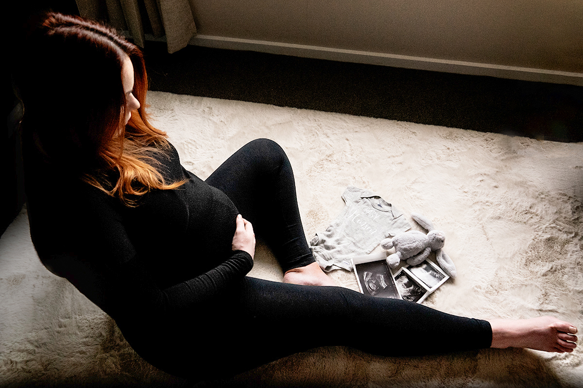
Mary, your image of your pregnant daughter-in-law is really special. My daughter-in-law also has red hair! I do love this memorial to these times for her.
These are the things that I would do (and did in PS) to improve the image.
1. The chair does not add to the story and is distracting, in my opinion. So I removed it in PS. I had to cut out a patch of the rug and move it to cover up a dent in the rug left by Content Aware Fill (Edit > Fill > Content Aware Fill. I also used the clone tool to fix a few messy spots.
2. I found myself wanting to see your daughters arms and a bit more detail to emphasize the belly. To do that,
a. I added a Brightness/Contrast adjustment layer and took the contrast way down and moved the brightness slider up a bit.
b. I selected your daughter-in-law and the dark areas behind and below her.
c. I clicked on the mask for the adjustment layer with the selection active, and then inverted that selection. The black paint on the mask then covered everything but your daughter-in-law and the area beneath and behind her. This brought out detail and showed her arms around her belly better.
d. I stamped up and took that merged layer into Camera Raw. In Camera Raw, I moved the Shadows slider up a bit.
|
Jul 12th |
 |
| 77 |
Jul 21 |
Comment |
I just want to add that the beautiful dunes are always moving. This particular image was on the downside of a dune, and debris like this stick creep across that face. The white sands are actually gypsum. Gypsum is rare in a sand and it reflects very well. Hence the sands change their color to reflect the colors of the sky, which can be very vivid at sunset. The effect is slight, but beautiful.
|
Jul 12th |
| 77 |
Jul 21 |
Reply |
Thanks Linda. I like the added contrast and the bright tail around the moving wood. The detail in the stick is also nice. I wasn't sure about bringing out that detail, as it does fight a bit against the minimalist approach. But your enhancements do look nice. |
Jul 12th |
| 77 |
Jul 21 |
Reply |
Thanks Linda. I like the added contrast and the bright tail around the moving wood. The detail in the stick is also nice. I wasn't sure about bringing out that detail, as it does fight a bit against the minimalist approach. But your enhancements do look nice. |
Jul 12th |
| 77 |
Jul 21 |
Reply |
I really like your enhancements, especially the brightening of the smooth trail behind that moving stick! Thanks for the suggestions! |
Jul 12th |
| 77 |
Jul 21 |
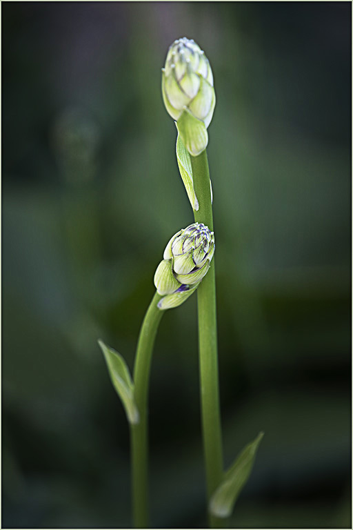
Comment |
The colors are lovely and the composition is graceful.
I'm not sure the Topaz presets helped much with sharpness. The lower bud was fairly sharp in the original. Have you tried using the High Pass technique in PS? Duplicate the top layer. Go to Filters > Other > High Pass. A gray screen will appear. Move the slider to the right just until you see the outline of what you wish to sharpen. Change the blending mode of that gray layer to Overlay. It does a wonderful job! Here is High Pass applied to your final image. |
Jul 2nd |
 |
| 77 |
Jul 21 |
Comment |
I think this would be lovely on her wall! The colors are bright, the composition is cheerful. I like the addition of the blue as a second major color in this image.
My only hesitation is that sunflower in the texture on the flower in the lower left. I found it quite distracting. To me it just doesn't fit well into the composition. If it were mine, I would mask it out and substitute some other pieces of sunflower from another part of the texture layer. |
Jul 2nd |
| 77 |
Jul 21 |
Comment |
This is an amazingly beautiful treatment. I love the colors and the textures you used.
My only suggestion would be to use a layer mask on the texture layers, with a low opacity soft brush, and paint black on the flowers with the mask selected. To my mind, you need to bring the flowers out a bit more to separate them from the background.
This is a frameable image, in my mind! |
Jul 2nd |
8 comments - 3 replies for Group 77
|
15 comments - 3 replies Total
|


