|
| Group |
Round |
C/R |
Comment |
Date |
Image |
| 34 |
Apr 21 |
Comment |
This will be my last image until July. I'm going on a cancer sabbatical. Believe me, it will not be near as much fun as our group is! I'm already fed up with having a bevy of professionals tell me what I should do and what is going to happen, over and over again. Mostly, they talk at 50 miles per hour also, rattling off lists and oblivious to the fact that I've already lost them on the second sentence! At my age, I need printed lists, which I may or may not be able to read accurately due to my failing lychee's -- er--eyes. Sigh. Life is more complex than an entire castle full of compositions!
See you all in July. Here's hoping you've all had your shots and can endeavor to enjoy the summer without undo conflict due to COVID fears and 'what ifs'! |
Apr 13th |
| 34 |
Apr 21 |
Comment |
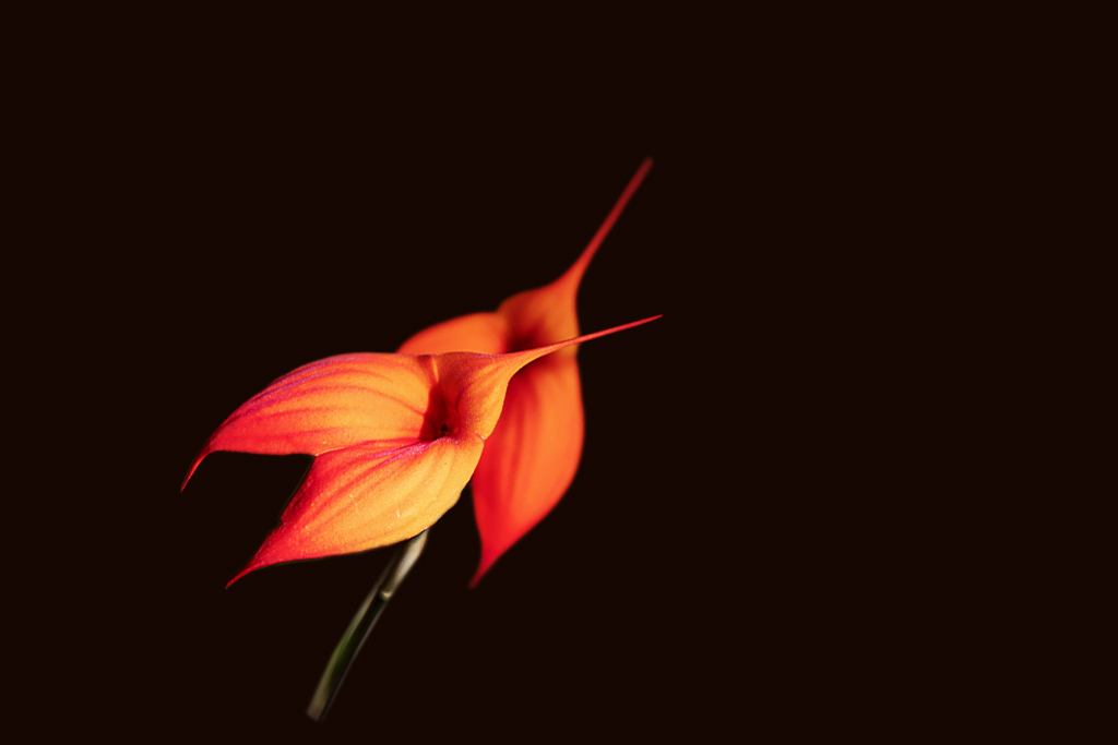
Ah, minimalism, my new favorite photographic area! It is really surprising how difficult it is to produce a minimalistic image. It takes a lot of big steps down from imagining compositions. I do like the very "Zen" nature of this one. It seems to me that it would make a snazzy hood ornament for a one of a kind custom built sports car! :-)
Great job Jan, once again! |
Apr 13th |
| 34 |
Apr 21 |
Comment |
Well Stephen, I also lived in that neck of the woods in 1984. We also ate a lot of delicious lychee! There were such a treat! I was in Malaysia.
Fran, your image is delightful, though a little 'gory', even without the blood :-). You did a masterful job of conceiving of it and carrying through on that conception. I do like the red jar top also! The black glass and stark black background are perfect. |
Apr 13th |
| 34 |
Apr 21 |
Reply |
I am really glad that you ignored your impulse to put antennae into the image! Simple is nicer. It gets your point across much faster! I'm trying to learn this better myself, but studying minimalism in photography! |
Apr 13th |
| 34 |
Apr 21 |
Reply |
Here is another subject with a similar setup. |
Apr 13th |
 |
| 34 |
Apr 21 |
Reply |
Yes, the cloth gives the texture, which is emphasized by the vertical stems. The cloth one uses is quite important, although I neglected to write it down when I learned this technique at PSA. I believe it was some type of thin linen. The cloth can't be too heavy. It was white and the room was VERY dark. While my preference was for colored vases, I have also used this technique on other objects, with varying success. Glass is best. |
Apr 13th |
| 34 |
Apr 21 |
Comment |
I enthusiastically agree with all that has been said! At first, I got stuck in a frantic search, to see where you used Original 3, but then, da, I read your explanation! Well done, once again, Alan! You have a delightful and inspiring imagination! |
Apr 13th |
| 34 |
Apr 21 |
Comment |
Your original image is a great photograph. I liked Original 2 also. The final image is full of color and I really like what you did with Fran's suggestion!
To me, the final image had the following mixture, which I found distracting: There was a bit more noise in some of the flowers, and not in others; some flowers were tack sharp, but others were blurry, though these areas seemed to be on the same plane. The blurriness did not appear in Original 1.Blurriness is appropriate for a watercolor treatment, but the dark outlines on some of the flowers is inconsistent with watercolor.
You are my favorite master of creative manipulation, but this month, I greatly preferred Original 1. However, I do really appreciate your pick of a subject! |
Apr 13th |
| 34 |
Apr 21 |
Comment |
Gwen, welcome to our group! I am glad to see that you are familiar with masking and layering. Not all new comers to other groups are!
Personally, I like that little ed up dark bug! To me, it adds interest. The original image is really nice, as you have really worked the depth of field well. You have accentuated that narrow depth of field in your completed image, and that works well, as does the flipping of the image.
I like the bark like texture, but do not prefer to have it on the leaves at all. To me, it distracts from the impact of the leaves. It does work well as a background, however.
I'm looking forward to seeing more of your creations! I will miss them for the next two months, as I will be on medical leave. But hope to see more upon return in July.
|
Apr 13th |
6 comments - 3 replies for Group 34
|
| 77 |
Apr 21 |
Comment |
Thanks for all your comments this month!
This will be my last image until July. I'm going on a cancer sabbatical. Believe me, it will not be near as much fun as our group is! I'm already fed up with having a bevy of professionals tell me what I should do and what is going to happen, over and over again. Mostly, they talk at 50 miles per hour also, rattling off lists and oblivious to the fact that I've already lost them on the second sentence! At my age, I need printed lists, which I may or may not be able to read accurately due to my failing eyes. Sigh.
I might pop in with comments, if I am up to it, but I doubt that I'll be able to do much PS work until my radiation burns heal. Life is more complex than an entire castle full of compositions!
See you all in July. Here's hoping you've all had your shots and can endeavor to enjoy the summer without undo conflict due to COVID fears and 'what ifs'! |
Apr 16th |
| 77 |
Apr 21 |
Comment |
It is a lot of fun to photograph the patterns of nature! In your original, I first saw a puppy at the top, coming down toward his bowl of food! I did not perceive a "canyon". That is the joy of nature. Each person can pick out the patterns that match their predominant experiences!
I like the "charcoal" appearance of your final image. To me, the square crop and shading that Witta gave to the image brings out the canyon pattern more strongly. The top part of the image seems to be too much negative space with respect to a canyon pattern.
Your image reminds me of a picture I took several hundred feet underground. The cave wall had similar textures and it looked like an old man's face, to me! |
Apr 16th |
| 77 |
Apr 21 |
Comment |
Linda, you took advantage of a clever observation! Is good!
I really prefer your second version, above. Varying the lighting on the texture adds interest, in my opinion. I do not prefer images that have an even intensity of light over the entire image.
This is a super texture to use with your subject. Well done! |
Apr 16th |
| 77 |
Apr 21 |
Comment |
Welcome Michael! I'm looking forward to seeing many more of your contributions! T
he colors and contrast in this image are outstanding. I do prefer Linda's slant on the flower. :-)
I think that the application of DXO detailing is a bit overboard on this flower. It is quite bright as it is, and the contrast between the orange and the yellow provide enough to work with, to sharpen the image. Detail presets tend to loose some of the natural softness of a flower, making the surface too rough, in my opinion.
I played with your image in Photoshop and NIK, in order to see what you had to deal with. Adding contrast and keeping a smooth shape was tricky! But here is what I did.
After selecting the flower with Select > Subject, I added a Selective Color adjustment layer. In that, I played with the yellow and the red sliders, and then the neutral and the black sliders. They worked rather well to bring out the contrast without adding too much roughness. A black Solid Color adjustment layer was added beneath the flower layer. To sharpen the image, I merged up (Alt Ctrl Shift E) and duplicated the merged layer. Then I selected Filters > Other > High Pass and adjusted the image so that only the outline and the crevices showed up. That layer was placed in Overlay blend mode to add the sharpening. |
Apr 16th |
 |
| 77 |
Apr 21 |
Comment |
Your processing is well done, in my opinion. Like others, the newer fence distracted me and seemed out of place, so I like Linda's removal of that fence.
I really like this image. In my opinion, it is frameable. When we lived in Arizona, I had one similar to this decorating my garden! I do miss it!
Just as a thought, this might look really cool with a weathered texture over it, with little texture over the white skull itself. |
Apr 15th |
| 77 |
Apr 21 |
Comment |
I love the colors and the creativity of this image. My only suggestion is like that of Witta's and Denise. The irregular black area where the man's back occurs, could be filled with the pattern/colors of the rest of the globe. If Content Aware doesn't work on the original, I'd try cutting and pasting from the top.
Great idea, Connie! |
Apr 15th |
| 77 |
Apr 21 |
Comment |
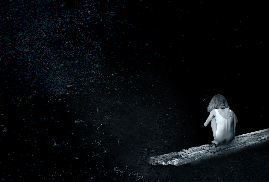
Lovely concept, Witta. I do prefer the portrait version. It's not just that I like the reflection of the girl, but I did find that piece of vegetation, sticking in from the right, to be a bit distracting. I also really liked the dark blue of the original, and I am wondering if you have considered making this monochrome using that dark blue instead of black as the color?
Since I have been playing with Minimalism in photography lately, I tried it on your image. I deleted the foliage, shrunk the girl, and moved her to the lower right. Then I did a BW adjustment layer, tinted with the dark blue in your creek bottom rocks, and darkened that a bit.
I still like both your original and especially your portrait style on this image, better than my minimalism take. But, I thought I'd give it a try. |
Apr 13th |
 |
| 77 |
Apr 21 |
Reply |
I'm afraid that I cannot see those white spots at the top of the corn, although I do see some white spots on the silk at the top.
I agree with Connie. To me, the stalk needs the part that sticks in the jar, for support. I also prefer it to run out of frame.
The gray frame on your version does look nice to me. Thanks for your comments! |
Apr 13th |
7 comments - 1 reply for Group 77
|
13 comments - 4 replies Total
|


