|
| Group |
Round |
C/R |
Comment |
Date |
Image |
| 34 |
Mar 21 |
Comment |
This is another alluring fantasy Jan. You take me back to my youth! I loved the way you painted in the desired colors. Do you use a Wacom tablet?
It doesn't bother me at all that you used an image for the lady. Where do we draw the line about what/whose image we can photograph and whose we cannot? When we photograph a beautiful building, we are photographing someone else's work. Of course the architect and builders get paid a lot more than most canvas related artists. We frequently use photographs of statues also, and that is someone else's art. I believe it is good to credit the artist when we photograph their work, provided we can know who the artist is. |
Mar 22nd |
| 34 |
Mar 21 |
Comment |
Wow, this is really beautiful. I agree about the bright spots in the distant center and a bit more enhancing of mother nature. At first, I didn't notice her. Candy's rendition is the one I prefer.
This is an inspired and lovely composition, in my opinion! |
Mar 22nd |
| 34 |
Mar 21 |
Reply |
While I agree with the comments made about this image, I wanted to clarify the intent.
This fort had seen a lot of death. Hence the grave and the spirit of the soldiers lingering on there. |
Mar 22nd |
| 34 |
Mar 21 |
Reply |
Actually, I'm not fond of this myself. It is lacking. |
Mar 22nd |
| 34 |
Mar 21 |
Comment |
A very nice composition, Alan. Like Beverly, I wanted to see it a bit crisper and lighter. But, of course, at night crisp and bright are not true to what our eyes perceive. Nevertheless, compositions are fantasy, so we can do whatever we want with them. It is the imagination that is fed, not the eyesight!
I agree with you about the documentation of each step working against the flow of creativity. What I do is to add one step to each layer or effect, and name that step appropriately. Then when I come back to the image, to document what I did, I fudge a little by simply using the step names as a reference. "Fudge" because sometimes I apply more than one tweek to a layer.
I believe that the way you described your adjustment layers is sufficient for this group. |
Mar 22nd |
| 34 |
Mar 21 |
Comment |
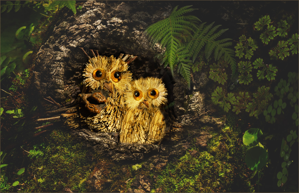
This is a very clever treatment of those two owls! I like the placement of the owls in the composition. One thought came to mind: Everything is tack sharp in the image. I wonder what it would look like if the shrubbery around that tree were softened a bit. That way only the owls would be the primary focal point. So I tried it. After opening your image, I applied an Exposure adjustment layer. In that, I upped the Offset and the Gamma Correction sliders. Then I painted with black on the adjustment layer mask, over the owls and their immediate surrounding bark. |
Mar 22nd |
 |
| 34 |
Mar 21 |
Comment |
This is such a cheery image. I love the colors and the bee. The purple crocus in the foreground was too blury for me, in the first image. But it is just right in the second image (redo) that you posted, as is the bee. Nice work! |
Mar 22nd |
6 comments - 2 replies for Group 34
|
| 77 |
Mar 21 |
Comment |
Oh my, this is a really challenging and rewarding process! I love the crystal structures that are generated. It's almost worth a trip back up north to try out this process!
I love the B & W image, as I am a big fan of geometrics. But the color version that Witta did is also beautiful!
Thanks for introducing us to this technique! |
Mar 22nd |
| 77 |
Mar 21 |
Comment |
This is very beautiful. I like the way you softened the background and brought out the sharpness of the Iris. I like the way Witta abbreviated that left hand grass. Denise's suggestion to slightly bring out the stem of the Iris, is also something that I would try if it were my image.
Your image is very appealing, to me. |
Mar 22nd |
| 77 |
Mar 21 |
Comment |
I agree about the noise. It is appropriate for an old image. However, I do prefer the tinted version as it does not show up the noise as much as the B&W version.
I think this is a good "photo journalism" image! |
Mar 22nd |
| 77 |
Mar 21 |
Comment |
Beautiful! It's been a while since I've done these spheres, and after a while, they all tend to look similar to me. But you did something unique and beautiful with yours. I especially like the placement of the flower in the top center, And the bottom flowers reminded me of a menorah! The colors are lovely also. |
Mar 22nd |
| 77 |
Mar 21 |
Comment |
I agree with Denise about the background. It is a bit distracting, to me.
The flowers are so structured that they have a real up close and personal impact. To me, they would be more appealing if they were softened just a bit, and perhaps a bit lighter?
Your composition is lovely in this image. How nice that you were gifted with such a beautiful flower! |
Mar 22nd |
| 77 |
Mar 21 |
Reply |
I love the art work in front of my image on the wall! Good setup! |
Mar 22nd |
5 comments - 1 reply for Group 77
|
11 comments - 3 replies Total
|


