|
| Group |
Round |
C/R |
Comment |
Date |
Image |
| 34 |
Feb 21 |
Comment |
Absolutely lovely, Jan. The scarf around that up-and-personal close goose is really cute. I too think that the geese in the sky are a needed touch. This is a beautiful winter scene and it puts this viewer into a nostalgic mode! We don't seem much snow in SC, but I grew up with it and played in it, and love it! |
Feb 24th |
| 34 |
Feb 21 |
Comment |
At first, I wanted those flowers to be brighter, but then I saw your Original 1 and what you were trying to do. To me, you captured some of the essence of "The Annunciation", in that you duplicated the colors and tones, a well as the bending of the two subjects together. One thing you might consider is to flip the image, so that the right flower (angel?) was bending toward the smaller flower (Mary). Simultaneously, you might want to make the flower that represents Mary, to be a more blue and beige color, instead of the same color as the angel flower. Just a thought...
I can see why "The Annunciation" is a favorite of Alan's! It is his style, expecially in the outlining of the components, rather than soft edges. |
Feb 24th |
| 34 |
Feb 21 |
Comment |
this reminds me of the flower fairy books that my other granddaughter used to love! I've been entranced by them ever since she was young!
To me, fairies should be more translucent, as they are light like butterflies, but also abstract and live in our imagination. So I made the gold fairy's wings more translucent by superimposing a warped version of the background image on top, then applying an inverted black mask to it. I painted white over the fairy, but with a much reduced opacity soft brush. I stamped up and applied NIK Viveza with spot burthening, to brighten the tips of her wings and attempt to change the light direction on her body. Finally, to me your image needs more space at the top. So I put a crop on it, and extended the top some, with the Content Aware Crop Tool option. I also narrowed the image. |
Feb 24th |
| 34 |
Feb 21 |
Reply |
that Heron really makes the image! Thanks for the suggestion. |
Feb 24th |
| 34 |
Feb 21 |
Comment |
Once more, you have demonstrated great creativity and implemented it with clever techniques! I do love this image. At first, I was distracted by the action going on behind the wall on the right. You have violated a rule of not drawing the viewer's eye out of the picture. But that "violation" I'm sure was intentional. It adds an air of mystery, which is entirely appropriate for this image! Of course, the lines of the walls draw one's eye to whatever is at the end of the image, which I assume is another donkey and rider. My eyes are not so sharp these days, and your resolution is too small to catch that important detail. The color tones and shadows are perfect, in my opinion. I really do like your image! |
Feb 24th |
| 34 |
Feb 21 |
Comment |
Your treatment of the sheep is excellent, in my opinion. I hate to say this, but the head of your granddaughter just doesn't seem right in this image. To me, it appears as if it is growing out of the sheep's back. Perhaps if you had included a bit more of her body and extended the top of the sheep image to make room for that, it might correct this misperception. In PS, you can apply a crop that takes a tiny bit off of the bottom, and extends an appropriate amount above the top, and then click on the Crop tool's Content Aware option. Then add your lovely granddaughter with a bit more body into the image. That's just a thought. Also, you might consider moving her more toward the same sheep's head to reveal more of her body.
You are fortunate to have had this time with your granddaughter, and your expression of that time in your image is inspiring! |
Feb 24th |
| 34 |
Feb 21 |
Comment |
I agree with Alan with respect to the skulls. I do find the skulls on top of the mask to be cluttering. To me, the dark gold color over the central Goth's face is too intense, too dark. With the light burst above her and the intended glow from her, it would seem to me to be more consistent if it were lighter in tone and brighter.
Your image is an inspired work of creativity, in my opinion! |
Feb 24th |
6 comments - 1 reply for Group 34
|
| 77 |
Feb 21 |
Comment |
Denise, I really like your revision! It focuses the eye on that lovely tree trunk! The blurring of the background and the complementary color set make for a very artistic image, in my opinion. |
Feb 24th |
| 77 |
Feb 21 |
Comment |
I too prefer the first image. The distortion of the shape and the missing ditties between 4 and 8 are all due to the perspective of the photographer looking up at the clock. They are natural. To me, the texture over the clock and the shape say "antique" and "history". I like that. |
Feb 24th |
| 77 |
Feb 21 |
Comment |
She reminds me of my granddaughter at that age, who carried around a similar look if anyone singled her out! Great capture! The black and white treatment are also better, to me, than the color version, especially since you took out the background and extraneous man!
I agree with Witta about the hair. Perhaps a bit of a hair like brush could pull out some strands so that her hair does not look cut off. The tatoo on her father's neck merges too much with the flow of her hair at that point. The effect is to make his neck seem a bit transparent. Darkening that tatoo might help deliniate his neck from her hair. Witta did that in her version.
Good luck with that sweetart! If she is anything like my granddaughter, she will be a pistil! I was one also, at that age. There were more than one story about me getting into trouble, consistently! But no one captured that personality as you have done! |
Feb 24th |
| 77 |
Feb 21 |
Comment |
Connie, I like the final image of the church, and prefer the flipped version. The outline of the church does not bother me, as it looks artistic to me. I agree with what others have said about the flowers. While I like the edging there, of the tree and flowers, I find that post distracting. You might consider cloning it out with Content Aware in PS. Also, darkening the flowers a bit so that they don't catch the eye first.
The clouds are spectacular, as is the detail on the church entry. Good job in capturing and using that! |
Feb 24th |
| 77 |
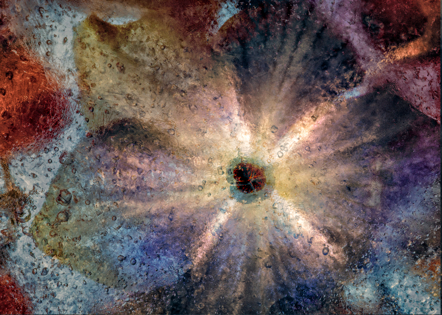
Feb 21 |
Comment |
Witta, I agree with what the others have said about this image. Ice projects cold, and cool colors are more consistent with it. The warm, dark tones don't do much to convey the nature of the image, in my opinion.
I had fun playing with your image. I layered Original 2 over your final version, put the opacity at 77% in Hard Light mode. I then applied two adjustment layers: Brightness/Contrast and Selective Color to lighten up the original 2 layer and bring out the cooler blues, without eliminating your choice of gold tones. To keep those tones in play, I copied your final layer and put it on top of the stack at Normal and 38%. Then stamped up, took the top layer into NIK Color Efex Pro, applied a Detail Extracter preset, followed by a Pro Contrast and Darken/Lighten Center preset. |
Feb 24th |
 |
| 77 |
Feb 21 |
Reply |
Thanks Denise. I guess the variety of responses here all concur about the hot spots, but vary on everything else. But, it is all good! Everyone has their own reactions to art! |
Feb 24th |
| 77 |
Feb 21 |
Reply |
I like your rendition, Linda. However, that overlay does need to be fixed with a mask over those hot spots, especially around the legs. It surely helps to have a second pair of eyes on what I create! |
Feb 24th |
| 77 |
Feb 21 |
Reply |
Thanks for catching that, Witta. I'll mask out those spots. |
Feb 24th |
5 comments - 3 replies for Group 77
|
11 comments - 4 replies Total
|


