|
| Group |
Round |
C/R |
Comment |
Date |
Image |
| 34 |
Jan 21 |
Comment |
This is my favorite this month, but Jan, your work is always most appealing to me! The tones, the textures, the distorted images of mailboxes with the bird, and the added touch of the twine in the bird's mouth all work together well. This is an image I would love to hang on my wall! |
Jan 24th |
| 34 |
Jan 21 |
Comment |
Lori, your image makes me shiver! The colors and snow effect are well done to convey the feeling of a cold evening in the north.
I too, did not notice the horse or recognize it as such. I thought that it was a person inside, dressed in white, or a bright light inside. Either way, it does add an interesting tiny highlight effect to the muted colors in the rest of the image.
One thought: If you want the viewer to realize that this is a stable, perhaps put a horse pulling a wagon just outside. Of course that would be a different story than having that small bright contrasting horse head looking out of the window.
Nice job! |
Jan 24th |
| 34 |
Jan 21 |
Comment |
Oh, my belly aches! I never saw Psycho and never want to see it! Despite the subject, I was excited when I read all the steps you used to create this well crafted image! Thanks for stimulating a thought process that goes beyond just simple editing!
PS, I really love the angle at which this appears to have been shot! |
Jan 24th |
| 34 |
Jan 21 |
Reply |
Thanks Jan. Your alterations are definitely an improvement in my eye! |
Jan 24th |
| 34 |
Jan 21 |
Comment |
I really like the original image of the building(s). Your idea of three different poses coming forward to the large foreground Jack is quite clever.
I had mixed emotions with this image. At first, I laughed because as a child, I loved Jack in the Boxes and they always made me laugh. But looking at the image, something just did not sit right with me. I think it is the stark contrast in color tonality that bothered me most. So I decided to play with the image a bit. I added a blue-green tint to make it look more yucky and darkened the background to make it look more scary to me. Then I painted on the masks used above, and brought back the toned Jacks at various opacities to simulate depth. I also dodged a bit on the Jacks and burned the bright parts of the background. |
Jan 24th |
 |
| 34 |
Jan 21 |
Comment |
This made me laugh immediately Candy. The set up was delightful and the texture really pulls the setup all together and makes it special! |
Jan 24th |
| 34 |
Jan 21 |
Comment |
Well, I am glad that someone finally found a use for those orbs everyone was generating a couple of years ago! I still see them around, and they do bore me, though I did have fun playing with them when they first arrived on the scene!
My eyes are getting old, and they don't see like they used to, but I don't see any sunken marbles in your revision. Is it my eyes or are you spoofing us? :-)
Kudos to you for having fun! Trying out new things and just escaping into creative editing is a great way to make the time past rapidly! Your image is fun. If you really want to make it into a work of art, perhaps Fran's suggestions would be a good excursion.
Thanks for reminding us to play with this stuff and to have fun! |
Jan 24th |
7 comments - 1 reply for Group 34
|
| 77 |
Jan 21 |
Comment |
I appreciate what you did with softening the color and intensity of the background. Both versions are beautiful, but I do like your edited version the most. I would not change anything either. |
Jan 25th |
| 77 |
Jan 21 |
Reply |
I think the signature is beautiful. I like the font you use. Also, it is not at 100% opacity and blends in well with the image. That's good, in my opinion.
|
Jan 25th |
| 77 |
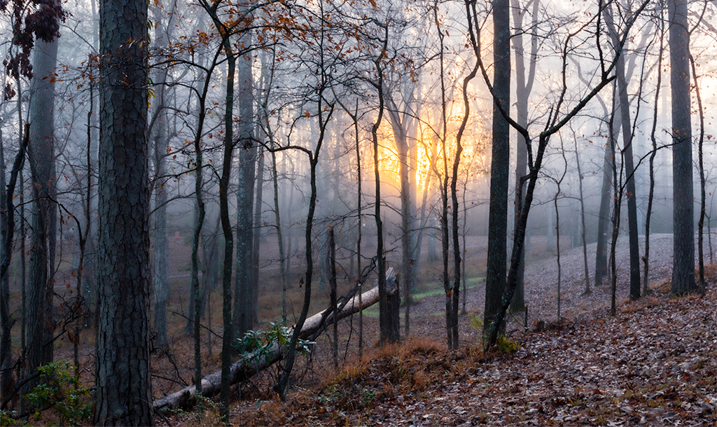
Jan 21 |
Comment |
What a lovely morning, what a lovely image, and what a wonderful experience! I do miss our camping days on the mountain tops in Arizona!
To me, your image is quite adequate to convey your inspirational experience. I like the three dimensional effect of following the downed tree up at an angle to the rising son. Although I like Witta's version, to me it looses that 3D effect.
I decided to try a different crop, one that made it look closer to a panorama. While in PS, I also added a Selective Color adjustment layer, and turned the colors a bit cooler, to reflect the icy feeling of early morning sunrise in winter. That involved altering the white and the neutral sliders a bit. It was fun to work with your image.
It reminds me of a funny story. My husband and I were camping with our desert savvy dog, on top of the Mogolon (sp?) Rim in Arizona. We were surrounded by tall Ponderosa Pines. Our dog was unfamiliar with the high woods and she knew how to get out of our tent. In the middle of the night, she woke us up with ferocious barking, outside. We panicked and rapidly exited the tent to see what dire danger we would be facing. It turned out that it was the full moon beginning to peak its head between the trees and over the edge of the rim where we were camping! Wish I'd captured a picture of that!
Your image is a nice, moody capture. I love it!
|
Jan 25th |
 |
| 77 |
Jan 21 |
Comment |
This is a lovely image. The lines, colors, fog are emotionally impacting.
To me, the lines and colors need to be more defined. So I took this into Photoshop, and added two adjustment layers: A Curves adjustment layer and a Selective Color adjustment layer. I played with the sliders on both, starting with Curves, until I got the colors to separate a bit and bring out what was behind the fog in order for it to be more obvious that this was an image of the fog over the valley. |
Jan 25th |
 |
| 77 |
Jan 21 |
Comment |
What a wonderful, warm experience to decorate a new home for Christmas! It brings back memories for me.
Extending the canvas is something I do frequently. You can do it with PS crop tool. You merely pull the touch points on the crop out from the image, check the Content Aware option on the tool's menu bar, and crop. Another way to do it is to simply add canvas and then use the Rectangular Marquee tool to select the blank canvas as well as an equal amount of the image. Then select Edit > Fill > Content Aware. When you use either technique, don't try to extend your image too much. A little bit will do it fine!
I really like Witta's signage on the blank white pillar of wall. That white wall is what my eye goes to immediately and I find myself wondering about the image because of it. To me, it is a distraction. However, with some message on it, it takes on a role in the image. Another option might be to darken that wall considerably, so that it is barely noticeable or to place a long velvet maroon drape over the white of the wall in the image.
Your home at Christmas must be a very warm and loving place!
|
Jan 25th |
| 77 |
Jan 21 |
Comment |
This reminds me of the exploring we did when we lived in Arizona. The ridges behind the palms remind me of Death Valley in CA. Where was this shot taken?
I really like the crop and flipping done by Linda. You have a lot of wonderful textures in your image, and the Topaz painting (Impressions?) really brought out the texture and color in the palms and foreground vegetation. Of course, in "real life" the desert out there is like the original in color--dry and not very lush. However, in the evening, the light changes everything, and in your development (and Linda's tweaks), it looks more like evening colors. Perhaps a sky that had late afternoon or evening colors would complement the colors of the vegetation? |
Jan 25th |
| 77 |
Jan 21 |
Reply |
Oh my, I didn't notice that stuttering 'a'! Thanks for catching that! I need a proof reader! |
Jan 6th |
| 77 |
Jan 21 |
Reply |
On close examination, I can't determine if the tan above the deer's eye is part of the deer's fur or part of the original background. But, my eyes are not that great anymore! |
Jan 6th |
| 77 |
Jan 21 |
Reply |
Opps, I didn't even notice the obvious shadow on the deer's neck!
As to the distortion on the deer's face, I don't see it.
thanks for the comments! |
Jan 6th |
5 comments - 4 replies for Group 77
|
12 comments - 5 replies Total
|


