|
| Group |
Round |
C/R |
Comment |
Date |
Image |
| 34 |
Dec 20 |
Comment |
This is a stunning picture turned into a stunning composition. I agree with everyone about the effects of your technique, subtle tones, etc.
As to the shadows, these are closely situated buildings, so shadows of the left building are to be expected. It looks like the solar rays are coming from high to the left of the man and a bit behind him. Hence the heavy shadow of his beard, the shadow beneath his arm and hand, both of which are slightly shifted to the front right. Because of these shadows, I would expect his body shadow would also be to the right, beneath and slightly to the front right, rather than in back of him.
In spite of the turmoil regarding the shadows, this is a really engaging image, in my opinion! |
Dec 27th |
| 34 |
Dec 20 |
Comment |
Delightful idea! I was surprised by the eyes at first, and found that fun. But I also like the suggestion that they might look better if they were looking at the girl, which would require a shift in the composition. I'd also try getting rid of the cat ears and most of the face, as the eyes alone have impact.
The ferns in Original 1 are really cool. To me, it would have been nice to have included them with the flowers, as a grouping. The flowers are also too perfect to be knocked over, so if they are knocked over, perhaps some dried out edges and faded color would be more appropriate.
I immediately liked this image. It reminded me of the Flower Fairy series my granddaughter used to read. Along those lines, perhaps adding fairy wings to the girl would enhance the story! But that might not have been the story you wanted to tell. |
Dec 27th |
| 34 |
Dec 20 |
Comment |
The use of various mushrooms as they frame the image of the forest path and lady, are very well done technically, in my opinion.
As I looked at your image, something didn't gel with me, so I opened up Original 3 and compared it to the final image. I found that I liked Original 3 better. What the final image does is to extend her hair out and make the face seem even larger. That is because of the light coming in from the side. The face looks smaller to me, on Original 3, due to the contrasting green color and lack of light rays. Actually, I would prefer an even smaller face, with "hair" of twisting vines and thistles. To me, the face just looks out of place and clashes with the mushrooms. To me, it makes the story ambiguous: Is it about the mushrooms or about the face of mother nature. They seem equally balanced in the composition. |
Dec 27th |
3 comments - 0 replies for Group 34
|
| 77 |
Dec 20 |
Comment |
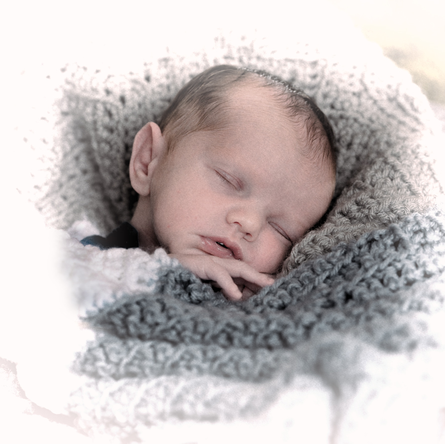
such a beautiful baby, and your rendition is also beautiful.
I took the liberty of playing with this a bit. I wanted to see what it would look like in a lighter rendition. Somehow, the dull gray blanket didn't agree with my feeling of this baby. He needed some heavenly white around him!
All I did was to make a square crop by subtracting from the sides and adding canvas on top and a little on the bottom. I used the Content Aware Fill option of the crop tool to do that.
Next, I took the image into Topaz B&W > Opalotype > Hand Painted Cream, with an orange filter and a white vignette. I applied a mask to that layer back in PS, and painted with a soft brush and low opacity black, to bring back a tad bit of blanket under his arm. |
Dec 28th |
 |
| 77 |
Dec 20 |
Comment |
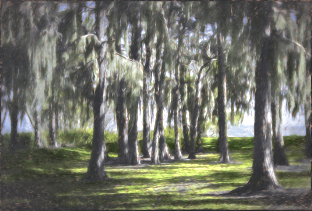
The feelings you convey of walking in the early morning through the trees, are feelings that most of us can really relate to. It is such a peaceful experience.
I agree with Witta that the viewer needs to be pulled more into the picture by the use of light. I would also like to see more of a difference between the tones of the water verses the sky. I did not realize that there was water there, when I first looked at the image.
I wanted to make the image a bit more dreamy--impressionistic. So I used Witta's version into Topaz Impressions 2 and applied a Monet II preset, with a brush change and some tweaking of color saturation. It still didn't impress me, so I added a very small Vignette Blur from NIK Color Efex Pro, followed by a Darken/Lighten center preset, with the center placed at the water top slightly to the right. After that, I brightened the image up a bit with an Exposure Adjustment Layer and a Selective Color layer, followed by a bit of light blue painting on the right center water, to distinguish the water from the sky. |
Dec 28th |
 |
| 77 |
Dec 20 |
Comment |
Cecilia, I too am fascinated by patterns, and have taken many of various ripples and reflections in the water. I've also got a lot of rust images. I find the colors in rust to be mesmerizing! Your original images are very nice. I especially like the bullet hole and rust!
In this particular rendition, along with others, I prefer the horizontal to the vertical format. In my opinion, it would also be better if the two patterns did not bisect the final image through the middle. I'd sacrifice some of the water half or some of the rust toned half. You might also want to consider the use of a Selective Color adjustment layer, to bring out the reds a bit more in the final image or otherwise select one color to add emphasis and contrast.
Are you aware of PS's Content-Aware Fill option on the crop tool? It allows one to expand an image in any direction, and it fills in the new space with the same pattern near the original edge. You simply pull the crop edges out, click the Content Aware checkbox at the top right of the Crop tool menu bar, and then you crop. Another way of doing this is to use the crop tool to expand an edge, adding new blank space. Then you use the Rectangular Marquee Tool to select all of the new blank space and some of the adjacent image (only a little of the image space is needed). Then click Edit > Fill > Content Aware.
|
Dec 28th |
| 77 |
Dec 20 |
Reply |
Linda, I really like your interpretation! The diagonal plus the texture are impressive to me. |
Dec 28th |
| 77 |
Dec 20 |
Comment |
Connie, to me this is the essence of "fine art". The colors, shapes, and textures in this image are immensely appealing to me.
We all suffer from forgetting of the steps, so I believe for the sake of a "study group", that it is important to go slow and document each step. There is a notes capability in PS.
On a selected layer, click on the Notes Tool. It looks like a page out of a book, with the lower corner turned up and a pen writing on it. Notes you take are only visible to you and do not show on the image itself.
As an alternative, I use one layer for each step. Then I label the layer with what I did on that layer. I save my file as a TIFF or PSD, and later, when it is time to write a description, I just turn off all the eyeballs except the bottom one, and then write what I did by turning on each higher level layer eyeball, one at a time. I resist the temptation to use the menu items at the top bar and instead, I use Adjustment Layers. |
Dec 28th |
| 77 |
Dec 20 |
Reply |
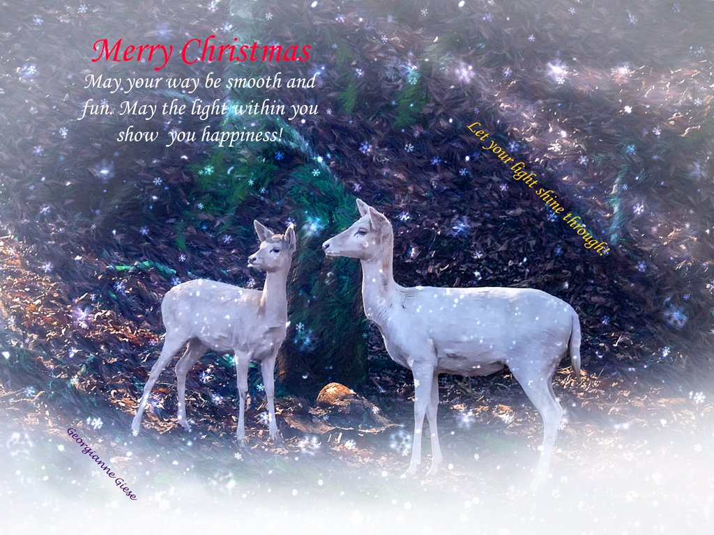
thank you for your comments Linda. I like the way you handled that tree stump in back of the deer. To me, the light rays were very important, as it set the mood for what I wanted to do with the image.
Welcome to Fine Art Photography group! |
Dec 28th |
| 77 |
Dec 20 |
Reply |
connie, you just gave me an idea of how I can use the image of these delightful creatures! A horn in a fantasy scene would be fun! Thank you! |
Dec 28th |
| 77 |
Dec 20 |
Reply |
I guess the greenery was too distracting. It was supposed to be a "Christmas" touch! :-)
I really like the way you emphasized the light in your rendition. The intent was to show the light shining into the shadows. The card I made is below. It isn't my favorite shot from the zoo trip, nor my favorite card, but I was in a hurry when I composed it! |
Dec 28th |
 |
| 77 |
Dec 20 |
Reply |
Actually, I like it with the greens dulled down. I worked on this image later, for a Christmas card, and added snow on the ground and in the air. I liked it MUCH better that way! |
Dec 28th |
| 77 |
Dec 20 |
Comment |
I'm sorry this is so late. I've been overwhelmed lately.
You have learned a lot, as evidenced by all the techniques you used in this image. Kudos!
I agree that the surrounding wood is much too predominant in the image. To me, it takes away from the girl, because of its visual weight in the image and also because the girl's face seems to be of a color that is not consistent with the light on the wood. To me, the girl's face is over saturated. The desaturation, which Cecilia applied, helps, in my opinion, as does the cropping Linda applied. In the former, the lighting on her face is more consistent in tone with the light on the wood. The crop Linda applied makes the girl the definite subject, and minimizes the visual weight of all the wood, though I personally prefer less saturation and contrast.
I am intrigued by your use of the Liquify tool to open her eyes more. I've never figured out how to do that. Could you explain how to do that, perhaps on our discussion board (Latest Threads)? |
Dec 28th |
5 comments - 5 replies for Group 77
|
8 comments - 5 replies Total
|


