|
| Group |
Round |
C/R |
Comment |
Date |
Image |
| 34 |
Nov 20 |
Comment |
This is another delightful image by Jan! I love the way you compiled all these delightful images together in one very creative composition. I have no suggestions to make, for in my opinion, your image is just perfect the way it is! |
Nov 2nd |
| 34 |
Nov 20 |
Comment |
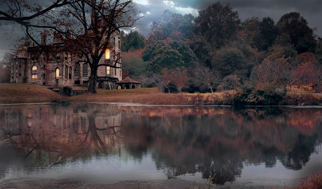
What a lovely image this is! Makes me want to be there. I love what you have done with the lake and reflections. The colors are so endearing to me, as I love fall color!
To me, the castle is much too far up the left side of the image, so I would crop off the bottom part of the image, to bring the castle down a bit. I'm also wondering about the top of the castle and the predominant tree by its side, in the reflection. They seem to be lost in the reflection. |
Nov 2nd |
 |
| 34 |
Nov 20 |
Reply |
|
Nov 2nd |
 |
| 34 |
Nov 20 |
Comment |
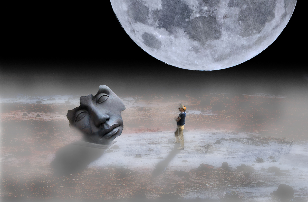
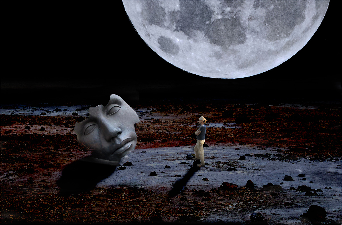
Alan, I love all of your work, especially how you use simplicity in compositional objects to tell a story.
This is not one of my favorites of yours, for it seems to violate your general compositional objectives. The rocky ground here is just too busy and distracting to me.
I played with it, to eliminate the distraction of the ground, and came up with two alternatives. In the darker one, I used an Exposure adjustment layer. In the lighter one, I used Color Efex Pro Graduated Fog. In both, I used masks to tailor the adjustments.
I also used an Exposure adjustment layer to alter the lighting on the man, as in the original, he is front lit, but in the composition, the light is coming from behind and above. The moon, however, provides a second and powerful source of light, I would suppose. The rotation of the sculpture is peculiar with respect to the light, which made me think there was supposed to be a second source. |
Nov 2nd |
 |
| 34 |
Nov 20 |
Comment |
I love the way you are experimenting with different setup ideas. This is an intriguing one! It might also have been interesting to center the ball.
Ond thing that I noticed, when looking at your original, was that the legs of the tripod came out of the frame, which I like. But in the strictly black and white version, those legs do not show up as well as they exit the frame, so that impact is lost. It's probably because the contrast in the image is so bright and hard, that the eyes fail to see such bottom detail.
I applied a Solid Color adjustment layer in light blue with a Color blending mode. The legs seem to be more dominant in this, I believe.
|
Nov 2nd |
 |
| 34 |
Nov 20 |
Comment |
It is a lot of fun to make one's own backgrounds out of the same or similar images as the subject. You did a marvelous job doing so.
The use of Topaz Impression really performed magic on the subject flower. The entire image looks like a painting and a marvelous work of art! |
Nov 2nd |
5 comments - 1 reply for Group 34
|
| 77 |
Nov 20 |
Comment |
Oh my, I love the way you explain how you just popped out for surgery and then popped back in with such a unique and lovely image! That's resilience and dedication for you, along with a love of photography!
I, too, love to photograph rust on old machinery. Where is this Museum of Transportation?
I love the way your straightened, sharpened, and brought out the colors on this lovely geometric image. it is quite appealing. My only suggestion would be to remove the white spot at the upper left corner.
Nice job, and I hope that you have recovered well from your surgery!
|
Nov 2nd |
| 77 |
Nov 20 |
Comment |
Welcome Linda! Your silhouette is well composed. I do like how you positioned the moon in your composition. Your crop was good, in my opinion. I do love the branches of the tree and how they circle the moon and show up in silhouette against the face of the moon.
Shooting the moon is not an easy task, especially if it is the night of the full moon, when the moon is so bright that it requires one to really close down the exposure. In your case, I would photographed the day before or after the full moon, and have first tried an f stop f16 and then adjusted the shutter speed down until the features of the moon were more apparent. |
Nov 2nd |
| 77 |
Nov 20 |
Comment |
This really gives me a chill, a premonition of the onset of fall as it gives away to a chilling winter. I liked what you did with your edits to bring out the brightness of the colors. The fog simply makes the story, that story of chill and premonition! This is almost like a Japanese tapestry. It is lovely! |
Nov 2nd |
| 77 |
Nov 20 |
Comment |
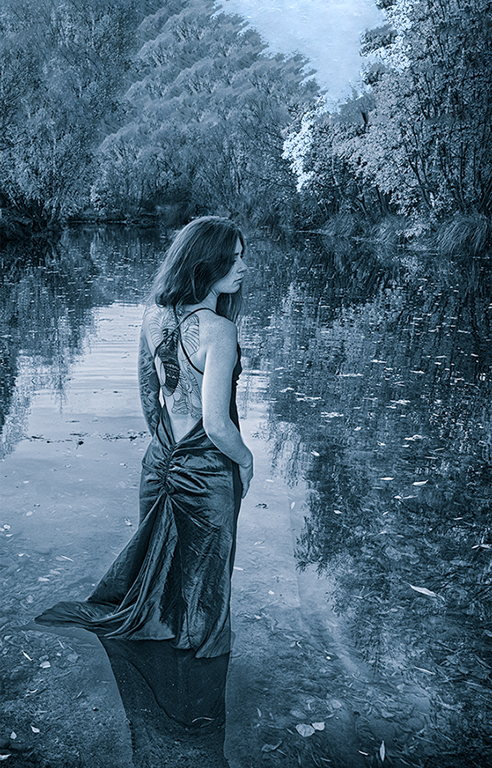
Amazing image! Tell me you didn't bribe her to walk into that water!
You did a masterful job on this. I do like the monotone, though I also like Original 2 a lot. I'm not sure of the cyanotype toning, however. Guess that is a personal preference for each of us. Despite that, the image is very impacting.
I found myself wanting to see a bit more above the lady, and a bit less below, even though that interfered with her lovely reflection in the water. To me, she seemed too centered vertically. So I downloaded the image, and in PS, I applied a crop, extended the crop above her head, and cut off a bit of the bottom. After cropping (and adding about an inch above the image, I selected the blank addition and about 3/4" of the image below the addition. Then I applied an Edit > Fill > Content Aware fill. I also applied Content Aware Fill to remove the bridge that sat like a hat on top of her head. |
Nov 2nd |
 |
| 77 |
Nov 20 |
Comment |
This is a nice fall color shot. You were quite successful in bringing out the glow of those sunlite leaves.
to me, the image lacked a story, a punch. I decided to play with it, to bring out the story it tells, more clearly. What was needed, in my opinion, was to bring out the bark in the background. Though it is just the background, without accentuating it clearly, there is just too much dark space, in my opinion.
I selected the subject (Select > Subject), tweeked the selection to include all of the golden branch leaves; duplicated the layer of the selection (Ctrl J); applied an Exposure adjustment layer on a layer beneath the leaf (subject) layer and moved the sliders of the Exposure complex up a little, on all three sliders. That brought out the detail of the bark while muting it a bit.
here is the result. I don't know if you'll care for it, but to me, it told a better "woodsy" story of fall. |
Nov 2nd |
 |
| 77 |
Nov 20 |
Comment |
Sorry to disappoint you, but I have no suggestions regarding the color of this moody image. I believe what you landed upon here is perfect! The glow around the moon is very good. The reflections in the water are perfect, except, in my opinion, the water and reflections should be just a tad murkier, perhaps with an Exposure adjustment layer Offset slider. The image is just a very moody and appealing image. I love it! |
Nov 2nd |
6 comments - 0 replies for Group 77
|
11 comments - 1 reply Total
|


