|
| Group |
Round |
C/R |
Comment |
Date |
Image |
| 34 |
Oct 20 |
Comment |
Stunning! Your three objects for a good triangle to guide the eyes around your beautiful image. I do love the texture you used! |
Oct 26th |
| 34 |
Oct 20 |
Comment |
This is a very classic image, in my opinion. I love the colors. The buildings and the people are fine, in my opinion. The light seems to be coming from a low right side. The buildings are on a hill, so that light would cast a reddish tone as the sun sets in a foreground valley. The light on the people seems to be coming from the right direction, to me. Perhaps you could lighten up the sides of the buildings a bit and add some variation of light on the trees.
You did an excellent job on this composite, in my opinion. The composition reminds us of history, and the final result is like a painting. |
Oct 26th |
| 34 |
Oct 20 |
Comment |
In my opinion, you did a good job on treating the original image. I also like what you did with the color in the final image.
Did you try a square crop on this? I found myself wondering what it would look like if the blue area were smaller, the crop was square, and the fog surrounded the bottom, as you have done. |
Oct 26th |
| 34 |
Oct 20 |
Reply |
Thanks for the suggestion, Alan. I really do like what you did with my image! |
Oct 26th |
| 34 |
Oct 20 |
Comment |
Good image! The photos of the monks are wonderful material! Where did you get the cloud brush? It is very effective.
My preference would have been to add just a few more clouds, lightly over the dark spots on the bottom left. Walking through the clouds of time is surely a good representation of the journey toward enlightenment! |
Oct 26th |
| 34 |
Oct 20 |
Comment |
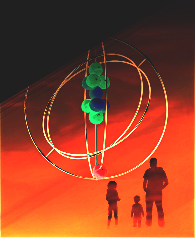
I do love the silhouettes you used, and the color of the background. The concept is good, in my opinion.
One thing that is a challenge when compositing, is to get harmonious colors. To me, the gyroscope is the wrong color to fit into the background you created.
To correct the color dissonance, I copied your Original 2 and pasted it over your final image. I then copied that top layer and flipped it horizontally and vertically. Then I used a motion blur on each layer and merged the layers after masking to form a single texture layer. I needed to brighten the final texture layer, so I added both a Brightness/Contrast adjustment layer and an Exposure adjustment layer, and kicked the sliders up on both layers. The final step was to change the blending mode of the texture layer to Hard Light. |
Oct 26th |
 |
| 34 |
Oct 20 |
Comment |
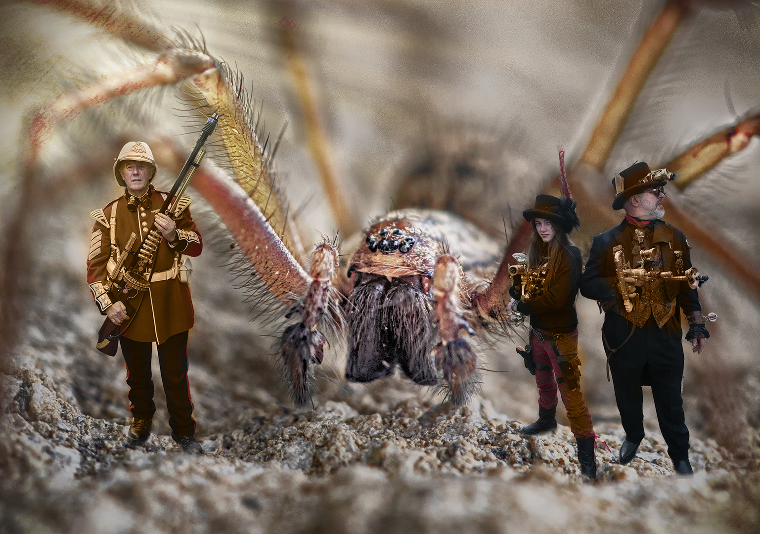
Good creativity!
It seems to me that the spider is the subject and might benefit by more illumination. The red coat does not seem to be compatible with the colors of the image, to me. I took the liberty of offering a different version of your image.
I added a texture in a color that harmonizes with the background and spider. The texture layer is at 100% in Color Blending mode. I added a layer mask to the texture layer and inverted it to black, and then painted with white over the outfits of all of the people. Finally, I added a Brightness/Contrast adjustment layer, inverted it to black, and painted white over most of the spider, to increase the brightness of the spider and make it stand out as the primary subject. |
Oct 26th |
 |
6 comments - 1 reply for Group 34
|
6 comments - 1 reply Total
|