|
| Group |
Round |
C/R |
Comment |
Date |
Image |
| 77 |
Aug 20 |
Reply |
With some images, you can simply go to Image > Image size in PS, then click the lock sign between the two dimensions, and redimention the photo with no real change in quality of the image. With other photos, you can change the dimensions by choosing the crop tool in free mode, and extending the crop edge(s) behond the original. Make sure the Content Aware Fill button in the Crop tool options is checked, then click on the Move tool to crop. |
Aug 16th |
| 77 |
Aug 20 |
Reply |
Nice! |
Aug 16th |
| 77 |
Aug 20 |
Reply |
Mary, I hadn't even noticed that pollen on the stamens! I do love your suggestion, and will bring back that pollen! Thank you. |
Aug 10th |
| 77 |
Aug 20 |
Reply |
Perhaps a little more differences between the tones on each?
|
Aug 8th |
| 77 |
Aug 20 |
Reply |
Bunny, I do like your idea. It is quite affective! |
Aug 8th |
| 77 |
Aug 20 |
Reply |
Witta, I like what you have done except for the texture. To me, it is too much. Connie's texture appeals to me much more. But your critique is helpful, in my opinion. |
Aug 8th |
| 77 |
Aug 20 |
Reply |
Witta, I like what you have done except for the texture. To me, it is too much. Connie's texture appeals to me much more. But your critique is helpful, in my opinion. |
Aug 8th |
| 77 |
Aug 20 |
Reply |
Witta, I like what you have done except for the texture. To me, it is too much. Connie's texture appeals to me much more. But your critique is helpful, in my opinion. |
Aug 8th |
| 77 |
Aug 20 |
Reply |
Hum, that was my first reaction when seeing this image! I'm not sure if its "great minds think alike" or "get our minds out of the gutter" :-)
|
Aug 7th |
| 77 |
Aug 20 |
Reply |
Thank you for mentioning the triptych as a final image, Bunny. I agree. It would make a good image set on its own, with no need to choose. I do think, however, that it would be interesting to try a triptych with an image that has more cropped off the bottom, such as Denise has done. |
Aug 7th |
| 77 |
Aug 20 |
Comment |
I actually left that dead pedal there for a reason. I hope to do that in all future images. Imperfection is life, and life is beauty. Wabi Sabi... |
Aug 7th |
| 77 |
Aug 20 |
Reply |
Nice, Connie. You really made that dead pedal disappear! |
Aug 7th |
| 77 |
Aug 20 |
Comment |
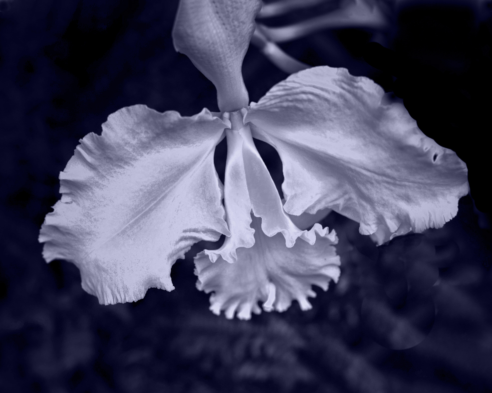
What a beautiful orchid. You did a good job of capturing its image. Your crop is symmetrical and eliminates the extraneous parts on the right. I really like your choice to apply a monochrome treatment you gave to this image.
As I look at your original, I think I prefer to see the two side petals not cropped out. Also, I would like to see more detail in the inside of the lower pedal. At any rate, I played with the image, to see if I could get a different crop and sharpen up that lower pedal center.
My first step was to apply a Selective Color adjustment layer, and adjusted the White slider, and the neutral slider to enhance contrast in those colors.
Then I cropped it with a 5 X 4 ration crop, with the top of the crop about 1/8th of an inch above the image, to move the flower a bit downward in the crop. To had image data to the blank top, I selected it plus a bit of the image below it, and applied Content Aware Fill.
I then took the image into NIK Color Efex Pro, and applied a Darken/Lighten Center preset, with the center on the lower pedal. Then I applied a Detail Extract preset and pumped up the detail on the lower pedal with the spot tool. Then came the Pro Contrast preset and a Save.
Back in PS, I used the Stamp tool with a hard brush around larger areas of white, to stamp the dark photo texture over the light areas and remove the misc. pedals from the top and bottom right.
Finally, I applied the PS B&W Adjustment layer, upped the red, yellow, cyan, and blue sliders, and applied a cool tint.
|
Aug 2nd |
 |
| 77 |
Aug 20 |
Comment |
This is a very good treatment of this unusual, yet lovely seed pod. I like the way you angled the image. You also really brought out the detail in that seed pod. Good job!
I looked up the link to Jimmy McIntyre's videos. I've placed that link in the Helpful Links page (button is at the top of our pages, third row down). He uses his software to explain Luminosity masks.
I've also added an excellent link on how to do this yourself in PS, using Select > Color Range, with a layer mask.
There is also a link for Luminosity masks in LR. this is a simple way to simulate some Luminosity masks in LR. |
Aug 2nd |
| 77 |
Aug 20 |
Comment |
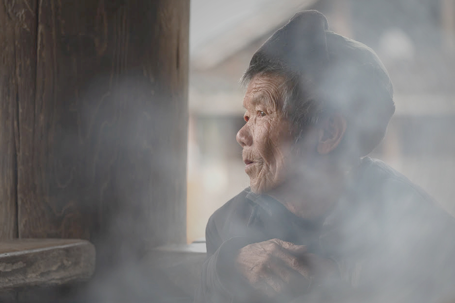
What a dramatic, lovely moment frozen in time by your excellent image! Her expression, her outline against the natural light of the window, and the smoke are all perfectly captured.
In my opinion, there is much too much visual weight on the left. The intensity and tone of the color on the wall picks up the color on her hands and face, and pulls ones eye away from her, toward the wall.
Starting with your original (which I prefered), I handled the window background by adding a Levels adjustment layer in PS. I moved the sliders around until the smoke obscured the background better. then I painted with black, with a soft brush at 50% opacity, on that layer mask, over her face, to hide half of the adjustment there.
Next, I added a Brightness/Contrast adjustment layer, to tone down the brown wall. I took both sliders down to the left end, and then, once again, I used a soft, lower opacity brush to paint over her entire face in black, so as to hide that layer's adjustment there.
An image on the monitor is emitted light, so it is always brighter than the reflected light on a print. This image, with my adjustments, was too dark. To correct for this, I added another Brightness/Contrast adjustment layer, and brought up the brightness of the entire image, just a bit.
Finally, I cropped the image, to get ride of some of that remaining visual weight on the left, and emphasize this wonderful woman's face.
Secondly, I |
Aug 2nd |
 |
| 77 |
Aug 20 |
Comment |
Connie, to me this is an excellent example of photographic Fine Art. I do love this image. The composition is spot on, in my opinion. the side tables give a sense of place. The texture really adds to the classic style of a classic subject! In my opinion, the texture really gives this image impact. Bravo!
|
Aug 2nd |
| 77 |
Aug 20 |
Comment |
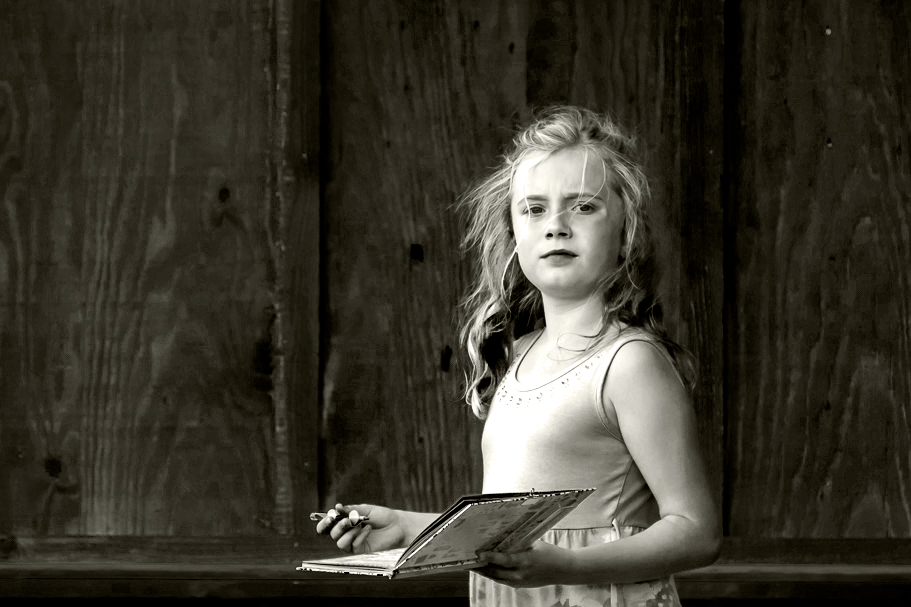
I like the middle version best. Also, your crop is very good. I like the way you moved the girl to the right.
You might want to try a crop where the rock and lower skirt does not show, although it would not be a square crop, as you have chosen.
Just for fun, I played with this lovely image, applied a Levels adjustment layer to accentuate the contrast on the girl, and then applied a B&W adjustment layer in PS. In that layer, I took down Red and Yellow all the way, took down Cyan and Magenta a bit. I also applied a light tint to it, since that is closer to the middle tint you used, which I liked. Then I cropped it, placing the girl's face at the right upper power point and eliminating the stone. |
Aug 2nd |
 |
| 77 |
Aug 20 |
Comment |
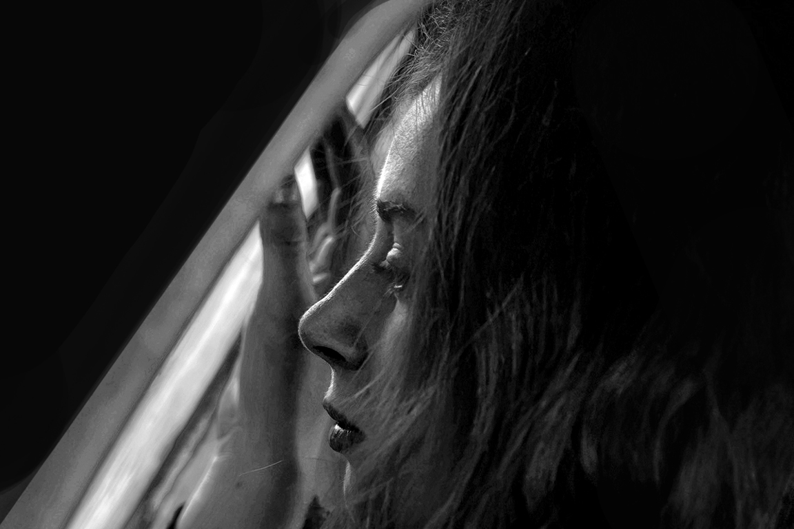
Mary, I love this image. It is very emotionally powerful and well done. I do love the dark sides with the diagonal light.
My first thought is that this image could use a few white or gray pixel stroke around the outside. As it is, one can't see the sides against the black page background. But then I thought of something else. Black is a very heavy color. It provides a very heavy visual weight to the image, which somewhat detracts from the lovely profile and light. So I played with the image a bit, to break up that heavy extensive visual weight of the black sides.
First I tried cropping, but that made the image a nonstandard ratio, not good for printing.
Finally, I decided to forgo plugin monochrome conversion, and just to with PS B&W adjustment layer. Before doing that, I uased a Selective Color adjustment layer to heighten the yellows and whites, and emphasize the reds. That added a needed contrast to bring out the hair and the folds in the curtain. After applying the B&W adjustment layer, I applied a Brightness/Contrast layer and took the brightness all the way down. With a mask, I painted black over the diagonal center areas and her lower hair on the bottom right, to hide the effect of the adjustment layer in those spots. That was done to bring out some detail in the center and break up that heavy black part of the side, leaving the left and upper right sides in the dark. That still didn't darken the edges enough, so I applied a solid black layer, and painted black on the mask, with various opacities, to hide the solid black adjustment layer, over the center and areas that I didn't want to be totally blackened out. |
Aug 2nd |
 |
7 comments - 11 replies for Group 77
|
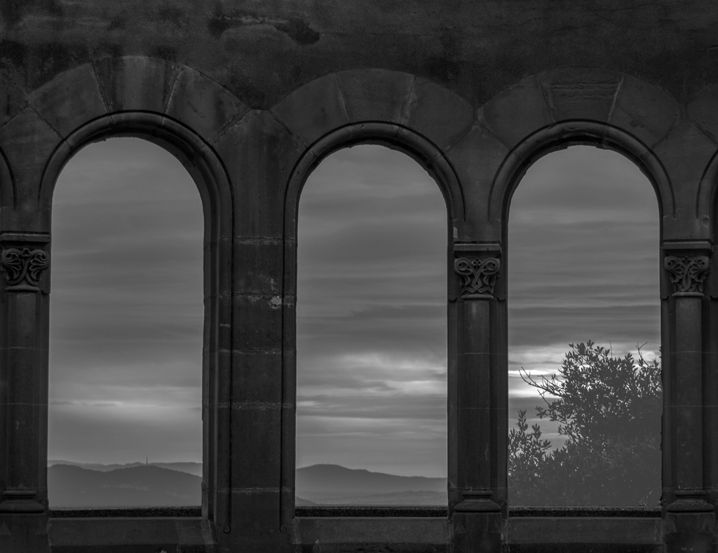
| 83 |
Aug 20 |
Comment |
I concur with what has already been said with respect to the darkness of the exposure. To capture the mood, one would not want to have too much contrast. But an overall lightening of the exposure might help.
I found myself wondering if the arches themselves were this dark. Where you on the inside of these arches? Was there more light inside, so that the arches themselves might be lit a bit more?
I played with it and brightened the arches a bit. then I upped the exposure and the offset on the outdoors. |
Aug 10th |
 |
| 83 |
Aug 20 |
Comment |
Original image? Technique?
I really like the form and lines in this image. To me, this is one of your best, though for me, it needs a few tweeks.
For improvement, you might wish to make the semi-opac intersections totally solid, with no fading out. Those areas really attracted my eye and seemed to contradict the stark contrast in the rest of the image. |
Aug 10th |
2 comments - 0 replies for Group 83
|
9 comments - 11 replies Total
|


