|
| Group |
Round |
C/R |
Comment |
Date |
Image |
| 34 |
Jul 20 |
Comment |
Jan, you have got to stop doing this! You are getting just too good at what you gift to us! :-) Again, my thoughts join the others with respect to your creative image. My only thought is that I wasn't sure if those were white rocks or sheep. Could you possibly make some of the white things a bit larger, so the difference is clearer?
Your image surely does tell the story of our stay at home plight this year. After a while time seems absent, marked only by the rising and setting of the sun! But I'm still waiting for that alarm clock to go off and wake us up from this nightmare!
|
Jul 21st |
| 34 |
Jul 20 |
Comment |
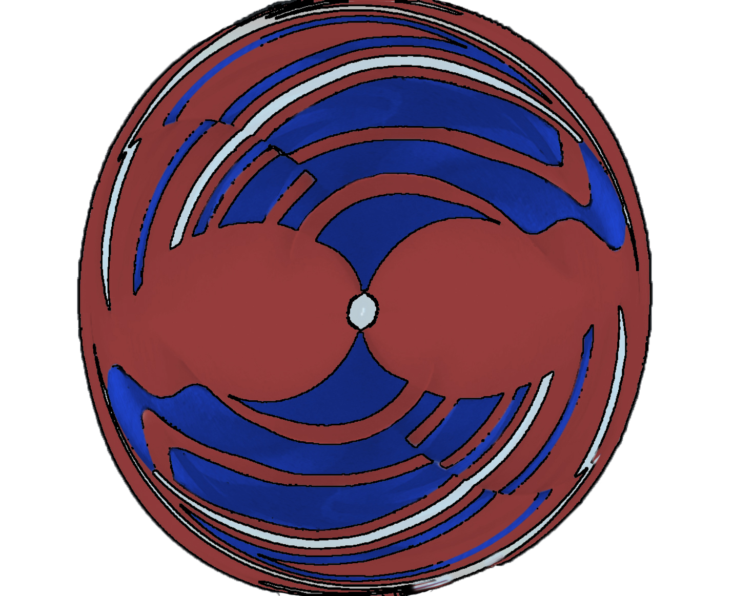
I agree that this lovely graphic creation should be called "two fish kissing!" One could almost use this graphic as a logo.
I do like the color treatment you gave to this. However, I couldn't help myself. I had to experiment with it. I simply put a stroke around the lines of the graphic, using Topaz Studio 2 Simplify Black Line Only. I had to trim some of the smudgeness of that perset with a mask, and I didn't spend much time on that, as you can tell. then I deleted the black background and inserted a white one. |
Jul 21st |
 |
| 34 |
Jul 20 |
Reply |
Jan, I really like your spin on this! :-)
|
Jul 21st |
| 34 |
Jul 20 |
Comment |
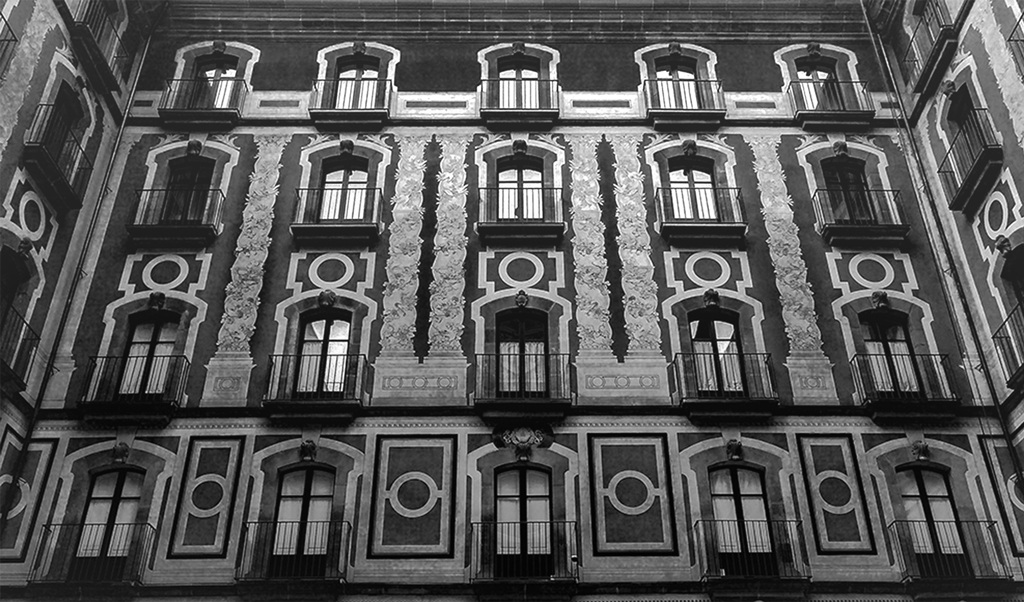
I agree with all that has been said in praise of your work here Alan. I'm also inspired to look into your use of the clone tool!
One thing that caught my eye was the skew of the top floor, front windows, which you inserted. When you held the Alt key and copied the bottom windows, I assume that it placed the copy on a new layer? If so, you could easily use the transform tool to change the skew of the windows, if you so desired. As they are, they look like they are opening inward on the left side. The line at the top of each window is not parallel with the top of the window frame. Is that what you wanted? I'm also not sure about the direction of the light, as the first 2 windows from the left are shaded at the top but the third window is in bright light. But the light seems to be coming from the left of the image and falls more brightly on the left side of the building.
I thought this building looked familiar, and see that you were in Charleston. It's one of my favorite cities, and I have many images of buildings similar to this!
|
Jul 21st |
| 34 |
Jul 20 |
Comment |
OMG, we must be reading one another's minds! However, you are the only one who pulled it off! I was attempting to create an image of a chapel with one lonely person in the front pew by the alter! But the churches were closed and locked, so I gave it up due to time constraints. Your's is not a "church" but the meaning, the story is the same.
I love what you have done. Others have sang its praises appropriately and all I can say is 'ditto'. You handled the harsh light so effectively, and you have conveyed the feeling you intended, in a manner that reached all of us. Great work! |
Jul 21st |
| 34 |
Jul 20 |
Comment |
How lucky you are to have such a beautiful garden! I'd be out there photographing with my husband everyday, if we were that lucky!
I do love your garden images, but the image with the faces on it just doesn't click for me. You have done a masterful job of blending, but I found myself of two different opinions. Perhaps I would like it more if the faces were a bit more predominant. Alternatively, I think it might appeal to me more if the faces were eliminated and just a swatch across and including the eyes of each lady were peering out of the garden at me. (like the Cheshire cat?) |
Jul 21st |
| 34 |
Jul 20 |
Comment |
This is a great image, in my opinion. I do love the yellow/white dress, as well as all of the composition.
I found myself wondering about the yellow leaf-like specs and why the lace collar is yellow near its downward peak. The latter effect is something I might try to turn back to a white/cream color. But these nit pics are not so important.
The story told by this enchanting image reminds me of some of my favorite stories as a young child! Love it! |
Jul 6th |
6 comments - 1 reply for Group 34
|
| 77 |
Jul 20 |
Reply |
Witta, I really love the toning in this alternate version of your image! After considering what you did, what I previously said, and what Guy Davies mentioned about not cropping, I take back my previous crop suggestions. The wide, uncropped view does add to the feeling of isolation, and I do like that in your image!
|
Jul 17th |
| 77 |
Jul 20 |
Reply |
Cecilia, I have thousands of textures that I have photographed over the last decade. However, I've only used a few of them. Each regular image can only be matched with certain textures, and that is just a seat of the pants matching, influenced heavily by the photographer's personal preference. I have never read any rules for that matching. Basically, I match for color coordination, fine grained lines and/or painterly variations in tone and softness. I have found that many of my own textures have some heavier lines, which restricts the images that can be used with them. Recently, I reflected that I find purchased and free textures of others were often better suited to my tastes than my own. That is when I decided to make more painterly and/or soft images from my own images. I focused on colors in an image and the lack of big obstructions and heavy lines that call for a different type of treatment. |
Jul 6th |
| 77 |
Jul 20 |
Reply |
I like this one better than the original. Also like the color one with the legs on the right better than the original. That's just my opinion. |
Jul 6th |
| 77 |
Jul 20 |
Reply |
I'm not sure of what 'blob' you are referring to. But I did notice that you seem to have cropped off the top hinge on the door, but left a bit of a black mark (tip of hinge). I would remove that with Content Aware Fill in PS. Something else: Perhaps you can lighten and staurate the flowers just a bit, so they are equal in brightness to the broom head.
As you noticed, a top crop seems to be in order, in my opinion.
|
Jul 6th |
| 77 |
Jul 20 |
Reply |
I can't see the texture either, but my eyes are not as good as they used to be! I even went to the extreme of dusting my screen! Still couldn't see it. Perhaps it could be just a little bit stronger? |
Jul 4th |
| 77 |
Jul 20 |
Reply |
Witta, you have also inspired me to go back and rework some old images of mine. I have lots of old houses and barns, but there is one, taken on one of the islands in Puget Sound, that reminds me a lot of your image. I always loved that image, but didn't know quite how to treat it. If I can find it again, your inspiration is urging me to see what can be done with it! |
Jul 3rd |
| 77 |
Jul 20 |
Reply |
Thanks for your thoughts, Denise. I do like the reds, as they add some color contrast and pick up the similar color at the bottom of the lily. I do like your suggestion to ad more reds. I could try that on the left bottom, where there are some lighter reddish blurred flowers. Thanks for that suggestion! |
Jul 3rd |
| 77 |
Jul 20 |
Reply |
PS, you would not need a stroke around your redone image, as it would stand out from a black background. |
Jul 3rd |
| 77 |
Jul 20 |
Reply |
To add an image boarder, there are several ways you can attempt. The first can be tricky and perhaps, a bit sloppy. You simply select a box within your image, and that box is just a tad bit in from all sides. You invert your selection and paint white over the selected pixels.
The second way is easier. Many post processing filters have plugins and presets that put a frame around the box.You can use one and reduce the size of the frame to the tiniest amount. I used NIK Color Efex Pro 2 with the Image Boarders preset. |
Jul 3rd |
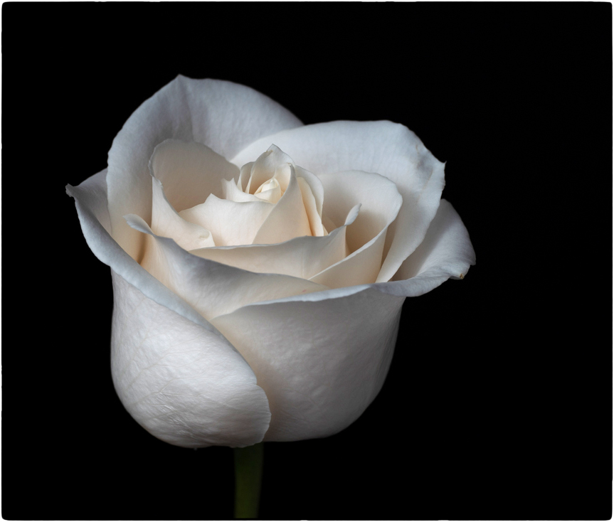 |
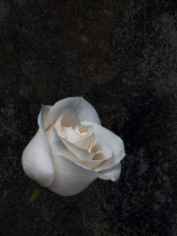
| 77 |
Jul 20 |
Reply |
I really like what you have done with the background and the rose. The texture you chose is spot on, in my opinion. I like the softness it contributes to the image. You brightened the rose just enough. |
Jul 3rd |
| 77 |
Jul 20 |
Reply |
Thanks Bunny.
I left the flaws in the stem because that's the way stems are--bumpy, lumpy, etc. Somehow flaws seem to be part of the nature of life! (Certainly I've had enough of them myself!). Flaws always remind me of a story I cherished in my youth. I don't remember the whole content of the story, but it had to do with a lady removing a mole, not realizing that it was a mole that her husband loved. |
Jul 2nd |
| 77 |
Jul 20 |
Reply |
I admire you for trying new techniques, even when you don't care to use them much! Your analysis of matching textures to themes is right on, in my opinion. I agree that sometimes the simplicity of blank white/black or even other solid colors, really can make a simple subject stand out. I think this is especially true with respect to still life images.
It's delightful to read your reply about how you view textures. |
Jul 2nd |
| 77 |
Jul 20 |
Comment |
Cecilia, I agree with the previous comments. You brought the landscape to life, and the result is lovely.
I agree that the image would have been better taken from a different angle, with the legs pointing into, rather than out of, the image. It would not be easy, but you could cut them out in PS, and paste them into a new layer. You could then rotate the legs from 90 to 180 degrees or just flip them horizontally. You would then have to go back down to your source layer and do a Content Aware Fill to remove the outward pointing legs.
One other thing you might consider, is to make the extreme whiteness of the legs into a cream colored tone, such as in the bright part of the clouds, which would not conflict so much with the yellows in your final image. |
Jul 2nd |
| 77 |
Jul 20 |
Reply |
|
Jul 2nd |
 |
| 77 |
Jul 20 |
Comment |
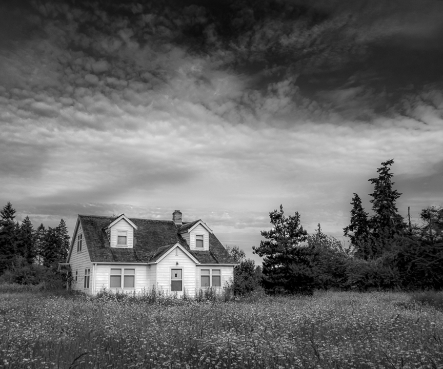
this is a heartwarming reminder of times in our history. As an image, it is beautiful to me. The monochrome version appeals to me more than the color original. I also like the sky you inserted in the BW version better than the original sky.
I have two suggestions. First, I found the bright squiggles in the center clouds to be quite distracting. Secondly, it seems to me that the wide landscape of trees detracts from the central subject.
I tried two different crops and took out the bright squiggles with the healing tool. What do you think? |
Jul 2nd |
 |
| 77 |
Jul 20 |
Comment |
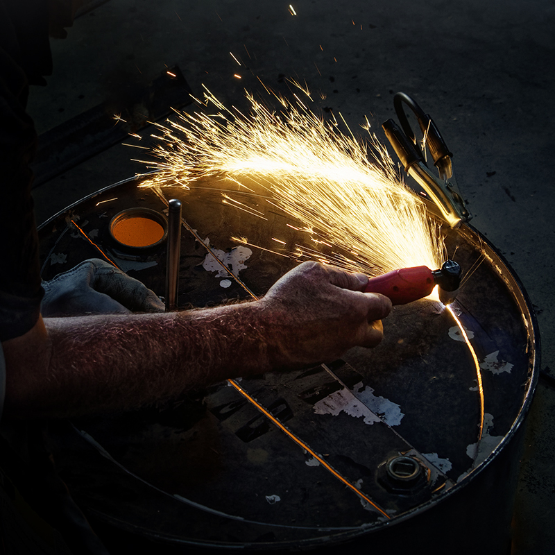
What a great way to spend your social isolation!
I agree with Larry about the burned out area in the sparks. But I disagree about the inclusion of the side of Larry. Everyone sees things differently, and here is my take on it.
To me, the primary subject is the arm of Pete performing the welding. The sparks are part of that subject and story. So, personally, I would put more emphasis on that arm, and less on the side and face protector of Pete.
I played with your image, and cropped it in more, to eliminate most of Pete's body. Then I used content aware fill in PS, to eliminate the face protector. I dodged the arm a bit, to bring out the line of the top of the arm and burned the bright center of the sparks, though that didn't help much. I also took out some stray light spots on the bottom right with the healing brush. Finally, I took it into NIK Color Efex Pro, and applied a Darken/Lighten preset, with the center on the hand and dark edges. |
Jul 2nd |
 |
| 77 |
Jul 20 |
Comment |
The starkness and contrast of your colorful subjects against the white background, packs a lot of punch, in my opinion. I do love this image.
I also like Witta's texture. My eye has become adicted to texture, and I find myself applying it to almost everything I do now. But after looking at your image for a while, I also see the beauty of that clear almost block like separation of colors. In my opinion, the composition is strong enough that you could go either way and have impact. |
Jul 2nd |
| 77 |
Jul 20 |
Comment |
I agree with Witta's comments. In addition, it does need a few pixel stroke around the edges. I do love the subtle colors. A more textured background would also improve the image, in my opinion.
One thing you might consider for your crop: The Western eye reads from left to right. The implication for that in photography, is that it is most often best to put the negative space to the right of the subject, with the subject facing the center of the image. So a crop with the rose on the left might enhance the rectangular crop, in my opinion. Also, to my aging eyes, I would like to see the rose itself, a bit brighter.
Here is just one other interpretation, in which I added texture, brightened and tilted the rose. |
Jul 2nd |
 |
| 77 |
Jul 20 |
Comment |
Connie, I really like this image and what you have done with it. You've complimented the age of the farmhouse with the grunge treatment. The flowers are perfectly colored for the image.
I agree about the crop, and perhaps you could burn the brightness on the left of the image a bit. However, I really like the curtains, as they remind me of a time before air conditioning, when curtains used to blow in the breeze through the window. That was always dream/fairly like to me as a kid.
Good job! |
Jul 2nd |
| 77 |
Jul 20 |
Reply |
Thanks Witta. I'll try your suggestions! |
Jul 2nd |
6 comments - 14 replies for Group 77
|
| 83 |
Jul 20 |
Reply |
Thanks for pointing out the window piece, Jose. I agree. I didn't even notice that. |
Jul 26th |
| 83 |
Jul 20 |
Comment |
This is a sharp image of a fine feathered friend! You have captured the catch light in the eye and even the drop at the end of the beak!
I agree that something should be done about that background. The underside of the beak and the neck of the bird sort of get lost in the background. They are barely different in tonality. If possible, I would get rid of the dark wall altogether. One suggestion would be to duplicate the background layer (entire image), then pass the top layer through a high key filter. Put a white mask on that high key layer, lower the opacity of that layer, and paint with black on the mask over the image of the bird. Use a soft brush for the center of the bird, a hard brush for the edges. Paint with black over the seat on which the bird is standing, also, as that is blown out already. The black on the mask hides the high key on that layer, over the bird and seat. A simpler technique to make the bird's head stand out more, would be to use a dodge brush over the head, with different opacities for the throat and the top of the head.
Finally, you have lost a lot of pixels from the bottom left, on the pillow on which the bird is perched. You might want to tone down that bright area by adding some texture, burning, etc.
Your image of the bird is well done. But, in my opinion, the background is distracting and could use some work, in order to complement this lovely bird image. |
Jul 21st |
| 83 |
Jul 20 |
Comment |
There have been some recent workshops offered online, about wabi Sabi. I find it a reasonable concept to look at all aspects of life on earth, and not look for beauty in the idealized form alone. Maybe that's because I am way past my prime now! :-) But it always bothered me that photographs of flowers and vegetation were downgraded in judging, due to imperfections in the subject itself.
I too am surrounded by cypress swamp country. You have inspired me to dig out some of my swamp images and work with them!
Your image emphasizes the height of the cypress trees, as they reach into the sky. I like that. The perspective, of course, is a bit tilted, but I like that also. It adds to the feeling of looking upward. the sharpness comes across even in the blades of grass as they sparkle in the sunlight. The toning of the image is tinted in a manner that reminds one that this is a time of dying, of decay. I also appreciate its softness.
The only thing that I find distracting is the frame. To me, the image would stand by itself, without that frame. The burnt nature of the frame does add to the story/feeling of decay, which is an integral part of the swamp. However, it is just too dark for me and dominates the softer tones of the image. I think I would prefer to see a cypress tree trunk on either side of the image, as a natural frame and perhaps a darkening of the bottom with the burn tool. Anyhow, that is just a thought. Without trying such an alternative way of framing, I have nothing to compare to what you have done. |
Jul 21st |
| 83 |
Jul 20 |
Comment |
Ditto on what everyone has said about your wonderful capture of this image! The "black hole" doesn't bother me at all. To me, it just frames the runner and makes her head stand out more.
I am amazed by the preparation that you took to get this image! Kudos to you! That is the mark of a really true working photographer.
Personally, I am dealing with cancer myself right now, and I find this woman's courage, captured by your photograph, to be endearing!
|
Jul 21st |
| 83 |
Jul 20 |
Comment |
Dirk, this is a really good capture of motion. The car is quite crisp sharp, while the background is motion blurred. I'm not sure about the lost pixels in the exhaust fire. To me, they are a bit of a distraction. Was there really fire coming out of the back? Was it a very hot plume of air? At any rate, to me the image might benefit by cloning in some pixels where the data seems to have been lost by the exposure.
What were your camera settings? |
Jul 21st |
| 83 |
Jul 20 |
Comment |
Debasish, your image forms a really nice pattern. It's one that is worth framing, in my opinion.
I tried playing with it. I cropped a bit off the right to make it more symmetrical (though not perfectly!) Then I upped the exposure on the top and gradually darkened it toward the bottom, to give more emphasis to the "rising up" of the viewer's eye. |
Jul 7th |
 |
5 comments - 1 reply for Group 83
|
| 96 |
Jul 20 |
Comment |
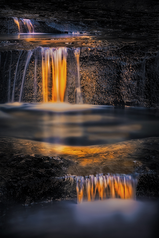
Wow, this beautiful experience really has generated a lot of great comment, and I love it. Thanks to Larry for the invitation to come look and join in!
To me, the flow in this image is only broken by the darkness of the middle pool. I do like the crop. I also agree that it would have been a good idea to take the image from a lower perspective. The latter is sometimes difficult for us old folks, as it is hard to get up after crouching down! At any rate, I see nothing wrong in playing with the image in post processing, in order to really communicate your live experience. A photographer's experience is unique to them, usually, as it is molded by their entire personal life experience and the intertwining of emotions as they become automatically ingrained within our psychi. Nevertheless, as "creators" of a pictorial communication, we wish to connect our feelings and reactions with those of others. We wish to share our experience effectively.
Photography is a communication art, just as writing is. It is important for us to remember that no good book comes straight out of the author the first time. Most parts of a book are written and rewritten many times. The art of a good story is that it communicates the central ideas of the author. Often that means that our memory of events or our intent of the story must be reshaped to fit the psychological language of those whom we wish to understand what we give forth. That is how we connect.
Toward that end, I find it perfectly appropriate to use post processing to alter the often surprising image that comes out of the camera, in order to adequately convey the experience our filtering perception gave to us when we took the picture!
Flow has been mentioned. It did not occur to me to be a factor when I first saw your image. However, I do see how improved flow could communicate well to many people. So, I took the liberty of playing with your image. I simply amplified the color and lightness of the reflections in the middle pool, to connect the two pools with a continuum of the same light. I also toned down the brightness of the bottom pool, by adding a tiny blue tint to the water there. I took both colors from the image itself.
I don't know if this would help you to communicate what you experienced on your photoshoot, but I did have fun playing with it. I also really appreciate the discussion that your lovely image has generated! |
Jul 19th |
 |
1 comment - 0 replies for Group 96
|
18 comments - 16 replies Total
|


