|
| Group |
Round |
C/R |
Comment |
Date |
Image |
| 34 |
Jun 20 |
Comment |
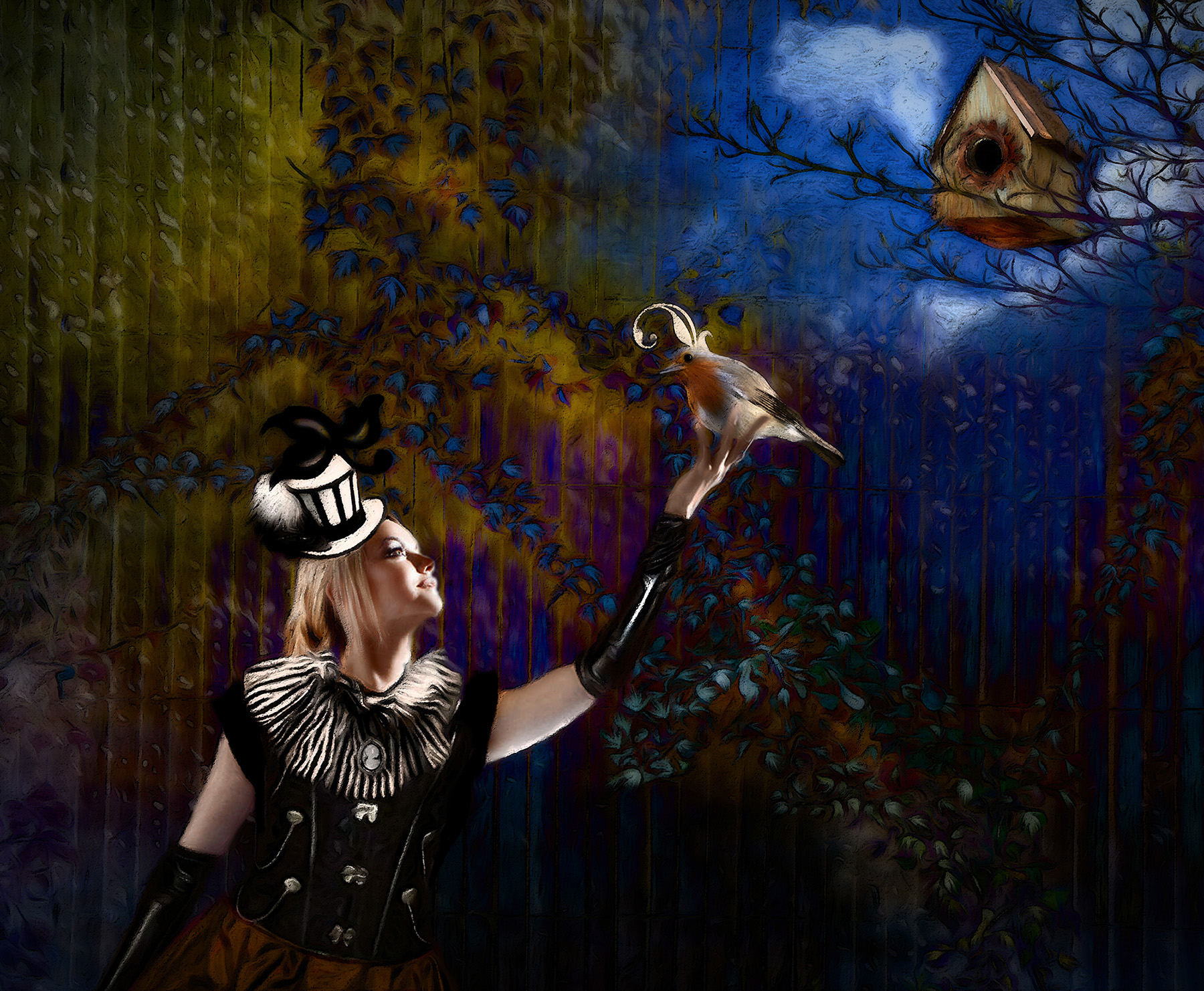
Again, you have outdone yourself. The line followed by the eye goes from the women, to the bird, to the bird house. There it is stopped by the bird house and tree limbs, while it lingers on the light spots in the sky, so one is not led completely out of the picture.
My only suggestion is to put a few lighter spots above the lady, to bring the eye back into the image in a circle. here is what I mean.
Love your image! |
Jun 9th |
 |
| 34 |
Jun 20 |
Comment |
This is an image that conveys a powerful feeling that invokes how many of us feel about the social isolation! My only complaint about this excellent image and story is that it sort of made my stomach flip! Today was George Floyd's funeral, and my stomach was not doing too well with all of that anyway.
Your use of monochrome with the colorful center is very directed! My only minor suggestion is that it would be nice to see a little sky above the tree.
Good job. |
Jun 9th |
| 34 |
Jun 20 |
Comment |
Alan, as usual, I love your compositions! Thank you so much for the step by step description on how to make the outline of an object.
I do love the color you chose for this composition. The story is also very good. Keep inspiring us! |
Jun 9th |
| 34 |
Jun 20 |
Comment |
Candy, your foggy image definitely has a "feel" to it. I love the spookiness of it, and you developed it well. Guess I'm not as observant as others, but I really didn't notice the face until I read your description, and then I had to hunt for it. So, to me, I would have liked it more if the face were a bit more prominent, perhaps with a slightly more predominant brown tint. Guess the face is the subject, but, as such, it should be more prominent, in my mind.
My first thought, when I saw your image, was that it would look appealing with a small green frog in the foreground. Just a thought. |
Jun 9th |
| 34 |
Jun 20 |
Comment |
This image is outstanding, in my opinion! Viva OTT! I love what you did with the flowers and garlic, on this lovely meandering path. The final result of the treatment you gave is so appealing to me. I love the pencil effect.
BTW, here in Myrtle Beach, South Carolina, we have a King's Highway, close to where we live. It is not nearly as lovely as this old byway, however! They tore down nature and put up a cement "parking lot", otherwise known as a paved highway. |
Jun 9th |
| 34 |
Jun 20 |
Reply |
Thanks Alan. That is the look I was after. |
Jun 4th |
5 comments - 1 reply for Group 34
|
| 54 |
Jun 20 |
Comment |
Alan, I was just scanning this month's photos from all the clubs, when my eye was caught by this photo. I clicked on it, and naturally, it was one of yours! i do LOVE your style! This is outstanding, in my opinion. I do prefer the version without the table and chair. Thank you again, for all your inspiration! |
Jun 10th |
1 comment - 0 replies for Group 54
|
| 77 |
Jun 20 |
Reply |
I find the dog distracting. The subject before was the leading lines toward the end of the tunnel. Now there are 2 subjects. |
Jun 20th |
| 77 |
Jun 20 |
Reply |
I like this one even better, though both are excellent! |
Jun 19th |
| 77 |
Jun 20 |
Reply |
Personally, I liked the sunflower background better. I do not care for the glow or the brown background on the newer image. If you don't care for the sunflower background, how about just blurring it more, so the sunflower does not show up, but you still keep those wonderfully golden colors? |
Jun 18th |
| 77 |
Jun 20 |
Reply |
Thanks bunny! |
Jun 11th |
| 77 |
Jun 20 |
Reply |
Good suggestions, Witta. Thanks. |
Jun 11th |
| 77 |
Jun 20 |
Comment |
I agree with Witta, and really like what she did to correct brightness on the left combatant. |
Jun 11th |
| 77 |
Jun 20 |
Reply |
You do bring up good points Bunny. But also consider that when one is in your room, looking from the perspective of the photo, the image on the wall and the window do NOT look skewed. That is because perception makes an automatic correction for the data that enters the eyes. The camera does not make such a correction. Hence the appearance of skewing creates a bit of dissonance and discomfort for the viewer, in my opinion. One way to correct for this could be to take a separate picture of the image on the wall, at the same distance as the current one, but at eye level. That separate picture could then be copied onto the piano image and the skewed picture could be deleted. In my opinion, it is fine and challenging to have the viewer's eye wandering through the image, but it is counterproductive to introduce dissonance that might detract from the main subject, and your image does have a main subject (which is a good one!).
There are a few points here, which are good for discussion. 1. One subject, multiple subjects, or entire image as a subject?
2. Abnormal looking non-subject features when an image has a main subject.
3. Perspective, skewing, keystoning: When to use, when not to use.
What do the rest of you have to say about these topics? |
Jun 4th |
| 77 |
Jun 20 |
Comment |
Your story is excellent. I really do like the piano and music. You did a very good job of bringing out the detail of the piano in this dark image.
Perspective is a difficult challenge in photography. I'm very short, so it is hard for me to keep my camera lens parallel to the ground, as I have to point it upwards to get many of my subjects and my arms aren't long enough to keep it level when they are raised above my head! It looks to me as if you were pointing your camera slightly upward to get this image, which is probably part of the reason why the window and the wall picture look keystoned. Sometimes one can correct this keystoning in post processing, other times you can't. Photographing at an angle also contributes to this peculiar effect. Perhaps it would not be so obvious in the window, if you did clone out the picture on the wall. |
Jun 4th |
| 77 |
Jun 20 |
Comment |
Celia, your image is quite appealing, just as it is, in my mind. however, I do like Witta's crop a bit better. The colors are eye catching. The turn of the subjects face was very fortuitous! Your image reminds me somewhat of DeGrazia's work, seen in his old home in Tucson, AZ.
You might consider cloning out the signs above the subject's head. Personally, I find them a bit distracting, and removing them would simplify the image, in my opinion.
Good work! |
Jun 4th |
| 77 |
Jun 20 |
Comment |
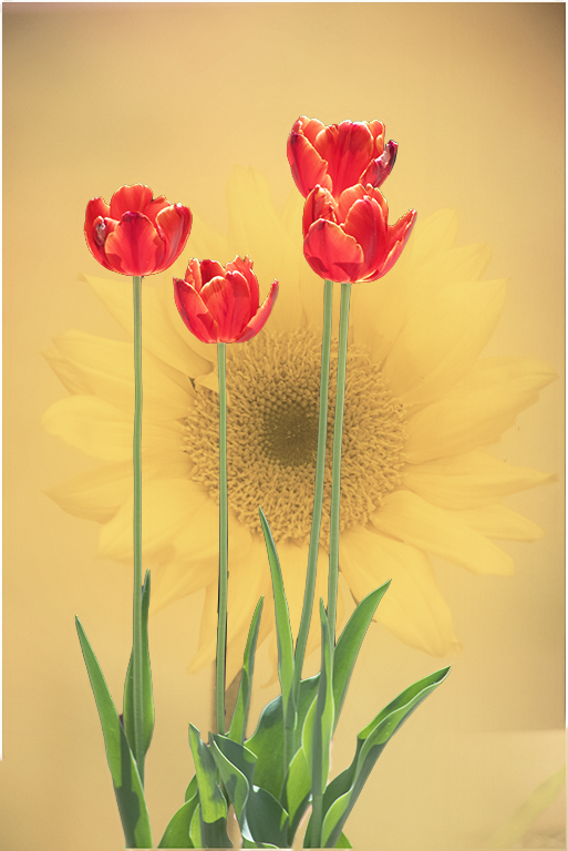
Connie, I do love your image and its colors. the only thing I would change is to take that errant sunflower leaf out, as previously mentioned.Personally, I would have liked to have seen just a little more definition in the sunflower petals.
I couldn't resist playing with your image. My changes involved the following:
After cutting out the flowers quickly with adjusted Select > Subject, I duplicated the underlying sunflower image, and blurred the lowest level one. The upper level sunflower layer is at 64% opacity in Hard Light blending mode. I then applied a Selective Color adjustment layer to the images below the top sunflower layer. In that, I maximized the yellow slider and lowered the black slider to -72%. I also lowered the black slider to -20% on the Neutral scale. I then applied a Selective Color adjustment layer to the tulip layer, and clipped it to that layer (alt click on line between adjustment layer and underlying layer). In that adjustment layer, I lowered the Cyan slider to -65%, to bring out the reds. I also upped the Black slider to +14. |
Jun 4th |
 |
| 77 |
Jun 20 |
Comment |
Witta, your image is wonderful in black and white! The lines and the shadows really make this image. I do like Bunny's crop, though dodging those dark areas might have had the same effect. The patterns in the ceiling also contribute to the upper two thirds of the image. Well done!
|
Jun 4th |
6 comments - 6 replies for Group 77
|
| 83 |
Jun 20 |
Comment |
Lance, while I appreciate your project, I do find the squiggles distracting in the monochrome image. I do like them in your color version of the image. |
Jun 9th |
| 83 |
Jun 20 |
Comment |
Georgios, your street photography is compelling. I agree with the discussion about cropping and/or homing in on just part of the multiple stories conveyed in your image. if you want to retain the upper background buildings, how about blurring them, to simulate a more shallow depth of field? |
Jun 9th |
| 83 |
Jun 20 |
Comment |
this is a lovely, well composed image, in my opinion. I love its action story and its simplicity. I think the image benefits by the elimination of the floor.
Great job! Thanks for all the inspiration that your image has inspired! |
Jun 9th |
| 83 |
Jun 20 |
Comment |
What a fascinating idea! I do love everything about this, except I have a question about the wine glass. The left side vertical line makes the glass look strange--broken or a second glass within the wine glass. What caused that? Did you mean to line up the upper part of the glass with the lower part where the vertical line runs down the glass?
|
Jun 9th |
| 83 |
Jun 20 |
Comment |
Hi Dirk. The bird in its environment makes a good documentary image. The question that comes to my mind is, do you want a documentary image or do you want to impact the viewer with a statement?
To me, the placement of the bird in the image does not impress me, as a viewer. I would prefer more room around and above the bird.
I used the Select > Subject and the Polygonal Selection tools to select the bird, then Cntl J to copy it to a top layer. Then I used Edit > Fill > Content Aware item to remove the bird from the original image, used it as a background, and moved the bird down and to the left. |
Jun 9th |
 |
| 83 |
Jun 20 |
Comment |
Debasish, I really appreciate you using an image of a dying flower, instead of the traditional "perfect" flower. Your treatment of it is excellent, in my opinion. I also really like the darker and the lighter backgrounds proposed by Jose, and my favorite is the white background.
Nice work! |
Jun 9th |
| 83 |
Jun 20 |
Reply |
That is a good suggestion. I will reduce opacity of the texture on the boy. thanks! |
Jun 8th |
6 comments - 1 reply for Group 83
|
18 comments - 8 replies Total
|


