|
| Group |
Round |
C/R |
Comment |
Date |
Image |
| 77 |
May 20 |
Reply |
Very nice crop, in my opinion. |
May 9th |
| 77 |
May 20 |
Comment |
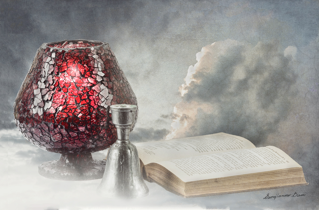
I applied some of the suggestions here, to hopefully improve this month's image.
I used the Content Aware feature of the Crop tool, along with some cutting and pasting, to add space on top of and to the left of the image. Then I used a soft low opacity brush to erase sections of the overlap, where I pasted.
I used some dodging and burning, along with a black to white gradient map adjustment layer, to bring out the brightness of the candle.
Thanks for all of your comments and suggestions. I like this version better. |
May 8th |
 |
| 77 |
May 20 |
Reply |
Great! I added that bit about High Pass and Masks for selective sharpening, because not all of our group might know about it. On the other hand, maybe they do know about it. I just didn't know. There are so many nuances in PS, and so many alternate ways of doing the same thing! |
May 7th |
| 77 |
May 20 |
Reply |
Bunny, to apply sharpening to just on area of a photo, simply sharpen the photo as a whole, and then apply a mask in PS. Invert it to black, and paint with white over those areas you wish to have sharpened. Alternatively, leave the mask white and paint with black over areas that you DON'T want sharpened.
I found an excellent way to sharpen is to use Filter > Other > High Pass. A grey popup window opens. Move the slider to the right just until you see an outline of the objects in your image. Click OK. Change the blending mode of that layer to Overlay. To unsharpen certain parts of the image, proceed as in the first paragraph, above. |
May 7th |
| 77 |
May 20 |
Reply |
Connie, this treatment you did is over-the-top excellent! Thanks! I was not aware that Topaz had a "Precision Contrast" app.
Does it add anything, in your estimation, beyond what is done between NIK Viveza and Pr0-Contrast in Color Efex Pro? Is it another AI product? |
May 7th |
| 77 |
May 20 |
Reply |
I definitely prefer this green interpretation to the other one, though I still love the blue in the original. Nevertheless, the color green, as it is used here, does remind me of CV 19, in that green is typically a color that can be associated with illness. Aside from that, the green in this image is quite beautiful to me! |
May 6th |
| 77 |
May 20 |
Reply |
Thanks Connie. I agree with you and Cecil about the left side needing more space. I'll try the Crop tool with Content Aware Fill on it. |
May 6th |
| 77 |
May 20 |
Reply |
Thanks Denise. I'll work on the glow a bit more. The glass was thick, and the lit candle did not show through very well. It might have, if the ambient light had been lower. |
May 6th |
| 77 |
May 20 |
Reply |
My husband and I use that app quite frequently. It will give you everything you need to know about your location and the direction of the sun and moon at various times. It is free and a must have app for a photographer! |
May 6th |
| 77 |
May 20 |
Comment |
Denise, your image is lovely in form (composition), and in color. That tip of the bud does need to be brought back, as Witta suggested. but the coloring is perfect, in my opinion. I also like the "shadow" you created.
Glad you could join us here, and I'm looking forward to seeing more of your creative macro images! |
May 5th |
| 77 |
May 20 |
Reply |
thanks for the suggestion to make the book the center of a further composition! I hadn't thought of that, but it really is a great idea! |
May 5th |
| 77 |
May 20 |
Reply |
Thanks for your perspective, Witta.
I do want the elements to overlap a bit, as that gives a feeling of continuity and a grouping. The cloud angles off in an opposite direction of the angle of the candle holder, as that forms a nice "V" shape. In addition, the eye can circle from the candle holder, to the bell, to the book to the cloud, and back again to the candle holder, in a circular motion. |
May 5th |
| 77 |
May 20 |
Reply |
Actually, I did have more of the bottom of the bell exposed initially. But somehow, it did not work well for me and I preferred more of a cloud to convey the story. As to a bit more room at the bottom, I'll try that. Sounds like a good idea! Thanks! |
May 1st |
| 77 |
May 20 |
Reply |
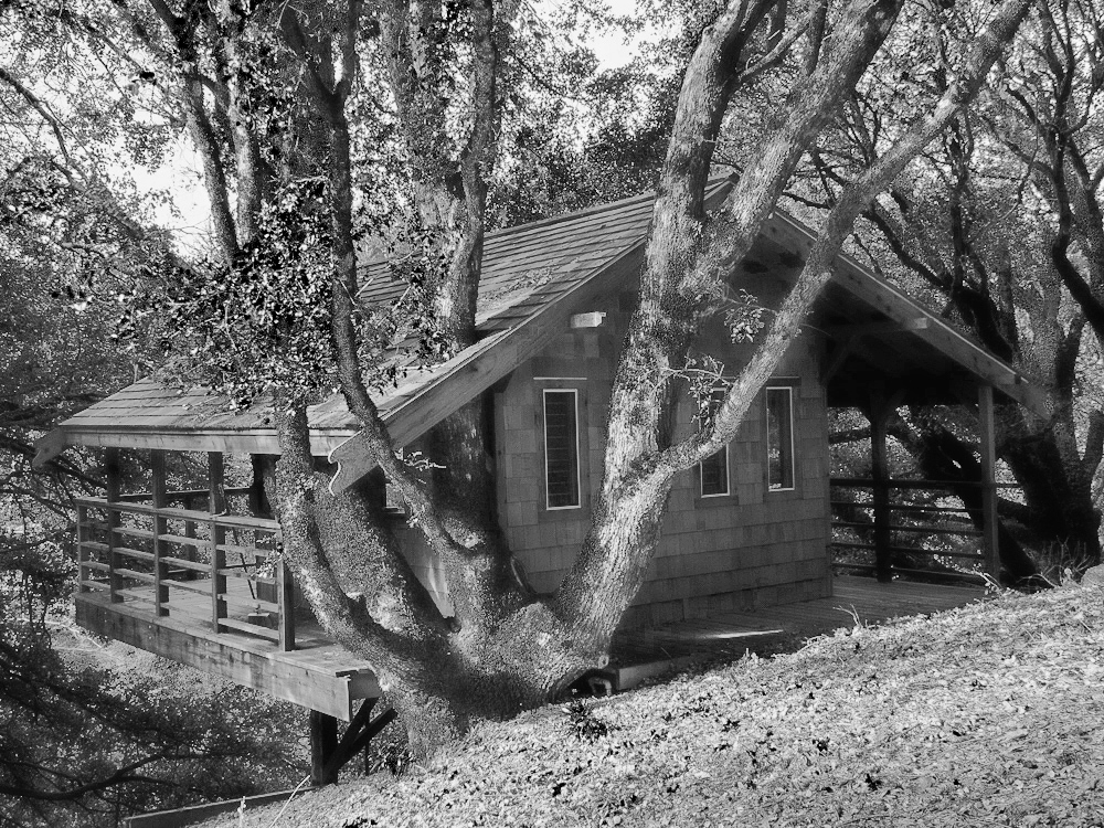
Oh, I love that this is on your property! How wonderful and it really does provoke some photographic challenges, but the rewards could be fantastic! In addition to the rewards of photographing, just being outside in a place like this must be physically and mentally inspiring! |
May 1st |
| 77 |
May 20 |
Comment |
The story and the colors of this image are quite impacting. The black bird really adds to both. You really brought out the vibrance as well as the reds in this image, to make the scene more impacting. I loved that!
It would be helpful, in my opinion, to remove the bird reflection and feet along the upper edge (Content Aware Fill in PS-- Edit > Fill > Content Aware).
On the bottom edge, it would be nice to see a little more space beneath that bottom reflection. In PS, you can do this with the Crop tool. Select the Crop tool and drag down the bottom so that the canvas shows for about 1/4 to 1/2". After doing that, on the top Crop menu, click the Content Aware option, and then click the Move tool (or any other tool). The bottom pattern will be extended in your image. The only other issue with doing this is that the dimensions of your image change and you might not desire those new dimensions. You can compensate by cropping some of the top. On some images, you can compensate by changing the image size (Image > Image Size and uncheck the chain-like link between Width and Height.) |
May 1st |
| 77 |
May 20 |
Comment |
Wow Mary! Jess was very lucky to get you as a photographer of her training event! This is a very creative and emotive interpretation and I can see why Jess would want it for her walls.
The fogginess of the image through the rays of light adds a very ethereal, dreamlike quality, and, in my opinion, that prompts the viewer to invoke their imagination. It adds impact that way. The composition well conveys the action.
Great job! |
May 1st |
| 77 |
May 20 |
Comment |
Connie, you picked a difficult subject, as artificial flowers can be hard to turn into a good image. But you did turn this garage sale find into a lovely, painterly image. That is what fine art photography incorporates! Good job!
You might consider replacing the wire that looks like phone wire, as it doesn't seem to belong with the other elements, in my opinion. Perhaps a photo of a twig or vine would work better. That is just a thought... |
May 1st |
| 77 |
May 20 |
Comment |
This is such a lovely image. I love the geometrics of it and the shading that resulted from your manipulations. It is really inspiring that you chose to work with Polar coordinates!
My preference is for the colors in image 'b', as it combines the cool colors of the original with the warm colors you introduced. I find that I'm liking blues a lot more lately! |
May 1st |
| 77 |
May 20 |
Comment |
Bunny, I do love your subject. It reminds me of a place that my husband and I stayed in, in the mountains of North Carolina. With all the shade in the image, as well as the high contrast light on the grass, it is difficult to get a well exposed image. But your composition is very nice, in my opinion. You did a pretty good job of lightening up the house also. When I played with your image, I found it was darn difficult to bring out that tree house! So you had quite a challenge on your hands!
In my opinion, I would like to see the house lightened a bit more, and the image sharpened a bit more. I found that the quickest way to do that is to take the original image into NIK Color Efex Pro, and apply a Hi Key preset. After doing that, applied a B&W adjustment layer, took the slider for red up a bit and the rest of the sliders down. I stamped up, and then I used a tip I learned in a 7 Advanced Blend Mode Tricks offered in the recent Photoshop Virtual Summit series.
I converted the top layer to a smart layer in PS (Layer > Smart Objects > Convert to Smart Object). Then I selected Filter > Other > High Pass. On the popup window, I put the slider at .7 and hit OK. Here is the result. |
May 1st |
 |
7 comments - 12 replies for Group 77
|
| 83 |
May 20 |
Comment |
I do love the wind, as long as it is not a hurricane! (I live in hurricane country!) Wind blowing in the trees makes a beautiful sound and sight, and your image does capture that sight. This image would make a good texture, with a bit of tweaking.
It would be nice to see your original image and the steps that you took to convert it to monochrome.
To me, the vertical lines on the top third of this image, are a bit of a distraction. You might consider removing them.
There is a real art in capturing light to make an impressive image. To me, the same intensity of light throughout an image, is not too exciting. I do think this image would look better, to me, if there were some variation of overall light.
As I look at your image, I think that there is a tree trunk almost hidden in your image. Perhaps you might wish to bring that out, to give a focal point to the image.
Here is my interpretation of your image, done in Photoshop CC:
1) I selected the areas to be changed and used Adobe Edit > Fill > Content Aware fill to remove those vertical lines at the top.
2) To bring out the whiteness of the seeming tree trunk, I applied an Exposure Adjustment layer. I upped the exposure to 1.61, lowered the offset to .0623, and lowered the gamma correction to .93.
3) I inverted the white mask on the Exposure Adjustment layer, from white to black (Ctrl i), and then I painted with white over the spots in which the tree trunk seemed to peep through. The white revealed the Exposure layer adjustments.
4) To add some variation in light across the image, I added a Brightness/Darkness Adjustment layer and upped the brightness to 42 and lowered the contrast to -43.
5) I inverted that brightness layer to black, and then I used a large soft brush, at about 50 percent opacity, to brush over the left side, as the wind was breaking through from that direction, so logically, the light could also be breaking through from that direction. |
May 8th |
 |
| 83 |
May 20 |
Reply |
With a duplicate background layer in Multiply blend mode. |
May 8th |
 |
| 83 |
May 20 |
Comment |
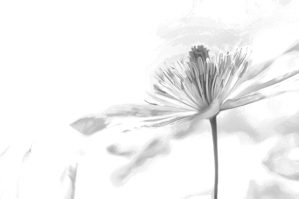
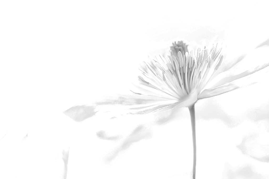
This is a lovely, delicate image. You didn't say how you converted to monochrome, so here is how I would do it, to bring out the yellows. As Lance mentioned, it would work better on the raw file, as there are many artifacts on the previously developed color image.
1. To make a harder, more definitive flower, In Photoshop CC, duplicate the background layer and set the duplicated layer to a "Multiply" blend mode. I will include an image of the development I did, with and without this duplicated layer. The softer image is without.
2. Add a B&W Adjustment Layer and play with the red and yellow sliders. I put the red slider at 44 and the yellow at 31. This controls the intensity level of the yellows in your monochrome image.
3. To soften the image a bit and get rid of a lot of the background artifacts, I added an Exposure Adjustment layer. On that, I kept the current exposure, lowered the offset to .0983, and lowered the gamma correction to .81.
|
May 8th |
 |
| 83 |
May 20 |
Reply |
I appreciate that you took the time to play with my image. That's how each of us learns and it is a lot of fun! |
May 6th |
| 83 |
May 20 |
Reply |
Thanks for your two versions. I prefer the coloring in the first. You really did get that separation!
My only issue with these well 'separated' images, is that they seem harsh to me. Is there some way you could soften them, without loosing that separation? |
May 6th |
| 83 |
May 20 |
Reply |
Separating the buds from the flower background was, indeed, the real challenge in converting this to monochrome! this was a case in which the color was the separator. Perhaps an overall darkening of everything but the buds might help. I'll keep trying!
|
May 5th |
| 83 |
May 20 |
Reply |
Thank you Lance. Glad you enjoyed it!
|
May 2nd |
| 83 |
May 20 |
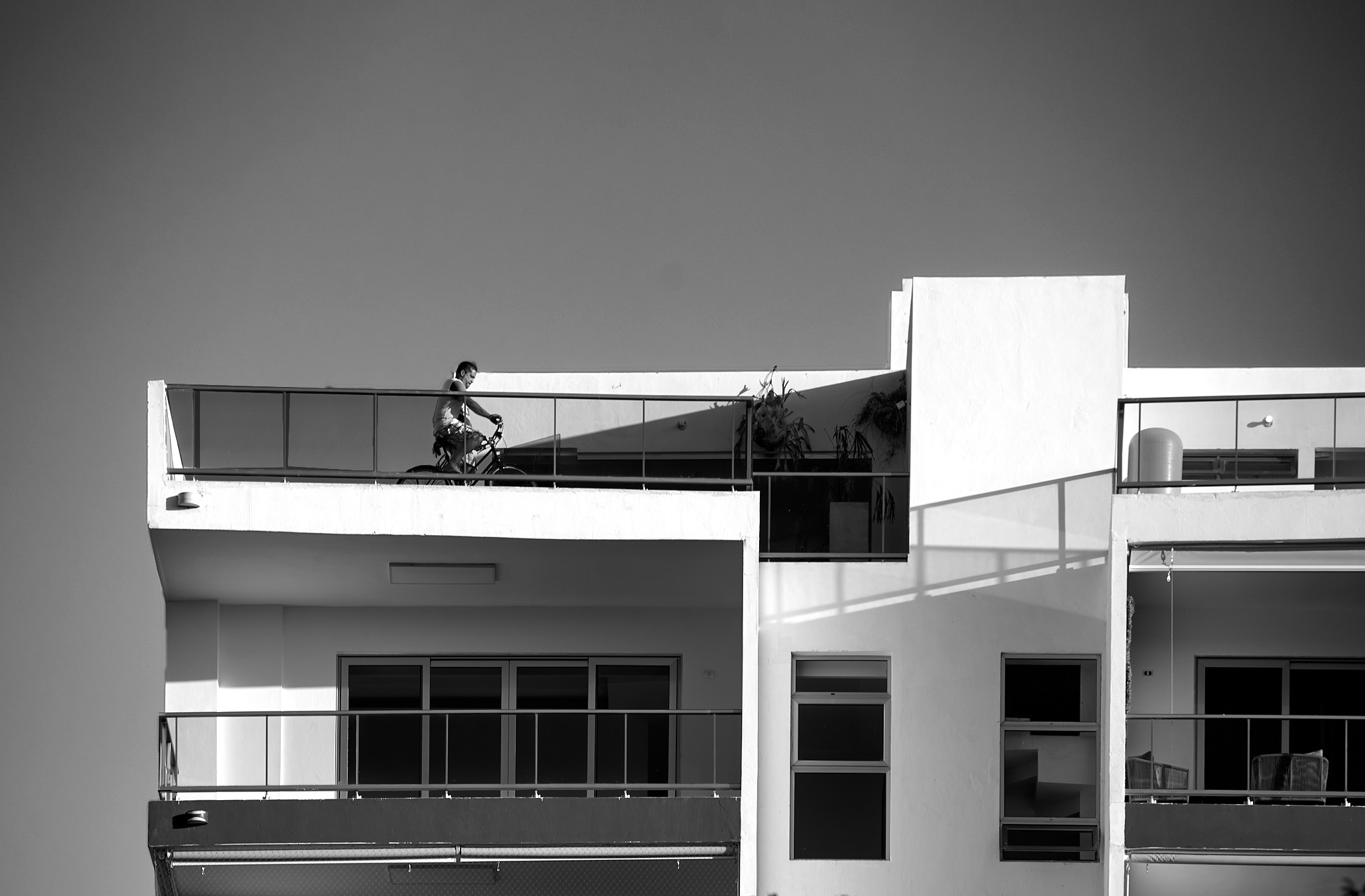
Comment |
Good catch on a photo that depicts what we have all been going through!
To me, the bike rider is the main subject, as his activity is what makes this story. Yet, it is hard to notice him without a bit of searching all over the photo. In most cases, one wants the subject to be the first thing one sees when looking at an image. It seems to me that all that you would need to do is to lighten the sky, so that the bike rider stands out by contrast. Also, the foliage at the bottom seems distracting to me.
To fix these issues (for me), I cropped the bottom off of your image and added more sky above, using Content Aware option of the Crop tool in PS. I then put an Exposure adjustment layer over the image and increased the exposure. Then I selected the sky on the original image, reversed the selection, selected the exposure layer mask, and painted black over the building and rider, to bring back their original exposure. This left the sky with the higher exposure. To my eye, this simplified the image and brought the subject out more and into the viewer's eye more quickly.
|
May 1st |
 |
| 83 |
May 20 |
Comment |
The clarity of this image is impressive. The texture is illustrated well, in my opinion.
I can't find the saucer on which the sugar is placed. Perhaps the ring edge of the saucer in the original could be incorporated into the final image?
To me, the image is not engaging. Even so, it might have served its original purpose at Albany State University, quite well.
|
May 1st |
| 83 |
May 20 |
Comment |
Judith, you did an amazing job of really bringing out the contrast in the image. It is a great improvement over the original.
I have a couple questions. First of all, what is this an image of? At first I thought it was a washed out road, over which water was rapidly falling. Your explanation seems to imply that it is fog, though it does not look like fog to me!
Secondly, could you explain Luminosity masking for us? Thank you in advance! |
May 1st |
5 comments - 5 replies for Group 83
|
12 comments - 17 replies Total
|


