|
| Group |
Round |
C/R |
Comment |
Date |
Image |
| 34 |
Apr 20 |
Comment |
Another great composition Alan! I am very impressed by the floating stair squares, and especially by the varying shades of the shadows, which you obviously took great care in creating.
Since the light is coming from the upper right,you might consider slightly darkening the back of the bar maiden's scarf and skirt.
Yay, ale or tea? I like your suggestion of an option! :-)
|
Apr 25th |
| 34 |
Apr 20 |
Comment |
The striking contrasting colors really make this image pop. The background you created really helps also. I appreciate the addition of that lantern, as it also adds to the story of a scary grinch on a dark street's night. |
Apr 25th |
| 34 |
Apr 20 |
Comment |
Jan, you've done it again. I do love your steampunk images, and this one is no exception. The crisp edges and subtle colors really make it here.I love the added lamp accents also!
|
Apr 25th |
| 34 |
Apr 20 |
Comment |
Jan, you've done it again. I do love your steampunk images, and this one is no exception. The crisp edges and subtle colors really make it here.I love the added lamp accents also!
|
Apr 25th |
| 34 |
Apr 20 |
Comment |
Jan, you've done it again. I do love your steampunk images, and this one is no exception. The crisp edges and subtle colors really make it here.I love the added lamp accents also!
|
Apr 25th |
| 34 |
Apr 20 |
Comment |
Jan, you've done it again. I do love your steampunk images, and this one is no exception. The crisp edges and subtle colors really make it here.I love the added lamp accents also!
|
Apr 25th |
| 34 |
Apr 20 |
Reply |
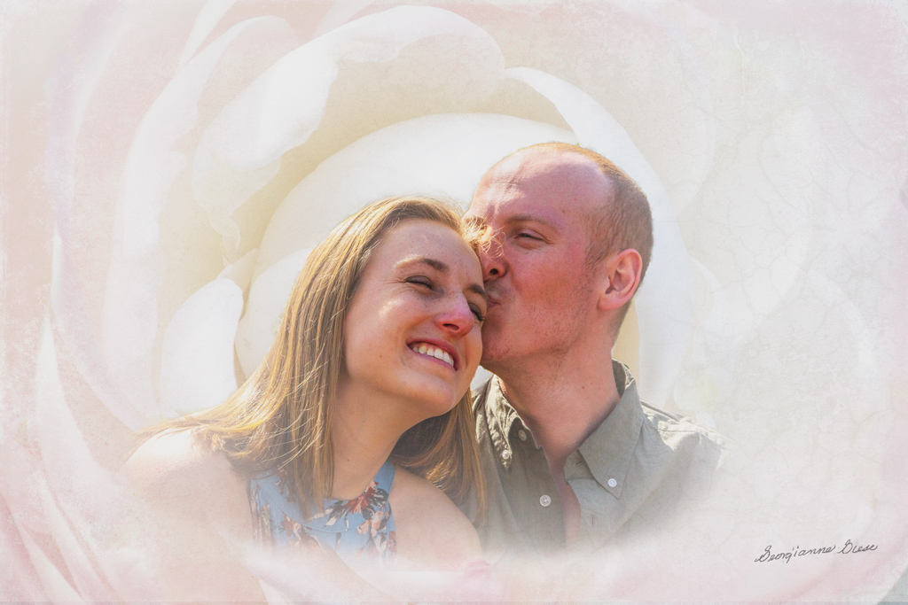
Interesting idea Jan. Glad that you decided to play with the image. I too like to do that with the images i see on the group pages. It's a great way to spend our time in lock up! :-)
My concept was to embed the couple in a flower. It was inspired by an old friend of mine, who embedded an image of her infant grandson in a rose. So both the flower and the people together, were part of the story of this image. I'll have to work on making that work a bit better! |
Apr 10th |
| 34 |
Apr 20 |
Comment |
Thanks Alan. I will try your first two suggestions. But I'd have to retake the image to remove the hair. There is no visual eye behind it, as the camera captured the hair, not the hidden eye. But I will see what content aware does with it.
...
Here are the first two changes. Content aware to remove the hair did not work, as expected. |
Apr 4th |
 |
| 34 |
Apr 20 |
Comment |
This is beautiful. The background is very effective. Wish I could see the textures you combined!
The detail on the horse and the angle of his head in the original shot, are very impressive. Great job! |
Apr 1st |
| 34 |
Apr 20 |
Comment |
Fascinating!I'm amazed at the images taken by your iphone on top of the prism. They are in sharp focus at such a short distance.
Your use of these prism images, to create a lovely background, is very impressive. The resulting image is very effective, with the bright yellow flowers against the dark multicolored background.
Stay off the streets! It is very productive! |
Apr 1st |
9 comments - 1 reply for Group 34
|
| 77 |
Apr 20 |
Reply |
No one is perfect, even in photographic artistry! Because we all make mistakes, we seek out the involvement of others, to help notice the things we miss and make suggestions for changes, which may or may not fit in with our goals. But working together, each of us can be "more perfect"!
I had to smile because the entire topic of errors is huge! First of all, it is always important to check one's work, no matter what that work is. That's a habit that doesn't seem to have been taught to many in our world right now! (I'm not referring to you, Connie)
Secondly, whenever possible, have someone else check your work. The creator of anything is not the best person to check their own work, simply because it is human NOT to see issues in one's own creation.
My husband and I just had this same discussion last week, as he was bummed because he missed something when he was putting something together.
Okay, I'll get off my soap box now. It's just that it seems increasingly difficult in communications these days, e.g., between doctor's offices, because people don't check their work, e.g., "did I really send that fax to the other doctor?" |
Apr 17th |
| 77 |
Apr 20 |
Reply |
I like your redo much better! |
Apr 9th |
| 77 |
Apr 20 |
Reply |
Thanks for that tip about exporting instead of saving to a JPG file! I'd never heard of that, but I'm surely going to try it next time! |
Apr 9th |
| 77 |
Apr 20 |
Comment |
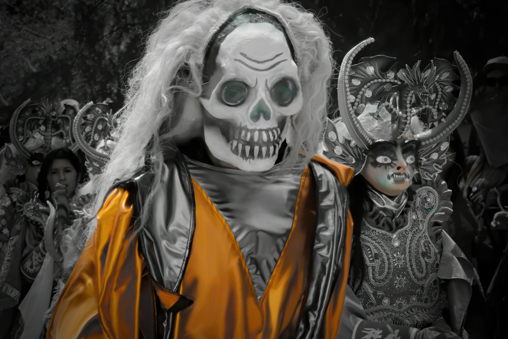
This is a really cool image! I do love the monochrome with a color treatment. If this were to be entered into a competition for monochrome, with one color, you would have to do as Cecelia has done, and remove all other colors except the orange, in the image. However, I do like the slight color in the lady's mask.
What I found distracting was the hat on the right. So I removed it with Content Aware Fill and added a slight black vignette. I also applied a burn to the bright wig on the lady and a dodge to her eyes. I also burned the pupils of both main characters and applied a dodge to the skull of the main character.
These were just tweaks to this delightful image which you might consider. Thanks for this great image, and for the opportunity to play a little with it!
|
Apr 9th |
 |
| 77 |
Apr 20 |
Reply |
Interesting articles. Kelby is more concerned about using PSD than TIFF. That's understandable, since he is probably THE PS trainer around. But he does have a point about saving in PSD if that is a smaller file than the corresponding TIFF.
As to printing in TIFF vrs JPG, when I send my photos out to be printed, they always require a JPG for the size of files I use. I send a 300 PPI JPG file. But when I print at home, I always print from a TIFF file. My home prints are always better than the prints I send out.
I suppose the biggest difference between JPGs and TIFFS that we see on the screen has to do with PPI. It also has to do with the fact that everytime one edits a JPG and resaves it, pixels are lost even more.
After reading Kelby's article, I might switch to saving and printing with PSD instead of TIFF, if it saves space on my hard drive!
|
Apr 7th |
| 77 |
Apr 20 |
Comment |
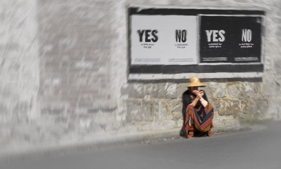
I couldn't resist playing with this image a bit. So I downloaded the original and started.
To influence the viewer to perceive indecision, etc, I wanted to do a couple of things. 1. Emphasize the hands and face more; 2. Increase the sense of isolation around the main figure, while maintaining the importance of the signs in the story.
To emphasize the hands and face, I simply applied a Brightness/Contrast adjustment layer, inverted it to black, and painted white over those areas at 100% opacity.
To increase the sense of isolation, I added a bit more screen on the left and cropped a bit off the bottom. I also did an Edit > Transpose > Distort to slightly enlarge and change the angle of the leftmost wall, trying to put the figure more in the distance from the viewer. Grey is an emotional color of depression, isolation, etc., so I added an Exposure adjustment layer, lowered the exposure slightly, upped the Offset and Gamma Correction slightly and applied that to the background, not to the lady. Like you, I used Select Color to enhance the lady.
Going back into Color Efex Pro, I highlighted the lady with Darken/Lighten Center, and then applied a Vignette Blur with the lady at the center.
Back in PS, the effect was too dark, so I applied a Hue/Saturation layer and desaturated and lightened all colors. Then I applied a layer mask to bring back the lady and the sign, with different opacities on the soft brush to get the shading right.
Finally, I applied the Radial Blur, at 2 and then used a mask to bring back parts of the sign.
I'm not sure that the result is any better than yours or if it really captures more of that feeling you were trying to convey, but I sure had fun trying! |
Apr 7th |
 |
| 77 |
Apr 20 |
Comment |
This is a very emotional rendition. The choice to move the woman to the center of the sign was appropriate and well done, in my opinion. The effect of her crouching under the sign, along with the wording on the sign, has a lot of impact, to me.
While the emotions conveyed to me are not of indecision, anxiety, and relationship difficulties, the emotions conveyed could be the result of one or more of those issues. To me, the crouching and the spinning correspond more to dizziness from medical issues such as drug problems or other health issues, often accompanied by despair.
Just as a thought, you might consider taking this image into Color Efex Pro, and applying a Vignette Blur around the edges. That preset gives the effect of fading in/out.
|
Apr 7th |
| 77 |
Apr 20 |
Comment |
Connie, you did a spectacular job of bringing out the detail in the shadows of the medallion, as well as the details in the bright areas.
The star bursts on the lights are lovely, very effective. As others have pointed out, it would have been nice to see a similar light cloned over the one that was unlit.
I do appreciate the angle and agree that straightening it would not enhance the image, and probably would subtract from its impact, in my opinion.
Technically, you have done quite well. The chandelier is quite beautiful and you have done it justice, in retrieving it from its dark surroundings and bringing it to life. To me, though, I would not prefer to hang an image of this subject in my living room! Nevertheless, you have provided a good exercise in craftsmanship, in my opinion. |
Apr 7th |
| 77 |
Apr 20 |
Comment |
Good eye for catching everyday objects and turning their images into something creative!
I'd love to have seen those three photos that you combined. When you have more than the three 'originals', you can combine some into one image and submit that combined image.
I really like the way you layered this texture, so that it is almost transparent. Personally, I felt that the bubbles distracted from the intent of the image. They are, however, part of the texture, so it would take a bit of finagling to reduce their appearance. The colors, however, are perfect, in my opinion.
Thanks for another good job! |
Apr 6th |
| 77 |
Apr 20 |
Comment |
You have done a good job of capturing the beauty of a tree.
I agree that the vignette is not helpful here and like the revision that you made.
The discussion here has been very interesting and helpful. As to the difference between the perception of JPG vrs TIFF, I'm not sure about the exact reasons for that. JPG, however, is a compression of TIFF, in which many pixels are thrown out. An algorithm, written by a human, then decides how to process the image to make it appear as close to the original TIFF as possible. Algorithms written by humans are always subject to error, as well as to differences in opinion as to how something should be processed.
I wouldn't worry about it. Print only TIFF files. JPGs are intended for screen display, not printing. |
Apr 6th |
| 77 |
Apr 20 |
Reply |
I like what you have done, Witta. It does declutter, perceptually, a bit. Only thing I would not do is to crop out to eliminate the building on the left of the image. I think the tradeoff there relates to the room given to the main subject, the house, in the image. If cropped, there is just not enough room on the left and the subject is almost going out of the picture on the left. Personally, that building on the left background doesn't bother me. I didn't even notice it until you pointed it out. Perhaps covering it with some vegetation might be a compromise strategy.
Thanks for your input! It is much appreciated. |
Apr 3rd |
6 comments - 5 replies for Group 77
|
| 83 |
Apr 20 |
Reply |
Nice, Judith. It makes the buildings more prominent and the foreground less, relatively. |
Apr 25th |
| 83 |
Apr 20 |
Comment |
Jose, this is a really powerful image. Not many people would think to make a silhouette against a black background. It is so creative and so appealing! Thanks for stimulating our vision to see beyond the ordinary! |
Apr 25th |
| 83 |
Apr 20 |
Comment |
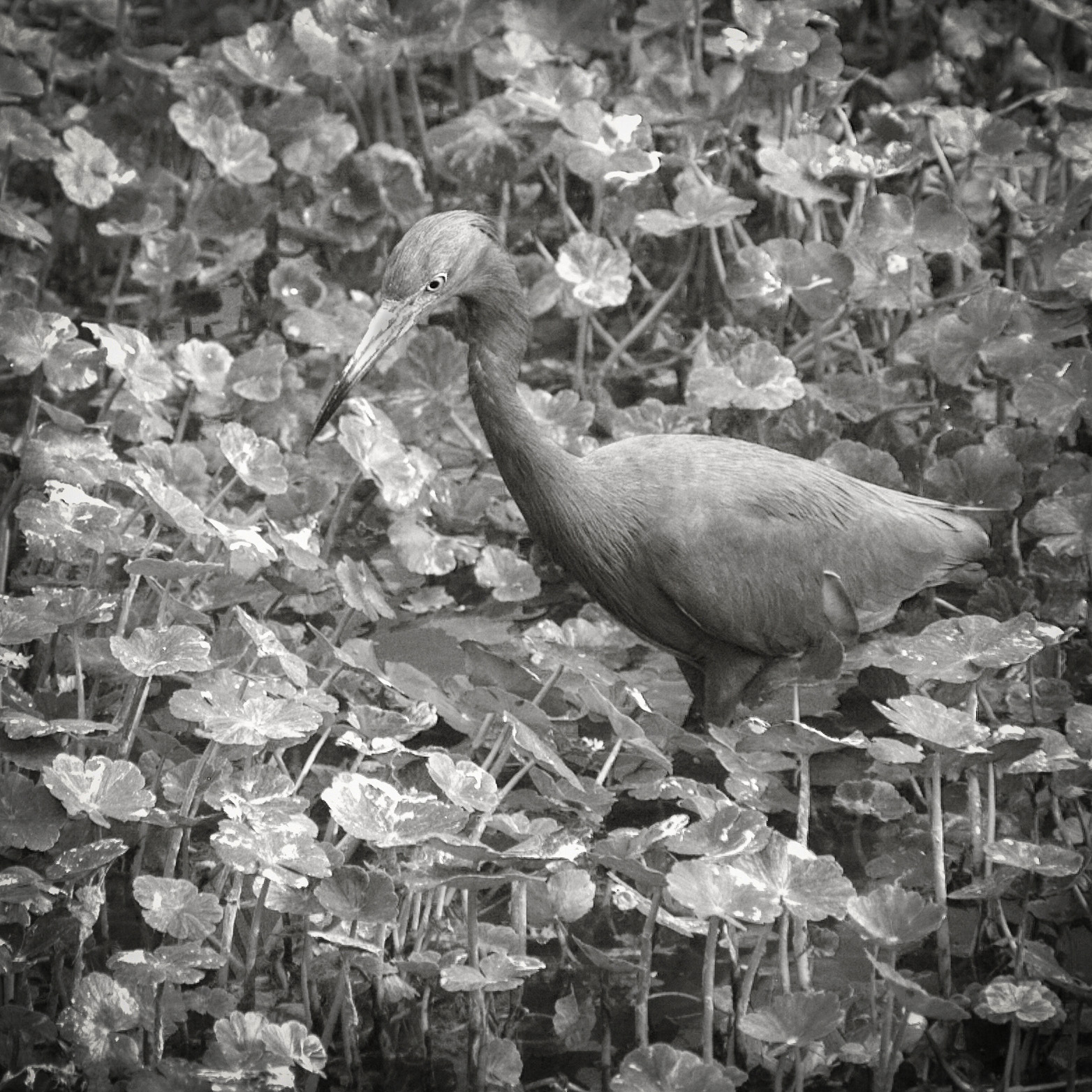
Lance, you seem to prefer silvery, more monotone images. I do appreciate your style.
On this image, I agree with Jose. My preference is to have a bit more tonal separation between the subject and the background. To show you what I mean, I applied a Levels adjustment layer with a mask, to just slightly darken the bird and leave the background as is. |
Apr 25th |
 |
| 83 |
Apr 20 |
Comment |
I do appreciate all the work done and suggestions on your images. I much prefer the final image posted at 18:59:45. The contrast is not so harsh, and the faces are much more prominent to me, because of that. The motion blur definitely adds a lot to the image.
What a wonderful opportunity to photograph such an event. But, it was indeed a challenge due to the lighting conditions! |
Apr 25th |
| 83 |
Apr 20 |
Comment |
Dirk, this is SO delightful! I so appreciate the instruction on how you did this. |
Apr 25th |
| 83 |
Apr 20 |
Comment |
Debasish, I agree with Lance that the raindrops are too prominent and create a distraction from the overall effect. It would be fun to experiment a bit in future situations like this.
One thing you might consider is to do focus stacking in a similar situation. If you have not done that before, here is how.
With camera in the same position, use live view and magnify the image. Place the focal point on the a central rain drop. Magnify even more and then, using manual focus, focus on that magnified focal point. Snap. Repeat, but with the focal point on the tree, for instance. Repeat this entire process a third time, with the focal point on the building, for instance. You can do this, enlarging, changing the focal points, enlarging again, snapping the picture, for as many different points of focus as desired. Then merge them all in PS with File > Automate > Photomerge. |
Apr 25th |
| 83 |
Apr 20 |
Reply |
Judith, can we see what you did with this image and luminosity masks? |
Apr 25th |
| 83 |
Apr 20 |
Reply |
The original-1 is an HDR, not an HDR filter. It is an automated software combination of 7 different images, each with a different exposure. Consequently, there is no "original" color image. Some people do not care for HDR. Others apply a post processing HDR filter to their developed raw image. This is neither of those last two options.
There is a lot of information in this image. That is because the story contained in the image contained a lot of information in the natural world. All of that information contributed to the story, in my opinion. The house without the garden would just be a different story about an old house. The garden without the house would be just another classical garden. The two together tells its own unique story. Perhaps the color version does differentiate those various areas more. I wanted to see what I could do with color channels in BW, to differentiate those areas. Perhaps I could have developed the color version better, before conversion. I posted the color version in Group 77, and made some subsequent changes to it due to some suggestions there.
I'll take another look at a conversion to BW, using the changes I made in 77.
|
Apr 4th |
5 comments - 3 replies for Group 83
|
20 comments - 9 replies Total
|


