|
| Group |
Round |
C/R |
Comment |
Date |
Image |
| 34 |
Mar 20 |
Reply |
That work as a Graphic Designer surely paid off! You are an expert! I agree with you about photo competition. Our club has one every other month, which is enough for me! I have found that there are not many judges that like composites or anything that uses PS extensively. Judging really has too large of a subjective component for my tastes. |
Mar 23rd |
| 34 |
Mar 20 |
Comment |
Once again Jan, you have created a wonderful masterpiece. I see you have returned to a bit of steampunk, and I love what you have done with it here. The subject is stunning. The colors and forms are delightful. I do love the textures you have used.
You have a wonderful ability to imagine a marvelous image, and, perhaps, an equally good ability to start without a completed idea and just know what to use to pull together a great finished product. How long have you been creating photographic compositions? |
Mar 22nd |
| 34 |
Mar 20 |
Comment |
Fun observation and photograph.
To me, there is just too much dark space here. I agree with Steve and Jan that something, such as more stars, might break that up a bit. |
Mar 22nd |
| 34 |
Mar 20 |
Comment |
This is my favorite this month. I am fascinated by your image. I really like the way you offset the alcove. In my opinion, it adds greatly to the impact of the image. The entire idea/story of this image is so creative, and it really appeals to me.
Others have pointed out some small points for improvement in technical detail, though those minor details do not affect the impact of this image to me. I'm not sure, but perhaps the shadow below the floating player should be moved to be more directly under the bench and player? The light seems multi-dimensional, but appears to be coming from above and behind him. Perhaps some geometric measurements would show a truly accurate shadow, but, again, it does not detract from the impact of your story here! |
Mar 22nd |
| 34 |
Mar 20 |
Comment |
Candy, your experimental led to a lovely focus on a beautiful flower.
To me, the center seemed just a bit off with respect to the outside pedals. The smooth whites just didn't seem to harmonize with the textured pinks. I wanted to see more texture in the center, with a brighter hello "butterfly" in the core.
So, I tried to accomplish that without being able to replicate all of your textures. To do so, I sampled the darker pink at the top of the image, and used that color on a solid color adjustment layer. I inverted that mask to black and painted white over center of the flower, at about 50% opacity and put that layer in Overlay mode. The butterfly part was still too dark, so I applied a Brightness/Contrast adjustment layer, upped the brightness, inverted the mask, and painted white over the butterfly. The result is not as bright as yours in the center, but it did add a bit more texture and uniform color tone to it. |
Mar 22nd |
 |
| 34 |
Mar 20 |
Comment |
This image tells a haunting story, in very vivid color. I love the lines of the fence perpendicular to the walkway. Together, they hold the visual weight of the story, in my opinion.
The strong sky provides a powerful support to that story. To me, the cross breaks up the vast space of the field, but other than that, does not add much to the image. It would add more, in my opinion, if it were larger and more towards the foreground. Candy's rendition of the cross on the right improves this issue, to me. But I would have placed the cross more at the power point.
I do envy you the ability to walk over on this historic and dramatic place! |
Mar 22nd |
| 34 |
Mar 20 |
Reply |
I know Anderson, SC. We stayed there for a week when we evacuated because of the hurricane over a year ago. That is a beautiful part of the state, not far from the mountains and some lovely country. Wish we had moved there. I do love the mountains, now that the ocean has become 'ordinary'! |
Mar 19th |
| 34 |
Mar 20 |
Comment |
What an imaginative compilation! Very nice and congratulations on getting the image in the DD Showcase!
I agree with Mike about the ribbons. They do look strange. Also there appears to be a 2-3 pixel black outline around her arms and a smaller one around her feet. Perhaps a selection of her cutout, decreased in size by a couple pixels, inverted, and deleted would get rid of that. In my opinion, I prefer no dark lines around the subject in images that contain cutouts.
Great job, and what fun that must have been to photograph Lilly and pull this all together! |
Mar 3rd |
6 comments - 2 replies for Group 34
|
| 77 |
Mar 20 |
Reply |
In my opinion, this is a good reason NOT to enter exhibitions! I don't and probably won't.
Such barriers to artistry are all artificial. I'm not an art history major, but it seems to me that very few artists who are regarded highly, got that way by entering contests. But, contests do provide an outlet, though judging is highly subjective.
If one were to carry through logically on a prohibition against using others textures, or derivatives thereof, as a prohibition in one's own art work, then I would argue that anyone who photographed something man made and then used it in a composition, would be in violation of this type of prohibition! To me, it seems a bit far fetched.
However, any organization is free to set up whatever artificial restrictions that it wishes, as long as those restrictions don't violate basic human rights. But, I don't believe that PSA has such a restriction about textures for its study groups. |
Mar 22nd |
| 77 |
Mar 20 |
Comment |
Witta, I'm with you. To me, it is the final product that is most important: "I want it to be the best I can do." Post processing is fun, once one allows ones self to put in the time necessary to learn how to do it and what you could do to enhance a raw photo. I like to mention that Ansel Adams spent a year trying to post process one of his famous images, to get it good enough, in his estimation. His son claims that he would be ecstatic about using Photoshop!
As to the ripples in your image, they sing to me! I love to walk on the beach and note the always varying patterns in the sand. Good job in catching the feeling of your walk!
|
Mar 20th |
| 77 |
Mar 20 |
Reply |
Thank you for your input, Larry. While I am not the composer of this lovely image, I would like to comment on the thoughts you present.
While it is true that bright spots attract the eye, it is not necessarily true that the eye stays there. To me, balance is the key, as you alluded to in your comment about the mill being trapped in between two bright spots. On reflection, I prefer to see the sky there. To me, it adds to the story of the image as it is something that is intricate to ones view of such a scene.
To be truthful, I had not even noticed the sky, in my quick memory of the image. My eyes settled on the lovely mill and the fence, with its accompanying walkway. The visual weight of those elements far outweighs the bright spots, in my opinion.
I do love the flowers and the brightening of those flowers in Cecelia's interpretation. However, if it were my image, I would burn the bright portion of the top of the fence railing. But I hadn't even noticed that until you pointed it out. Again, the visual weight of the fence line and the mill, accented by the lovely flowers on the tree limbs, just made the image in my mind! |
Mar 19th |
| 77 |
Mar 20 |
Reply |
Witta, I can find no guidelines that limit what textures can be used in PSA Groups. Although I have a ton of my own textures, I found the ones used to be better than mine for this particular image. I don't participate in contests approved by PSA, so I don't really know what the rules are for any particular contest. However, if you can find someplace that speaks to the admissibility or non-admissibility of the use of textures made by someone not the image maker, then please let us/me know that source. I know that in our camera club contests, judged by PSA, there is no restriction on whose texture can be used in an image. |
Mar 12th |
| 77 |
Mar 20 |
Reply |
Cecelia, I like what you did and I especially like your detailed explanation! Your interpretation is more like the original. Did you start with that original, or did you work on the final image? One thing I did notice was that in your version, the image seems a bit oversharpened. That might not have happened if you had the original raw file to work on. But the process you went through is quite instructive to those who use LR. Thanks! |
Mar 12th |
| 77 |
Mar 20 |
Comment |
That's an interesting experiment, to use an iridescent sheet to mute the image and add some color streaks. It's a variation on "shooting through".
I love your composition. It really is dramatic. You brought out a lovely definition in your flowers.
For my tastes, I would have prefered a slightly brighter image, with more contrast between the flowers and the kettle. You might consider taking a picture of the iridescent sheet, along with a picture of your composition, and then layering the image of the sheet over the composition layer in PS. Then use a mask and paint with varying opacities of black to bring through the flowers and the kettle a bit, to a desired level for the flowers and contrasting kettle. |
Mar 3rd |
| 77 |
Mar 20 |
Comment |
I applaud your excellent playing! The images of smoke that you have taken and refined, are really excellent. I'm sure that you can use each and all in future images, as add ins to tell some creative stories.
My husband looked at these and immediately saw two ladies dancing. That might be something that you could build upon by puting transparencies of people, bent with the edit > Transform> warp or edit > puppet warp in PS, to fit into the curve of the smoke!
As a fine art image, your composite alone does not do anything for me. However, it is important to do the kind of things that you have done, and it is also a learning experience for the rest of us! As Guy says, "Just don't set off your smoke alarm!"
|
Mar 3rd |
| 77 |
Mar 20 |
Comment |
The curve of the walkway and fence lead the viewer right into the lovely old mill. The reflections are lovely. This is a great original photograph, and you have enhanced it to a lovely perceptual scene. There is not much I'd change about it.
That said, there is one minor thing that I would consider doing to it. Perceptually, things in the distance are less sharp and, perhaps, a bit darker. You might consider just a tad blur along the road and its immediate surroundings, especially as it winds further away from the eye. Anyhow, that's a minor point.
Great job! |
Mar 3rd |
4 comments - 4 replies for Group 77
|
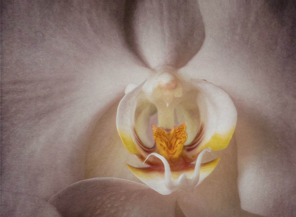
| 83 |
Mar 20 |
Comment |
It is a lovely image. The tips of the stamens are quite sharp, so the must have been where you focused. The bottom pedals are soft, as is often done for effect in a flower image.
I agree with Dirk-Olaf abot the right corner. You might consider cloning out the white spots at the edge.
I found myself wanting to see a sharper image of the patterns on the innermost pedals. Perhaps a bit of dodging over the pattern would brighten it up and give it a bit more impact. It would also give some variation in light over the image.
I don't know if you are into this, but to me, a bit of focus stacking on the center of the image might have been quite powerful. |
Mar 23rd |
| 83 |
Mar 20 |
Reply |
Judith, your revision really enhances the image, in my opinion. In my opinion, you do not need to apologize for making a revision, as this is a common practice in other groups. It is always helpful to see the different perspectives of group members, rather than to just read about them. A picture is worth a thousand words! |
Mar 23rd |
| 83 |
Mar 20 |
Comment |
Welcome Georgios! Your image this month really evoked a reaction in me of classical isolation. I find it lovely and very appealing.
I like Judith's rendition, as it emphasized the monastery and brought out the nun better, due to similarity in tone. My only suggestion would be to be aware of the placement of the primary subject. If possible, this scene might have had more impact with respect to the nun, if you had taken it from a point to the right of where you took it. That would place the nun at a power point. As it is, she is too close to the center for me.
What a wonderful experience for you! Wish I could see that spot in person! Thanks for sharing this place with us. |
Mar 23rd |
| 83 |
Mar 20 |
Comment |
This is a very impacting image. I do like your last revision best! The addition of the much lighter area on the left really gives the eye someplace to go after following the enticing lines of the ski tracks. As a former cross country skier in the upper peninsula of Michigan, I really like the image. It reminds me of the absolute wonder of nature and the inner calm when skiing. But, I really miss the snow on the trees in your image! This is a personal memory, of course. When I was skiing, there was always a load of snow on the trees, sometimes creating an arch tunnel, through which we skied. So, I took the liberty of adding a reminder of snow to your image!
In PS, I added a NIK Color Efex Pro Graduated Fog preset. Then I put that layer at a Dissolve blending mode at 60 percent. I used a mask to bring back some tree trunks, merged up, and then used a Silver Efex plugin with a Wet Rock preset. Finally, I put a mask on the top layer and painted black over the foreground, to bring back the definition in the ground. I'm not sure that I like it any better than your final revision, but it did remind me more of my snowy cross country ski days! :-) |
Mar 23rd |
 |
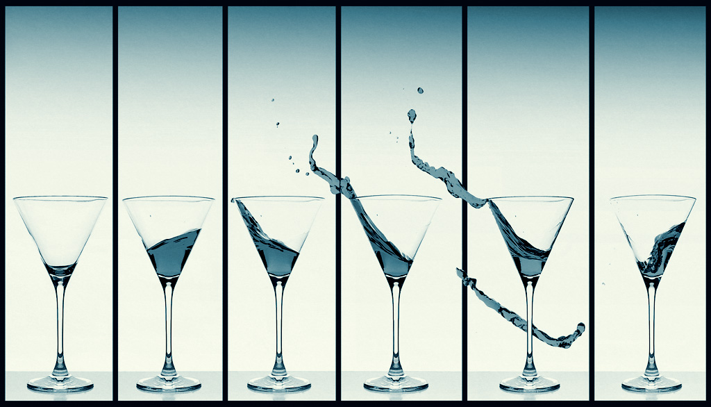
| 83 |
Mar 20 |
Comment |
This is a joyful image! I love your experimentation. The way you set up for the images was clever. The way you put together all the images is very impacting. This is a composition that would look great on someone's dining area wall!
Personally, I prefer the color image, with its blue water and purple outlines! But, for purposes of our group, the monotone works also. Have you tried a tinted monotone? This creates a monotone image, where the only color is cerulean, in various tones.
I took the color image into PS and opened a Topaz B&W plugin. There, I went into the Cyanotype Collection and applied a Cerulean preset. |
Mar 23rd |
 |
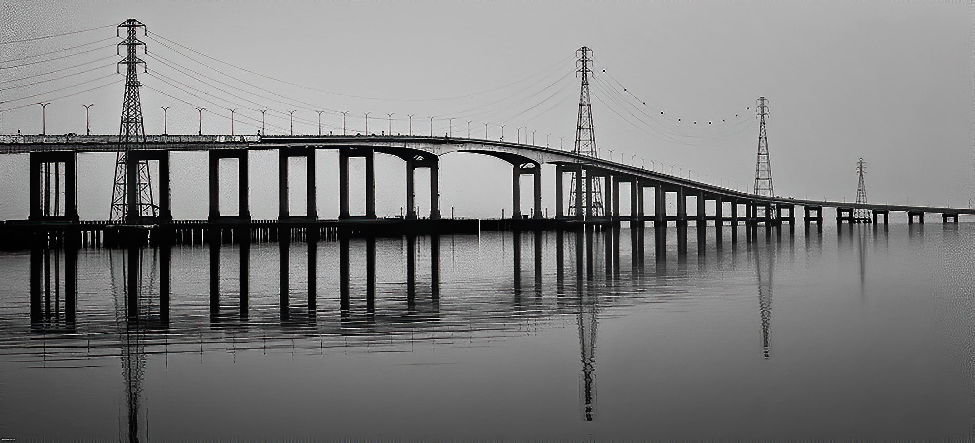
| 83 |
Mar 20 |
Comment |
The lines and reflections in this image are really primary and attractive.
To me, the lighting is too dark and too flat. A bit of variation would be nice. Perhaps a slower shutter speed, combined with a graduated neutral density filter, would have added more light dimension. There is also a lot of noise in the image. Photoshop (PS) can take care of eliminating a lot of the noise and it can add a variation in lighting.
Your concept is really good. The image does tell a story and it is attractive. I took the liberty of adjusting some of the technical development aspects.
From PS, I used the plugin, Topaz Labs AI Denoise to remove the noise (mostly). Then I used NIK Color Efex Pro with its Darken/Lighten Center preset. In that preset, I set the center to the left (closer part of the bridge). Finally, I added a Brightness/Contrast adjustment layer and upped the brightness a bit and the contrast a lesser bit.
|
Mar 23rd |
 |
| 83 |
Mar 20 |
Reply |
I haven't tried redoing the image without the texture on the sky, but might, with a different texture. This texture makes the image look as if it were printed on old fabric, which was my intent. |
Mar 11th |
| 83 |
Mar 20 |
Reply |
There are many ways to use textures, but I know of no hard and fast rules. Once one starts using them, you just do what looks best to you. The only rule I've ever heard of was that some places require that you photograph your own textures, and not use the free ones or purchased ones from others. But that rule is not used much anymore, since a lot of the fine art photography uses textures regularly, especially in flower photography. |
Mar 11th |
5 comments - 3 replies for Group 83
|
15 comments - 9 replies Total
|


