|
| Group |
Round |
C/R |
Comment |
Date |
Image |
| 34 |
Feb 20 |
Comment |
this is a stunning image! I love the black background. It really makes your clever fire flower pop.
I've studiously avoided the Pen tool, but now I am definitly going to follow your lead and play with it, especially the Freedom pen tool! What fun!
Thank you for the beautiful and instructive inspiration! |
Feb 24th |
| 34 |
Feb 20 |
Comment |
Everyone needs humor in their lives, and you have contributed to that! I didn't understand the image until I read your title and looked at the original cartoon.
I agree with the previous comments about the cloud. Steve's solution seems a good one to attempt. |
Feb 24th |
| 34 |
Feb 20 |
Comment |
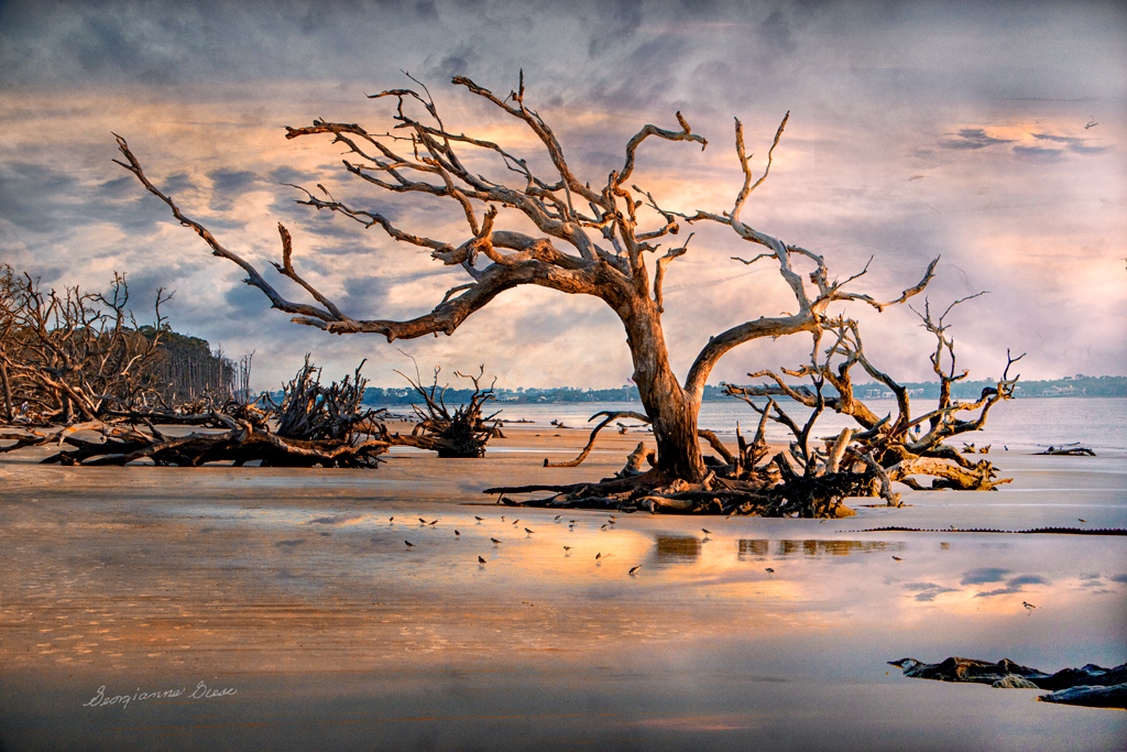
In my opinion, this is a really riveting image.
I agree with Alan and think that a little lightening of the left side of the man and his pulled case might solve the issue.
My first reaction was like Jan's. It felt like there was too much sky. But the more I looked at it, the more I felt that the prominent sky really added to the drama of the story. the lit up cloud also adds drama. It's a beautiful sky!
Great job! |
Feb 24th |
| 34 |
Feb 20 |
Comment |
Wow, I really appreciate your list of steps!
The image is really good. Your use of masks was excellent, especially on the feathers of the bird against your blurred background. The addition of the frog really made the image, and that was very artfully placed.
Great job! |
Feb 24th |
| 34 |
Feb 20 |
Comment |
Sorry this comment is so late! I thought that I had already done my comments, but apparently not!
The image is interesting and it is fun to play with orbs. I like your idea for your composition. The clarity in the orb makes it the immediately apparent subject.
You might consider bringing back the clarity of the closest piling (on the viewer's right of the orb). That is what bothered me the most, as it seems to be at the same depth of field as the further back pilings.But it is not at the same depth as they are, so, in my opinion, its blurriness would not be as strong. To me, that discrepancy catches my eye and triggers a discomfort with the image. |
Feb 24th |
| 34 |
Feb 20 |
Comment |
What a fun image! it does deserve the awards it made! I love the expressions of the girl's body and face. You certainly captured those well. The composition is fantastic, and it works very well in monochrome! |
Feb 24th |
| 34 |
Feb 20 |
Reply |
Thank you for your comments and work on the image. I really prefer the enlarged engine, as you have accomplished. For my taste, the flowers should be a bit brighter, as it is a celebration of that magnificent engine's life! However, I also would use some of Steve's suggestion, and place deep grass around the engine's edges. All good ideas from the two of you!
|
Feb 10th |
| 34 |
Feb 20 |
Reply |
Thanks Barbara. It's nice to see you visit our group! |
Feb 7th |
6 comments - 2 replies for Group 34
|
| 77 |
Feb 20 |
Reply |
thanks for that hint about the Unsharp Mask. I'd never heard of it, but I tried it on a recent flower image, and it really popped the flower! |
Feb 28th |
| 77 |
Feb 20 |
Reply |
Flipping the sky would have been a good idea. I don't think I tried that! |
Feb 24th |
| 77 |
Feb 20 |
Comment |
This is an inspiring image, cast into the perspective of traditional Chinese art! The warm gold with the sun, really adds to the image, in my opinion.
The boats do not bother me so much, though they do seem to be a bit more predominant with respect to the rest of the image.
Perhaps the relatively bright houses at the left edge of the image, could be steeped in a bit of fog after darkening them, to take away their heavily contrasting sharpness relative to the softness of the rest of the image, along the lines suggested by Witta. These are just some thoughts.
Overall, this image is a great example of photo art, in my opinion! |
Feb 16th |
| 77 |
Feb 20 |
Comment |
I took another look at my image after reading Witta and Mary's comments. Fussed with the darn thing for quite a while. I ended up lightening the right side with a Level'a adjustment layer and using the clone stamp, as well as a separate layer, which I painted with coral, to add clouds and the right color to the brighter right side area. Also, used NIK Color Efex Pro, Contrast preset to bring out more detail in the trees.
When the sun rises through clouds, but it is still low on the horizon, it will cast its light as color on distant clouds, so I'm not sure that the original was far off base. But, here is the revised version. The more I look at it, the more I prefer it! Thanks for all your suggestions! |
Feb 14th |
 |
| 77 |
Feb 20 |
Comment |
Your image is quite good, in my opinion. I appreciate your crop and your post processing. Like Witta, I believe that it would be a good move to tone down the quano on the rocks, but not to take it out, since it is part of the seal's environment and story.
What a thrilling experience you had, and what a memory you have caught! |
Feb 8th |
| 77 |
Feb 20 |
Comment |
Connie, this is a lovely photograph. I do love the whiteness of the snow and the contrast with the trees. The effect of the wind blowing is also very appealing to me.
I'm not a fan of Topazes simplify brushes, as they all look so fake. Their edges are too sharp, and they all look alike. I do use Topaz presets that contain the simplify brush, but I almost always reduce its size to the smallest possible value. Consequently, I found the same geometric stamp of the simplify brush, as leaves on the trees, a bit distracting.
Other than that, I love both your rendition and Witta's. I didn't mind the black on white contrast of the background, but I can see the reasoning behind Witta's changes. Normally, things in the distance are softer, and in the case of falling snow, much lighter. |
Feb 8th |
| 77 |
Feb 20 |
Comment |
Mary, you certainly did make the image into a soft and dreamy one. I tried to replicate what you did from your original, but just couldn't get it right. What did you do with the curves layer to retain the original skin tones, but invert the black to white?
What bothered me was the uniformity of the lighting and detail in the image. I found myself wanting to see some detail at some focal point. Perhaps you absolutely did not want that, if it was to be a dream. But, in my opinion, a picture has to appeal to a wider audience, if that is what you are interested in.
I used your final image and added a few layers. The first was a Selective Color adjustment layer. In that, I took the blacks up 100% on the black slider and the white slider, and 40% on the neutrals slider.
I stamped up (ALT CTRL Shift E) and took the resultant top layer into NIK Color Efex Pro. In that, I applied a Detail Extractor and adjusted the Detail slider to get the detail in the fingers, and then clicked oK. Unfortunately, the Detail in the fingers brought out detail brown spots on the hands, so I added a Layer Mask and painted with black with a soft brush at a low opacity (about 25%) over the brown spots, to remove them from the visible spectrum.
I stamped up again, and went back into NIK Color Efex Pro with that new top layer. This time, I applied a Vignette Filter, in white, and made the vignette quite small, just to catch the edges.
Here is the result. |
Feb 8th |
 |
| 77 |
Feb 20 |
Comment |
Witta, this is indeed a work of art. I do love the color cast that you gave to it. Thanks for the description of how you did that. This is an excellent example of fine art in camera! |
Feb 6th |
| 77 |
Feb 20 |
Reply |
Thank you for those great observations and suggestions. I will follow up. |
Feb 2nd |
7 comments - 3 replies for Group 77
|
| 83 |
Feb 20 |
Comment |
I love the perspective of this image. Shooting low was perfect, in my opinion. The story of this image is impacting.
To me, the motion blur is a tad too much, and I find it distracting. I'm wondering if you had increased you ISO a bit, if it would not have taken care of the overexposure of the bright sky and given a bit more definition to the musician, while still maintaining a sense of motion. Generally, I've always tried to focus on the eyes of a moving subject, so at least that much is in focus.
This was an adventurous photo shoot and exceeds the "normal" street photography! |
Feb 24th |
| 83 |
Feb 20 |
Comment |
Every person has their own perspective! :-)
Personally, I prefer the straightened perspective. It looks more real to me because the image data are 3 dimensional to the eye, and perception straightens things in memory. The camera converts 3 D to 2 D, and that is where the perception of slant enters in, as it can't be corrected by the brain's knowledge that the objects are NOT leaning.
I prefer the starker contrast of your second version, Lance. I probably would have prefered a BW rendering. That said, the tinted rendering adds to a story of pollution, as it reminds me of the green/gray skies we used to see when I was a kid, and everything was being dumped into our air!
The fence in your second version, seems part of the story. The wires in the original were distracting to me. Perhaps that is because wires have an aggravating way of getting into the way when I am trying to photograph a subject! So my eye gravitates toward them! |
Feb 24th |
| 83 |
Feb 20 |
Comment |
Judith, I really like the second crop you made. The main one just left me appreciating only the light painting you did. The second one really seems better to me. As to the scrunched scarf, it is interesting, but not as engaging for me personally, as the second crop.
I agree with Jose that a light on the brand would be appropriate and eye catching.
Have you tried using the monochrome of the draped scarf with just the red band on the scarf showing in color? |
Feb 24th |
| 83 |
Feb 20 |
Comment |
Nice variation on a mono image of forks. I love the reflections. You might consider making it a bit sharper, by going to live view, magnifying the image, and manually focusing on the magnified intersection of the two forks. Another thing to consider would be focus stacking, so that the foreground reflection could also be a bit sharper.
:-) I found myself wishing that I had a pair of eye glasses, shaped something like the shape of your subject! I love the geometry of the image. |
Feb 24th |
| 83 |
Feb 20 |
Comment |
I tried to change the intensity of the sky, but did not like the result. I believe the real problem, which might have accounted for Judith's sky objection, was the texture I applied. So I stripped the image back to the original, and applied a different texture. I prefer the result, though if you don't like textures on images, it will not be your cut of tea! :-) |
Feb 4th |
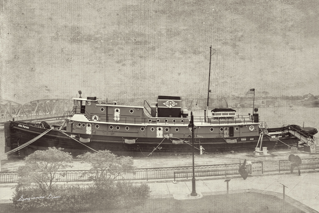 |
| 83 |
Feb 20 |
Reply |
The sky in the color version is exactly what was photographed. It was not an inserted sky. And, the original sky was quite bright. However, in the monochrome version, I overlaid a texture. The reason for that was to de-emphasize the clutter of the background, which was not controllable by me, due to the fixed location of the tug.
I do believe that I will try to tone it down a bit, as that might improve the image, as both of you have suggested. |
Feb 4th |
6 comments - 1 reply for Group 83
|
19 comments - 6 replies Total
|


