|
| Group |
Round |
C/R |
Comment |
Date |
Image |
| 34 |
Jan 20 |
Comment |
I agree with STeve. This is my favorite image this month. You did such a great job on it, and these two munchkins are just too precious! My only picky comment is that I would eliminate that red fleck on the right edge, by the lightening bolt. |
Jan 17th |
| 34 |
Jan 20 |
Comment |
I do like the second version better.
Although it is convenient that software now provides canned skies, I find myself wishing that you had taken that Milky Way image yourself. Although it can be cold to do so, a nighttime photo shoot can be wonderfully rewarding. |
Jan 17th |
| 34 |
Jan 20 |
Comment |
Yes, you do have the best festivals!
I disagree about the ghost dancers. To me, they are part of the story told by this image. The title conveys what is supposed to be the sense of the image: Bedlam. Therefore, the image is a bit busy, but that's the nature of bedlam! The teeth on the left remind me of the Cheshire Cat, which is another symbol of bedlam and confusion.
Good job in concocting an image that saves a thousand words! |
Jan 17th |
| 34 |
Jan 20 |
Comment |
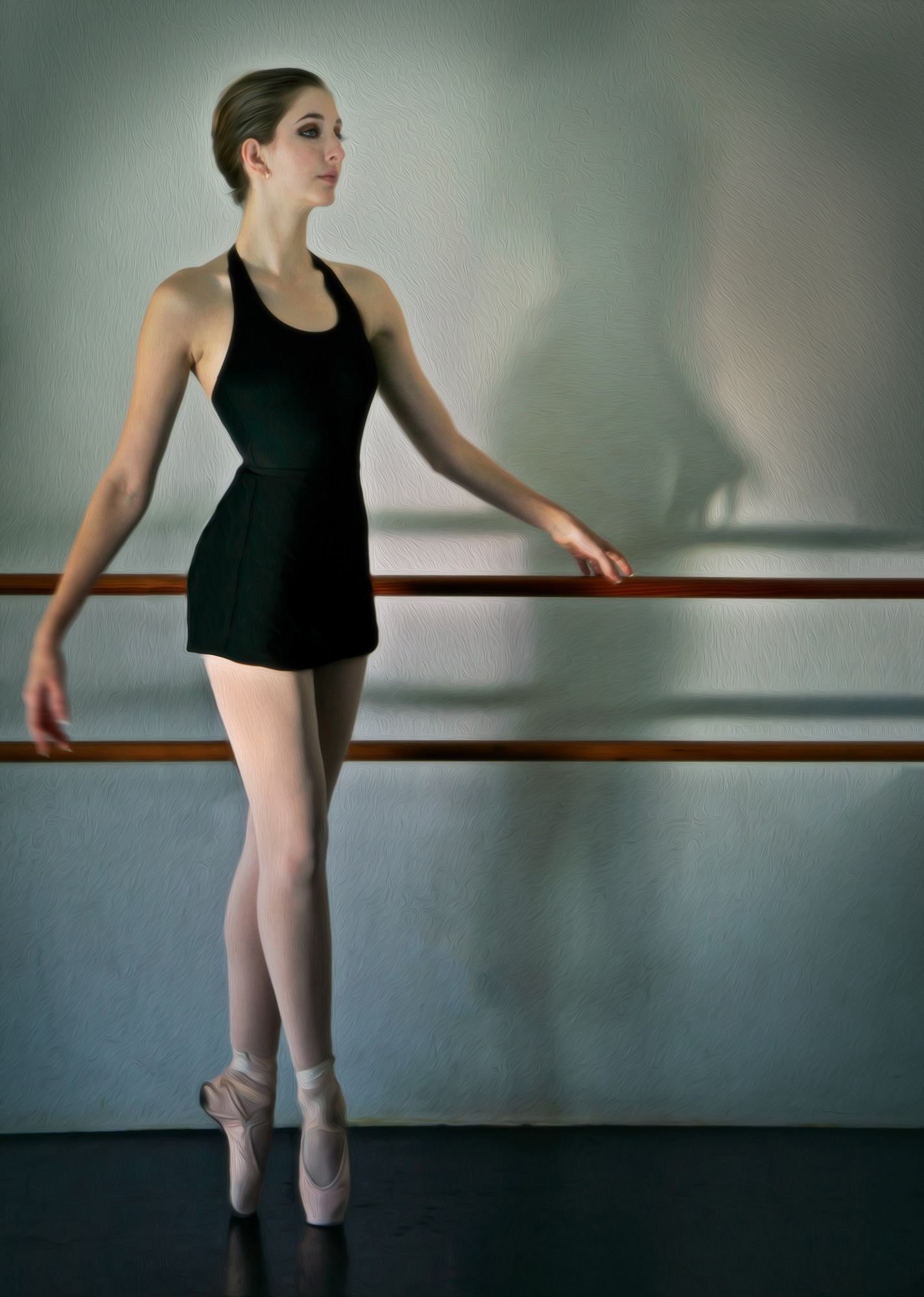
this is a delightful image. I like the treatment you gave to the shadow and to the overall image. The only thing that bothers me is the black metal hardware of the hand rail. So I just used Edit >Fill > Content Aware to remove it. |
Jan 1st |
 |
4 comments - 0 replies for Group 34
|
| 77 |
Jan 20 |
Comment |
This is my favorite this month. I find your image incredible, and one I would gladly hang in my living room!In my opinion, it is an excellent example of fine art photography, mainly from the camera. Awesome! |
Jan 17th |
| 77 |
Jan 20 |
Comment |
It is so important to explore, to delve deeper and in different directions. Doing so, we can discover promising and fun techniques to add to our palate as we encounter different subjects that cry out for special treatment! Bravo for your work!
As to the final effect, this conversion really does nothing for me. I do prefer the original over the gray tinged pedals of the final. To me, it would have been lovely without the gray. |
Jan 17th |
| 77 |
Jan 20 |
Comment |
This is a really fun, well done image, in my opinion. The expression on his face is priceless! The face in the background adds a lot to the story also.
I do like Witta's tweaking to de-emphasize his face and highlight the book. |
Jan 17th |
| 77 |
Jan 20 |
Comment |
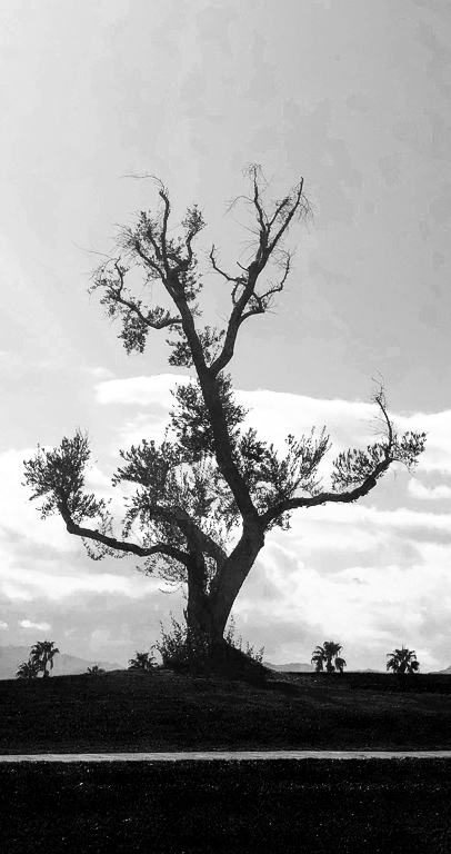
The best camera to use is always the one you have on hand! Good catch.
Although there are many tiny branches on this tree, it lends itself to a graphical interpretation, in my opinion. Hence, the square crop and oil painting do not render the full extent of its impact to me.
Playing with it, I decided to give it a more radical vertical crop. I added a Brightness/Contrast adjustment layer, to increase contrast, and then added a BW adjustment layer, to convert it to monochrome. On the BW layer palette, I took each color slider down, except blue and magenta. |
Jan 17th |
 |
4 comments - 0 replies for Group 77
|
| 83 |
Jan 20 |
Reply |
I do see your point about the attractiveness toward the original. The color of the barn certainly draws one in. Sorry that the story of this image looses its "umph" for you in BW. Guess I prefer the color version also! |
Jan 28th |
| 83 |
Jan 20 |
Reply |
I didn't notice those changes you point out. Perhaps, if the tweaking of the luminescence had been done on an original, before conversion to B & W, the results would have been different. |
Jan 17th |
| 83 |
Jan 20 |
Comment |
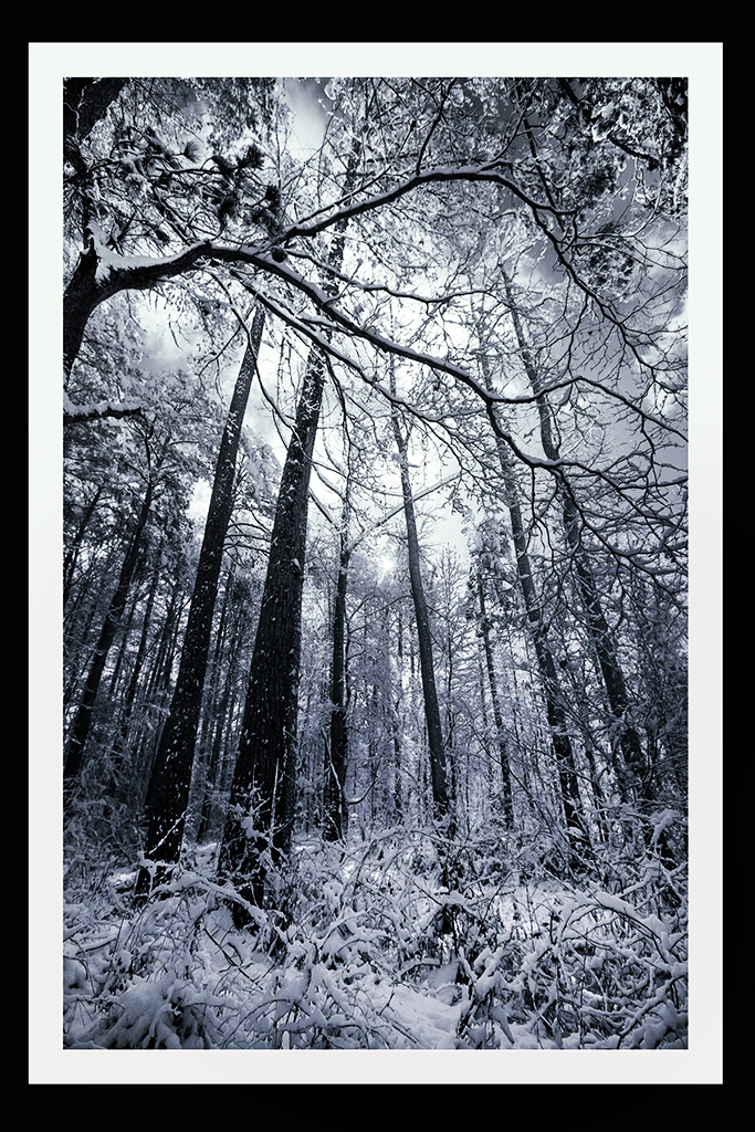
My, I'm starting to get cold as the cold front moves into Myrtle Beach and so many of this month's images are of snow and ice!
Seriously, I much appreciate your ethereal and cold light beaming through the bare tree limbs. I grew up on Michigan, where ice and snow on the trees was a delight for me as a child!
In keeping with the desire for a bit more definition of the trees, while still maintaining the ethereal nature of that lovely light, I tried playing with a Selective Color adjustment layer, topped by a Brightness/Contrast layer. On the Selective color layer, I heightened the Yellow and decreased the Black on the White slider.On the Neutral slider, I decreased the Black. On the Brightness/Contrast layer, I increased the contrast and decreased the brightness slightly. Then I went back to the Selective Color layer, and put a mask on it. I painted black over the bottom half, to hide the effects of Selective Color on the ground area. |
Jan 17th |
 |
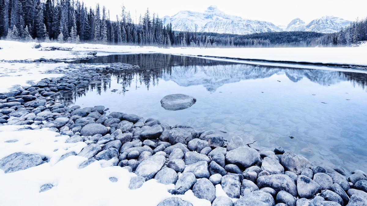
| 83 |
Jan 20 |
Comment |
If this image were intended to stand by itself, sans any marketing purpose, there are some slight changes that would appeal more to me. I found myself wanting to see more contrast. So I applied a Selective color adjustment layer to it, and added just a bit more black to the sliders of the neutral and the black color sliders. Then I applied a B&W adjustment layer to it. On that, I took the yellow, blue, cyan, and magenta sliders way up to the right. Here is the result. |
Jan 17th |
 |
| 83 |
Jan 20 |
Comment |
I too, prefer the blue cast. This blue is a cold color, which compliments the story of the frigidness of the image. The rock in question, does not detract at all, in my opinion.
To add coolness to the scene, you might consider a whitish vignette. That's just a thought.
I had fun playing with this image. hope you don't mind. I applied a High Key Color Efex Pro treatment to it. Then I put a mask on that layer and used a 50% Opacity soft brush to bring back some of the blue in the lake and a 20% opake soft brush to bring back the mountains. I liked the chill factor that High Key presents here.
|
Jan 17th |
 |
| 83 |
Jan 20 |
Comment |
This is a stunning image, in my opinion. I love the starkness of it. I deeply appreciate the crop, the reflections, the birds, the high-key, everything. To me, this is a job well done! |
Jan 17th |
| 83 |
Jan 20 |
Reply |
For me, it definitely depends. I'm open to anything that looks good to me, regardless of any other considerations! I like to just page through filters, toning, blend modes, etc., until I pick a few that stand out to me. I often find that there are many that cast a mood/tone that is different and appealing to me.
i love that you are teaching the history of photography. I find that there is much misunderstanding about the various trends in photography that have been popular since its inception. None of them should be taken as absolute directions, in my opinion. To me, as an photo artist, I look at the final product and do not care how it was obtained. It just has to have some emotional appeal, and that might differ for different people looking at the same image. That said, a good photo artist, in my opinion, needs to constantly explore different ways of improving and/or altering their techniques. That is why honest feedback on the PSA groups, together with thorough explanations, is so important to me! |
Jan 12th |
| 83 |
Jan 20 |
Reply |
Thanks Lance. I love what you have done. The image was an old one, taken more than 6 years ago, probably without a tripod. That is probably why the ISO was so high--to eliminate effects of hand shake. But it was probably too high. Also, there was a lot of shade in that area, so probably a lot of the brightness was due to the too high ISO. Live and learn!
When I return home, I will search for the original, and follow your suggestions, which are good and effective, in my opinion! |
Jan 12th |
| 83 |
Jan 20 |
Reply |
Thanks Dirk. I too am fond of the experience of taking in old places into my mind . The imagination is triggered, with wonder about who lived there, how they lived, what was their life like, etc. |
Jan 10th |
4 comments - 5 replies for Group 83
|
12 comments - 5 replies Total
|


