|
| Group |
Round |
C/R |
Comment |
Date |
Image |
| 34 |
Dec 19 |
Comment |
As usual, your compositions are very impactful. I really like the floating rock tower. You added an eye catching variation on the cairn, by adding the house, tree, and stairs.
My only distraction is the flock of birds. To me, the image would be more powerfully simple, yet starkly appealing, without the birds.
Thumbs up! |
Dec 13th |
| 34 |
Dec 19 |
Comment |
What a beautiful young lady she is! Guess I'd be tempted to make the colored version of the triptych into a soft sepia, like her sisters. But that is just a personal preference. |
Dec 13th |
| 34 |
Dec 19 |
Comment |
I like your ideas for the combination. The rain is a crowning touch!
To me, the man does not quite blend into the composition. He is too close to the center of the image, in my opinion. It's dark and rainy, so he should be less saturated and not as bright. The fire from the gun, however, does need to be bright.
I cropped the image on the left, to place the man at the third vertical line. I then selected him onto a layer of his own, and applied a saturation adjustment layer, lowering the saturation. I also applied an orange photo filter adjustment layer to the entire image. I tied the saturation layer to the cutout layer (Alt click on line between layers). On the orange photo filter layer, I inverted the mask to black and painted with a large low opacity white soft brush over the entire image. |
Dec 13th |
 |
| 34 |
Dec 19 |
Comment |
Well, the previous comments are quite involved, and I'm not sure what else to say. I love the whimsy of this composition! Perhaps the shadows could be a bit lighter, but I'm not sure of the source of the light, as the moon looks rather non-illuminating. Perhaps it should have a glow around it?
Your image made me smile, with an inner giggle. Good job! |
Dec 13th |
| 34 |
Dec 19 |
Comment |
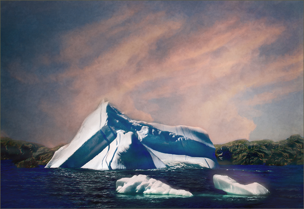
the composition works for me, especially with the addition of the two foreground icebergs. However, a sky like that would show some reflected color in the water. I made a quick try to paint in some reflections in the water, just painting with a soft, low opacity brush on a blank layer above your image. I'm not sure of the result, but I just wanted to illustrate the idea. |
Dec 13th |
 |
| 34 |
Dec 19 |
Comment |
Steve, personally I do not like the radial blur at all and the color of the final background is quite distracting to me. My favorite is Original 2. I like the impressionistic background there. My second favorite is Original 3, because the blurred background has more neutral colors, which do not compete with the band members for attention. The final background colors and intensity of the background demand attention, and they are the first thing noticed in the image, to me. That distracts from the subject, in my opinion. |
Dec 13th |
7 comments - 0 replies for Group 34
|
| 77 |
Dec 19 |
Comment |
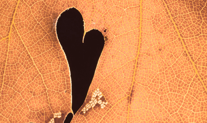
I agree with Witta, that a crop should be applied to emphasize the heart. Another thing that distracts from the heart is the color, in my opinion. Orange is a very dominant color, which really screams "look at me". You might want to consider darkening it, or frosting it with a BW layer at weak opacity over the top.
I gave this a more severe crop than you might like. The non-heart black areas carry too much visual weight, in my opinion, when any crop is applied. So I found I had to take them out. The orange is lightened with a BW adjustment layer, in Luminocity mode.
In macro photography, it is especially important to notice one particular photogenic component, and just focus in on that. As we go along in practice (I too am starting out to learn macro), we'll get more adept at noticing the 'sweet spot' of an object and cutting out everything else!
I applaud your endeavors to learn macro photography. This is a very good shot! |
Dec 17th |
 |
| 77 |
Dec 19 |
Comment |
Tis the season, so when I first saw your image, I thought it was a Christmas present wrapped with a sad rag doll!
I like what you used to bring this together. To make it scarier, perhaps it would help to make the brown ribbon into white window pains, with a latch showing? You would probably have to extend the image on the right, using Content Aware Crop. Just a suggestion.
Hope you have some time this holiday season, to relax and create more of your great images! |
Dec 17th |
2 comments - 0 replies for Group 77
|
| 83 |
Dec 19 |
Comment |
Here is my second version of this month's image. I lightened up on the texture photo over the sky, and also applied a Curves adjustment layer bo brighten the image a bit. The final conversion to BW was done with a different Platinum cast, as I couldn't remember which one I used last time! |
Dec 20th |
 |
| 83 |
Dec 19 |
Comment |
Lance, why don't you create a special discussion area for discussions such as this? Tom Pickering can insert a link to that area at the top of our page. With a discussion page, you can suggest many different topics that might be of interest to the group. I did that for my Fine Arts Group 77. You can check it out at the top of our page: "What is Fine Art". |
Dec 20th |
| 83 |
Dec 19 |
Reply |
I disagree with this. What would the Center for Creative Photography, co-founded by Ansel Adams, say about this attempt to move post processing away from the field of photography? Did this movement have traction when compositing and other such "digital art" techniques were done in a dark room?
There has been a consistent bias against the electronic simulation of dark room techniques, ever since that software was first developed. That is probably because older photographers dug their feet into giving up their chemicals and having to learn "the computer".
What about the works of Calvert Jones, student of the inventor of photography, William Talbot? In 1846 he started manipulating and removing components of an image. That type of thing, including the insertion of different skies, has been done in the dark room since the beginning of photography. Was that then "digital art" instead of photography? If so, many classic photos will need to be reclassified.
As mankind progresses, there are many things made that do what was once done by hand, in a more automated manner. That does NOT change the classification of the final result, which is produced with a new tool, rather than hand done with an older tool.
Composites in study groups must be made from photographs, and those photographs must be taken by the maker of the image. A bad photo generally produces a bad composite.
I view any good photographic image as photographic art. To me, digital art is that which is made from a composite of graphic images, with perhaps the addition of a photograph. An image should be categorized by the final result and its physical components, not by its post processing tools.
|
Dec 20th |
| 83 |
Dec 19 |
Reply |
Thanks for your contribution Jane. I would like to take your suggestions, along with the many suggestions to lighten up on the texture over the sky, and rework this image. I had tried lightening up the sky in one of my versions before posting it this month. But the sky, with comparatively little texture, just didn't seem to fit right with the rest of the image. But, I'll try again and also try the curves adjustment layer. |
Dec 19th |
| 83 |
Dec 19 |
Reply |
Lance, you are correct about an artist adhering to their own narrative/interpretation. However I would not presume to judge just what that narrative/interpretation is nor assume that it was aligned with MY narrative/interpretation. I fail to find any explanation of what Jane considered her narrative/interpretation to be. Perhaps, like many of us who post in the study groups (and I have been doing so for years), we are not fixated on a particular interpretation, but rather open to molding our work along with others, until we can rest upon one or more interpretations that appeal to us. Thanks to the availability of post processing, initiated slightly after the camera was invented, we can mold and sculpt our work (as did Ansel Adams), until we create our own "masterpiece". I do not view photography as composed of two opposing art forms. In my opinion, the camera and the post processing are just names for parts of the same continuous, overall process: The production of a final product that has appeal. |
Dec 18th |
| 83 |
Dec 19 |
Reply |
My apologies. This comment was from me, not Fred Giese. I commented from my husband's computer, thinking that I was logged in as me. In fact, the login had been left there by my husband! Oh the fun of being a two photographer/computer family! |
Dec 18th |
| 83 |
Dec 19 |
Comment |
This is a lovely studio image, in my opinion.The light on her face seems very good to me, with part of the sides of her face in shadow.
The step does not bother me, as she is obviously sitting, and needs something to sit on. Perhaps it would be more appealing if something like a white velvet cloth had been draped over the stairs. I wouldn't try to clone out the stairs, as she would be then sitting on air. As it is, you might try lightening the stair top to blend in more with the background. It sort of sticks out of her back as it is.
Happy holidays everyone! |
Dec 17th |
| 83 |
Dec 19 |
Comment |
I didn't get the memo about themes this month! Sounds like a good idea to me, however.
Lance, I love this image, in particular the infrared like brightness of the tree top leaves in contrast to the darkness of the tree trunks. As to the lower right branch, in my opinion it belongs there to add balance to the trunk on the left, and it really doesn't matter where it is coming from. In my opinion, the small stub at the bottom left behind the tree could be cloned out.
Thanks for a beautiful image! I'd love to see the one the customer selected! Happy holidays everyone! |
Dec 17th |
| 83 |
Dec 19 |
Comment |
When taking a nighttime landscape image, it is always necessary to take at least two images, one exposed for the stars and another exposed for the foreground. They do take quite different exposures. They are blended in PS or some other such post processing tool. One way to bring back the light rays for the lighthouse, is to add a Brightness/Contrast adjustment layer on top of the blended image. Adjust it to the brightness of the rays from the light. Invert the adjustment layer mask to black. Paint in the center of the light beam with a narrow low opacity brush and white on top of the paint palette. Widen the brush, and half the opacity. Paint over the ray image again, to get the falling off light of the ray.
Your image has a lovely composition. In my opinion, the sky needs work, as others have mentioned. Photographing stars can be very tricky! But it is also fun and rewarding, providing you have plenty of warm clothing and a headlamp with red lights!
|
Dec 17th |
| 83 |
Dec 19 |
Comment |
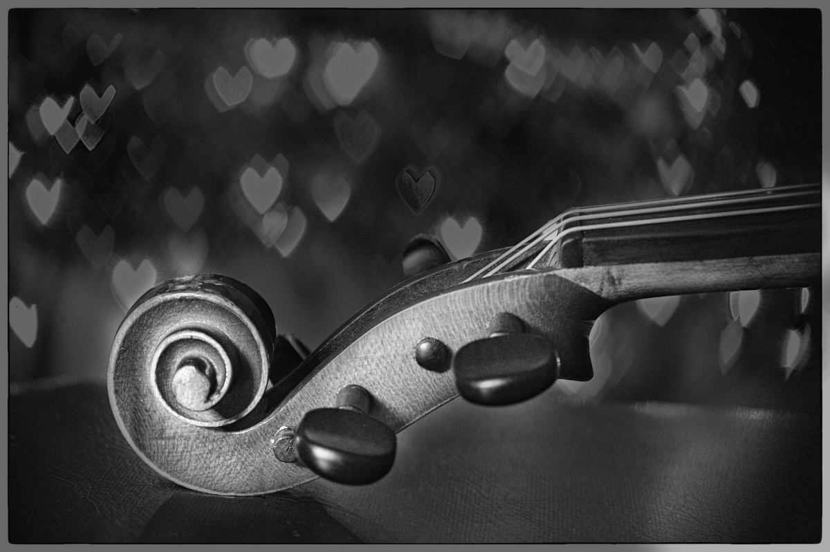
The conversion you did places a nice lighting emphasis on the curves of the violin. That is lovely. The composition is also nice, in my opinion.
My eye kept drifting to the lower right corner, where information was lost/concealed. I found myself wishing that it were a tad lighter, so that some information was there instead of a black blob.Perhaps a 2 px stroke around the black edges would help distinguish it better from a black viewing screen.
I tried playing with it. The BW conversion was done with NIK Silver Efex Pro. In there, I applied a Fine Art preset, with a green filter. The background became too light, so I applied an Exposure adjustment layer and took down the exposure a bit. To bring back the violin and the lighter information in the lower right corner, I painted with black, to hide the exposure adjustment layer over the violin and corner. |
Dec 16th |
 |
| 83 |
Dec 19 |
Comment |
The textures are well preserved in your image! The lighting is perfect for highlights and shadows while simultaneously not blowing out the silky and brightest parts of the image. Very nicely done, in my opinion! |
Dec 16th |
| 83 |
Dec 19 |
Reply |
I'm not sure why my single post is posted twice? I did not post that second one! |
Dec 7th |
| 83 |
Dec 19 |
Reply |
Thanks for your suggestions. Your treatment is lovely. However, I still prefer the heavy texture application, because to me, it adds age to the photo, and that age brings out the story of the age of the subject matter.
As to shooting in high ISO, in my experience, that adds a lot of color noise. I'll have to try it on some shots and see what it does when a noisy image is changed to monochrome. Thanks for the suggestions!
|
Dec 6th |
7 comments - 7 replies for Group 83
|
16 comments - 7 replies Total
|


