|
| Group |
Round |
C/R |
Comment |
Date |
Image |
| 6 |
Nov 19 |
Comment |
The lovely shades of gold and yellow are perfectly symbolic in this image! I love the sharp contrast against the black background. It isolates the subject, and it gives the subject great impact. In my opinion, this is an excellent and engaging image. |
Nov 15th |
1 comment - 0 replies for Group 6
|
| 34 |
Nov 19 |
Reply |
thanks Jan. I too like the painting effect on this image. I'm not a fan of it on many images, but I think it works on this one. |
Nov 9th |
| 34 |
Nov 19 |
Reply |
Interesting observation about the lighthouse. It is ancient, and I do see the same leaning in the original. It is far away also, and perhaps the perspective in the original shot was a bit off. Being only 5' tall, I do have trouble with perspective, especially since most things are MUCH higher than me!
The pole in the shot (tall tree on the right), along with its reflection, does tend to cut the image in two. I'll take a look at removing that.
Thanks for your comments! |
Nov 9th |
| 34 |
Nov 19 |
Comment |
Again, your work is outstanding, in my opinion. I love what you have done with the sky and water and fog. Overall, the image is extremely appealing. It looks like the girl is in a dream, where the pier is floating in the sky! Lovely! |
Nov 7th |
| 34 |
Nov 19 |
Comment |
I'm a big fan of geometrics, and you have really done a great job in creating this symbolic geometric image.
I agree that the robe is too saturated. Nevertheless, the saffron color seems that it would be nicer than white, to me.
Steve's idea of walking toward the light really enhances the image, in my opinion. However, in Steve's rendition, there are two sources of light, as seen by the two shadows. Unfortunately, the upper left side light seems to be coming from a darker place, so some work would need to be done to make sure the light sources are correct. |
Nov 7th |
| 34 |
Nov 19 |
Comment |
Very well done for an old gal! :-) I especially like the static light streaks. You did a great job with the lighting and shading. |
Nov 7th |
| 34 |
Nov 19 |
Comment |
I like the idea of this image. Also, the colors and components. Nevertheless, I kept wanting to see that rope, and perhaps the front end of the camel, coming through an open window, as though it were emerging from a different dimension accessed only through the window. |
Nov 7th |
| 34 |
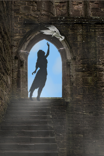
Nov 19 |
Comment |
The concept you have built is appealing. I do like the fog.
I agree with Jan, that the pose of your granddaughter does not fit well with the bird. I also agree with Steve, that a different crop might work better. I tried to achieve that. |
Nov 7th |
 |
| 34 |
Nov 19 |
Comment |
I really do like this image! The color tones and the opacity of each layer is right on, in my opinion. You've used this church yard scene before (or one very similar). I like this composite better than the last. |
Nov 7th |
| 34 |
Nov 19 |
Reply |
It looks like the bottom line effect of what you have done is to desaturate the image. I like it. I tend to oversaturate my images.
Recreating memories seems to be what a lot of this month is about! I am really enjoying the high quality of the images this month! |
Nov 7th |
6 comments - 3 replies for Group 34
|
| 77 |
Nov 19 |
Reply |
Gee, I thought I was the only person who liked what others didn't and didn't like what others did! But, I refer back to the comment I recently posted in our discussion area. National Geographic disgards hundreds of photos that are good but ordinary. They publish photos that are special and different in some way, even thought they may be of often photographed subjects. I believe that differences are what catch the eye, just as movement catches the eye in a forest for a hunter. However, that difference might not appeal to a particular viewer. |
Nov 11th |
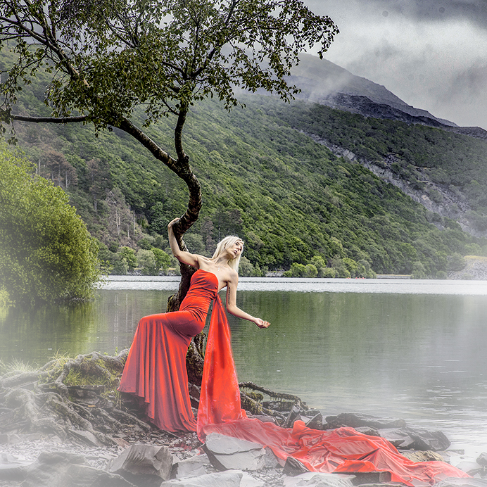
| 77 |
Nov 19 |
Comment |
I too would tone down the greens, as they are of equal intensity to the reds in the subject.
To me, it is important to emphasize the subject and de-emphasize the supporting background. In my opinion, a background should help define the story of the image, while not distracting from the subject or competing to be an alternate subject.
This lovely image would best be displayed in a square crop, in my opinion. Personally, I would like to see a bit more fog. Fog does a couple of things. It adds to the story on its own, but it also helps to cover up an intense background, thereby causing the eye to define the subject with greater clarity.
I used NIK Color Efex Pro with a Graduated Fog preset, to add a bit of fog, and then used a mask to break up the fog, as happens in nature. I also used Selective Color and BW in Luminosity mode, to enhance the detail in the red and diminish the luminosity of the greens.
|
Nov 8th |
 |
| 77 |
Nov 19 |
Comment |
I love the texture, as well as, the inked lines in this image. The delicate colors and structures in the flowers remind me of a Chinese painting. This is absolutely lovely, in my opinion. |
Nov 8th |
| 77 |
Nov 19 |
Comment |
Bunny, you did a fabulous job with your setup for this image. I really liked the original image. One of several points that commend that image, is the placement of the flowers to the side of the image.
To me, the pink tone of the flowers is less desirable than the yellow tones. There is another way to remove the color from the flowers. Here is what I did to do that. I also tweaked the focus of the image to the flowers with a vignette, rather than using a square crop for your diagonally focused flowers.
1. Selective Color adjustment layer
a. Yellow, Black, Yellow, Magenta sliders all the way to left
b. Cyan slider all the way to right
2. Stamp up (Ctrl Alt Shift E)
3. NIK Color Efex Pro with top merged layer selected
a. Remove Color Cast preset
b. White Neutralizer preset
4. NIK Color Efex Pro with top merged layer selected
a. Detail Extractor 51% with control points on each flower
b. Darken/Lighten Center with center on flowers and Border Luminosity way down
5. Selected the base of the vase and applied Edit > Fill > Content Aware to remove rather distracting vase bottom.
|
Nov 6th |
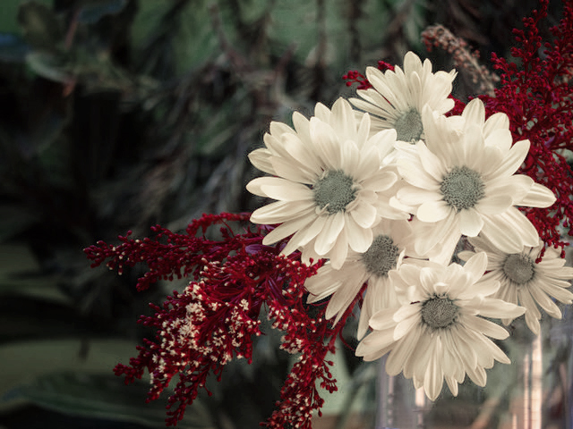 |
| 77 |
Nov 19 |
Comment |
I love the work that you did to take a good image and turn it into a great image! the light leak is a really nice touch, as are the subtle tweaks to produce the muted colors, which add to the mood of the image. The story you produced with this image, is very impacting, in my opinion.
I don't know if you are aware of this, but I'll post it here in case others are not. I just learned of this myself a couple months ago. You can place a BW adjustment layer over your layer(s), change its blending mode to Luminance, and adjust the sliders to mute selected colors. You can also place a Selected Color adjustment layer over your layer(s), and adjust the Neutral and Black layers to do something similar. |
Nov 6th |
| 77 |
Nov 19 |
Comment |
Jim, this is a very beautiful classic shot of Savannah. It reminded me so much of a classical French impressionist painting. Because of that, I could not resist making it into one, with Topaz Impression 2.
Here is what I did:
1. Copied the original background layer
a. Click on layer
b. Cntl J
2. The sky was a bit blown out, so I selected it on Layer 2, with the Quick Selection Tool (paint brush with dotted circle about its tip).
a. After selecting that tool, you just follow the edges of the sky with your cursor to make the selection.
b. Cntl J to copy that selection to a new top layer.
c. Paint the new top layer with a soft brush and Cyan on the top (foreground) layer of the paint palate.
d. Select a Multiply blending mode for the Cyan layer.
3. With the Cyan layer (top layer) selected, I stamped up (Ctrl Alt Shift E). A new top merged layer was created.
4. With the merged layer selected, Clicked on Filter > Topaz Labs > Topaz Impression 2. A new window opened up. On the right side, there is a list of presets. Scroll down to see the preview of each preset. I believe that I selected a Renoir preset.
5. Click OK.
|
Nov 6th |
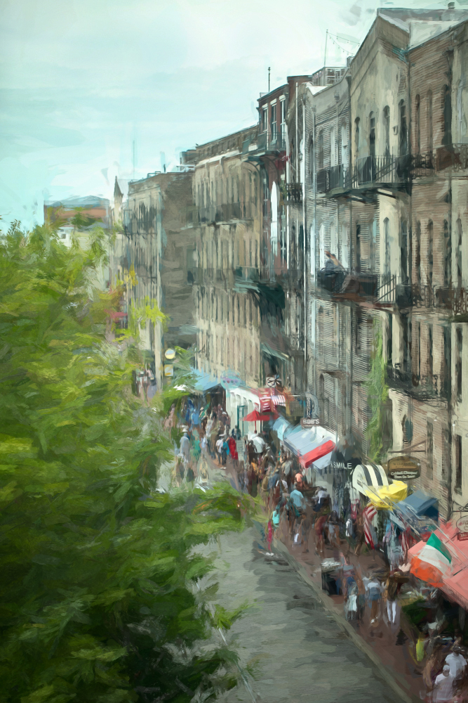 |
| 77 |
Nov 19 |
Comment |
Art is a very subjective thing. To me, your subject lacks ascetic appeal, but to others, it might have tremendous appeal.
In my opinion, you did a great job of emphasizing the tools. I do find the enhanced chicken wire to be a distraction, and much prefer the more muted appearance of the chicken wire in the original. In the final version, the chicken wire seems to have an intensity equal to that of the subjects, which are the tools. A muted background is better to show of a subject, in my opinion. |
Nov 6th |
| 77 |
Nov 19 |
Comment |
Mary, I would say that this is fine art photography. We'll wait for the group to reply on that score.
It would seem that there are at least three categories of "fine art": 1. Mostly realistic scenes of unusual appeal; 2. Scenes made to look like paintings; 3. Abstracts and composites of artistic merit.
Most of this month's submittals have been of type 1.
Your image is beautiful, in my opinion. I'd consider it worthy of hanging in someones living room! |
Nov 6th |
8 comments - 1 reply for Group 77
|
| 83 |
Nov 19 |
Reply |
Actually, I darkened the beginning of the path, because I wanted to evoke the thought; "Out of the darkness, toward the light". But as a straight shot, without that thought, some lightening of the path would work. |
Nov 9th |
| 83 |
Nov 19 |
Reply |
When I first saw this image on my computer, I was really bummed that I had cut off the top of the church! But it is 1 1/2 hour drive to go back, so next time we are down that way, I will get a shot with the top of the church!
This shot was taken on a Kelby Photowalk, this year. |
Nov 9th |
| 83 |
Nov 19 |
Reply |
Nice second view, but I prefer the view you chose instead. |
Nov 8th |
| 83 |
Nov 19 |
Comment |
This is a lovely image of a spiral staircase, which is not always easy to capture. I do like your crop and to me, the lighting in your image is fine.
Dirk-Olaf's is even more appealing to me. I love the stark contrast and the black on white effect very much. |
Nov 8th |
| 83 |
Nov 19 |
Comment |
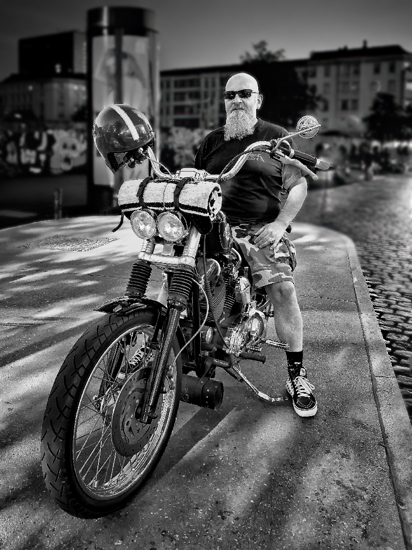
Dirk, I do like the subject of your image.
In my opinion, it is important that nothing else in the image compete with the subject, which is the motorcycle rider and his bike, in this case. The background does contribute to the story, so it is best to keep it. However, there are too many bright spots in it, including the windows with the lady. The spots need to be removed, and the window with the lady needs a good deal of darkening. Also, the background should be out of focus, so that its detail does not compete with the subject.
Here is what I did, by means of suggestion, for this image and its story.
1. I ran the image through Topaz DeNoise AI, to remove the considerable amount of pixelation noise.
2. I selected the bike, rider, and surrounding cement; inverted the selection; applied a 2.6 Gaussian blur in PS CC to the selected background layer. I then used a mask, painting in black with a soft brush, to soften the edges of the selection.
3. I stamped up (ALT CTL SHIFT E) to create a top merged layer, without destroying the layers beneath.
4. I used the Spot Healing Brush to eliminate the bright lights in the background; used a selection + Edit > Fill > Content aware fill to eliminate the large bright spot to the left of the rider's head; used the Burn tool to darken the window with the lady, until it was darker than the rider's head.
5. Finally, I used NIK Color Efex Pro > Darken/Lighten Center, to darken the edges and keep the rider bright. I applied a mask to that layer to remove the edge darkening from the bottom and bottom sides. |
Nov 8th |
 |
| 83 |
Nov 19 |
Comment |
You've done it again Jose! This is a beautiful portrait. Where do you get your fantastic models?
I agree with Dirk-Olaf's suggestion about putting a bit more space above the girl. However, I think his rendition has too much space to the girl's right. How about a portrait crop, instead of a landscape? |
Nov 8th |
| 83 |
Nov 19 |
Comment |
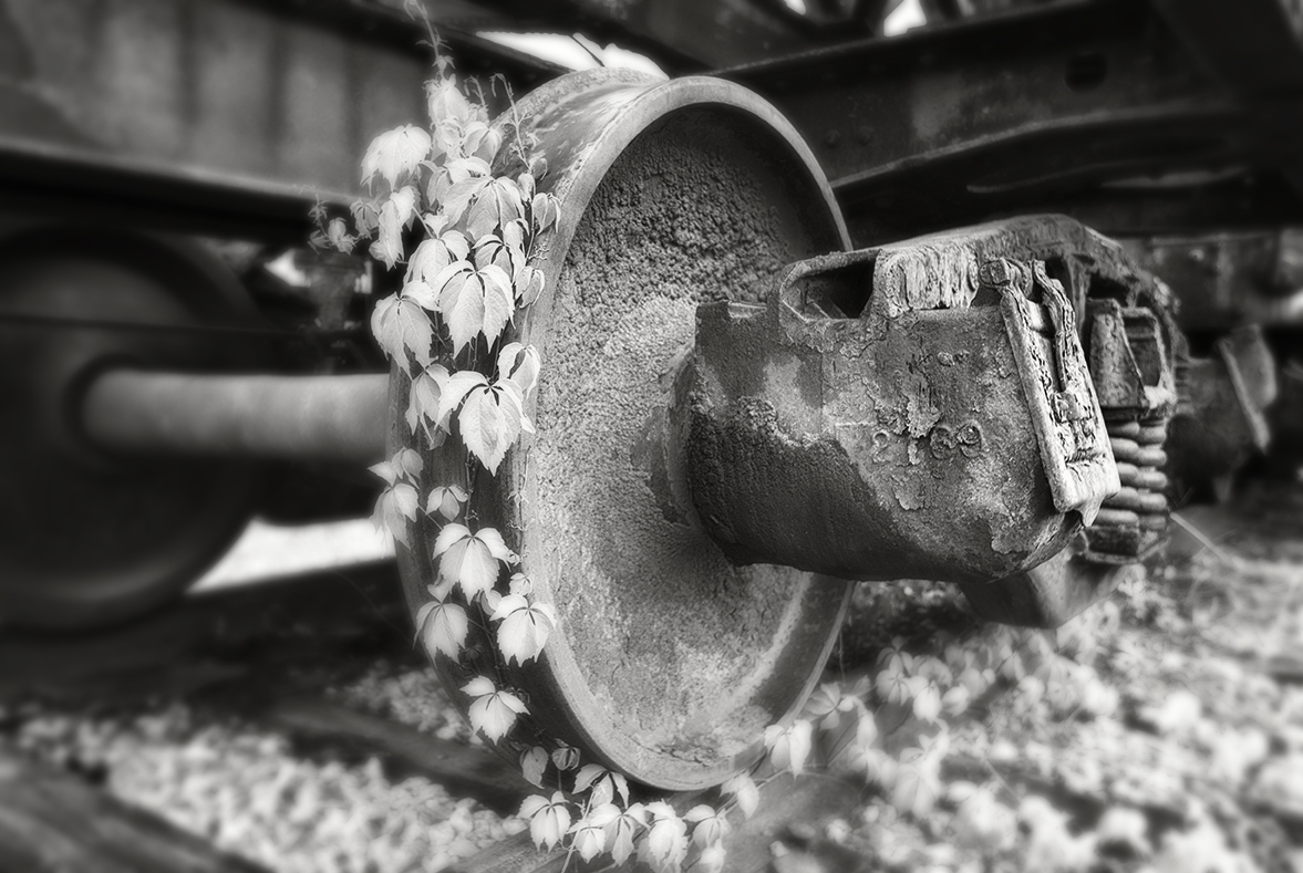
Your comments about shooting in less than perfect sunshine are insightful, and that is my prefered mode of photography. I really hesitate to do straight "documentary" photography, with nothing that sets the photo as one of distinction.
Your image shows a good range of black and white tones. The composition and concept behind the photo is good, in my opinion.
To me, the wheel is the subject and my preference would be to have the rest of the image more out of focus, in order to not detract from the subject. While depth of field is something one would control in the camera, I tried to mimic it by applying a gaussian blur at 4.4 to the entire image, and then apply a mask to the blurred layer, to bring back the central subject. Then I applied a NIK Color Efex Pro Darken/Lighten Center preset, to darken the non-wheel outer parts of the image, while having a light center on the wheel. |
Nov 8th |
 |
4 comments - 3 replies for Group 83
|
19 comments - 7 replies Total
|


