|
| Group |
Round |
C/R |
Comment |
Date |
Image |
| 34 |
Oct 19 |
Comment |
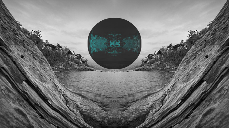
Here is an even better way to make a sphere, which might really look better than the one I did. https://www.youtube.com/watch?v=p3voxrSlMc4
I'm going to play with this one for future images. Love it!
|
Oct 9th |
| 34 |
Oct 19 |
Comment |
here is a decent tutorial on how to generate a sphere from an image: https://www.youtube.com/watch?v=aLTFSyjFviI
Although her presentation is a bit confusing, I started out with it, and applied the first part of her instructions to your original 3, creating a sphere out of it. (I don't remember exactly how I tweaked her instructions, but think I used filter > distort > spherize--you can experiment) . I applied a red gradient on top of the sphere, then resized it much smaller, copied, and pasted it over the original 3 in a separate opened image. The pasted layer is in Subtract blending mode at 76% opacity.
|
Oct 9th |
 |
| 34 |
Oct 19 |
Comment |
The driftwood does create an inviting frame. You did a good job there, in my opinion.
I used to know how to make a globe out of an object, but have forgotten and I couldn't find the instructions, but I'll keep my eye open for them.
If you really want a globe, why not photograph one. Anything round would work, such as fruit, a ball, or something photographed at a home decorating shop. You can always blur out unwanted texture/pictures.
To me, an image of a sailing boat would work better than a globe here. Maybe it's because the scene with a sail boat reminds me of my favorite poem when I was a kid. |
Oct 9th |
| 34 |
Oct 19 |
Reply |
The creative process differs at different times and for different people. In this case, I was playing and experimenting. Efficiency was not an objective, as it might have been if I had a clear image of a desired result in mind when I started (which I did not). So I just explained what I did using the layers in the final result, after many other layers were deleted! |
Oct 7th |
| 34 |
Oct 19 |
Reply |
Your April image in Group 54 for delicious! I'm really appreciating your well considered violation of the unwritten rules about placement and edges!
Sometimes my husband does something similar when he photographs. He deliberately cuts the subject off on specific sides. It used to bother me, but I'm going to reconsider after seeing how effective this can be in a photograph! |
Oct 4th |
| 34 |
Oct 19 |
Comment |
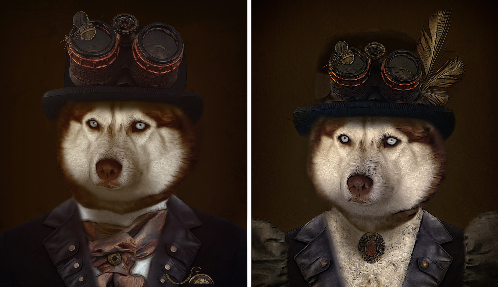
Oh no! Not another beautiful Steampunk image by Jan! Love, love it! You are so good at producing these images!
My only comment about possible changes would be for you to emphasize the clothing of the dudette a bit more, to bring out the fact that she is a 'she'. At first, I didn't notice the puffy sleeves and lacy blouse.
I brought out the feminine clothing with a Brightness/Contrast adjustment layer, inverted to black, and painted over the collar and sleeves with white. After stamping up, I applied a NIK Color Efex Pro White Neutralizer preset to remove the yellow from the dukette. |
Oct 2nd |
 |
| 34 |
Oct 19 |
Comment |
Wow, you did such a super job on that monochrome look! The colors in the originals were distracting to the combined story. In my opinion, you really composed this well. I really like the way you placed the man on the edge facing inward. It really adds to the story, in my opinion, even though I've never been tempted to put anything at the edge of an image! This might be a violation of someone's photographic rules, but the man's placement is quite effective, in my opinion! |
Oct 2nd |
| 34 |
Oct 19 |
Comment |
Candy, I love your images! It's so satisfying to get an artistic photo in the camera without having to create it with a lot of work in in post processing! I do love the way you organized the objects together as one image. The shape of that organization is different and 'cool'! |
Oct 2nd |
| 34 |
Oct 19 |
Comment |
Good composition, though I would have liked to have seen more of the church yard/church in the background. I'm partial to that image of your ancestor's graveyard and that lovely old church! |
Oct 2nd |
7 comments - 2 replies for Group 34
|
| 77 |
Oct 19 |
Comment |
As I was falling asleep last evening, I kept seeing this image in my mind's eye. I really find it fascinating. That and your mention of "I just think in terms of what appeals to me..." etc., reminded me of one weighty comment about what makes "fine art". It's really what appeals to the viewer enough to hang in their living room (if they could afford to purchase it!). |
Oct 9th |
| 77 |
Oct 19 |
Comment |
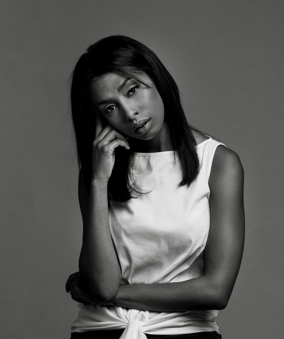
Mary, the original image looks too posed to me. The final image really tells a story of fear and deception! You did a great job, in part by your cropping and vignetting, and by whitening the eyes so much. The placement of the hands really adds to the story, and I'd say that they, together with the eyes, are the subject.
Great job! |
Oct 8th |
| 77 |
Oct 19 |
Reply |
That action for stamping up is a GREAT idea Witta. Don't know why I haven't thought about doing that. I will now! I stamp up a lot!
Thanks for your critique. |
Oct 3rd |
| 77 |
Oct 19 |
Comment |
Karen, this image is my favorite this month.The original was a good photograph, from the technical perspective. But your transformation of it in mono really works fantastically, to bring out a story. Great job! |
Oct 2nd |
| 77 |
Oct 19 |
Comment |
What beautiful forms nature provides. You got a really intriguing image of it. My preference is for the original over the colored one. However, when I examined the original, I see that there are shades of pink and cyan already in that multi-varied surface of those glaciers. Your work really emphasizes those colors for the viewer. Fun! |
Oct 2nd |
| 77 |
Oct 19 |
Comment |
Jim, I really love your image! This is an excellent display of the use of light and story telling in an image. It also illustrates a talent that photographers really need: Patience! It was so fortunate that the lovely lady came by and knew what to do!
The composition of this image is really nice, in my opinion. I would also have liked to see an image where the lady's body was turned somewhat, to correspond with her line of sight.
There seems to be some type of distortion (color noise?) on her nose and above, along the edge of her profile. It makes it look like there is a pimple at the end of her nose. There is a similar color distortion on her skin and on the wall, with pinkish color mixed in with beige. Did you use a tool or plugin to remove noise? Maybe there really was a mixture of those colors in the light or surface of the photographed objects.
At any rate, this image is powerful and personally, I love it!
|
Oct 2nd |
| 77 |
Oct 19 |
Comment |
What did you do, specifically, to get those dark edges? Was it done with a Topaz app? The dark edges really make the picture, by emphasizing the geometric nature of the image.
I was puzzled about the floating lamp shade on the left. On close up examination, it appears to be a reflection and one can barely see the leg of the lamp near the bottom. But if it is a reflection, it appears to reflect off of the outside on its right side, so the only conclusion I could make is that it is reflecting off of a glass window. However, there is no other indication that there is a window there. To clarify, you could make it clear that it is a free standing lamp and not a reflection, by filling in the leg of the lamp OR make it a reflection sans window, by erasing the right side of the shade, cutting it at the edge of the shiny wall. Also, there is a piece of a shade reflection on the left edge. You might want to remove it with Content Aware.
You did a good job of coming up with an interesting image in the midst of a busy trip! Thanks for sharing this with us!
|
Oct 2nd |
| 77 |
Oct 19 |
Comment |
Witta, you took a good image and made it into a great image with a real provocative story! Your conversion to BW was very effective and must have taken a lot of specialized work to darken the bright areas, bring out the hair, and turn the light dresses into a shiny silver!
I noticed two things you might want to work on: There is a dark ring on the ground around the girls, and it doesn't blend well; the rocks to the top right of the log and at the bottom right are blurry, though I don't think they were in the original.
Your image is really nice, in my opinion! |
Oct 2nd |
7 comments - 1 reply for Group 77
|
| 83 |
Oct 19 |
Reply |
I really do like Judith crop more than the one I did, as long as the seat is not in the way. As to lighting, my preference would be to lighten just a little, as I formerly suggested. To me, it leaves enough contrast while still conveying the drama of dark to light. The difference, of course, is minimal, and all in the eye of the beholder.
At any rate, this is my favorite image of the month. In my opinion, it is great!
Where are the rest of our group members comments? Time is running out, and it would be nice to hear from them. |
Oct 22nd |
| 83 |
Oct 19 |
Comment |
I really like your revised version. I thought the blotches through the window were due to continued outside wall, so they don't seem to be a problem to me. Like it!
PS, another way of affecting luminosity is to add a BW adjustment layer, in Luminosity blending mode, and adjust the sliders in it. |
Oct 9th |
| 83 |
Oct 19 |
Comment |
Lovely photo, with a good story reflected in the posing and expression.
You might want to consider softening the lighting a bit, as to me, the light on her lit side is a bit harsh and the light on the other side of her face is too dark. Also, a tighter crop would eliminate what is to me, the extraneous stool.
To illustrate what I mean, I downloaded the image, and applied an exposure adjustment layer, and then a Brightness/Contrast layer. I inverted both to black and painted white on their masks over selected areas, including the arms. It just toned down the bright light, and exposed the dark areas a tweek more. |
Oct 7th |
 |
| 83 |
Oct 19 |
Comment |
This looks like an infra-red image! I assume it must have been snow and frost that give the coloring if it is not infra-red!
It is stunning, in my opinion. The softness off the fog and the varying shades of white and gray really add to the mood of this image. Great job!
|
Oct 7th |
| 83 |
Oct 19 |
Comment |
I like what Dirk said about your technique. It must have been fun!
As to the composition of the image, it does little for me. It's always good to include details on your settings and equipment, and why you chose the angle you chose when you took this image. |
Oct 7th |
| 83 |
Oct 19 |
Comment |
I really appreciate the simplicity of this image.
To me, the luminosity of the light through the window, as well as its cast upon the bench and floor, have lost their character with respect to the luminosity and shadows on the walls. So my preference would have been to preserve the difference in luminosity between these points. To me, the outdoor light and the indoor light are almost the same in your conversion. A push of the yellow slider in PS BW adjustment layer would have helped preserve that difference, while tinkering with the red slider to darken the shadows. However, emphasizing the maintenance of the tonal differences would have decreased the softness of the image, and that softness may be your preference. |
Oct 7th |
5 comments - 1 reply for Group 83
|
19 comments - 4 replies Total
|


