|
| Group |
Round |
C/R |
Comment |
Date |
Image |
| 34 |
Sep 19 |
Reply |
Alan, I really do like your rendering of my flower. Perception and likes/dislikes are really so personal, I guess. For me, the background is part of the story of the image. My rendering comes with memories of quaint old homes and their gardens. It reminds me of my grandparent's gardens, and that brings back the joy of those yourthful days. I love old homes, even if they are tumbling down. So that is what my story was meant to convey--the feeling of an old home and garden. Still, I do like your more modernistic approach. Glad you enjoyed playing with the image. I like to do that with images I find here also! |
Sep 12th |
| 34 |
Sep 19 |
Comment |
Forgot to mention: My favorite doodle is the one you drew, of the flower! Can you print that doodle? It would make a good decal or applique for napkins or other items. |
Sep 11th |
| 34 |
Sep 19 |
Comment |
Wow! How fun! I do love the variations provided by the ipad apps. Wonder if any of these apps are available for an Android tablet?
I'm not sure I'd spend much time on the tablet however. My time is already too short, and it disappears altogether when I'm playing in PS! |
Sep 11th |
| 34 |
Sep 19 |
Comment |
The original image (leftmost?) is an intriguing portrait of your granddaughter. The middle image reminds me of a print that my grandmother had on her bedroom wall, of a young angel, praying. This was a good idea as a gift! Is your granddaughter much older now? |
Sep 11th |
| 34 |
Sep 19 |
Comment |
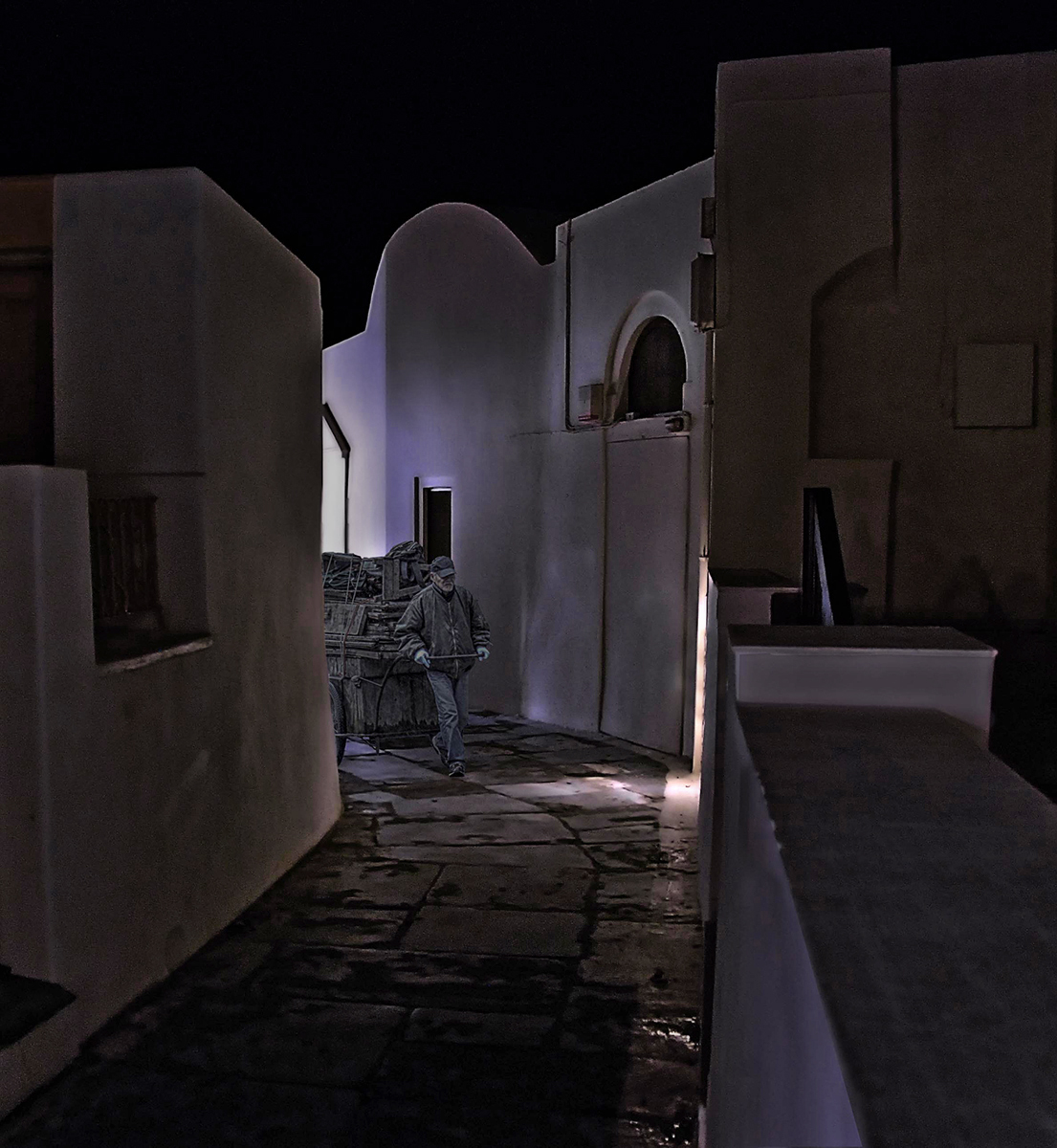
Alan, I love this composition. It is classic, in my opinion. My only reservation was the placement of the vendor. If he had been a little further forward, you could have had some light falling on the side of his face, to define him more.
The tonality and luminescence of your image seems consistent with night vision. However, as a viewer of the excellent 'story' you are telling with your image, I personally prefer more definition. My perception would define the components, despite the subdued definition afforded by mere sight. So I took the liberty of putting a bit more definition on your image.
I added an exposure adjustment layer, to increase the exposure, with a .98 gamma correction. I painted with black of varying opacity on the layer mask, to exclude portions of the walls. Then I added a selective color adjustment layer, selected the red channel, and subtracted some of the black and yellow from the reds by moving the black slider to the left.I selected the blues channel, and added some darkness back to the blues by moving the black slider to the right.
The result keeps a lot of the night feel, but defines the objects a bit more, especially the vendor. |
Sep 11th |
 |
| 34 |
Sep 19 |
Comment |
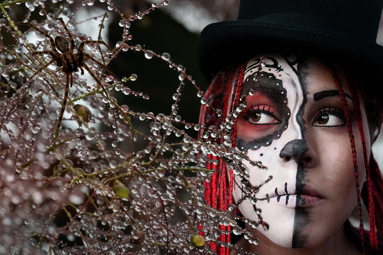
Well, this certainly would also have fit into the season in October! You did a great job on that spider, both in the image itself and in its placement on the 'web'.
Something bothered me about the entire image, so I decided to play with it. Turns out that what bothered me was the luminescence of the Goth was too equal to that of the web, so that the image lacked dimensionality. So I put a BW adjustment layer over it, set that layer to a blending mode of Luminance, and slid the red and yellow layers to the left, to darken those colors only (in the skin). I inverted the layer mask to black and painted white over the Goth's face. That changed her luminescence to a lower level, to give more an illusion of depth to the image. |
Sep 11th |
 |
5 comments - 1 reply for Group 34
|
| 77 |
Sep 19 |
Comment |
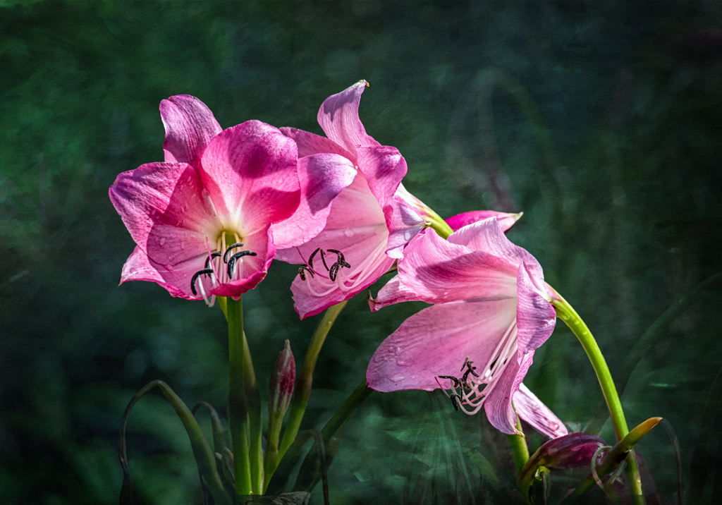
I decided to redo the entire image for this month. I added a different texture and refined the flower selection, since after Witta's comments I magnified the selection radically, and applied a mask to correct the jagged edges of the selection. When applying the new texture, I decided to leave it with a bit of transparency, in order to emphasize the background as a background garden (flowers hopefully seen as those curves Witta mentioned, and foreground flower bud at bottom right, as Mary mentioned. To me, it just looked better than having solid textural background to the main flowers. |
Sep 11th |
 |
| 77 |
Sep 19 |
Reply |
Thanks for the specific mention of the pink on the lower right stalk. I believe this might be what Witta was also referring to. If I can find my original work on this, I will work on those corrections. Between some personal medical stuff and our hurricane last week, I've been scurrying to get my files back together and find things! |
Sep 10th |
| 77 |
Sep 19 |
Reply |
Good catches, Witta. Thanks. |
Sep 10th |
| 77 |
Sep 19 |
Comment |
Your image is very intriguing! I love what you have done with the perspective. The monochrome treatment is very impacting.
At first, I had a hard time figuring out whether or not the middle (vertically) building on the right was a reflection of viewed through a transparency of the foreground building. But then I realized that you were doing a double exposure, and it didn't have to "make sense" from the point of view of realism. At any rate, the overall impression that I get from your image is one that really resonates with me. |
Sep 8th |
| 77 |
Sep 19 |
Comment |
It is interesting to see the range of comments on colors. To me, the colors in Bunny's image are not unrealistic, if the image is supposed to portrait the golden hour of sunset. However, what this image is intended to portrait is not necessarily realism.
This discussion touches upon our discussion of "what is fine art photography?" There are few great works of art or photography that accurately convey the "real" situation, though many images are concocted to deliver a dish of apparent realism to a willing-to-believe viewer.
When and if a photo is meant to convey a feeling or an emotion, then the final product (TIFF, PSD, or even some JPG) is designed to evoke that feeling or emotion, even though it is not an organization of pixels that "accurately" reflects what a robot (or image sensor) might register upon seeing the original scene (as in RAW format).
As a photographic artist, my desire is to produce an image that conveys my original internal reaction to as many in my intended audience as possible. But many who view it might be led down a different path by my presented transformation of pixels.That too is okay. The registering of different opinions helps me to see more clearly how I might wish to tweek or decide not to tweek how I am expressing myself through my work. It's all good.
|
Sep 8th |
| 77 |
Sep 19 |
Comment |
Love the image you posted here, Bunny! You are right, in my opinion. |
Sep 1st |
| 77 |
Sep 19 |
Comment |
Bunny, your adjustments really add a lot to this image, in a very artistic and appealing manner. I love the colors in the final image.
The objects that remind me of 'jacks' on either side of the boat lineup, are a distraction, in my opinion. If you could remove those objects, e.g. 1. draw a selection around the entire 'jack'
2. Wth NIK > Edit > Fill , select Content Aware fill. |
Sep 1st |
| 77 |
Sep 19 |
Comment |
This is a nice treatment for a busy subject. I was surprised by how green the Spanish moss is, in the original. With your color change, you really highlighted that moss and made it look more realistic AND beautiful. The lilac wash added just the right amount of
One thing that I notice in the final version, is the object that looks like a turtle in the upper left side. In the final version, it appears to be floating on air. If you could bring back some of its green underpinning, that floating look would be eliminated. |
Sep 1st |
| 77 |
Sep 19 |
Comment |
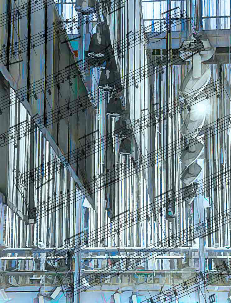
The colors in the final version seem more in tune with the theme. They do appeal to me.
The bright area on the right edge is distracting to me, so I decided to crop it out to see if that negatively impacted the result. It didn't, to me.
One thing I'd try, if it were my image, is to change the opacity of the top and bottom musical score, and to fade the edges That way it might look more like the music is floating across the 'room'. |
Sep 1st |
 |
| 77 |
Sep 19 |
Comment |
This is lovely,Witta. Your main color image reminds me of a Norman Rockwell painting! I especially like the colors in the final version more than the original version. The monochrome image is also appealing, in my opinion. At first, I did not care for the tight crop. However, my husband homed in on that one as his favorite. It is, perhaps, a bit more dramatic.
I can't think of anything that I could offer to improve either version. |
Sep 1st |
9 comments - 2 replies for Group 77
|
| 83 |
Sep 19 |
Comment |
To me, this is a wonderful expression of street photography! I love the expression on the leftmost lady's face, as well as the expressive arrangement of legs! Is that a bird by the window, who kindly flew through your scene at just the right time?
As to the monochrome nature of the image, you have a wide range, from white through black. Great job! |
Sep 11th |
| 83 |
Sep 19 |
Comment |
The panoramic sizing, as well as the blue tone, seem very appropriate for this image. I would have liked to have seen the original. Glacier is one park we set out to see on a long road trip, but never made it there because of the weather! It's a beautiful place and sunset must have been captivating!
I find myself looking for a bit more detail in the foreground mountains, as shows up in the background mountain at the right, which draws my eye. Perhaps if you could increase the development focus on the blue line that divides the foreground mountain from its reflection, the first impression on seeing this image would be more representative of a reflection. At first, I didn't realize what it was, thinking it was an abstract central form, until I focused on the detailed background mountain and then noticed the tiny blue line that separated the foreground mountain from its reflection. |
Sep 11th |
| 83 |
Sep 19 |
Comment |
I love your image, and prefer the tight crop. My eye keeps moving around the image, as there is much that is delicious to take in (as the bees have found!) I love the water drops in the top right corner. I find myself wishing that the bee on the right were a bit more in focus, but all in all, that does not take away from the story, in my opinion. The larger crop is also lovely, but to me, the story about the bees is not nearly as predominant in that wider crop. |
Sep 11th |
| 83 |
Sep 19 |
Comment |
Your pointism-like impressionistic image would make for a great holiday card or decoration! It is subtle and lovely, in my opinion. I would also love to see this with the mountains back in, though their removal does really emphasize the foreground tree. |
Sep 11th |
| 83 |
Sep 19 |
Comment |
Your image emphasizes the patterns of the sea, which are lovely. It also brings in the playfulness of a human summer on the shore, which is part of a good seaside story.
Jane, this is not my favorite of yours. In no way does the image make me think of the effort needed to get to this place. To me, the darkness and high contrast detract from the story. I would have preferred a tighter crop, sans low key. |
Sep 11th |
| 83 |
Sep 19 |
Reply |
Well, following your suggestion, I looked up Luminance and Chromatic corrections in PS. Learned some very valuable tools! Thank you! |
Sep 10th |
| 83 |
Sep 19 |
Reply |
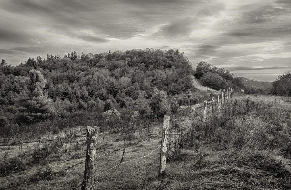
Lance, would you explain more about what you mean by " color-scale confusion"? Also, I didn't use a 'structure' setting on the image. I appreciate your comments, and decided to take another look at the contrast in the image. To me, the sky indeed is more powerfully contrasted in the BW than in the original, and perhaps that is what you mean by "loud"? At any rate, I decided to redo the image in order to see if the newer version addresses what you refer to. To be truthful, after reading your comments and reexamining the image, I really don't like the image as it is!
I couldn't find my original in its TIFF format, though I did find a bunch of raw files, and I think that my 'original' is actually an HDR. Anyway, I had to use the small JPG 'original' to make changes. In this second go around, I omitted the NIK initial steps and put the 'original' into Topaz BW and used a Platinum preset with a green filter. The sky was still not light enough in contrast to the ground, so I took it into NIK, applied a Lighten/Darken Center, with center at the infinite point of the fence, and applied a Neutral Density filter at the bottom, to direct the eye along the fence back into the image. Finally, I applied an exposure adjustment layer with a mask, to lighten up the sky.
Does the newer version address the issues you refer to as color-scale/grey-scale confusion and contrast? Is there more that could be done to address the issue?
Thank you so much for pointing all this out to me!
|
Sep 9th |
 |
5 comments - 2 replies for Group 83
|
19 comments - 5 replies Total
|


