|
| Group |
Round |
C/R |
Comment |
Date |
Image |
| 3 |
Aug 19 |
Comment |
The colors, the crispness and detail, the composition are all elements that make this a great image! It's very well done, in myh opinion.
What steps did you use in LR for post processing? |
Aug 3rd |
1 comment - 0 replies for Group 3
|
| 11 |
Aug 19 |
Comment |
This image has a very nice perspective, in my opinion. The monochrome treatment does seem to enhance the story. There is an excellent range of tones from black to white, which is often a much sought after quality in monochrome.
There are two things that caught my attention, that you might want to consider. The translation to monochrome somehow made the indentation at the back of his ear look like a shadow below a truncated ear. One way to play with that would be to add more contrast, just to that spot. If you use PS, a Brightness/Contrast adjustment layer would be something to try, along with a layer mask to just adjust that spot.
The second thing is the head of the person in front of the baritone player. In the monochrome, his head appears to be coming out of the front of the instrument. Color served to delineate it before. That's sort of tricky, in my experience. Perhaps darkening his skin, as well as his hat, might help to separate him a bit more from the foreground. One could remove him entirely by just darkening that left side, but then you might weaken the story of the marching band. What do you think? |
Aug 3rd |
1 comment - 0 replies for Group 11
|
| 34 |
Aug 19 |
Comment |
Now that's a work of art! The duplication of the spiral design really adds to your image. One suggestion: Make the distant blue spiral a tad bit more contrasty/defined, in order to draw the eye past the predominant foreground and deeply into the picture. |
Aug 24th |
| 34 |
Aug 19 |
Comment |
Helen, this is really nice. The various image you put together knit into a very nice image/story. The texture on the cement is very effective, in my opinion.
If I were to express a preference, it would be to bring out more detail in the green foliage and the water.
Well done! |
Aug 24th |
| 34 |
Aug 19 |
Comment |
Denise, your image is a very well done story. Everything in the image is so tac sharp, and the expression on your grandson's face is priceless! I'm glad you did this in monochrome. Your range of tonality is fantastic.
Hope you have a family book, in which to put this image so it can be passed on to future generations! |
Aug 24th |
| 34 |
Aug 19 |
Comment |
You did a marvelous job of isolating that little bird and making him the unquestionable subject of this lovely image. The texture you applied has the perfect color and "scratching" to make this a work of art.
I like Jan's idea of a vignette, though I would have made it much lighter. Other than that, there is nothing in need of changing, in my opinion. |
Aug 24th |
| 34 |
Aug 19 |
Comment |
It was definitely worth it, in my opinion! The sense of motion you created is really well done. I especially like the colors and texture.
Fall seems to be the time when all sorts of organizations come out of the woodwork and have festivals. Around here, September is dedicated to hurricanes and October always has at least two don't miss events every day! Wish we had the time and energy for all of them, in addition to the absolute necessity of photographing fall colors! |
Aug 24th |
5 comments - 0 replies for Group 34
|
| 53 |
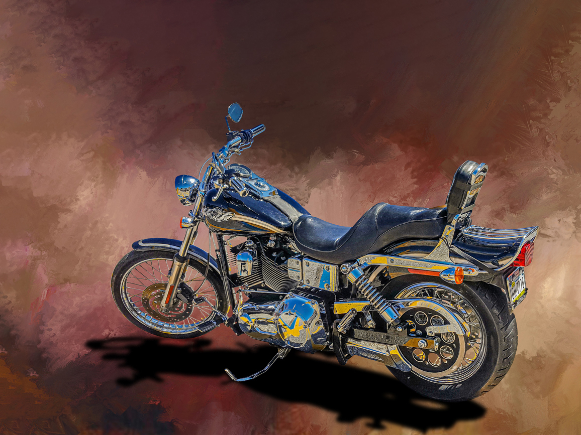
Aug 19 |
Comment |
Tom, the colors and texture of your image are lovely, in my opinion. I do like the tweaking of the shadow, with the front shadow a bit lighter than the back shadow and both of them lightened.
One thing that you might try is to give more space above and to the left of the bike. I tried using Content Aware fill option of the crop tool in PS CC. But the middle top of the texture became to 'heavy'. With the original texture it would have worked better. I also changed the size to a standard size of approximately 12 X 16 (3 X 4 ratio). |
Aug 26th |
 |
1 comment - 0 replies for Group 53
|
| 60 |
Aug 19 |
Comment |
What a fantastic image! The sharpness and closeup detail are quite remarkable, considering how you did it. The colors and composition are spectacular. This is a prize. I do hope you print and frame it for your wall! |
Aug 3rd |
1 comment - 0 replies for Group 60
|
| 64 |
Aug 19 |
Comment |
Well done! The angle of the light, the shadows, the range of tonality from dark to light, the background texture against the shine of the metal, all contribute to the high quality of this image. Of course, the implement itself is something to behold and you captured it very well, in my opinion! |
Aug 3rd |
1 comment - 0 replies for Group 64
|
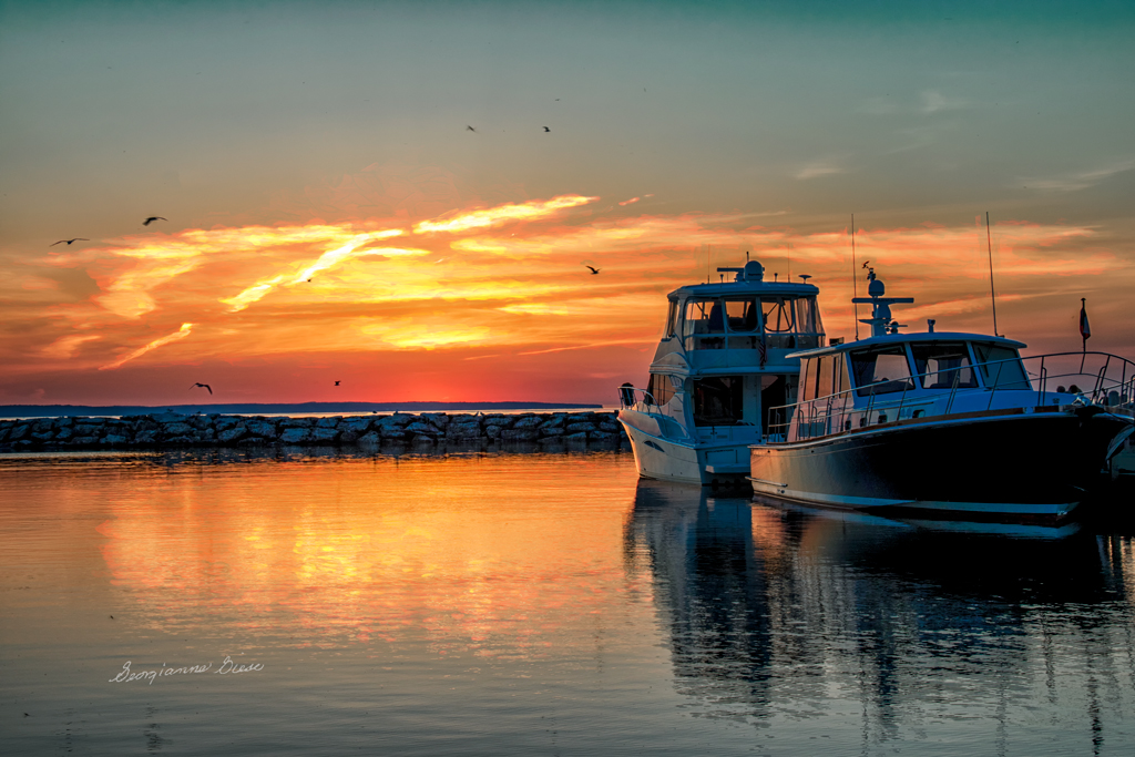
| 77 |
Aug 19 |
Reply |
Thanks for the suggestion Mary. I'll try that. I didn't even notice the sign before! When post-processing the image, I did wish that I had stepped a bit to the right when taking the original image. Darn!
I made your suggested corrections. There actually was no sign...just the brightness of the water behind the other side of the dock. To darken it, burning didn't work well, so I added a blank layer, picked the color of the post in that area, and painted on the blank layer over the reflective water. |
Aug 11th |
 |
| 77 |
Aug 19 |
Comment |
Topaz is a set of plugin presets, just like NIK (Google, which is now by DxO Labs). You can also get it as a stand alone collection of presets, with Topaz Studio. It's the same stuff, but you don't have to open PS or Lightroom to access the presets. While there are a lot of plugins, my preference is Topaz BW Effects, Topaz Impression 2 (for painting effects), Topaz ReMask (for good selection), and occasionally, Topaz Simplify (I use it for line drawings and some 'hand' painting). |
Aug 9th |
| 77 |
Aug 19 |
Comment |
When is a photograph not a photograph? To me, this is a play on words. I'd prefer to differentiate between a documentary photograph and a photograph with added artistic value. Perhaps one could ask the following question: "Would I be willing to spend in excess of $100. to print and frame this image, and hang it in my living room, with my name on it?" (Providing it is my image!) While some might like to hang documentary photos (especially historic ones), most modern image decor goes way beyond documentary. |
Aug 9th |
| 77 |
Aug 19 |
Comment |
Mary, you did an amazing job on this. I love the pose, and those eyes just really pop! Clarity of skin tones is great, and her face is quite sharp considering the dark conditions and high ISO. What camera and lens were you using?
I have only one suggestion, and it is just a preference I've mentioned to others: When your image has a black background to be displayed against a black background, it helps to put a 2 px white stroke around the outside. Similarly, if it has a white background that is to be displayed against a white background, a 2 px gray or black stroke helps. Of course, when printing and framing, there might be an artistic reason for not doing either. |
Aug 5th |
| 77 |
Aug 19 |
Reply |
J. Lanning, I must apologize and ask you to forgive me. I was responding to Stephen's posting, without remembering or investigating the very appropriate title of your image. I chalk it up to late night cloudiness, after a busy day. I'll be more careful in the future. As to ambiguity (not in your discussion), I stand by my comments on ambiguity in general. It is something I always try to be aware of, though it is a hard habit to break! |
Aug 4th |
| 77 |
Aug 19 |
Reply |
Stephen, I love the fact that you noticed the ambiguity in the title! Few people recognize ambiguity, but it is responsible for so much misunderstanding in the world. Years ago, I got a degree in Linguistics, and my eyes opened to recognize ambiguity more. Since I was also a Computer Scientist, who did business analysis and tried to translate what people said they did into computer software, it was incredibly tricky. Human language thrives on ambiguity, yet our old architecture of computers (still used today), does not tolerate ambiguity. All possibilities need to be accounted for. Perhaps that is why social capital is so important. By conversing with one another, if we really try to understand and don't get bent out of shape by what we believe another said, we can find a mutually understood meaning in something. |
Aug 3rd |
| 77 |
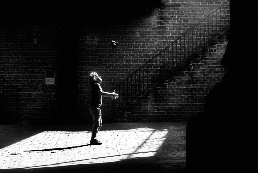
Aug 19 |
Comment |
The starkness of your image lends a certain edge to it, which is quite effective in its impact. The story this tells is also dramatic, in my opinion. It's good to see an image with a good story!
To me, there is too much visual weight given to the black chest on the right side. There is also a slit there, at the top, which is a bit distracting to me. You might consider cropping some of the right side, and placing a small white edge/stroke around the image, so it will stand out against a black background.
The idea of throwing the camera up in the air is scary to me! However, since it is part of the story of the image, you might want to consider making it stand out more, as in my eyes, it is difficult to tell that it is a camera.
I took the liberty of playing with your dramatic image, just to illustrate my comments. In the crop, I moved the man closer to the left third part of the image also, as to me, the third points enhance the impact of an image. I couldn't get it all the way there. Ideally, when taking the image, it might have worked even better to have positioned the person and the photographer more to the left. In addition to the crop and the stroke, I added a Brightness/Contrast Adjustment layer and a Black/White Adjustment layer in PS CC. |
Aug 1st |
 |
| 77 |
Aug 19 |
Comment |
Connie, your image is lovely and a very good example of what many consider to be "Fine Art Photography", in my opinion. The background is quite effective on it also. It does look like a painting, so whatever gave it that look worked for me.
If you are still using CS6, you might be interested in upgrading to Luminar at https://skylum.com/luminar. It is an inexpensive software that competes well with PS CC. |
Aug 1st |
| 77 |
Aug 19 |
Comment |
In my opinion, the color and texture changes you made really enhanced the beauty of this image. The panorama crop is effective also. I've taken a shot of this same lighthouse, and it didn't turn out nearly as nice as yours!
You might consider doing something about that mountain top, which looked to me like something floating in the sky. It took me a bit to figure out what it was, but it is a bit distracting, to me. A Content Aware Fill on the original image would take it out. |
Aug 1st |
6 comments - 3 replies for Group 77
|
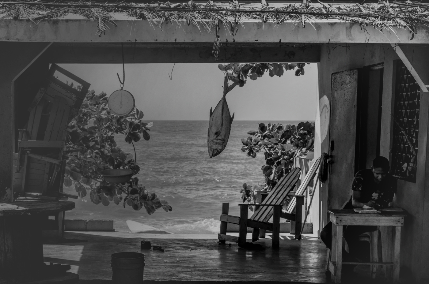
| 83 |
Aug 19 |
Comment |
The framing of the story here is very good, in my opinion. The scene does cover a lot of visual interest.
If you wish to simplify the visual scene, you might want to consider going with the direction of the light, and bringing the man more into focus, while putting the left side of the market into more shadow.
I tried to do that in PS, using an Exposure adjustment layer, a Brightness/Contrast adjustment layer, dodging and burning. |
Aug 24th |
 |
| 83 |
Aug 19 |
Comment |
This is a truly amazing image! I really appreciate the range of tones, the crispness against the softness, and the overall composition of this image. Thanks also for your explanation of how you shot this work of art! |
Aug 24th |
| 83 |
Aug 19 |
Comment |
At first, I felt distracted by the people in the image, but after looking at it for a bit more, I found that they really did help make the entire story. Actually, years ago at the Phoenix Art Museum, I shot a similar type of image, where people blurred past the art work. It's always a challenge to capture a publicly available scene without having the composition disturbed by people. Yet, going with the flow seems to present an even more complex, but interesting, story. In my opinion, this is a really thought provoking and appealing image! |
Aug 24th |
| 83 |
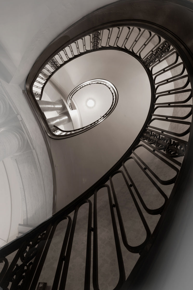
Aug 19 |
Comment |
The geometric nature of this image, emphasized by the angle at which you took the photo, are very appealing to me. I did find the architectural detail of the left side molding, to be distracting. The subject of your image just invites me to jump in and play, just for the sake of playing!
I used NIK Color Efex Pro, a Brightness/Contrast adjustment layer, and masks to emphasize the staircase and diminish the impact of the other extraneous architectural items. |
Aug 24th |
 |
| 83 |
Aug 19 |
Comment |
I can see that I have a lot to learn from you folks, about monochrome! I didn't notice anything that I would change. The natural light, the doorway shot, everything really is emotionally powerful, to me. Good job! |
Aug 24th |
| 83 |
Aug 19 |
Reply |
Your point is well taken, about the top of the hatch. It is better in color. It's good to have another set of eyes on this business of conversion to monochrome!
Indeed, the stairs were high. I suppose, considering the short stature of the sailors in the WWII sub, that they were well trained jumpers if they needed to exit quickly! Though I'm very short, I would never have made it, although panic does phenomenal things! |
Aug 12th |
5 comments - 1 reply for Group 83
|
21 comments - 4 replies Total
|


