|
| Group |
Round |
C/R |
Comment |
Date |
Image |
| 34 |
Jun 18 |
Reply |
I will try desaturating the water a bit. That deep blue was added by the Topaz Impressions preset. However, as you can see in the original, the water was light blue, as it was reflecting the atmosphere above, even though the rain was lightly falling. The water itself is part of the Intercoastal, and it is quite clean, though it is a harbor area. Physical pieces of discarded debris, however, are a serious pollution problem all over! |
Jun 18th |
| 34 |
Jun 18 |
Reply |
Helen, you are going to love Adjustment Layers! They come with a mask. With a mask on an Adjustment Layer or a Layer Mask on a regular layer, you don't have to select using a select tool. You can just use a paint brush to paint an area you wish to select. Make sure that you have magnified the area very much! You use black paint on a white mask to hide a selection, or white paint on a black mask to hide everything but the selection. You can flip between black on white and white on black with CTRL i (when the mask is selected). You do your painting on the actual image, with the mask selected. You can toggle between black and white paint with 'x'. Finally, you control shading by varying the opacity of the brush (on top brush menu). By painting on a mask, you can vary the shading and application of the adjustment layer. NOrmally, the adjustment layer applies its changes to all the layers beneath it. But you can make it apply just to the immediate layer beneath it also. You do that by holding down the Alt key and clicking on the line between the two layers. Have fun! |
Jun 5th |
| 34 |
Jun 18 |
Comment |
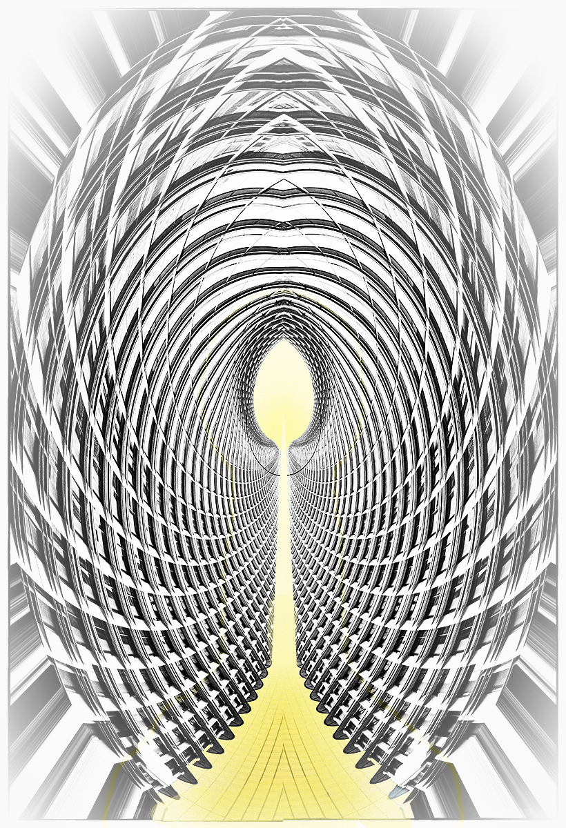
This is a clever idea, with a pleasing geometric result. When I look at your title, I want to see a bit more, something that would lead me into the path of the 'yellow brick road'. So, with a focus on traveling that road to the distant/infinite glowing center, I made some adjustments. First, I duplicated the image and applied a Darken/Lighten Center and a Vignette Blur, to emphasise the center and shift the sides a bit out of focus. Then I selected a Layer > Layer Style> Inner glow and Outer Glow, with a yellow glow. Following that, I applied two Adjustment Layers: Solid Color (with same yellow), and Vibrance. The yellow on the brick road was not gradually changing enough, so I selected the yellow and painted on the path, with a 45 percent opacity, until the change in tone from front to center was more gradual. To me, the intent of the title meant that one needed to have a more gradual movement toward the main focal point in the center and a de-emphasis on the foreground part of the geometry. |
Jun 5th |
 |
| 34 |
Jun 18 |
Comment |
In my opinion, you did a good job of combining the textures and bringing out the various colors of the textures. I also enjoy the musical score background.
It appears that the key is the primary subject, yet it seems to be lost under the texture, in my opinion. The musical score competes with the key for subject attention. You might consider cutting out the key to a separate layer, enlarging or lengthening the key a bit, and unmasking it to remove most of the texture. |
Jun 5th |
| 34 |
Jun 18 |
Comment |
Fantastic! My first impression was that the hand was to turn back the hands of time :-), but then I read your title (how true--working in PS CC is aging me fast, and I don't even notice the time flying by!).
The use of music bars as a texture is very effective, in my opinion. The blue and white fabric seems to have added a lot also, as do the black birds. Initially, I found the pink flowers to be a little disconcerting considering the rest of the color scheme. I would have preferred white flowers with yellow centers. However, that color scheme really is a matter of personal preference. After spending some time with the image, the pink is growing on me! |
Jun 1st |
| 34 |
Jun 18 |
Comment |
You did a really good job of straightening those doors! That's always a challenge for me, as I am very short. I tend to tilt my camera upwards to take images, and not keeping the camera horizontally straight is what causes a lot of perspective distortion for me. My arms are too short to hold the camera straight above my head and get a shot with good perspective! So post-processing is all that is left, and it can be a challenge on some images!
I really seek out these types of images, of doors within doors, windows within windows, etc. Your placement of the inner doors to the left of center is intriguing and not what one often sees in images like this. I like it!
My secret wish (wishful thinking!) is to go into a room of mirrors, and shoot that 'infinity' effect of reflections, without getting myself in the picture! In my dreams! |
Jun 1st |
| 34 |
Jun 18 |
Comment |
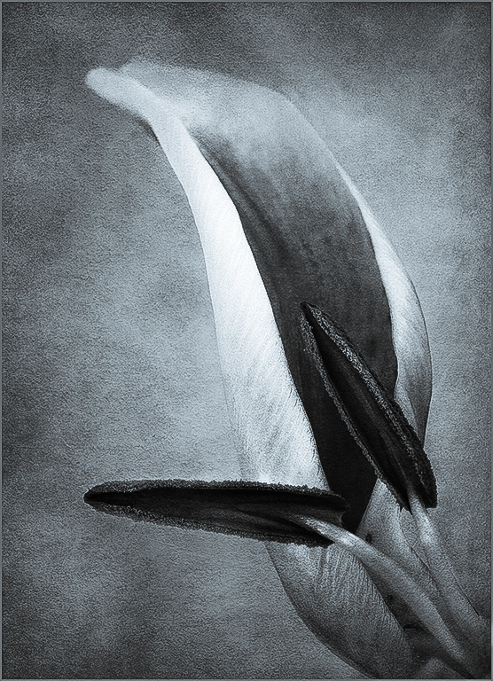
Here is the one done with the Camera Raw Preset BW with Selenium Tone |
Jun 1st |
 |
| 34 |
Jun 18 |
Comment |
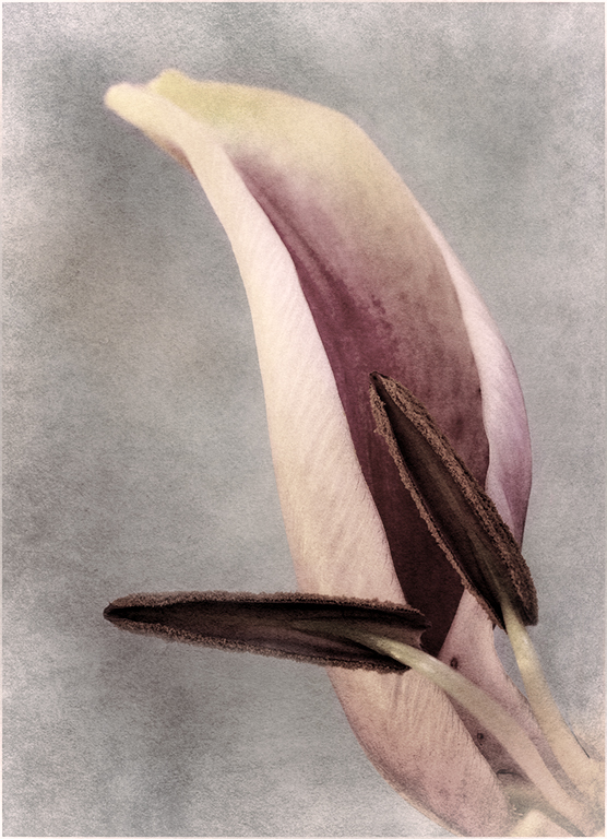
Candy, I love what you have done. You have made this flower a geometric study, and I love geometric looks. How did you get Content Aware in Camera Raw? I couldn't find it in my MS version of PS Camera Raw. However, my exploration in Camera Raw led me to find the Presets, on [my] extreme right of the menu lineup.
I downloaded your image, to play with it. Mind you, what you have done is perfect in my opinion, but it invited playing! Anyhow, I applied a Camera Raw Preset BW with Selenium Tone to your image. I do like how the geometric and tonal quality of you image translates into black and white, with toning.
Alternatively, I took your image into Topaz BW Effects and applied an Opolotype Hand Painted Chiffon preset to it. It's not true monotone, but does give an interesting tonality to your geometric subjects. Fun!
Actually, I believe if you put the tree images together, it would make a neat triptych! |
Jun 1st |
 |
| 34 |
Jun 18 |
Comment |
The first thing I noticed about your image, was that the right eye was smiling, and the left eye was expressing fear and uncertainty. Then I read your description and looked at the original. Indeed, you gave her a half happy expression! HOw did you get the PS Liquify to work on faces. Mine is always grayed out, and doesn't respond. I believe I don't know how to use that filter!
I like what you have done with the texture and coloring. As usual, great job! |
Jun 1st |
7 comments - 2 replies for Group 34
|
7 comments - 2 replies Total
|


