|
| Group |
Round |
C/R |
Comment |
Date |
Image |
| 34 |
Feb 18 |
Reply |
Be careful playing with this effect! It's quite addictive! :-)
|
Feb 12th |
| 34 |
Feb 18 |
Comment |
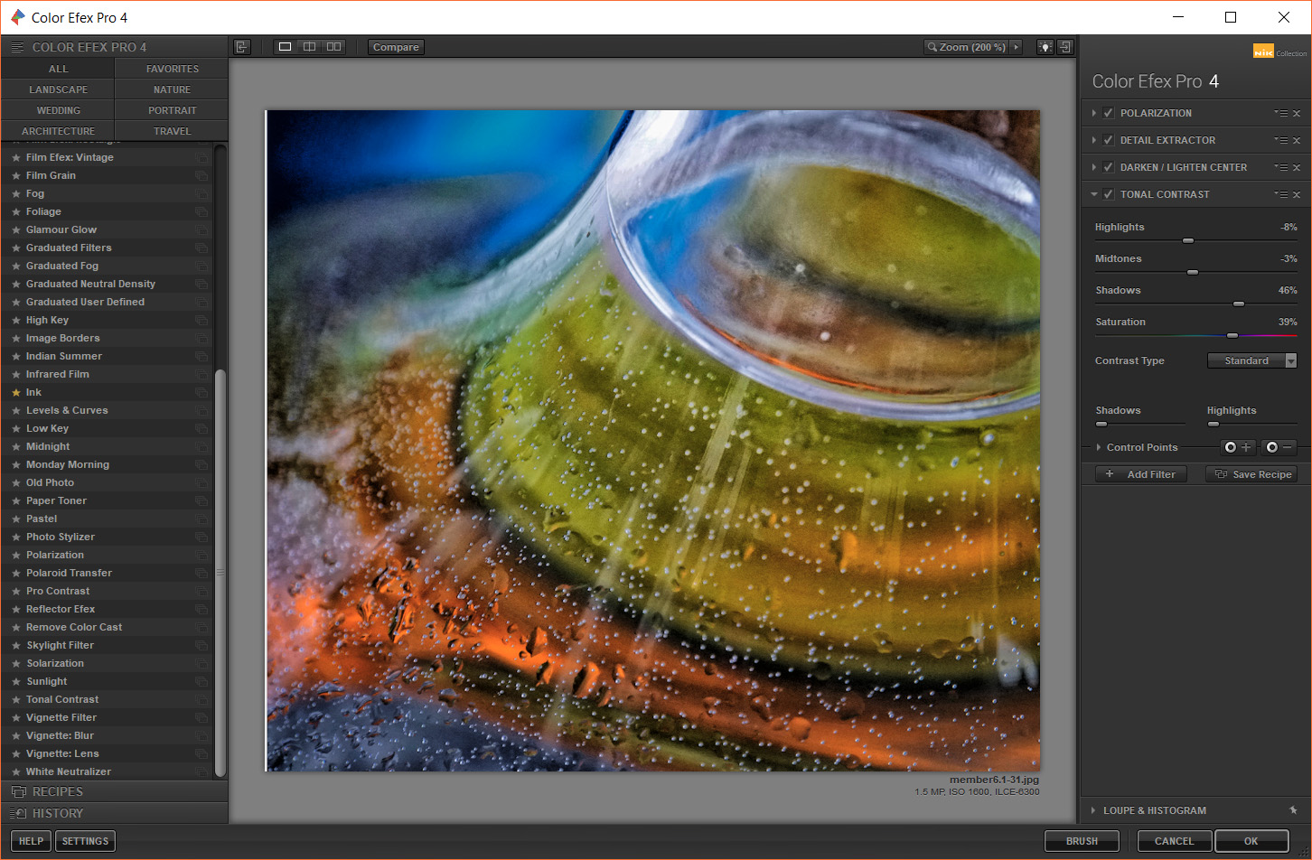
Here are the NIK filter presets: |
Feb 12th |
 |
| 34 |
Feb 18 |
Comment |
It sounds like that was a good workshop and that you are having much fun with it! Good!
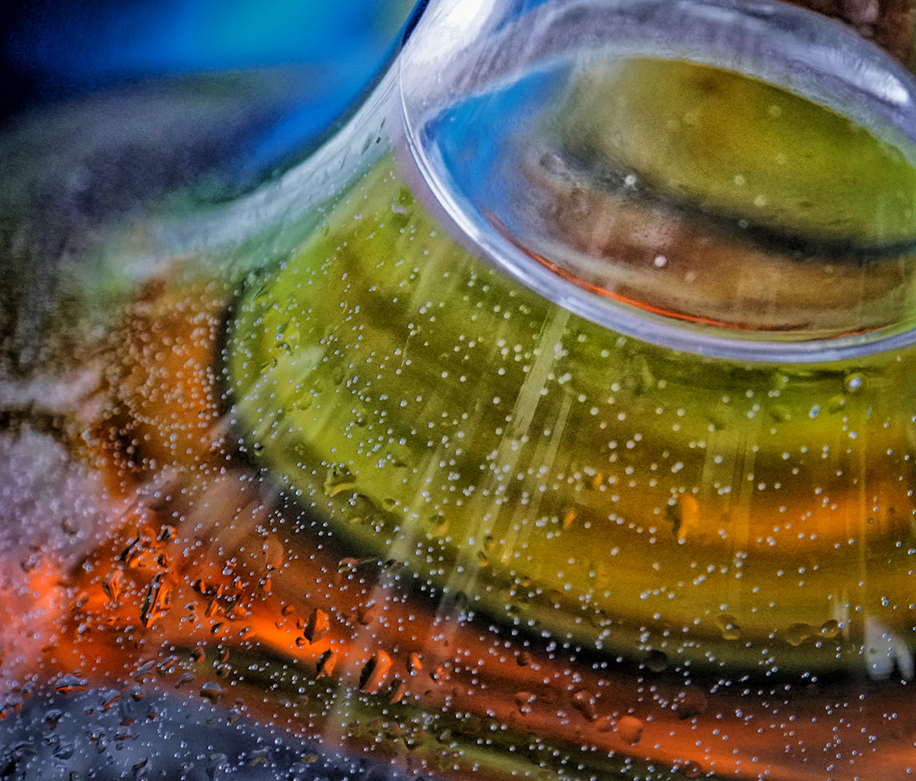
The colors are lovely, though I do like Steve's extra vibration and saturation better. To me, the crop left out some of the most interesting aspects of the original, mainly the curves of the bottle.
I made a different crop, to capture the curves in the bottle, and then applied a series of NIK filters to the image. The filters are shown in the attached image. |
Feb 12th |
 |
| 34 |
Feb 18 |
Comment |
I agree that the importance of the bird is diminished in the original photo. The light rays and texture do add interest to the image, but do not solve the issue of the desired predominance of the primary subject. Perhaps if you enlarged the bird image, it might help?
Steve's image is also appealing, though I'd still like to see a larger bird. |
Feb 12th |
| 34 |
Feb 18 |
Comment |
The combination of tones on the IR image works well for me. The subject matter does not impress me as a stand alone piece of photo art, though I am attracted to the Original 3 image, perhaps because of the lighting in it.
Perhaps you could try darkening the background and lightening the foreground, to vary the light intensity in the image? |
Feb 12th |
| 34 |
Feb 18 |
Comment |
Good treatment! Your use of texture really helped bring out the girl, as did your treatment of her image. |
Feb 12th |
| 34 |
Feb 18 |
Comment |
You did a good job in capturing the various elements of your town. I love the effect of 'Find Edges', along with the subtle coloring of this almost monotone image.
To me, the size and location of the seagull, as well as the location of the Goth, just look somehow 'off'. Perhaps if you decrease the Seagull size and place it where the Goth is, and then move the Goth toward the upper center of the image, the story might be better illustrated. That would be my first guess, though without trying it, I don't know if it would be more pleasing to me. Good story telling though! |
Feb 12th |
| 34 |
Feb 18 |
Comment |
The textures, patterns, colors of this very creative work, are well worthy of the effort you put into it! I'm fascinated by the tool you used--iColorama. I don't have an Apple computer or tablet. I did a search for it, for a PC, and didn't find a download link. Any ideas?
I love your image! |
Feb 12th |
8 comments - 1 reply for Group 34
|
8 comments - 1 reply Total
|