|
| Group |
Round |
C/R |
Comment |
Date |
Image |
| 34 |
Aug 17 |
Comment |
It would be fun to try Phil's suggestion. However, in my opinion, what you have done is fantastic! I love the dimensionality you gave with the drop shadow. The texture of the oil paint on the flower is also very effective, in my opinion. Love the entire composition! |
Aug 25th |
| 34 |
Aug 17 |
Comment |
Helen, I love Mono Lake and would love to see it again. In my opinion, your idea is lovely. This is creative, and you can do whatever you please with it!
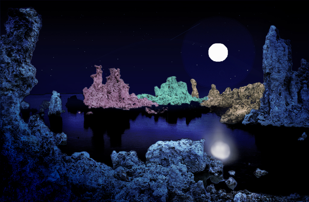
To me, the colors are a bit too bright. In dim light, colors fade and reds fade the fastest. I agree that the salt pillars need some shading, to give dimensionality. The moon's reflection is more irregular, unless the surface of the water is like glass. I tried to enlarge the moon and alter the reflection and position, plus add some shading and dim the vibrance a bit. I used NIK Color Efex Pro, with the Graduated Neutral Density, to add shading. I added several of the those same preset layers, rotating each layer to a different side, and then saved the NIK filter and used a layer mask with partial opacity of the brush, to bring back the lighter colors lit by the moon. I selected the moon and its reflection, copied and pasted to another layer, and then enlarged the moon and moved it and the reflection separately. To add a moon glow, I used the Layer > Layer Style > Outer Glow and fiddled with the settings until I got the effect I desired. The moon required a bit of a leading light path, so I coped the reflection layer and distorted it, and then lowered the opacity of that layer. To add a bit of distortion to the reflection of the moon, I used Filter > Liquify > Forward Distort Tool. The whole process took a lot of fiddling, but eventually got to a stopping point for me!
Now that you are using masks, you are going to get addicted to this stuff! You can do almost anything! |
Aug 25th |
 |
| 34 |
Aug 17 |
Comment |
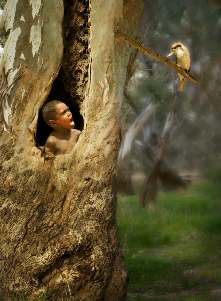
I concur with the comments so far. Jan's rendition is my favorite, though I tried a rendition myself. I wanted to put more space to the right of the bird, and get rid of the overpowering presence of the tree and the green. I used the crop tool, with Content Aware, to take off pixels on the left and bottom, and add pixels to the top and right. Then I used Edit > Fill> Content Aware Fill to clean up the crop fill. After that, I used a Gaussian Blur + a mask to bring back the tree, boy, bird and subtle parts of the grass background. That was followed by NIK Color Efex Pro 2 with Darken/Lighten Center applied several times, to highlight the boy, the bird, and a line in between and also a bit below, to catch the direction of the sun's rays. This was fun! Thank you Christine, for a clever combination of elements in a real story-telling composition! |
Aug 25th |
 |
| 34 |
Aug 17 |
Reply |
We sell some of our images, so we'd need a model release. As I've been told, if such an image is on the cover of a book or magazine, then one needs a model release. If it is in the interior of a book or article, a release is not needed. I've considered distorting the faces, but haven't gotten around to playing with that! |
Aug 24th |
| 34 |
Aug 17 |
Comment |
Nice image Phil. You brought out the tree leaves in the foreground and diminished the clarity in the background.
You might want to play with this image, perhaps adding some raindrops or some mist coming up from the river. |
Aug 23rd |
| 34 |
Aug 17 |
Comment |
Lovely image, with great post-processing. I like the simpler version also. |
Aug 23rd |
| 34 |
Aug 17 |
Comment |
Ditto on all that has been said! I too thought that the 'snow' was rain, and agree with Phil that a slight blue tone on the face (it's already on the arm) might help. As a side comment, I am envious of all that fabulous portraits that you are able to get! Do you normally get a model release for them? I usually avoid human photos because of the legal issues. But they make all the difference in the world in the appeal of a creative image! |
Aug 23rd |
| 34 |
Aug 17 |
Comment |
Thanks for all you comments! Each of you has contributed a lot. I appreciate Christine's comments about the size of the bird. It really makes a difference, to my eye. |
Aug 23rd |
| 34 |
Aug 17 |
Comment |
Steve, what you did is lovely! I prefer the brighter background to the one that Candy did, though I love both. The duller background harkens back to an older, aged picture, in my opinion, and that is not the effect that I wanted. |
Aug 11th |
| 34 |
Aug 17 |
Comment |
Candy, I really LOVE what you did with this image! Thank you. |
Aug 11th |
9 comments - 1 reply for Group 34
|
9 comments - 1 reply Total
|


