|
| Group |
Round |
C/R |
Comment |
Date |
Image |
| 34 |
Jun 17 |
Reply |
Phil, I think you might be right about not needing the texture on the foliage. I'll play with that! Thanks. |
Jun 24th |
| 34 |
Jun 17 |
Comment |
Helen, I love your idea here. The shine of the ripples really captures the essence of golden water and your work managed to preserve that. One thing looked slightly off to me, and that was the contrast in color and tone between her eyes and mouth and the gold in the water. Instead of the eraser, a layer mask with a low opacity soft black brush painted over her eyes and mouth might have preserved some of the golden water there. |
Jun 10th |
| 34 |
Jun 17 |
Comment |
Candy and Jan, I'd actually like to combine your suggestions, as well as Steve's to bring the bird a bit more away from the side of the bridge. I do however, want to keep the brighter light on the left, as the sun was setting, and I wanted to emphasize the feeling of that angled light. I'm not a big fan of symmetry! |
Jun 10th |
| 34 |
Jun 17 |
Comment |
Jan, you take me back to my youth, when one of my favorite story/poems was "Winkin, Blinkin, and Nod" (sailed off to the light of the silvery moon...)
I do love the image. My preference would be to make it a bit more dreamy like, by altering opacity and blending modes on the layers, especially the flowers and the girl in the leaf boat (perhaps with a Multiply mode?). Also, since the birds are not central to the image, in my opinion, plain, grey-white, translucent birds might be worth trying.
The flowing wave layer is delightful. In fact, the entire concept of the image is delightful, in my opinion! |
Jun 7th |
| 34 |
Jun 17 |
Comment |
Nice image Christine. I like the coloring and texture a lot. The only thing that caught my eye and distracted me was the top edge of the bird. To me, the thicker edge creates a cut and pasted look. In my opinion, a shading effect at the top might look better than the hard edging. |
Jun 7th |
| 34 |
Jun 17 |
Comment |
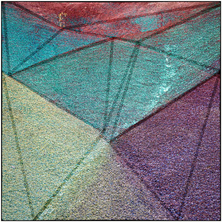
In my opinion, this is a lovely and clever way to make an abstract image from the original, more plain image. I agree with Steve that it almost looks like a background waiting to dramatize a more specific subject. Another way to approach it, without detracting from the geometry of color and shape as a subject, might be to add some crisp dark lines at the intersections of color and/or possibly some black geometric design, to flesh out the image and emphasize the colors and shapes as the entire subject. |
Jun 2nd |
 |
| 34 |
Jun 17 |
Comment |
Candy, you did a marvelous job at pulling that black dog out of that black background! His brown eyes and toned tongue and scarf help to accentuate this lovely portrait of a dog with a very impressive character face. As a dog lover, photographer, and artist, I love this image! |
Jun 2nd |
| 34 |
Jun 17 |
Comment |
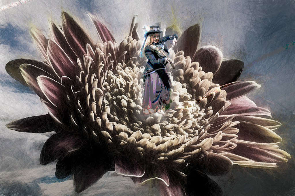
I love the concept, the flower, the Goth, and the toning you've achieved. Something about the Goth bothered me, however. At first, I thought it was the blueness of her outfit, which didn't seem to fit in with the other color tones in the image. Then I realized that even with the blue dress, it was hard to distinguish her from the rest of the image. The light and subtle variation of colors seemed too much the same over the entire image. So I did three major things to the Goth. I added an inner and outer glow to her layer, posturised her, and reduced her layer opacity to 58%. The result is included. |
Jun 2nd |
 |
7 comments - 1 reply for Group 34
|
7 comments - 1 reply Total
|