|
| Group |
Round |
C/R |
Comment |
Date |
Image |
| 17 |
Mar 23 |
Comment |
I really don't have anything new to add to the comments. You did a good job with the depth of field. Everything appears to be in focus from the very close foreground to the distant background. |
Mar 31st |
| 17 |
Mar 23 |
Comment |
I also agree that adding clarity and dehaze to the sky improves the image. The sky has so much natural drama that could be accentuated. |
Mar 9th |
| 17 |
Mar 23 |
Comment |
This is a lovely image. The only suggestion I have would be to tone down the bright spots in the background so that they don't draw the eye to them. |
Mar 9th |
| 17 |
Mar 23 |
Comment |
Ahh, I love the jellyfish. Is it just me, or is the overall image slightly out of focus? You might want to consider a little spot cleanup. There are quite a few little white dots especially on the right side of the image that I find a bit distracting. |
Mar 9th |
| 17 |
Mar 23 |
Comment |
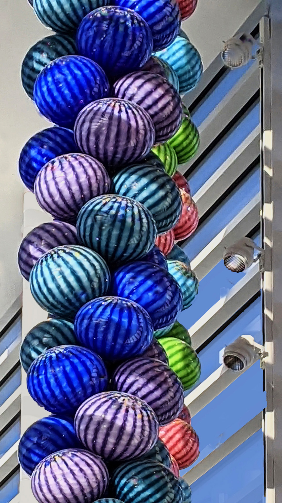
Another great version of this subject. Your composition is very effective. To my eye, the image needs additional straightening, it seems to angle inwards at the top on both sides. I used the skew tool in PS to pull the top edges outward. I also darkened the bright highlights, and added some contrast to give the image a bit more POP. Did any of this improve the image? |
Mar 1st |
 |
| 17 |
Mar 23 |
Comment |
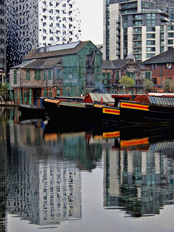
Good eye for spotting this composition. The image seems abit soft overall to me, especially apparent in the buildings. I added some clarity (maybe not enough to notice here). In my opinion, adding clarity does not detract from the grunge look you indicated in the title. What do you think? |
Mar 1st |
 |
6 comments - 0 replies for Group 17
|
6 comments - 0 replies Total
|