|
| Group |
Round |
C/R |
Comment |
Date |
Image |
| 24 |
Aug 21 |
Comment |
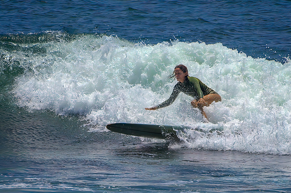
I'm definitely not the one to make suggestions about f stop and depth of field. But,since you chose to present this image as mostly monochrome with a splash of color, I think you might consider boosting the color to make the image pop a bit more. To my eye, it is kinda flat and uninteresting.
I boosted the yellow +25 and I boosted overall saturation +25. I feel like boosting the color wakes up the image without looking overdone or artificial. Just a suggestion.
|
Aug 6th |
 |
| 24 |
Aug 21 |
Comment |
I didn't notice the pink coloration. Thank you all for pointing that out to me. I think the culprit was the the NIK Skylight filter. I liked how it highlighted the surfer, but I didn't notice that it added a pinkish tone to the rest of the image. I have deleted that filter and made a few other minor adjustments. Is this better? |
Aug 6th |
 |
| 24 |
Aug 21 |
Comment |
I don't know anything about photographing models or doing portraits. But here are my thoughts.
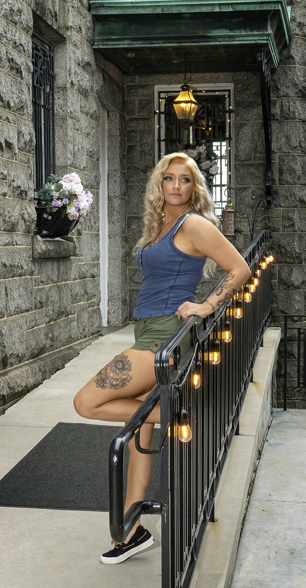
I think you did well at the composition/cropping. You could not move an iota in any direction without cutting something off/out that should not be removed. Her pose works very well.
My only suggestion would be to increase the exposure on the model a bit while also adding a vignette to darken the edges and force the eye inward.
On my edit, I added a curves layer and lightened the entire image. I then added the vignette to cancel the effects of the curve layer and darken the edges even more.
|
Aug 3rd |
 |
| 24 |
Aug 21 |
Comment |
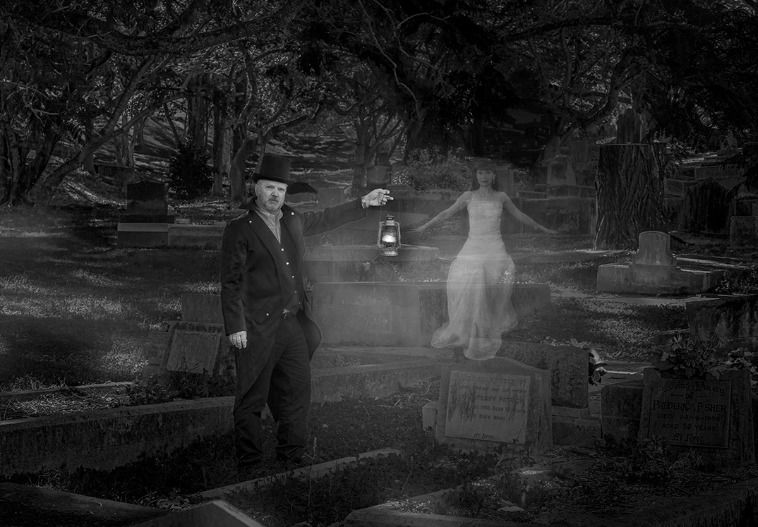
I absolutely love the concept and your execution of this image. I would never have thought of doing something like this. Kudos to you for imagining outside of the box.
I'm having a little trouble with the composition, however. It doesn't quite work for me with the man right in the center. To me, the image is unbalanced because everything with visual interest is on the right side of the image.
Maybe if you considered cropping the image, it might have more visual impact. |
Aug 3rd |
 |
| 24 |
Aug 21 |
Comment |
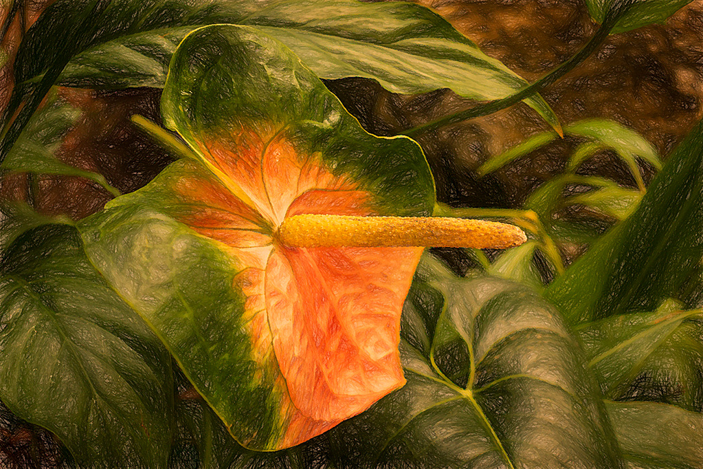
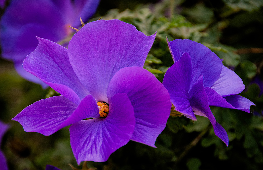
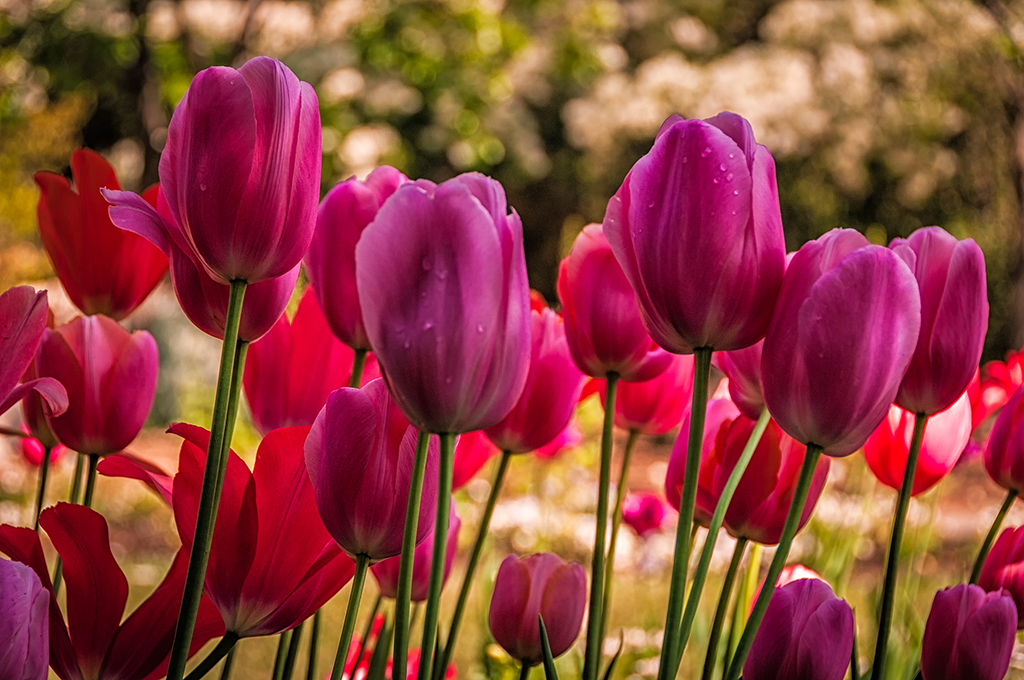
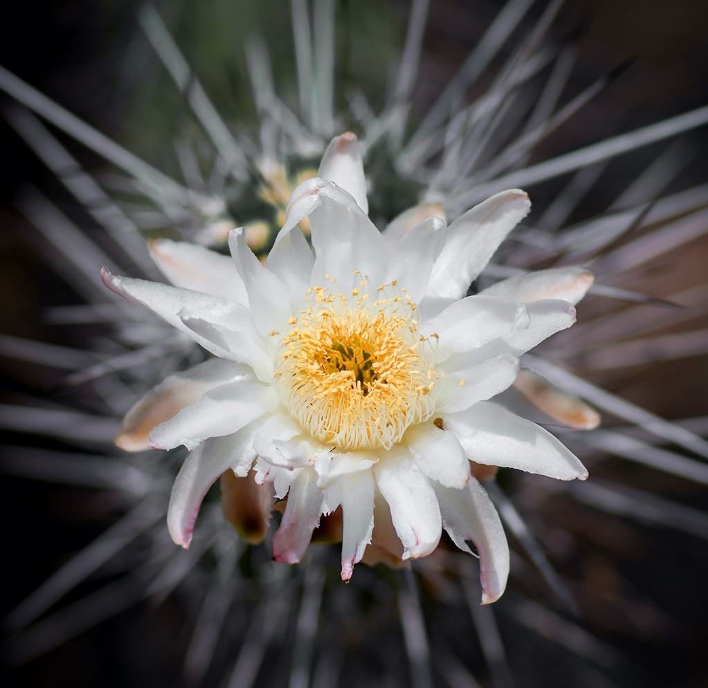
I really like the way you cropped this image and darkened the background to keep the flower as the focal point. Your adding hints of color to the petals makes the image more dramatic.
Two suggestions: there is a bug and a couple of small spots on the central petal. You might consider removing them because, at least to my eye, they are a distraction.
You also might consider adding a line or stroke to the edge of the image to separate it from the black website background. It is difficult to tell where the image ends and the black background screen begins. |
Aug 3rd |
5 comments - 0 replies for Group 24
|
5 comments - 0 replies Total
|