|
| Group |
Round |
C/R |
Comment |
Date |
Image |
| 24 |
Nov 19 |
Comment |
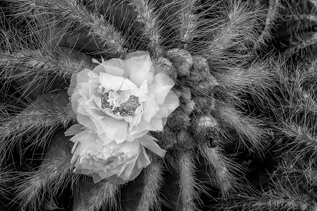
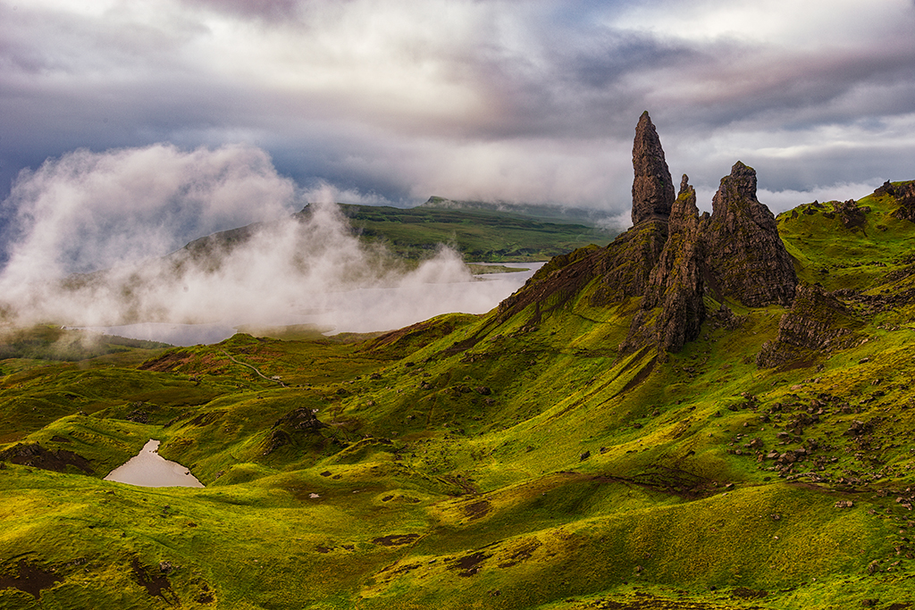
I like the adjustment Jim made. But, I still would like to see the group of people in the background just a bit more. You might want to play around with making them a tiny bit more visible without losing the wonderful foggy affect. |
Nov 8th |
| 24 |
Nov 19 |
Comment |
I like the adjustment Jim made. But, I still would like to see the group of people in the background just a bit more. You might want to play around with making them a tiny bit more visible without losing the wonderful foggy affect. |
Nov 8th |
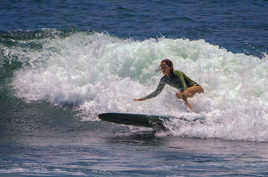
| 24 |
Nov 19 |
Comment |
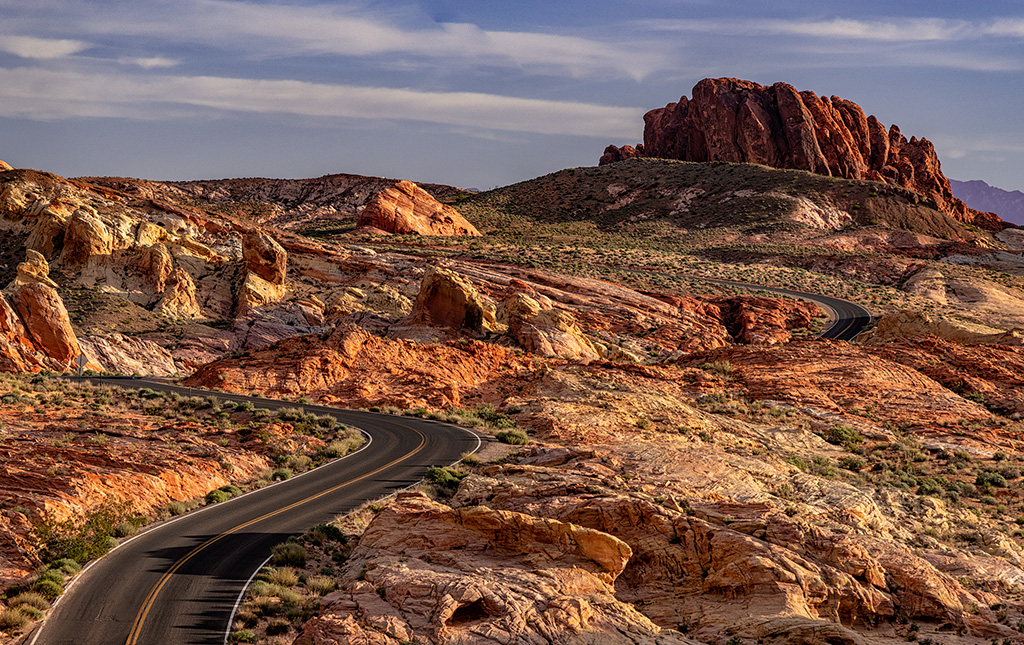
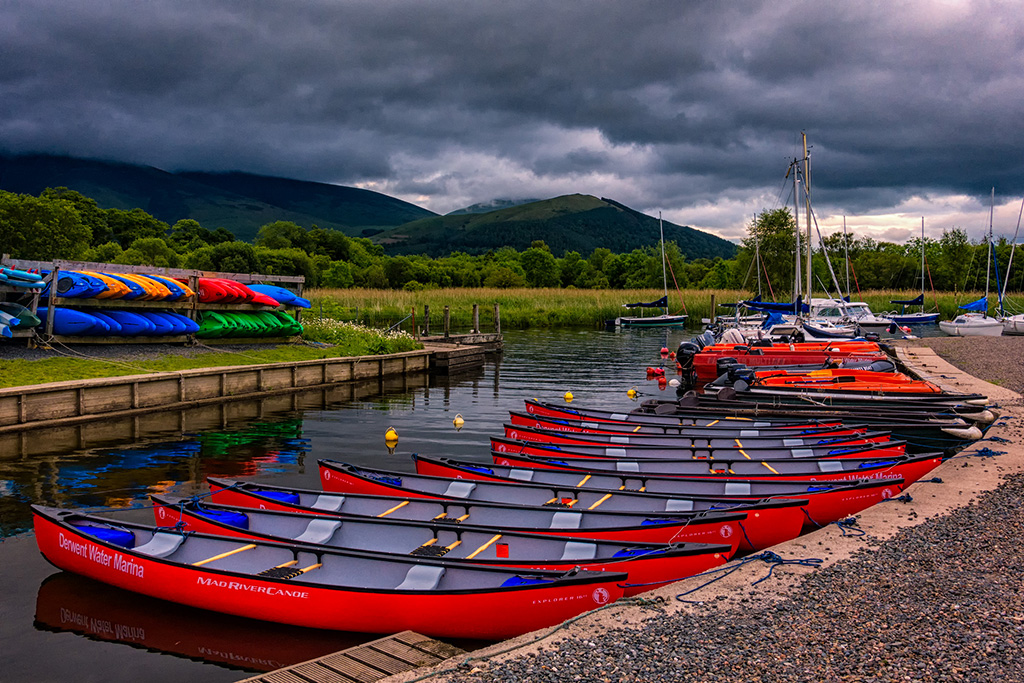
I agree with Jim. Taking out some of the road distractions really helped and he moved the subject a little more off center. I like this image a lot. |
Nov 8th |
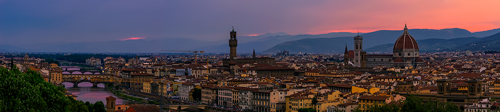
| 24 |
Nov 19 |
Comment |
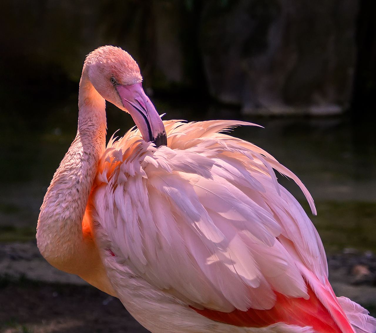
You might want to consider playing around with cropping this image drastically. I always think about what is necessary, what improves the image, what detracts from the image, etc.
I think you have the ingredients for a good image, but you might want to crop out all unnecessary things. |
Nov 8th |
| 24 |
Nov 19 |
Comment |
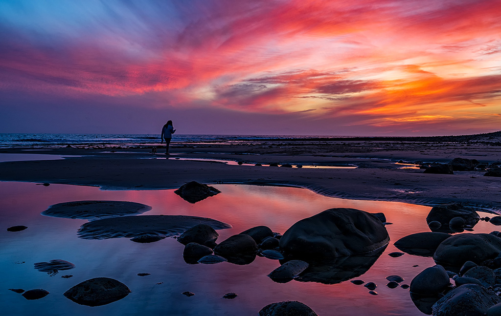
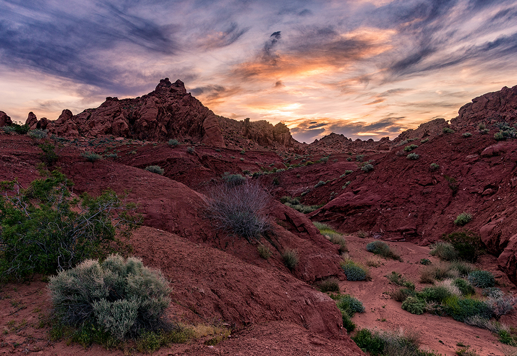
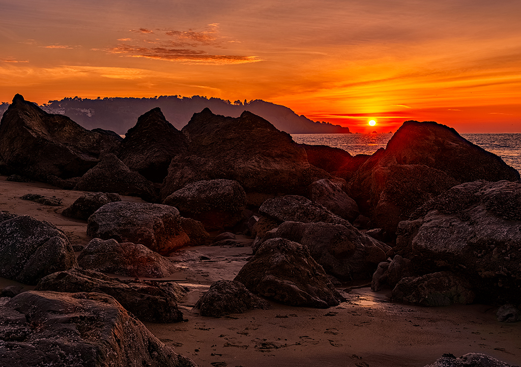
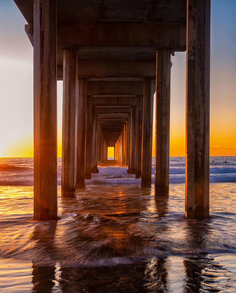
I love this image, but I really think your crop isn't the best. The small sliver of sky takes my eye out of the image.
And, in my opinion, there is way more sand necessary at the bottom of the image. Maybe if you condense the image to the best parts, it would be way more effective. |
Nov 8th |
| 24 |
Nov 19 |
Comment |
I agree with most of what you all are saying. My dilemma is that I can not make any major modifications to this image if I am going to enter it into competition in photojournalism or human interest. |
Nov 8th |
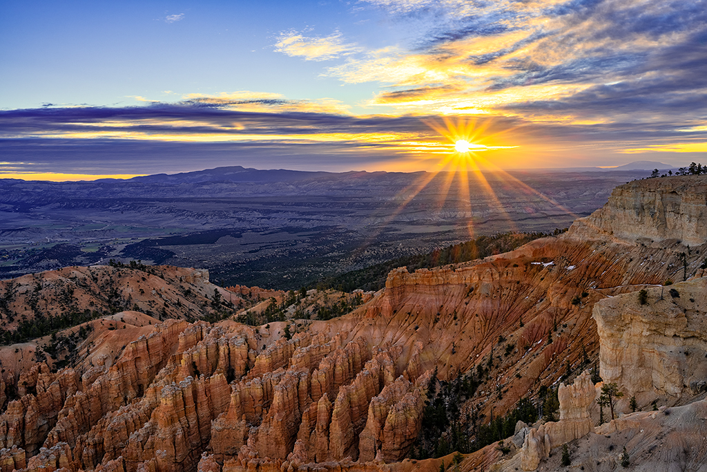
| 24 |
Nov 19 |
Comment |
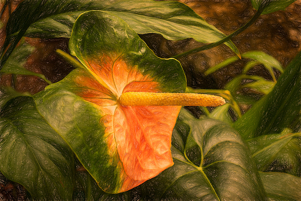
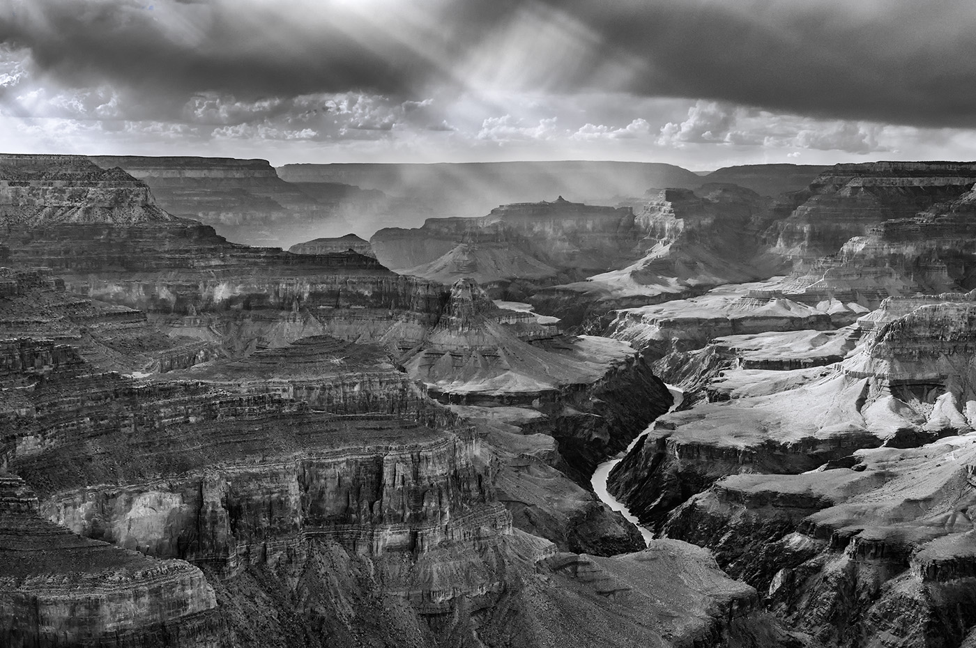
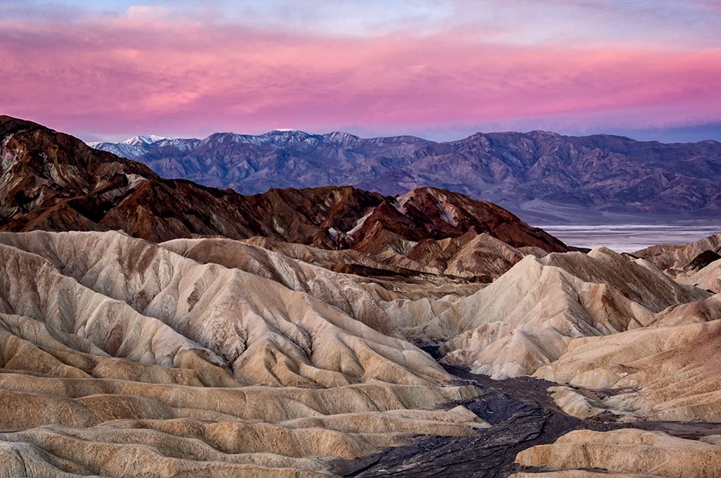
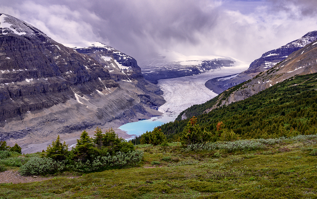
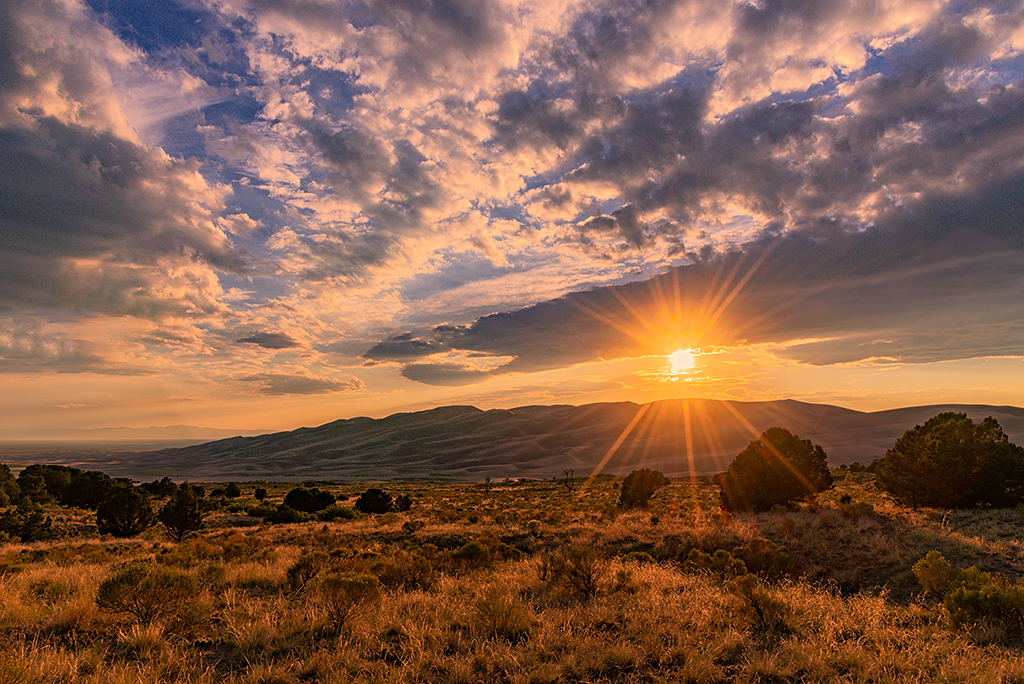
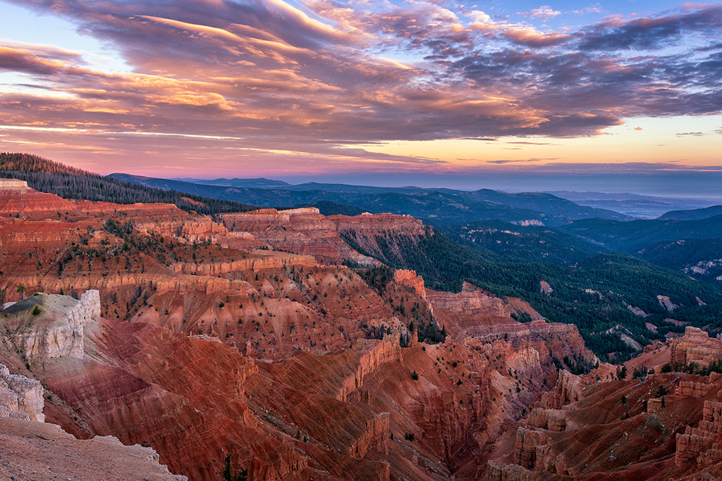
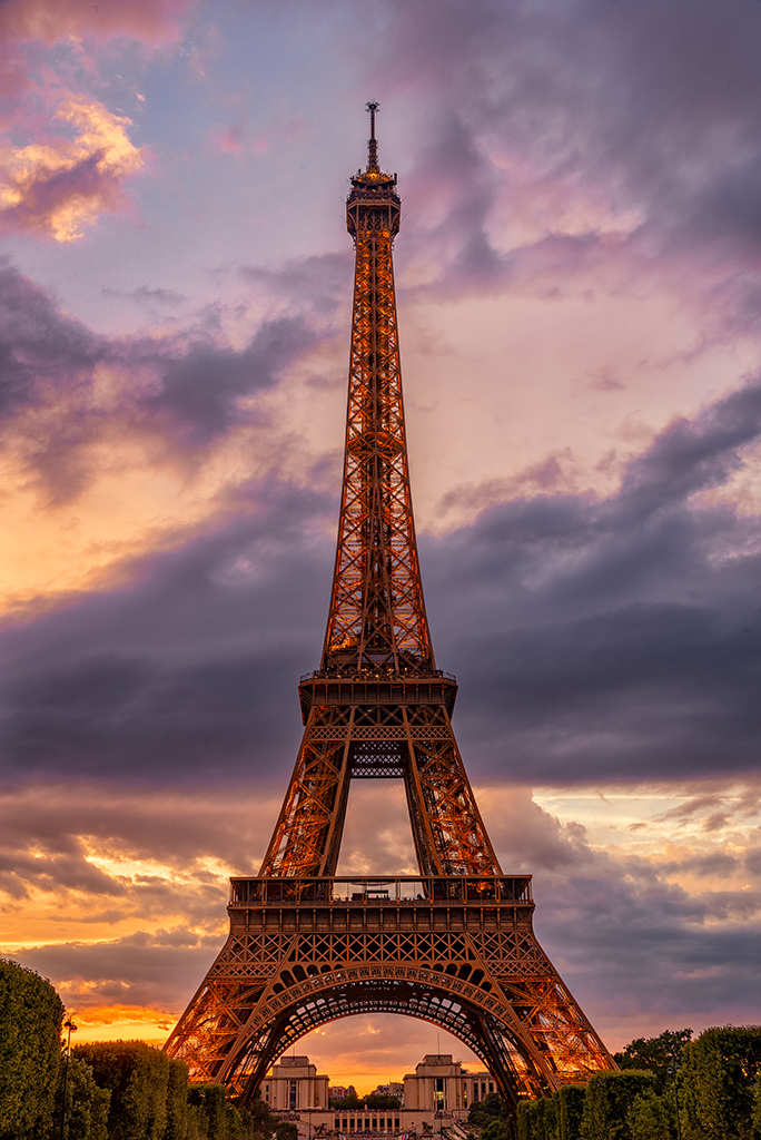
What a great subject. Good eye to see the possibilities here. I do think that you need to make more tonal adjustments. The whites in the clouds still seem blown out,and there are weird banding artifacts around the blue areas on the right that so not seem at all natural. Our adjustments, even if radical, need to appear minimal.
Have you thought about trying this as a black and white image? I suspect it would be way more effective in monochrome. |
Nov 8th |
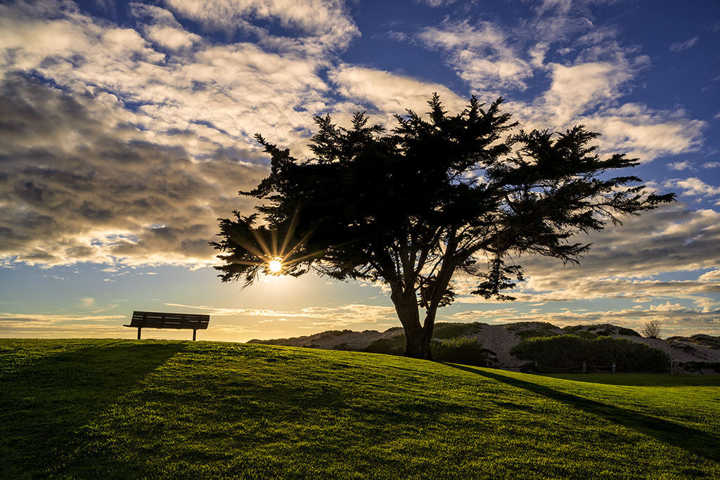
| 24 |
Nov 19 |
Comment |
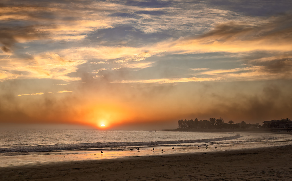
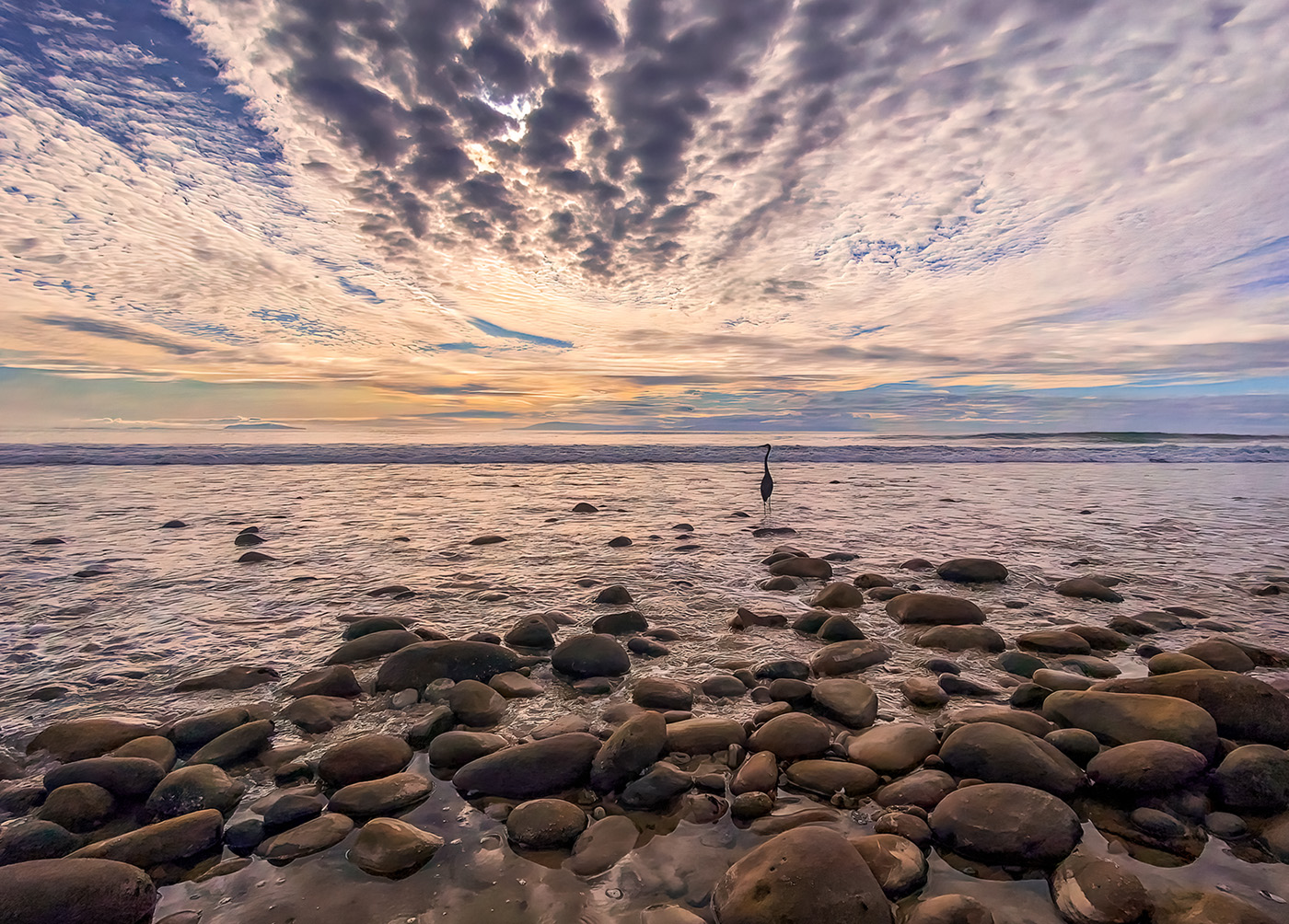
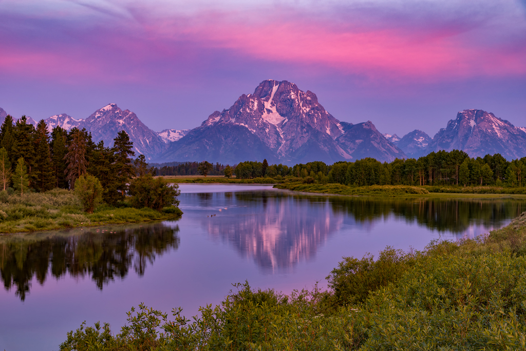
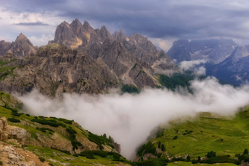
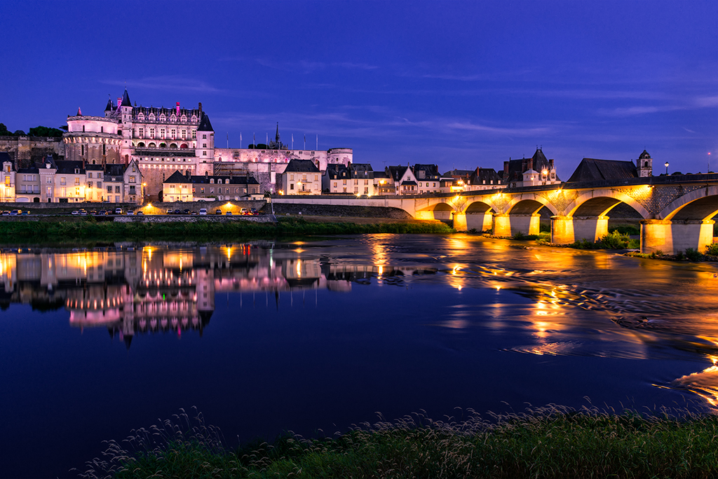
This is a beautiful image. However, I do have some compositional concerns. Half of the image is land, and the other half is sky. That creates a static image. I would suggest playing around with your cropping. Perhaps the sky can be approximately one-third, or the land can be approximately one-third.
The other compositional suggestion I would make is to move your point of interest out of the center of the image. I think you should play with the cropping to see if you can find something that is even more effective. |
Nov 8th |
| 24 |
Nov 19 |
Reply |
Yes, I agree that bright blue should have been cloned out. It bothered me too. I think I just forgot to follow up and do it. Thanks for the remider. |
Nov 1st |
8 comments - 1 reply for Group 24
|
8 comments - 1 reply Total
|