|
| Group |
Round |
C/R |
Comment |
Date |
Image |
| 24 |
Feb 19 |
Comment |
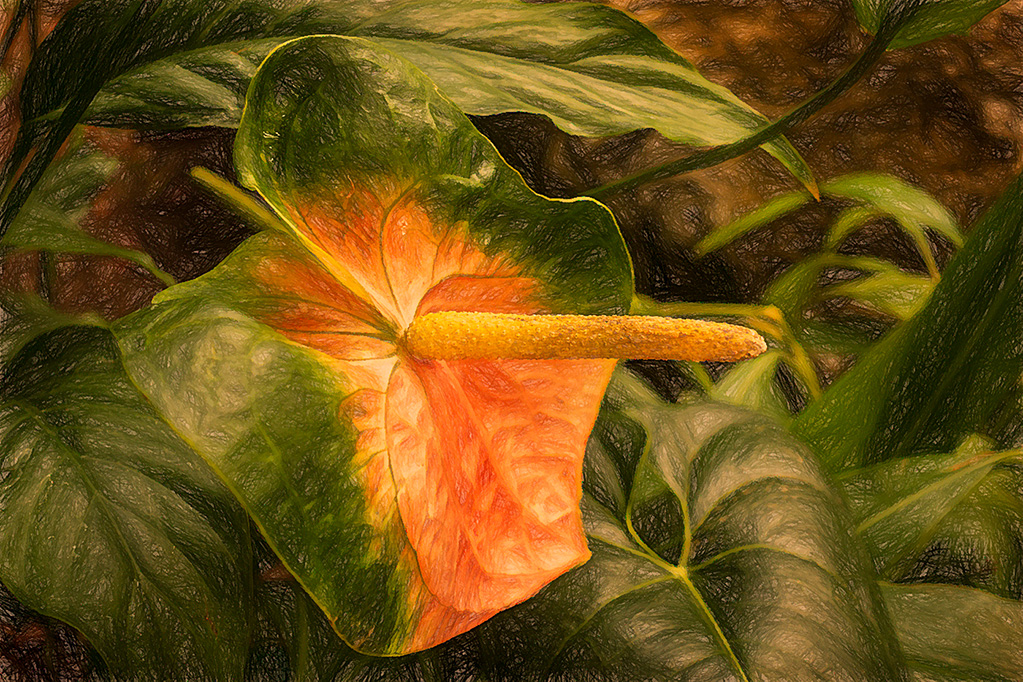
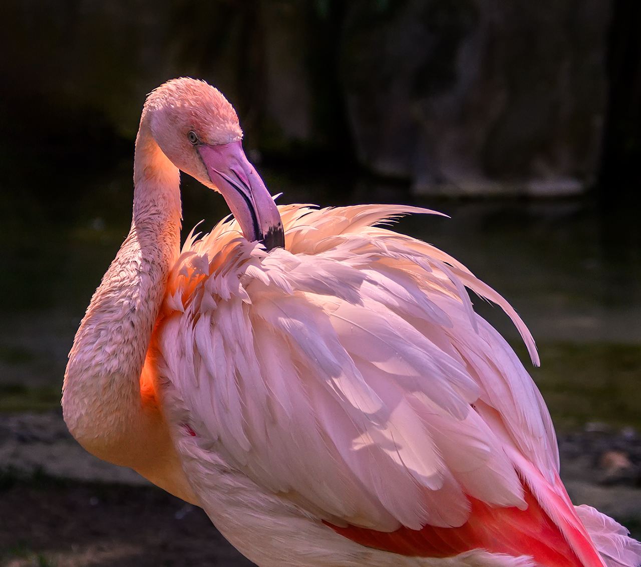
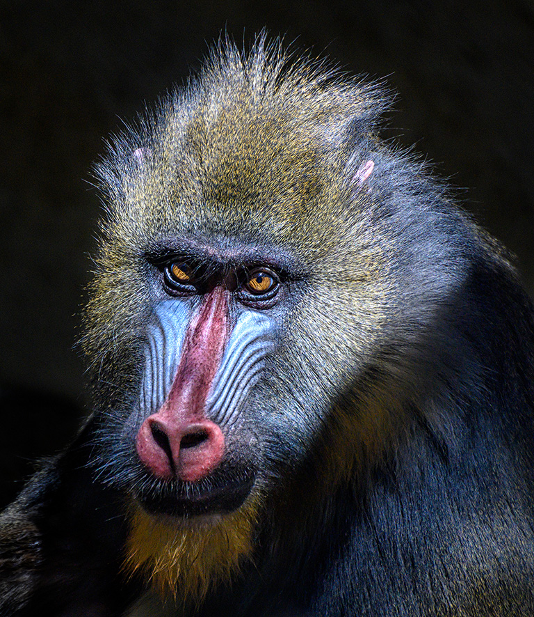
You did a good job catching the light in the eye of the animal in front. I agree that you could expand your crop a little. Have you tried this image in black and white? I might be very effective since there is little natural color in the image. |
Feb 24th |
| 24 |
Feb 19 |
Comment |
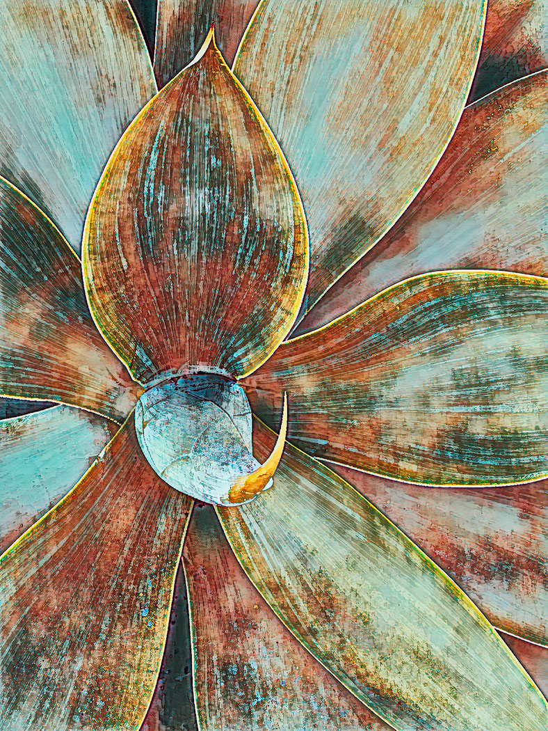
I can't decide whether I like the color or the monochrome version better. Both are effective. I like the way the track leads your eye around and around the image without taking you out of the picture. I agree with Dorinda, the starburst is a bit of a distraction. To me, it kind of stops the natural eye movement created by the circular tracks. |
Feb 24th |
| 24 |
Feb 19 |
Comment |
I like Jim's crop also. However. Using the detail extractor did bring out important details. I personally would like a bit more tonal contrast. The highlights seem a bit muddy to me in Jim's edit. I feel like the original quality of light was lost. |
Feb 24th |
| 24 |
Feb 19 |
Comment |
I prefer this to the one you originally posted. The color seems much better to me. |
Feb 9th |
| 24 |
Feb 19 |
Reply |
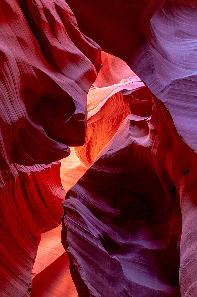
Yes, I did push the color beyond what you would see with your eye at midday. My goal was not to be documentary about what my eye saw, but to use the colors and patterns found in nature to create an original work of art. |
Feb 7th |
| 24 |
Feb 19 |
Comment |
Jim,
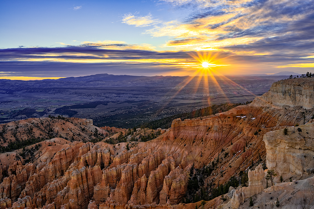
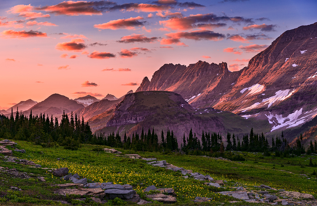
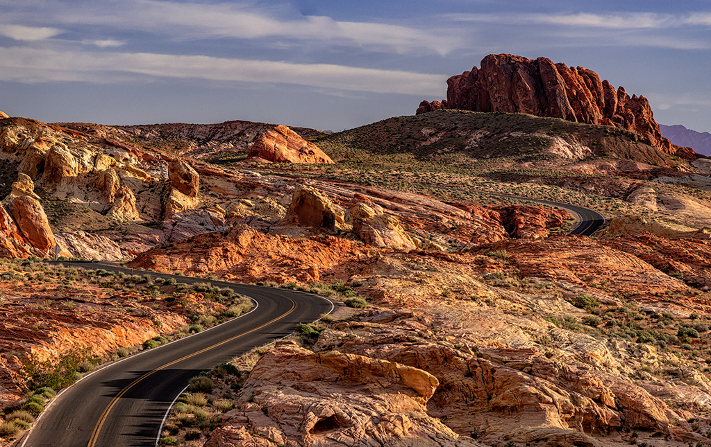
Your crop definitely improved the image. There were a lot of things in the original foreground that were kind of distracting and did not add to the image quality.
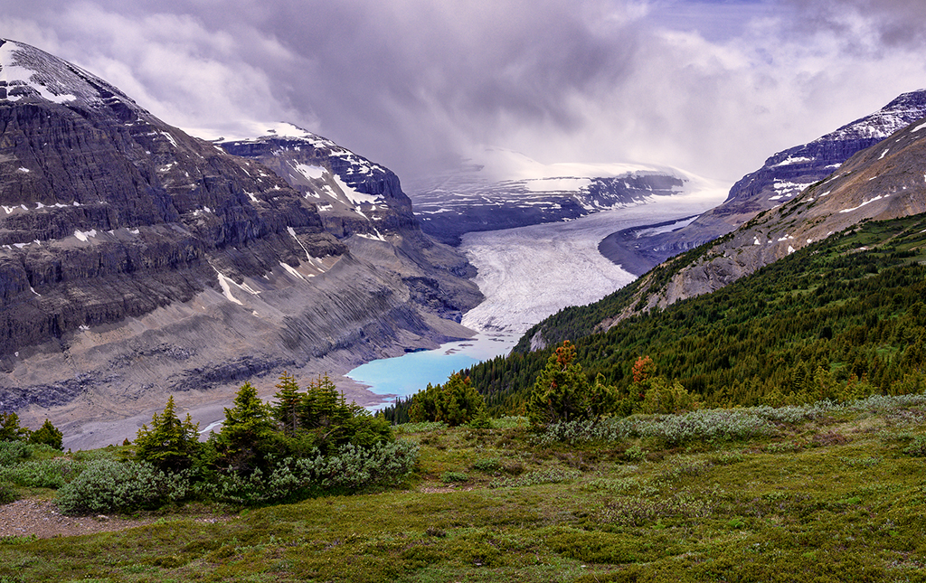
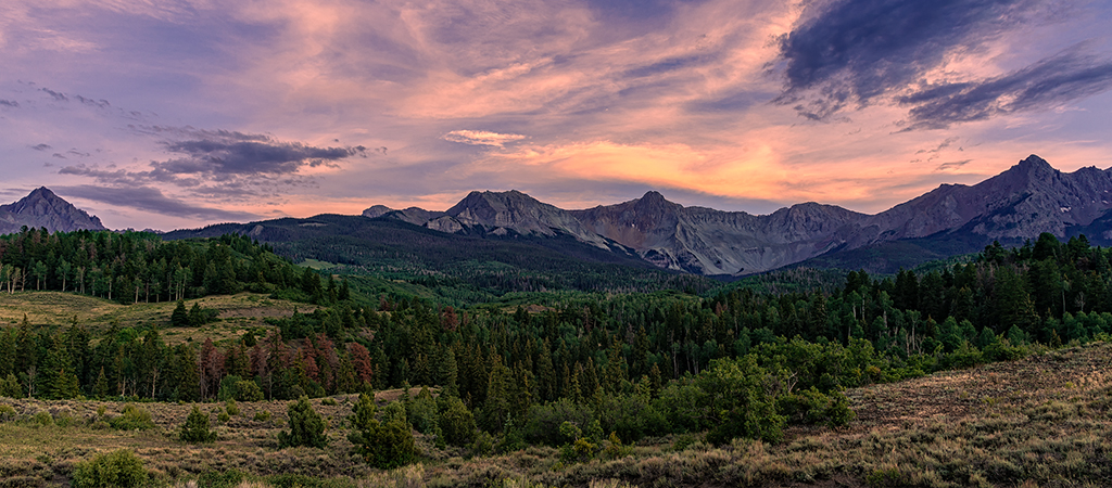
I know your goal was to bring out the yellow. To my eye, the yellow color cast on this image seems a little overbearing, especially in the clouds. I know downsizing for this format creates some problems. You do have a significant halo along the edge of the mountains where they join the sky. You can get rid of the halo by creating a blank layer set to darken mode. Then use the clone stamp along the edge where the sky and mountains meet. |
Feb 7th |
| 24 |
Feb 19 |
Comment |
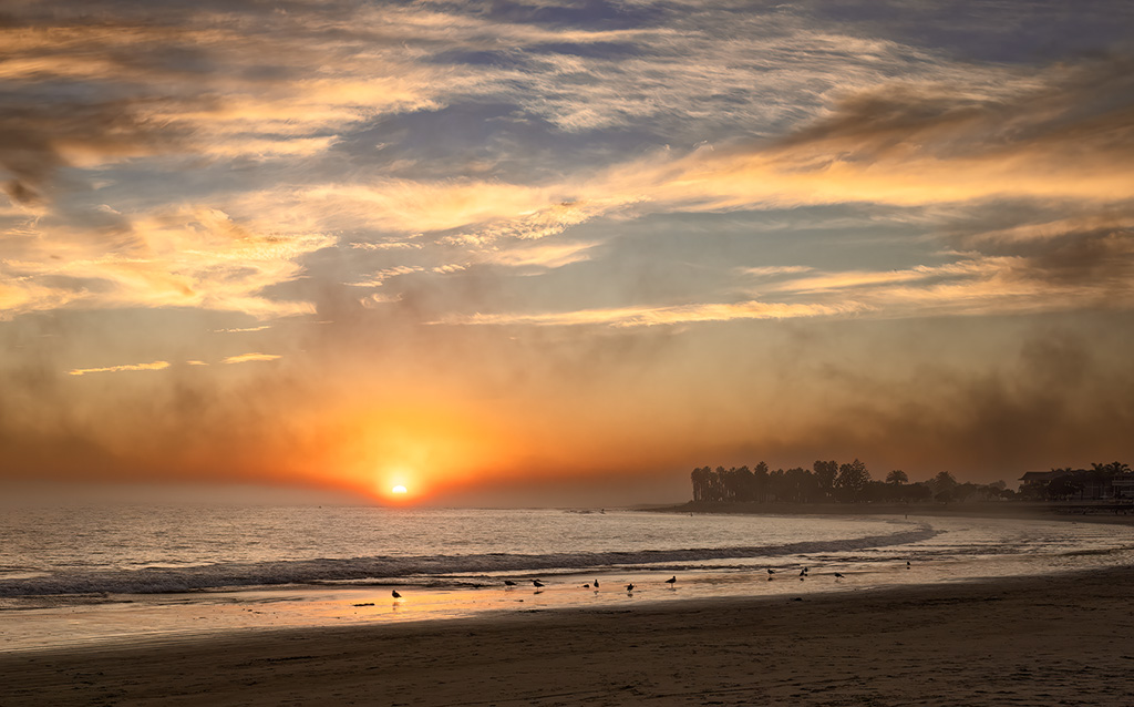
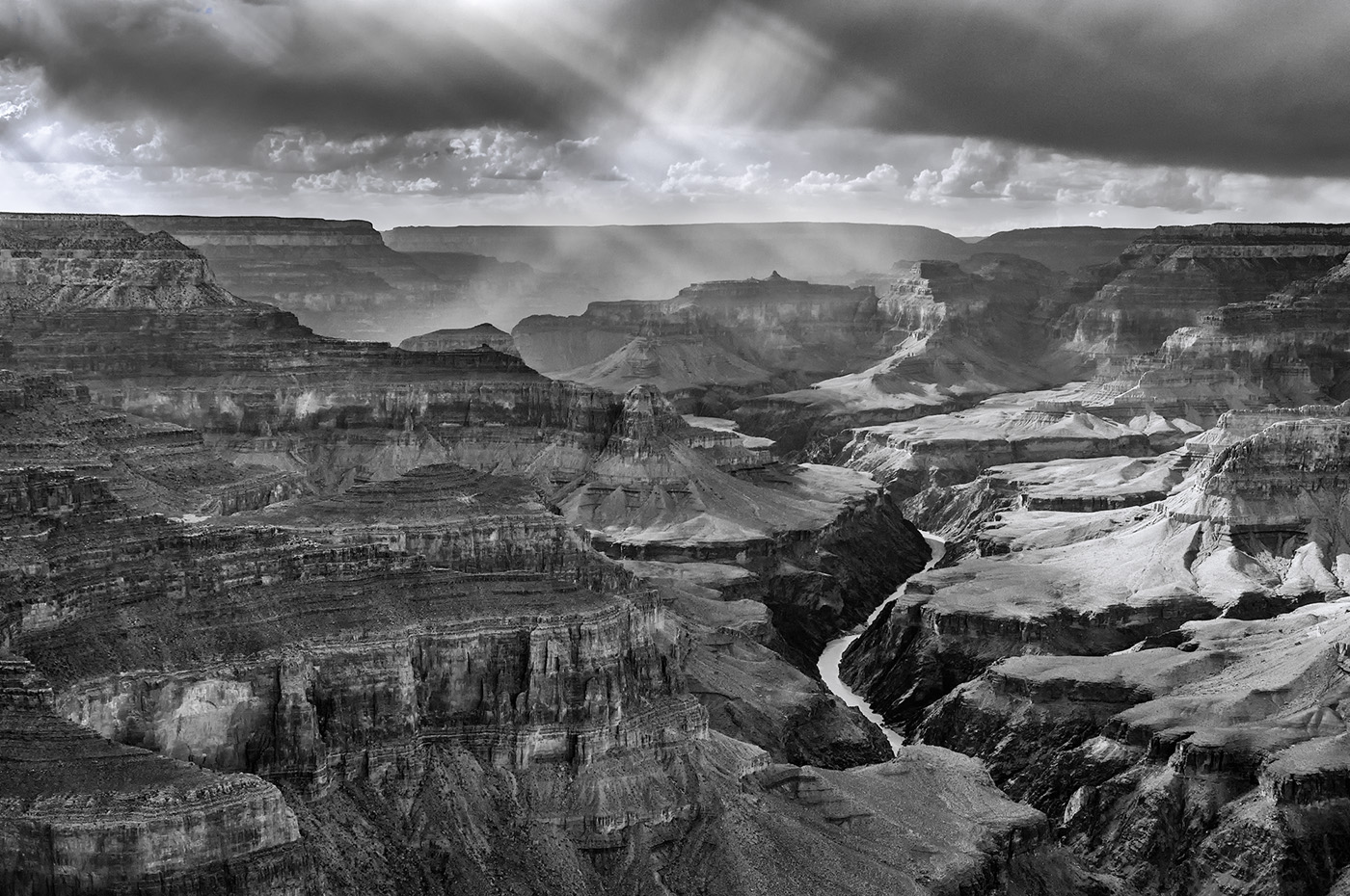
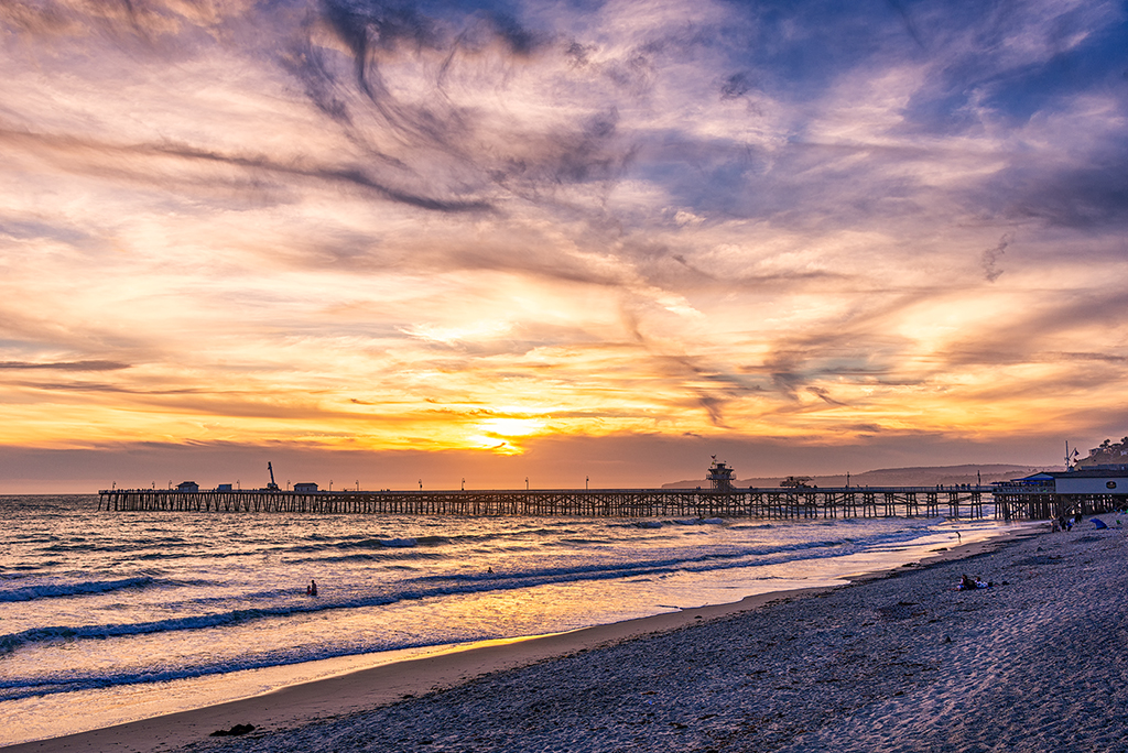
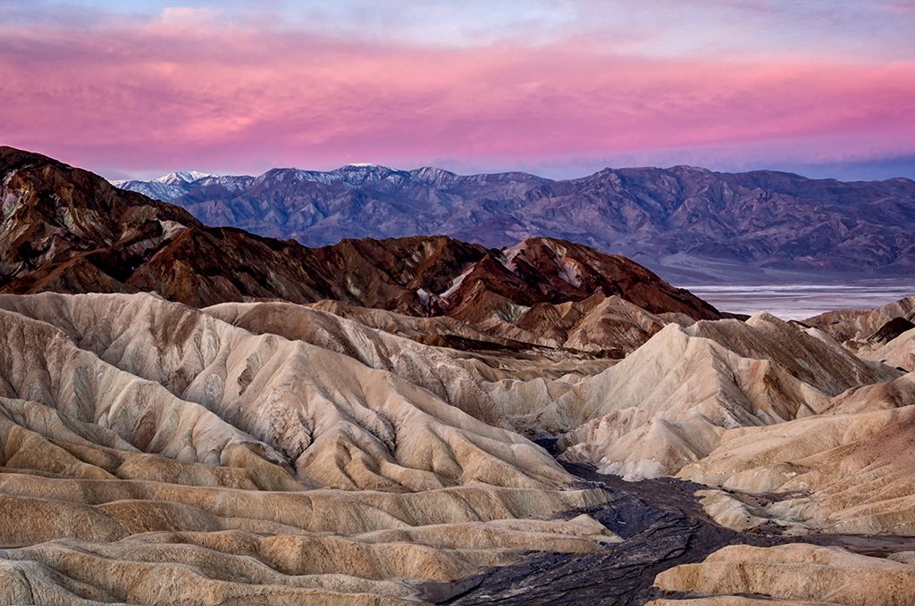
You did capture some vibrant sun rays. For my taste, the overall color tones are nice. You didn't say whether or not you did any post processing at all.
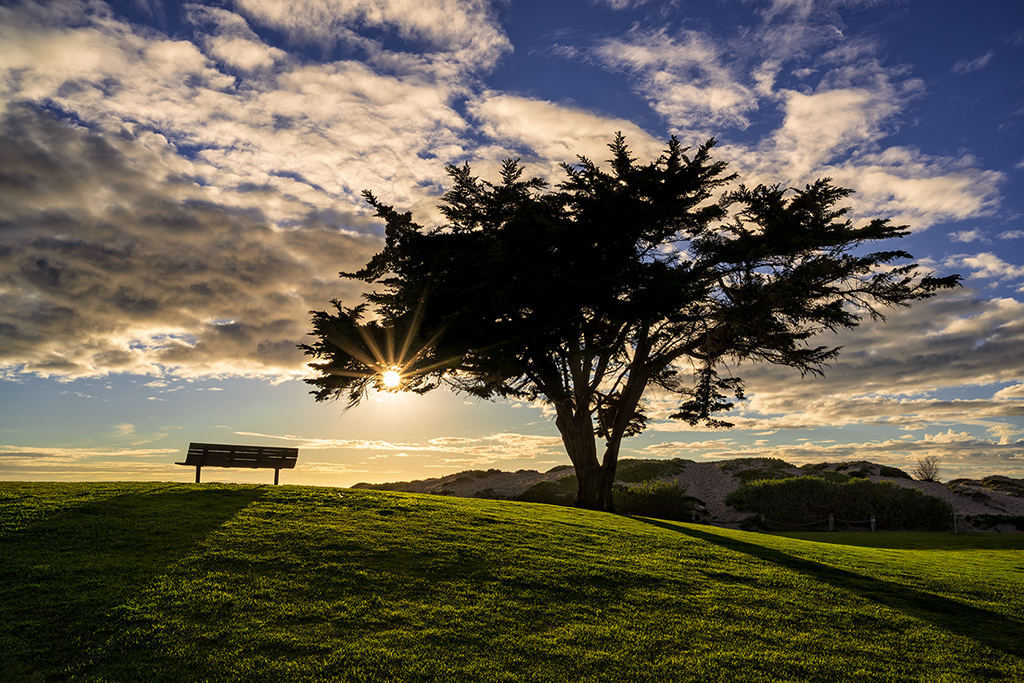
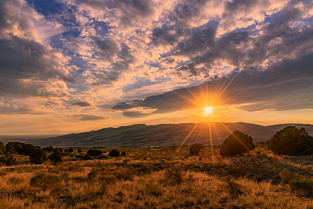
I agree with Jim that the image needs to be straightened since the horizon appears tilted. You might want to consider bringing down the brightest highlights and lightening the darkest shadows a bit. I would also consider adding a curves or levels layer to the sky using multiply mode which will darken the sky but still allow you to adjust the highlights and shadows to increase the contrast making the sun rays more prominent. |
Feb 7th |
| 24 |
Feb 19 |
Comment |
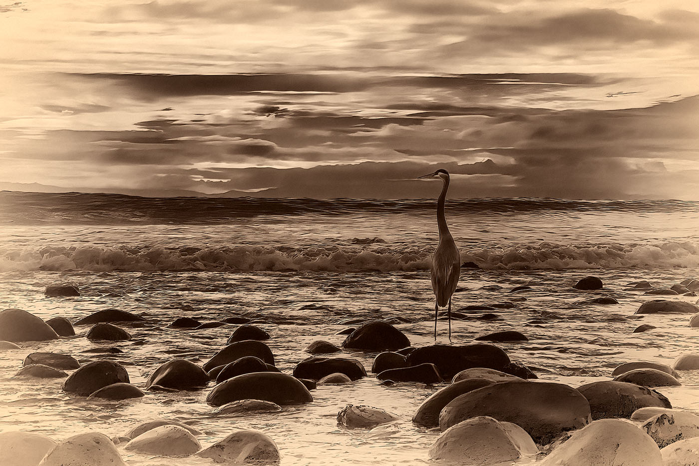
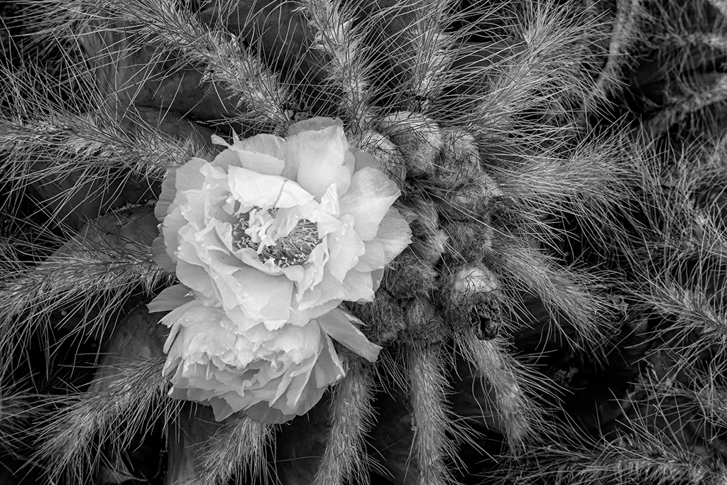
I am really liking this image. I feel like black and white was a good choice, or at least going monochrome. The original image is almost monochrome. I can't tell, but I wonder how this image would look in sepia tones rather than black and white. It might not work at all, but it might be very successful. You might consider playing around with monochrome in shades other than black and white.
I'm impressed with your wall, very creative. To my eye, the window wall provides a dynamic but not overwhelming background. Although lines and intersections are not really on lines of thirds, in my opinion, this does not detract from the image at all. The image feels visually balanced to me. Nothing is centered so a static feel is not created.
The highlighted edges of the window frame could potentially lead the eye out of the top of the image. However, for me, my eye goes up the left vertical line, comes down the right vertical line, then moves across the table to the lighted side of the vase. Then the circular motion of my eye repeats again.
In my opinion....well done! |
Feb 7th |
7 comments - 1 reply for Group 24
|
7 comments - 1 reply Total
|