|
| Group |
Round |
C/R |
Comment |
Date |
Image |
| 24 |
Jul 20 |
Reply |
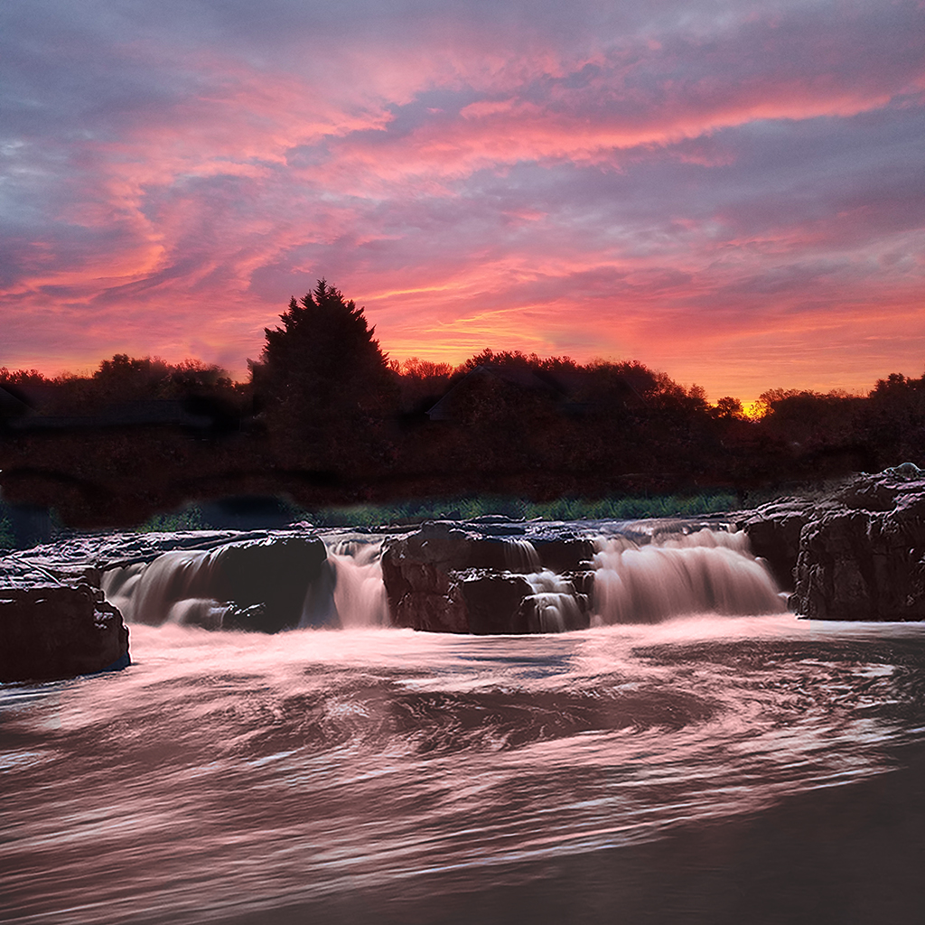
Laura, is this better? follow the comments to Sam below. Jim |
Jul 23rd |
 |
| 24 |
Jul 20 |
Reply |
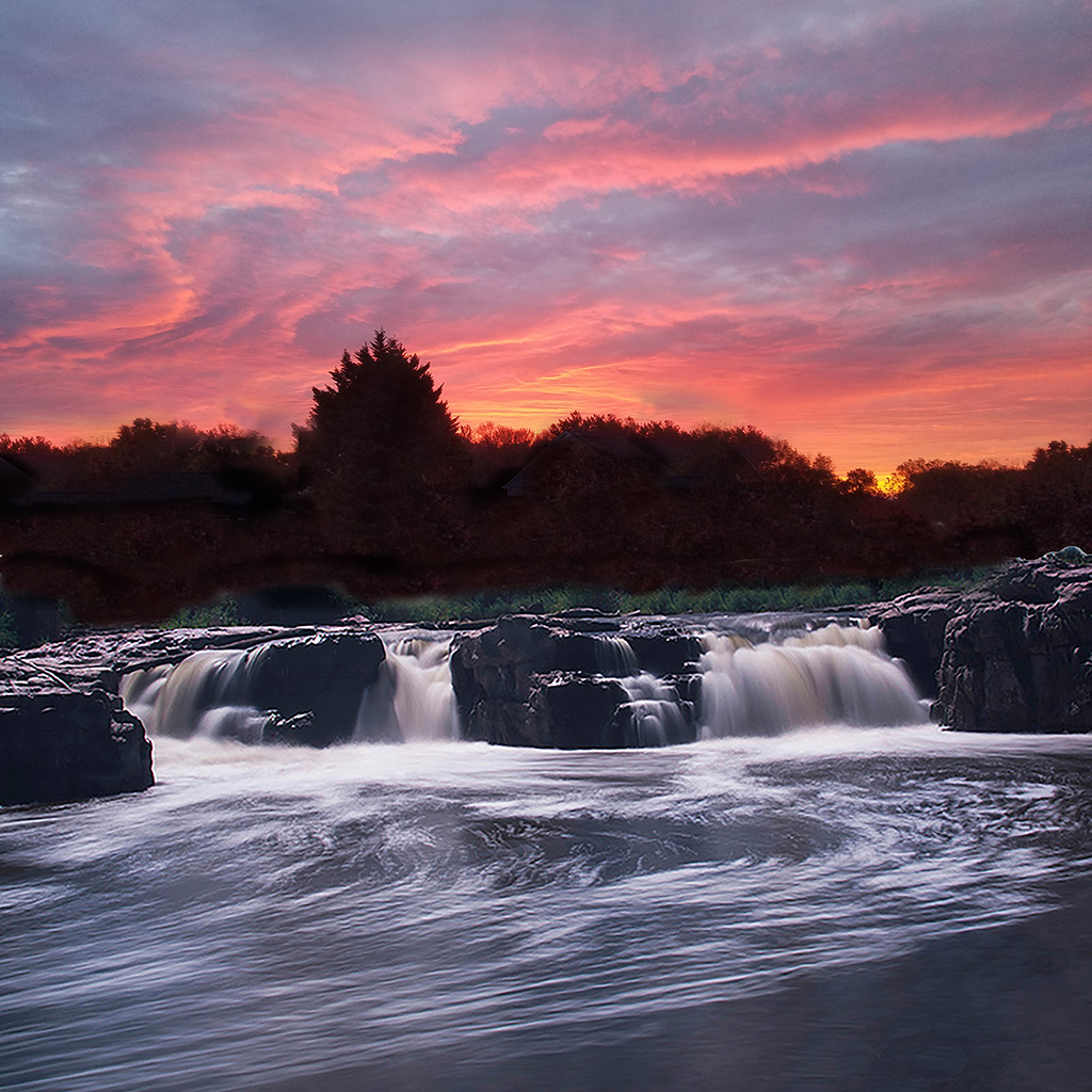
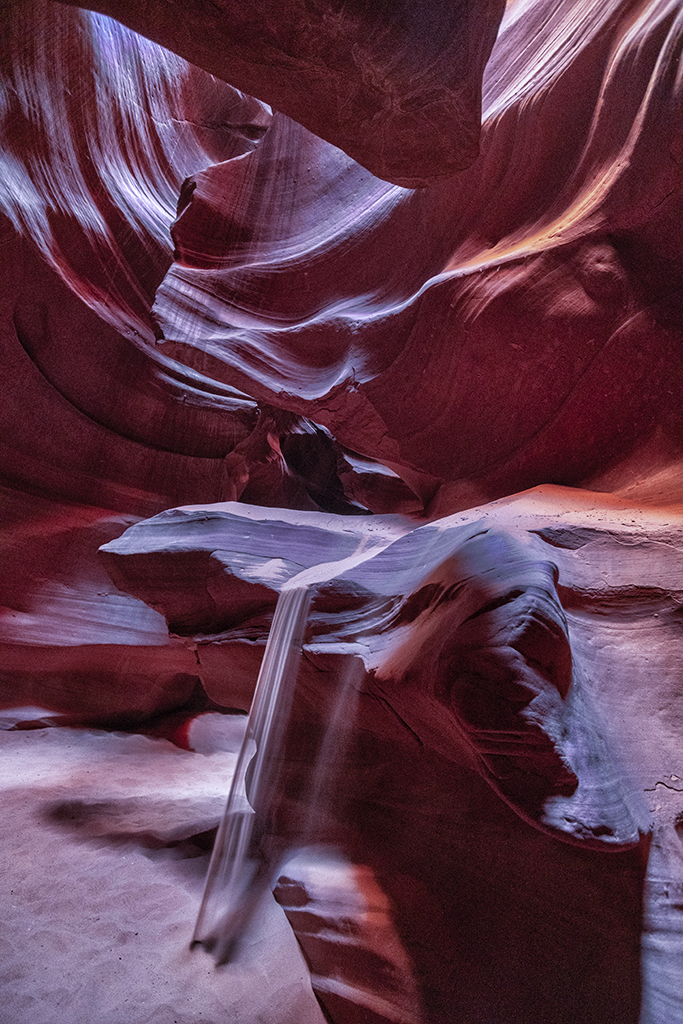
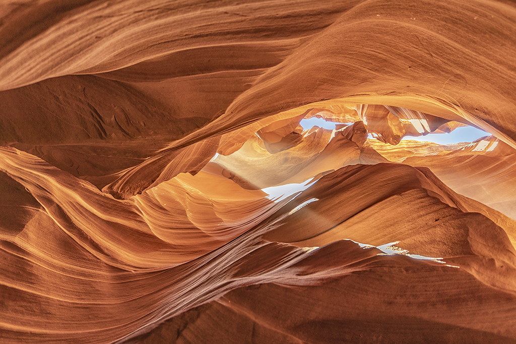
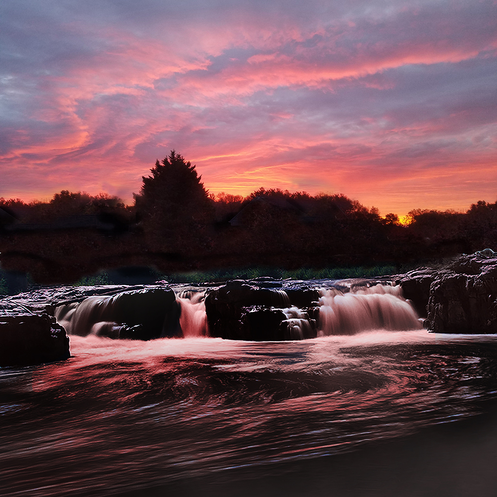
Sam, I realize that I am working with lighting that would not exist. Sioux Falls was taken facing to the south west. The sunrise was taken facing to the east. As for inverting the sky to make it a waterfall, I think it would be too difficult to make it look like a natural waterfall.
I think that what it needed was to correct the sunlight direction, making it darker as if it was in shadow with sunrise back-lighting it. Tell me what you think of this edit. Jim |
Jul 23rd |
 |
| 24 |
Jul 20 |
Reply |
Sam, Laura made the same suggestion. Here it is. Jim |
Jul 17th |
 |
| 24 |
Jul 20 |
Reply |
Laura, I experimented with ways to add the sunrise color. I did color replacement tool (white to light peach), adjustment layer > exposure > darken, gamma and offset. Let me know what you think. Jim |
Jul 17th |
 |
| 24 |
Jul 20 |
Reply |
Sam,
I've tried several methods (because I don't know how to do it the right way) and have not had results that I like. I want to get the white of the waterfalls a light shade of peach, but the peach shade keeps showing up in the gray areas around the white streaks. Do you have any experience with solving this problem?
Jim |
Jul 9th |
| 24 |
Jul 20 |
Reply |
Tab, thank you for sending the earlier original. I have replaced it with Original 2.
Regarding the differences between the prime original and your main photo, I see how you made the photo brighter and warmer.
You were very successful in getting the foreground and distance in sharp focus. Well done. I see more detail in your finished photo.
One difference in how we see your photos is I have installed Spyder 5 Pro which re-calibrates the color graphics card in my laptop each time I turn it on. Jim |
Jul 5th |
| 24 |
Jul 20 |
Comment |
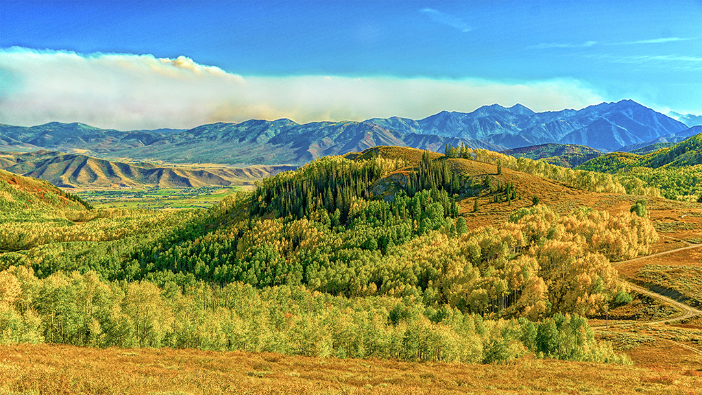
Tab, I like your composition, leading from snow capped mountains to the spectacular falls. Your decision to not use a neutral density filter for long exposure was probably the right choice because you might have "ghosted" the hikers into blurs. If you go back to get that milky long exposure of the falls, you'll have wait for all hikers to leave or stand still enjoying the view for 4 seconds or so.
To me, the original seems richer in color saturation and sharper detail on the mountain and rocks. Jim |
Jul 4th |
| 24 |
Jul 20 |
Comment |
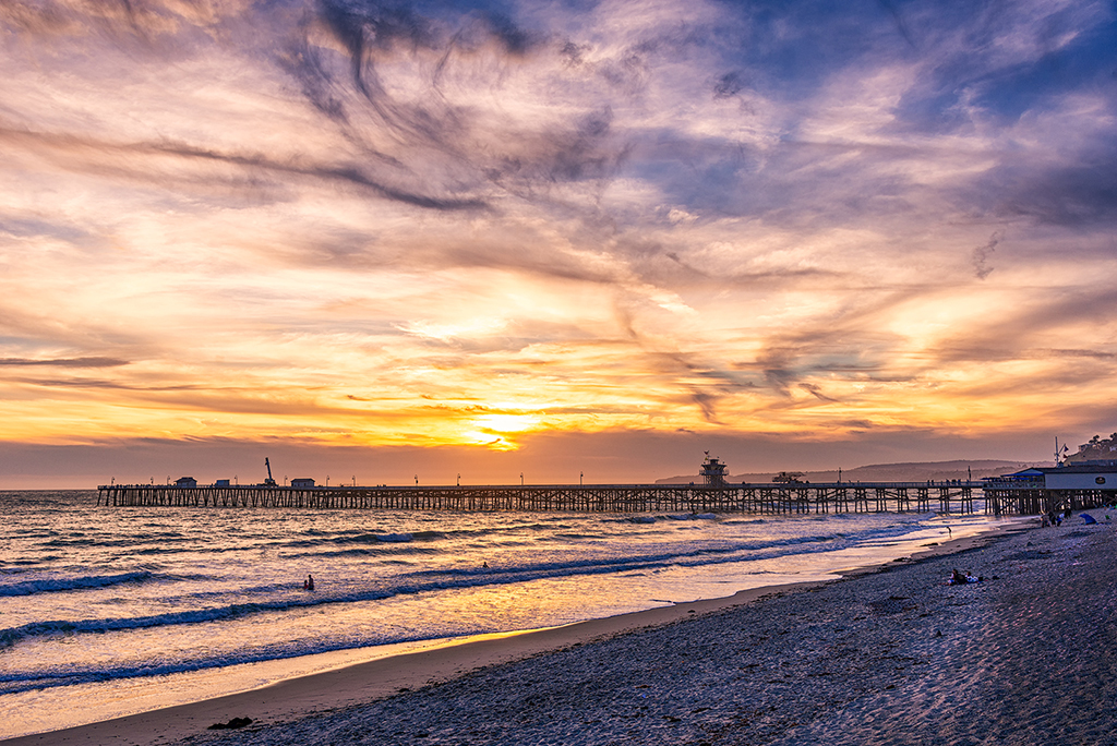
Laura, you brought out the best of in color saturation. I do like the details in the clouds. There is a streak of highlights in the beach which is distracting because it leads right off the right side. I would burn the highlights at the edge and let the highlight on the beach make a left turn to point to the person laying down. |
Jul 4th |
 |
| 24 |
Jul 20 |
Comment |
Sam, I like how the giraffes are criss crossed and how the half-eaten tree has the contour of the shorter giraffe. One improvement to attempt is to use the dodge tool to lighten the shadow on the shorter giraffe along the neck along the hairline of the mane. I might crop off 10% of the image on the left side because it does not add anything. It's not like you need space for the giraffes to move - they're not moving. It looks like they'll be doing this for a while. Jim |
Jul 4th |
| 24 |
Jul 20 |
Comment |
Donna, the colors at sunset are rich and grab our attention. I think there's more detail in the seeds that would show up if you sharpened the image in post-processing. You might also try the contrast/brightness also to see if that brings out more texture. Jim |
Jul 4th |
| 24 |
Jul 20 |
Reply |
Laura, thank you for your ideas. I started over again, this time I cloned trees from the sunrise to replace the houses. Then I erased the trees with blue sky showing through.
I did try to blend, luminosity and darken and the color replacement brush pale pink for white. I didn't like the results. |
Jul 4th |
4 comments - 7 replies for Group 24
|
4 comments - 7 replies Total
|