|
| Group |
Round |
C/R |
Comment |
Date |
Image |
| 39 |
Oct 24 |
Comment |
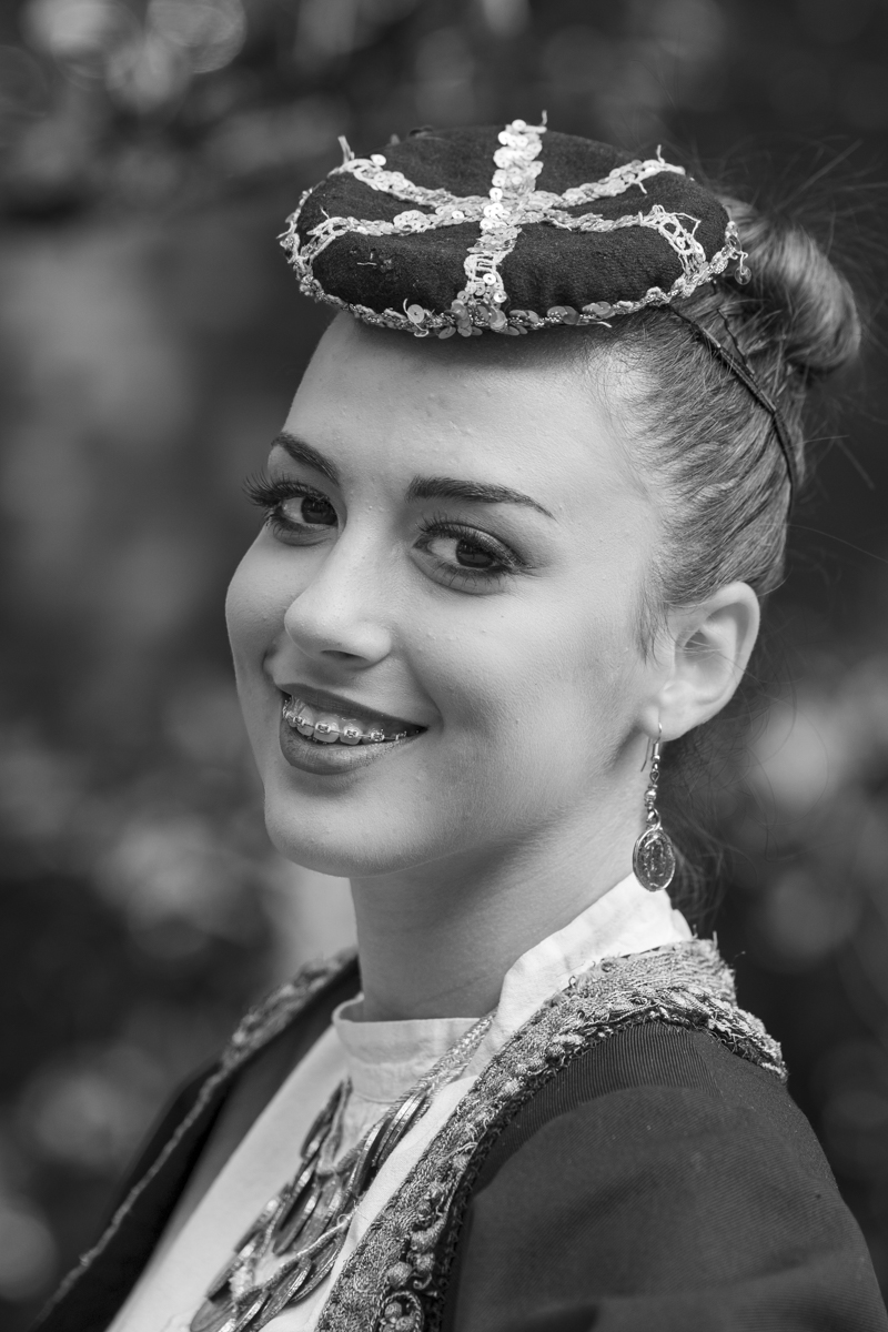
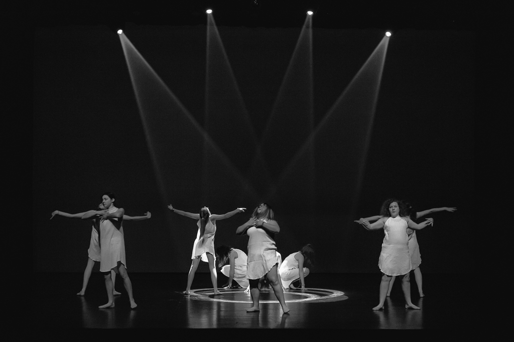
Three faces and six eyes. Job well done.
This is almost a portait photo. The texture in the wool is present.
Are they calling for help???? |
Oct 16th |
| 39 |
Oct 24 |
Comment |
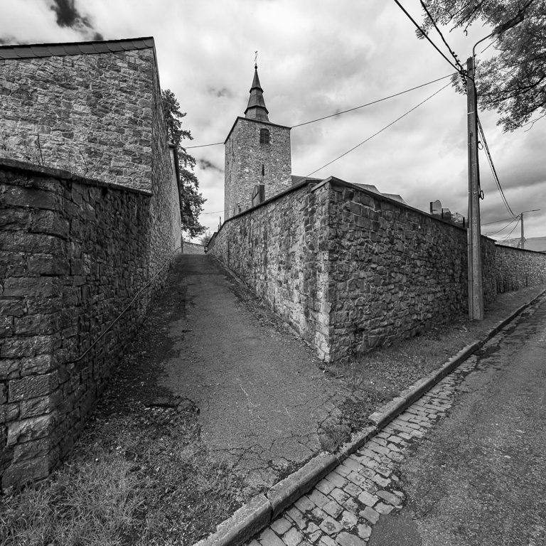
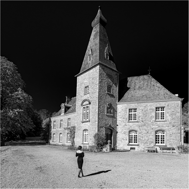
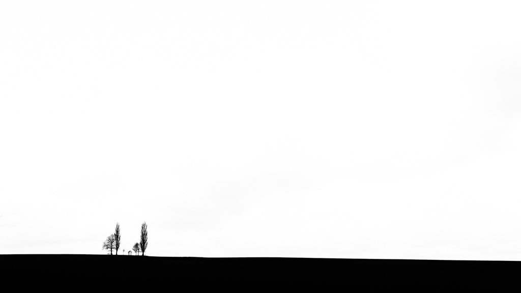
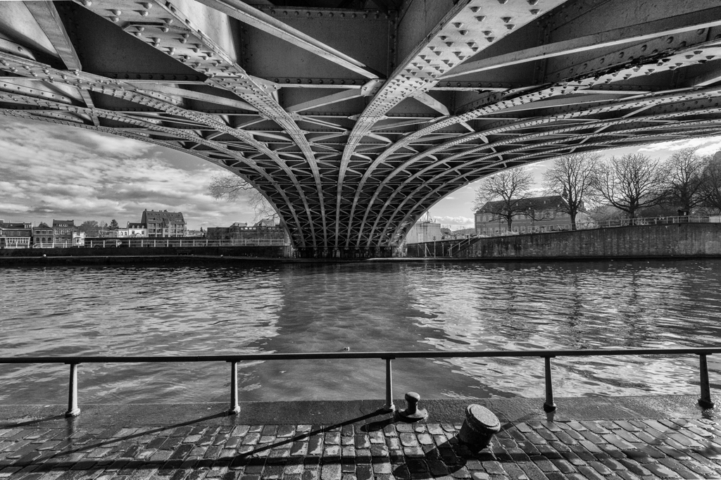
The colors has a path, a way to the building at the end. I like it.
However the B&W version is much stronger. Good choice of the square format. I really like it. I like the balance between the building at the end and the luminaire (light fixture) on the right, next to the banks, the only one with the "bulb in the sky", which makes it more visible.
Good idea to remove the 2 shadows on the left. The white building on the right draws the attention, indeed. |
Oct 16th |
| 39 |
Oct 24 |
Reply |
Good eyes Paul dor the 2 bottom corners...
When you have seen them, your eyes are attracted by them...
I will try to light them, without cropping to keep the subject on a strong point. |
Oct 16th |
| 39 |
Oct 24 |
Reply |
Thanks David.
I will try with less contrast. |
Oct 16th |
| 39 |
Oct 24 |
Comment |
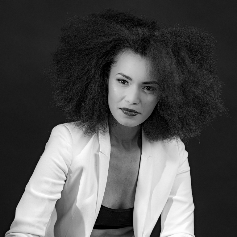
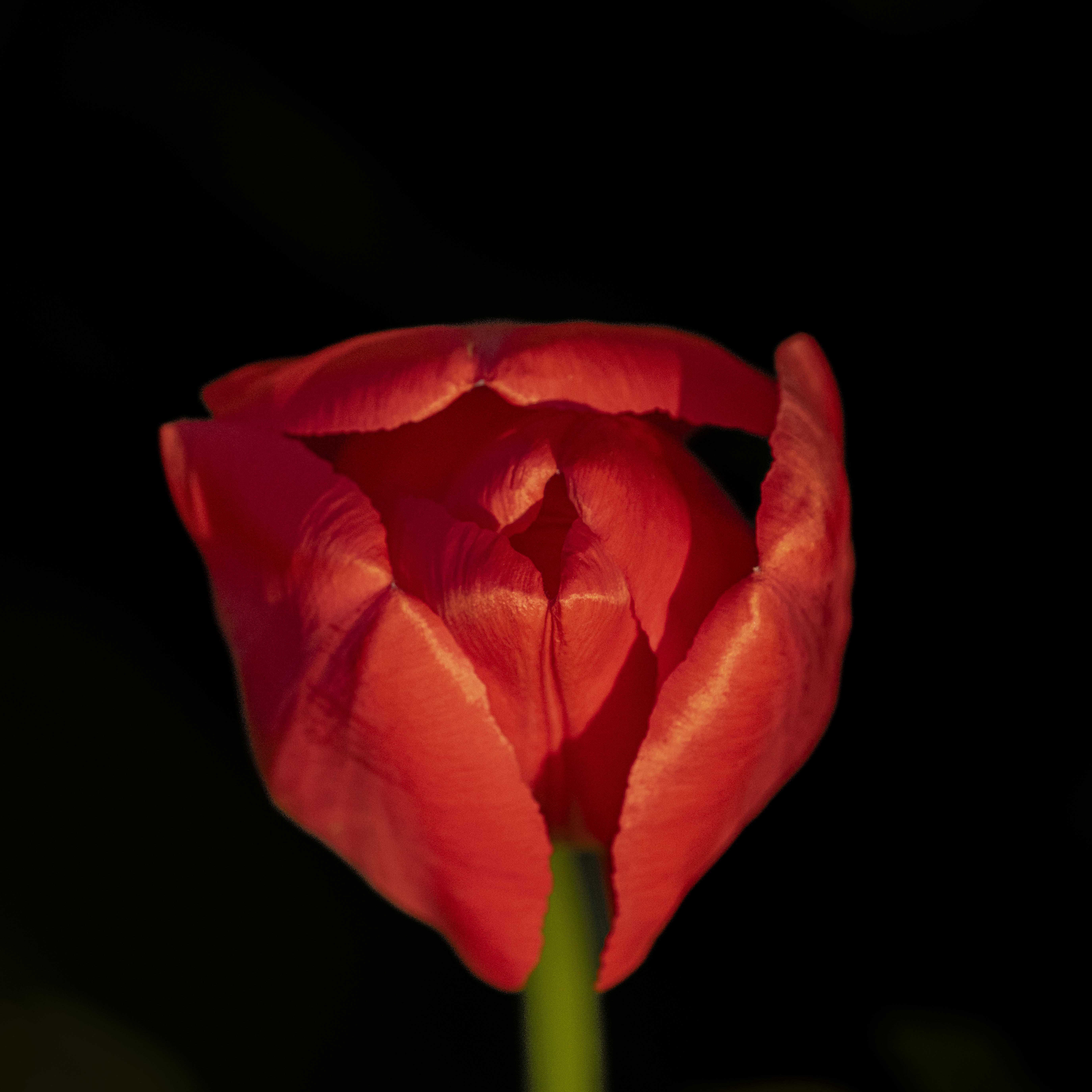
I think everything is already written...
Good conversion B&W, as in colors the red color attracts. Not the only reason, the conversion is well done, the subject is well highlighted.
We can imagine a story by the face of the fisherman.
With or without more space on the light, is different. I think here the focus has to be on the fisherman and his boat, not on the seascape. I like it. |
Oct 16th |
| 39 |
Oct 24 |
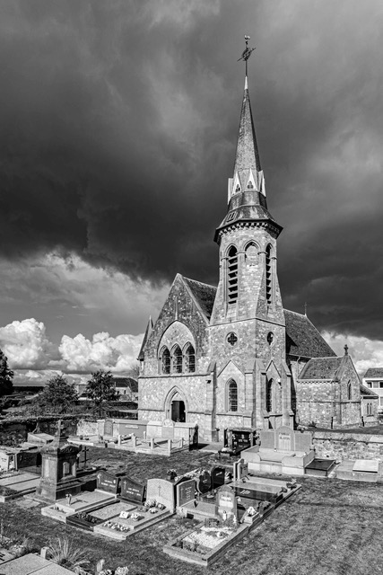
Comment |
Indeed a beautiful place to visit and to rest.
"To go to the point" with my personal opinion, this is an interesting subject, but the picture of your iPhone is not the best it has already taken. I think for two reasons: upper part is too dark and the lack of texture in the vegetation. Just a personal opinion.
However, well done for the composition, path and banks, and the lines and elements directing to the bells. |
Oct 13th |
| 39 |
Oct 24 |
Comment |
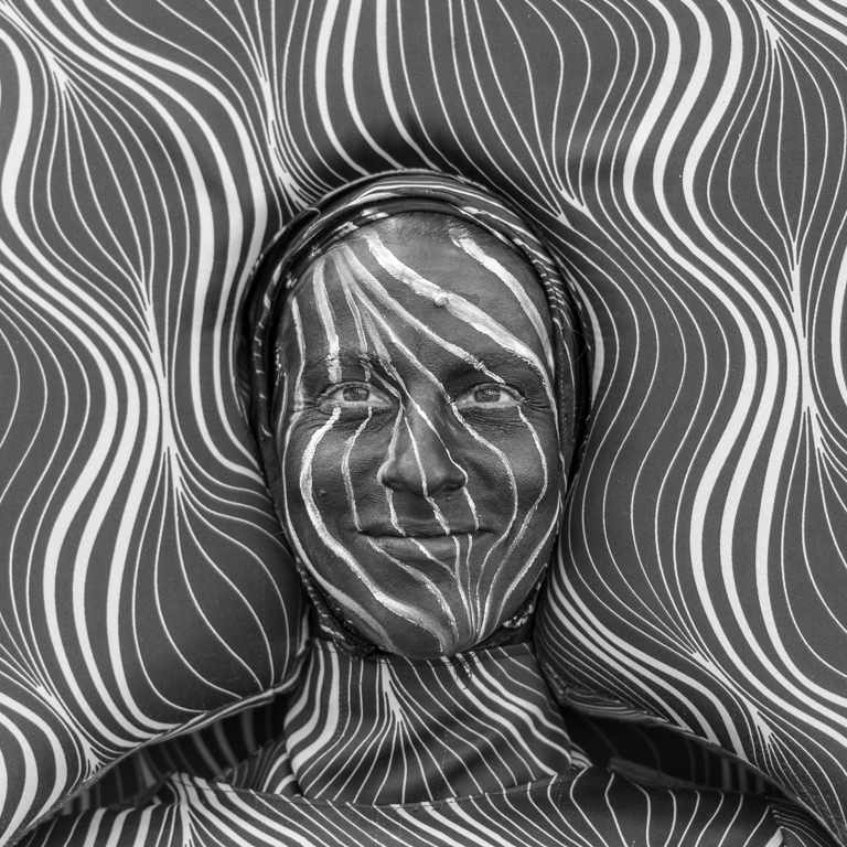
We don't have these wild animals in Belgium, so thanks to share this really beautiful picture. There were millions...
At the right time at the "right" place... to have a beautiful picture and emotion.... Perfect processing. As mentioned by David, to have both eyes is a bonus. |
Oct 13th |
| 39 |
Oct 24 |
Comment |
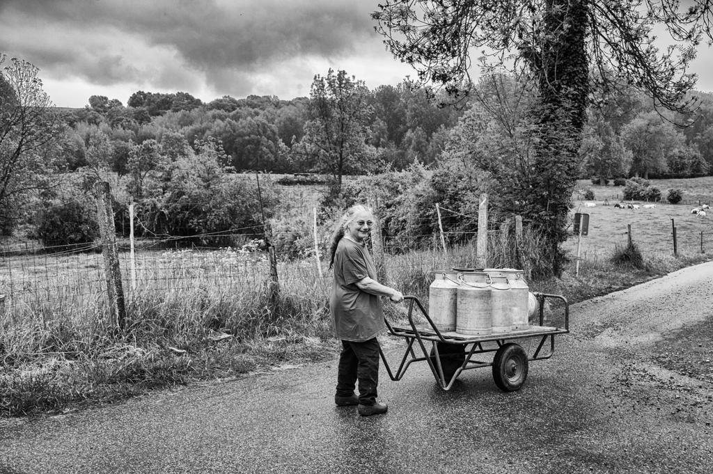
This is my youth (some years ago...) in Belgium, but with smaller tractors, machines and farmlands. We forked the bales onto the wagon. Beautiful souvenirs... Thanks David.
Good conversion in B&W (removing of the disturbing element, ...) and processing of the light, as already mentioned by Jerry & Diane. |
Oct 13th |
6 comments - 2 replies for Group 39
|
| 75 |
Oct 24 |
Reply |
With pleasure Murphy.
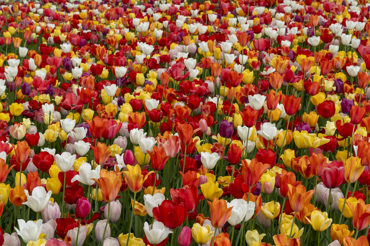
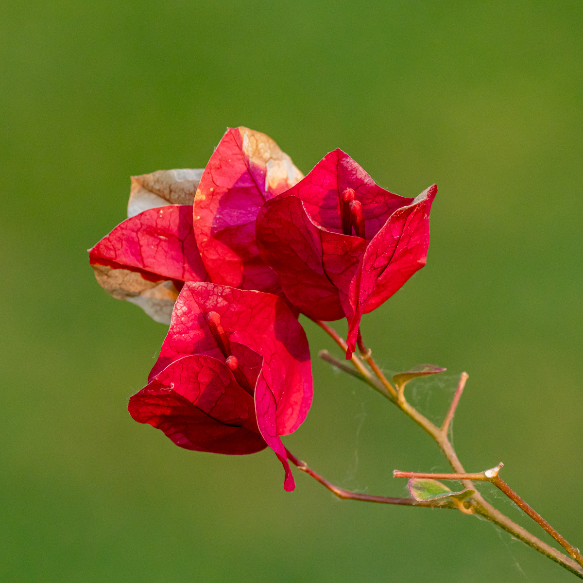
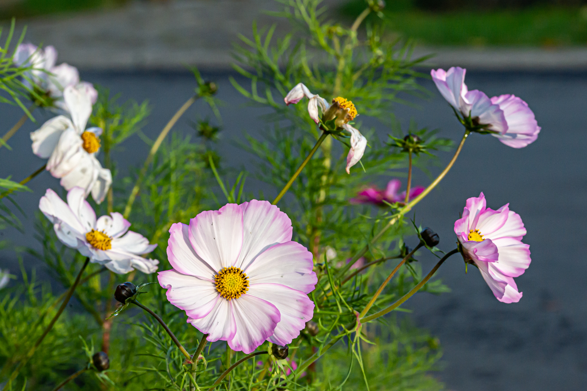
What I tried to explain it is that I see the picture and the distribution of flowers on the 2 ways, namely:
1. Vertical "groups" of two, 5 times (groups) of the 2 flowers, of
2. the 2 red flowers on the left, and after a kind of circle composed by the 8 remaining flowers.
I see more second description.
|
Oct 27th |
| 75 |
Oct 24 |
Comment |
All the process you have described (preparation, picture and cleaning) takes time.
As you mentioned, there is some vignetting in excess. For the rest, I can only applaud. |
Oct 19th |
| 75 |
Oct 24 |
Reply |
Always interesting and surprising to read how you have created your picture. |
Oct 19th |
| 75 |
Oct 24 |
Comment |
Both versions are indeed interesting.
However The B&W one is "more finished", see the stem in the lower left-hand corner.
The 'floating" stamen are intriguing and raise questions, so there are interesting.
As usual, job well done Ray. |
Oct 19th |
| 75 |
Oct 24 |
Comment |
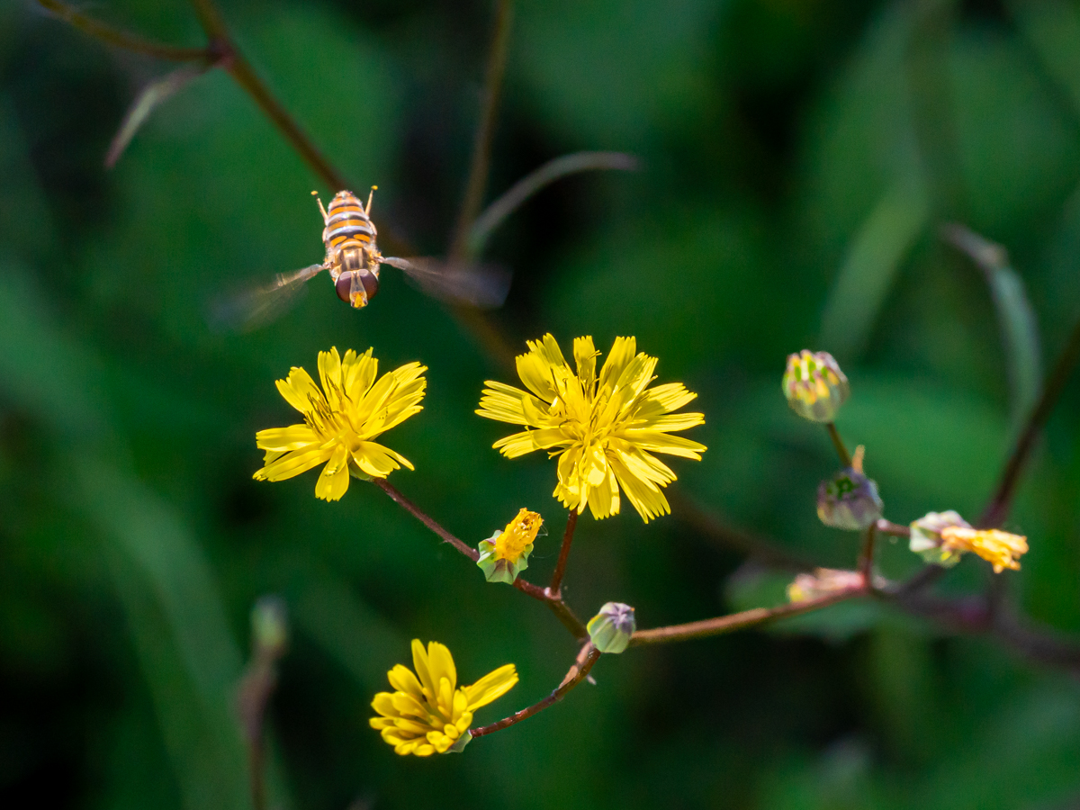
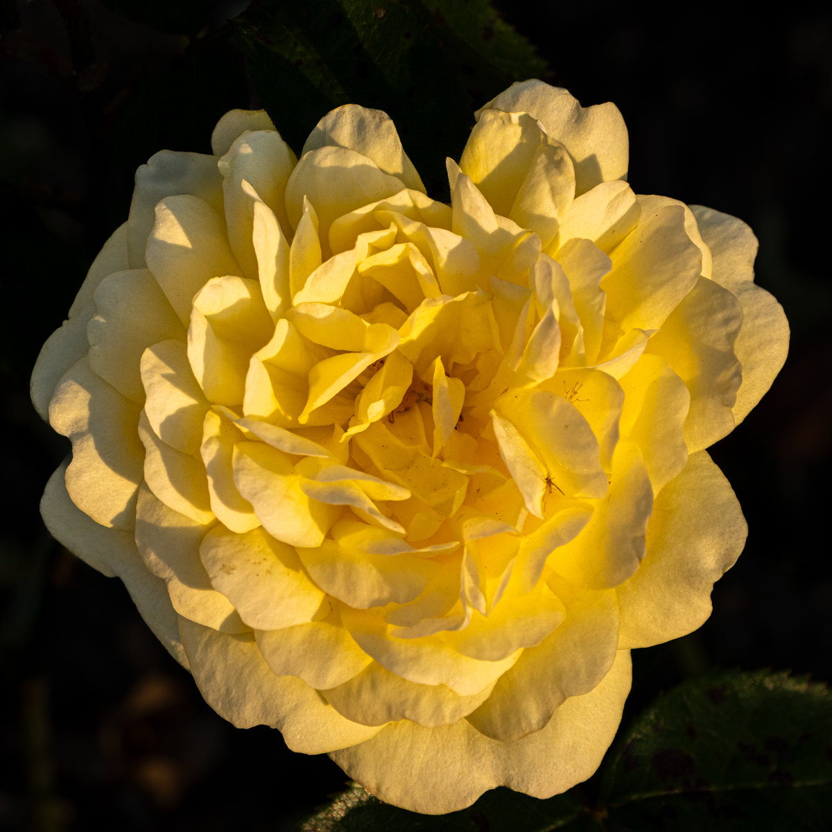
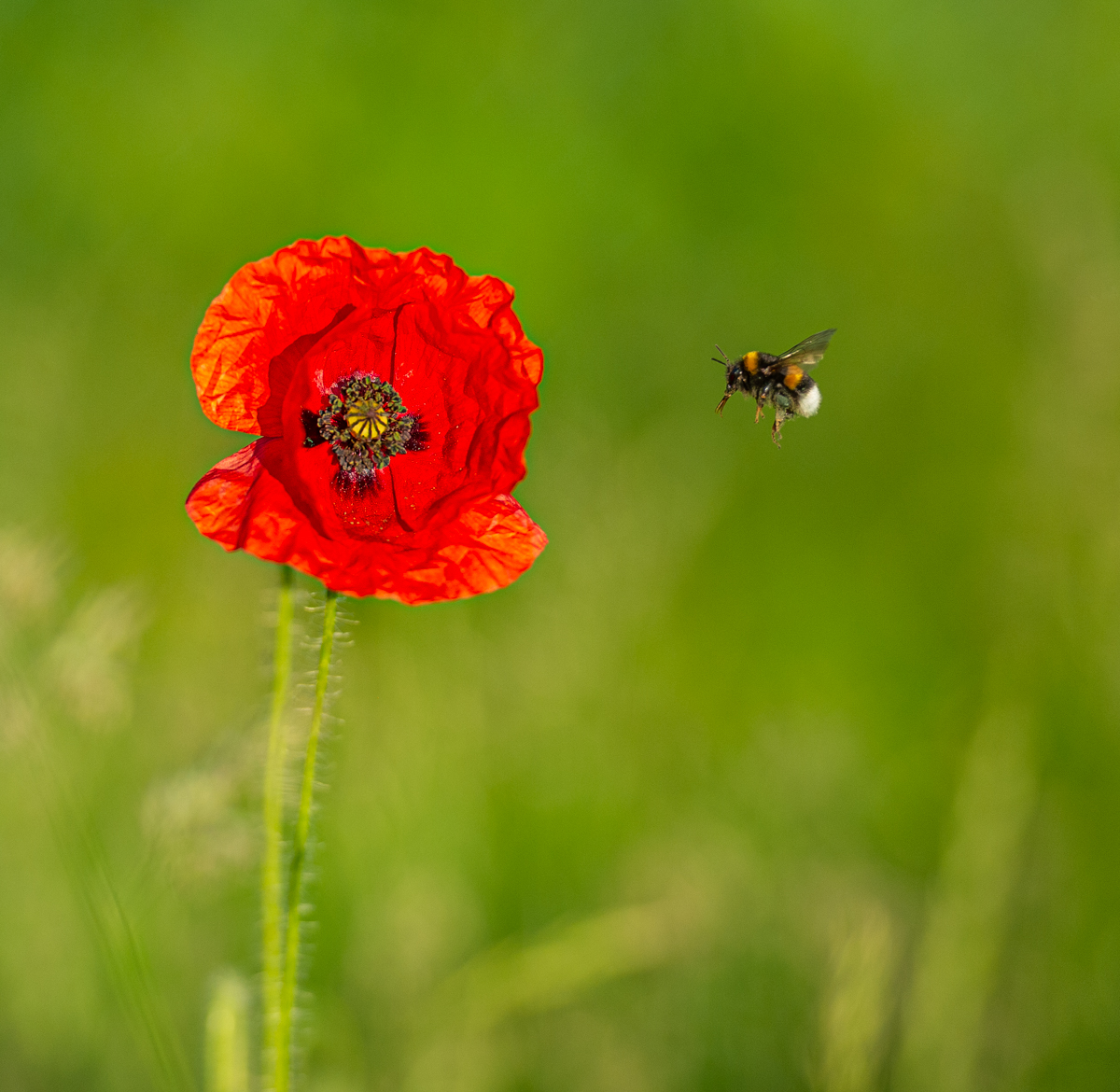
Beautiful flower. Well done.
Indeed the background is quite "busy", but it is, for me, mostly non-homogeneous.
As I like the square format, I think we need a larger background as you have.
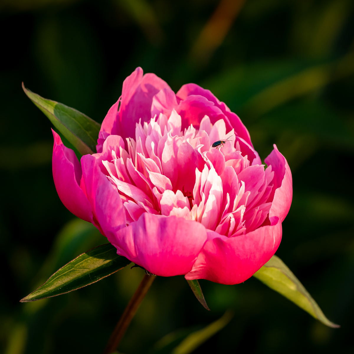
I also like the insect on the flower. |
Oct 19th |
| 75 |
Oct 24 |
Comment |
The Rhododendrons are great (sharpness and light).
I am quite "disturbed" by the out of focus blue lowers, and there are on a strong point, so it attracts attention. It makes a triangle with the 2 Rhododendrons.
Even if I like the square format, a suggestion is to crop a little. |
Oct 19th |
| 75 |
Oct 24 |
Comment |
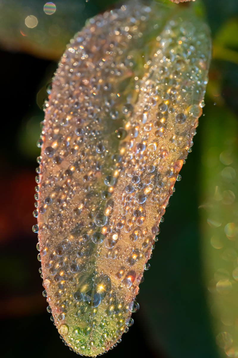
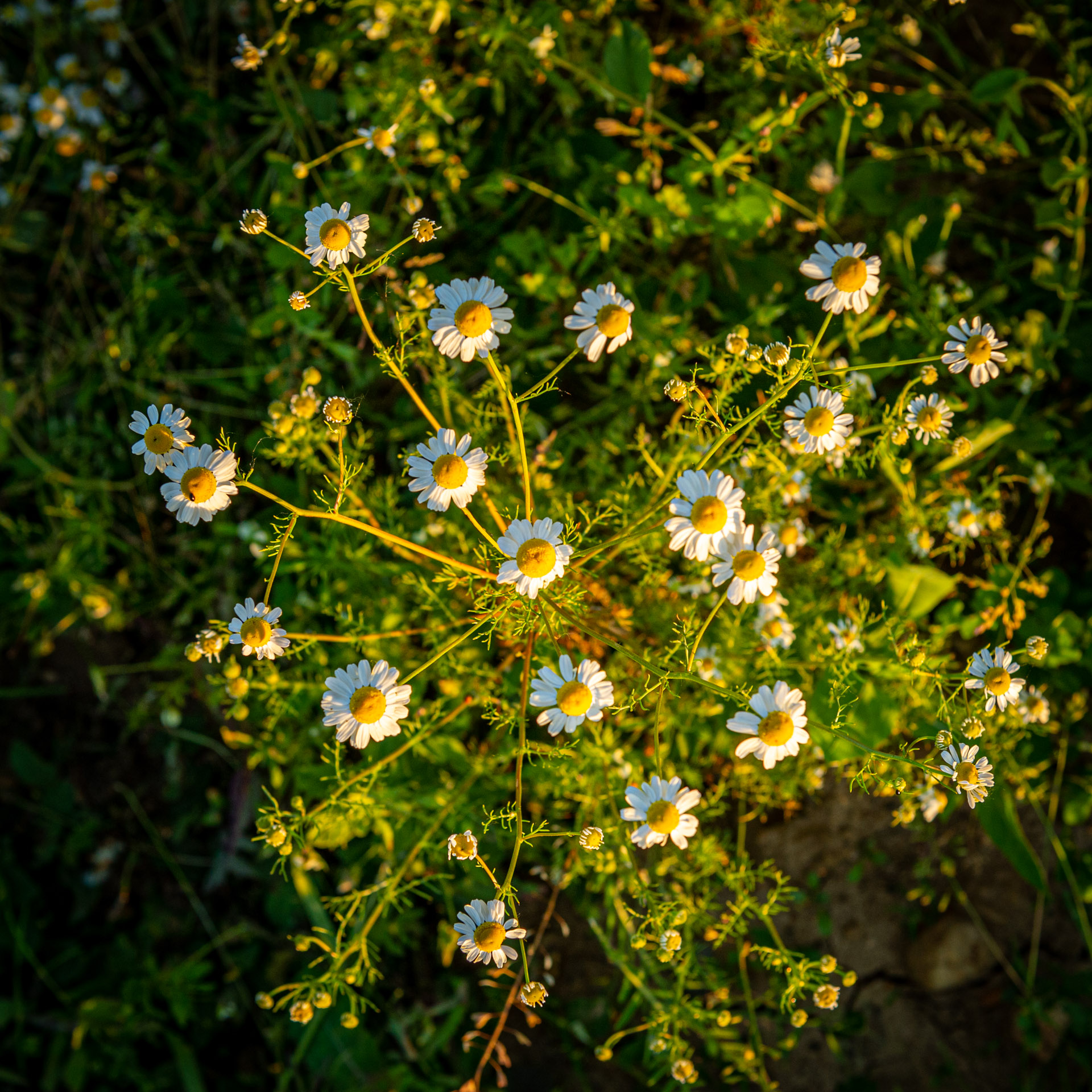
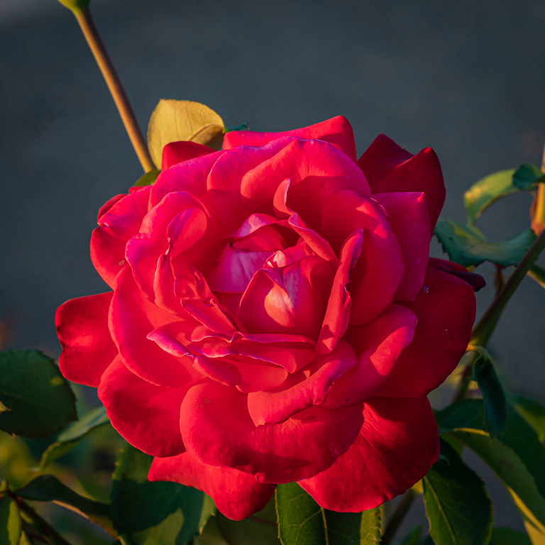
at first glance, I'm mostly attracted by the beautiful colors and the sharpness.
The vignetting gives the impression of better lighting in the center. I also like the position of the different flowers. I see it two ways, always groups of two, and 2 flowers on the left and a circle.
|
Oct 19th |
| 75 |
Oct 24 |
Reply |
Thanks Murphy, I will try this suggestion. |
Oct 19th |
5 comments - 3 replies for Group 75
|
11 comments - 5 replies Total
|