|
| Group |
Round |
C/R |
Comment |
Date |
Image |
| 39 |
Oct 23 |
Comment |
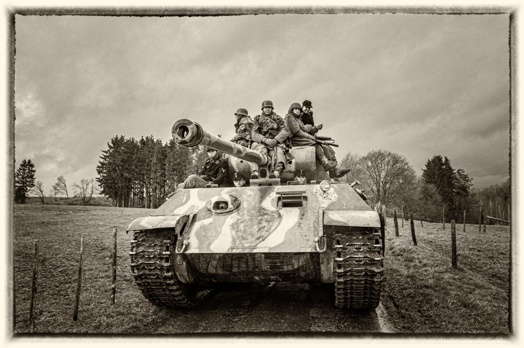
Great artistic image. Very well done.
I like the tones and the sharpness.
For the border, I like it (style of the subject), but I find (personal opinion) it is maybe too close to the subject. |
Oct 19th |
| 39 |
Oct 23 |
Comment |
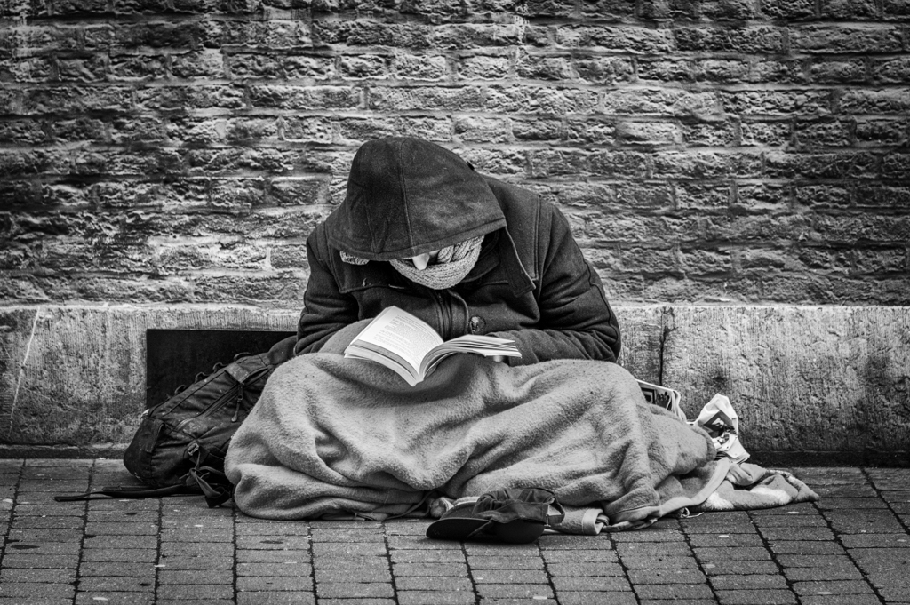
Nice experience I suppose.
The subject (bear) disappears a little in the B&W version. it is become more "abstract". It stays a nice picture.
To see the bear, I would prefer the color version. As it is the subject, don't you think there is too much water?
Your high speed allows to avoid the water drops to be burnt (too much highlighted), but you need to increase the ISO . |
Oct 19th |
| 39 |
Oct 23 |
Reply |
Thanks Paul for your comments. It is indeed hand held (high ISO to have enough speed). Camera: Sony a9 I. |
Oct 19th |
| 39 |
Oct 23 |
Comment |
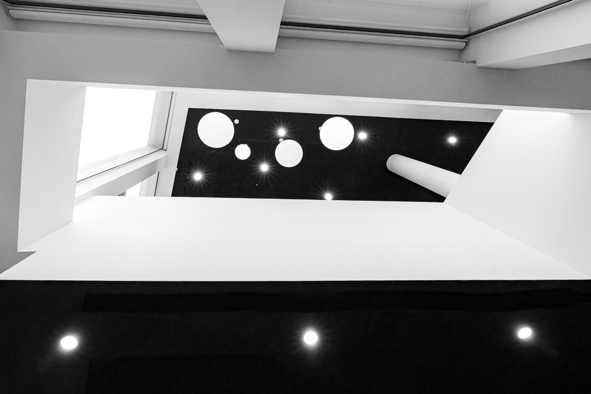
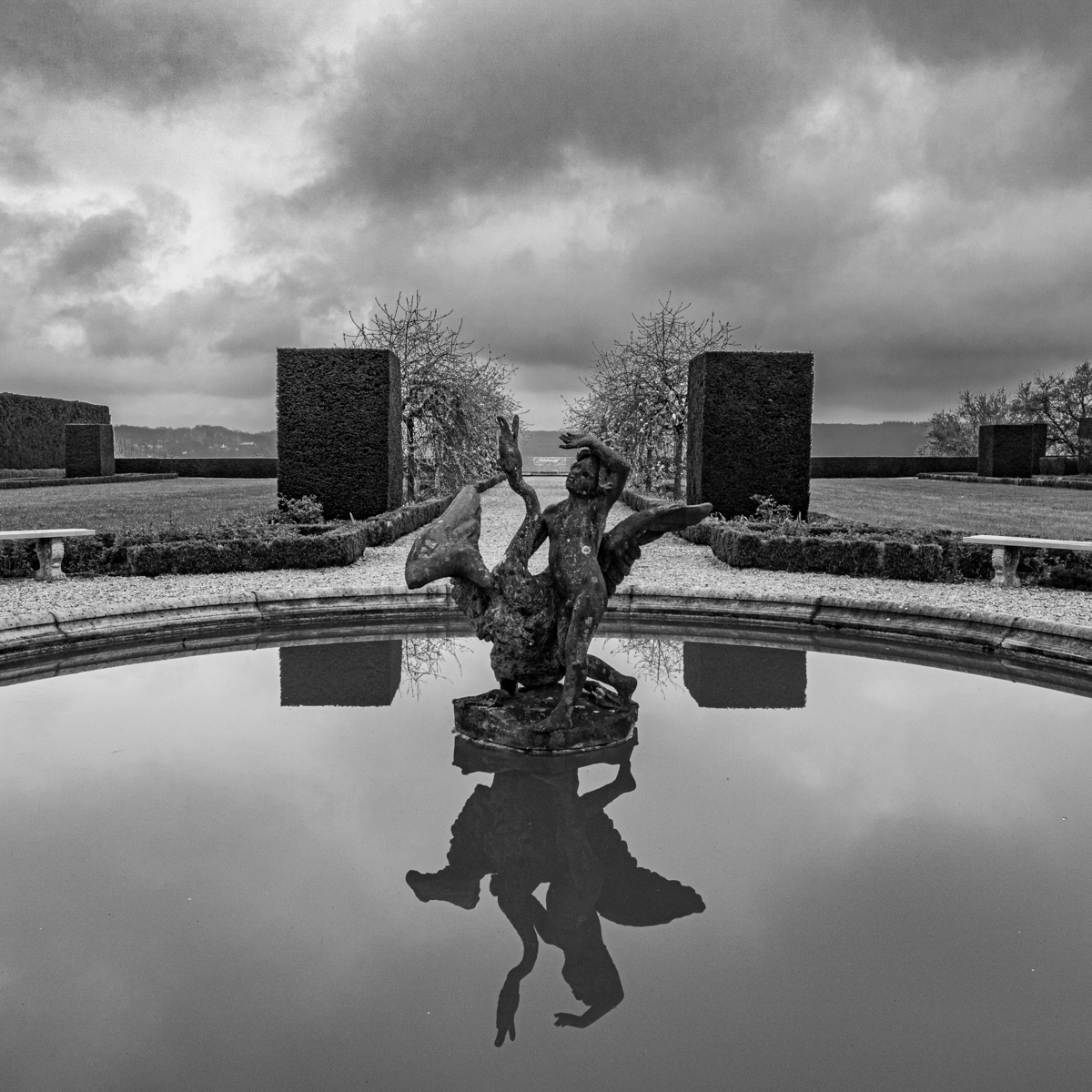
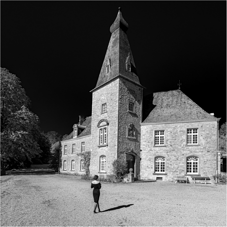
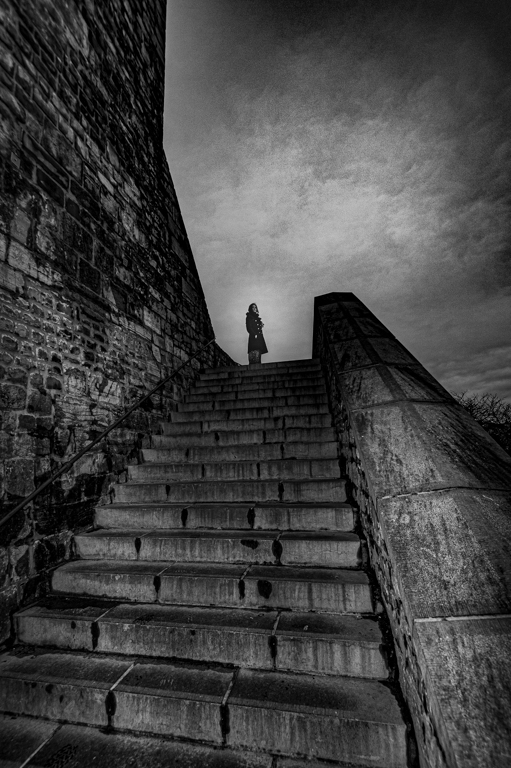
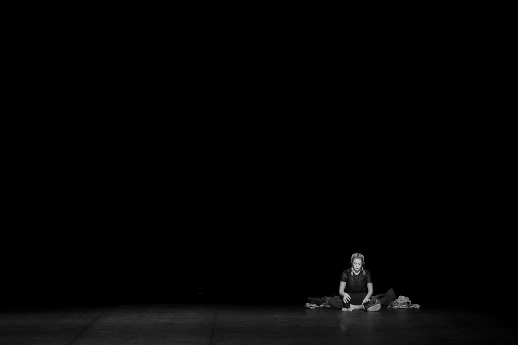
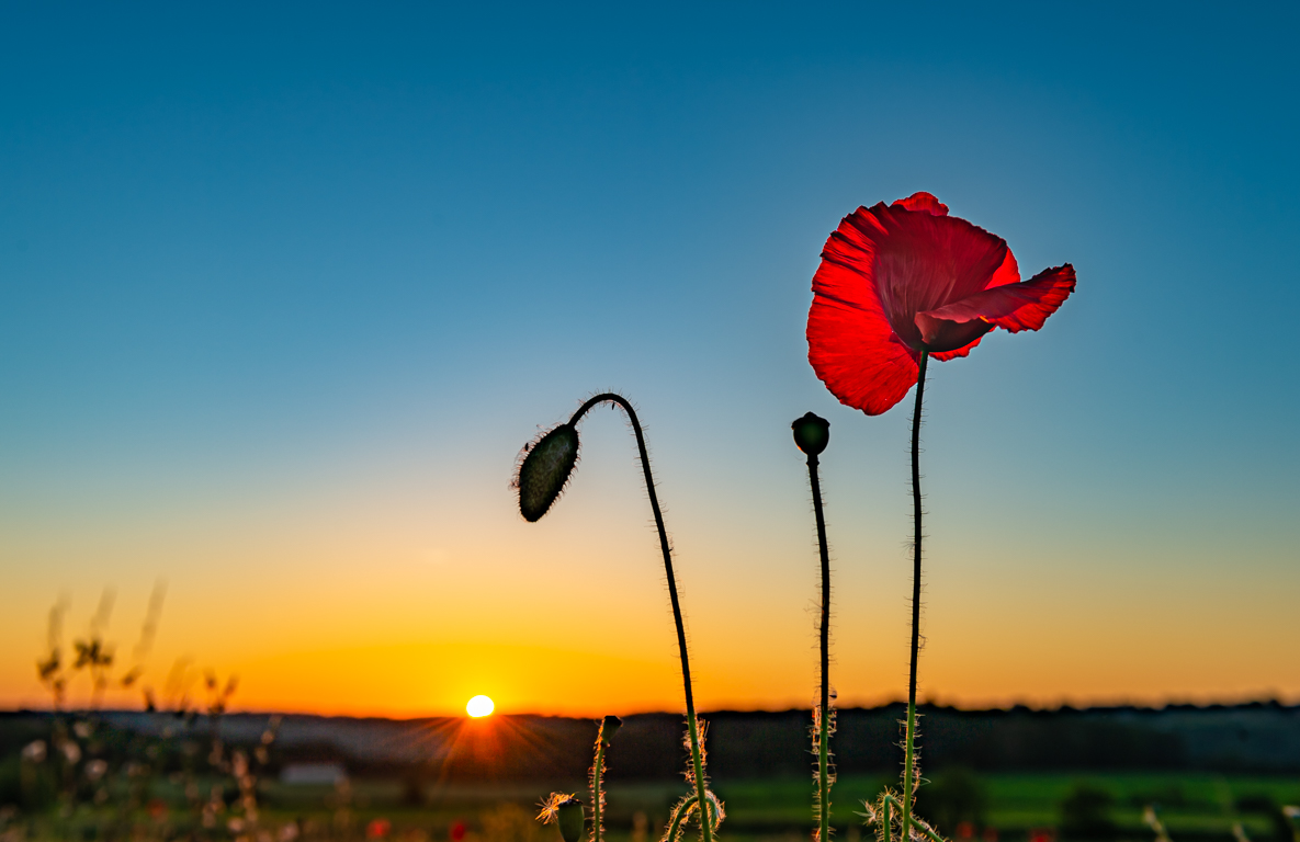
At the right place at the right time. Very good capture of the light, and there is a story.
I like the format, even if the proposition of Fran is interesting. A capture can lead to different images... It is even possible to crop a little this square version to more crop the window on the top (now it is too much or not enough).
I really like the composition with the statue, the boy and the background (window & stairs), and the light of course. |
Oct 17th |
| 39 |
Oct 23 |
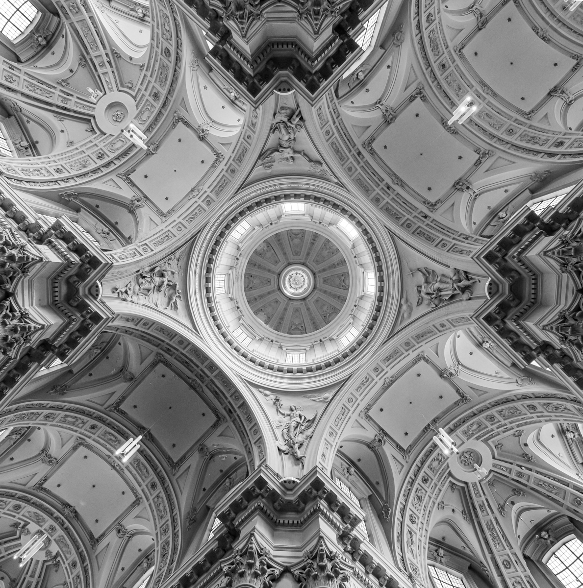
Comment |
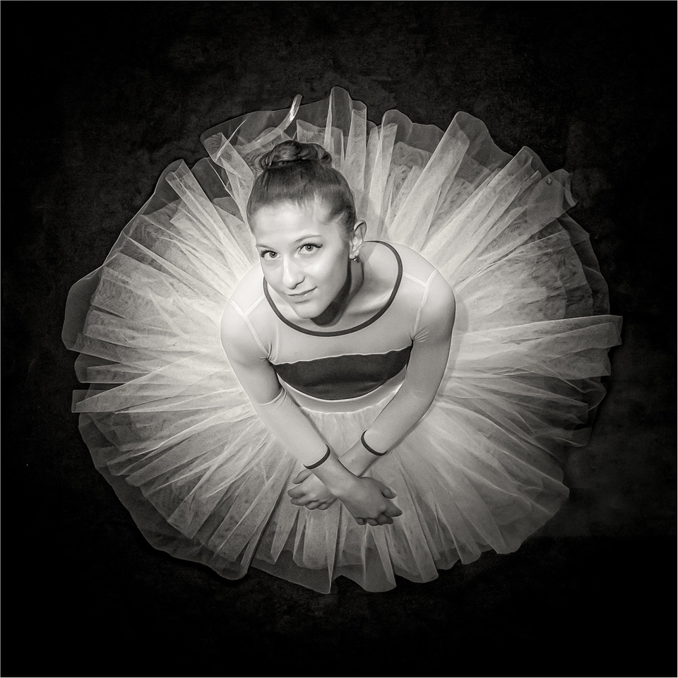
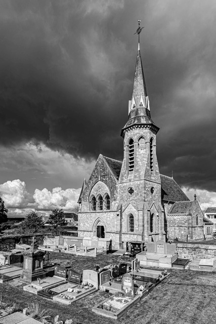
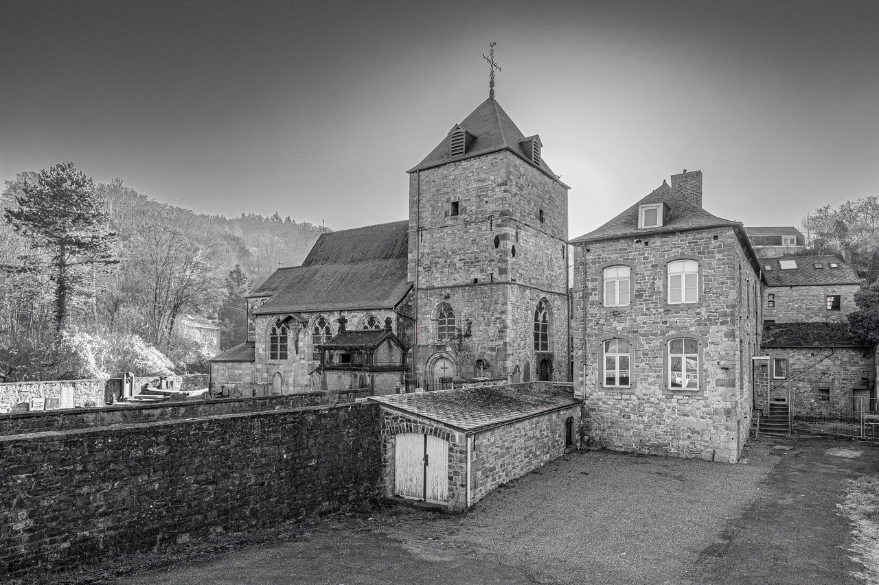
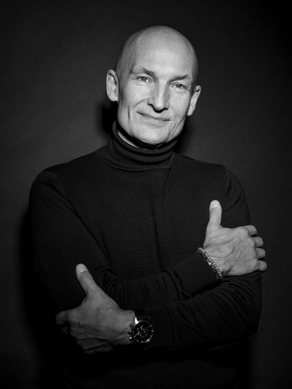
I really like such picture. See mine for this month.
As mentioned you did the job. I like the lighting and the tone.
The real difficulties in such an image is to reach a perfect symmetry. It is the first thing I look. In this case, you should have turn a little bit the phone to the right. Even quite difficult to see it when you take the picture.
Not a critic, just an opinion. Not easy all, see also mine image of this month, it doesn't have the perfect symmetry... I went back to the church to take again the picture... |
Oct 17th |
| 39 |
Oct 23 |
Comment |
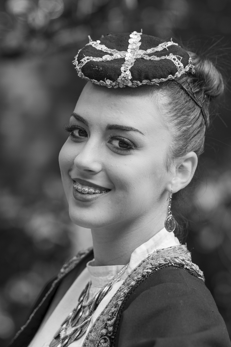
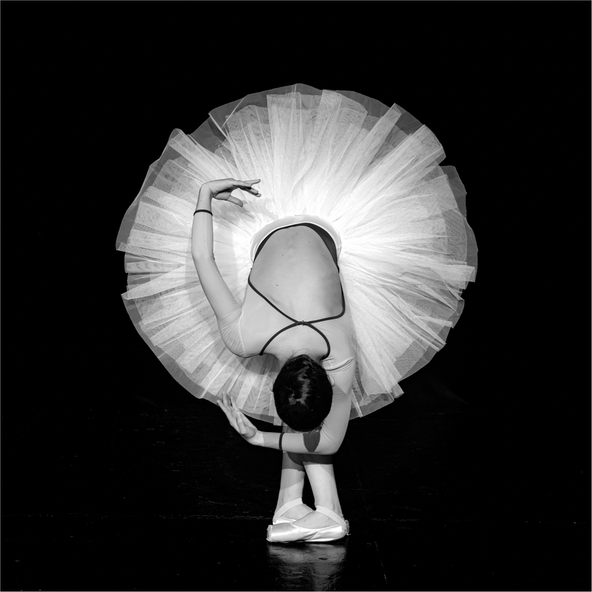
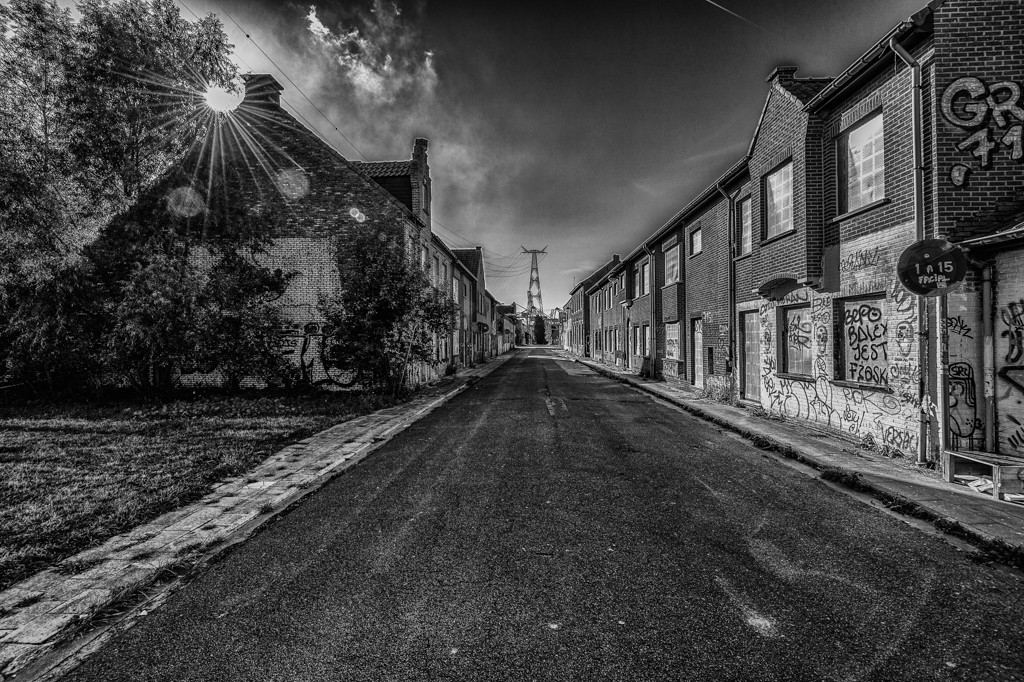
Good conversion in B&W. The image is stronger.
Well done the crop, as you took the image in portrait, and the sky doesn't give any information. Why not in landscape to have information about the environnement (sometimes we just forget to rotate the camera....)?
Never easy to take picture in a such emotional event. |
Oct 17th |
| 39 |
Oct 23 |
Comment |
Both versions (colors en B&W) are nice.
The B&W one is well done, but in this case, I would also, as already mentioned, crop the image.
The background is "the same" in both images, but I find in the B&W one, that it gives the impression to have been modified and to have some "halo" around the petals.. |
Oct 17th |
6 comments - 1 reply for Group 39
|
| 75 |
Oct 23 |
Comment |
Specialized technique. Interesting to see the result.
Without any explication, this will be qualified as abstract.
Good idea to have added the stars. Nice interaction with the ice.
|
Oct 23rd |
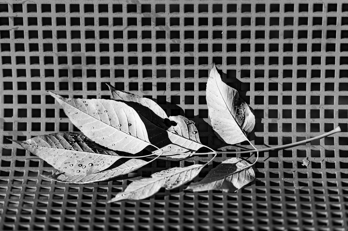
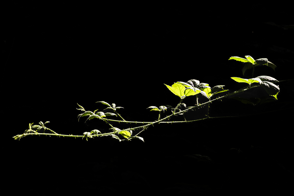
| 75 |
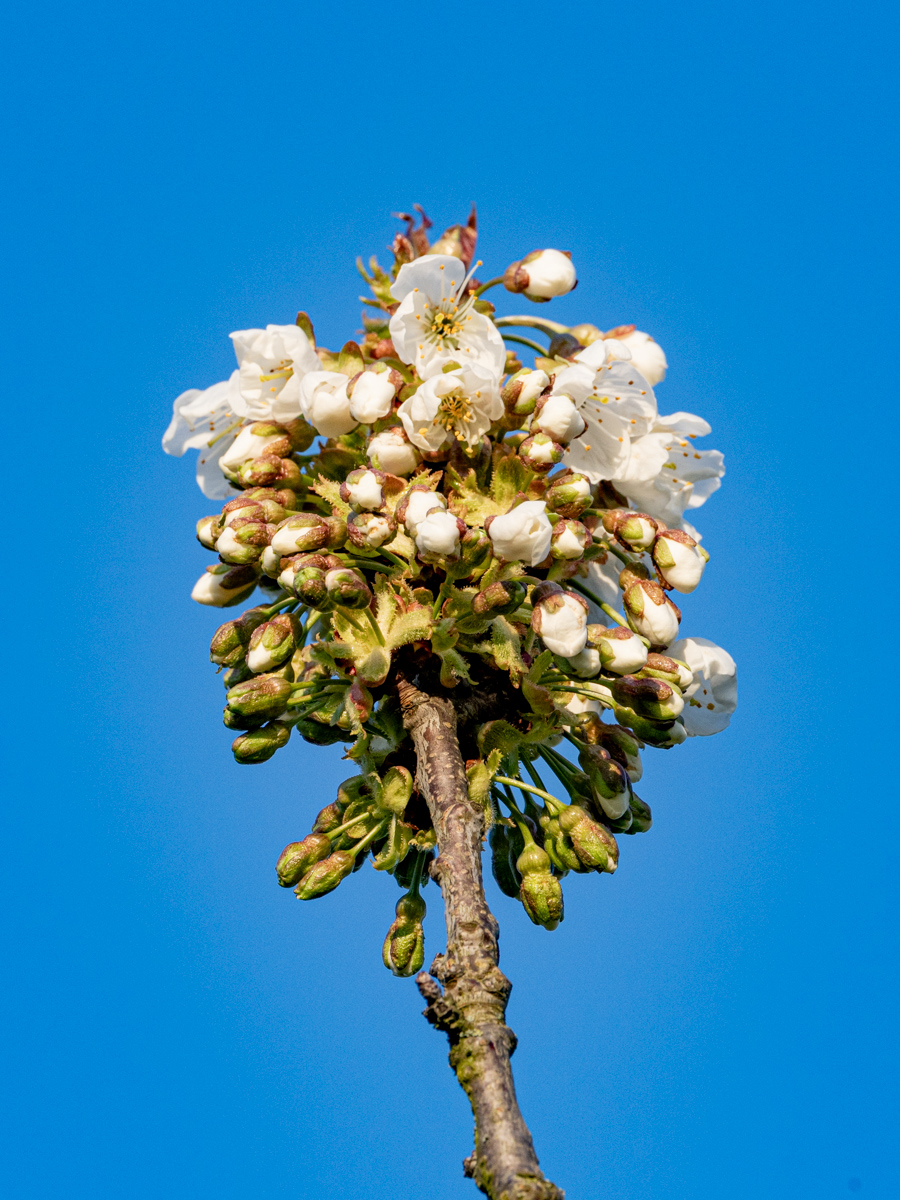
Oct 23 |
Comment |
Nice process to achieve this result.
The absence of stems can allow to see each (2) group of leaves as a picture with their own format (landscape & square). Just a suggestion.
I like the composition (position of the leaves) and the light.
Wit or without thin frame around the picture? |
Oct 23rd |
| 75 |
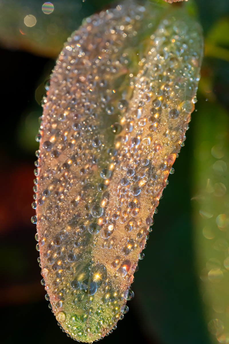
Oct 23 |
Comment |
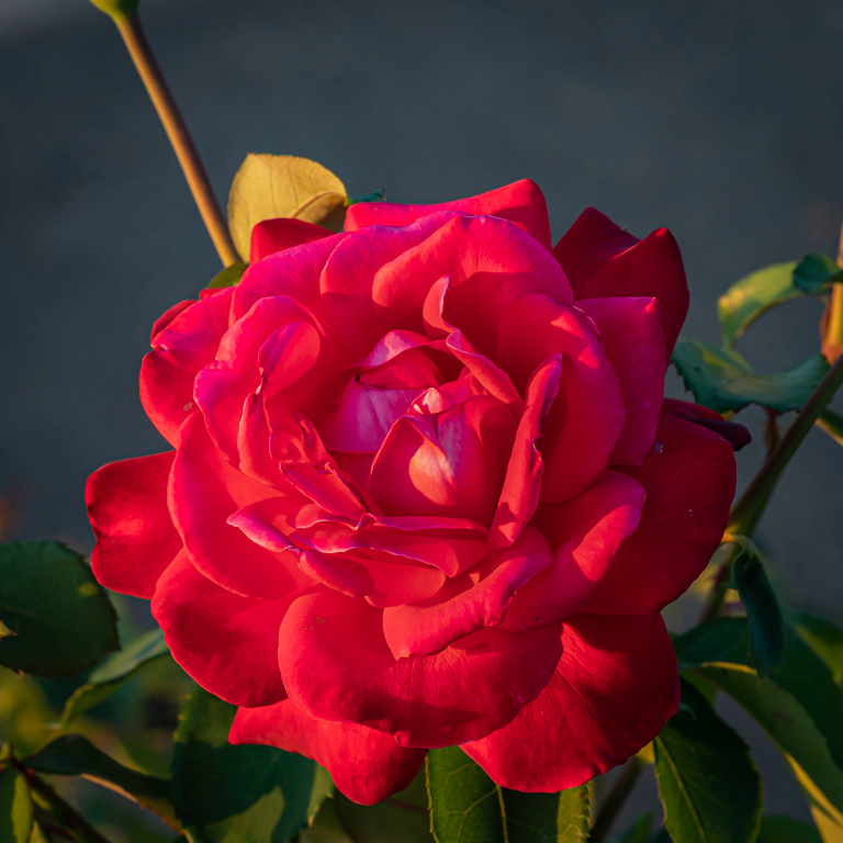
A lot of interesting elements: the composition (it can be compare with the head a bird), the position of the petals and their positions, the drops and the colors.
I agree with the analysis of the aperture.
There are pros and cons the thin borders, but personally I think in this case, it can help. |
Oct 23rd |
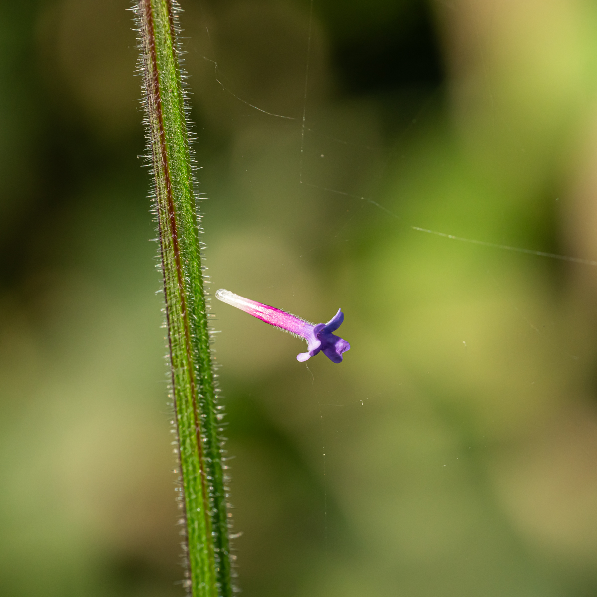
| 75 |
Oct 23 |
Comment |
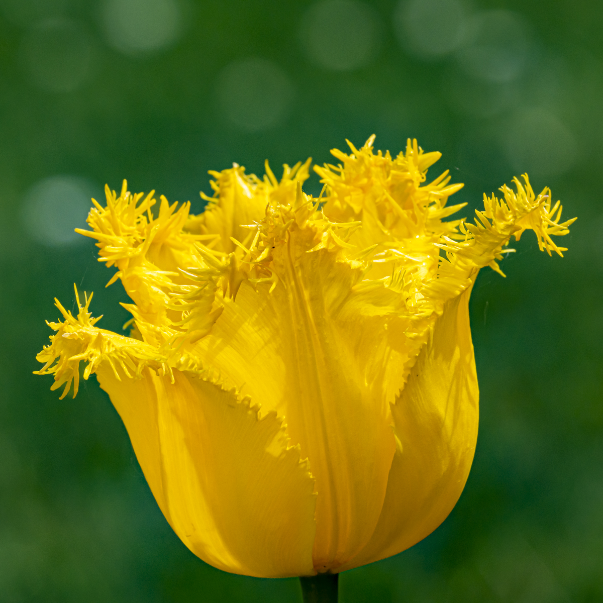
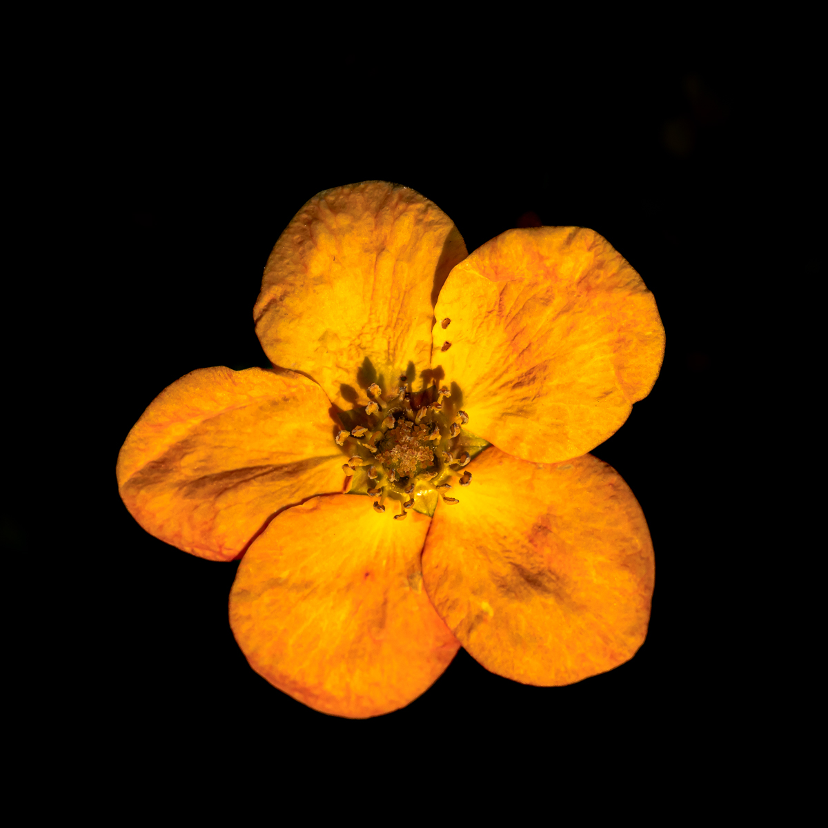
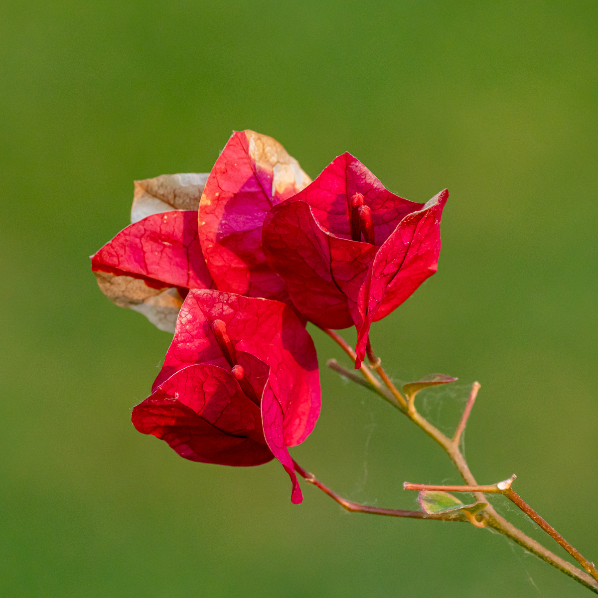
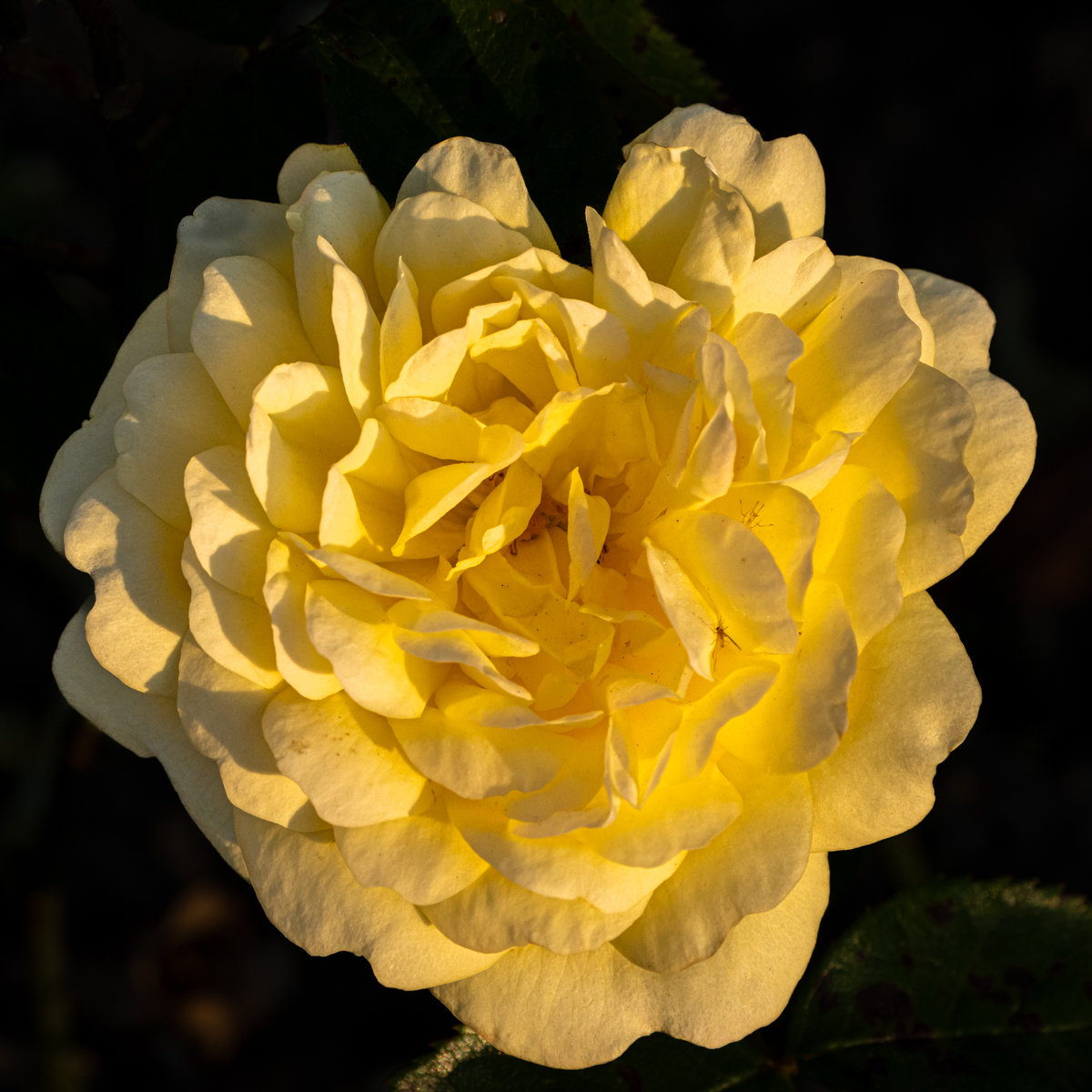
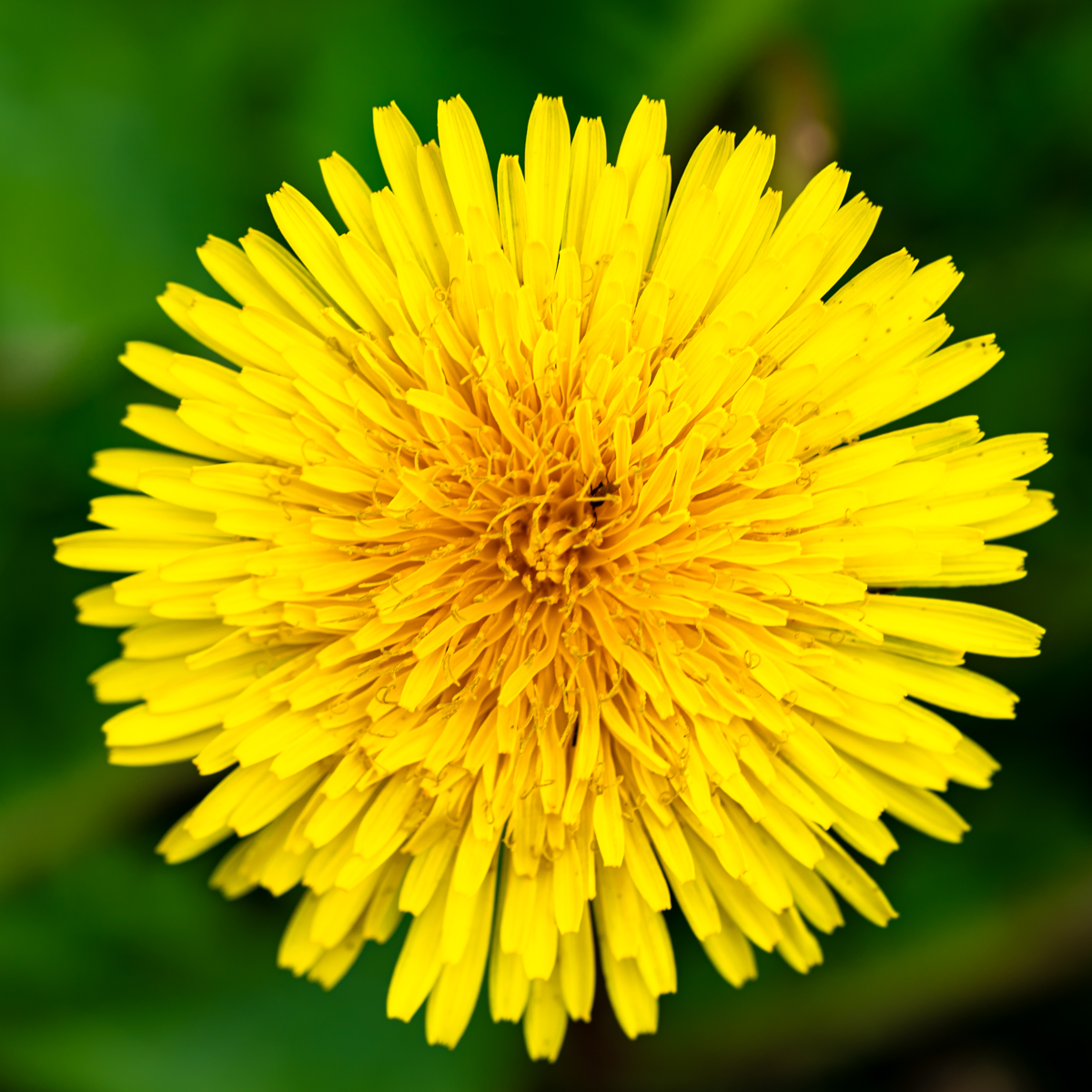
With a circle subject, I like (only my opinion) a square format.
In this case, there is too much space on the right. Il like the well-separated background.
We can distinguish the flowers in the center. We could have reach more sharpness with focus staking. I can't do that.... |
Oct 22nd |
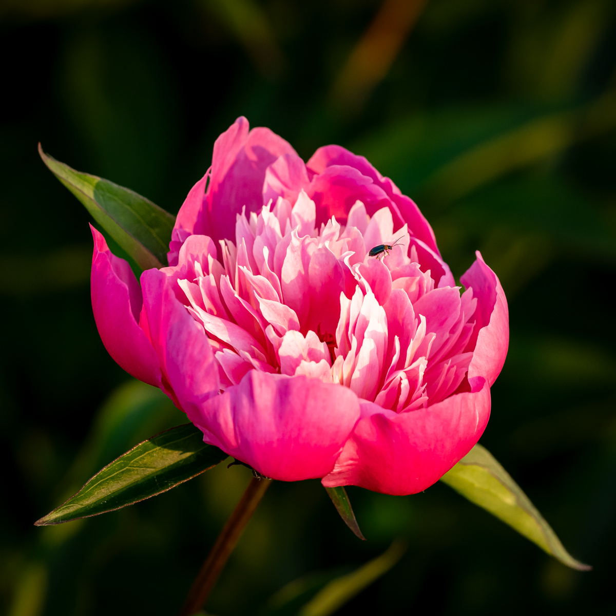
| 75 |
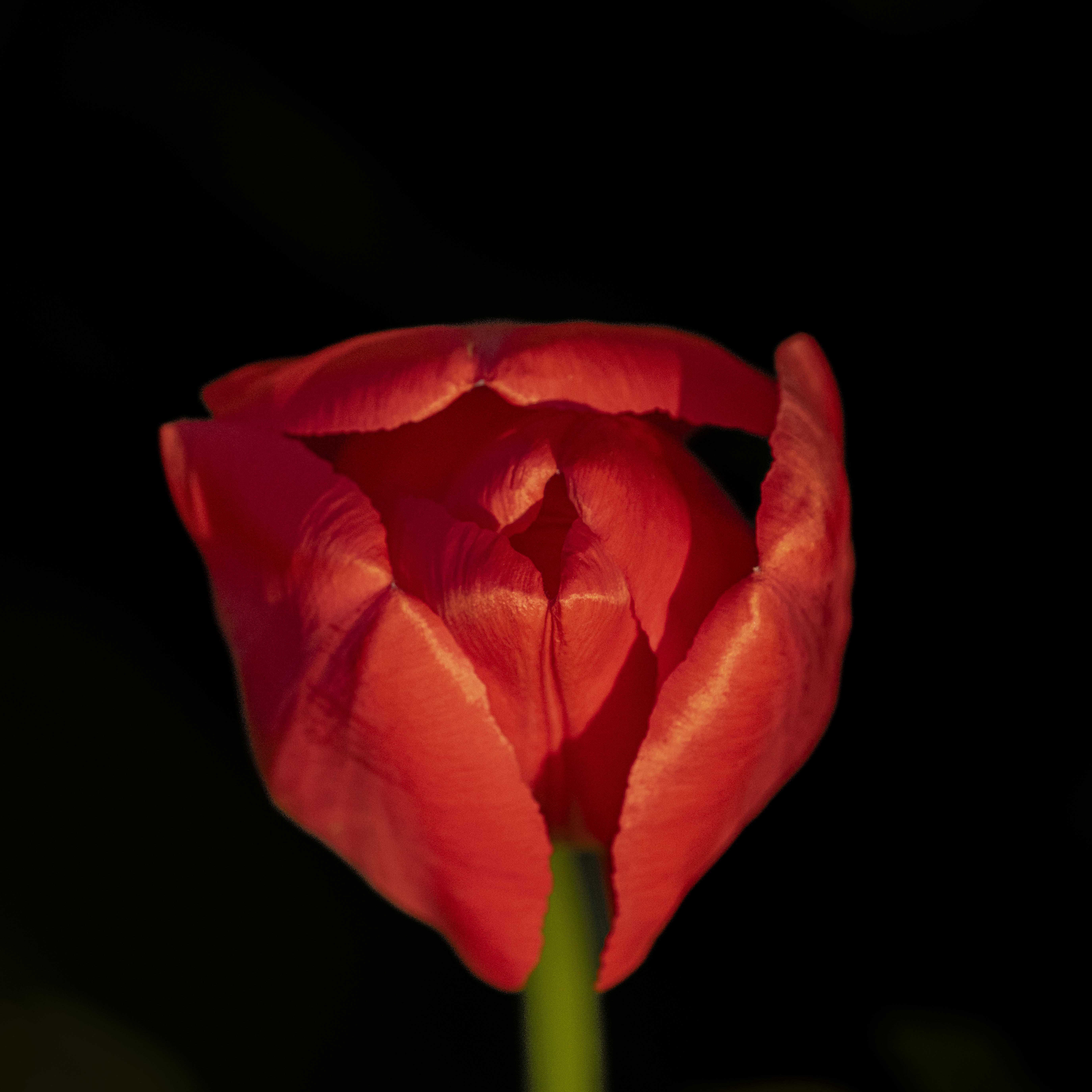
Oct 23 |
Comment |
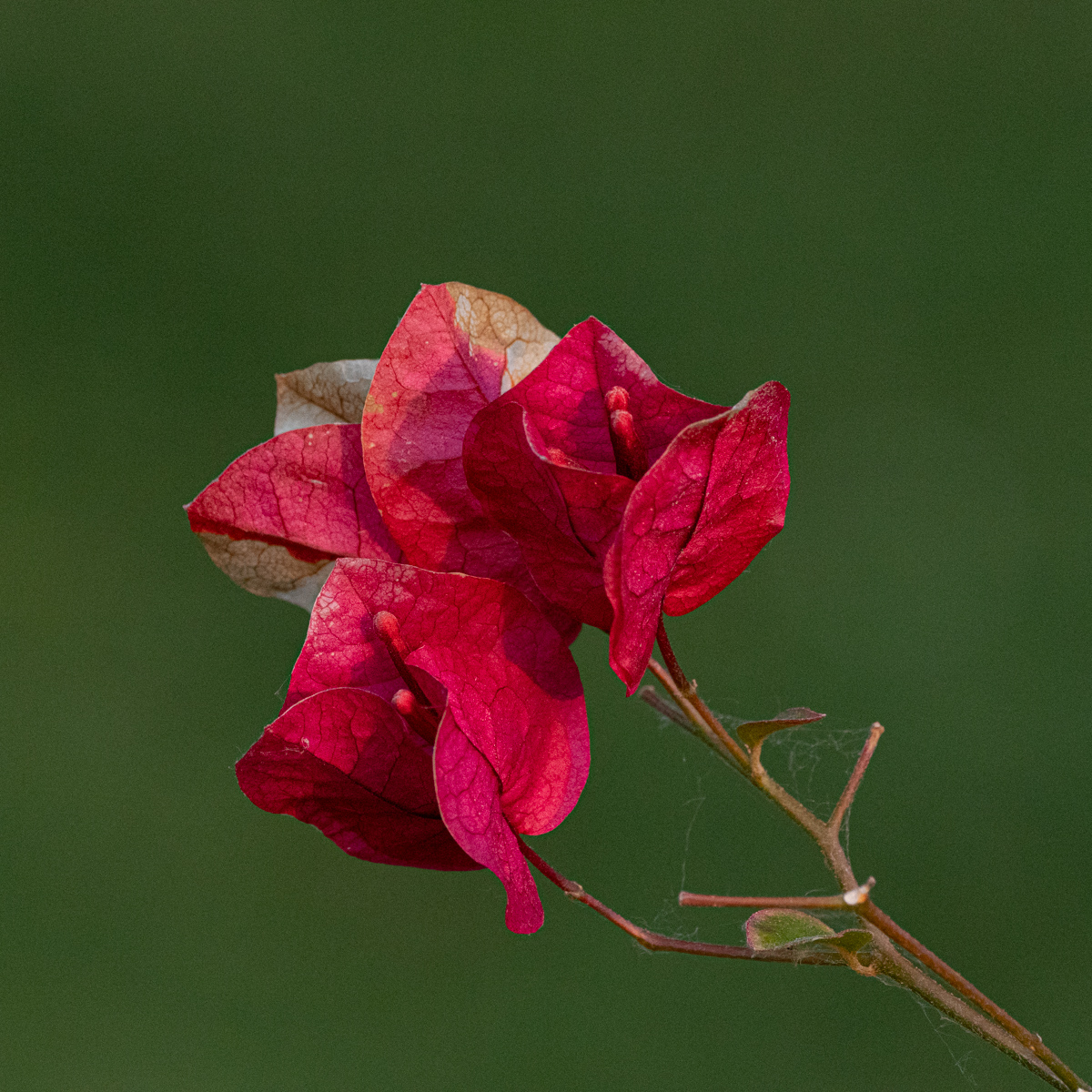
Focus stacking will always give another result (picture) than only one... Well done to reach this sharpness. I like the petals, the drops and the colors.
I like the composition (top down with open petals to closed one).
As there is work (focus staking) to reach this image, what do you think about a darker background, to much islet the subject? |
Oct 22nd |
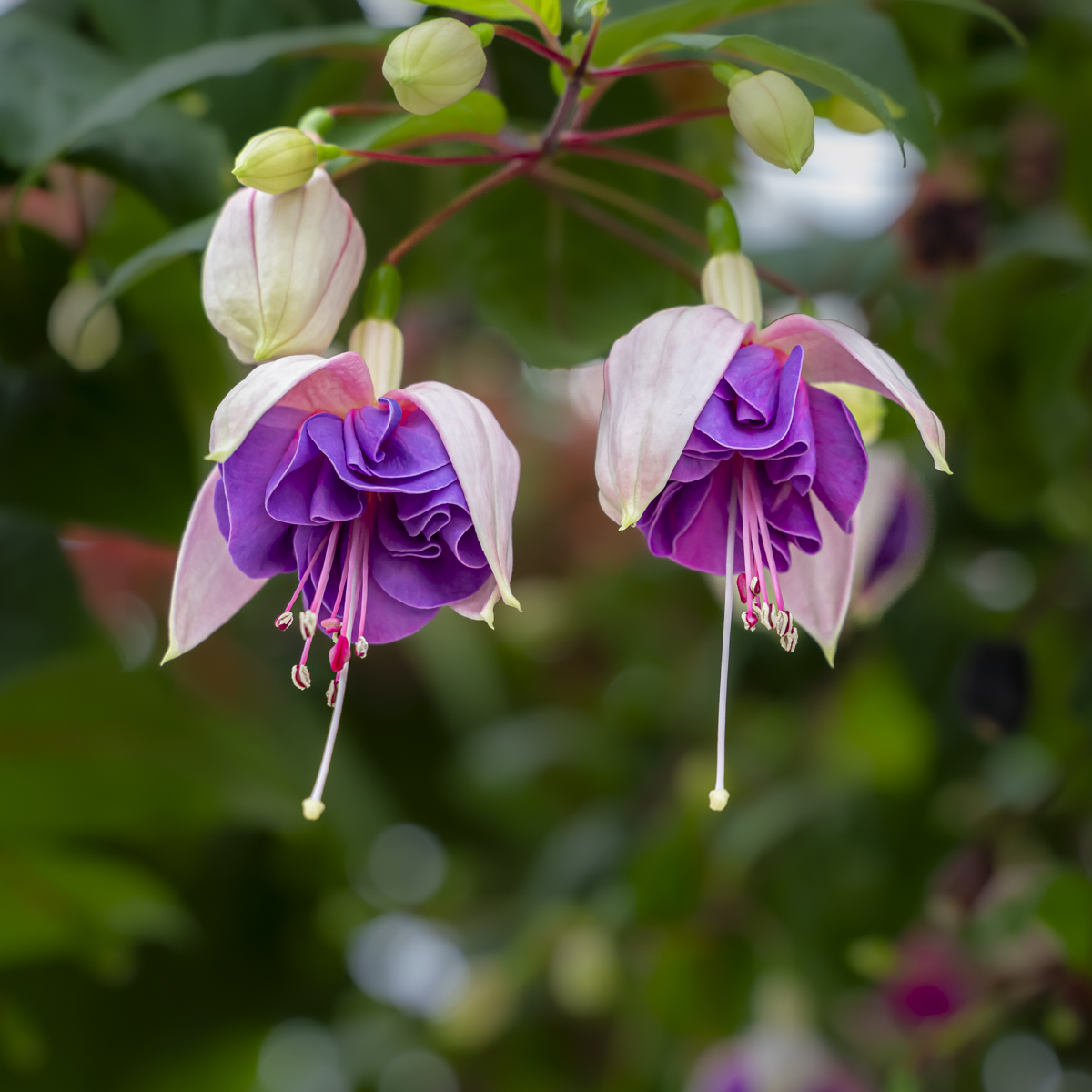
| 75 |
Oct 23 |
Comment |
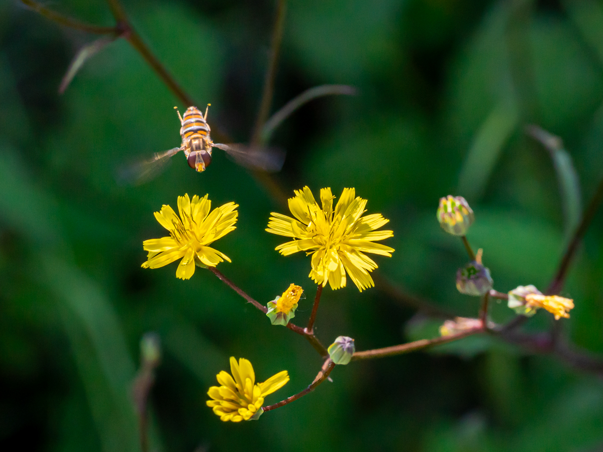
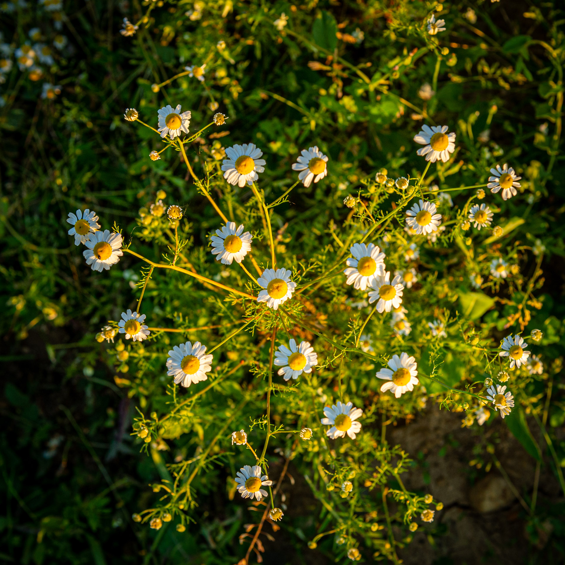
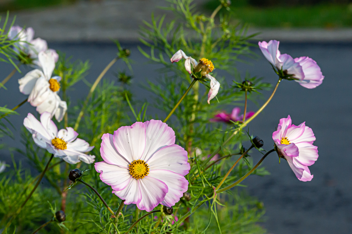
Another way to present flowers. Something else than only one flower.
I have the impression to have the flowers in front of me, almost in hands. Very sharp petals. Background is well-separated.
The closed flower on the left can be "disturbing" for the eye. |
Oct 22nd |
6 comments - 0 replies for Group 75
|
12 comments - 1 reply Total
|