|
| Group |
Round |
C/R |
Comment |
Date |
Image |
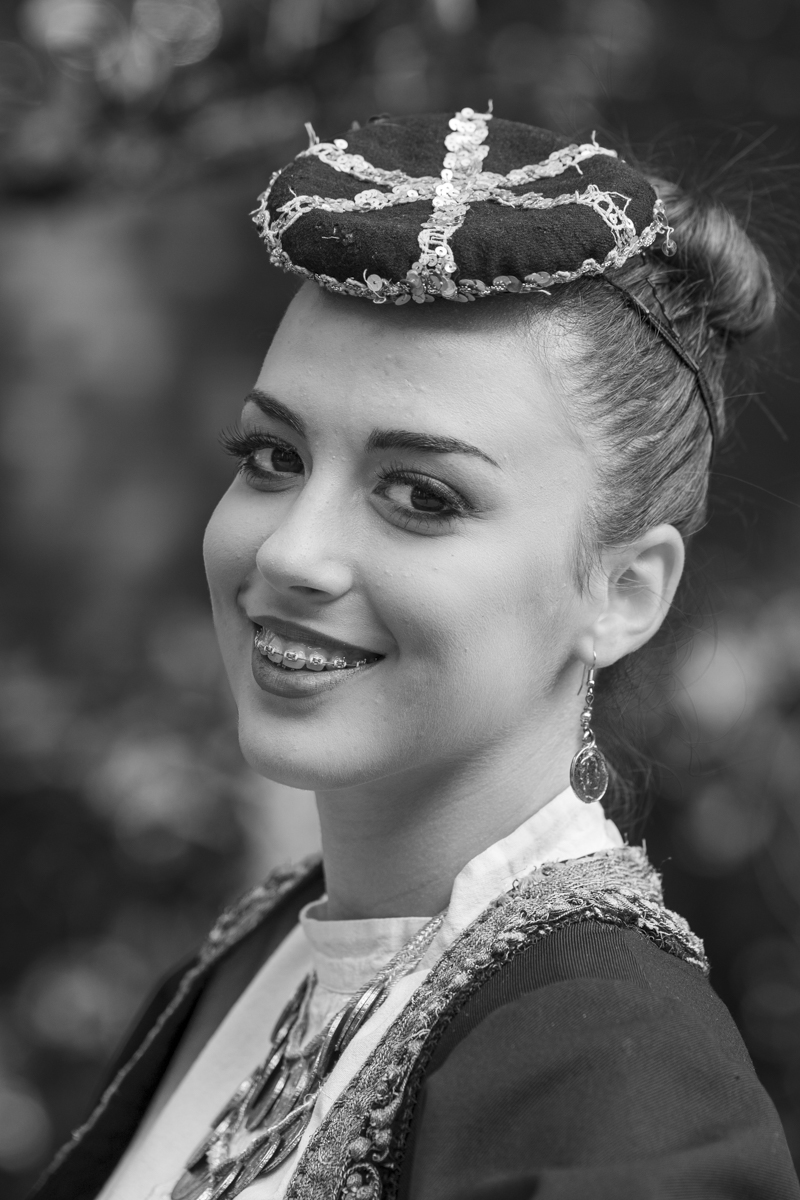
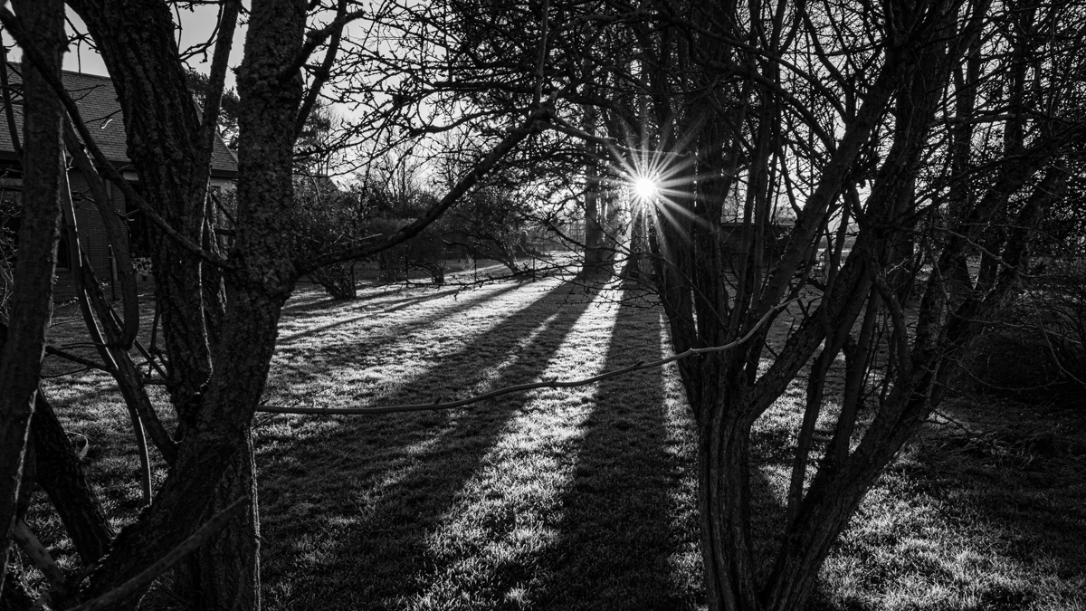
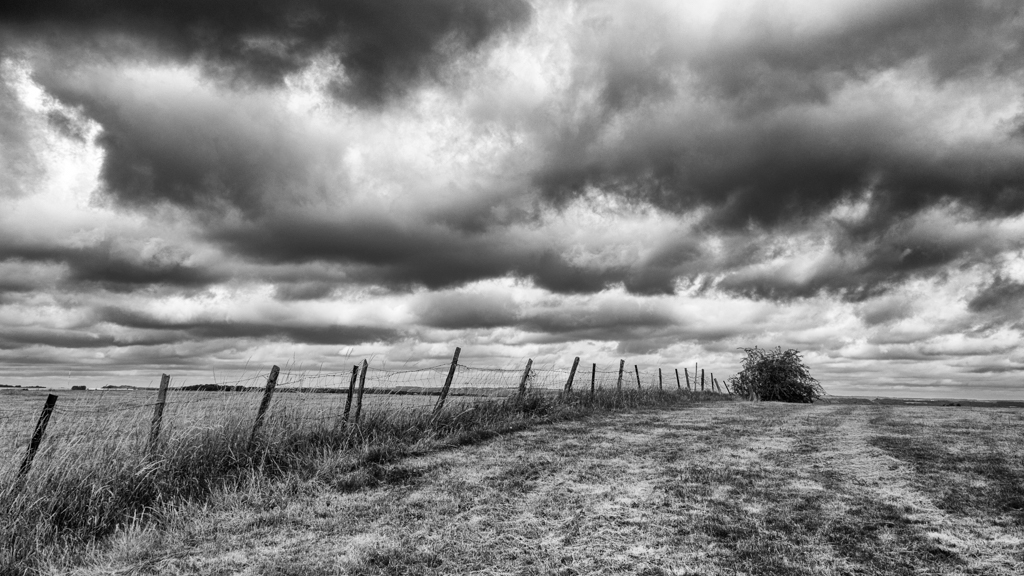
| 39 |
Sep 23 |
Comment |
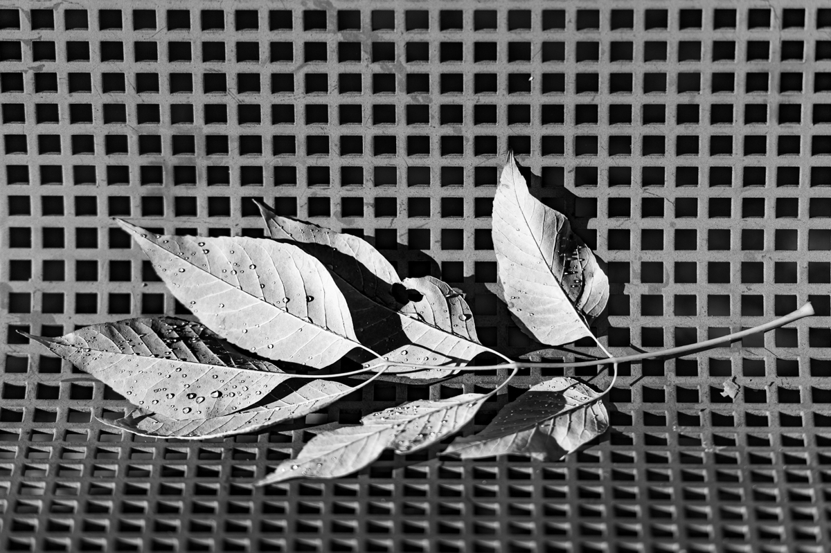
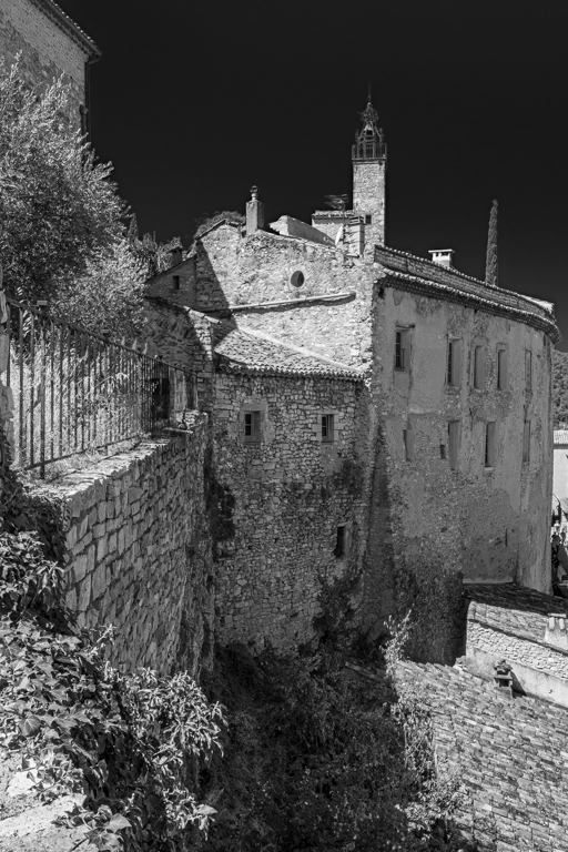
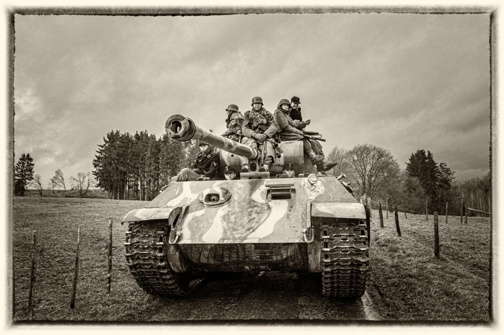
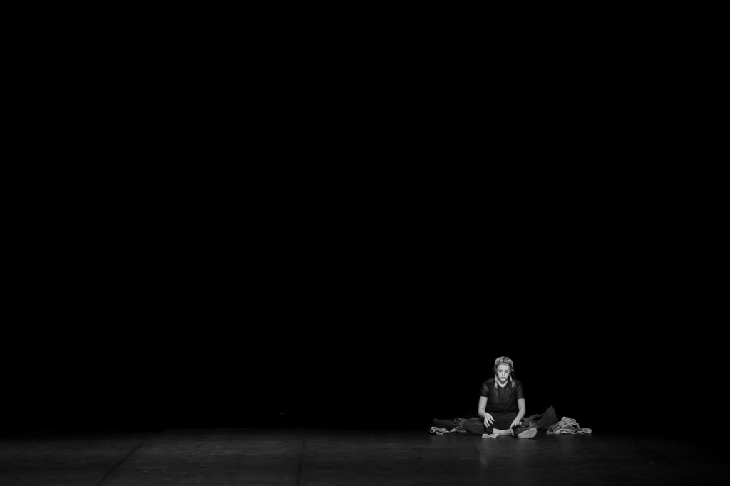
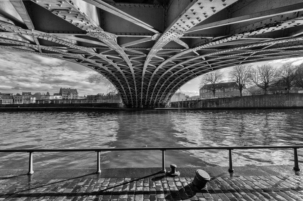
As mentioned by Paul, the power of B&W. Just great. I like it very much.
We often (me too) forget the thin stroke on the picture. There are pro and cons, but I also think it finished the picture and allow the viewer to be focused ont he picture.
Great light on/in the picture. |
Sep 15th |
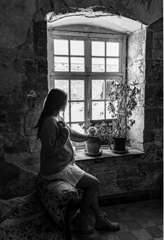
| 39 |
Sep 23 |
Comment |
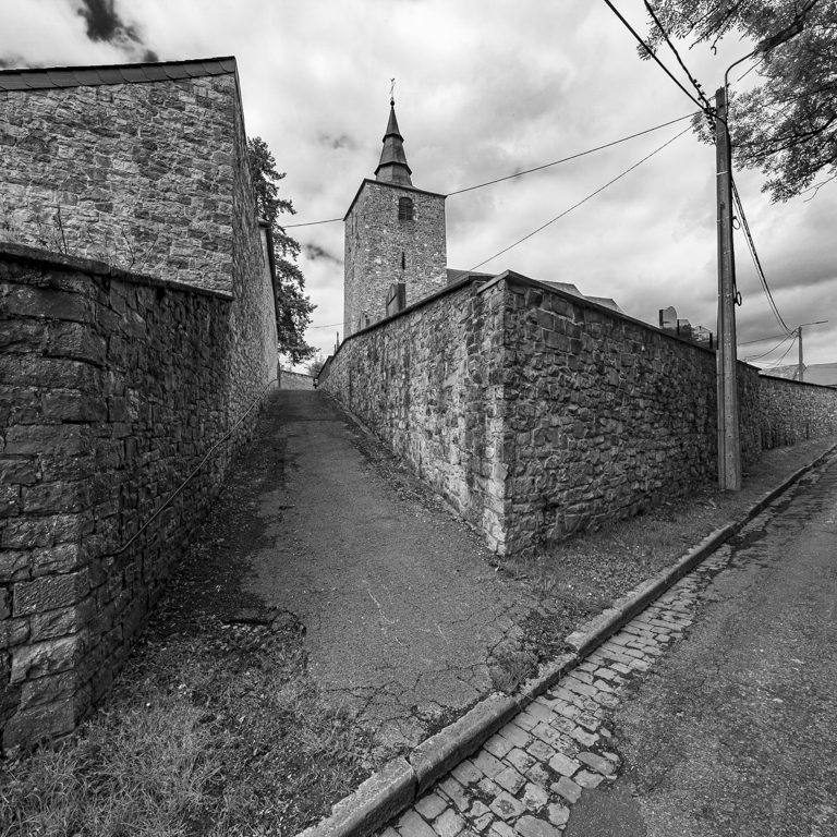
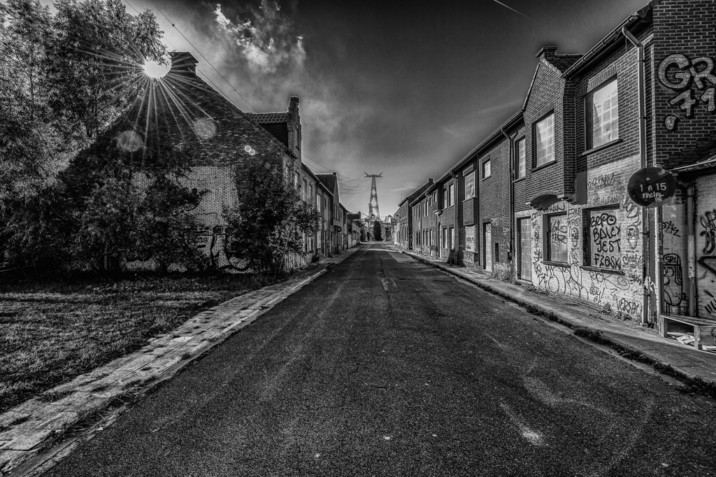
I like the idea of composition. A view through a window.
The V2 is well done (good process) but I (personally) choose the V1. We are less distracted by the second window. In fact they are two different pictures...
Of course, such pictures look this call the B&W.
It was possible to spend some time on place to take pictures. |
Sep 15th |
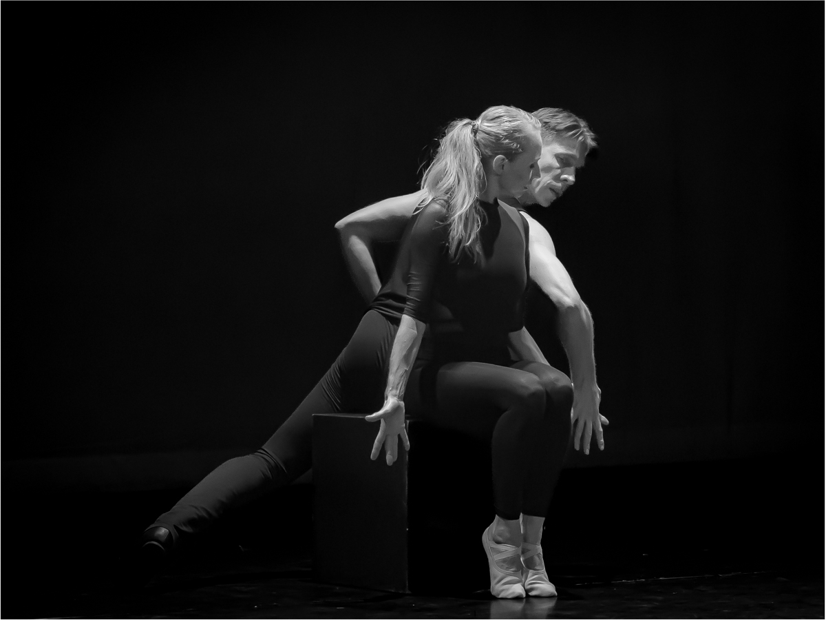
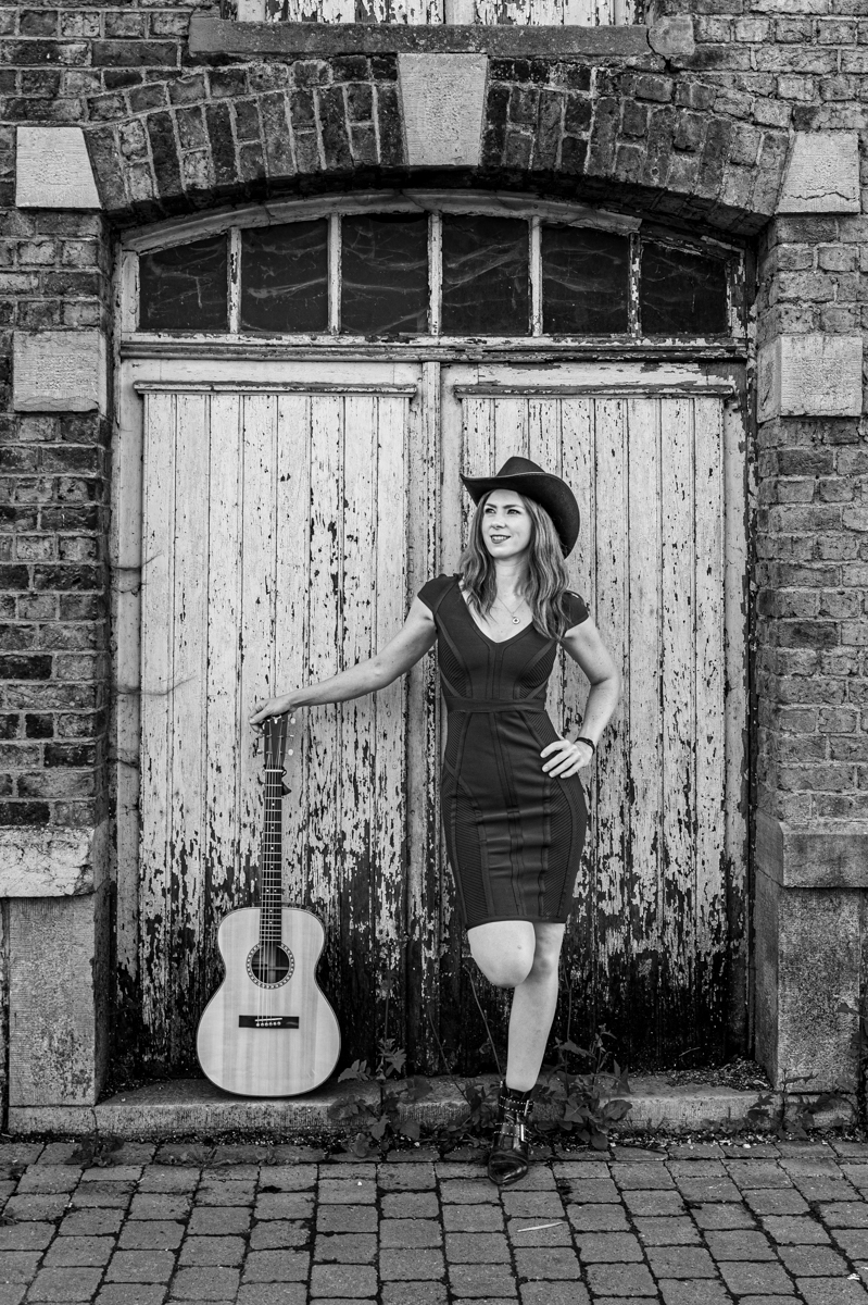
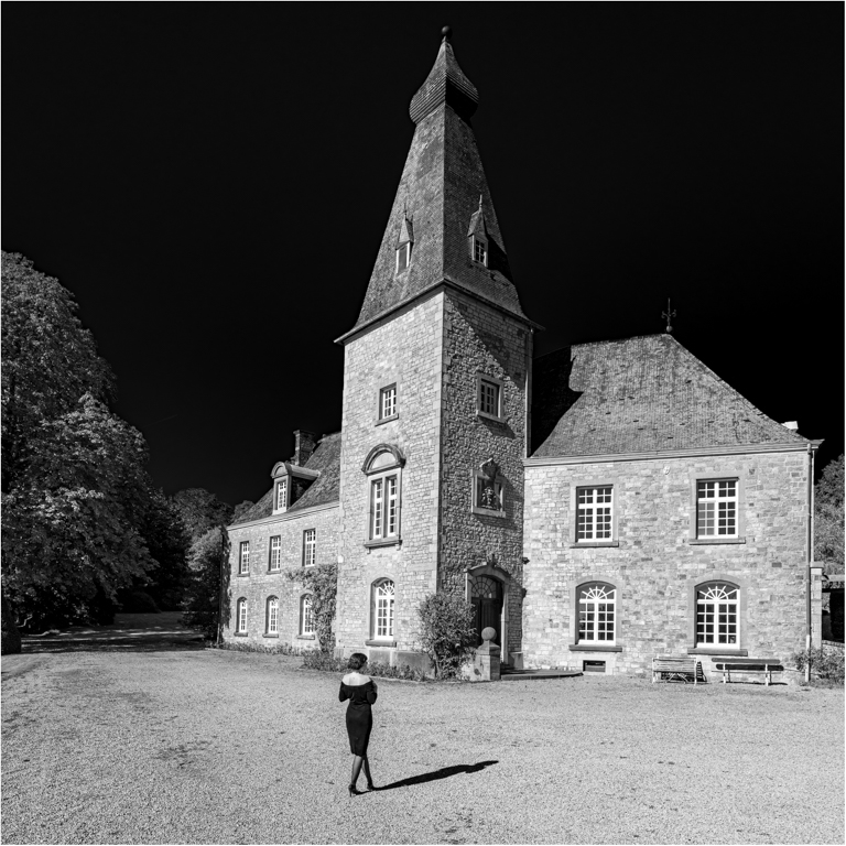
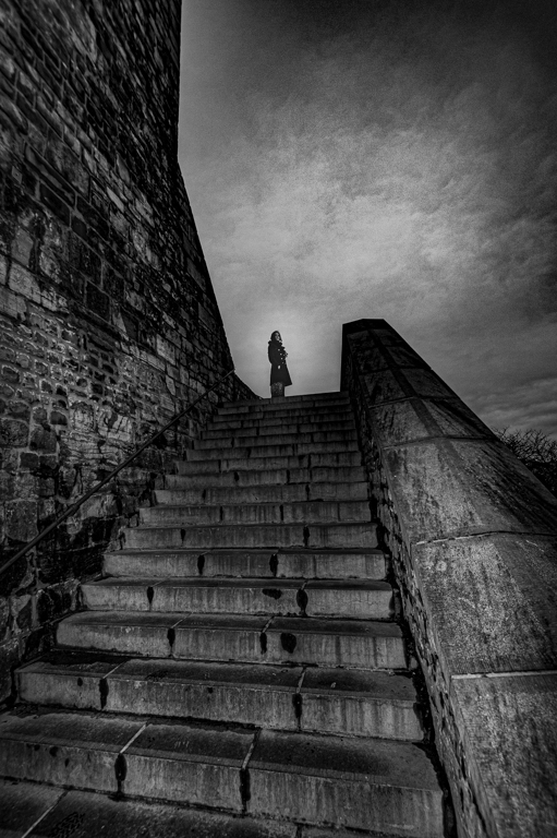
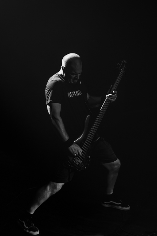
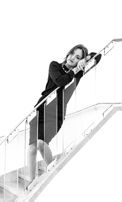
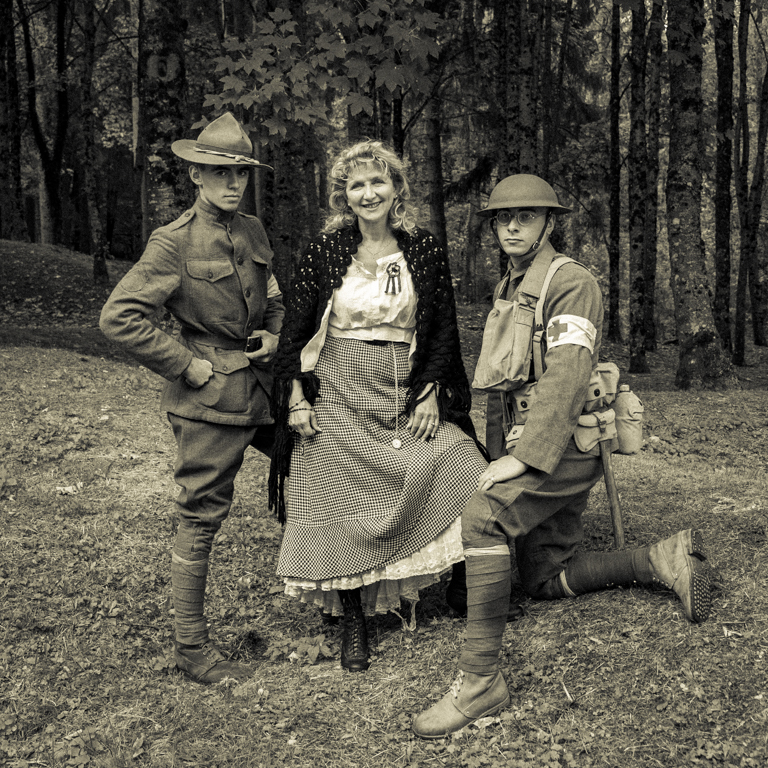
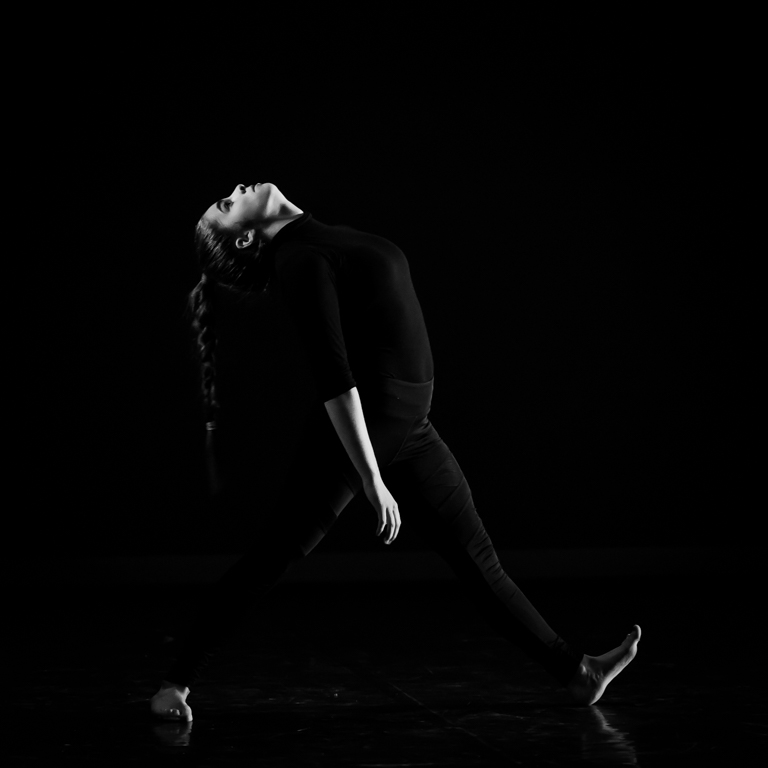
| 39 |
Sep 23 |
Comment |
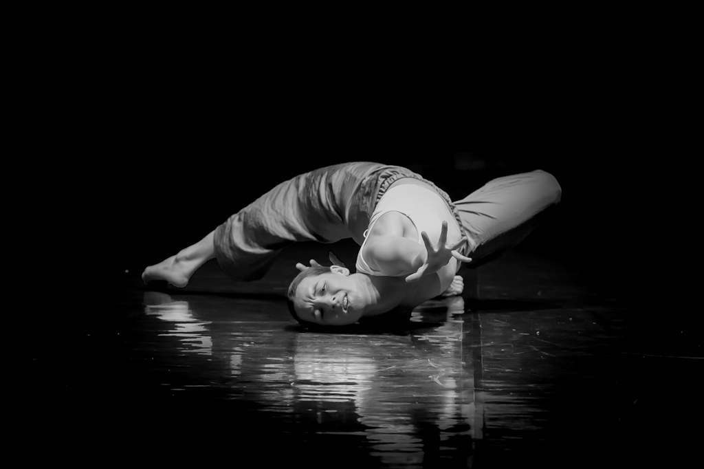
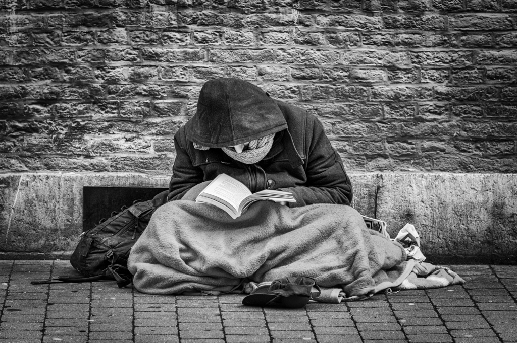
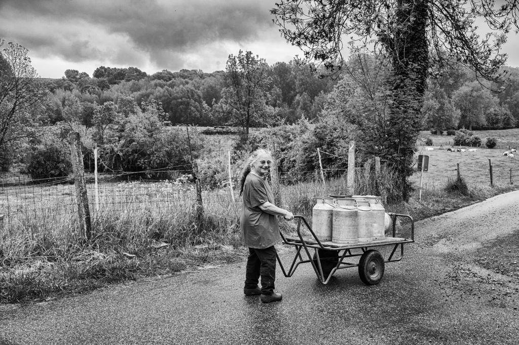
In two words: great and wonderful.
Good idea the crop in square format. I like his position, and specially his shoes that are very sharp and give him a "style".
Some can say a part of the bank is missing. It doesn't matter for me. Our eyes go ans stay to the man, and the tones of the pictures.
A lot pleasure with you new camera. |
Sep 15th |
| 39 |
Sep 23 |
Reply |
Indeed Kathryn, when I read the comments, I also look again and study the picture... The comments help ... |
Sep 15th |
| 39 |
Sep 23 |
Reply |
Thanks Paul. Indeed the light was not easy.
|
Sep 15th |
| 39 |
Sep 23 |
Reply |
I was even surprised of all these comments... |
Sep 15th |
| 39 |
Sep 23 |
Reply |
Thanks David for the analysis of the different parts and comments.
|
Sep 15th |
| 39 |
Sep 23 |
Reply |
Hello Lance and thank you for your comment.
It was hand held (5000 ISO to have enough speed) and I tried to have the camera horizontal. I need a little crop (difference between original ans picture). |
Sep 15th |
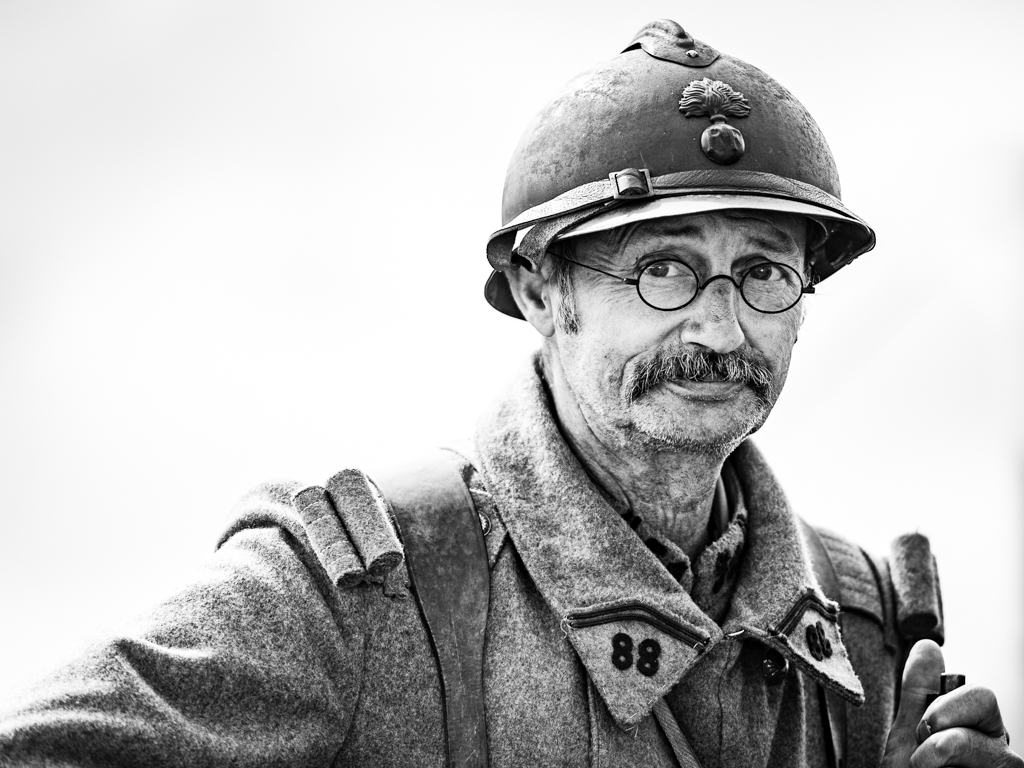
| 39 |
Sep 23 |
Comment |
Great story telling picture and interesting comments.
Of course the triangle with the flag is interesting and composed the picture, and the sidewalks are leading lines.
As the boy is smiling, it really tells something (fun, afraid, ...).
The white can be a "disturbing" element for a contest, but it is part of the street life. |
Sep 7th |
| 39 |
Sep 23 |
Comment |
Very good picture. We can see the look, the power of the osprey, well done.
As David mentioned it, both versions works well. However I find the B&W softer.
Great tone and sharp image (osprey feathers). |
Sep 7th |
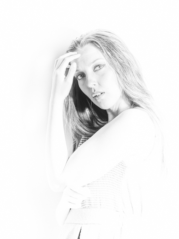
| 39 |
Sep 23 |
Comment |
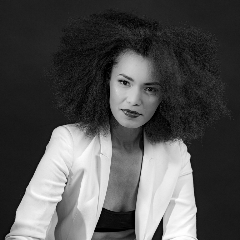
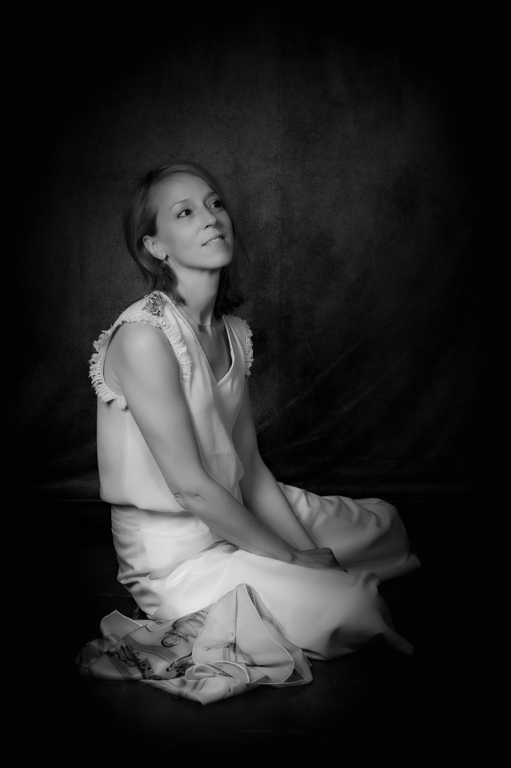
I really like the scene. Her eyes are wonderful. When they are fully open as it is, the face is illuminated and very beautiful. Not easy to realize that.
You will have a lot of fun with her. Enjoy.
Is she a Shih Tzu? |
Sep 7th |
6 comments - 5 replies for Group 39
|
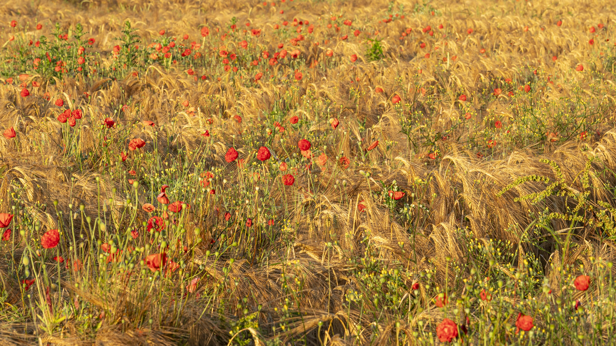
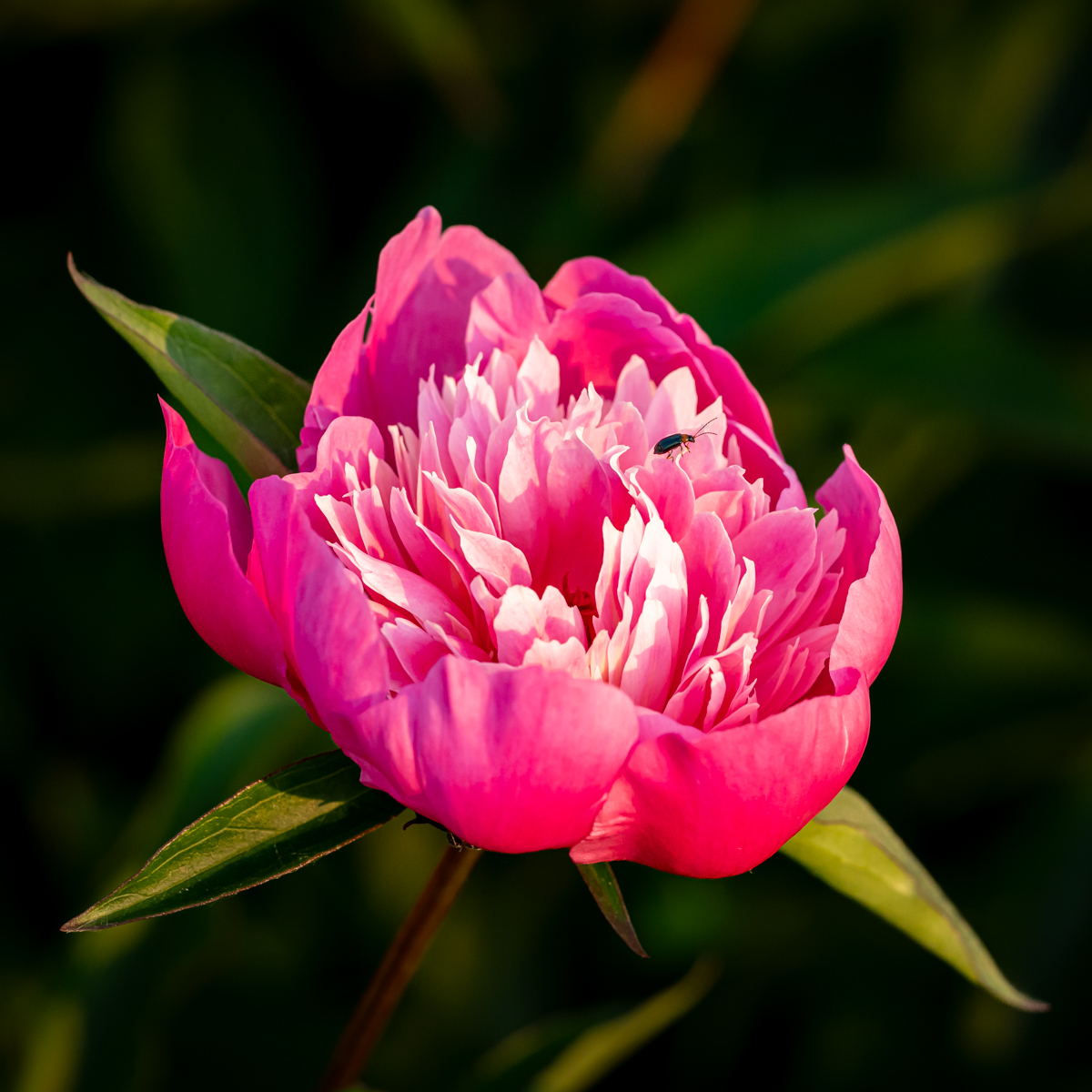
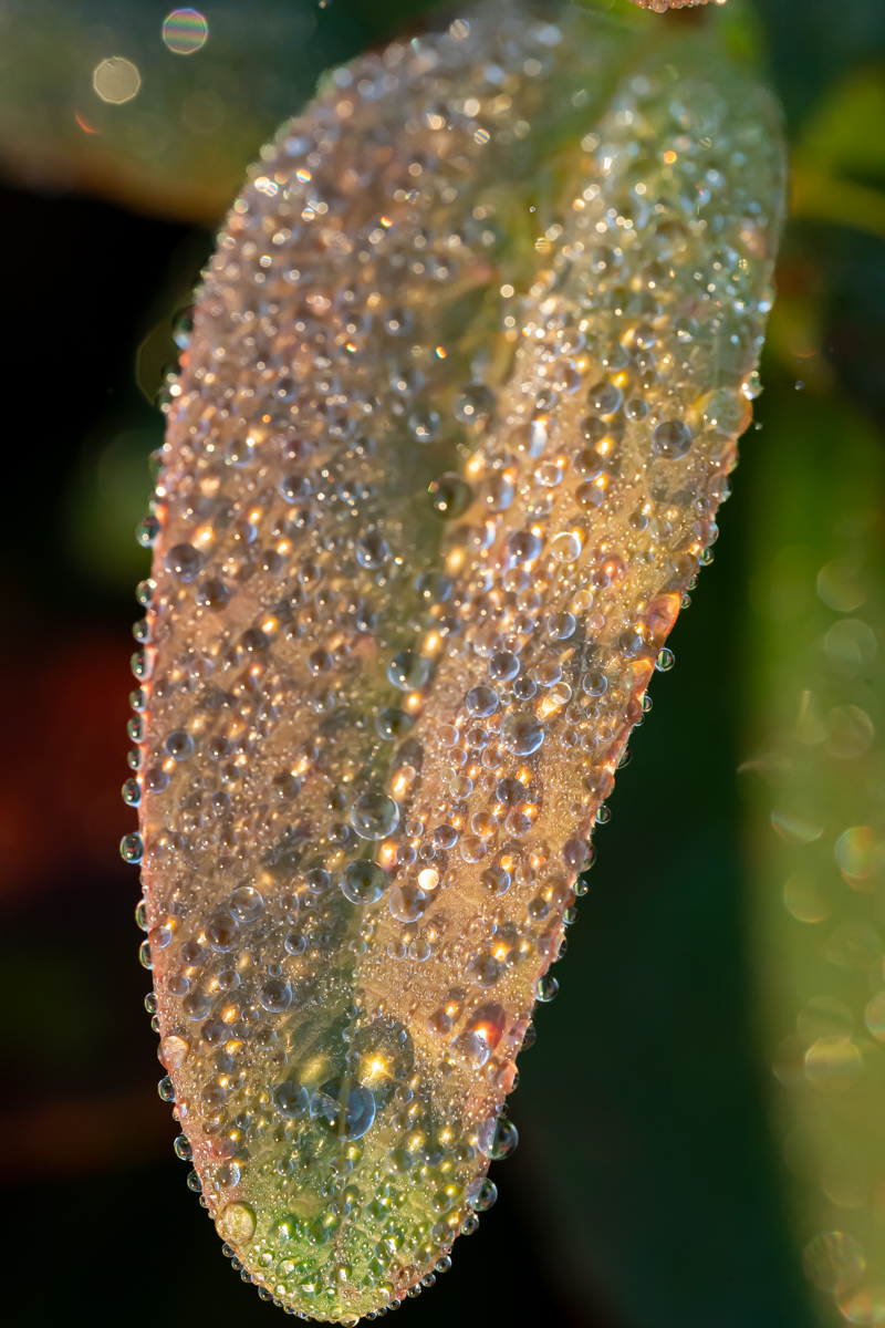
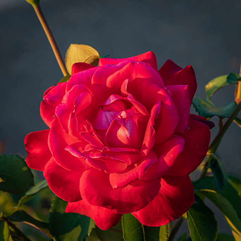
| 75 |
Sep 23 |
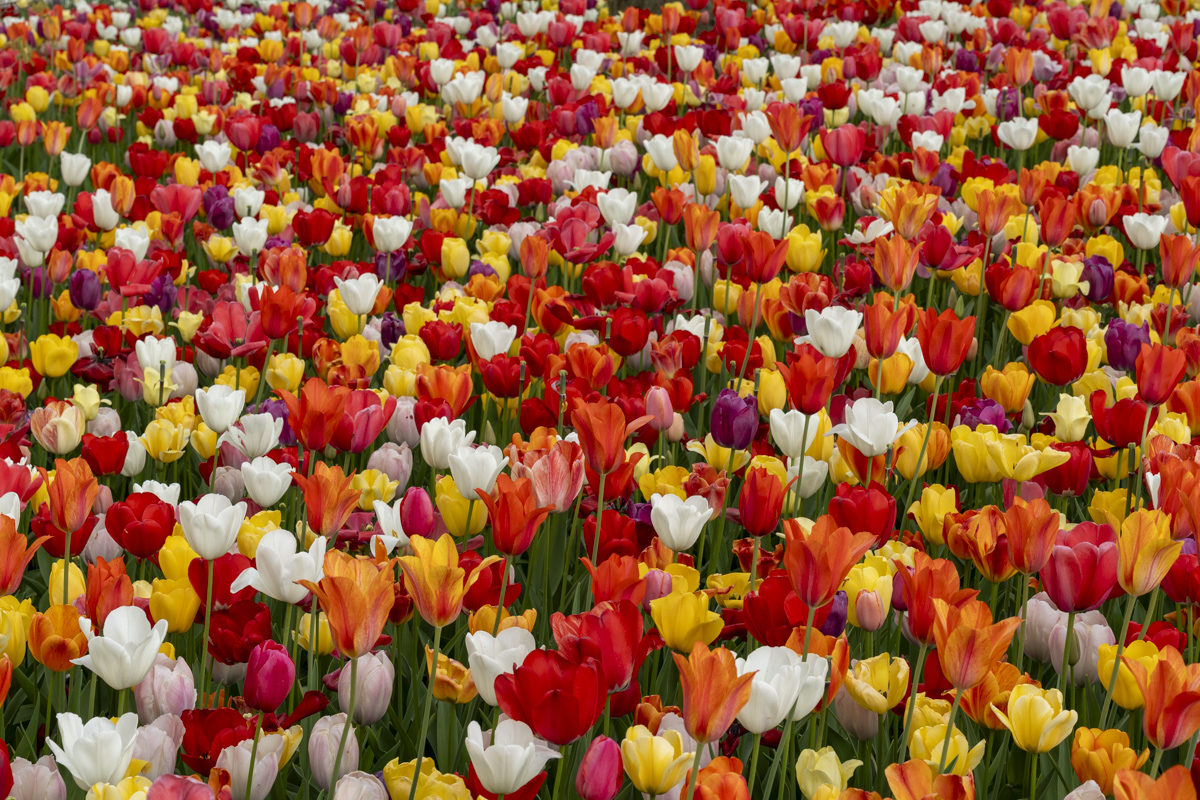
Comment |
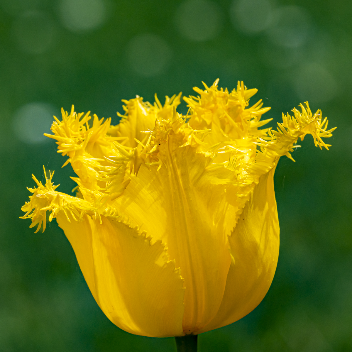
A pleasure of colors for the eyes.
I also like the water (and glycerine) drops.
A square format can be interesting? The red petal on the right can attract the attention. |
Sep 18th |
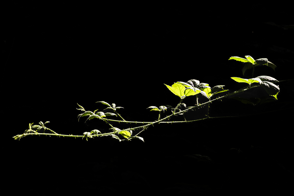
| 75 |
Sep 23 |
Comment |
What can we say/write? Just great! Congratulations.
The light and sharpness on lower leaves is incredible. As mentioned, good choice for the background.
Good idea this composition.
I have never done that, I think I should try. |
Sep 18th |
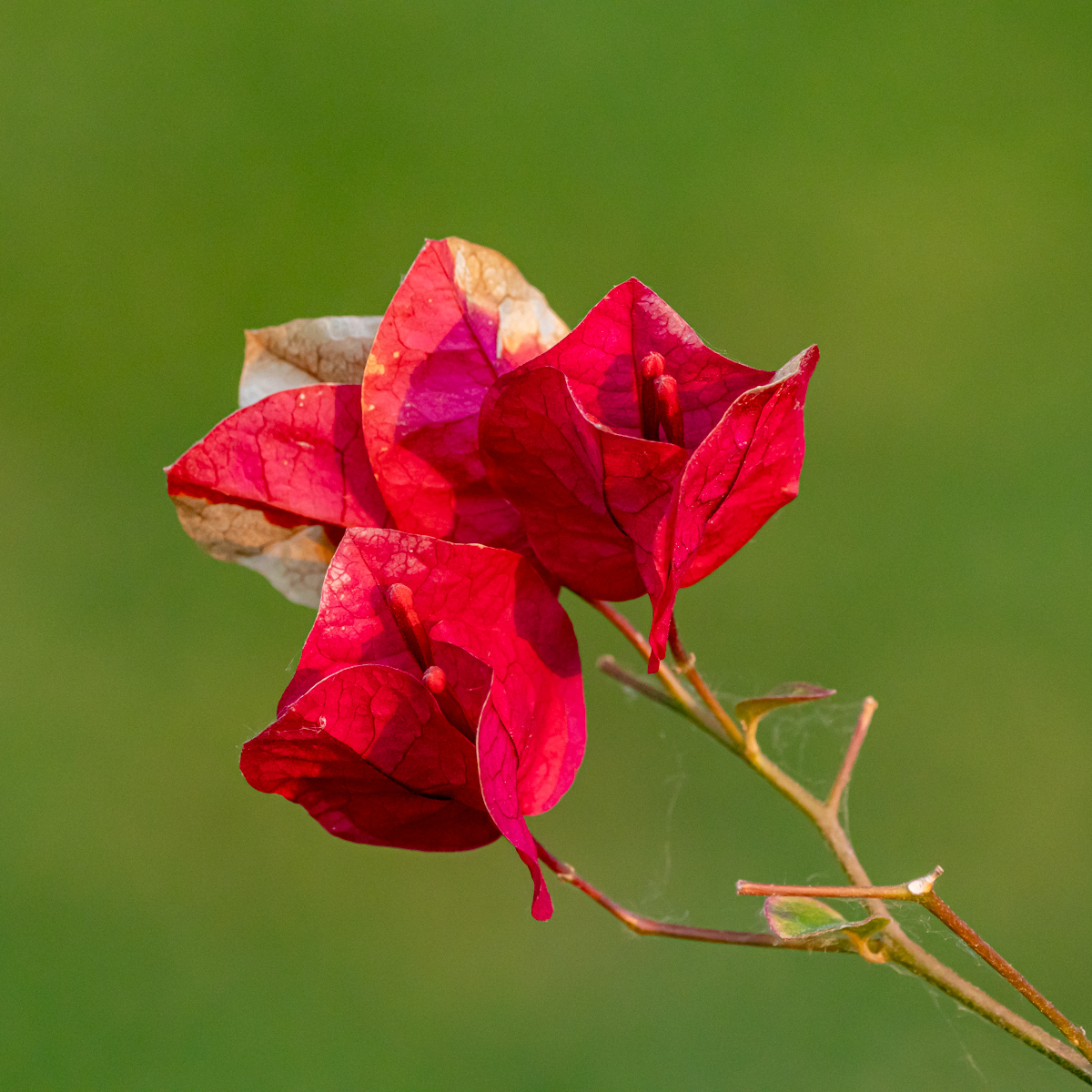
| 75 |
Sep 23 |
Comment |
I would add to the comment, that I would have tried to be parallel with the border of the pool.
Indeed the contrast of color are nice.
To avoid the grout lines, you just had to open (Lower f) the aperture. Fi: f/8 (even less) iso f/20. |
Sep 17th |
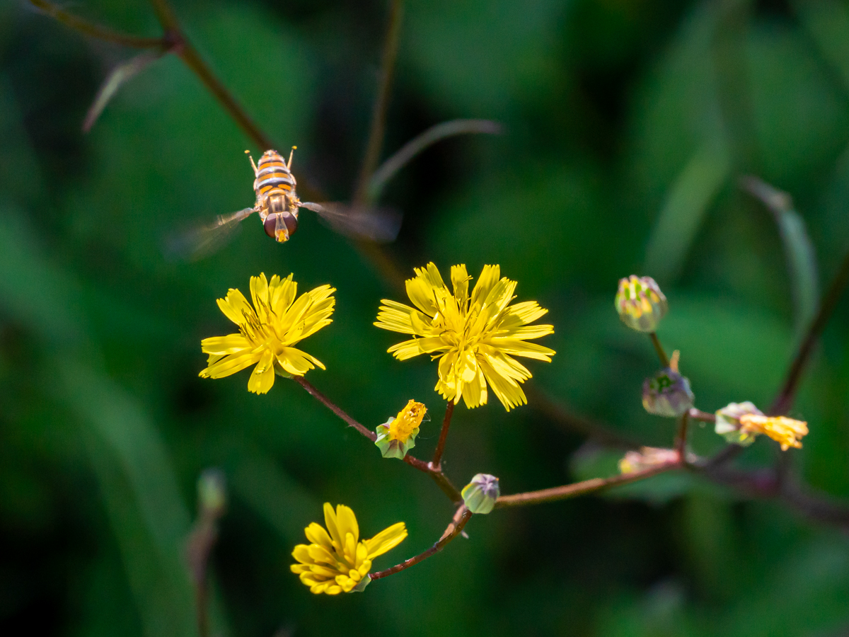
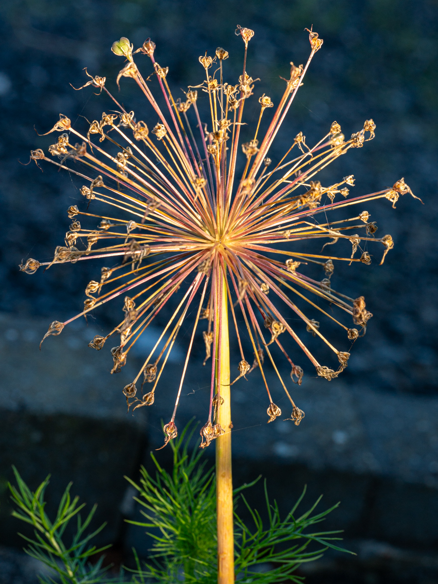
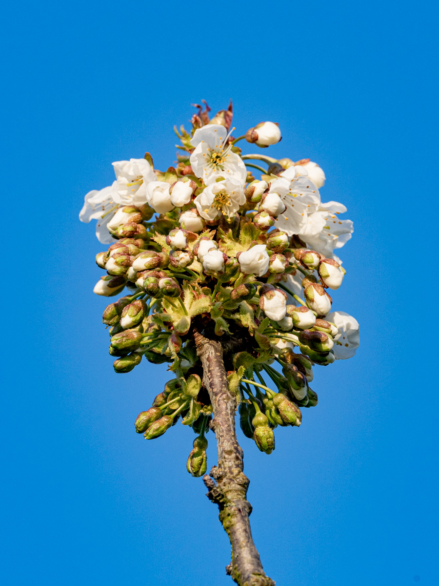
| 75 |
Sep 23 |
Comment |
Nice idea I like it. Something new.
I think you should have tried try have more flowers. It is empty (no flower) in the lower left corner and upper tight. An alternative, as written, is to crop a little.
Not easy to have all the flowers in the same plan, for the DoF. |
Sep 17th |
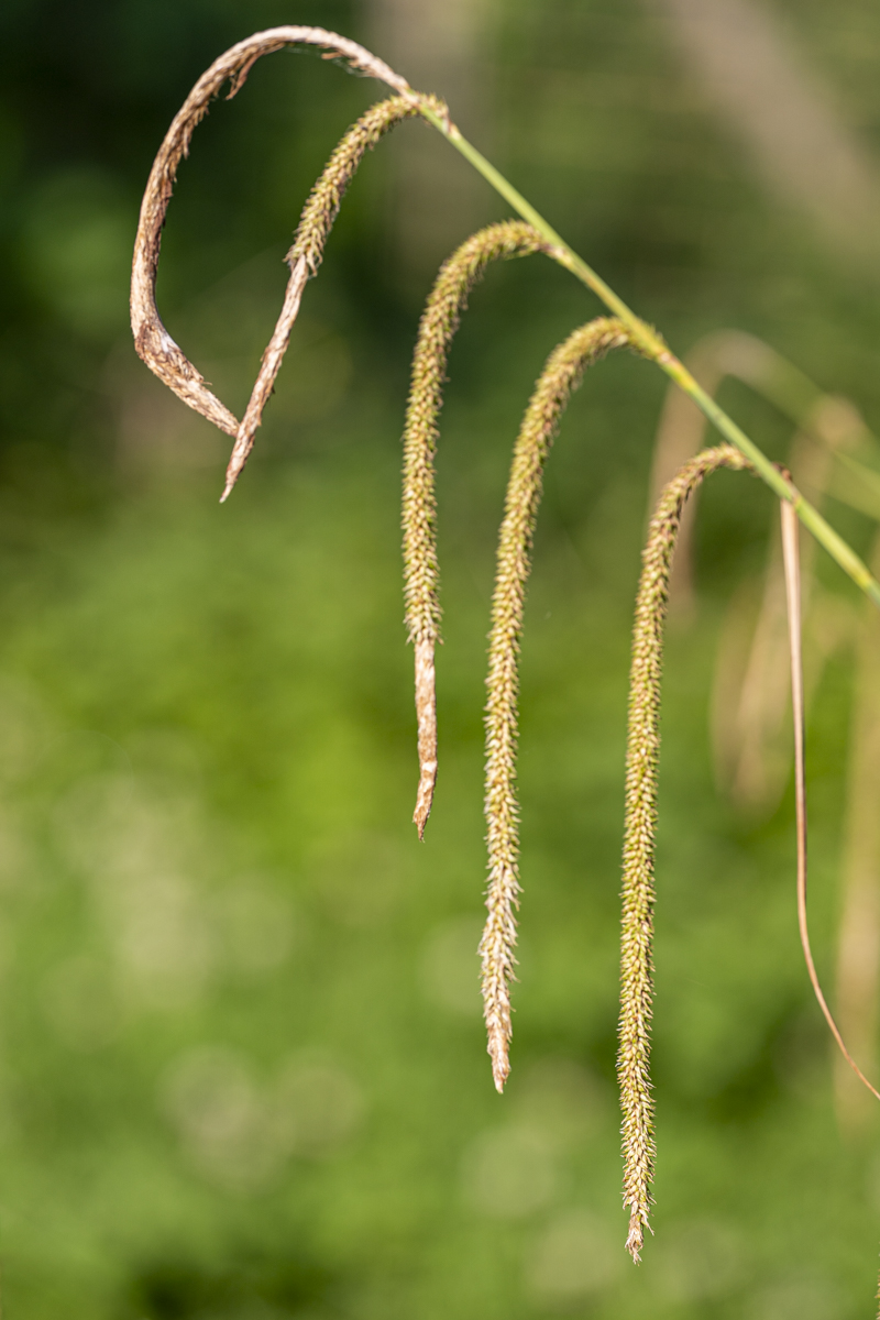
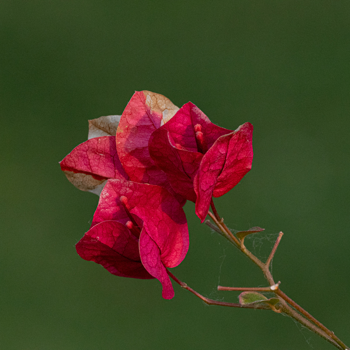
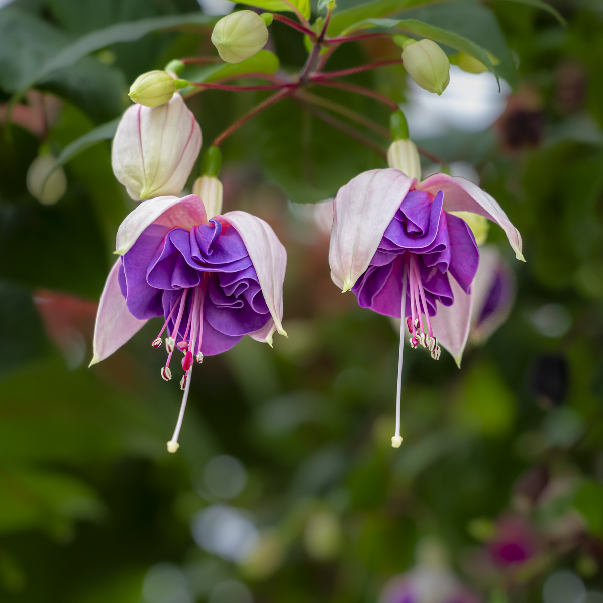
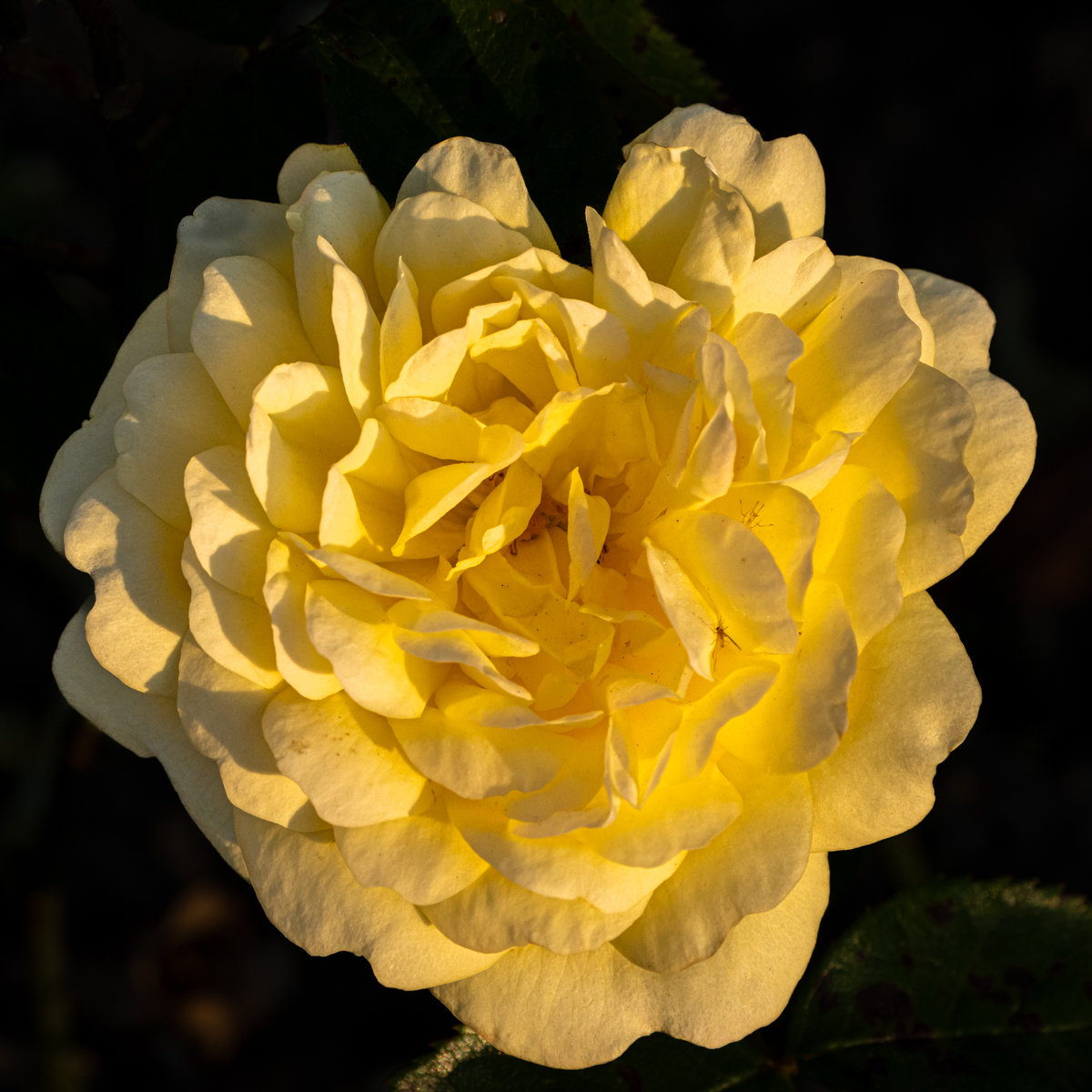
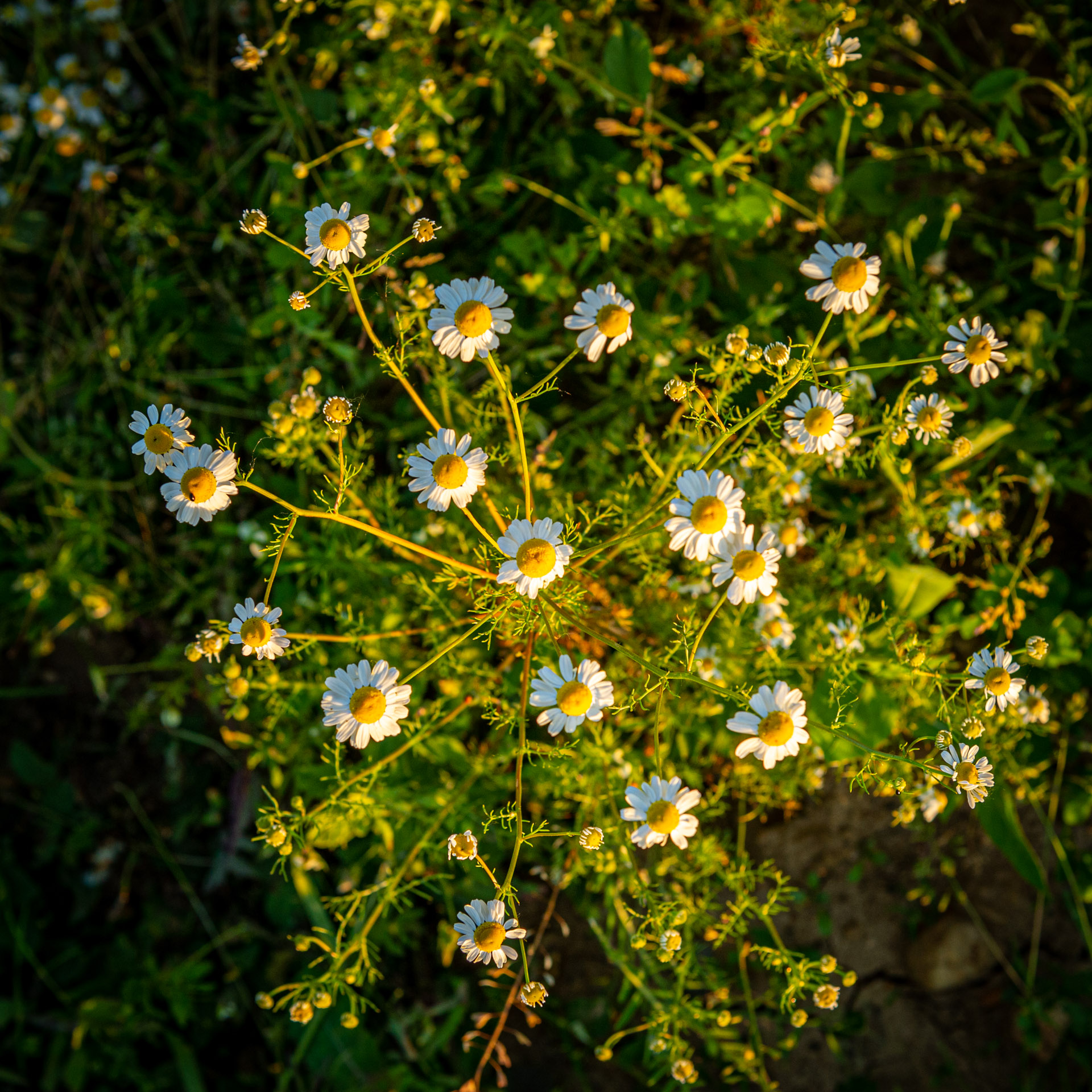
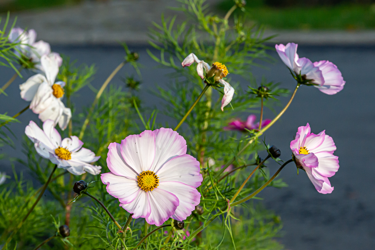
| 75 |
Sep 23 |
Comment |
The composition is intriguing for me. 3 Flowers, a big, a medium and a small one. The 2 biggest are together? and ons stand a little above the other. The third one (small one) is a little far from the 2 others. It is unusual. This is why it is a good picture.
Nice contrast of colors (blue and yellow).
No experience for your question. |
Sep 17th |
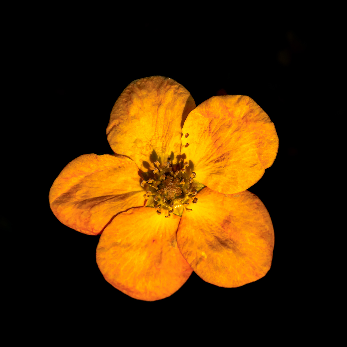
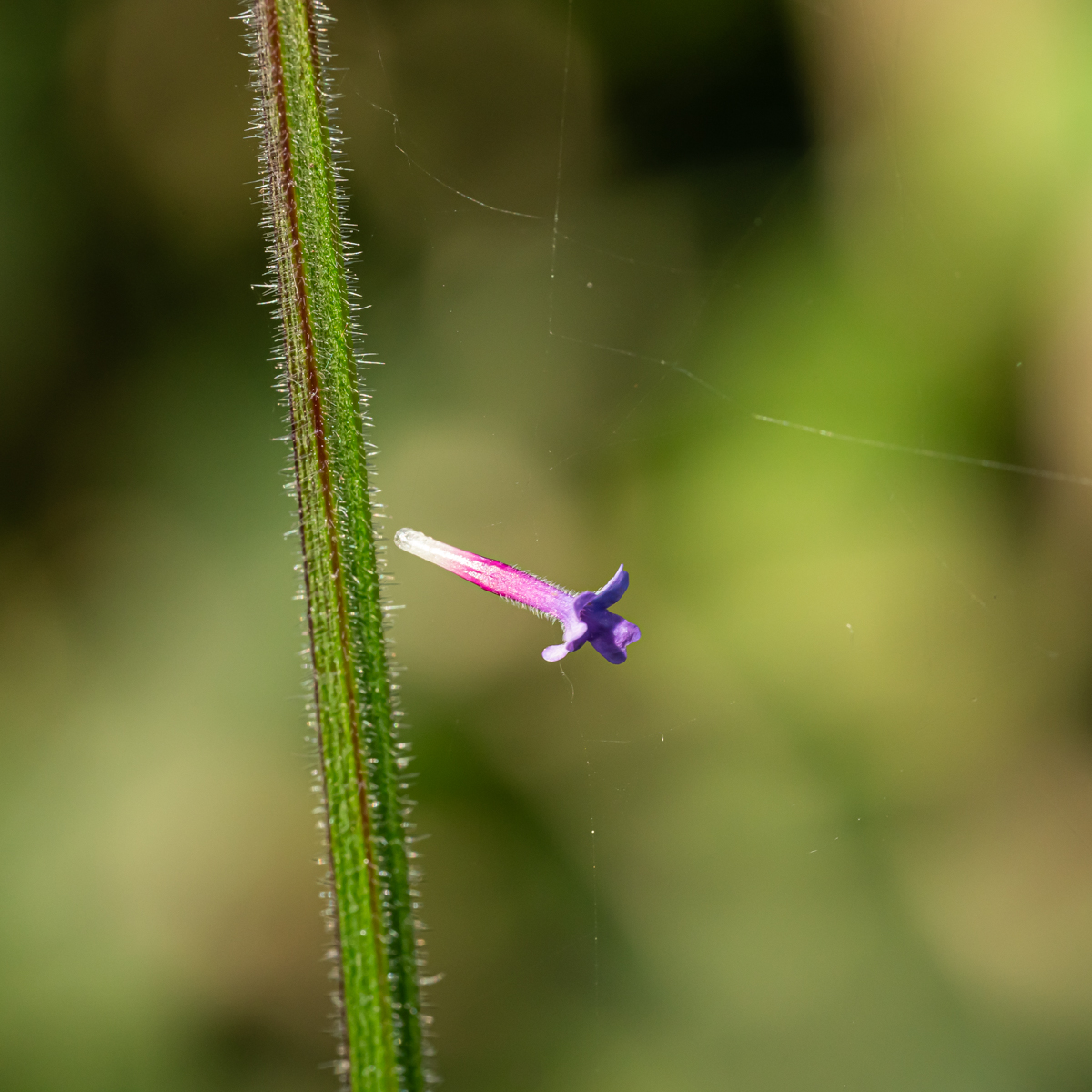
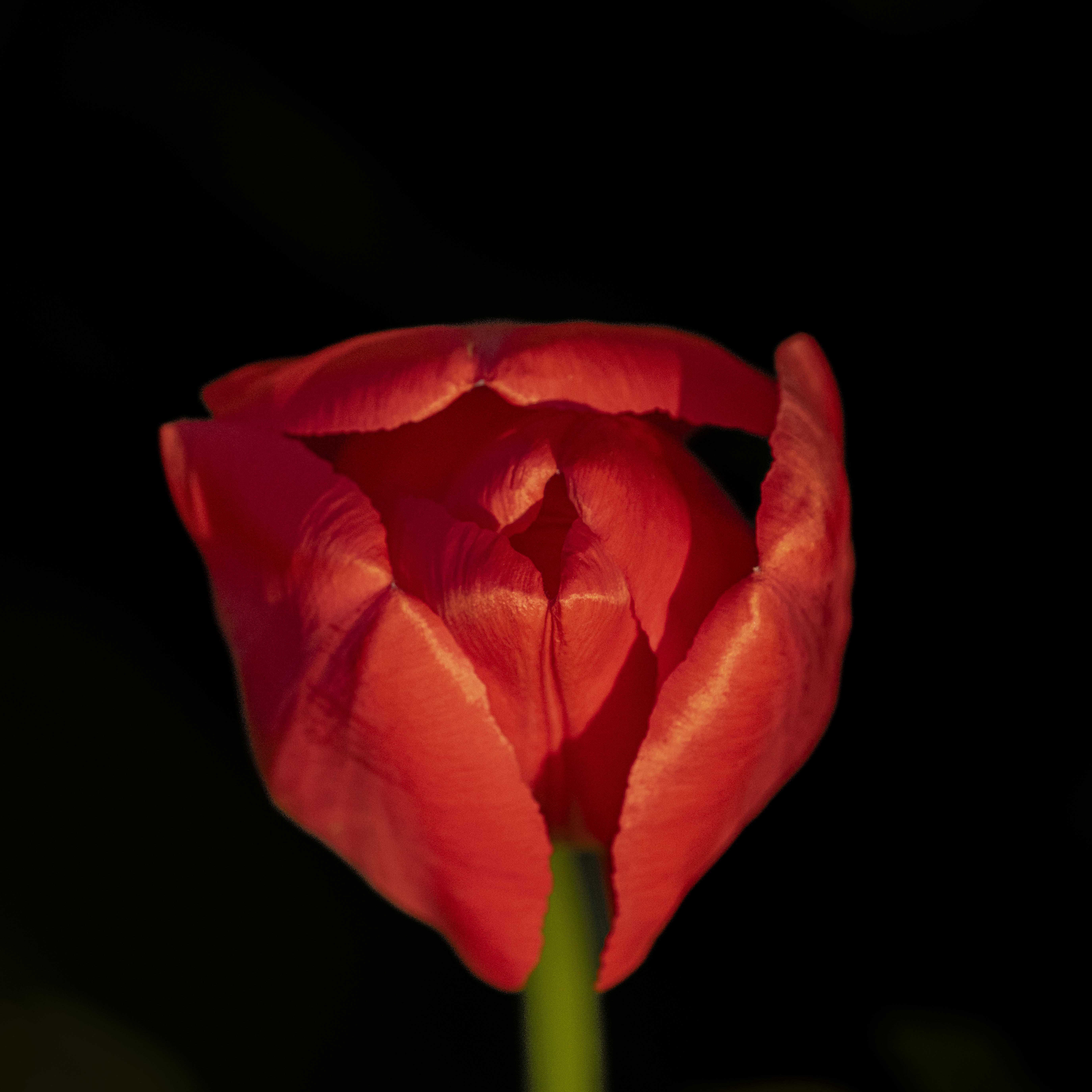
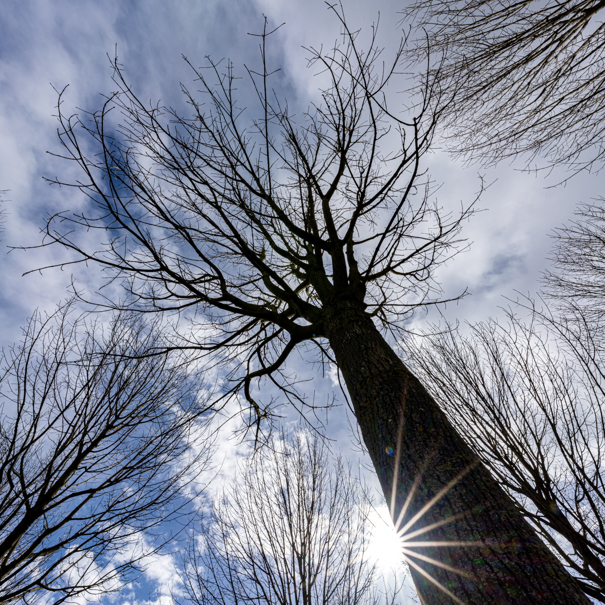
| 75 |
Sep 23 |
Comment |
I like the picture and the composition (line of the flower).
I have no problem with the perpendicular one. Indeed we see flowers of the front, other of the rear. Why no profile?
Maybe a little crop of the left. |
Sep 17th |
| 75 |
Sep 23 |
Reply |
Thanks Judy for this nice and good proposition. |
Sep 17th |
| 75 |
Sep 23 |
Reply |
Thanks Murphy for this opinion.
I think if everyone does as he or she wishes to do, it is the most important. |
Sep 17th |
| 75 |
Sep 23 |
Comment |
Dear All,
Thanks for your comments which are different. For the corner, there are some people in favor and other against.
Here, one again, I really appreciate the comment and the forum, as sometimes we can "discover" something we didn't notice... For the "empty stems", I think the spiderwebs can justify their presence... |
Sep 8th |
7 comments - 2 replies for Group 75
|
13 comments - 7 replies Total
|