|
| Group |
Round |
C/R |
Comment |
Date |
Image |
| 39 |
Jul 23 |
Reply |
Less is more: indeed. We forget that sometimes...
Thank you. |
Jul 20th |
| 39 |
Jul 23 |
Reply |
Thanks Fran for your pertinent comment, suggestion and work (removing the branch). |
Jul 20th |
| 39 |
Jul 23 |
Reply |
Thanks David for the pertinent comment. You are right for the house in the left. I mentioned it in my description, but didn't try to crop it. |
Jul 20th |
| 39 |
Jul 23 |
Comment |
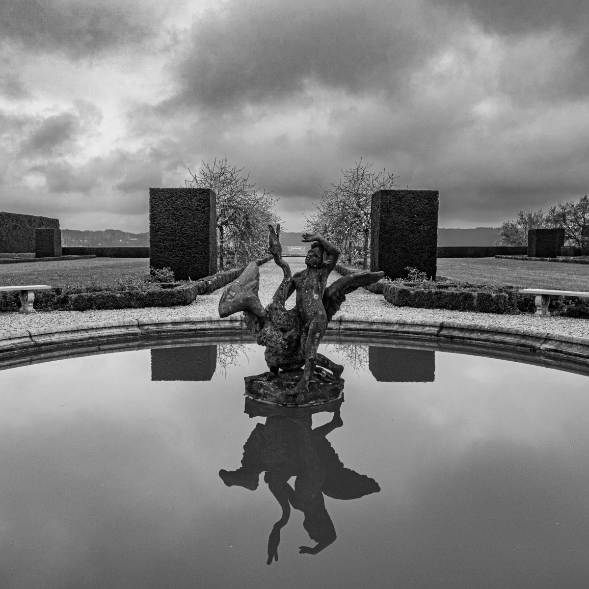
Beautiful park and picture.
I have the impression to be in another world.
Good idea and job to have added some space on the top. Very sharp subjects.
I think it is time to clean your sensor (see dots in color version).
|
Jul 20th |
| 39 |
Jul 23 |
Comment |
We are in the world of creativity. Good idea and well done.
I find we better saw the (right) eye in the color version. It stood out more and better highlighted.
The position (in flight) is just outstanding.
I really like the suggestion of Paul.
|
Jul 20th |
| 39 |
Jul 23 |
Comment |
At first sight I was a little disturbed by the place (in the center of the image) of the boat. However as the cable lead the eyes to the boat, It was no more an "issue" for me.
I like the perpective. A knee on the ground could have been also interesting (it would have been another image).
Such subject (old and in wood) calls the B&W. Thanks to the bird for his presence. |
Jul 20th |
| 39 |
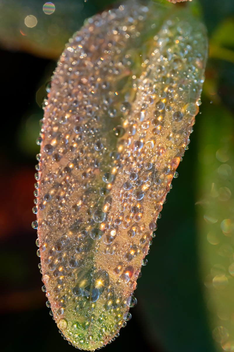
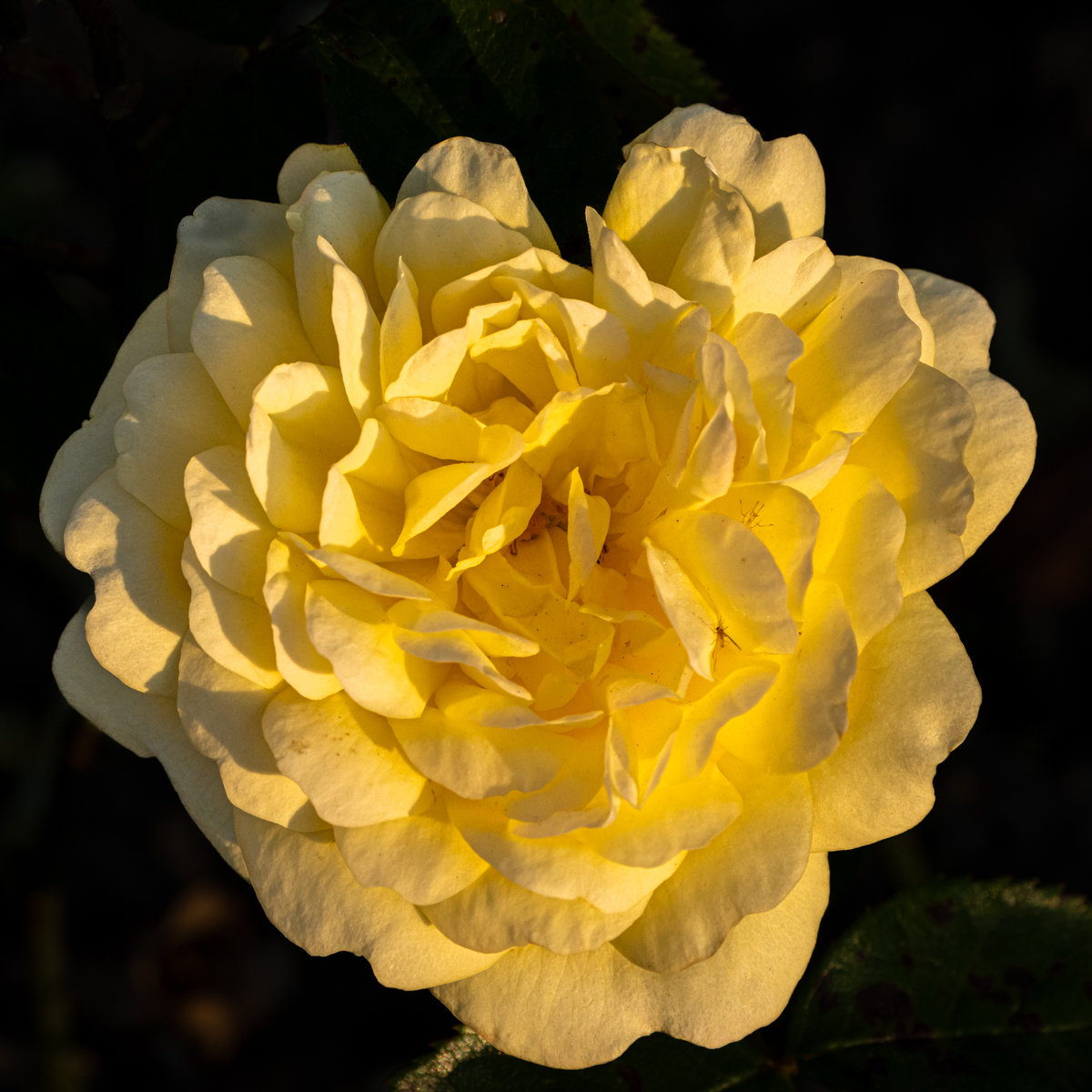
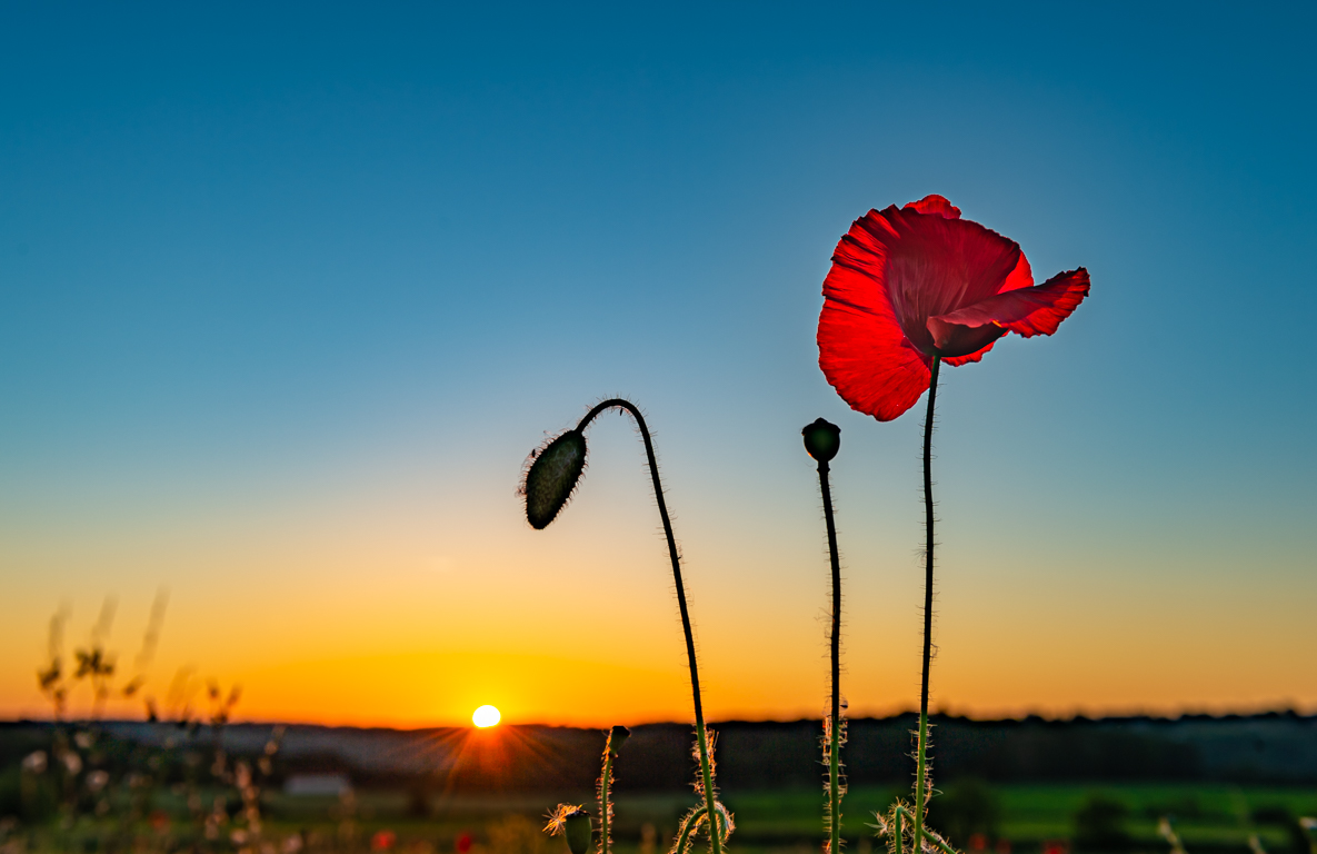
Jul 23 |
Comment |
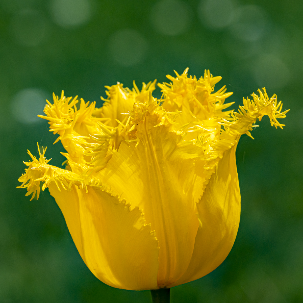
Before reading the comments, my opinion was the comment of David...
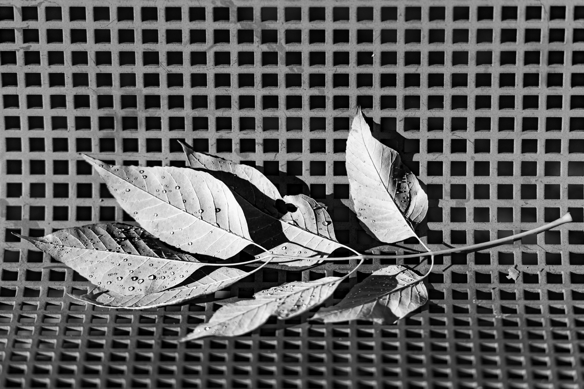
The sharpness to the petals and the water drops make the picture for me.
The composition of the 3 flowers is interesting: different sizes of flowers, close together, ... |
Jul 20th |
| 39 |
Jul 23 |
Reply |
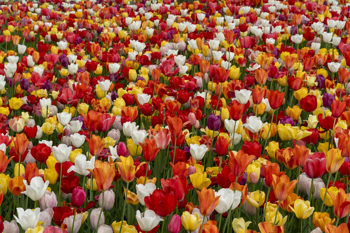
Welcome Fran to the Keukenhof. I wished to go this year but not succeeded... It is "only" 180 miles from home. It is a long distance in Belgium, but the neighborhood for you....
There is also such a garden in a castle next to Brussels: https://www.floralia-brussels.be/fr/floralia-brussels/
|
Jul 20th |
| 39 |
Jul 23 |
Comment |
Really nice and wonderful image.
The B&W version is a real improvement of the picture. Good job for the treatment.
I prefer without foreground, as the reflection brings enough information. well done the removing od the tree.
You have to be there at the right time. A lot of people of wine avoid either a good composition or the reflection.
I took pictures of some lakes this month, I will try to do as well as you did. |
Jul 20th |
| 39 |
Jul 23 |
Reply |
I agree too. |
Jul 20th |
| 39 |
Jul 23 |
Comment |
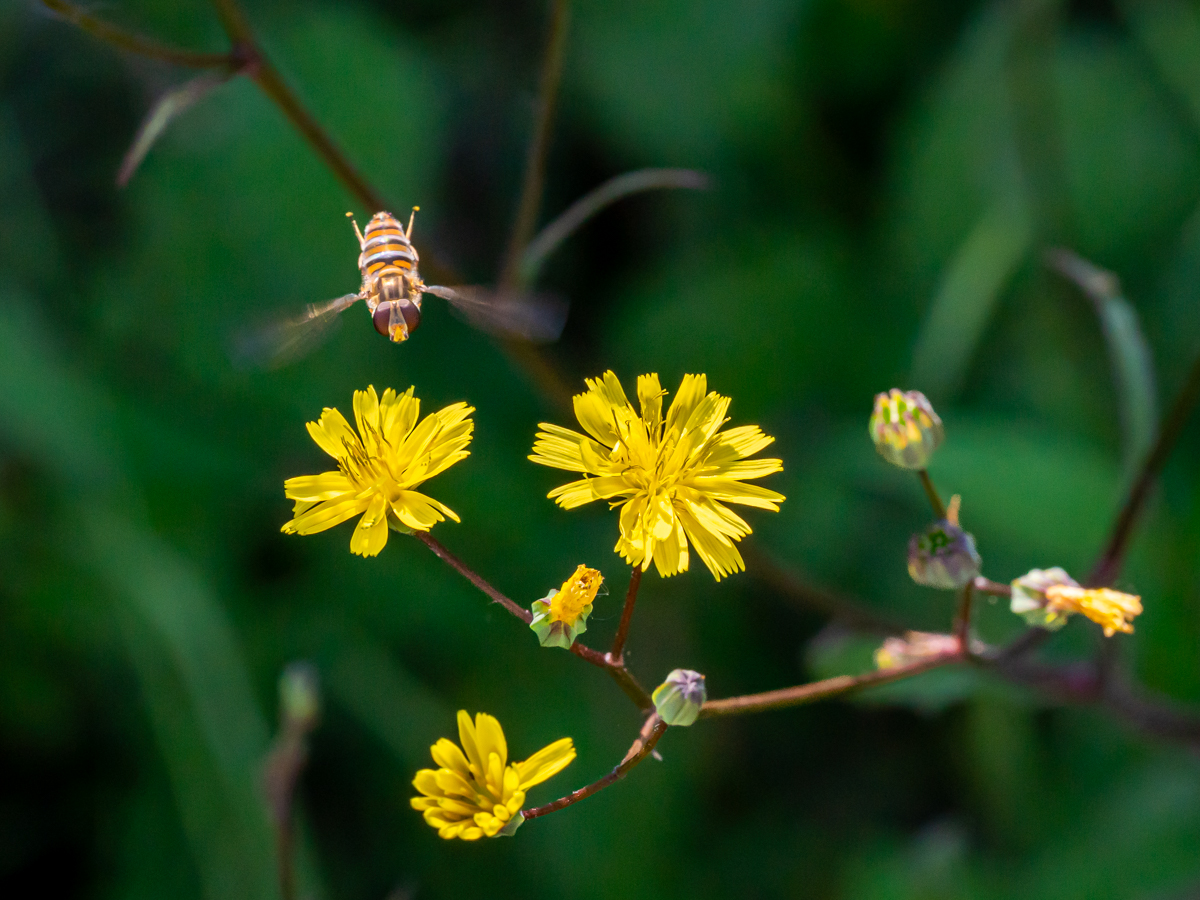
Nice composition David, I like it.
The bird is well sharped, and away from the background.
At first sight, I would have kept the composition as it is. However I find the suggestions very interesting. If you crop left & right, I would suggest to reach a square format. There are as many opinions as members...
Great experience with the birds. It is a pleasure to use this objective...
|
Jul 20th |
6 comments - 5 replies for Group 39
|
| 75 |
Jul 23 |
Reply |
Thanks Judy for the suggestion and your comment. |
Jul 25th |
| 75 |
Jul 23 |
Reply |
Thanks Dan for your opinion. |
Jul 25th |
| 75 |
Jul 23 |
Reply |
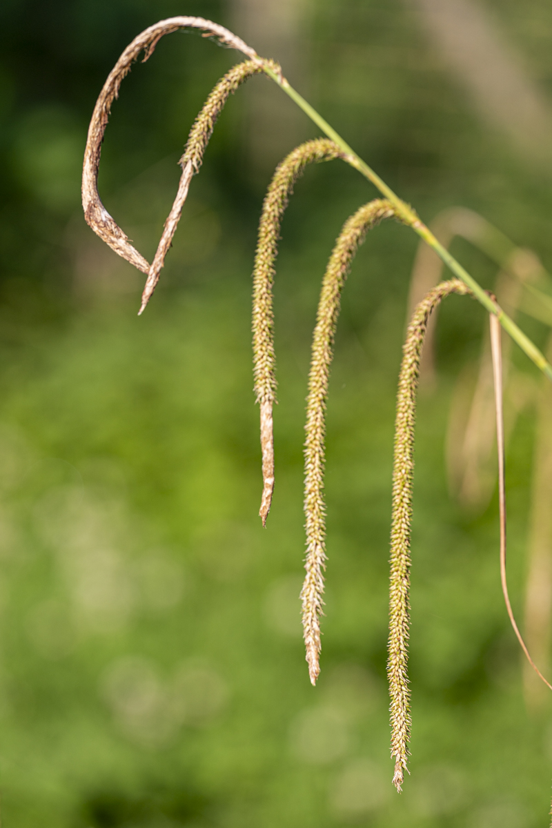
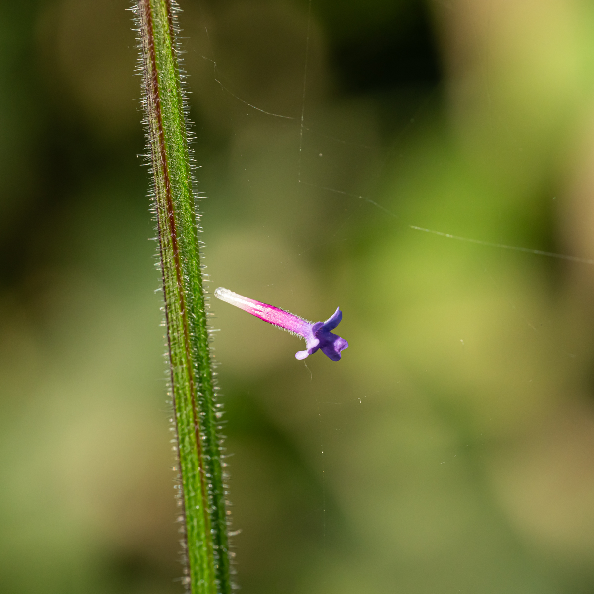
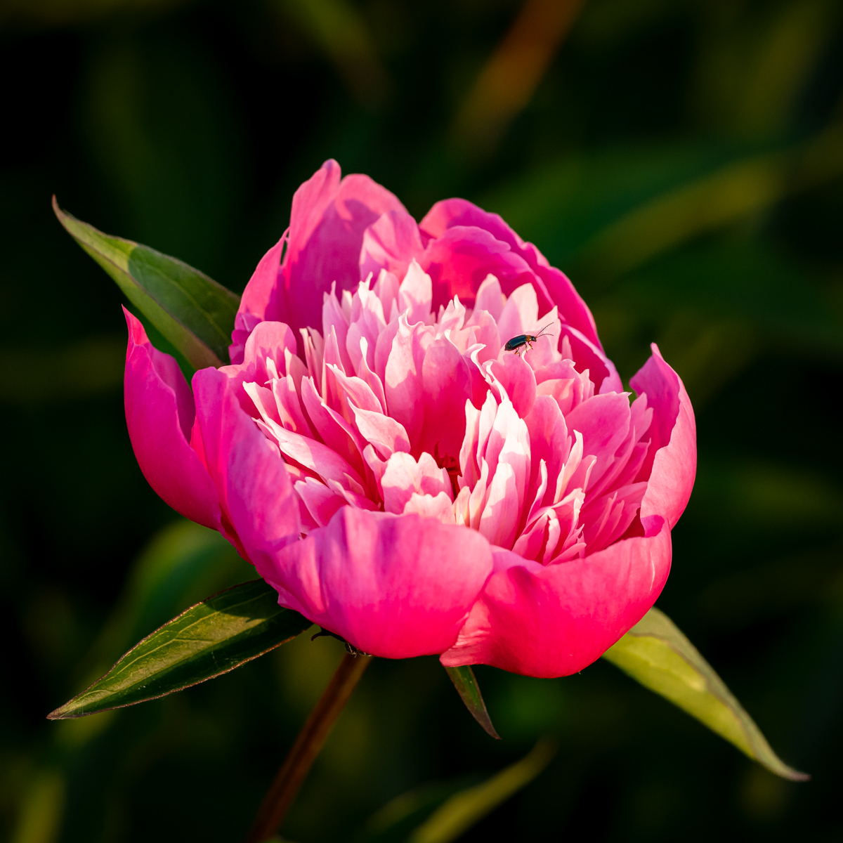
Thanks Ray for the suggestions.
I should have one with a bug (it is too small here). I have to look for. |
Jul 25th |
| 75 |
Jul 23 |
Reply |
Thank Murphy for your advice about the condition af taking pictures. Indeed I forgot a thin border. |
Jul 25th |
| 75 |
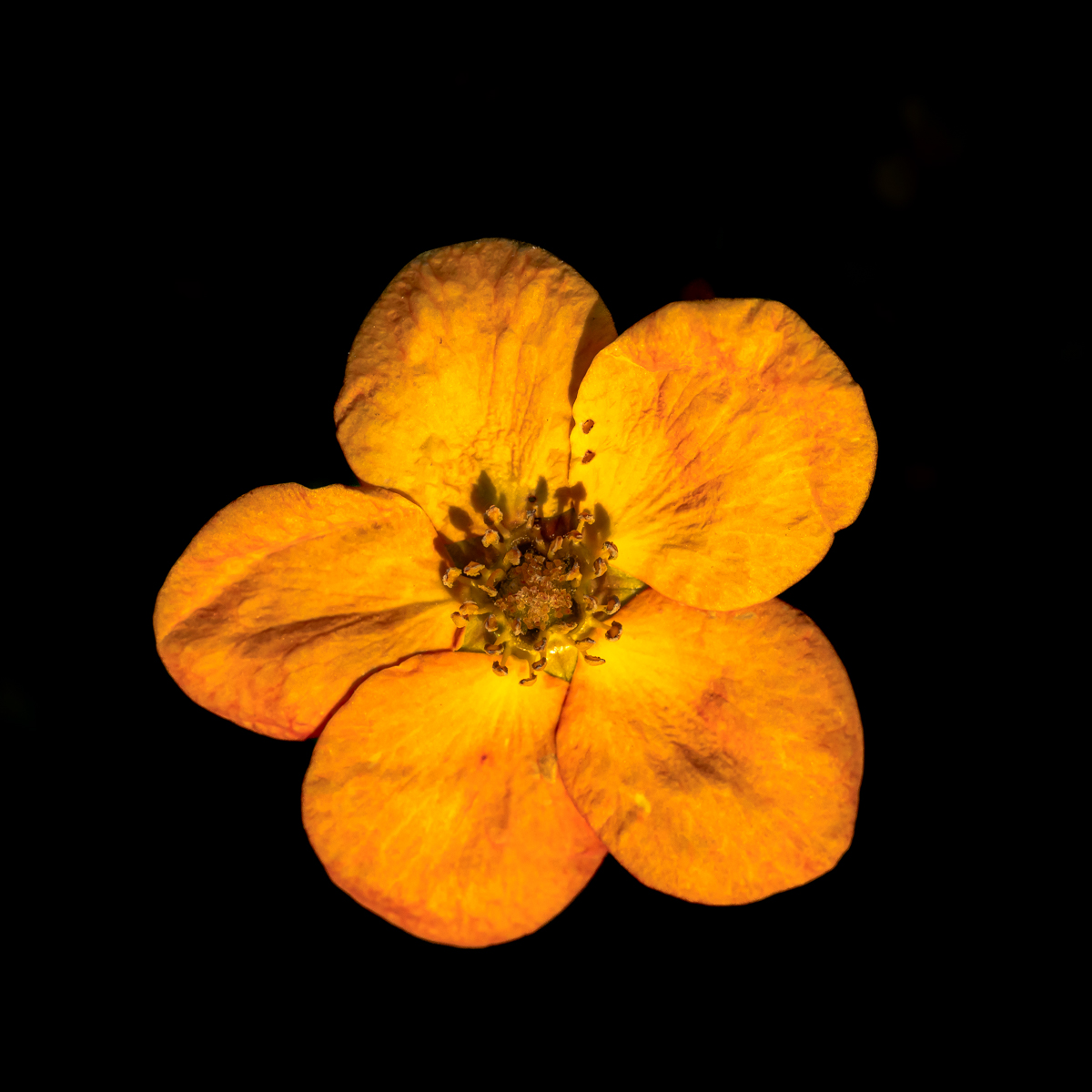
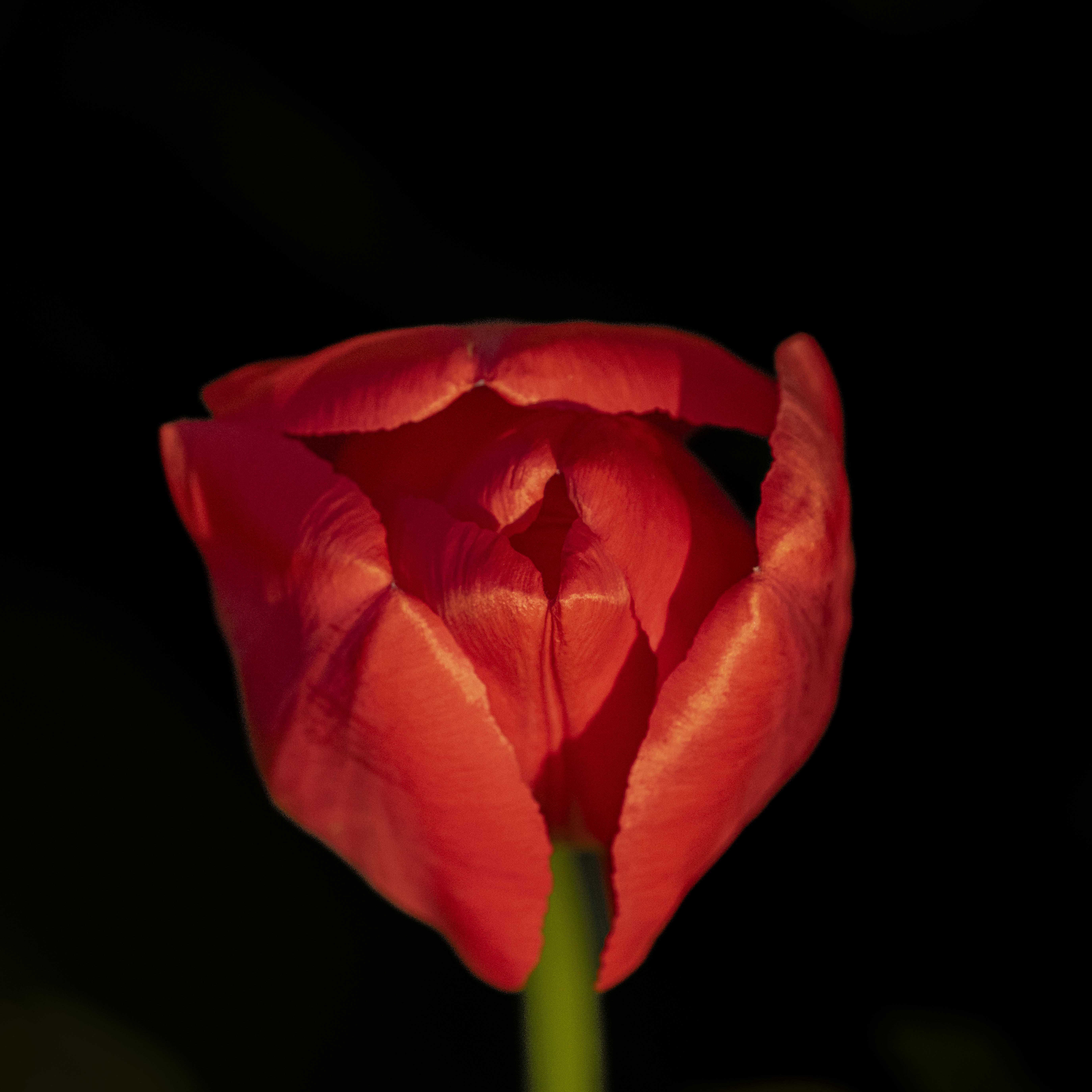
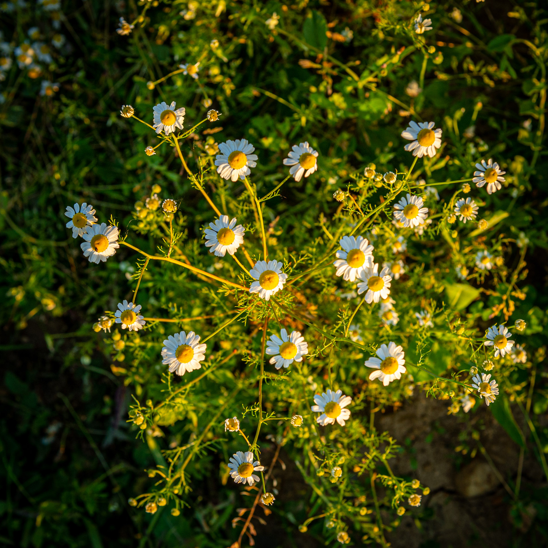
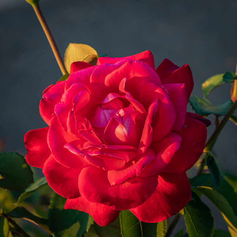
Jul 23 |
Comment |
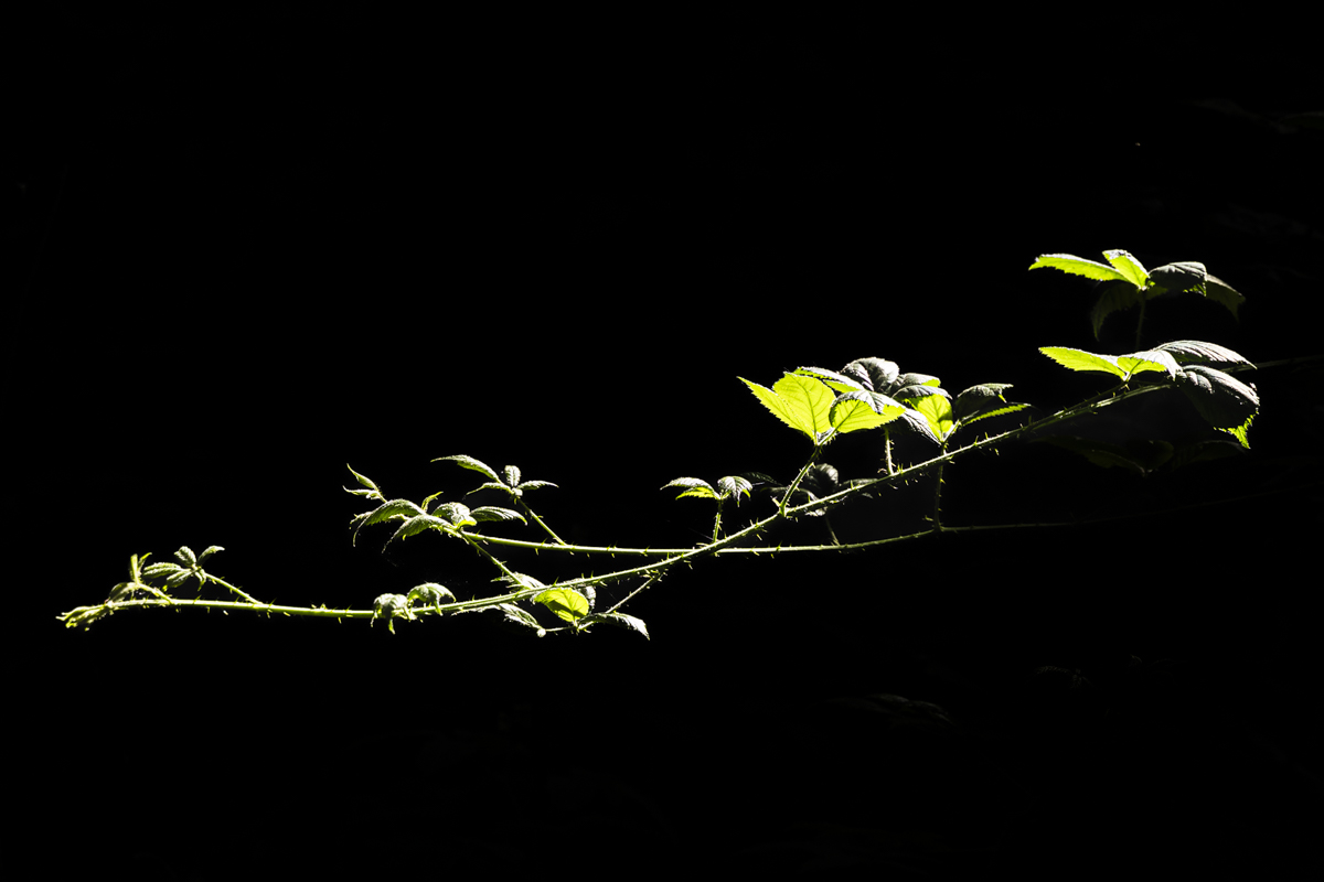
Impressive image. We dont't often see this flower at he time of evolution. Original idea. I really like it.
The background is softer than dark. It attract my attention.
I would have cropped a little on the right to center more the flower. Just a suggestion. |
Jul 25th |
| 75 |
Jul 23 |
Comment |
I like the composition (center, the petals, the ??? on the petals). The center is very sharp. I like it very much.
About the border, see the analysis of Murphy.
|
Jul 25th |
| 75 |
Jul 23 |
Reply |
I like the analysis about the border. Personally I like a thin border in cases, just to limit the picture. |
Jul 25th |
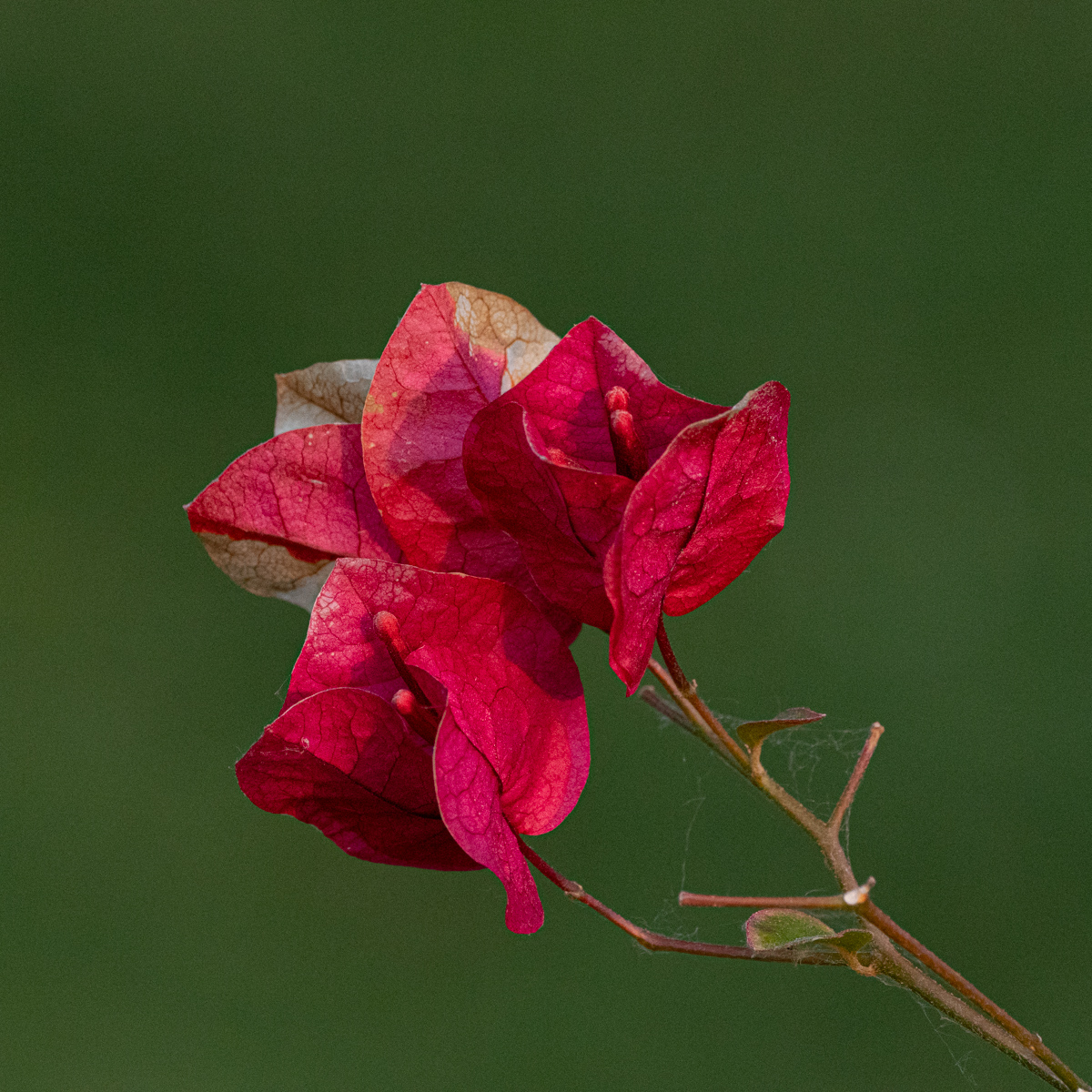
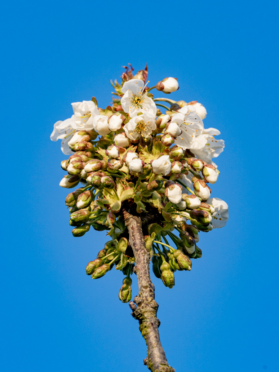
| 75 |
Jul 23 |
Comment |
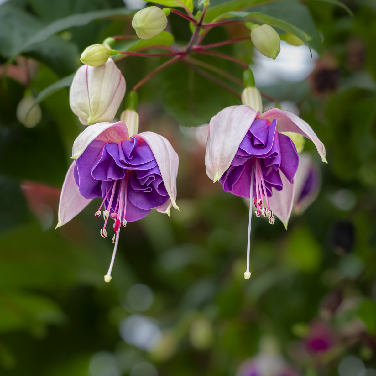
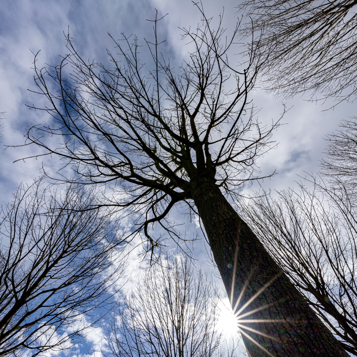
I like the two clusters, the second is part of the composition. It also gives an impressions of depth.
Maybe some parts of the background are quite bright, but it is your choice to keep them or not. The darker the color, the more the subject is highlighted. |
Jul 25th |
| 75 |
Jul 23 |
Comment |
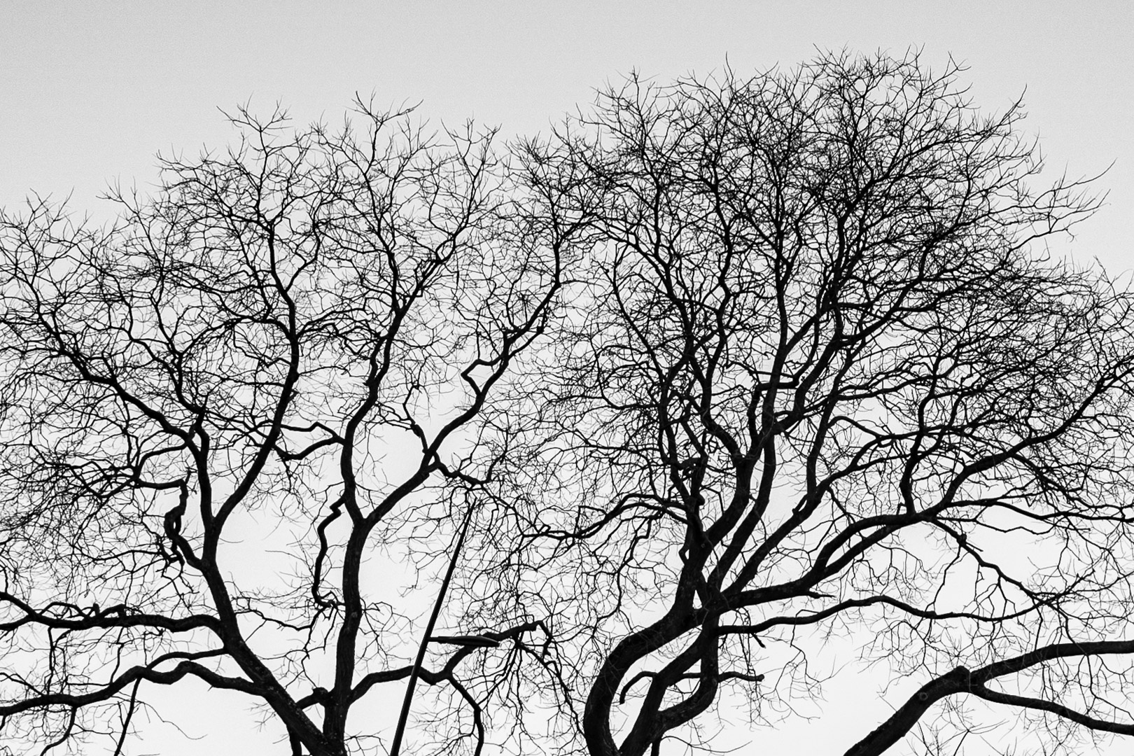
Even if it is always interesting to see the environnement (background) of the subject I also find it is a little too present here.
The crop version allows us to see the sharpness of the flower. When we look it at full screen it is just great. |
Jul 25th |
| 75 |
Jul 23 |
Comment |
I relie like the composition Murphy, well done.
The small color frame around the picture is a good choice, especially with the same color.
Th e price to be paid to reach a black background is maybe high when we deeply analyze the picture (the stem). At first sight it is very sweet and sharp. |
Jul 25th |
5 comments - 5 replies for Group 75
|
11 comments - 10 replies Total
|