|
| Group |
Round |
C/R |
Comment |
Date |
Image |
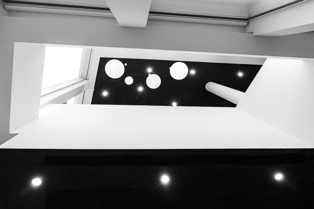
| 39 |
Jun 23 |
Comment |
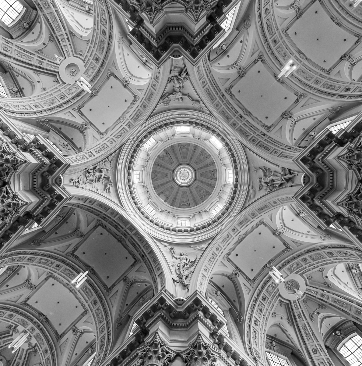
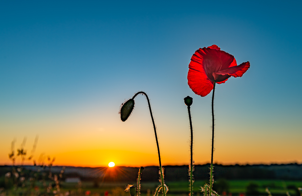
I really like this kind of picture, and I appreciate this one.
However, when I read all the comments, I realize this is not easy at all, specially for all the possibilities of lightings. It is always a choice of the maker.
I agree with David for the crop on the upper left. It would improve the symmetry, if you wish it of course ...
|
Jun 16th |
| 39 |
Jun 23 |
Comment |
I like the processing of the B&W, specially for the flower on the left (it has great details) and the background.
The composition of 3 flowers in a triangle with a focus on the left one is well done.
Maybe a small crop to better see the flowers.
I also forgot to put a small border around the picture, even if this was already mentioned a lot of times. It happens...
|
Jun 16th |
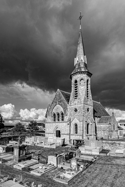
| 39 |
Jun 23 |
Comment |
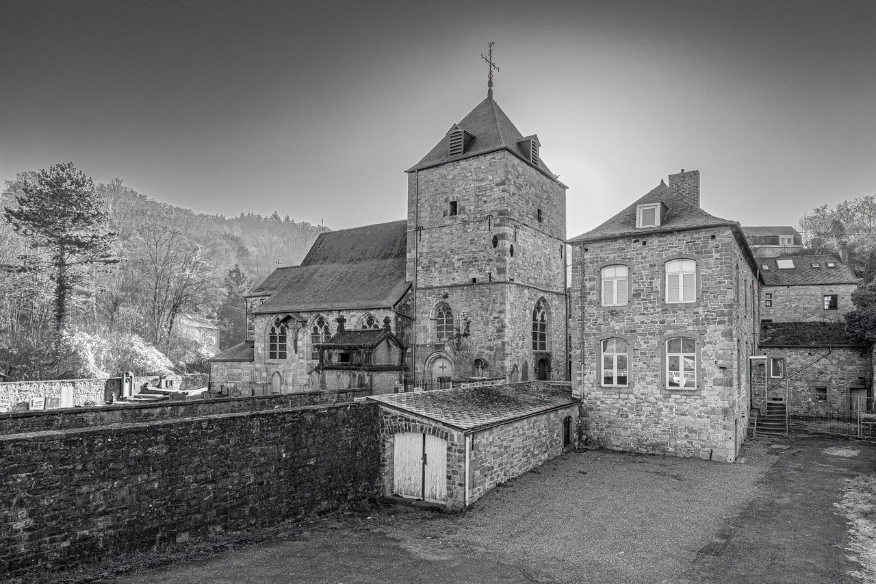
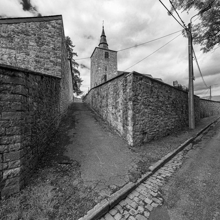
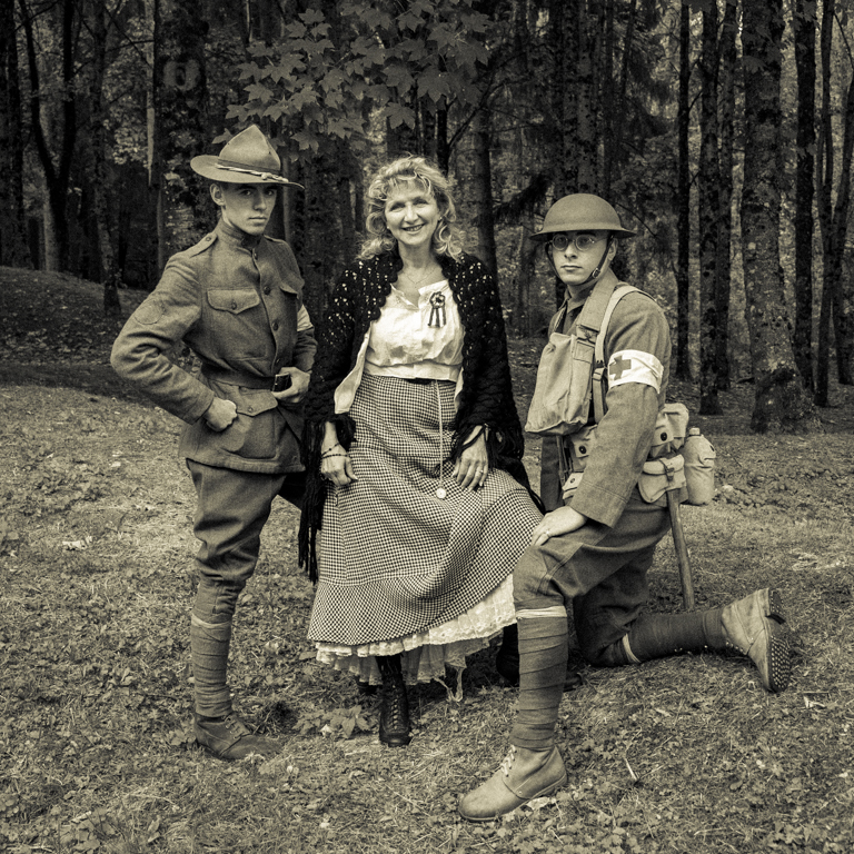
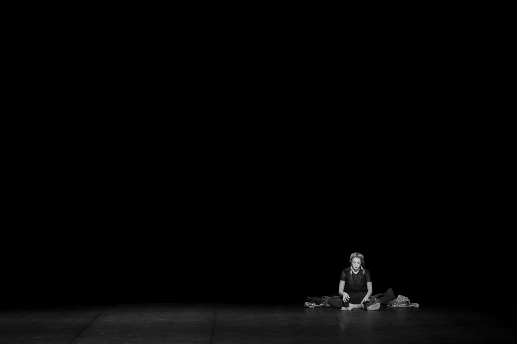
Good composition. There were several possibilities, namely the monk in the foreground as you did, either between the tombs.
I like your choice. The look of the monk makes the picture.
I also like very the (picture) background. It has an history, a soul. The sharpness of some trees (on the right) is different than the of the church. |
Jun 15th |
| 39 |
Jun 23 |
Comment |
I really appreciate the picture. The combination of the 2 images is well done. I find the waterfalls great (quite majestic due the angle of view).
You often come up with something new with your iPhone. I like that.
Even if the question about the long exposure is pertinent and can reveal it is 2 different pictures, the combination is interesting , this lead to question, which is a good point. |
Jun 15th |
| 39 |
Jun 23 |
Reply |
I like your analysis Kathryn. Even if I really like the picture, your question about the texture of the clouds and the long exposure is pertinent. I have not he answer. |
Jun 15th |
| 39 |
Jun 23 |
Comment |
Indeed a great job of editing. Well done. I think you (we) are free to edit a picture as we want for a free subject or theme in a contest. We are not in Nature nor in Journalism where the reality has to be shown and NOT transformed. A painter works as he thinks. It can be the same for us.
I like the composition and the tones. The (new...) sky is perfect. Good decision to work in B&W. |
Jun 14th |
| 39 |
Jun 23 |
Comment |
Nice and beautiful place to work.
I agree with both comments. I prefer the color version for this subject, but when =I saw the picture in B&W, I was amazed with the details and the texture.
For the composition, maybe see more place in the direction of the look.
You were at the right place, at the right time and with your camera... |
Jun 14th |
6 comments - 1 reply for Group 39
|
| 75 |
Jun 23 |
Reply |
Thanks Charles foe this analysis and suggestion. Indeed the background is quite busy. The light and the disposition of the flowers are the main subject. However, the background is there too... |
Jun 19th |
| 75 |
Jun 23 |
Reply |
Thanks Murphy for this analysis and suggestion. Indeed white flowers is not easy to photograph. |
Jun 19th |
| 75 |
Jun 23 |
Reply |
Thanks Dan for this suggestion. This is indeed a possibility. |
Jun 19th |
| 75 |
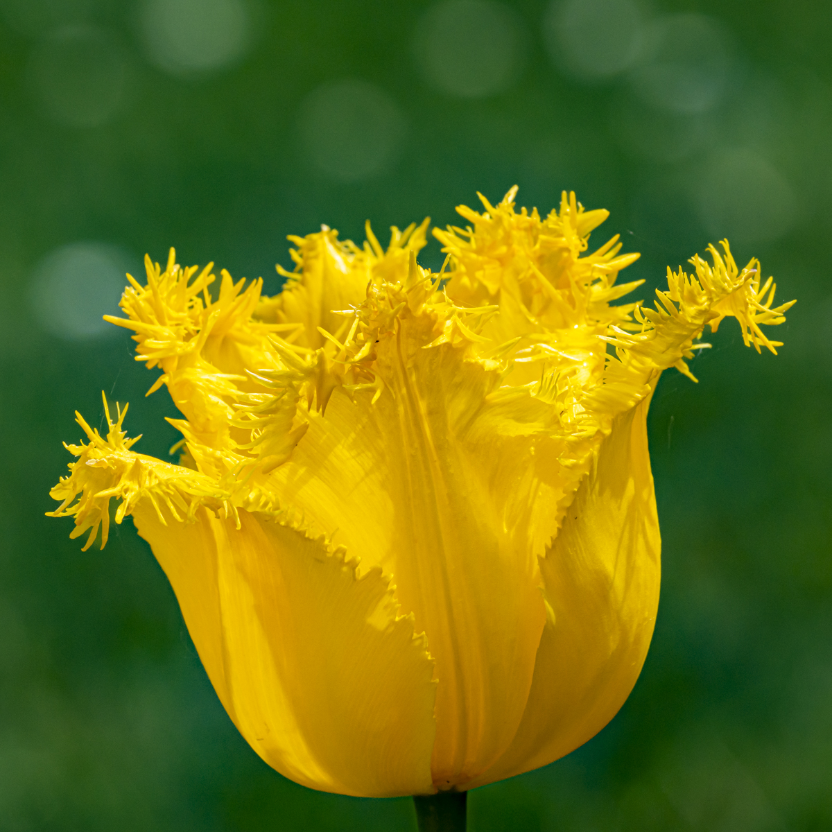
Jun 23 |
Comment |
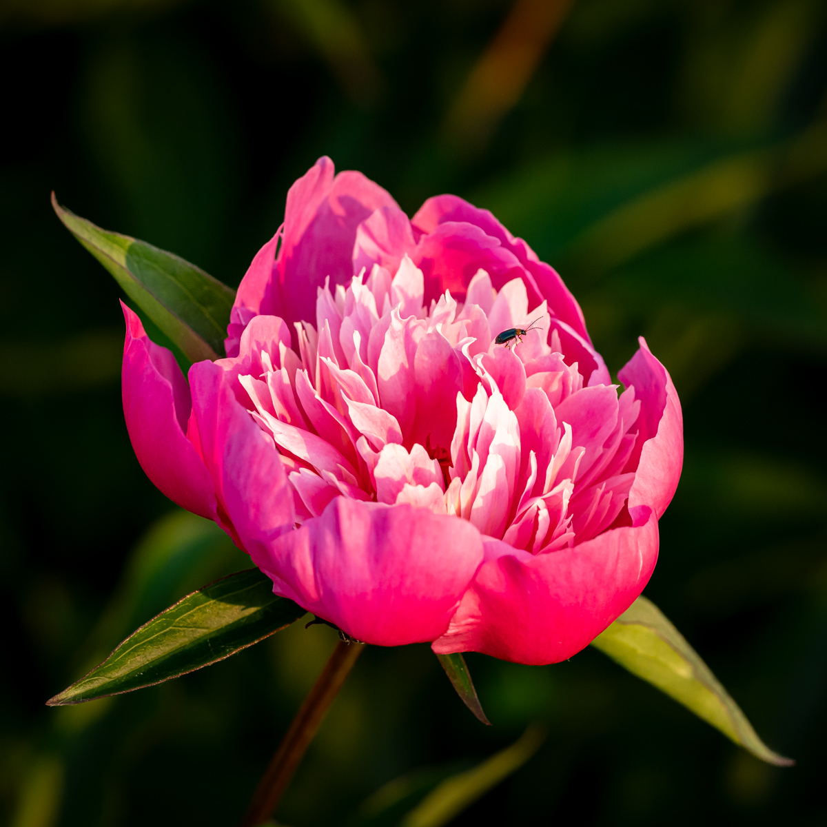
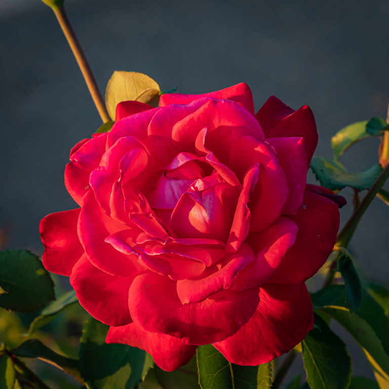
Really like the composition and the sharpness.
I have the impression to have small candles. I like the colors, but the background is quite attracting.
Never done the focus stacking, but it is worth doing it. Well done. |
Jun 18th |
| 75 |
Jun 23 |
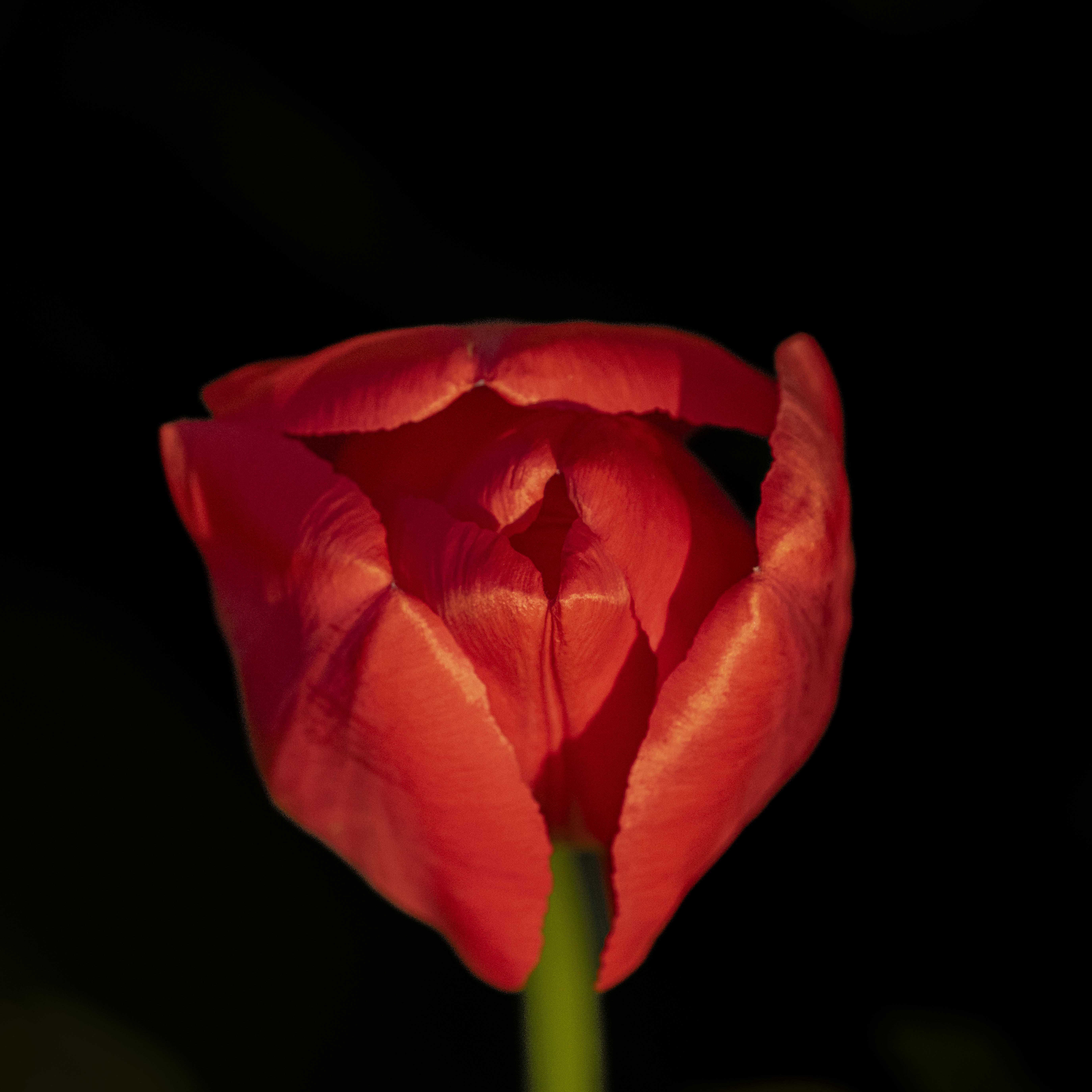
Comment |
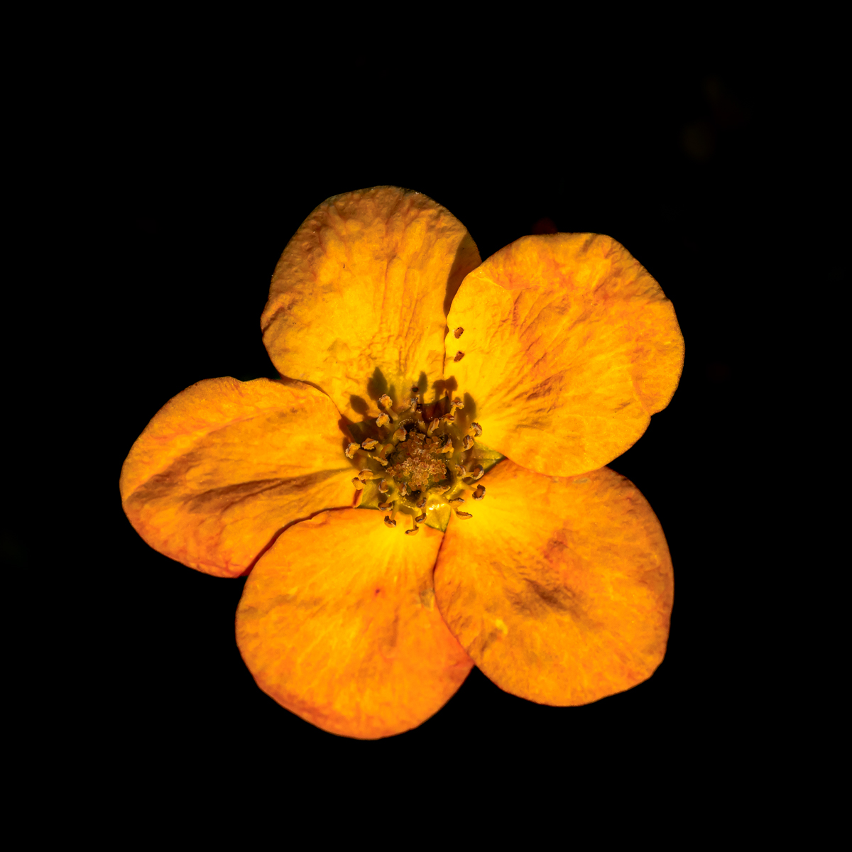
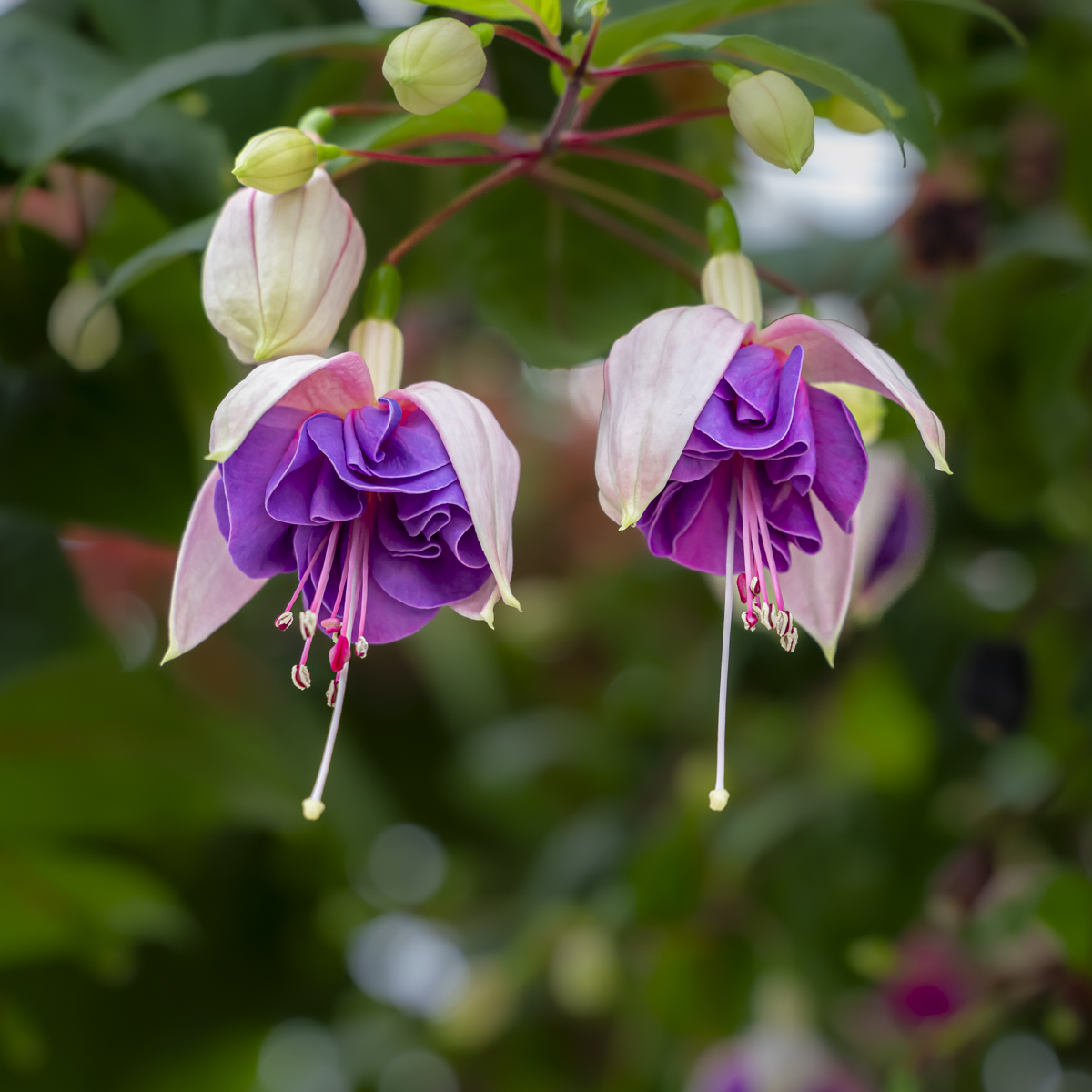
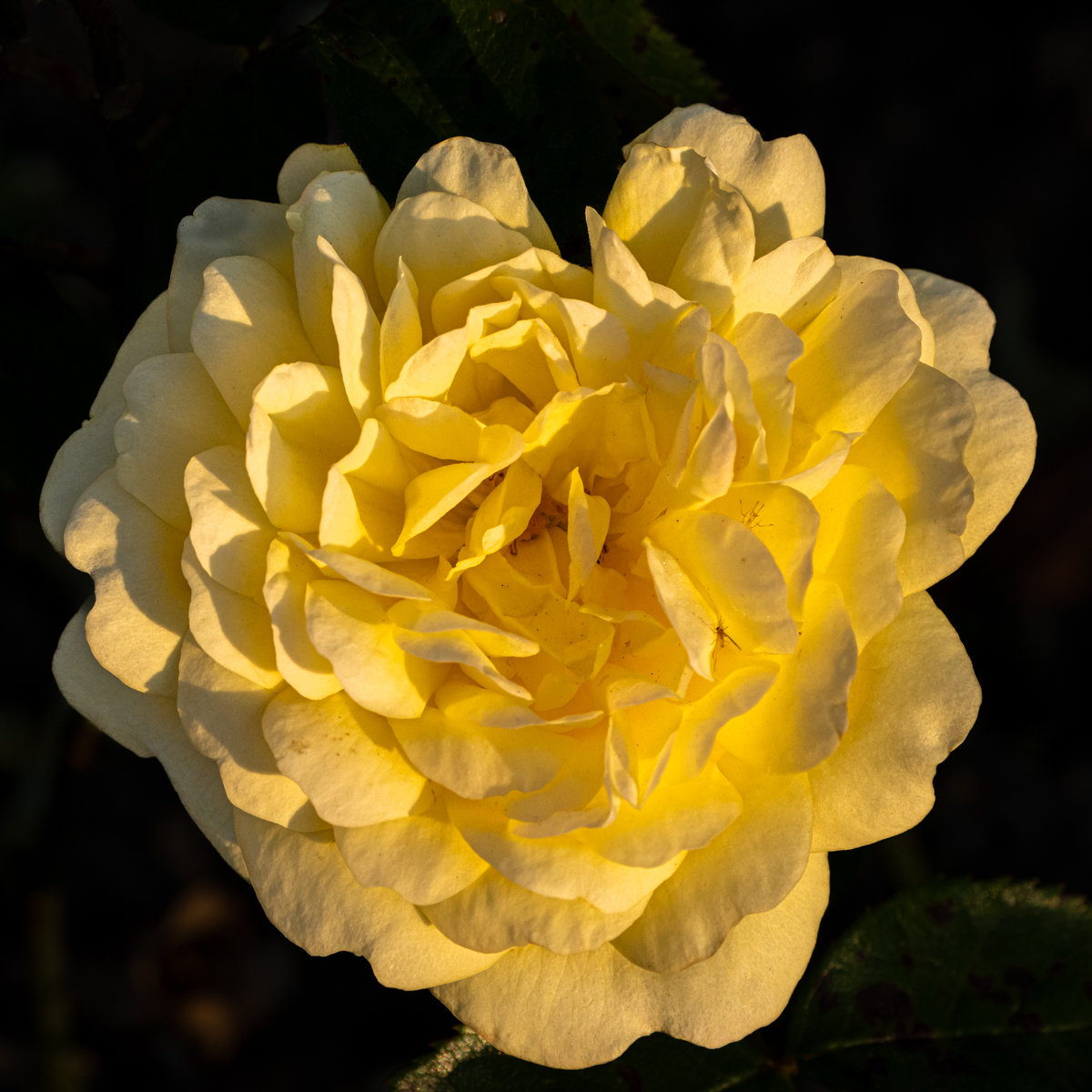
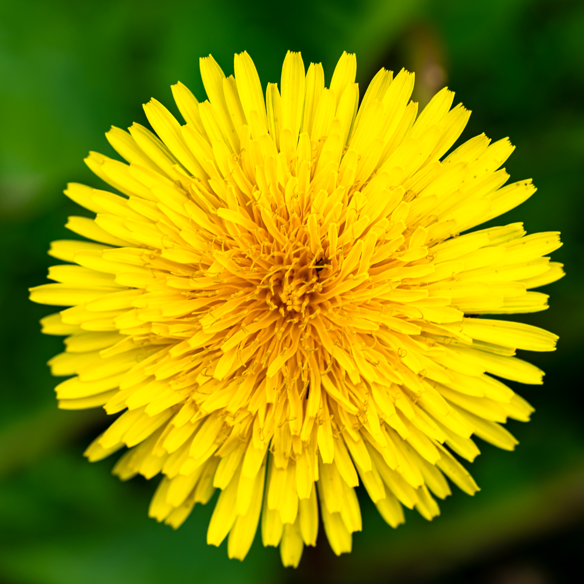
I like the composition and the direction of the petals to the center of the flower.
The disposition of the petals gives the impression to have tunnels in different direction.
Great tones. The vignette guides the eye to the center.
|
Jun 18th |
| 75 |
Jun 23 |
Comment |
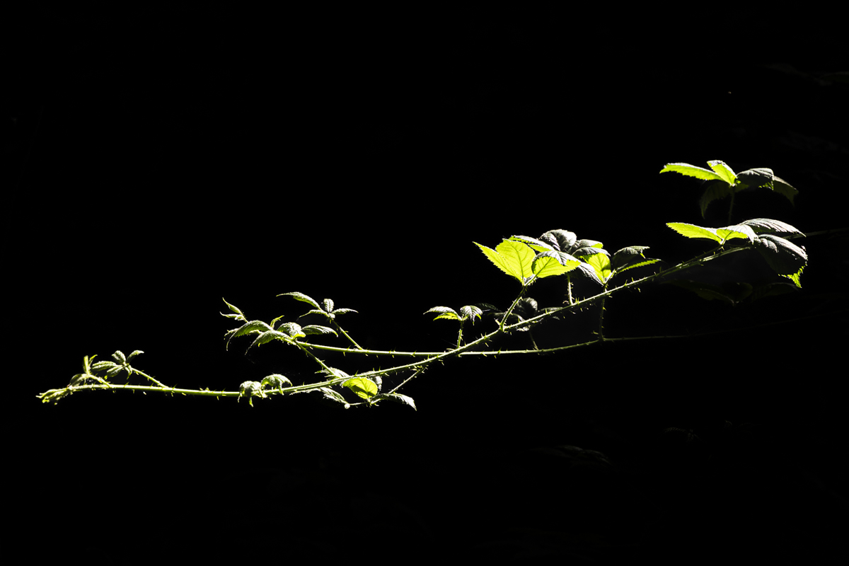
Good technique to darken the background. Never done it. I should try it.
Are the petals sharp enough or are they soft? As mentioned, a little bit of the stem could have been interesting.
Good composition. |
Jun 18th |
| 75 |
Jun 23 |
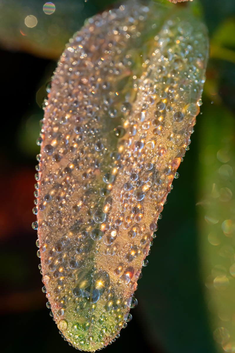
Comment |
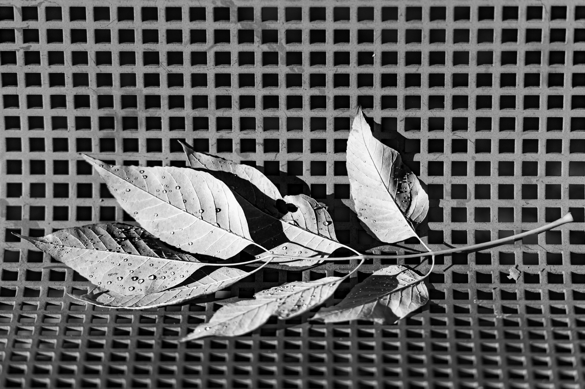
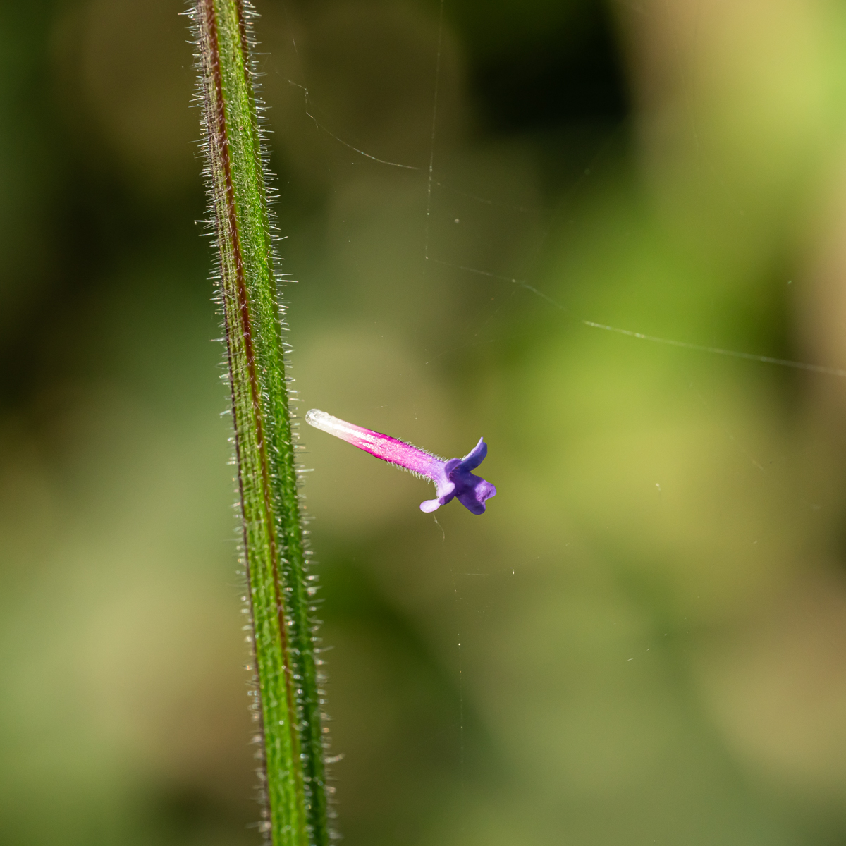
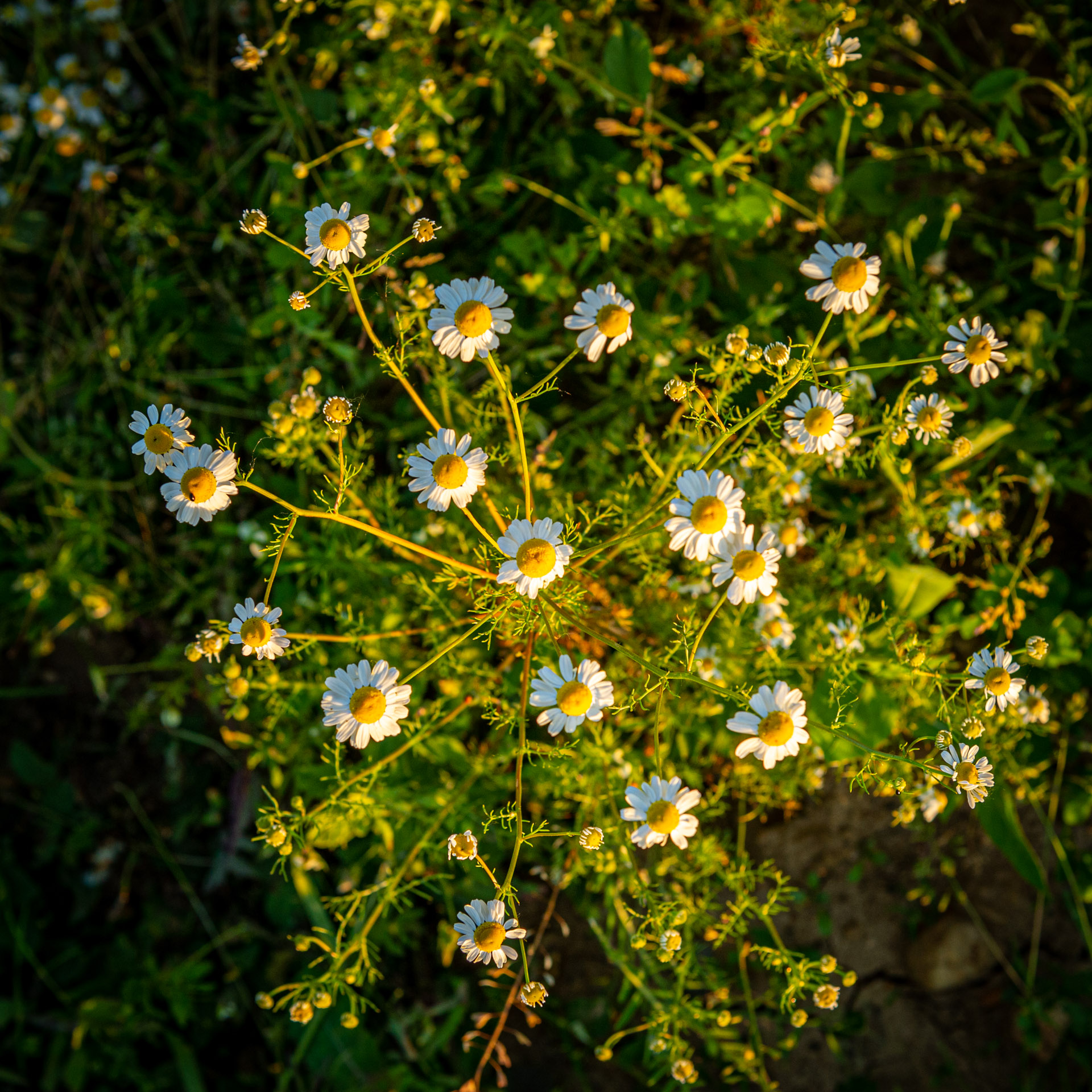
Beautiful opened flowers.
Wa can see the water drops, that shows the image is sharped.
I would prefer with less space on the right. The proposition of Raymond is very nice. I like it. A frame with the wood fence could be interesting... |
Jun 18th |
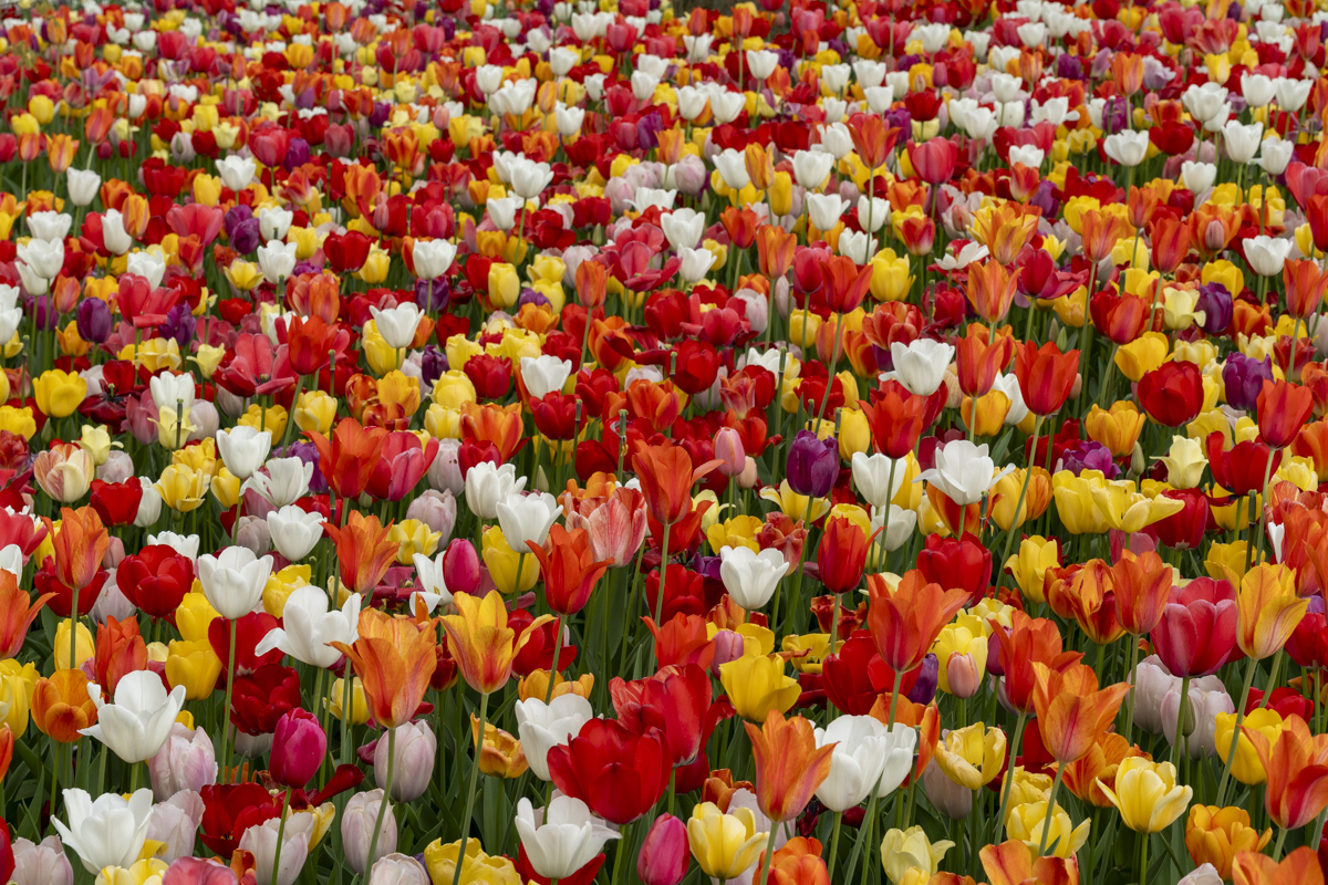
| 75 |
Jun 23 |
Comment |
Due to participation to this group, I have the (new) pleasure to take pictures of flowers. I did rarely before. I appreciate it, even without having a macro lens. However I always try to isolate one or some flowers, with a natural background. This is not the case here. It is he choice of the maker. Here there are too much elements.
Enjoy of your macro lens. I would like to have one (Sony). |
Jun 18th |
| 75 |
Jun 23 |
Comment |
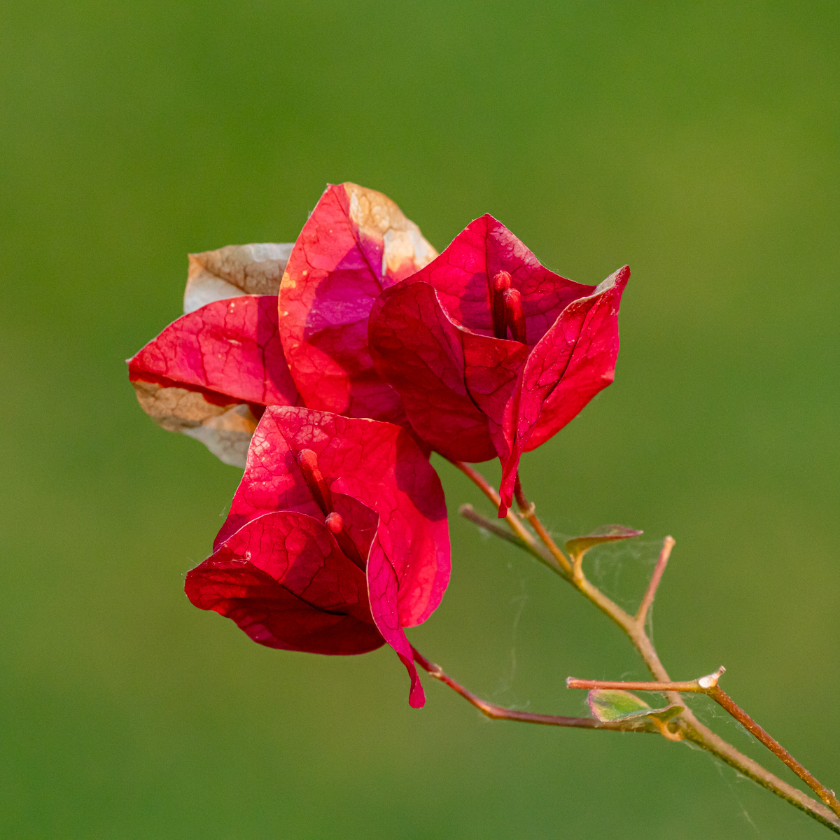
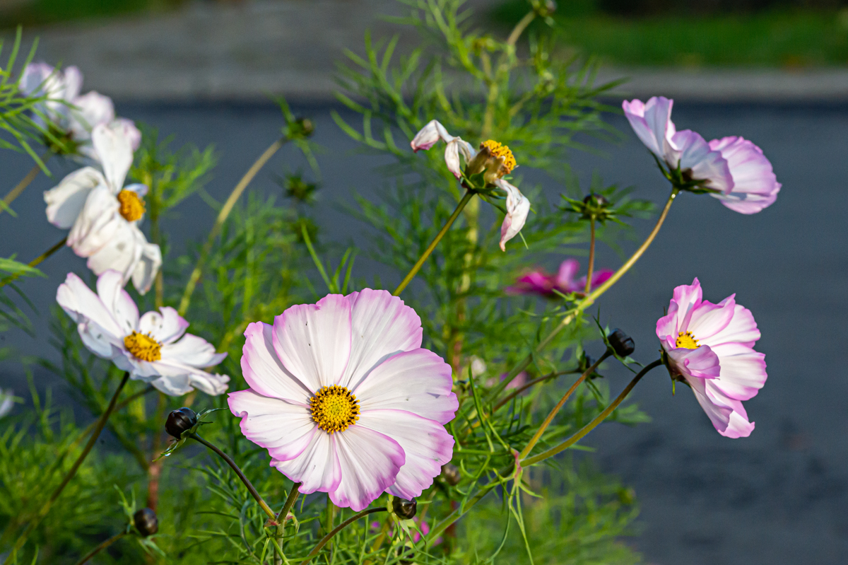
I appreciate the composition, the 3 flowers, the different colors, ... The upper flower is on a different stage (center out of the petal) is also part of the composition.
The small frame is color (of the leaves) is a good idea.
Good idea to digitelize your slide. I think some people will have a lot of work. |
Jun 18th |
6 comments - 3 replies for Group 75
|
12 comments - 4 replies Total
|