|
| Group |
Round |
C/R |
Comment |
Date |
Image |
| 39 |
May 23 |
Comment |
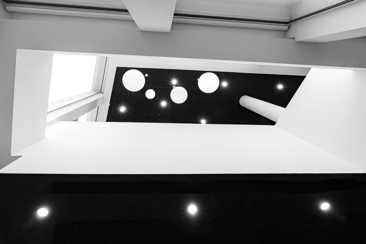
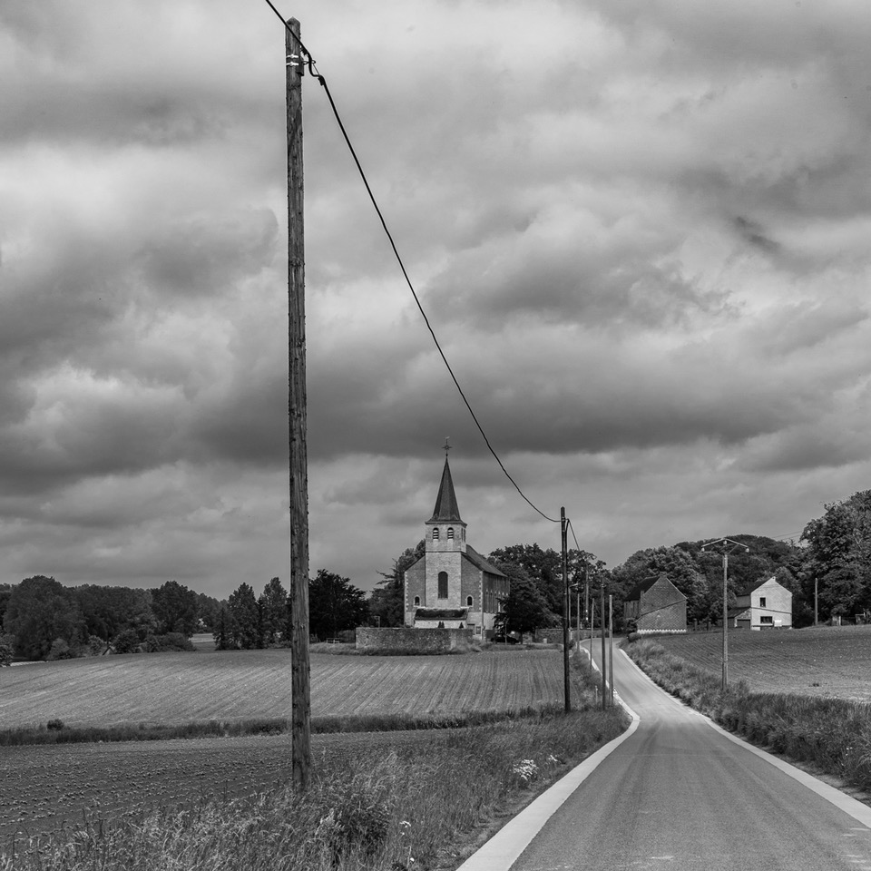
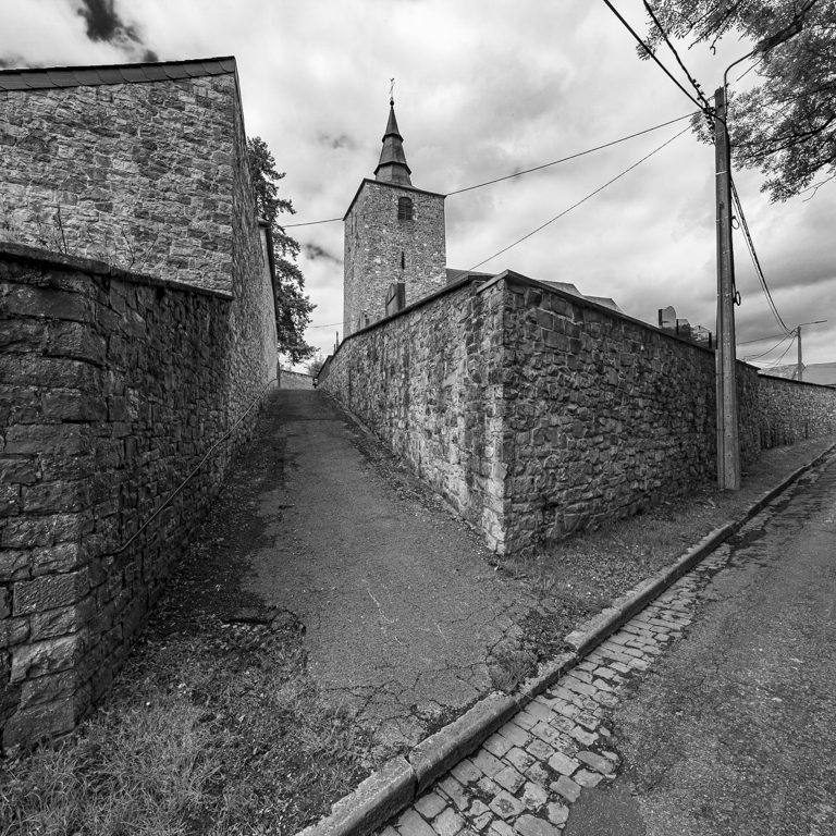
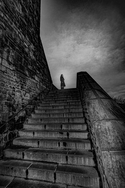
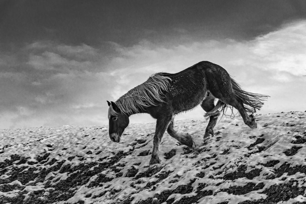
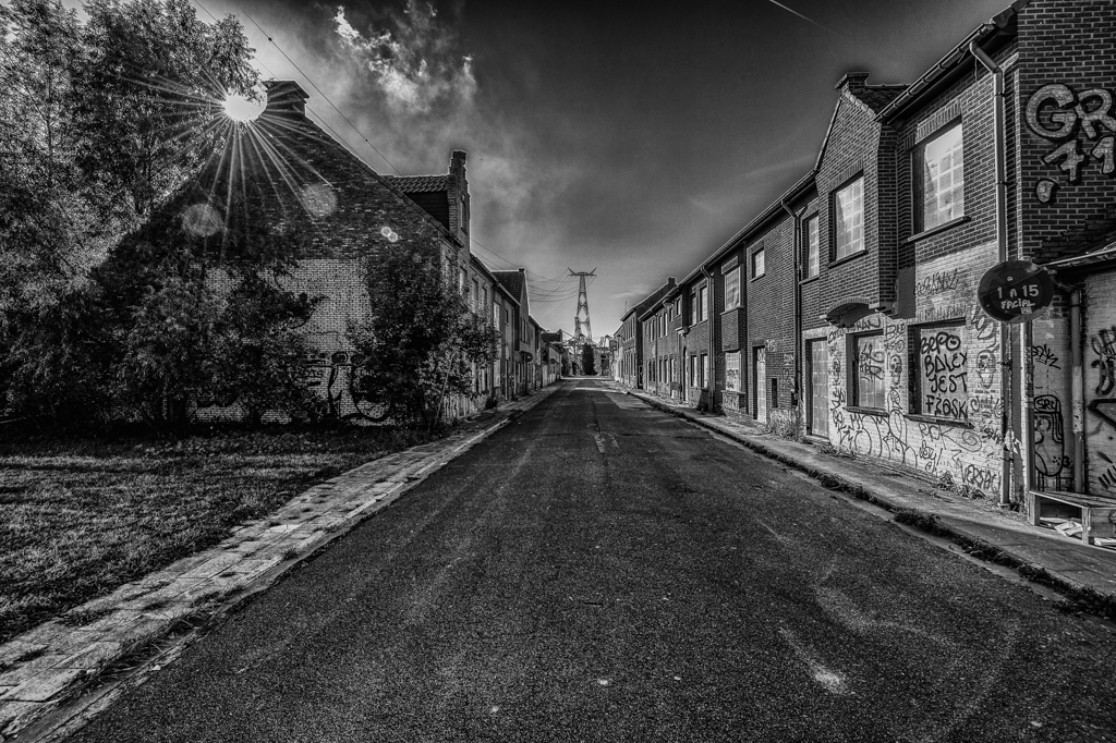
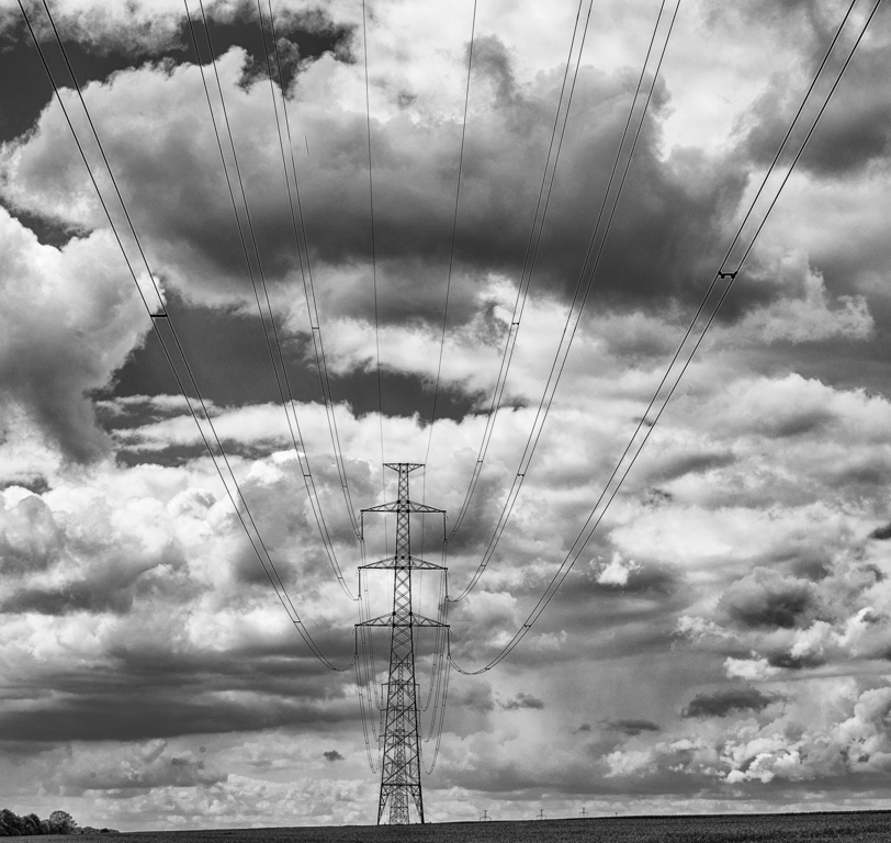
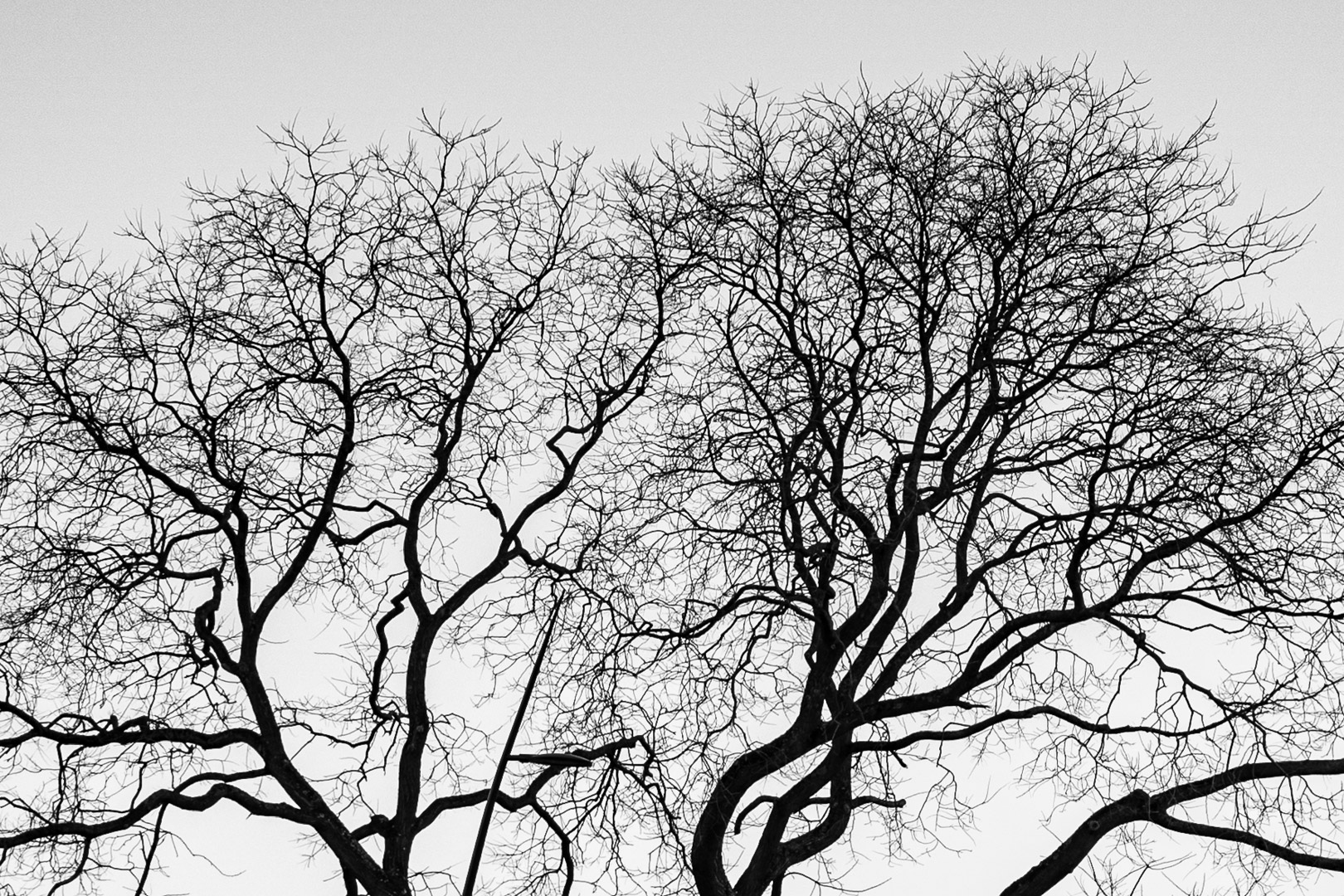
I really like the clouds. Good to have taken a picture.
I concur with the comments of David. With a composition more to the right, you could have a diagonal of the clouds.
You have dust on the sensor. Some spots on the color version, less in the B&W, but still present. |
May 10th |
| 39 |
May 23 |
Comment |
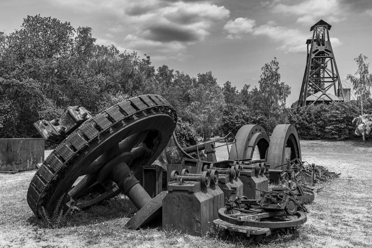
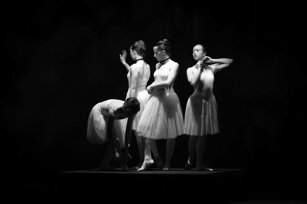
Good representation of the evolution of the cars....
Original angle of view which improves the composition. The right headlight is cropped, is it a choice?
You revealed details in the lower left corner (wheel).
There is no noise due to the high ISO (3200). It was not necessary to have a shutter speed of 1/500. This would have reduce the ISO. However there is no impact on the picture, just a technical and personal opinion. |
May 10th |
| 39 |
May 23 |
Comment |
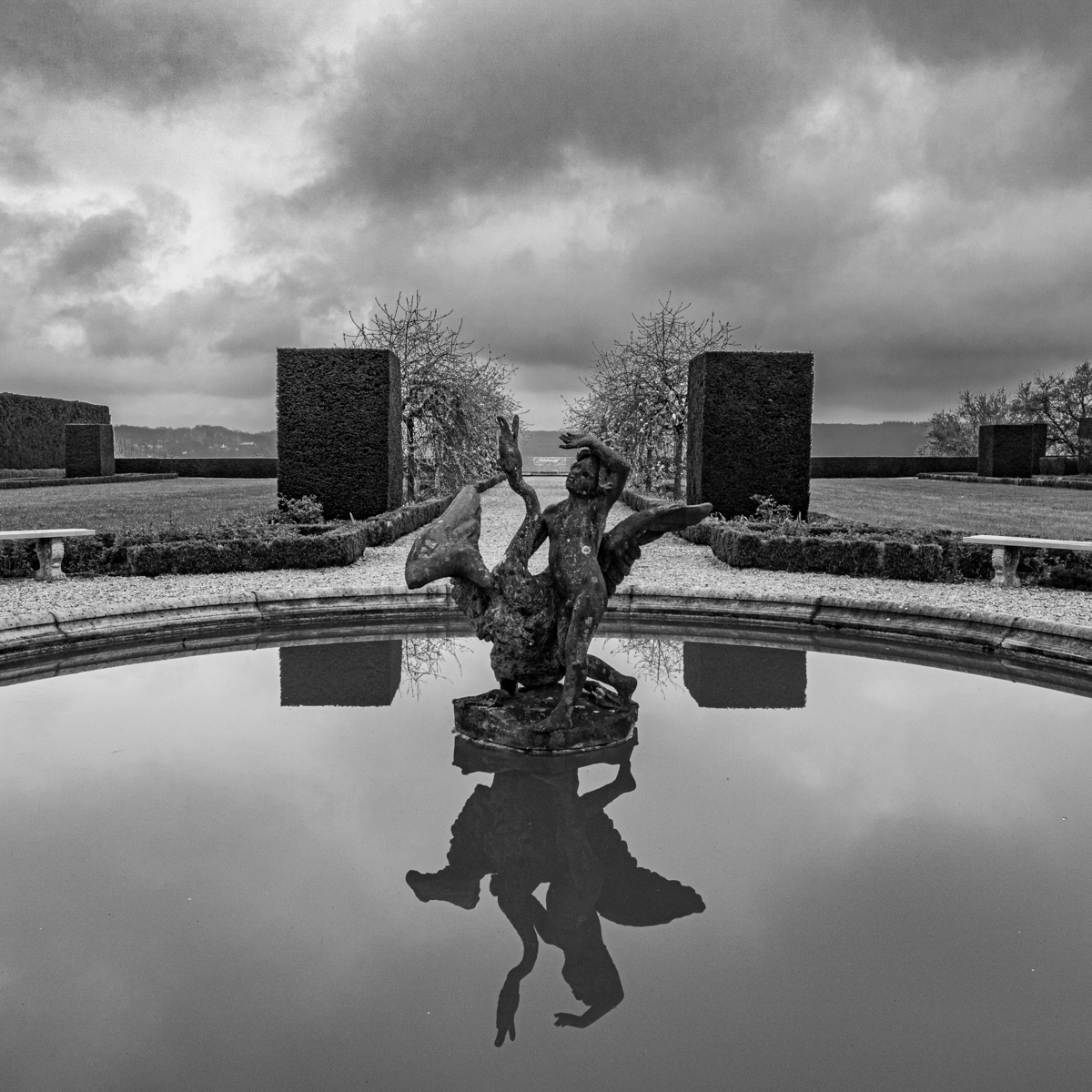
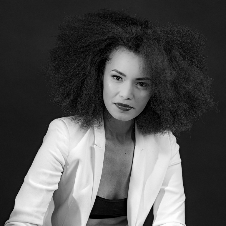
Just great. As wrote David, it quite unreal, "another world".
I also appreciate the guided lines, the stones and the softness of the water, the picture.
I find the upper left corner a little "blurred", not dark enough or with our enough structure. Just a minor remark in this beautiful image. |
May 10th |
| 39 |
May 23 |
Comment |
Two beautiful versions of an image.
I appreciate the structure in the sand and dunes. The shadow is also interesting.
Why did you cropped on the right?
Is it not (maybe my screen) to dark in the stone of the Totem?
I find a disturbing element in the color version (kind of dust "above the hollow, between the 2 small mountains on the right"), but this element is no more at the same place in the B&W version. It is more on the left. Am I the only one who see that?
|
May 10th |
| 39 |
May 23 |
Comment |
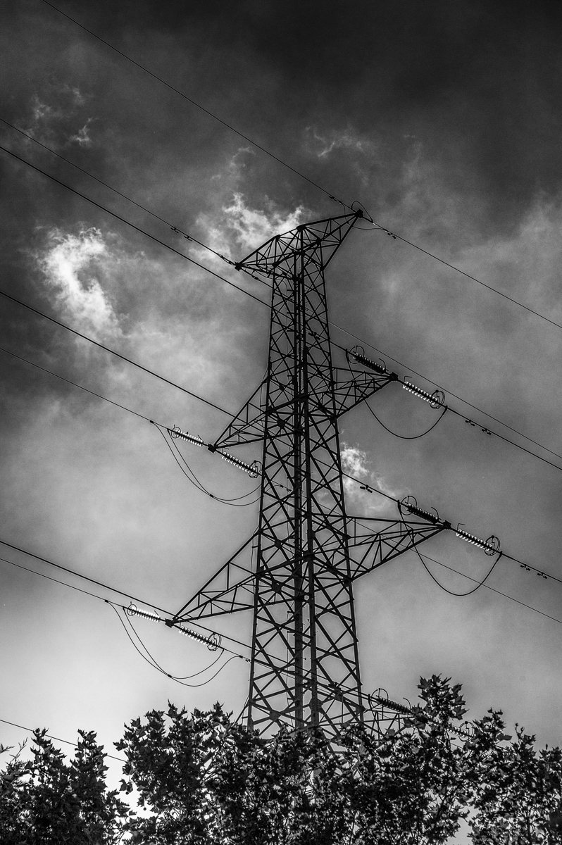
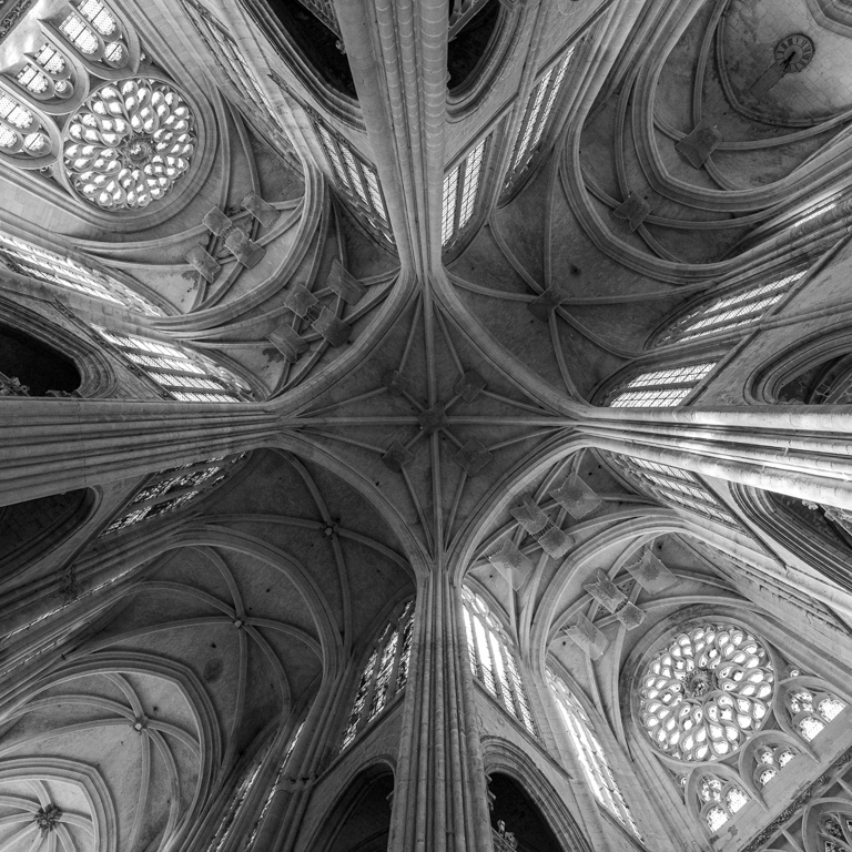
The B&W is moe dramatic, well done.
The structure of the sky (clouds ans light) is present and is beautiful. Same opinion fir the island.
There is a stone on the left. Is it disturbing ?
I like the central positon of the island. More central?
|
May 10th |
6 comments - 0 replies for Group 39
|
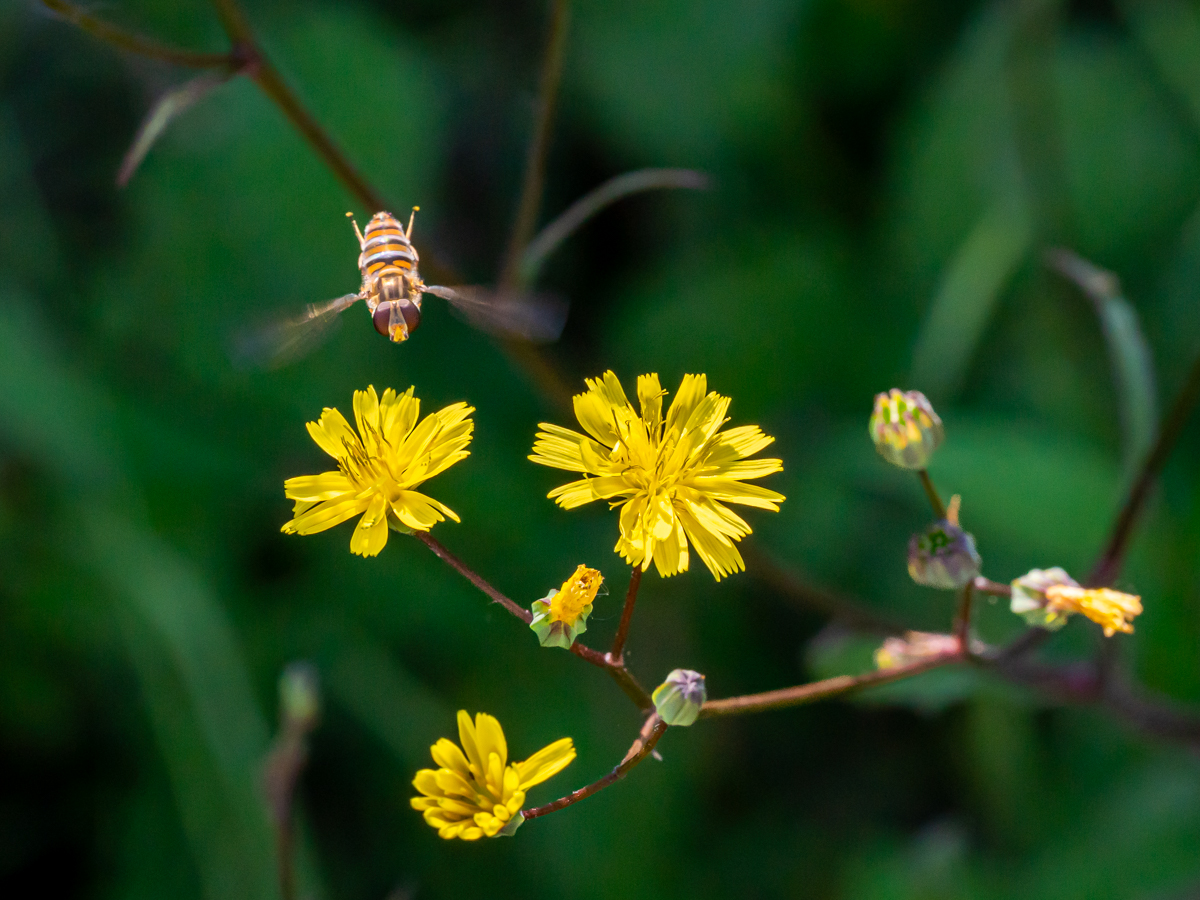
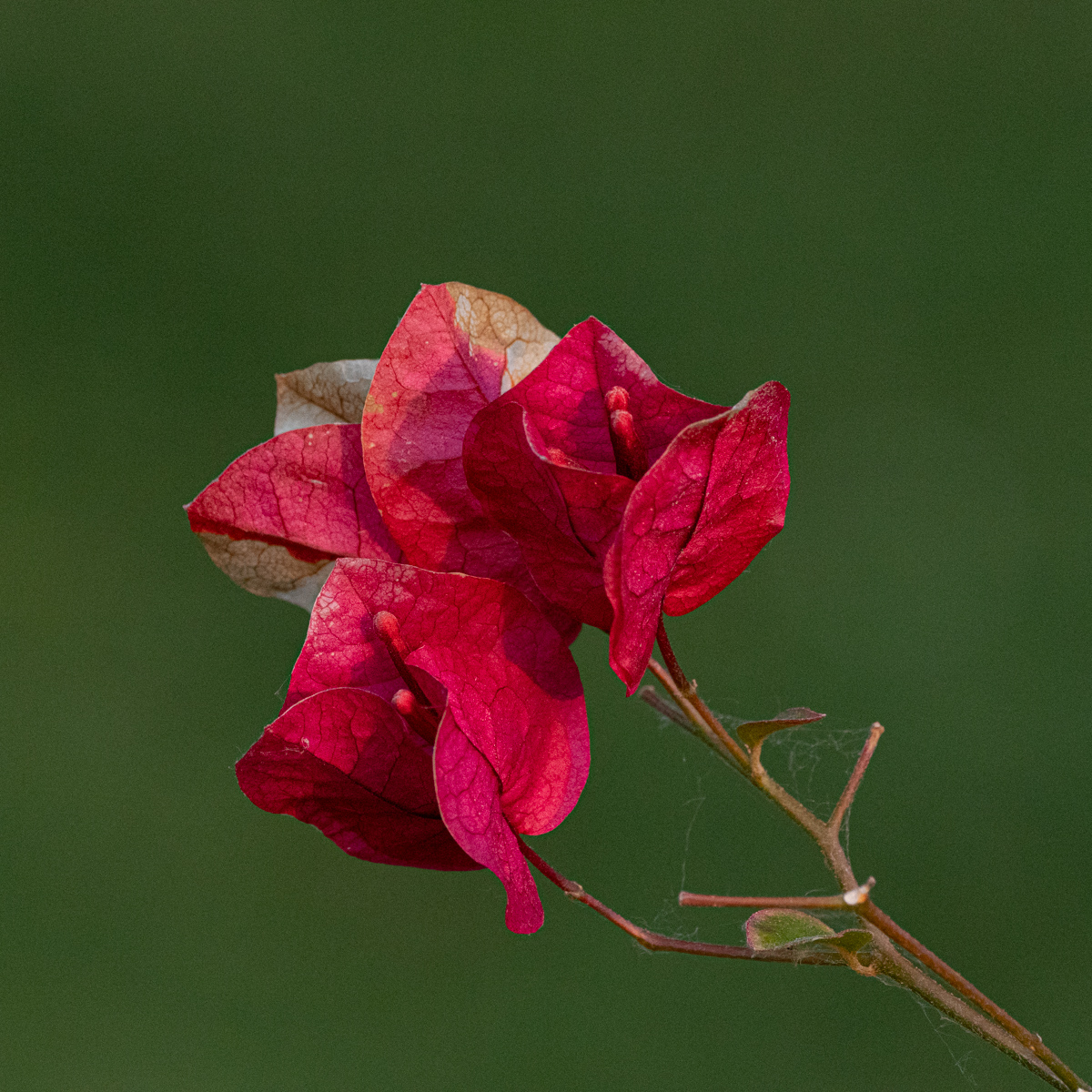
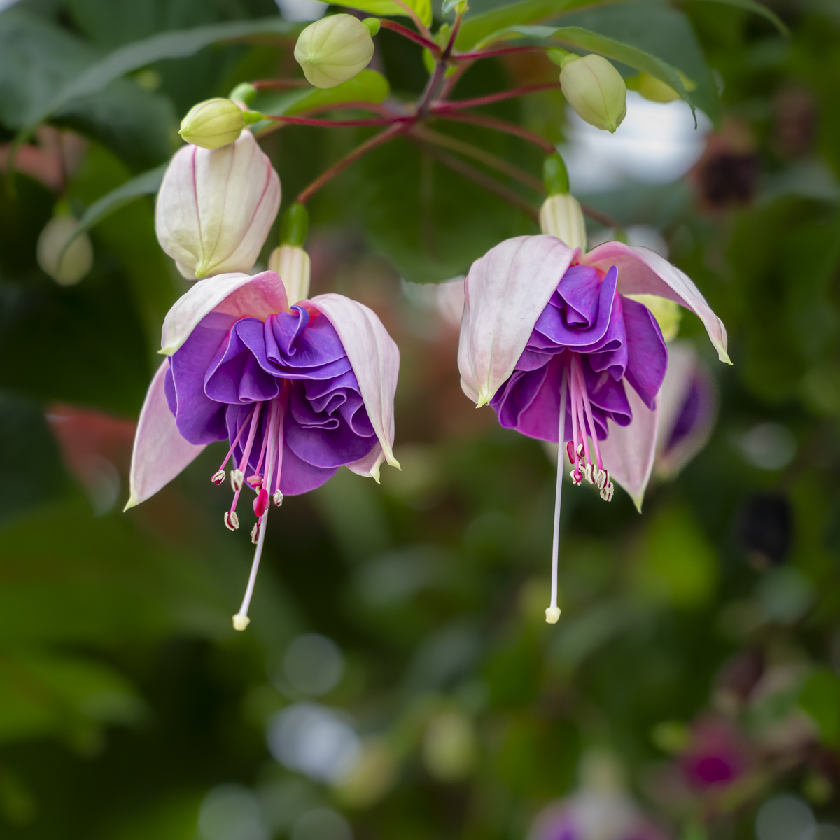
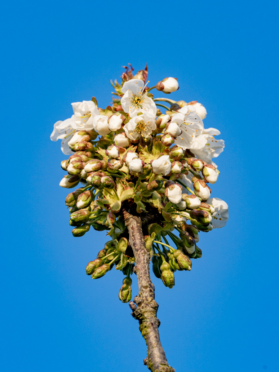
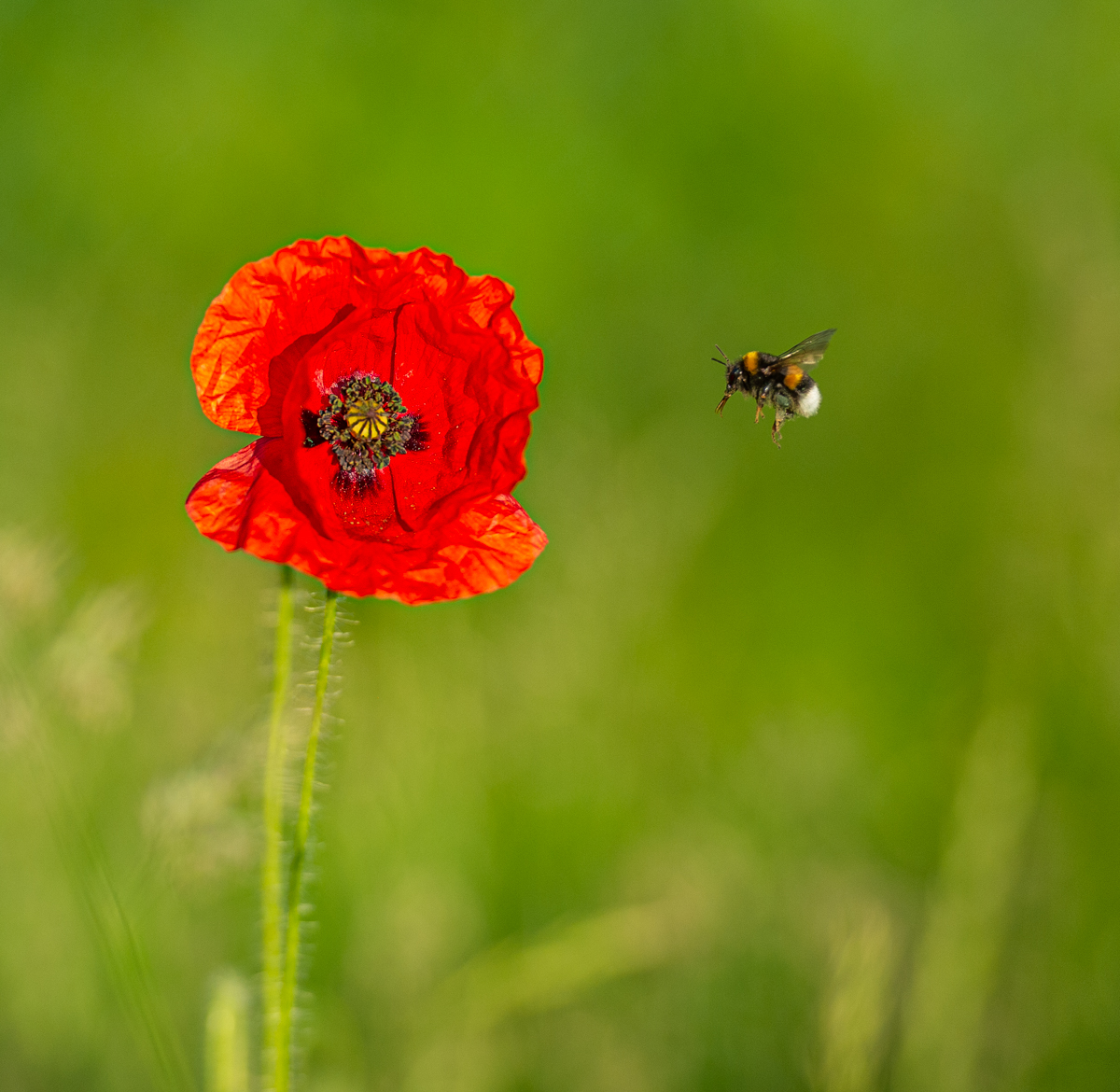
| 75 |
May 23 |
Comment |
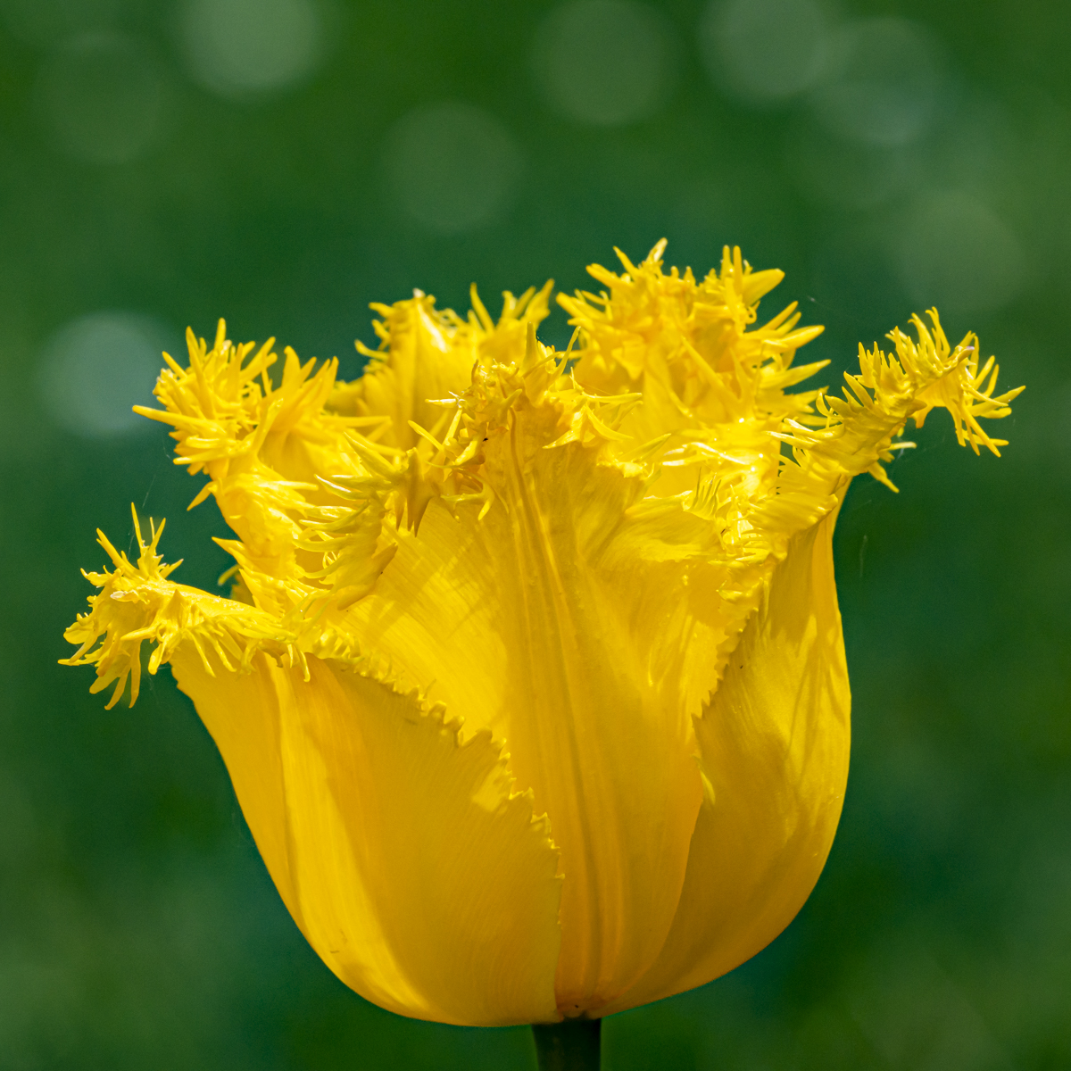
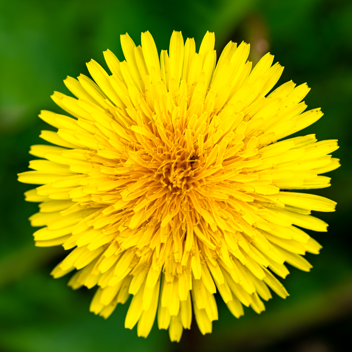
I like the contrast of the 2 flowers (flower and bud), with a "leaf" between them. The suggestion of Charles improve the picture (all the leaves and crop on the top). A real pleasure and added-value to have such member in a group....
With aperture at 5,6, not easy to have enough DoF for the pistils.
To increase your speed, if you have no tripod on hand, you could increase the iso. ISO 400 would have allow, in this case, a speed of 1/400. |
May 15th |
| 75 |
May 23 |
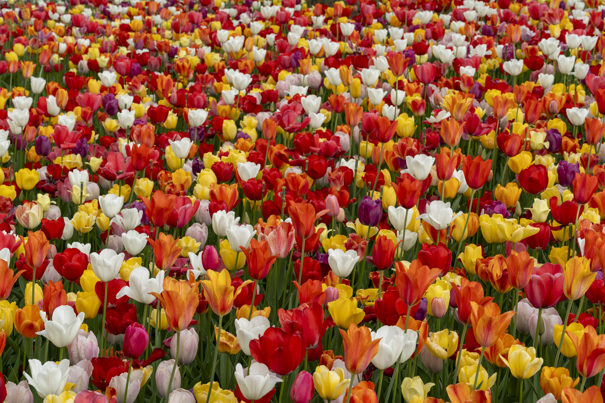
Comment |
Beautiful colors and the square format is a good option.
To understand the picture we have to look around, and there are a lot of flowers... The suggestion of Charles helps a lot to bring to light (attract the eyes) the flowers in the center. |
May 15th |
| 75 |
May 23 |
Comment |
Really appreciate the light and the composition, and the sharpness of course.
The "light glow behind the bloom" shows circles which give a better effect than a vignette.
Avoiding to start from the corner is a choice. We don't be afraid not to "respect the classical rules".
I "immediately" recognize your style....
|
May 15th |
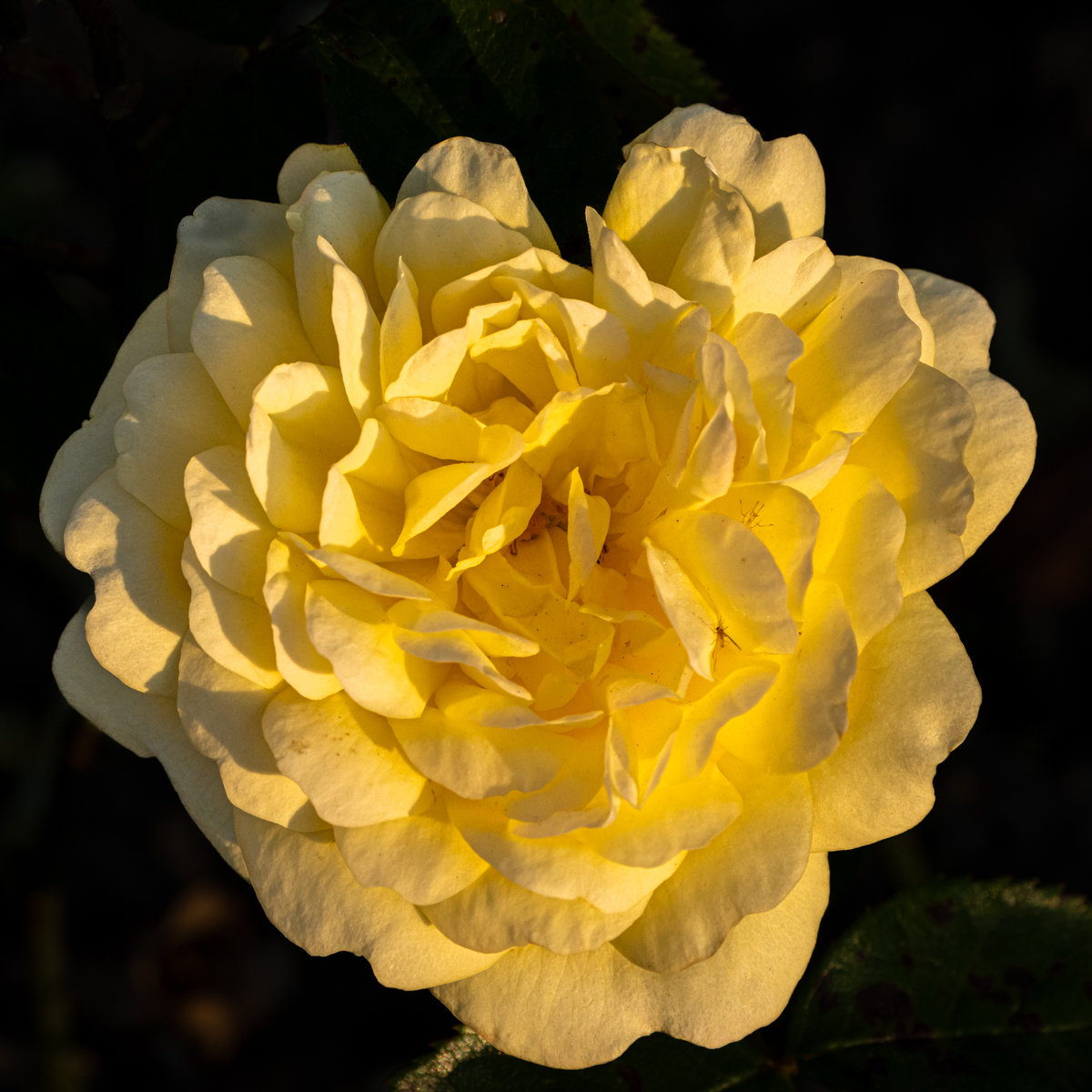
| 75 |
May 23 |
Comment |
I appreciate the softness of this image. The main subject (pistils, stems, ..) are on focus. Goor job.
I am disturbed by the halo around the petals, and also by the green stem on the right.
As you had a tripod, that means you took time to take the picture. It would have possible to have all the petals (left and bottom). Except that, I like the composition.
|
May 15th |
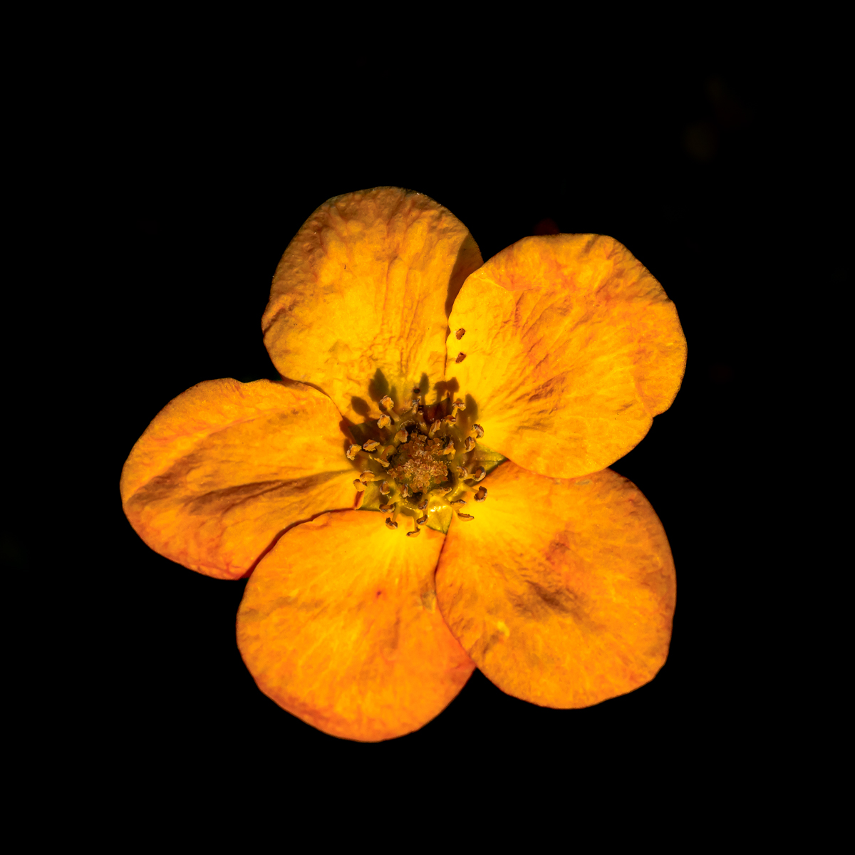
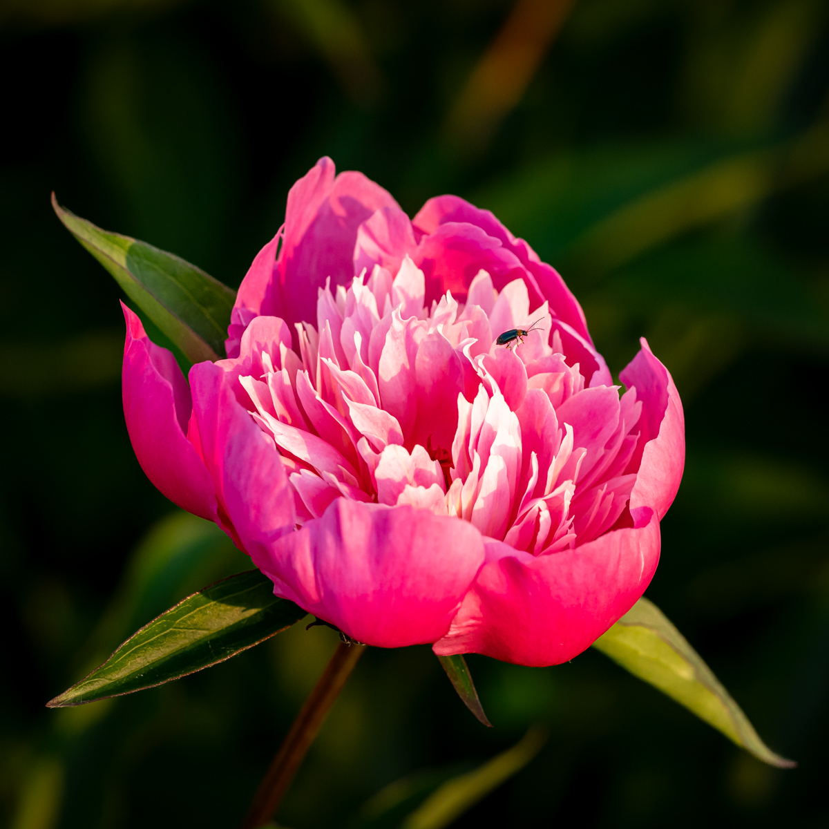
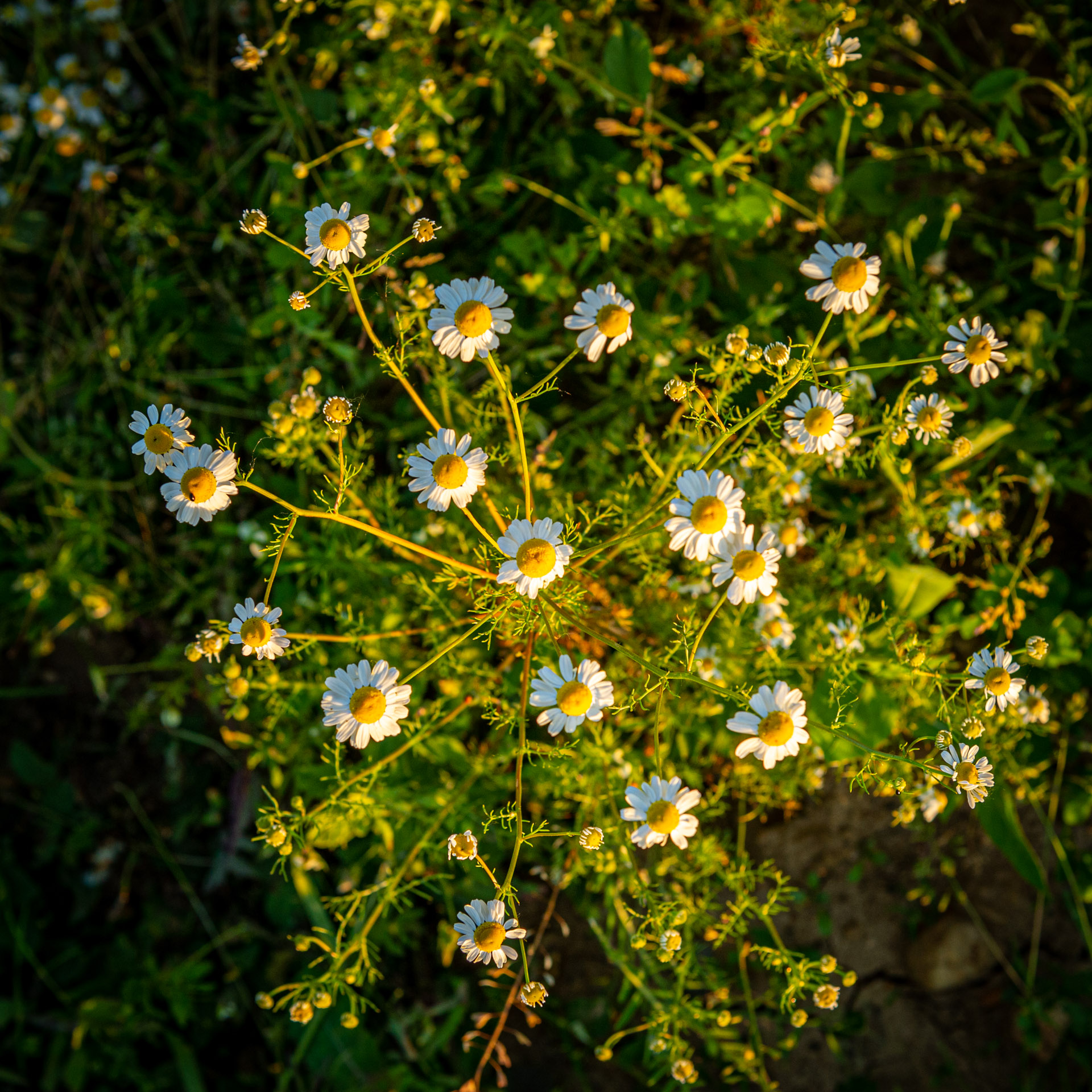
| 75 |
May 23 |
Comment |
There are different possibilities with this picture, as the 3 subjects (as its is) or only the crocus in a vertical format. That would be 3 differents pictures. It depends on the maker aim.
In this case the focus (with the 42 images) is on the crocus, the vertical proposition is maybe "expected". However the composition in a "almost" square format is very interesting and gives more depth. |
May 15th |
| 75 |
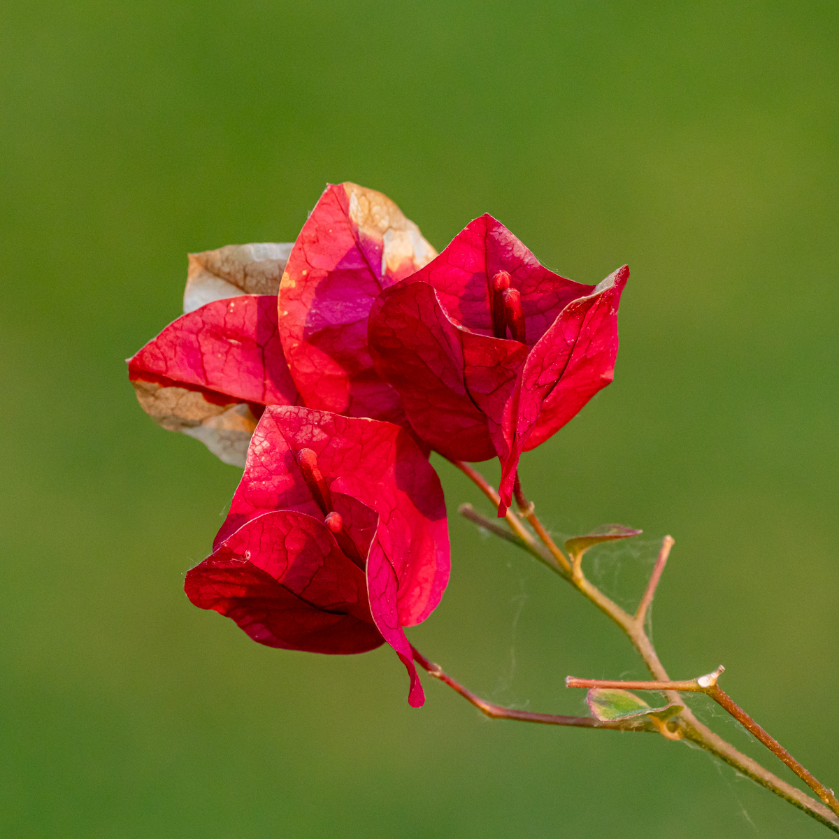
May 23 |
Comment |
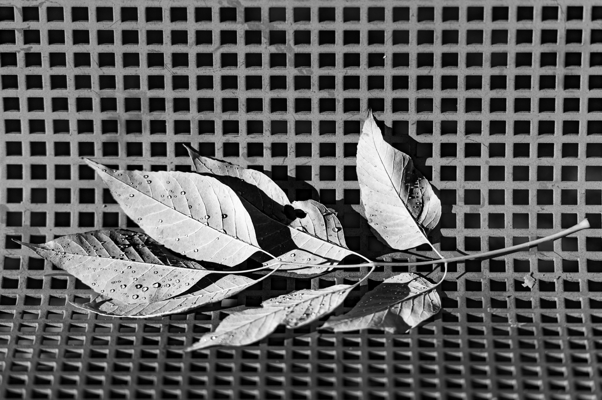
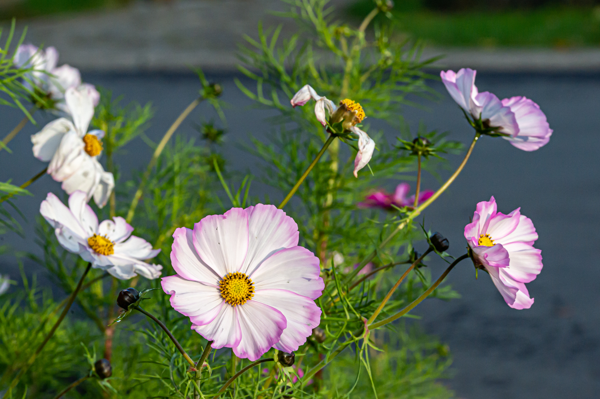
Just great colors. I really like it as the composition with 2 flowers at different stages (closed and opened).
The petals are sharped, and the water drops give a feeling of freshness.
There are 2 flowers, so 2 stems, but between them, we have an impression to have a third (cut) one, which attracts my attention. So I need to more analyze the picture.
Good idea to have a frame of the same color. |
May 15th |
6 comments - 0 replies for Group 75
|
12 comments - 0 replies Total
|