|
| Group |
Round |
C/R |
Comment |
Date |
Image |
| 39 |
Apr 23 |
Comment |
Thanks Ken for your relevant comment. I think I was right to submit this image to analysis. |
Apr 15th |
| 39 |
Apr 23 |
Comment |
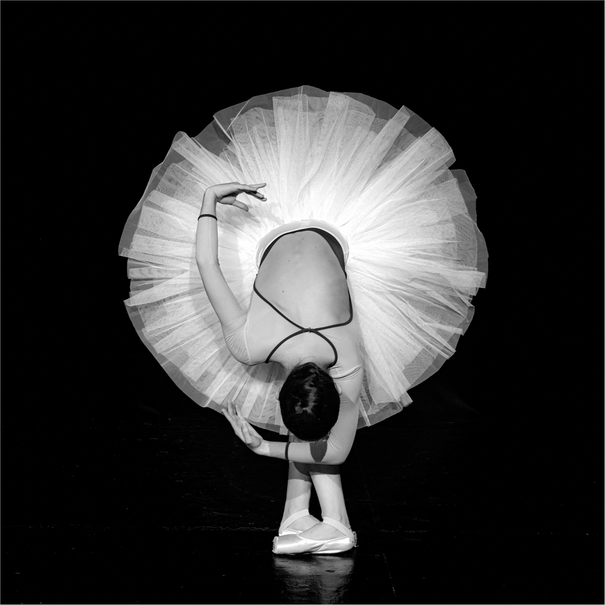
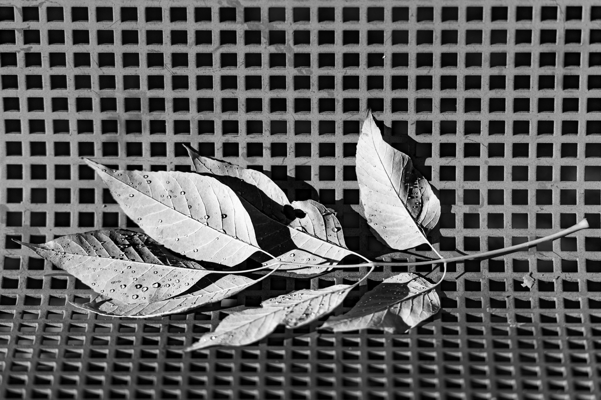
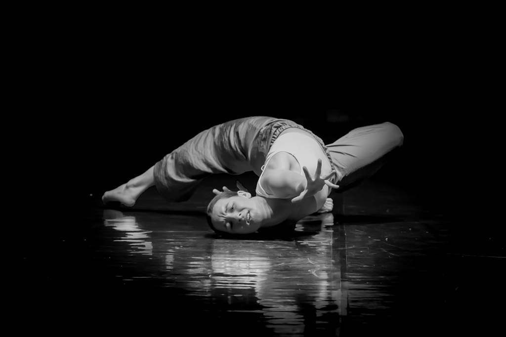
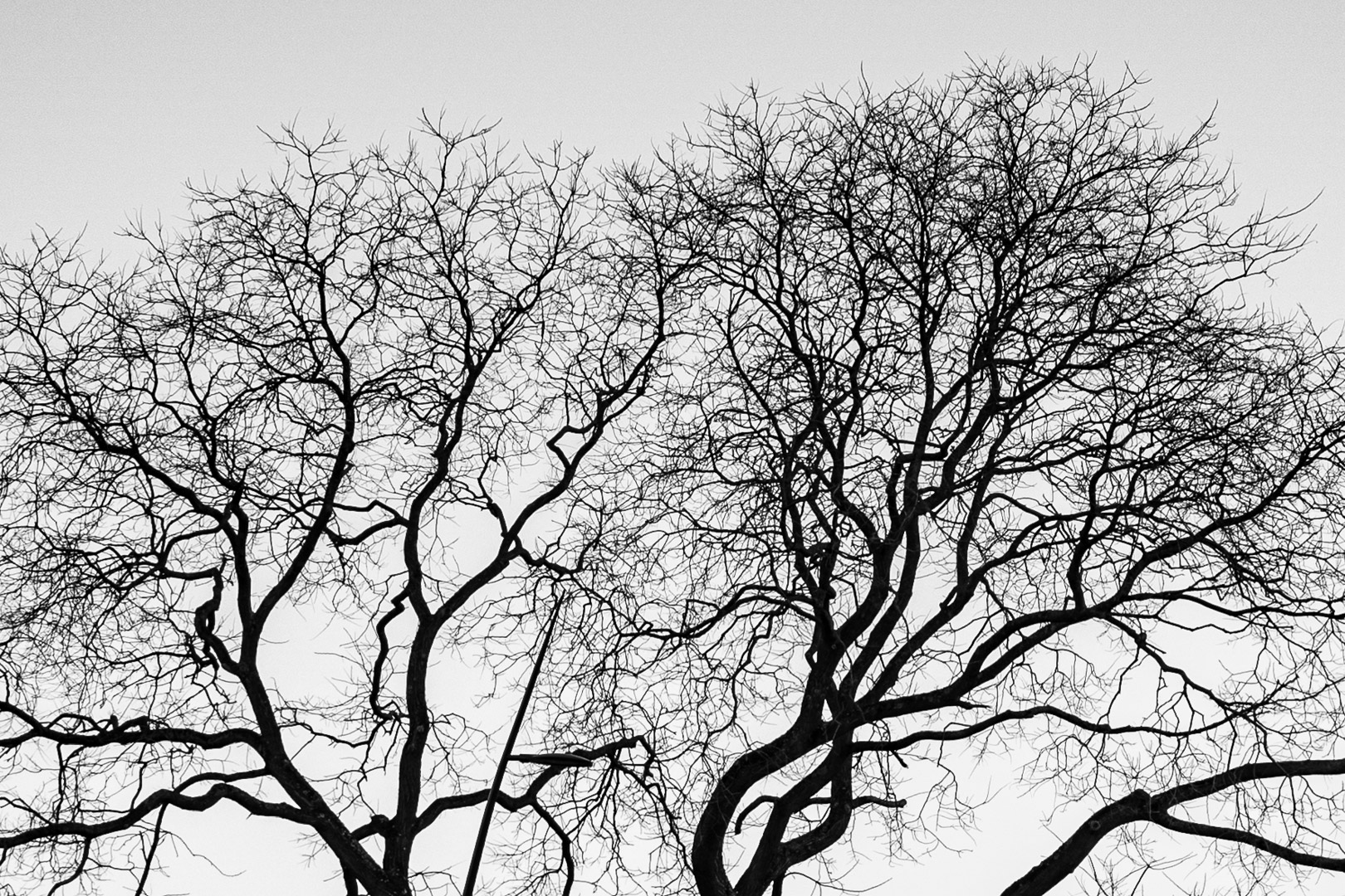
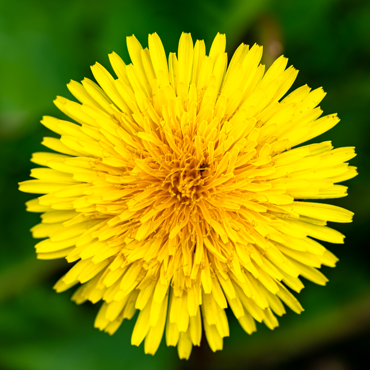
I also like both images, but the "simplicity" of the B&W is just great. Very soft image.
As David mentioned, a thin stroke (3 px) around the image will improved the visibility of the image.
The position of the petals (going down) is well situated. Not necessary to have an odd number of flowers. |
Apr 11th |
| 39 |
Apr 23 |
Reply |
I agree with your comment David. I received several times the comment of the stroke and I agreed with you. There is one now... |
Apr 11th |
| 39 |
Apr 23 |
Comment |
I like more and more the square format, as your original 2. However it depend on the composition, and in this case I prefer the main one. There is a diagonal of elements and a "recall" of lines on the upper right corner which improve the composition.
The crop in the lower left corner can be a little disturbing. |
Apr 11th |
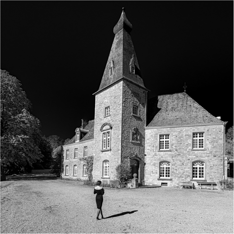
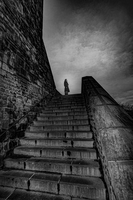
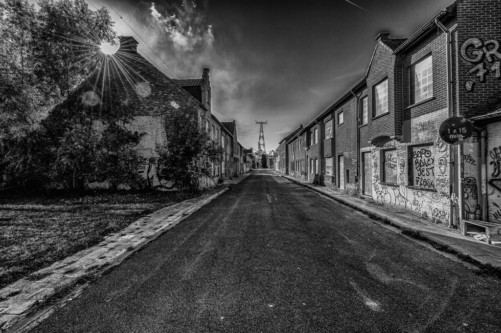
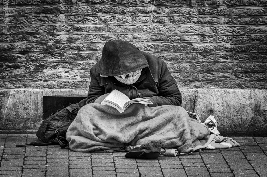
| 39 |
Apr 23 |
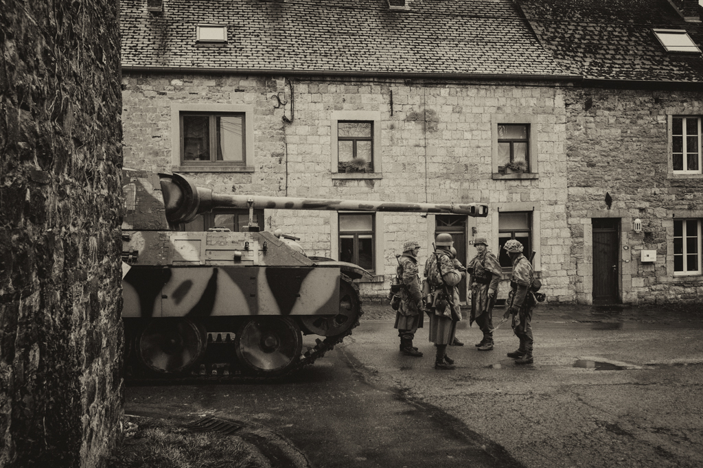
Comment |
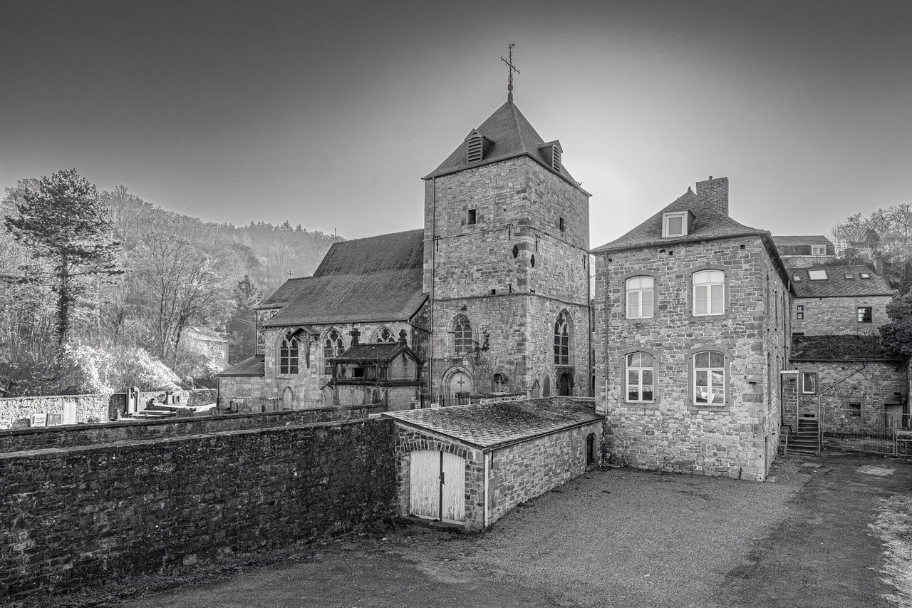
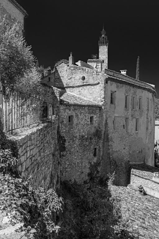
At first sight, we imagine a story with this picture (fi with the broken fence, the look of the man, ...). That makes the picture.
Was it necessary to crop on the left? It is your choice.
The shadows and the the structure of the buildings are interesting and call the B&W. |
Apr 11th |
| 39 |
Apr 23 |
Reply |
I really like your comment Jerry. Every part of the image is analyzed. |
Apr 11th |
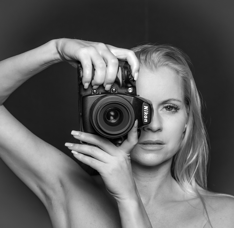
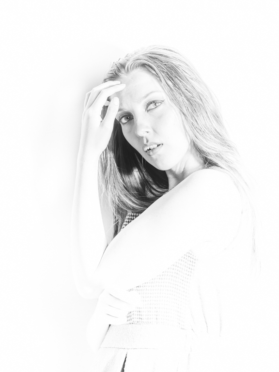
| 39 |
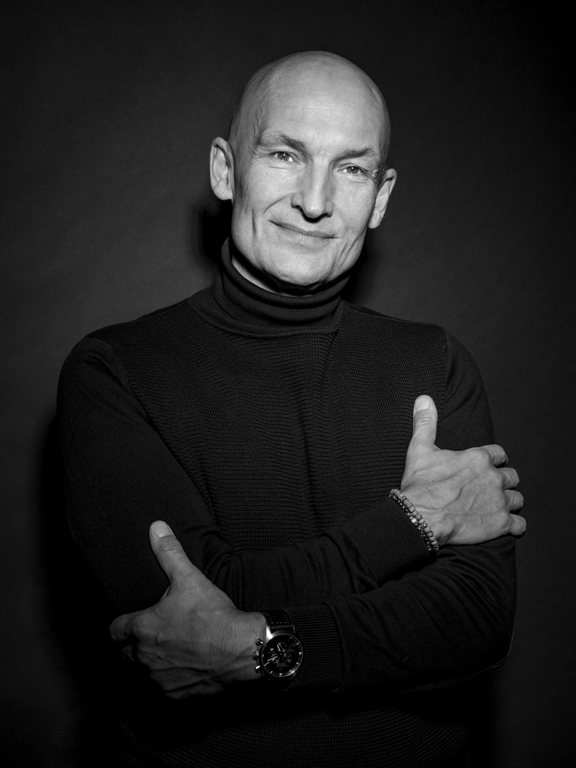
Apr 23 |
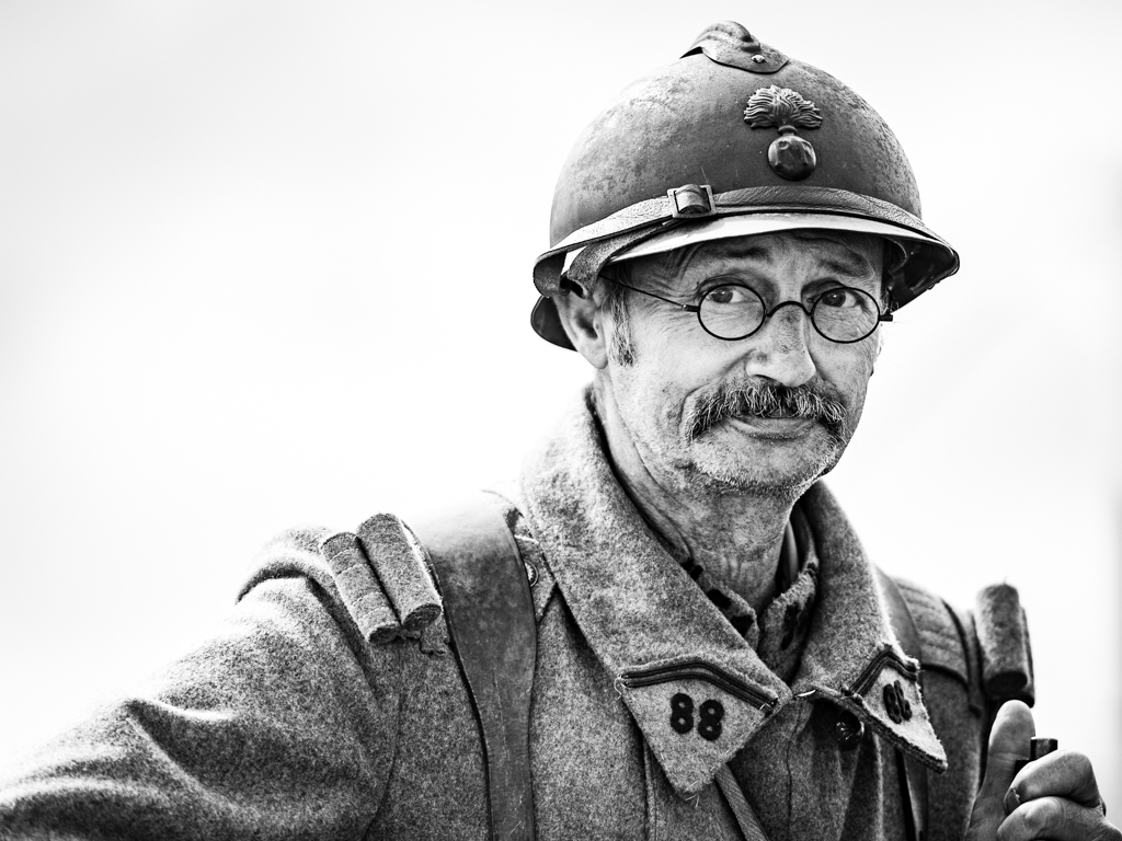
Comment |
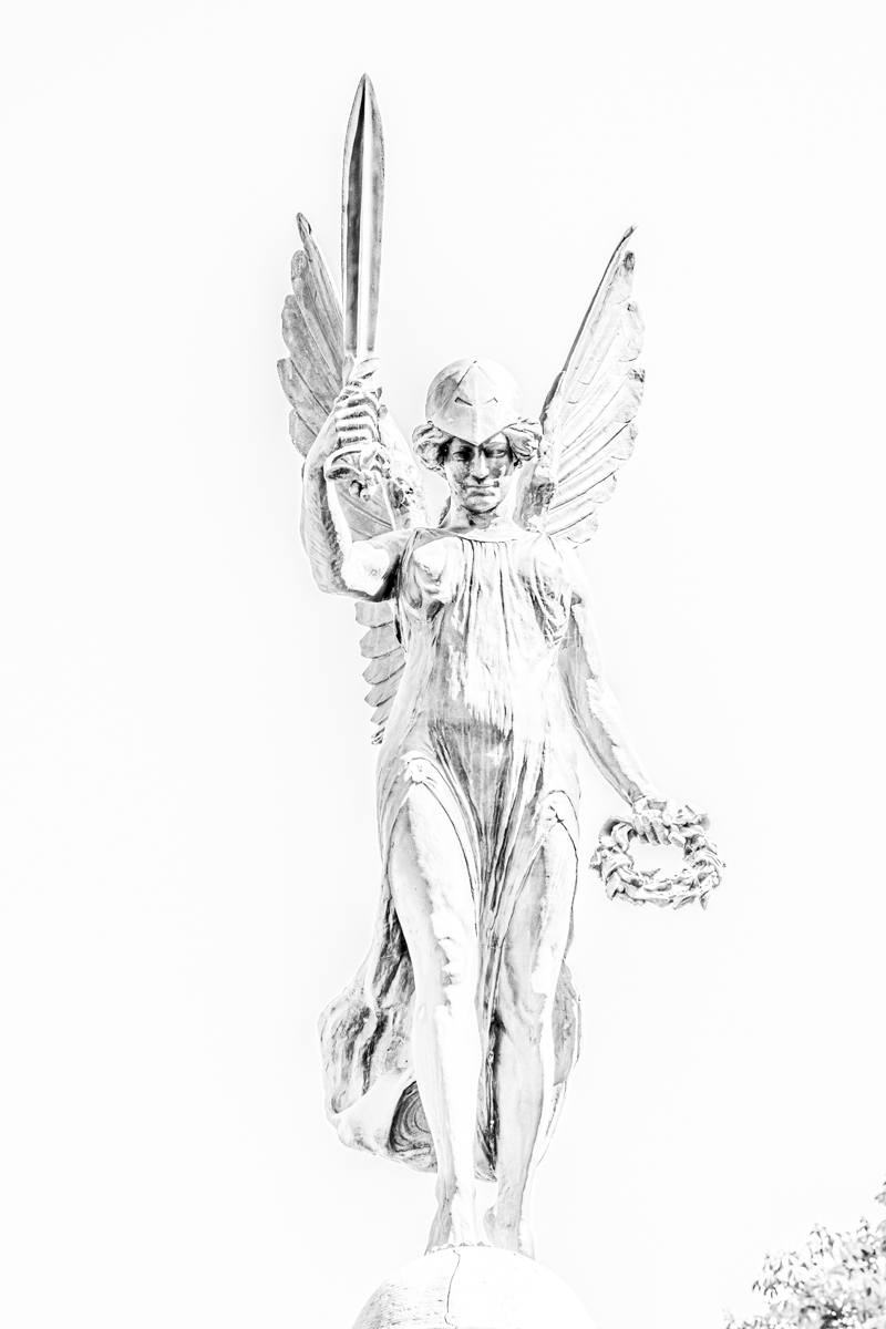
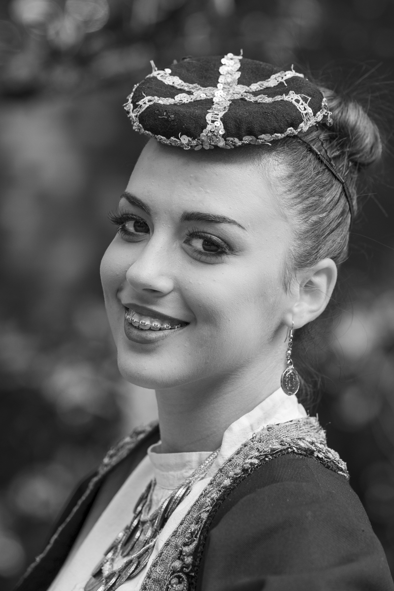
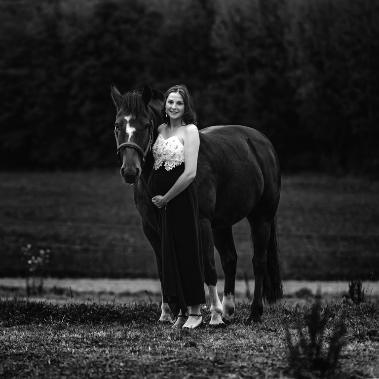
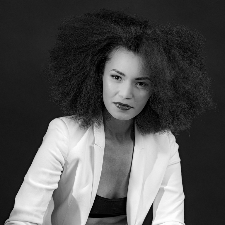
Jerry, the color version is very beautiful (I like the tones), but the B&W version is just superb. As Kathryn wrote, it is majestic.
The hair are sharp and have structure. It is the same for the stones.
I also like its attitude, the pose is natural. Almost a "studio"...
His right eye is very attractive. |
Apr 11th |
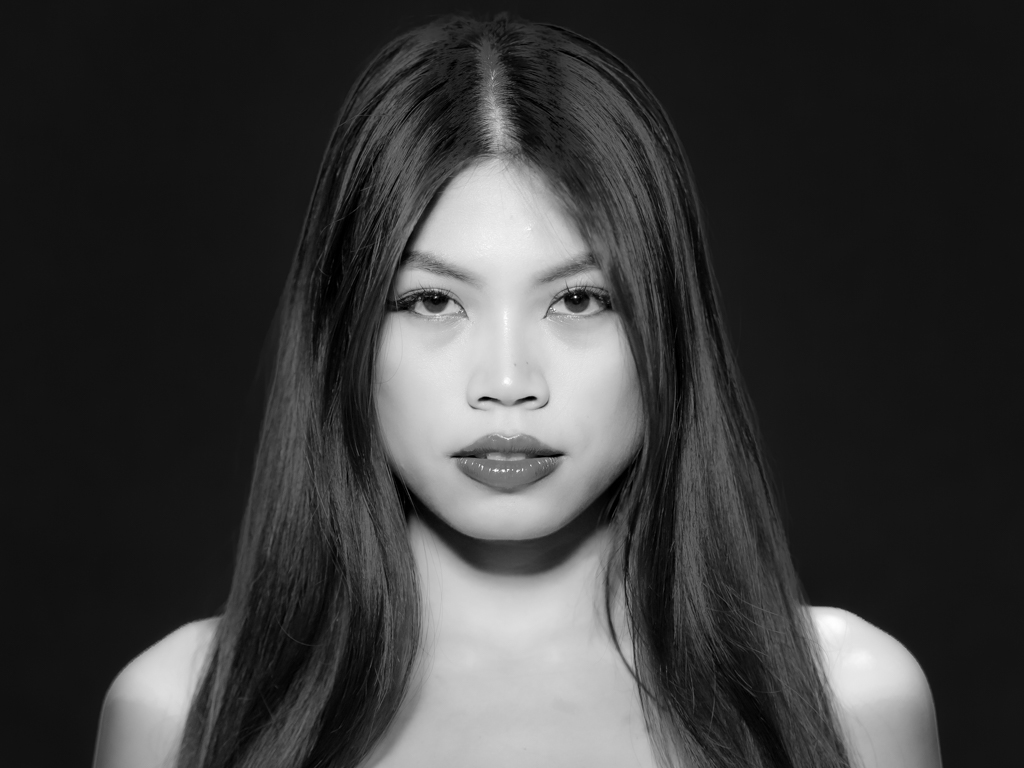
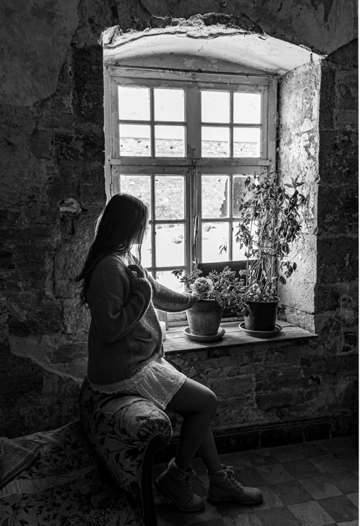
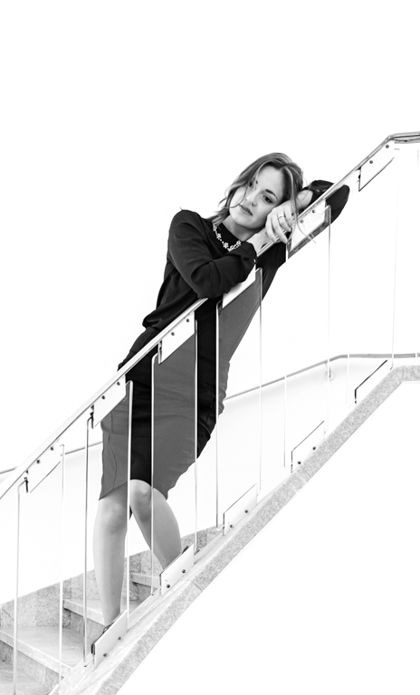
| 39 |
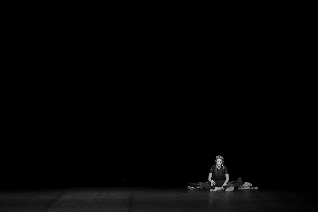
Apr 23 |
Comment |
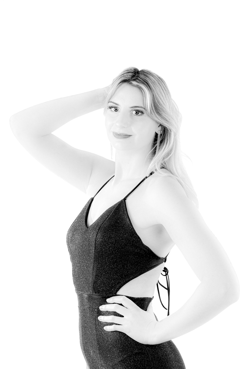
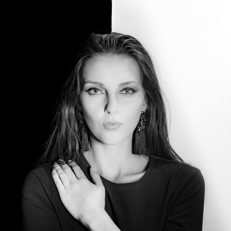
Very nice and soft natural light for a portrait. A natural look.
A little more light on the hair to have more structure could be positive.
The frame on the back, at that place, is disturbing. An alternative could have been: The lady more to the right (without being anymore in front of the frame). The frame would have been part of the image. The lady would have had less space in the direction of the lock, this would have been again the rules, but the rules can be fought... |
Apr 11th |
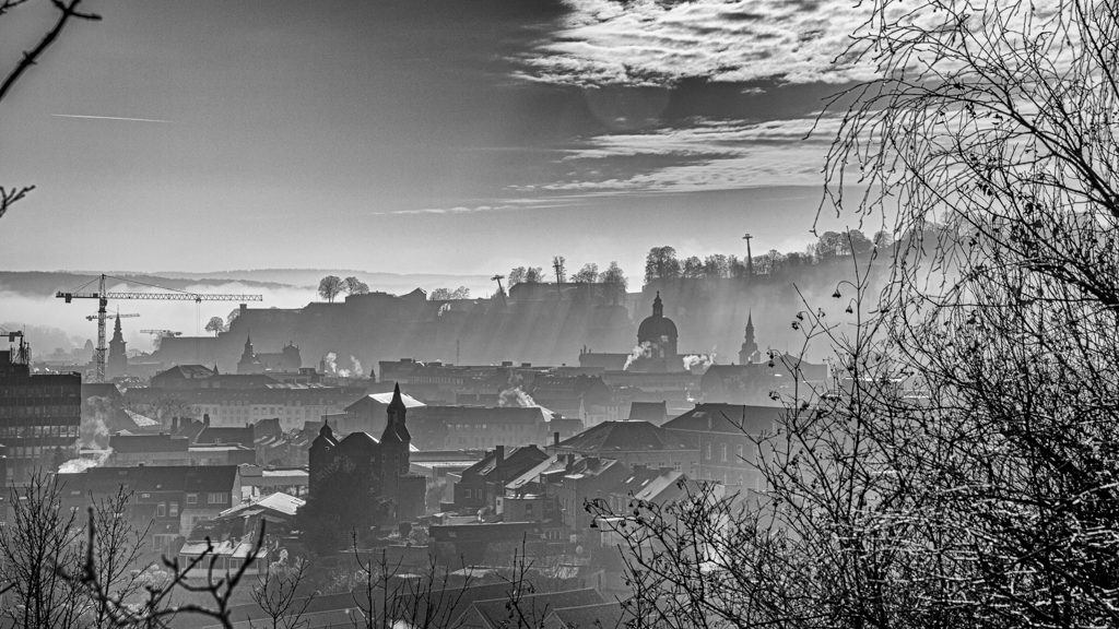
| 39 |
Apr 23 |
Comment |
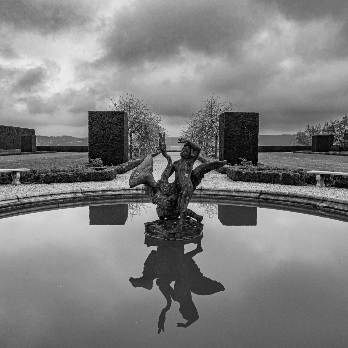
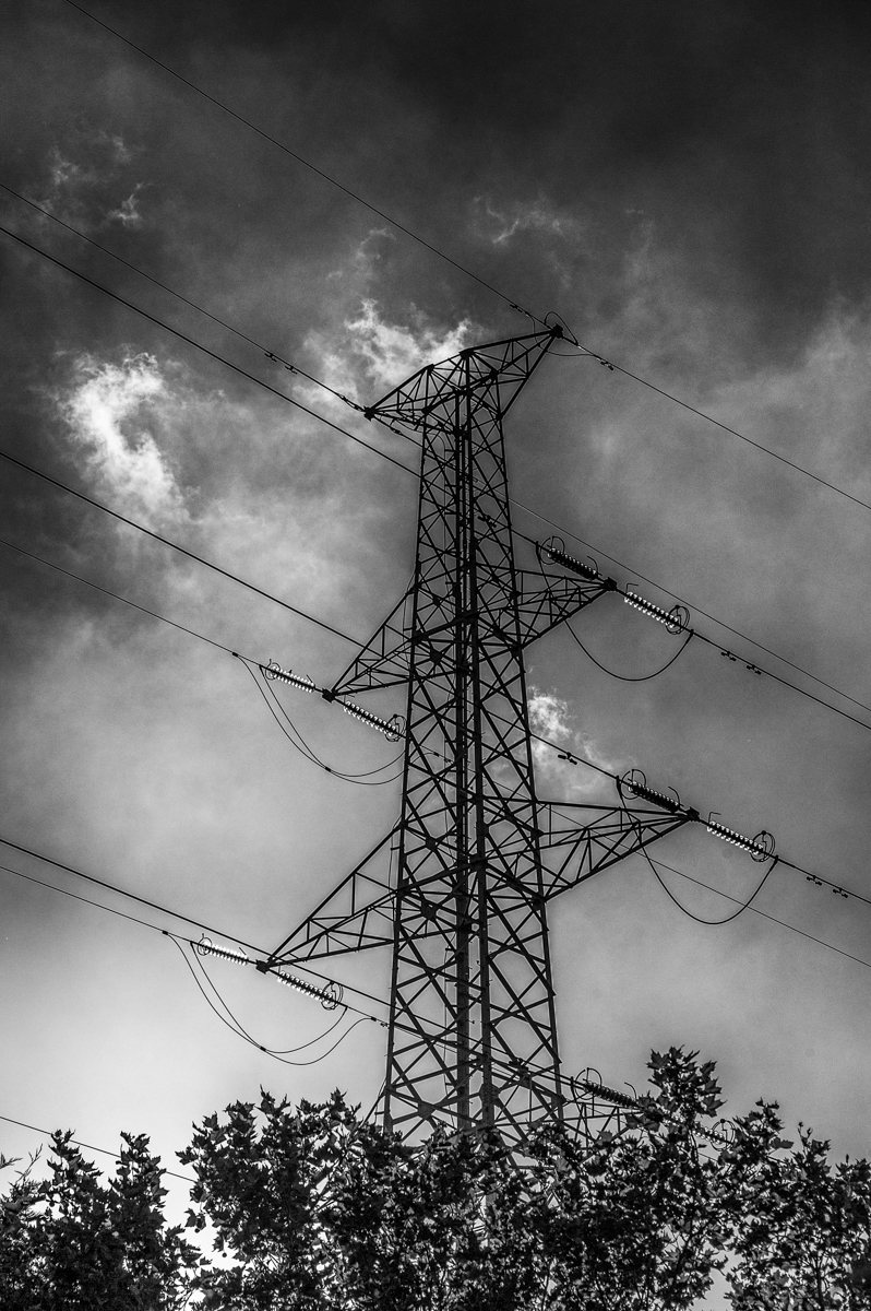
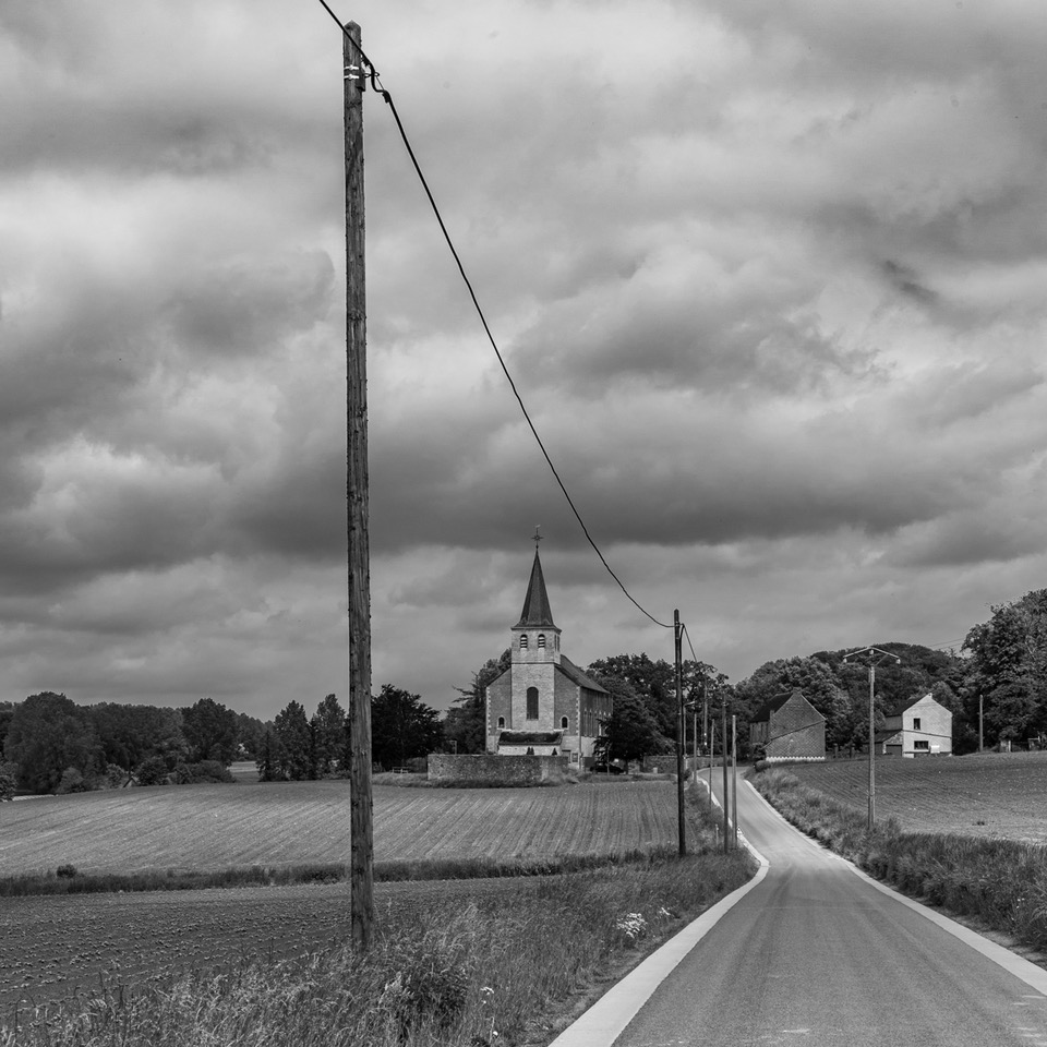
Thanks David for the description. Of course such an image calls for the B&W. I like the treatment, and all the leading lines (clouds and ice).
The preset 24 in SEP often works well. The structure of the ice and clouds is well present.
I like the panoramic format for such an image, it is your choice to have it or not. |
Apr 11th |
| 39 |
Apr 23 |
Reply |
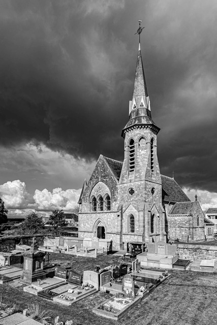
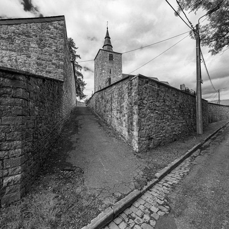
Thanks Kathryn for tour comment.
The "main" one (without clouds), is taken "against the light (sun)", this explains the light behind the "tower" of the church. I had to move to hide the sun and to have this effect. The trees in the background are not sharped and that annoys me in this image.
As mentioned in the reply to David, I really appreciate your analysis. That allows me to have another point of view. Thanks for that. |
Apr 9th |
| 39 |
Apr 23 |
Reply |
Thanks David for your comment.
The "main" one (without clouds), is taken "against the light (sun)", this explains the light around the tower of the church. I didn't put a vignette, it is the center that has more light.
It is why I use this image (without clouds) as main, as I really like the light behind the church.
However I really appreciate your comments as there are an analysis of the picture with a different sensibility. |
Apr 9th |
| 39 |
Apr 23 |
Reply |
Thanks for your comments Jerry.
These pictures were taken at different moment (days). It is too far away from home. I went there (for pictures) several times. I don't understand your question about the raw. The original is a copy of the raw.
|
Apr 9th |
7 comments - 5 replies for Group 39
|
| 75 |
Apr 23 |
Reply |
Hello Charles.
Thanks for your comments.
I agree with you on the contrast. The image of Ray is"different". I keep my choice of having more a "silhouette", but I appreciate his proposition. |
Apr 24th |
| 75 |
Apr 23 |
Reply |
Hello Ray.
Thank you very much for your work and advices.
Indeed I think it is worth trying to remove the "intruder". |
Apr 24th |
| 75 |
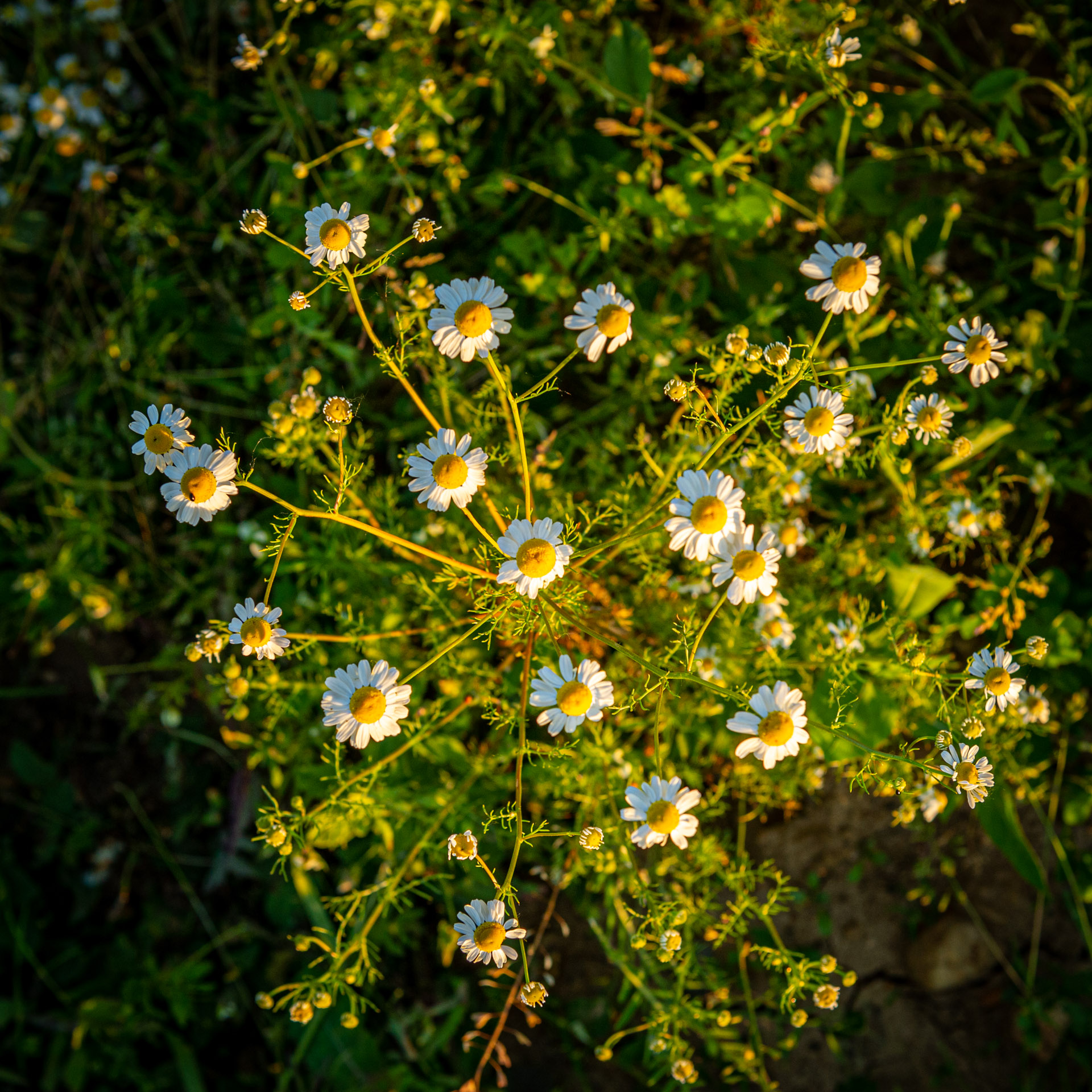
Apr 23 |
Comment |
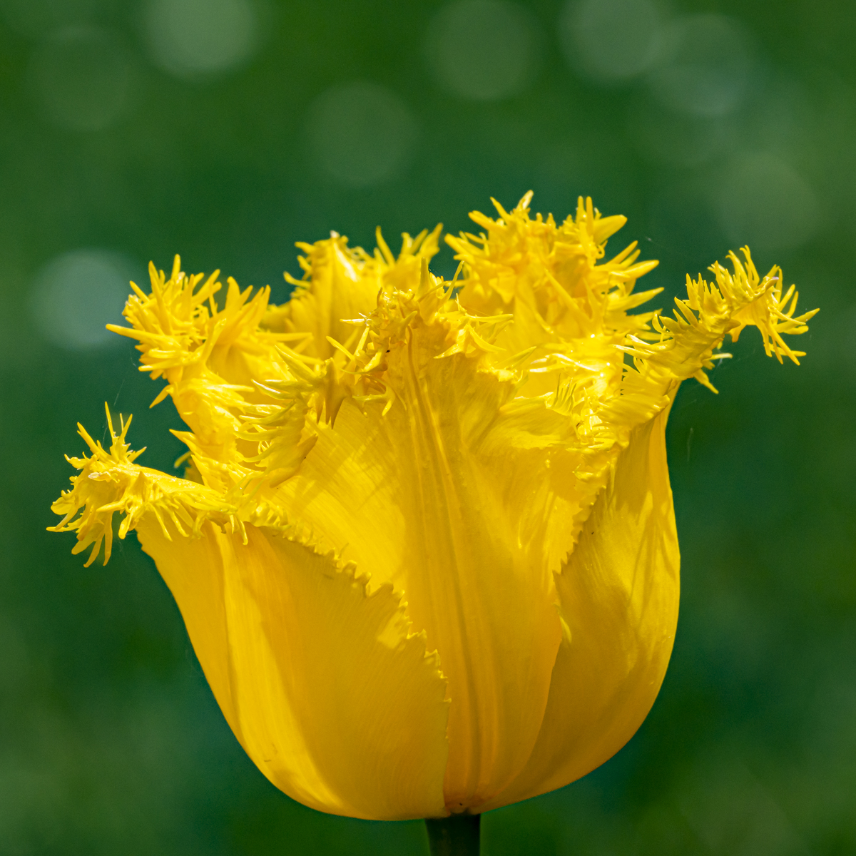
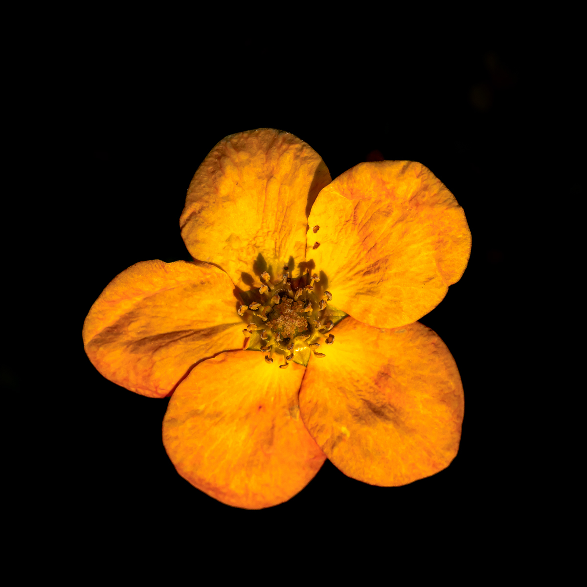
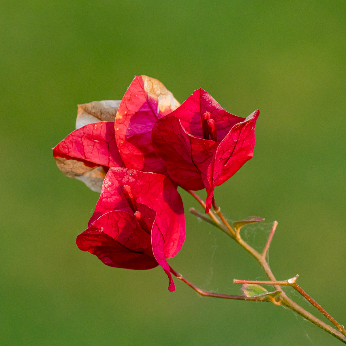
Another interesting point of view to capture the flower. I like the composition and the 2 colors.
There are indeed a lot of details we can appreciate with the sharpness of the picture.
|
Apr 17th |
| 75 |
Apr 23 |
Comment |
We immediately recognize your (beautiful) style Raymond. Beautiful light and composition. A huge and great job.
Good choice of the background. A pleasure to look at the flower (picture). |
Apr 17th |
| 75 |
Apr 23 |
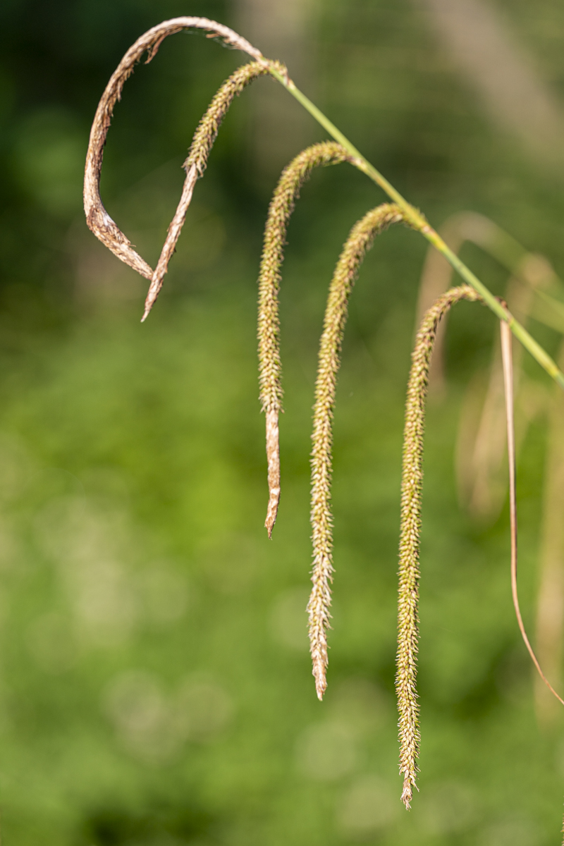
Comment |
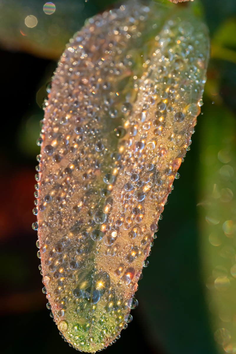
I like the lines formed by the green "pearls".
I agree with the suggestion of cropping on both sides to avoid the "disturbing" elements in the corners.
The difficulty was to obtain an interesting composition with such subject (flower) and you have done it. |
Apr 17th |
| 75 |
Apr 23 |
Comment |
I like the color and the composition (even if some more space around the flower could have improved the picture). Good idea the small frame around the picture.
I am a little disturbed by the (colored) blur around the flower. The transition with the background is not 'smooth" enough. Just a personal opinion.
If you crop to only keep the center of the image, you will have something very special, but completely another image. |
Apr 17th |
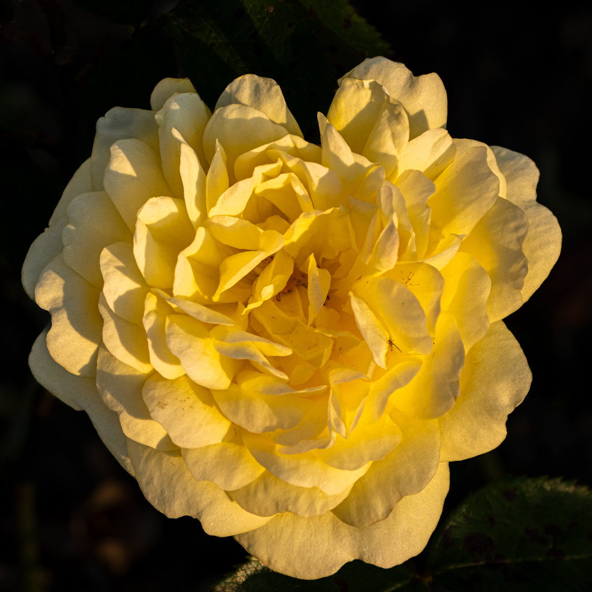
| 75 |
Apr 23 |
Comment |
I really appreciate the composition. Good choice for the format.
The leaves in the foreground are great. There are part of the subject.
I agree with you, the background (upper part of the image) is quite disturbing (a kind of blurry).
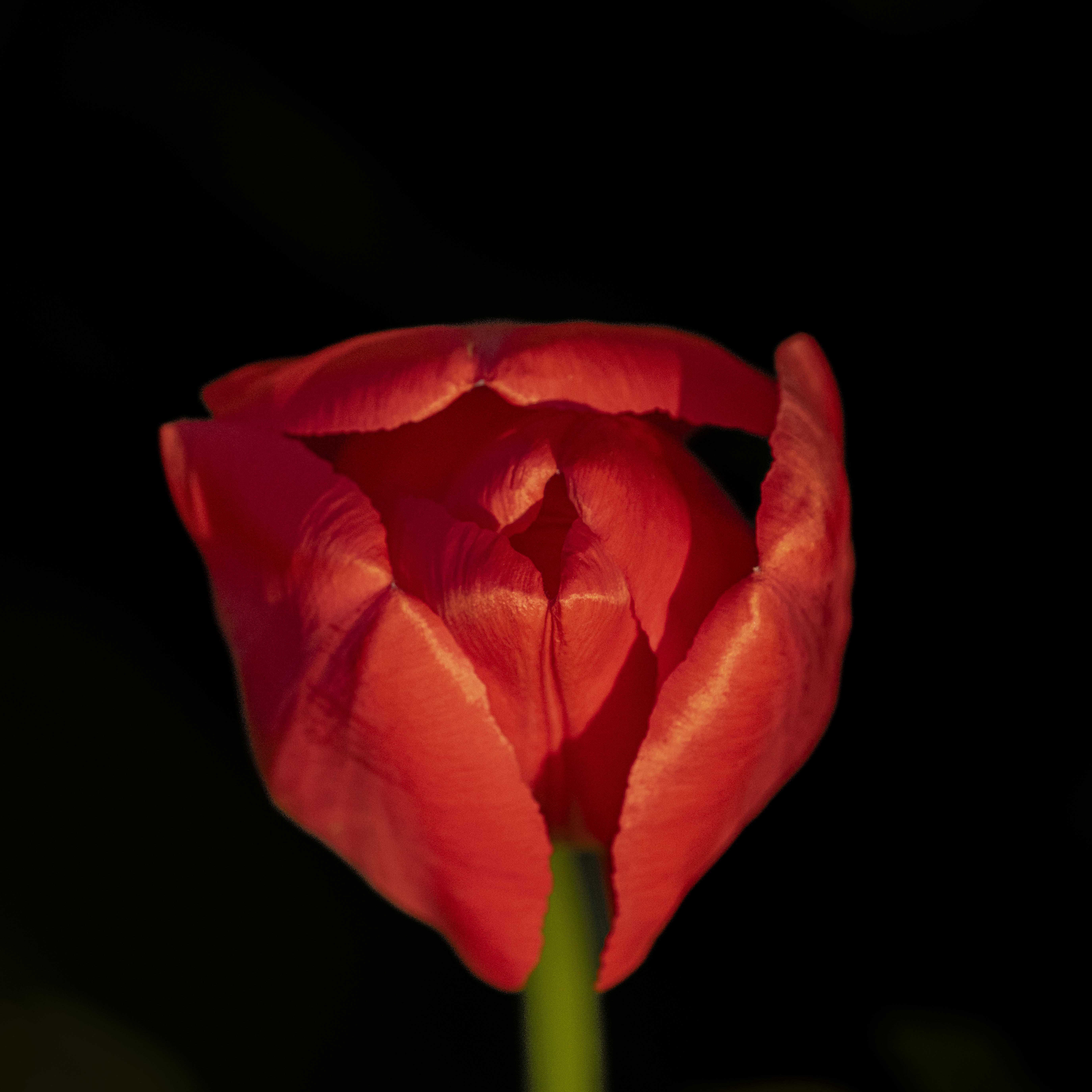
I agree with Charles for the "shadowed" parts, I like his proposition. Without doing that, I would agree with Judy for the straight petal. I hope this will not "change" the image. |
Apr 16th |
| 75 |
Apr 23 |
Reply |
Always a pleasure to read your comment Charles and to see your proposition. Thank you. |
Apr 16th |
| 75 |
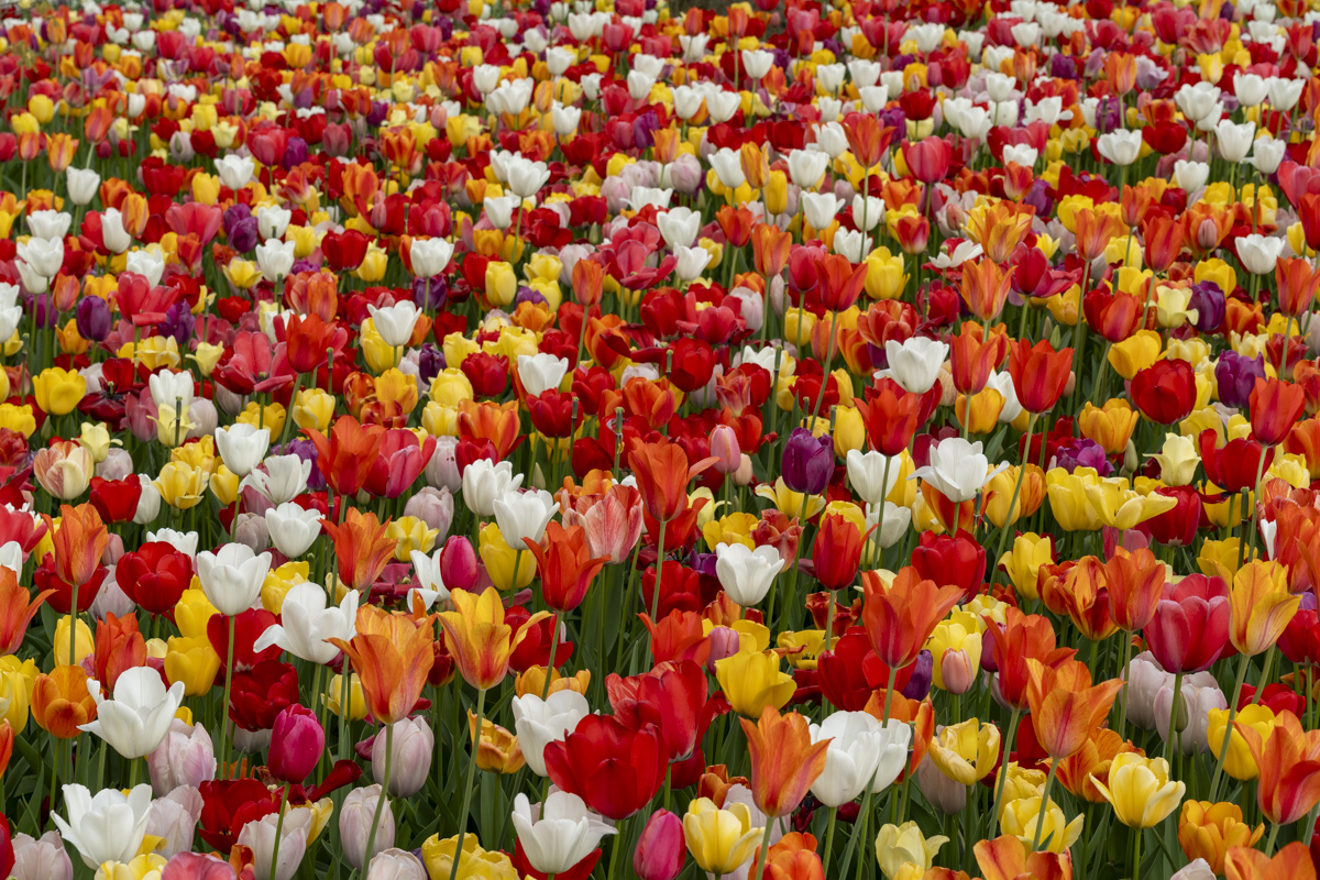
Apr 23 |
Comment |
Always a good idea, when it is possible, to arrive before the crowd...
Of course , the composition is great in the image (colors, lines, people and also the clouds in the background). Such image needs the panoramic format. Well done.
If you have time to tile to Europe, in The Netherlands, there is also such garden: https://keukenhof.nl/en/
Sorry for the confusion with the original... |
Apr 16th |
| 75 |
Apr 23 |
Reply |
Hi Murphy. I think I made a "mistake" when uploading the original.... There was no, I put it on the wrong place. So I had to upload a second time... Sorry for the confusion... |
Apr 16th |
6 comments - 4 replies for Group 75
|
13 comments - 9 replies Total
|