|
| Group |
Round |
C/R |
Comment |
Date |
Image |
| 39 |
Mar 23 |
Reply |
Thank you very much Kathryn. |
Mar 20th |
| 39 |
Mar 23 |
Reply |
Thank you Jerry. |
Mar 20th |
| 39 |
Mar 23 |
Comment |
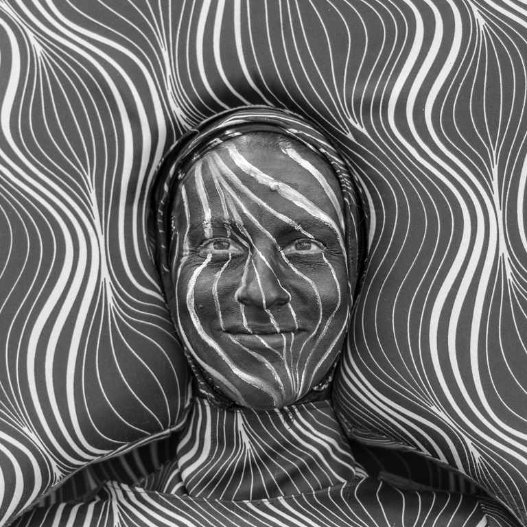
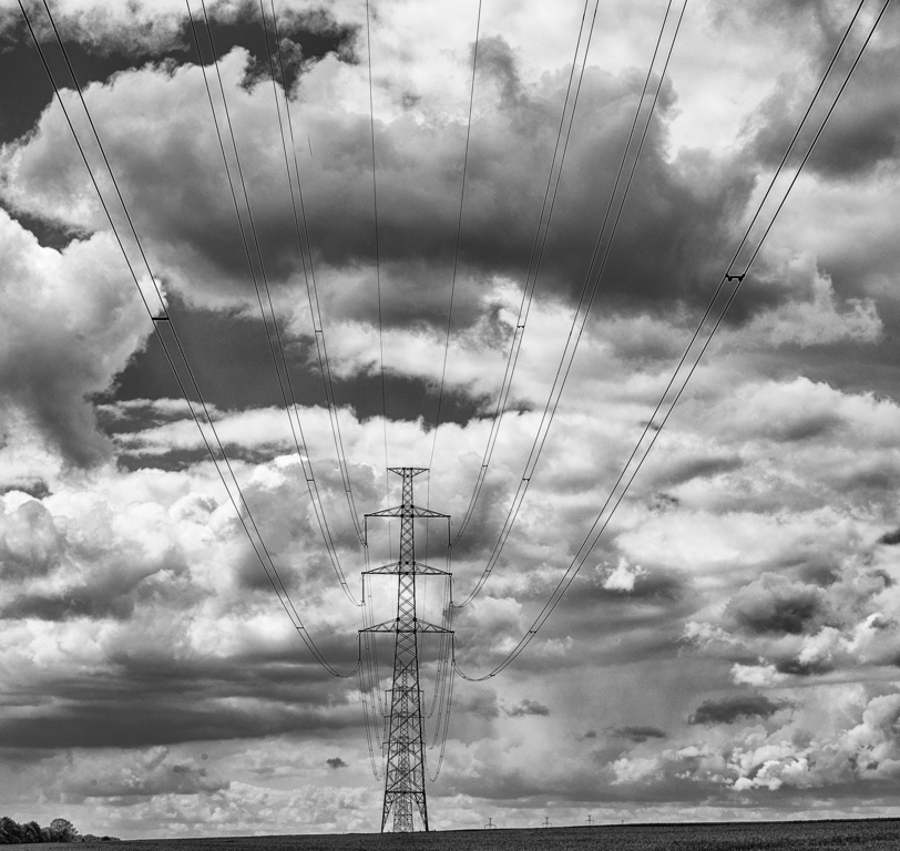
I went back and forth between the two versions several times to understand the B&W version. Great job. The creativity behind that is great.
Good composition.
Without the color version, it would take time to understand the picture. That means it is a good picture. The image calls out to us and encourages us to think about it. |
Mar 16th |
| 39 |
Mar 23 |
Comment |
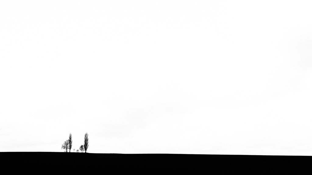
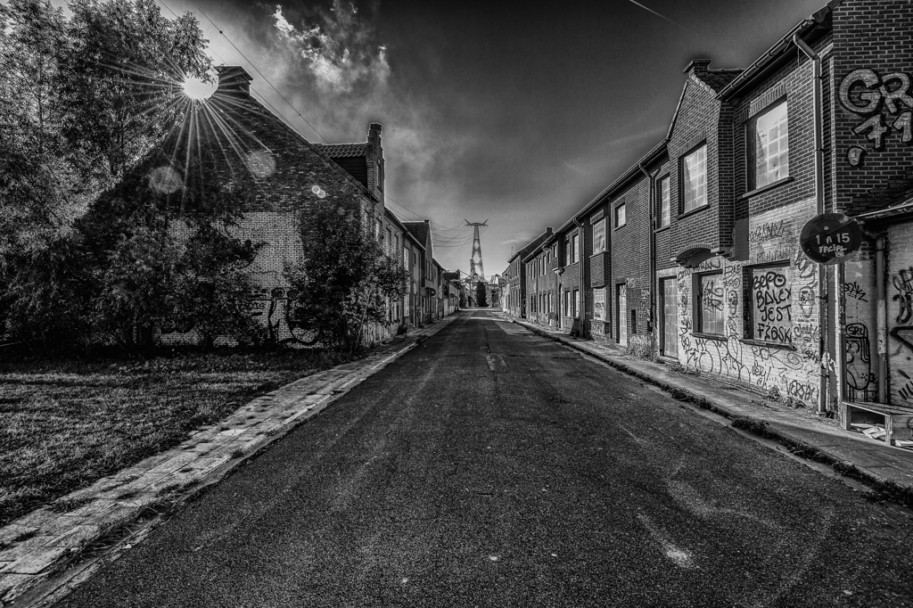
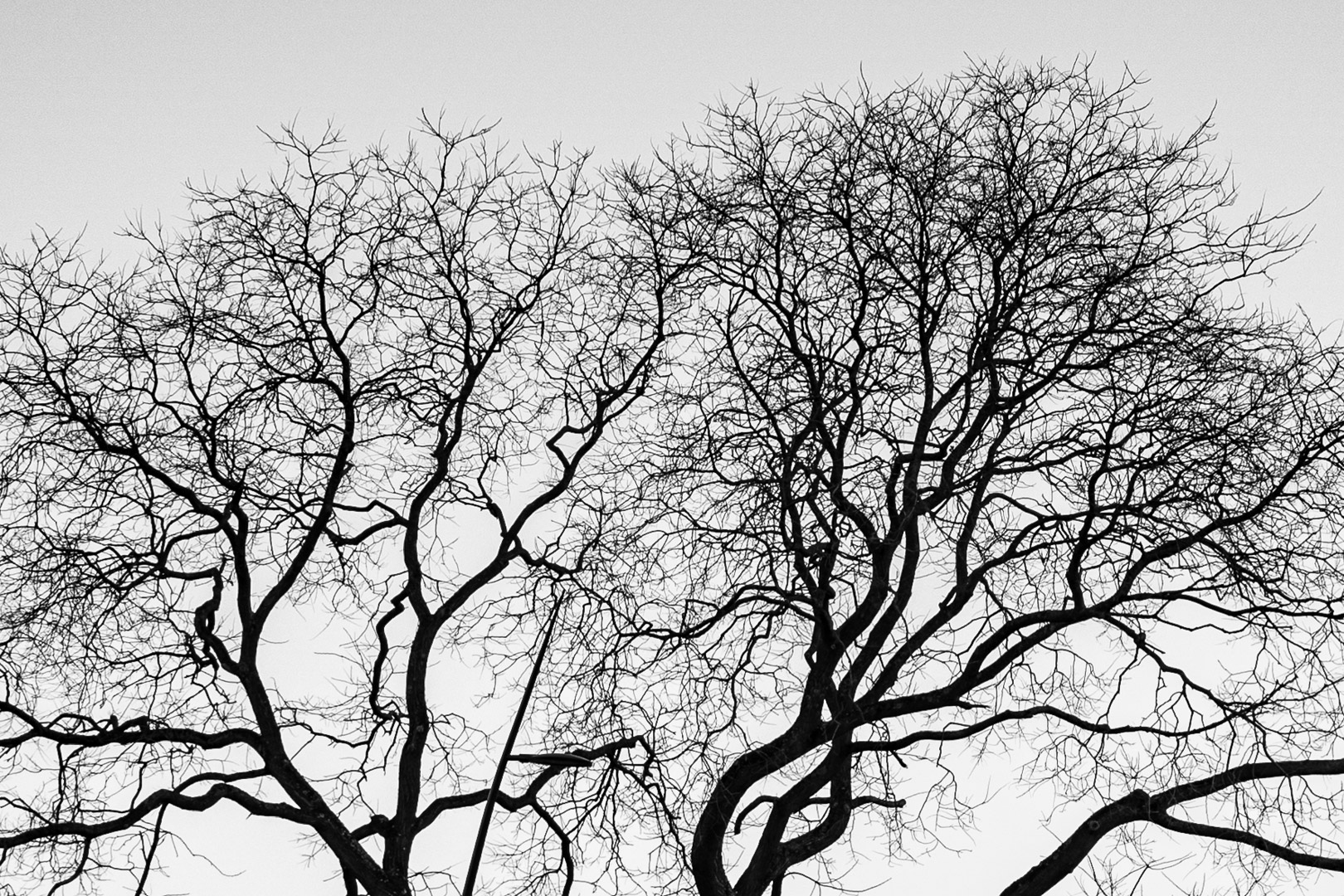
B&W version is much better than the color one. There is not much color in the winter. Good choice to convert it.
The eyes must make "several" turns to see all the elements of the image, and we finish with the falls. I like all these elements (Stone, Water, Trees and Sky & Trees). I really appreciate the composition.
For the shutter speed, it was a choice. This would be a different picture.
Personally, I prefer a thiner (more discreet) frame around the picture. Just a personal opinion. |
Mar 16th |
| 39 |
Mar 23 |
Comment |
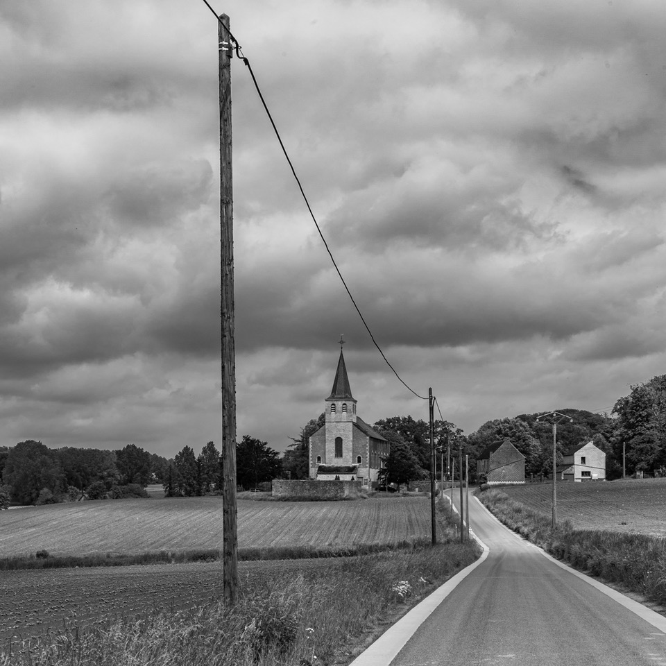
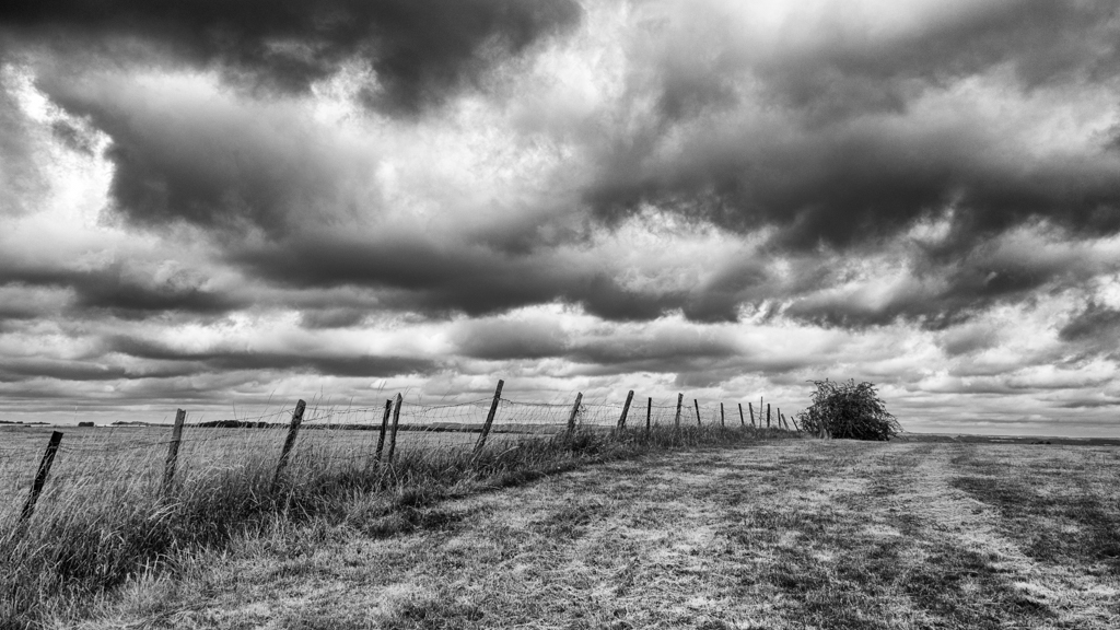
Really like the composition, the triangle with the fence, the tree and the barn. The fence leads the look, it is even 2 sides of the triangles.
The branches of the tree are sharp.
The B&W version works better, due to the better contrast of the different element (specially the tree). |
Mar 13th |
| 39 |
Mar 23 |
Comment |
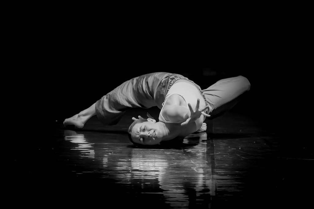
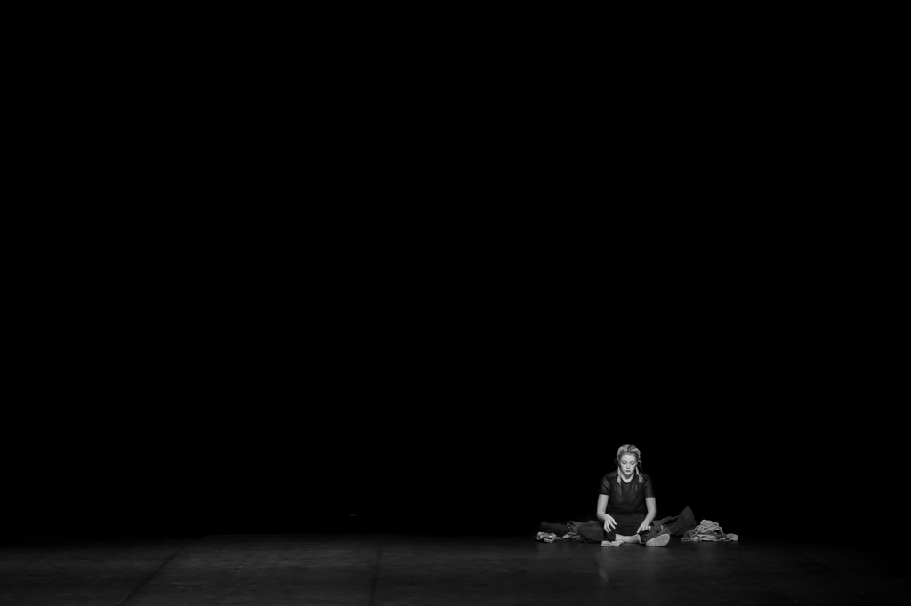
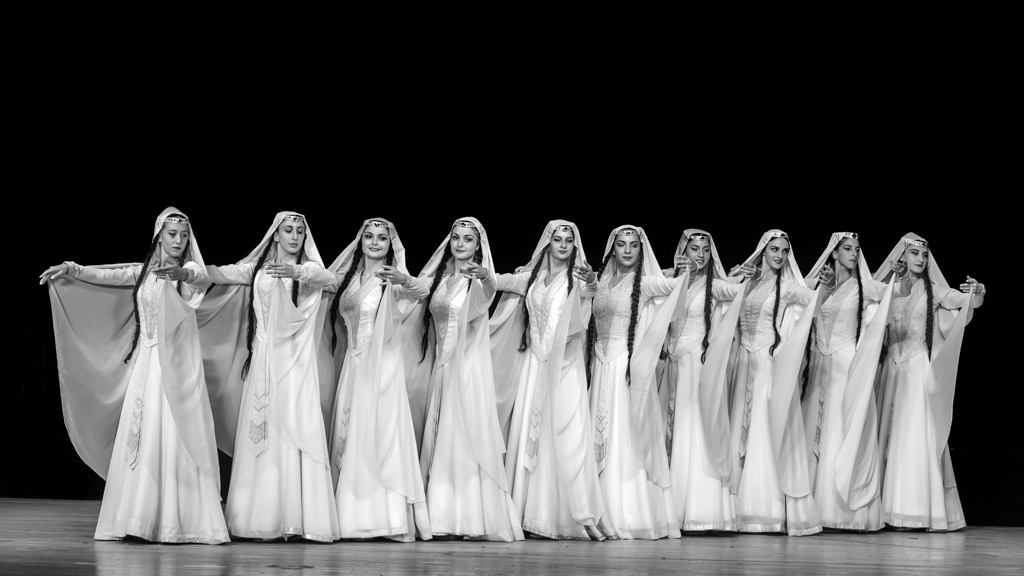
You have good friends Jerry. Nice experience I suppose.
My opinion is in the same idea than the other. I like the attitude of the central players. The space on the top (not enough), and on the left, there is a part of a stick coming from the left, and part of a lef (just on the limit) that I would delete.
At speed of 1/60, job well done. |
Mar 13th |
| 39 |
Mar 23 |
Comment |
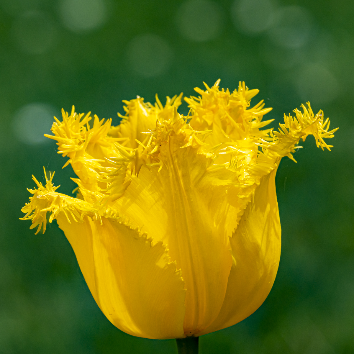
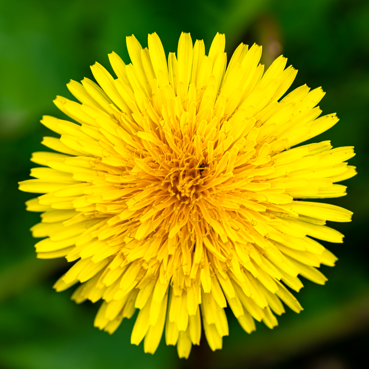
I like the composition.
The conversion in B&W is a choice as there is little color in the original. However the increase of the colors of the 3 "yellow" bushes could be an interesting image (triangle in the image). But we are in a B&W group...
I also prefer the contrast and the depth in the color version. It is perhaps more classical and less artistic than your proposal. |
Mar 13th |
| 39 |
Mar 23 |
Comment |
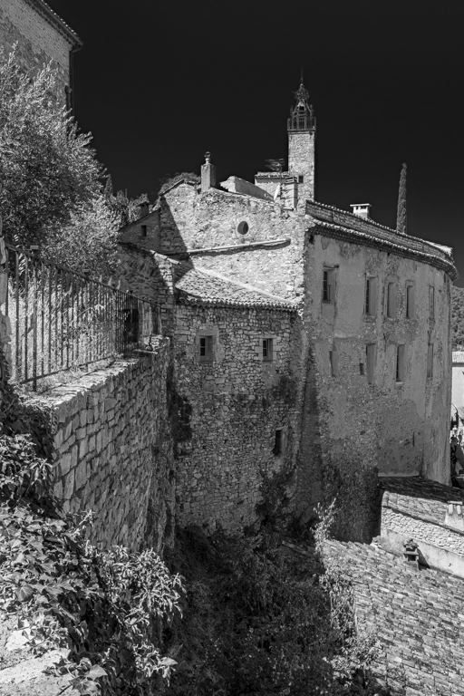
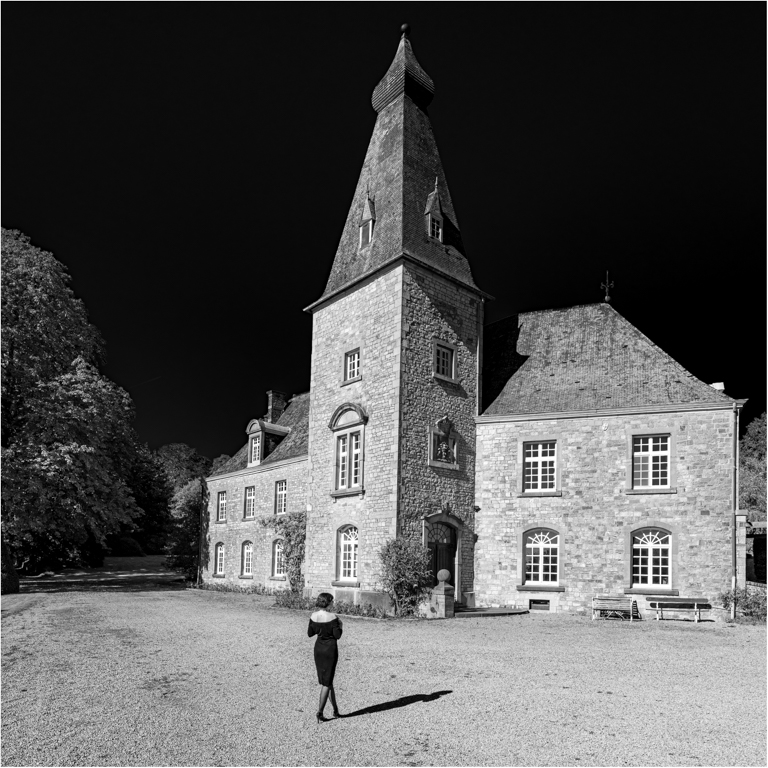
Good choice David for the B&W, as se have to enter the picture to understand it and the colors were rather "dull".
I like the balance of the picture, with the white building and the flag on the right. However I find the triangle made by the 3 buildings, the white building and the hangar in the foreground wel done in the original.
These are 2 different pictures. The B&W is now a beautiful landscape with nice tone. The colore one has a more detailed composition but with "dull color. This is just my point of view. |
Mar 13th |
6 comments - 2 replies for Group 39
|
| 75 |
Mar 23 |
Reply |
Thanks Raymond for your comment. |
Mar 28th |
| 75 |
Mar 23 |
Reply |
Thanks Charles for your comment and suggestion. |
Mar 28th |
| 75 |
Mar 23 |
Reply |
Thanks Marge for your suggestion & comment (showcase). It is a well-know place for photographs. It is next a highway. I quite often drive on it, but we need the light and a camera... |
Mar 28th |
| 75 |
Mar 23 |
Reply |
ThanksJudy for your suggestion. |
Mar 28th |
| 75 |
Mar 23 |
Reply |
Thanks for you comment Murphy. |
Mar 28th |
| 75 |
Mar 23 |
Comment |
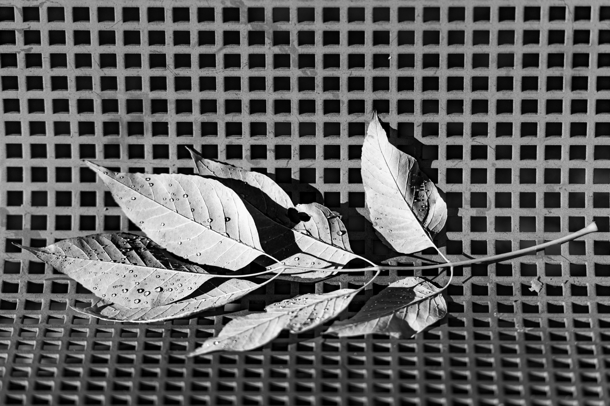
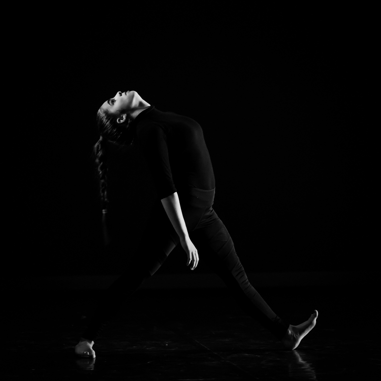
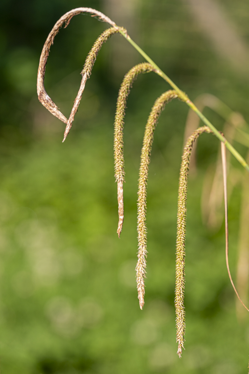
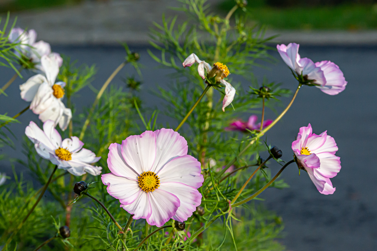
Charlie, you mentioned in a comment you begin to recognize the style of a member. Concerning your style e immediately recognize it...
I agree with your concerns of the lower left corner when taking the pictures. To place the leaf in the center with a dark (black) background would have been another picture, but a possibility. Just a suggestion...
Sharpness is just great. |
Mar 20th |
| 75 |
Mar 23 |
Comment |
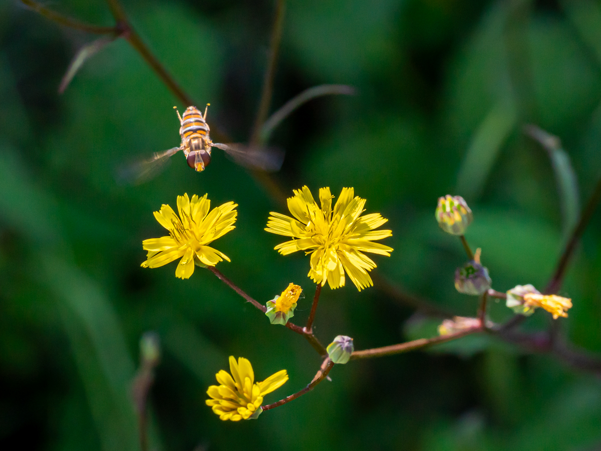
The composition is interesting and really well done. I like the "path" through the daffodils to the entrance.
I also like the different colors (daffodils sky, ground, house, ..) and the sharpness of the daffodils.
Really beautiful picture with an impressive history. |
Mar 20th |
| 75 |
Mar 23 |
Reply |
Relevant comment. The truth in fact. |
Mar 20th |
| 75 |
Mar 23 |
Reply |
Hello Raymond. I received the image and I was sure to have posted it, as "main" Image... Sorry for that. |
Mar 20th |
| 75 |
Mar 23 |
Comment |
I like the light and the soft colors of this image.
I also prefer (personal opinion)the suggestion of the crop from Judy.
Due to the forms of the leaves a square format can be interesting. |
Mar 20th |
| 75 |
Mar 23 |
Comment |
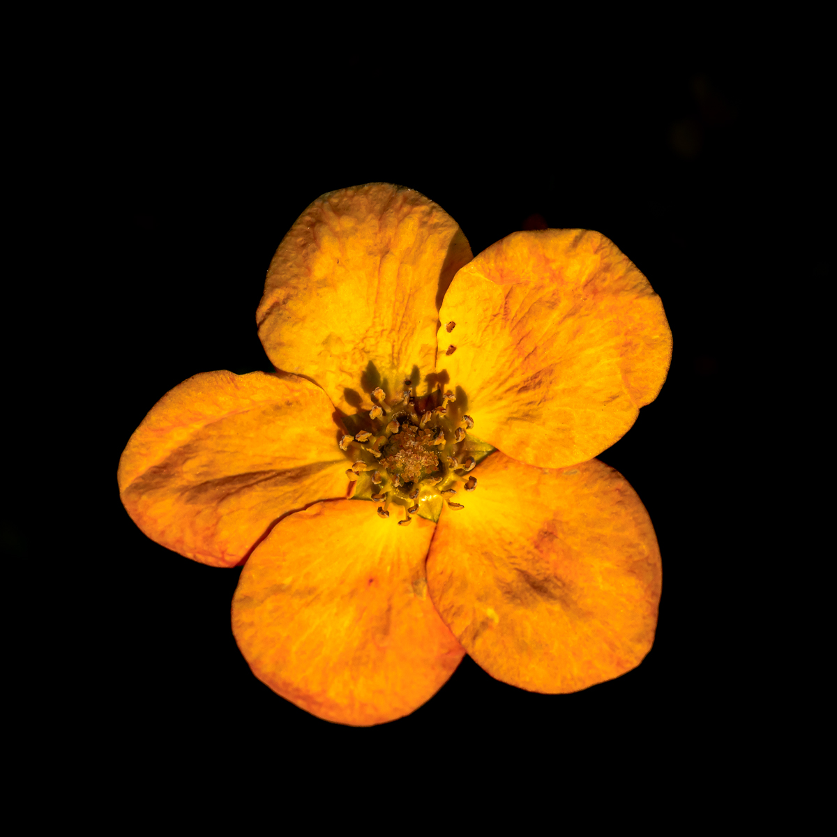
Original "old" picture which opens a debate....
I think we don't see that "anymore", this is also why its is interesting. We can imagine different situations: flowers in a swimming pool...
The leaves are sharp. I would have prefer not to have cut leaves or to be more cropped with less space on the right and always within a square format. |
Mar 20th |
| 75 |
Mar 23 |
Comment |
I like the composition and the different colors.
I also appreciate the green leaves in the foreground, they are very sharp.
The suggestions of Charles are indeed interesting. |
Mar 20th |
| 75 |
Mar 23 |
Reply |
Charles, it is always a pleasure to read you comment and suggestions. |
Mar 20th |
5 comments - 8 replies for Group 75
|
11 comments - 10 replies Total
|