|
| Group |
Round |
C/R |
Comment |
Date |
Image |
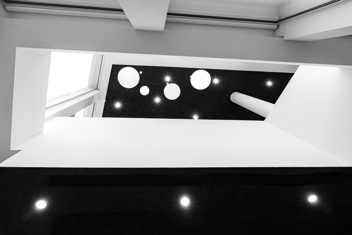
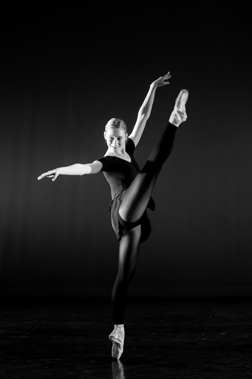
| 39 |
Feb 23 |
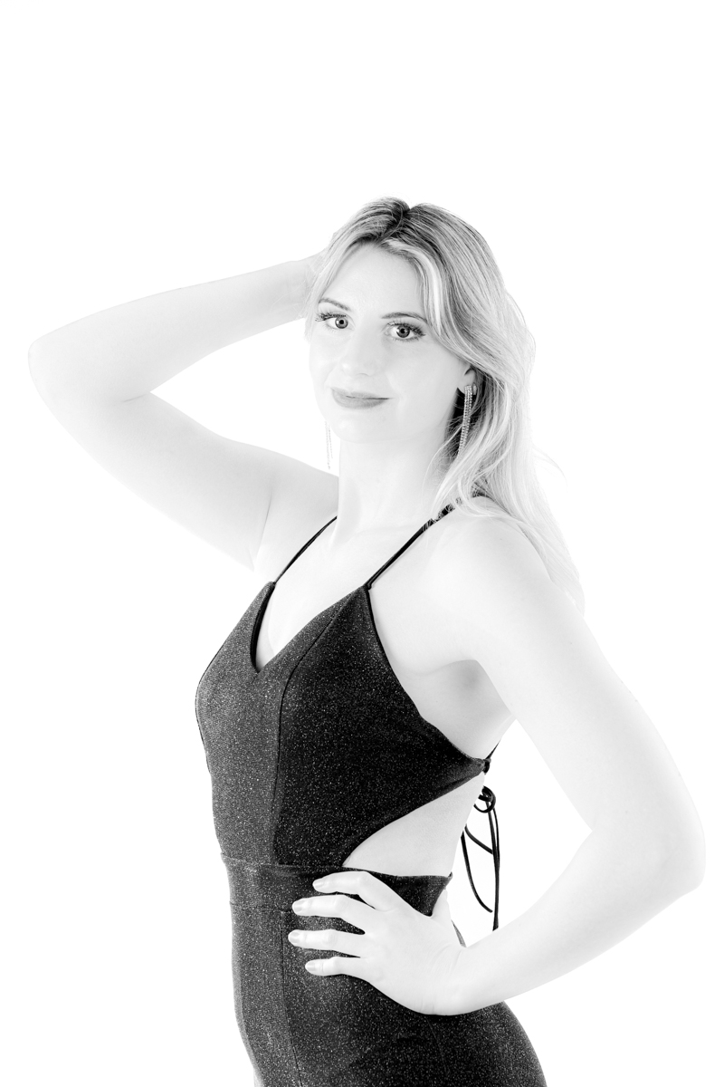
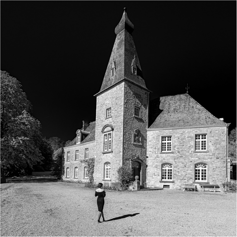
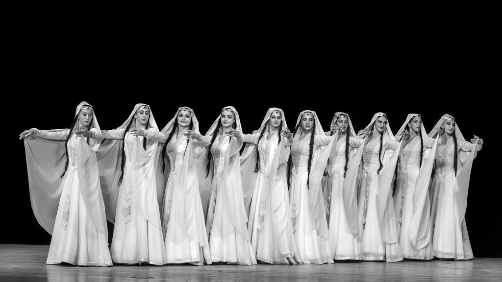
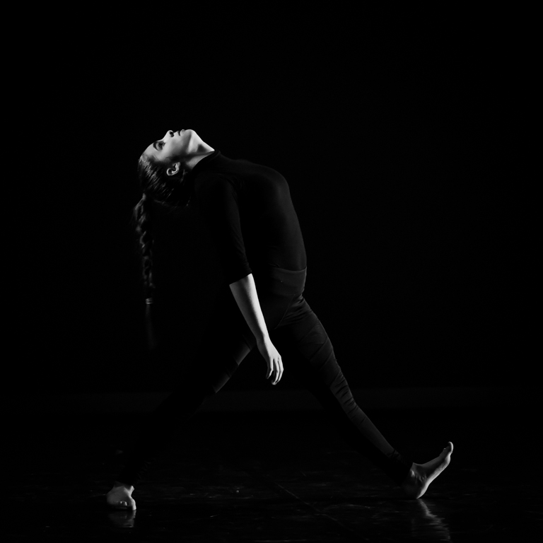
Comment |
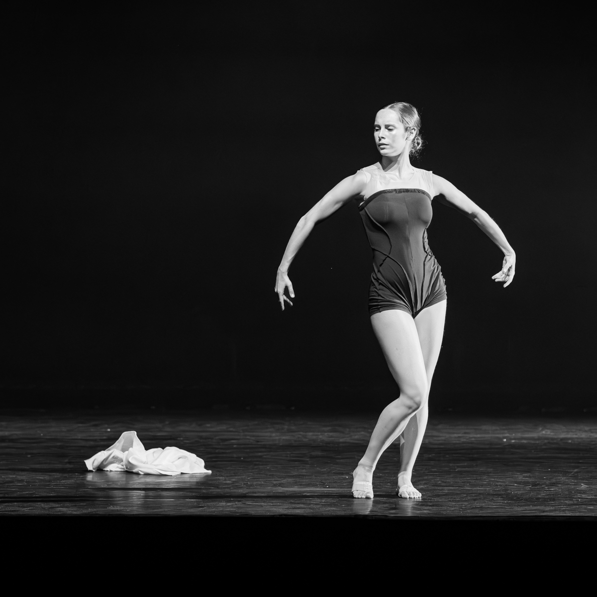
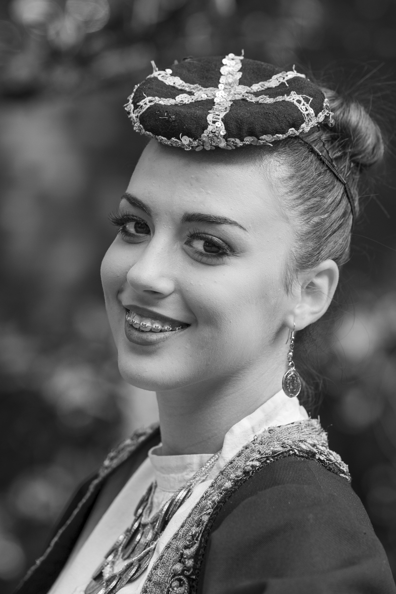
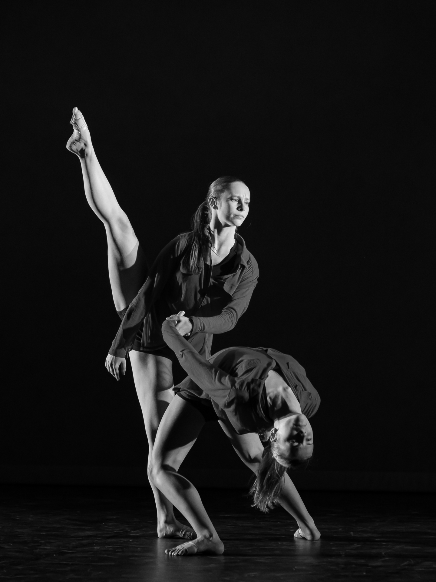
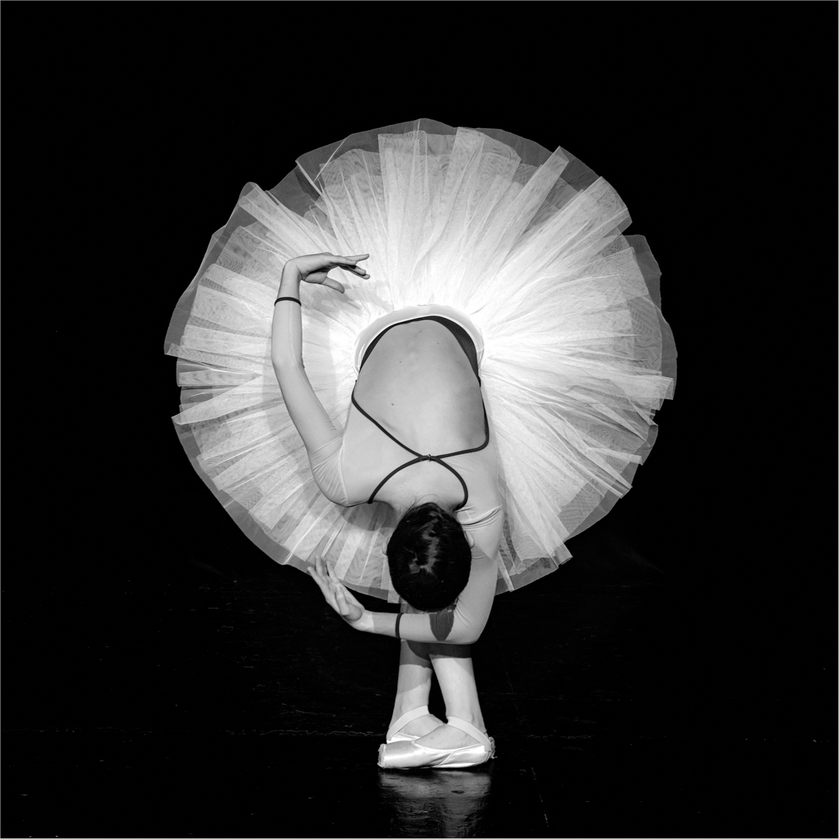
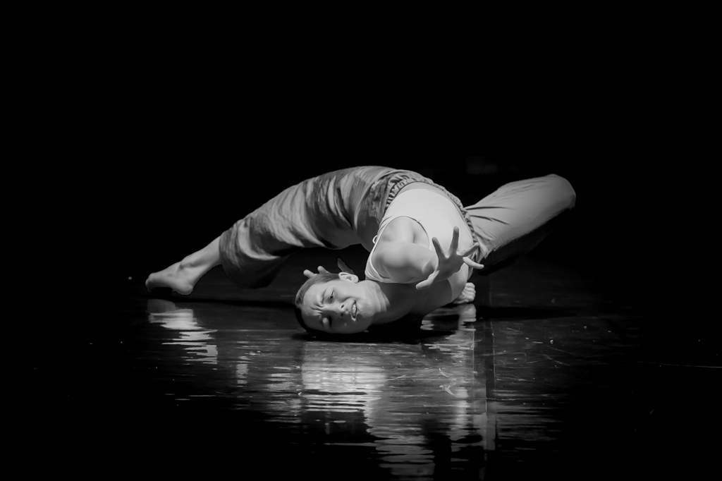
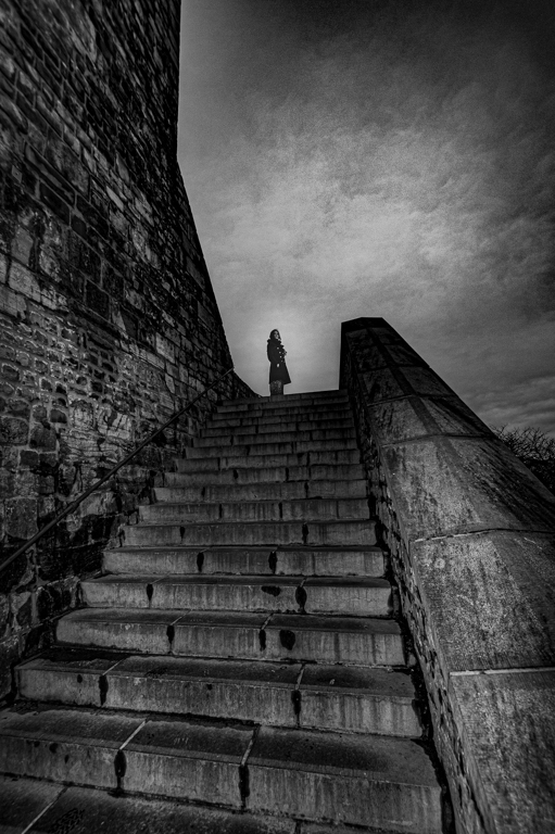
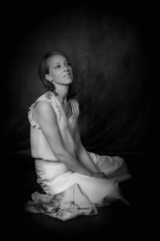
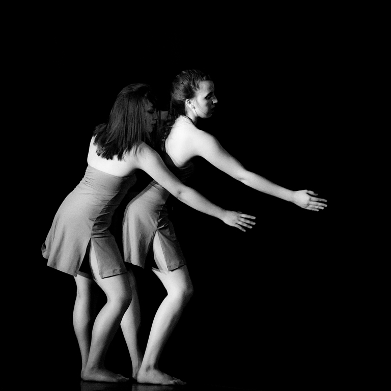
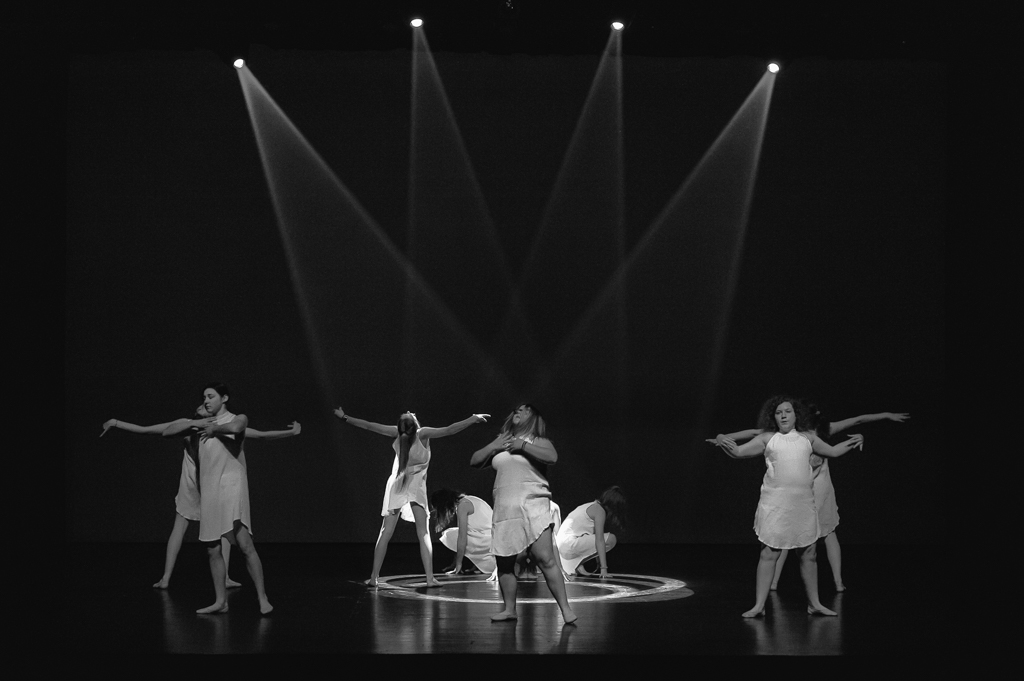
Both versions are beautiful. A lot of tones. The composition (light, position, look, ...) and the framing are well done. Eyes are sharp.
|
Feb 15th |
| 39 |
Feb 23 |
Comment |
When looking the picture and before reading the comments, I think the mood was a little scary, and I like it.
I like both versions. The B&W seems to be more sharp.
I like a frame around the small as it is often necessary in B&W, but, for me, its is a little too thick. |
Feb 15th |
| 39 |
Feb 23 |
Comment |
Everything is already written. Simplicity and beautiful.
I will also suggest to crop a little the bottom. The frame around is useful. |
Feb 15th |
| 39 |
Feb 23 |
Reply |
Thanks Paul. After having read all the comments, I agree with most of them. The dancer is indeed to bright. I like this group as there are very interesting and useful comments. I will start again from the original and try a new version. |
Feb 15th |
| 39 |
Feb 23 |
Reply |
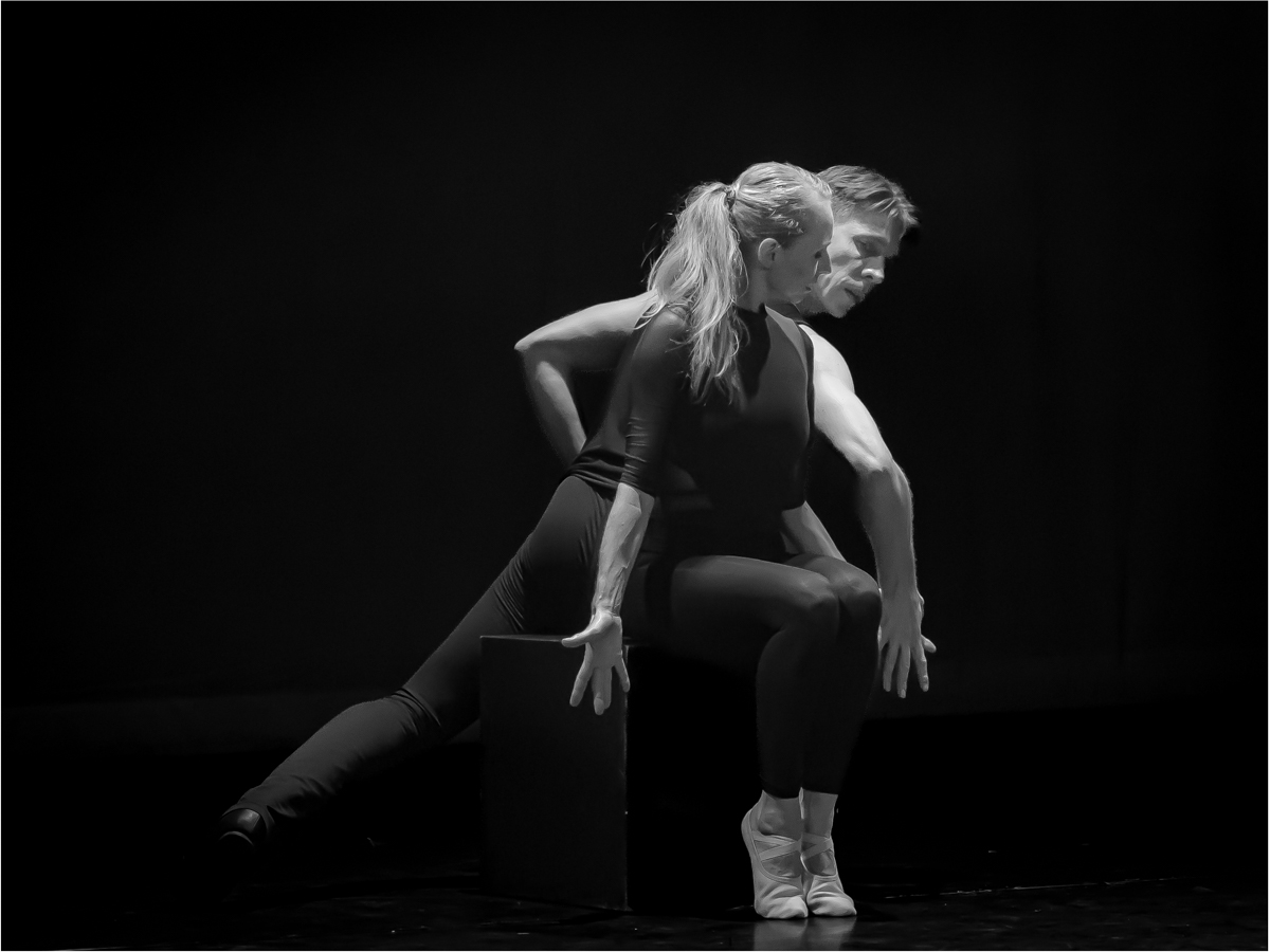
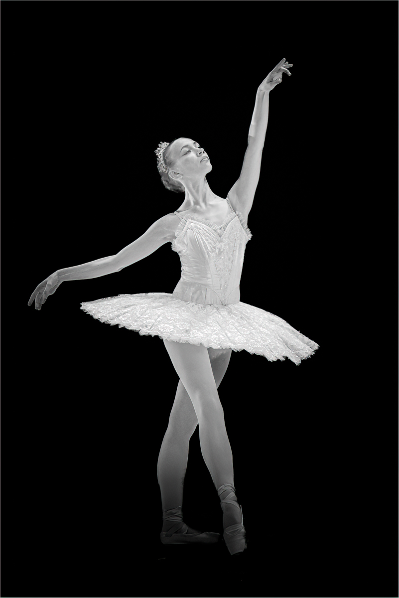
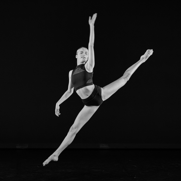
Kathryn. Thank you very much for your suggestion. I really like it very much. It is "another" picture. I think I will try to treat my picture as you propose it. It is not important to have a lot of pictures if we can have one as you treat it. I am not sure of the square format, even if I like this format. |
Feb 15th |
| 39 |
Feb 23 |
Reply |
Hi Ken. Also a good suggestion, as her face is less brighter than the skirt. Thanks you. |
Feb 15th |
| 39 |
Feb 23 |
Reply |
Thanks Fran. You are right. I should make a difference on the forward leg and foot. |
Feb 15th |
| 39 |
Feb 23 |
Reply |
Thanks David. I agree with your proposition. |
Feb 15th |
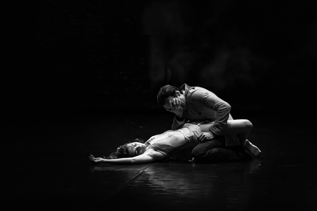
| 39 |
Feb 23 |
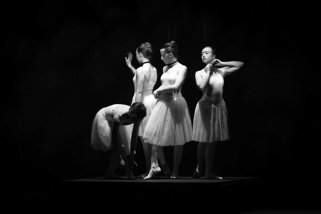
Comment |
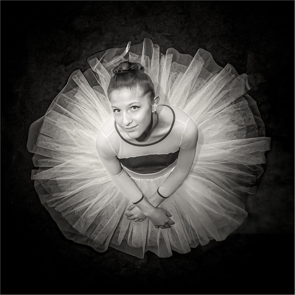
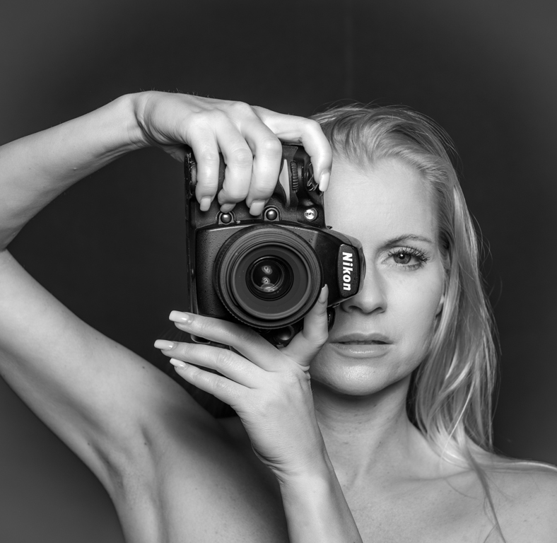
Really good work.
No comparison between the 2 versions. The B&W is much better: it is worked (sharp, tone, format, ...) and finished.
Ready to be printed. |
Feb 3rd |
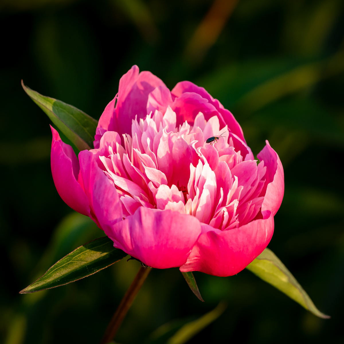
| 39 |
Feb 23 |
Comment |
Really good attitude of leopard.
Due to the lack of colors, a conversion to B&W is a really good option, and really well done.
Sharp image, especially the the tech information and hand hold.
Little space on top and below is a original choice. Good composition. |
Feb 3rd |
5 comments - 5 replies for Group 39
|
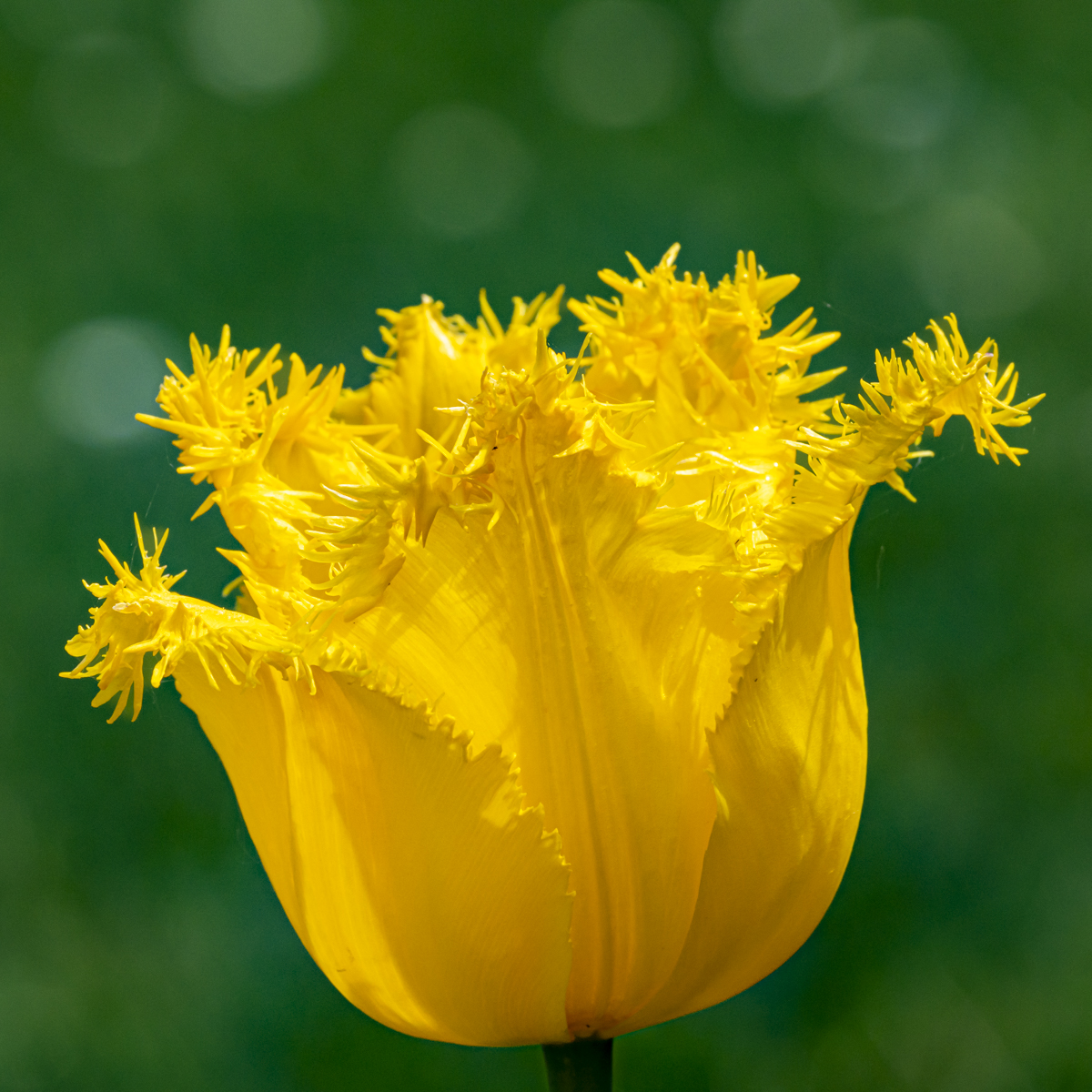
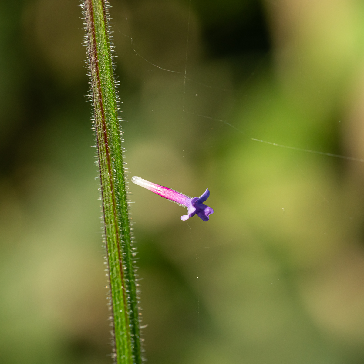
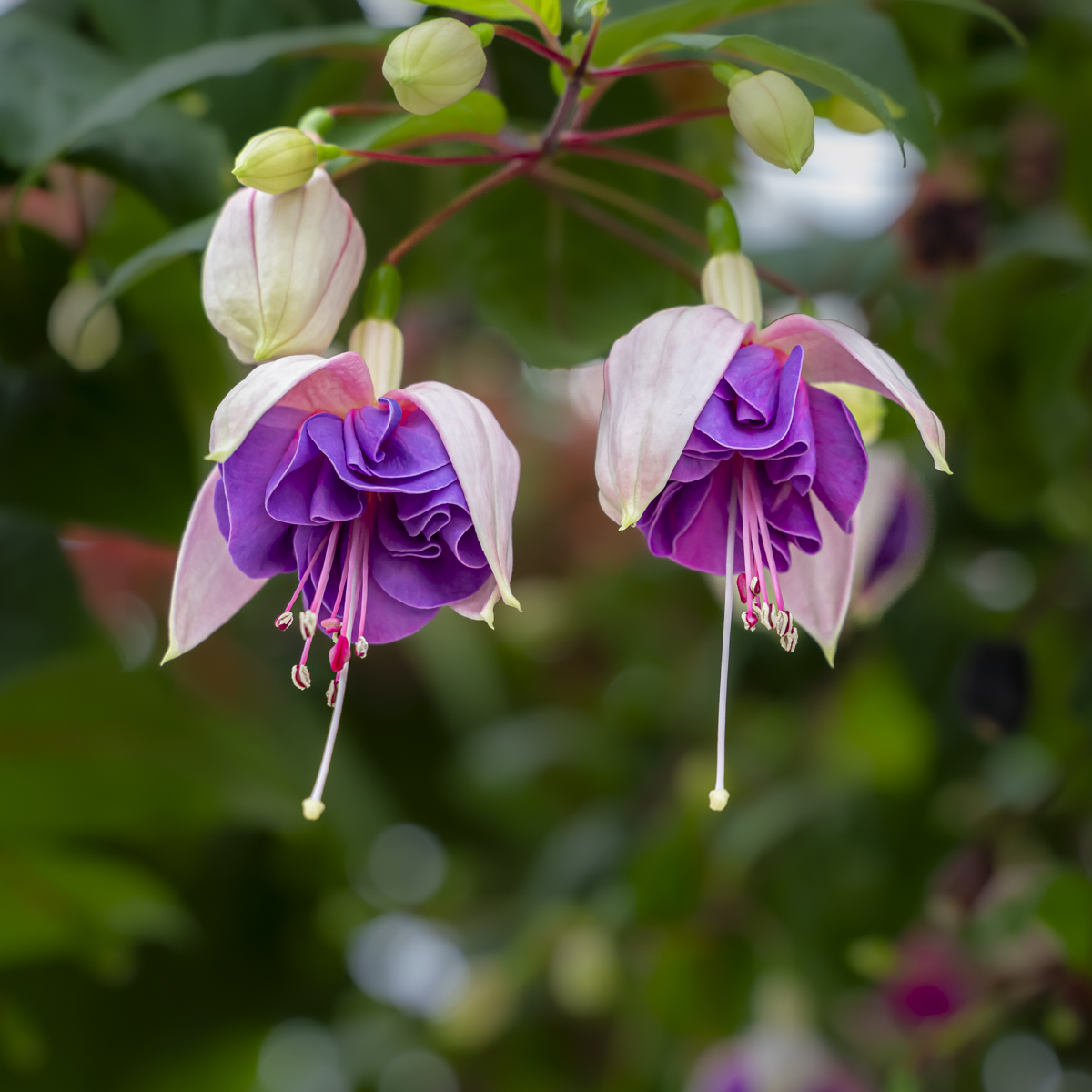
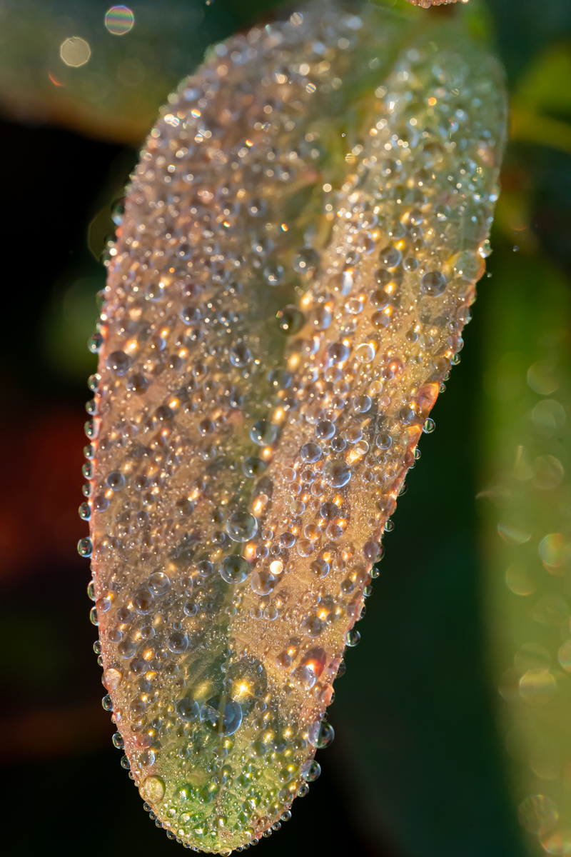
| 75 |
Feb 23 |
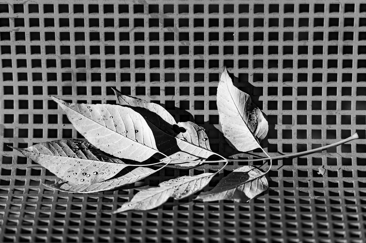
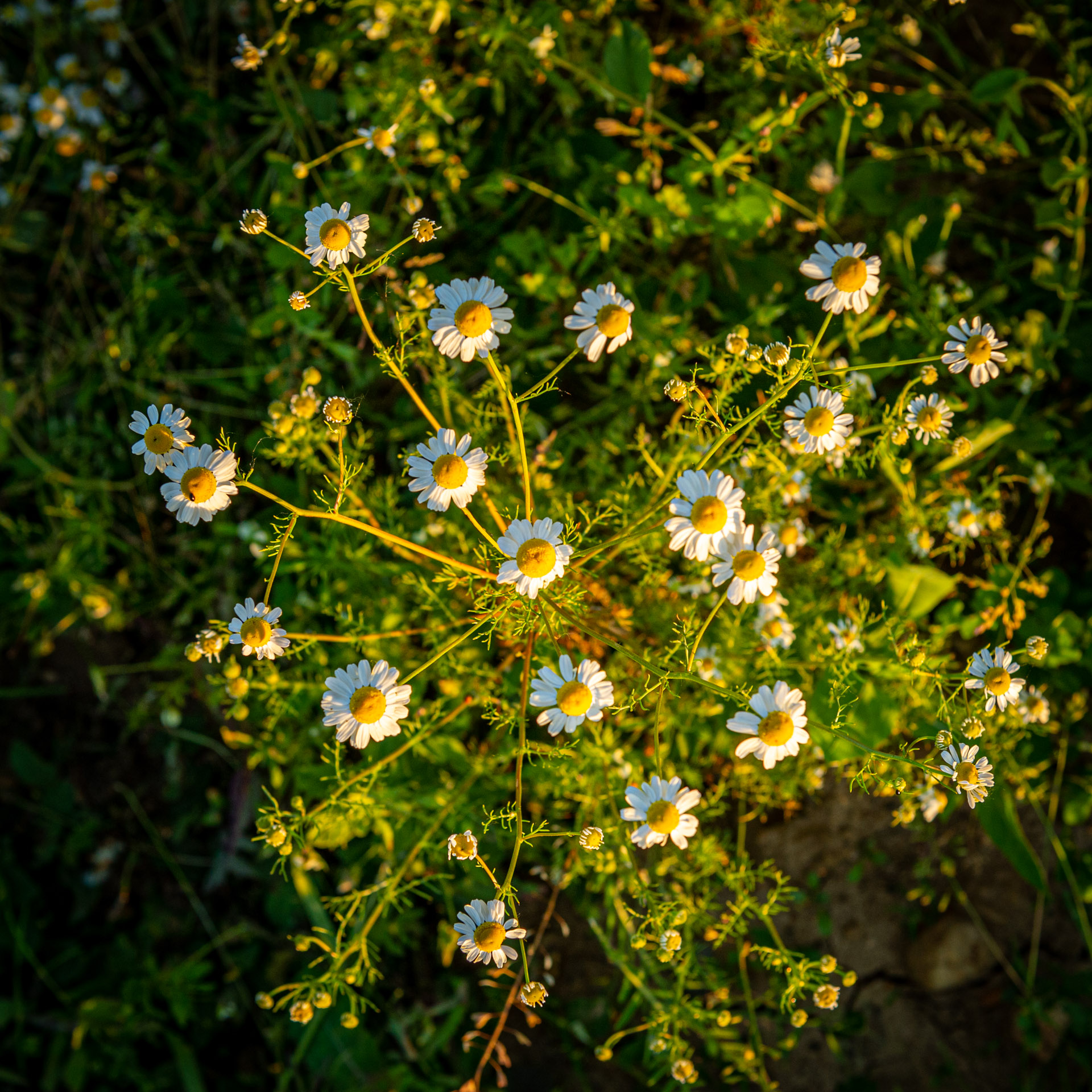
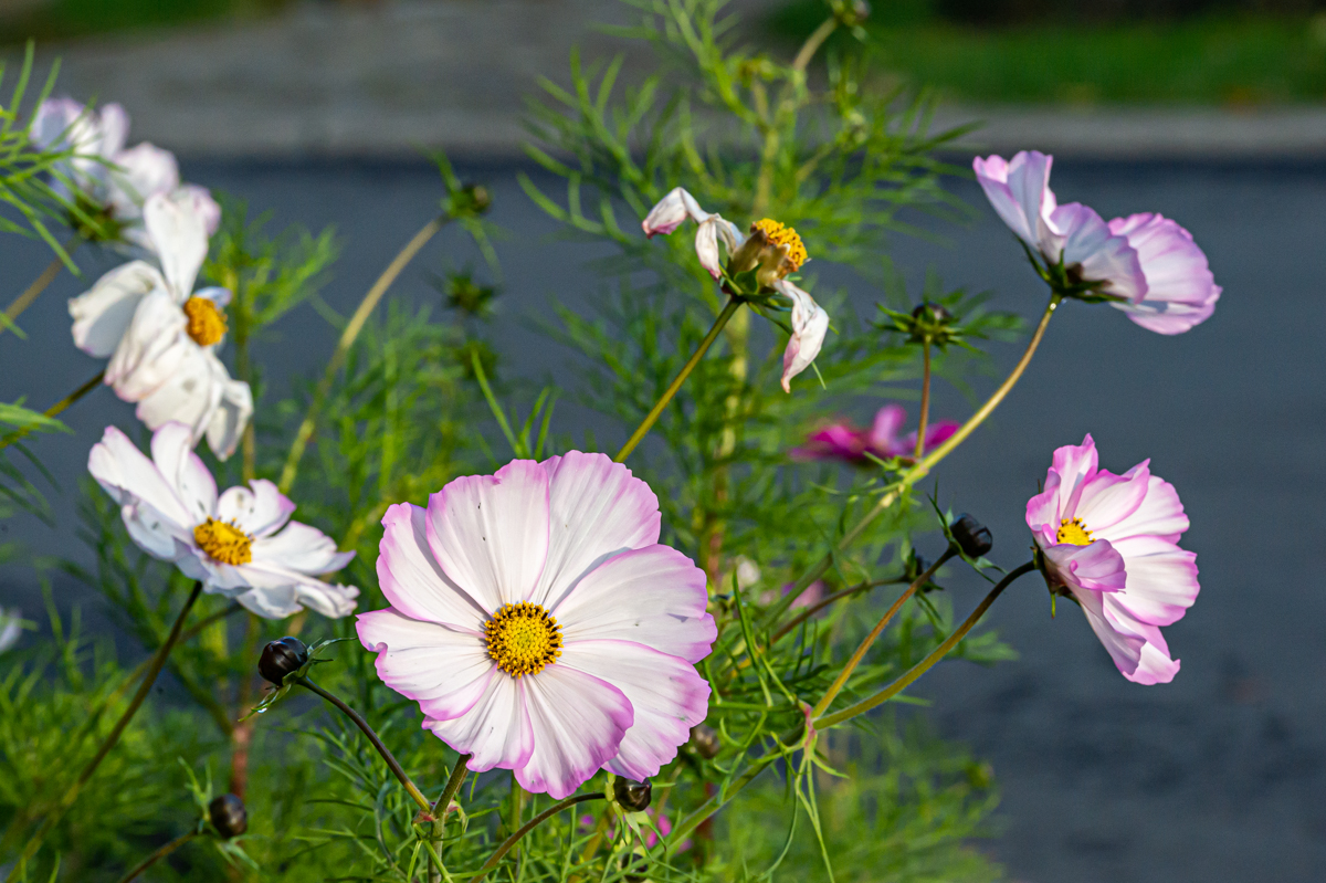
Comment |
Good idea to take pictures of dying flowers. We have to think to understand the subject. Thank you.
I like the 3 directions of the petals. Good idea for the B&W.
The lower left corner is quite disturbing. On the right sight, there is also a part of the petals quite disturbing.
|
Feb 22nd |
| 75 |
Feb 23 |
Comment |
I agree with Raymond.
The petals are well sharp, and I really like the shadow of the stems.
Good analysis of the background.
The square format is a good idea. Crop all the petals or not? It is 2 different and beautiful images. |
Feb 22nd |
| 75 |
Feb 23 |
Reply |
Thanks Raymond.
I made the unanimity about the too smaal DoF. If I good remember I have some difficulties with the (new) lens and I didn't take enough time to work correctly enough. I will remember that. |
Feb 4th |
| 75 |
Feb 23 |
Reply |
Thanks Murphy.
It was hand holding. You are wright, the use a a tripod and a better concentration could have improved the sharpness. |
Feb 4th |
| 75 |
Feb 23 |
Reply |
You are right Charles. Thanks.
I never made a focus staking. Has to be tried once.... |
Feb 4th |
| 75 |
Feb 23 |
Reply |
I think the "not appropriated" choice of aperture is due lack of concentration. Indeed I should have used higher f (closing aperture). |
Feb 4th |
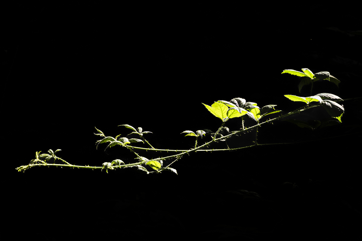
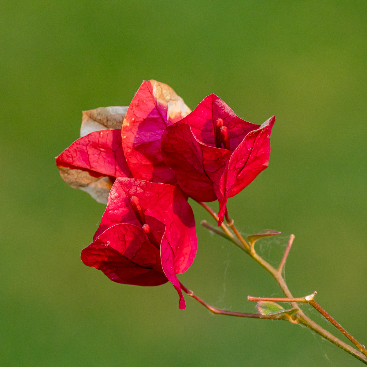
| 75 |
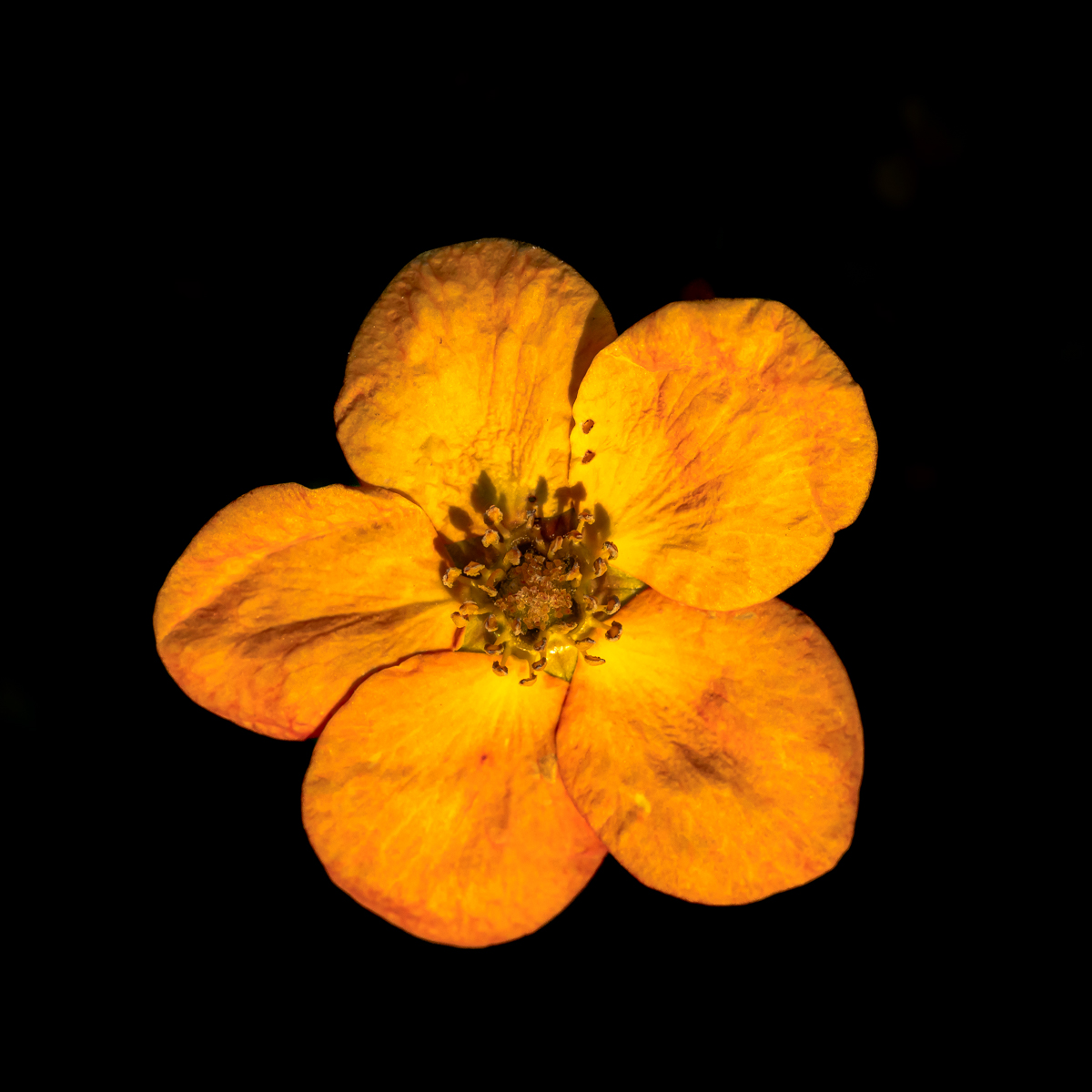
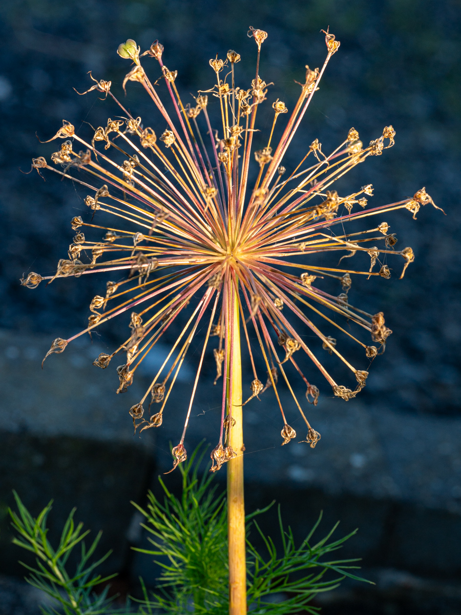
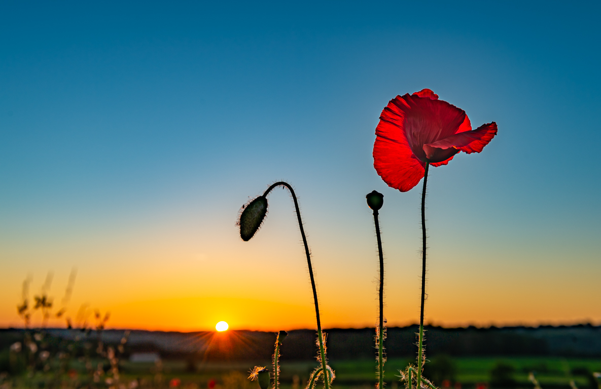
Feb 23 |
Comment |
Interesting subject. There is a small DoF. Difficult te see all the bulb and the stem.
A dark picture is a choice. It gives a more dramatic image, especially with the empty space. Some would have chosen a portrait orientation, but I like the "dramatic" background, so ok as it is. |
Feb 3rd |
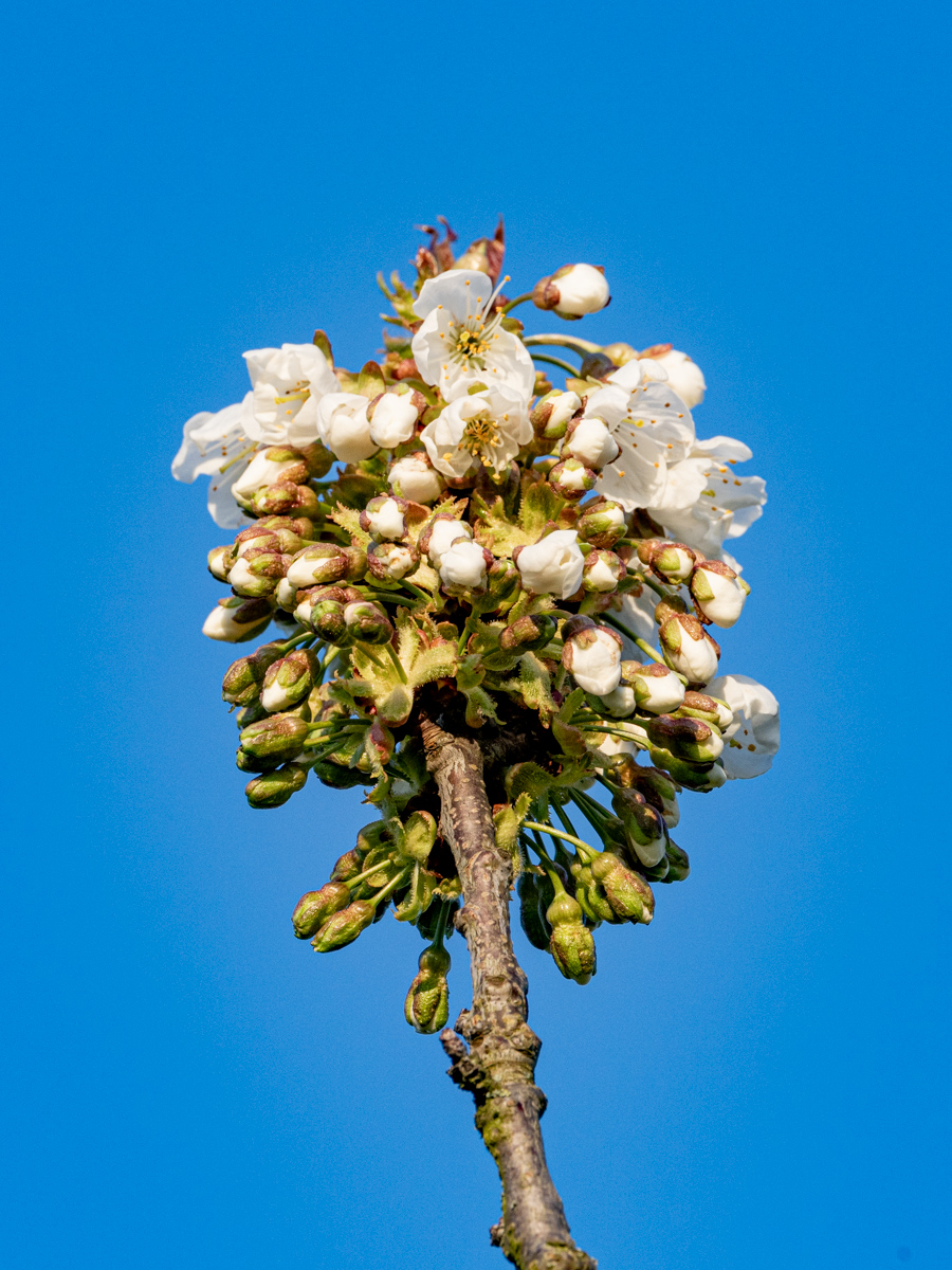
| 75 |
Feb 23 |
Comment |
Really good composition and beautiful colors.
Good job in the background. Sharp and a lot of details.
D700 have been and is still a good camera. |
Feb 3rd |
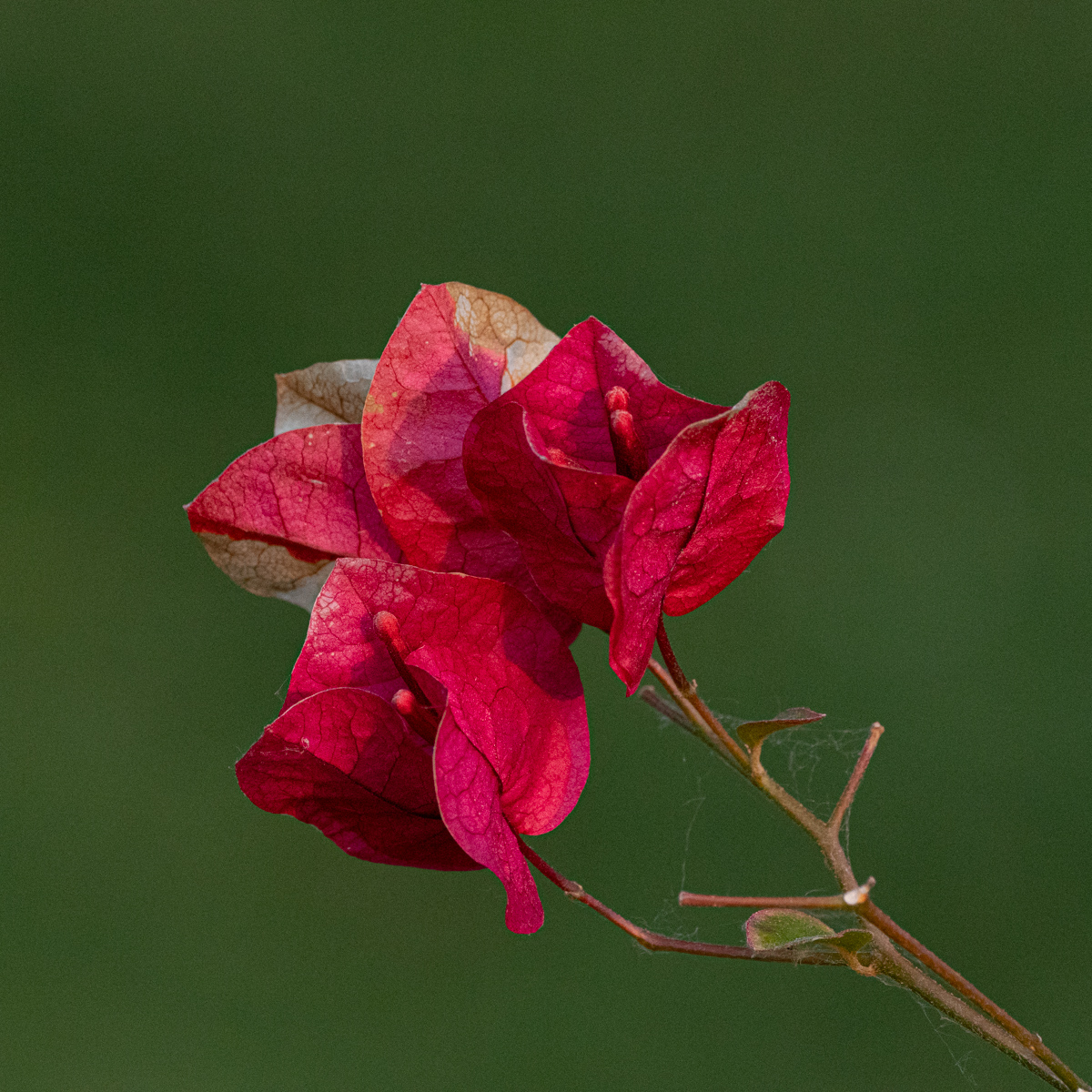
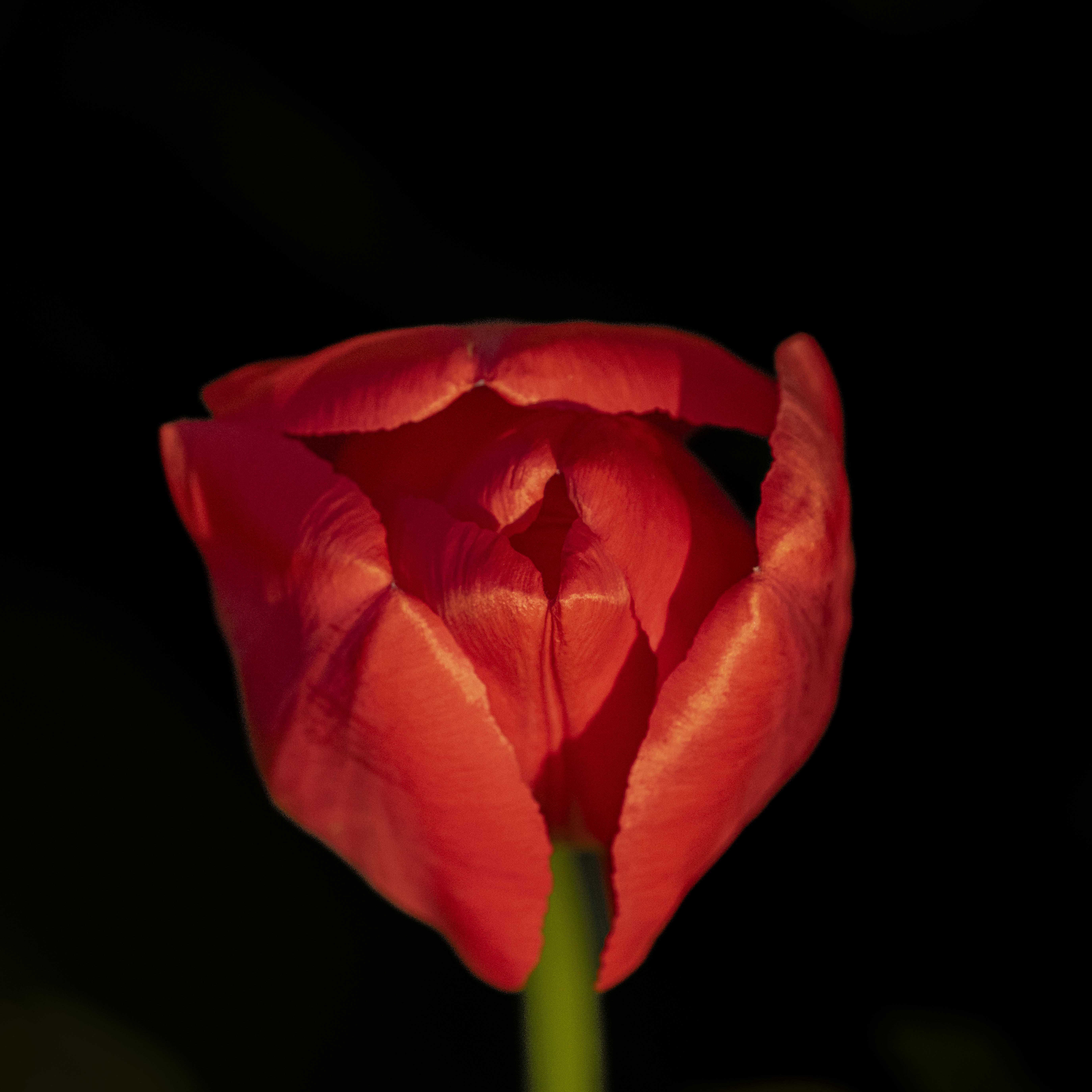
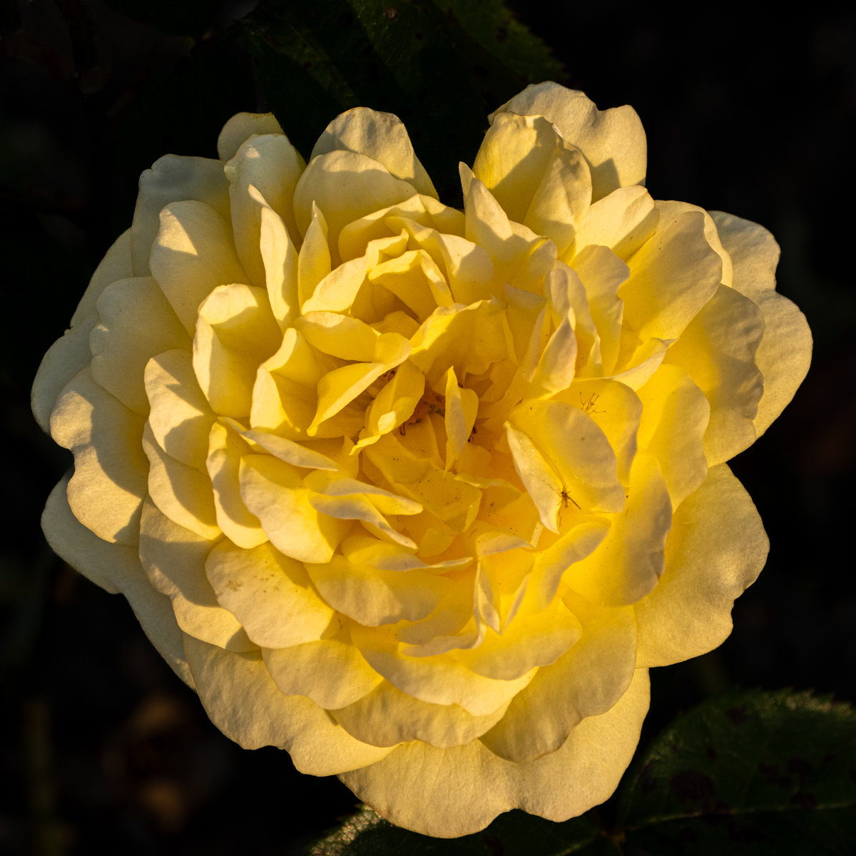
| 75 |
Feb 23 |
Comment |
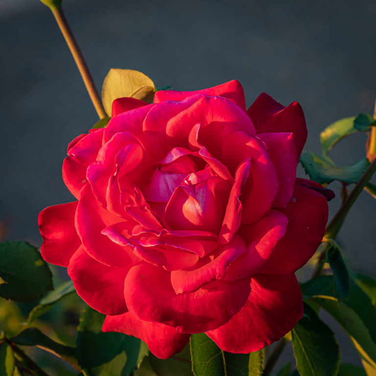
In two words: just great!
I really like the shape, the format, and specially the gradient of light and the shadow.
Not a too dark background is more soft. Well done. |
Feb 3rd |
| 75 |
Feb 23 |
Comment |
Hello Raymond. Welcome to this group.
A first look of the picture (without reading your information) we immediately see there is a lot of work to obtain this picture. Work well done.
With a subject in a circle shape, i like to have a square format. Not in this case, it would have to much empty space.
For the background it is difficult to choose. Every background will give another image. This one is very sweet & soft. A black one will give other aspect, a beautiful one, but different.
|
Feb 3rd |
6 comments - 4 replies for Group 75
|
11 comments - 9 replies Total
|