|
| Group |
Round |
C/R |
Comment |
Date |
Image |
| 39 |
Nov 22 |
Comment |
I agree with the statement that the eye makes the picture. Not easy to realize with this dark bird.
I also like the crop to keep some space in the direction of flight.
Even if the bird is the subject, I like the color and the structure of the tree. I think they are better in the color version. But the B&W is a good decision as the sky is not beautiful in color. I like it in white. |
Nov 16th |
| 39 |
Nov 22 |
Reply |
This is indeed another picture. Everyone has its own vision and interpretation. I like this one that needs some work. |
Nov 16th |
| 39 |
Nov 22 |
Comment |
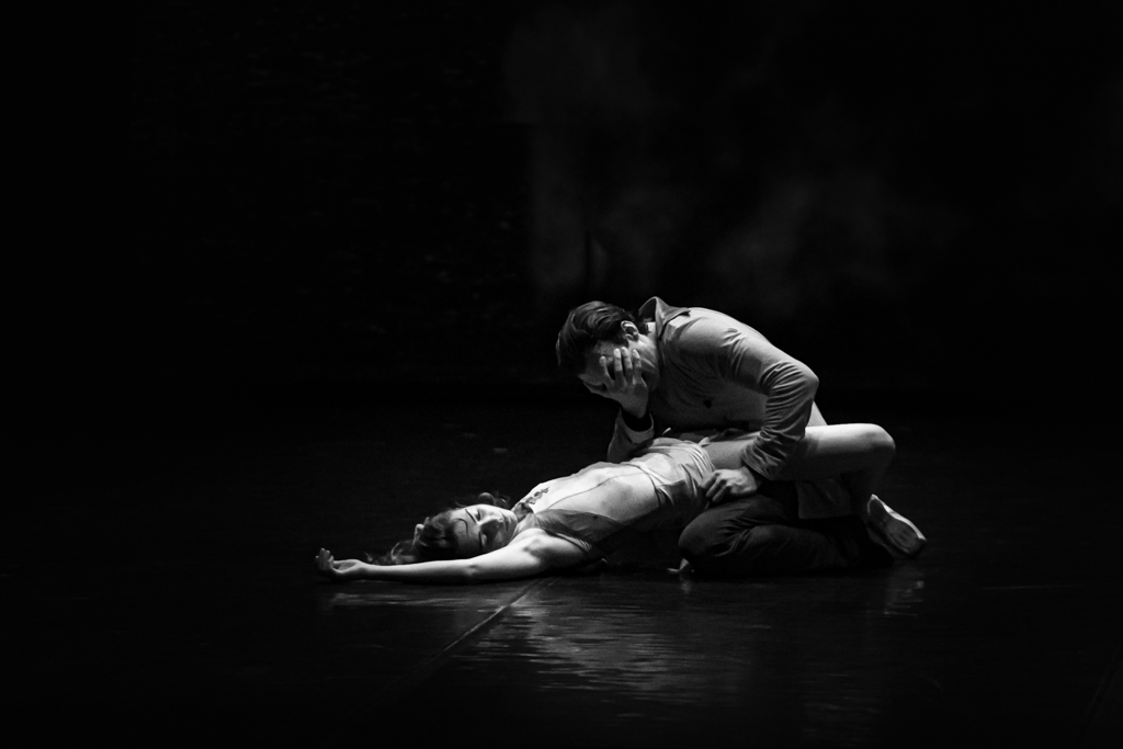
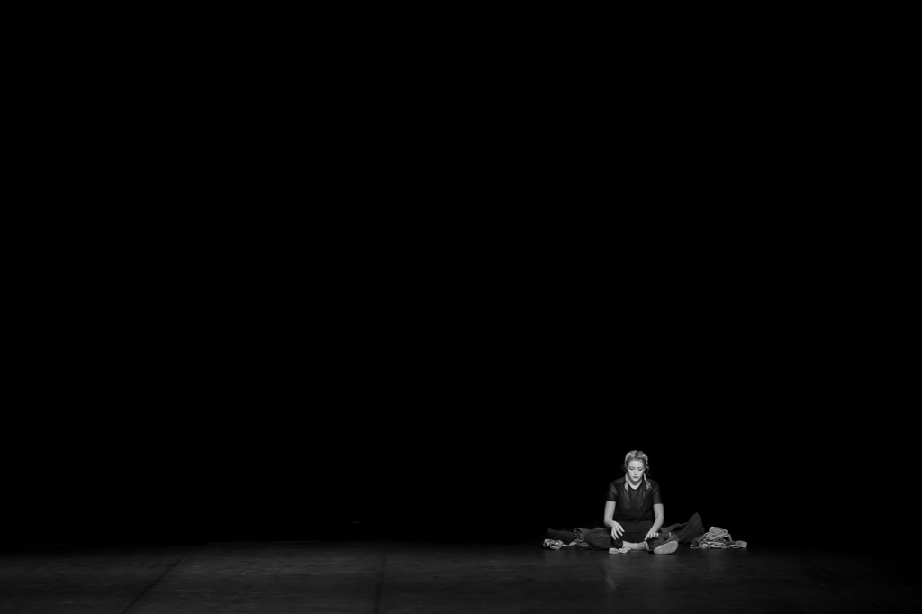
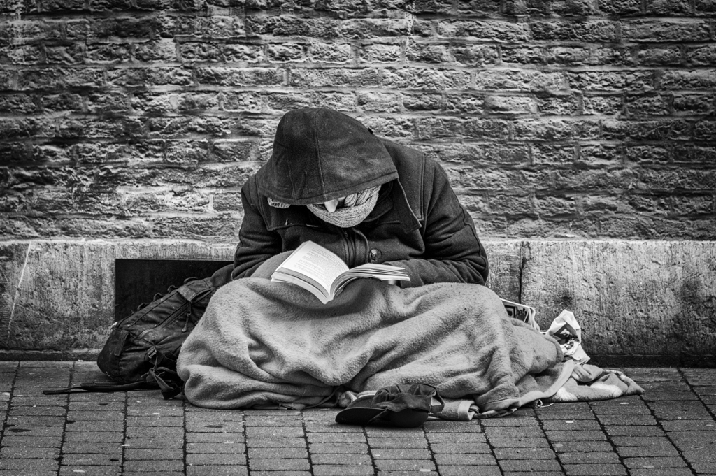
Everything has been written.
This is indeed a strong picture due the story.
The composition is great: the 2 persons are at the edge of the pictures and at the "extreme" (edges) of the society, a homeless and a "normal". |
Nov 16th |
| 39 |
Nov 22 |
Reply |
Hi Paul.
Thank you so much for the candor, and while I appreciate the photo, I agree with what you wrote.
It is just to try, and the pleasure to take pictures. You don't learn the studio at this event. |
Nov 16th |
| 39 |
Nov 22 |
Comment |
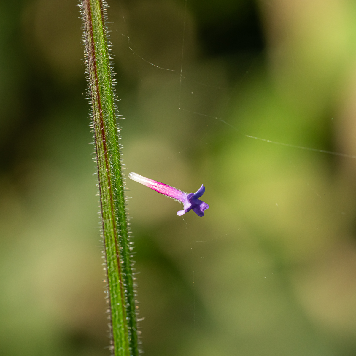
I have also the impression of an IR.
It is an opportunity for some "camera" (iPhone or camera) to change the format of the picture and this BEFORE taking the picture. The composition is completely different by taking directly a picture in a forma than to crop the image to the wished format.
The color version has beautiful color but it think th&t after some times you can be saturated by the colors, and the B&W is better also fir this reason. |
Nov 15th |
| 39 |
Nov 22 |
Comment |
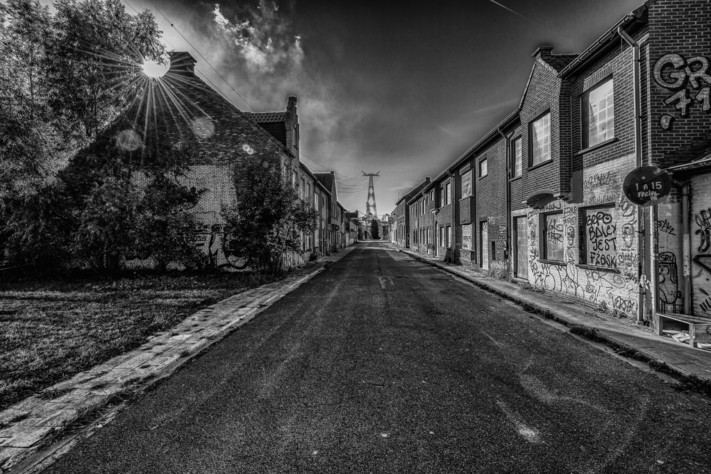
I like the different planes (ground) of the image, all with their characteristics.
The conversion is well done. More details in the foreground. Such clouds call the B&W.
To give a personnel opinion: the white frame around the picture is quite large and it is not panoramic enough for such an image (crop the sky). This is personal opinion.
|
Nov 14th |
| 39 |
Nov 22 |
Comment |
I relie like the detail and the sharpness of the cranes. I took such an image but without this sharpness. Good Job.
The B&W worked very well as the blue sky is not "beautiful". An orange one would have been different. However the B&W is very nice.
It is for this reason (we have copied the birds...) that our aircraft's have these shapes... |
Nov 14th |
| 39 |
Nov 22 |
Reply |
Thanks David.
I agree with you. I have a new version again... Thanks. |
Nov 12th |
| 39 |
Nov 22 |
Reply |
Sorry Fran.
SEP = Silver Efex Pro. A software dedicated for B&W. Very useful and easy to use. |
Nov 12th |
| 39 |
Nov 22 |
Reply |
Thanks Kathryn.
I think the new version is better, but I wished to try a "high key" with the first version... |
Nov 8th |
| 39 |
Nov 22 |
Reply |
Thanks Jerry ans Kathryn for your comments and suggestion.
I have tried to apply them, namely: cropped, no SEP, less modification, and sharpen AI.
|
Nov 8th |
 |
5 comments - 6 replies for Group 39
|
| 75 |
Nov 22 |
Reply |
Marge, with LR it is possible to select (easily) a subject (flower and you invert your selection) or the background (you can adapt the selection if necessary), and after you darken the selection (background). |
Nov 28th |
| 75 |
Nov 22 |
Comment |
If this is an image of new and old, we can also notice the same difference between before and after treatment, which is just great.
Good job to take and to assemble all the images. It was worth doing it.
The background is much better after the "development"... |
Nov 16th |
| 75 |
Nov 22 |
Reply |
Ok... I prefer the final version... |
Nov 16th |
| 75 |
Nov 22 |
Comment |
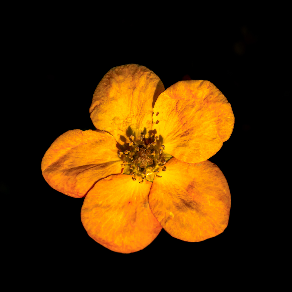
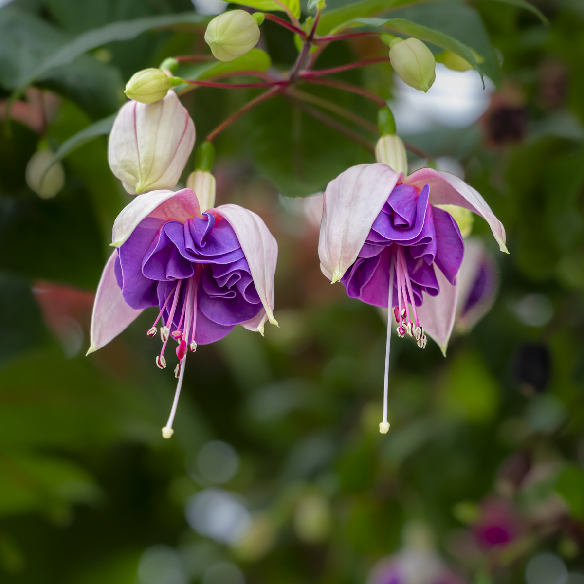
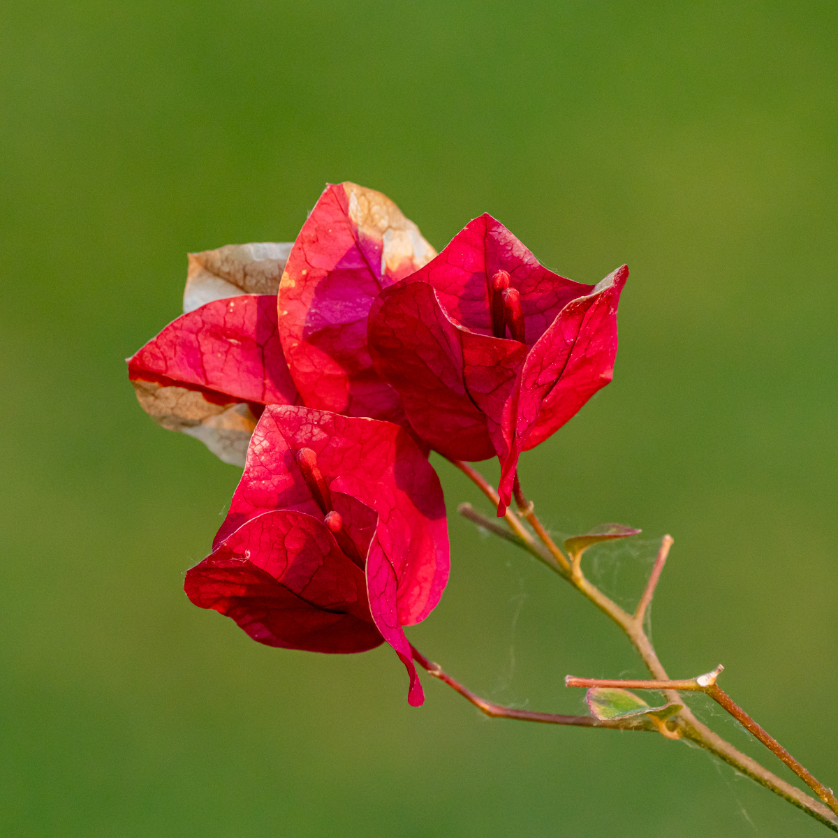
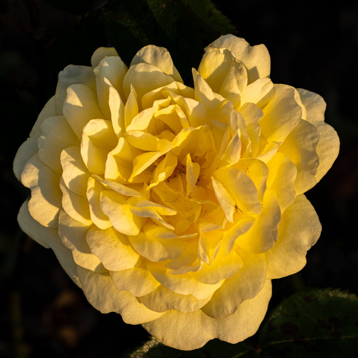
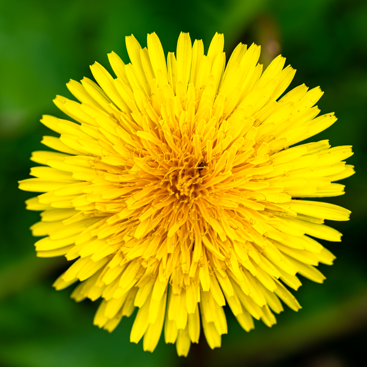
I like the central flower.
The two other (left & right) are too much or not present enough.
I would take the first suggestion with a square format around the central flower, wide enough to have the shape of the different petals. Just a suggestion.
Good idea of picture. I like it. |
Nov 7th |
| 75 |
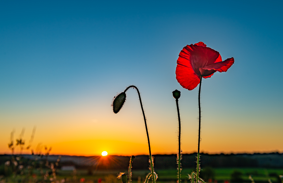
Nov 22 |
Comment |
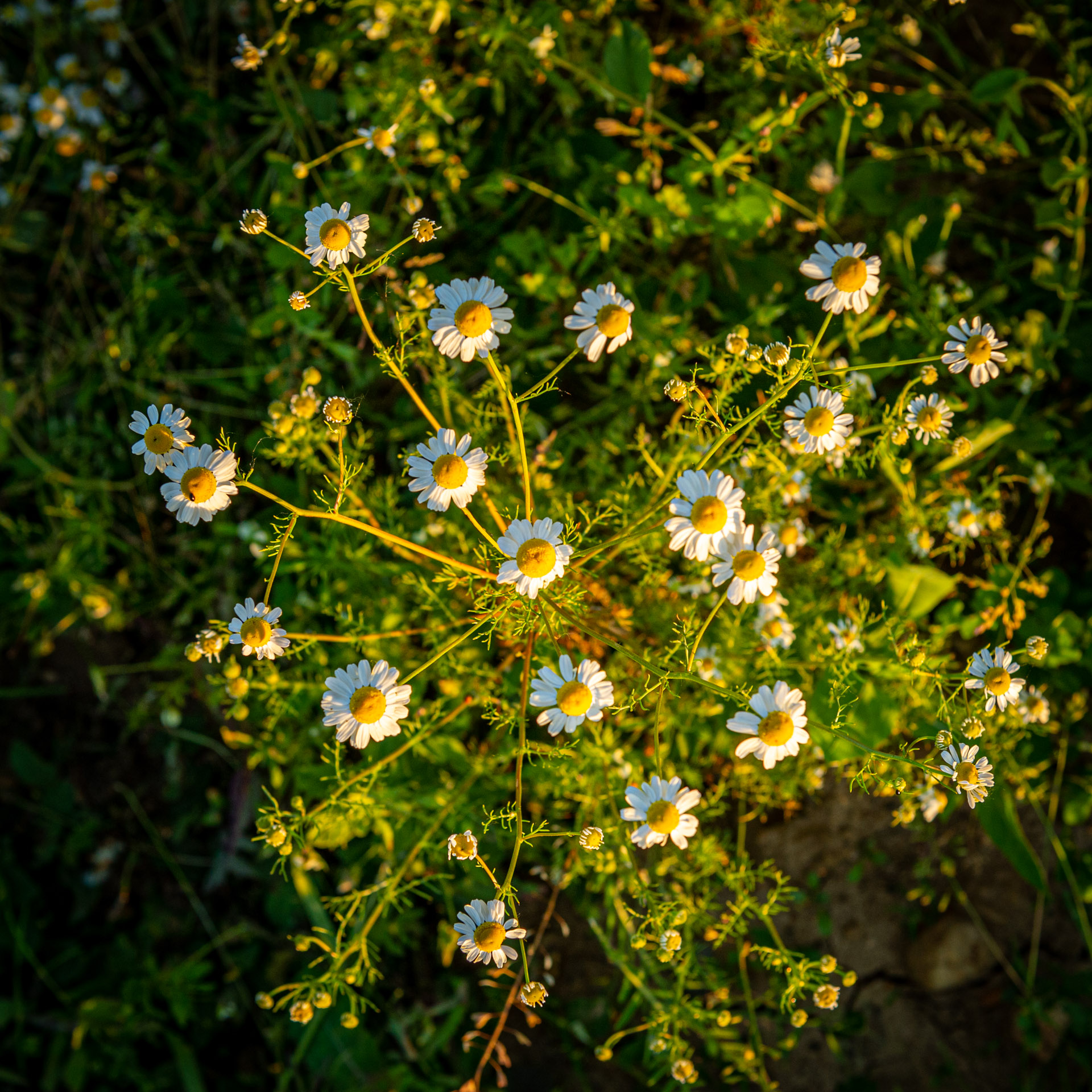
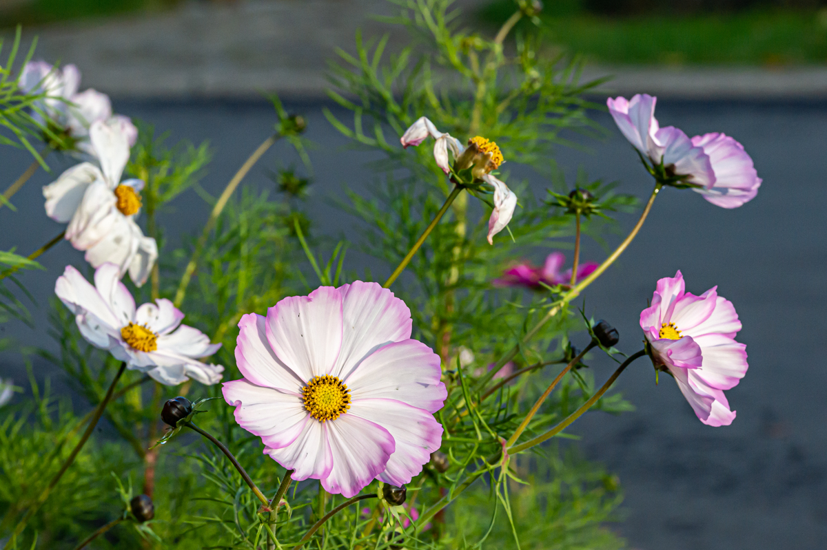
Different possibilities with this flower.
Either to close the diaphragm (f/16) by increasing the iso until 400 to increase the DoF. But the background would have been maybe too present.
Or to isolate more the flower by darkening the background. The second flower would have been darker.
The flower have nice shapes.
|
Nov 7th |
| 75 |
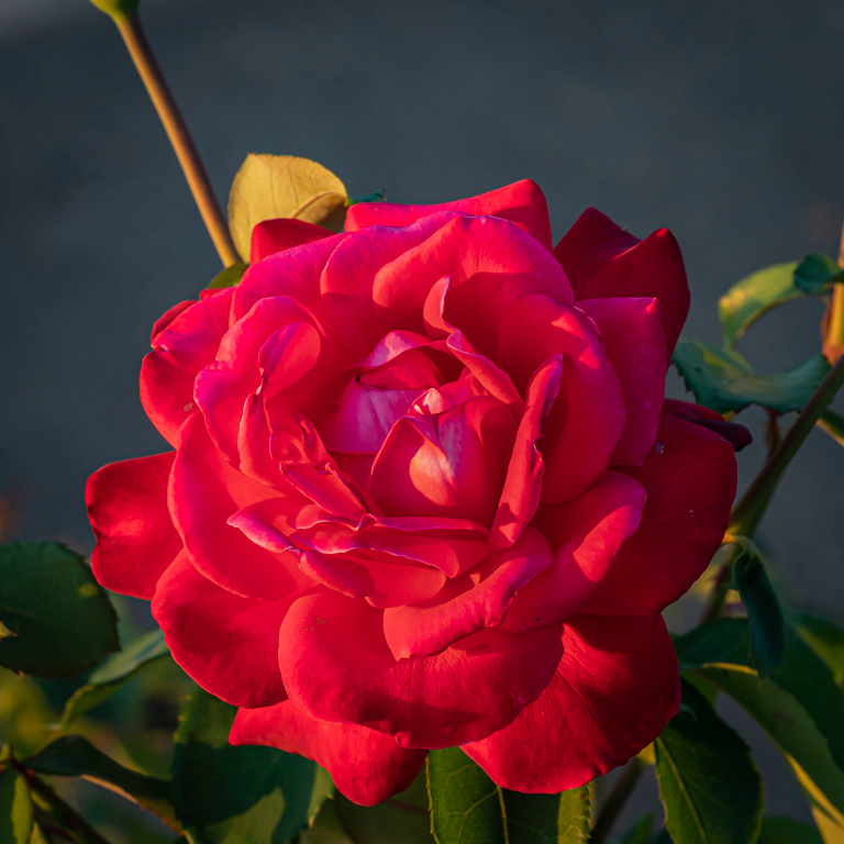
Nov 22 |
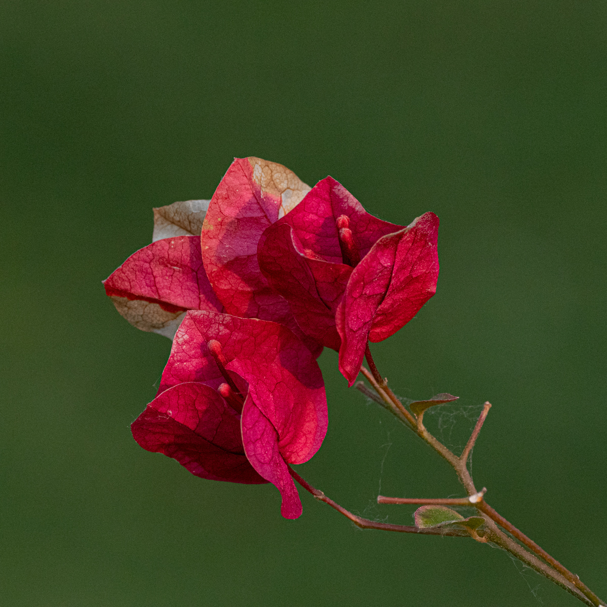
Comment |
I like the sharpness of the flower.
The burlap is certainly a good idea, but the color is of the Samy "family" than the flower. A bruin would have had more contrast, but it is your choice.
The small flowers on the right make a continuity of the central flower and the edge. That isolates less the main subject. It is also your choice. It is only my opinion. |
Nov 7th |
| 75 |
Nov 22 |
Comment |
Good composition. I like the flowers, and their position, around the central flower.
Good job with the focus staking (I have never done it, there are so many things to learn...).
Personally, I would appreciate a little bit more light on the flower, if it is possible. |
Nov 7th |
| 75 |
Nov 22 |
Comment |
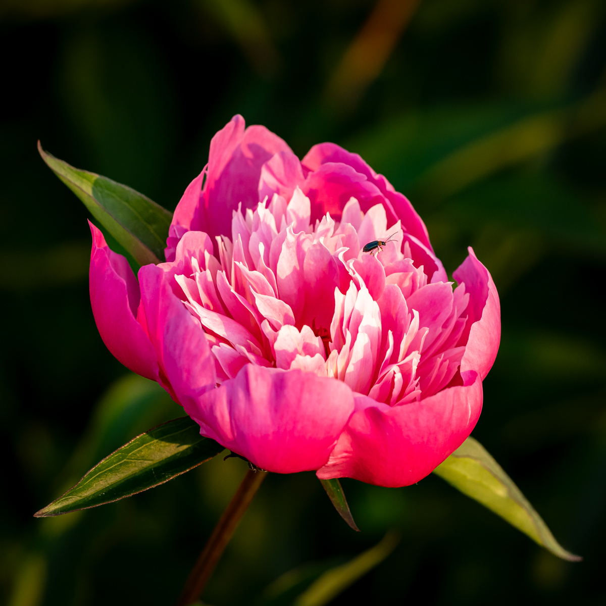
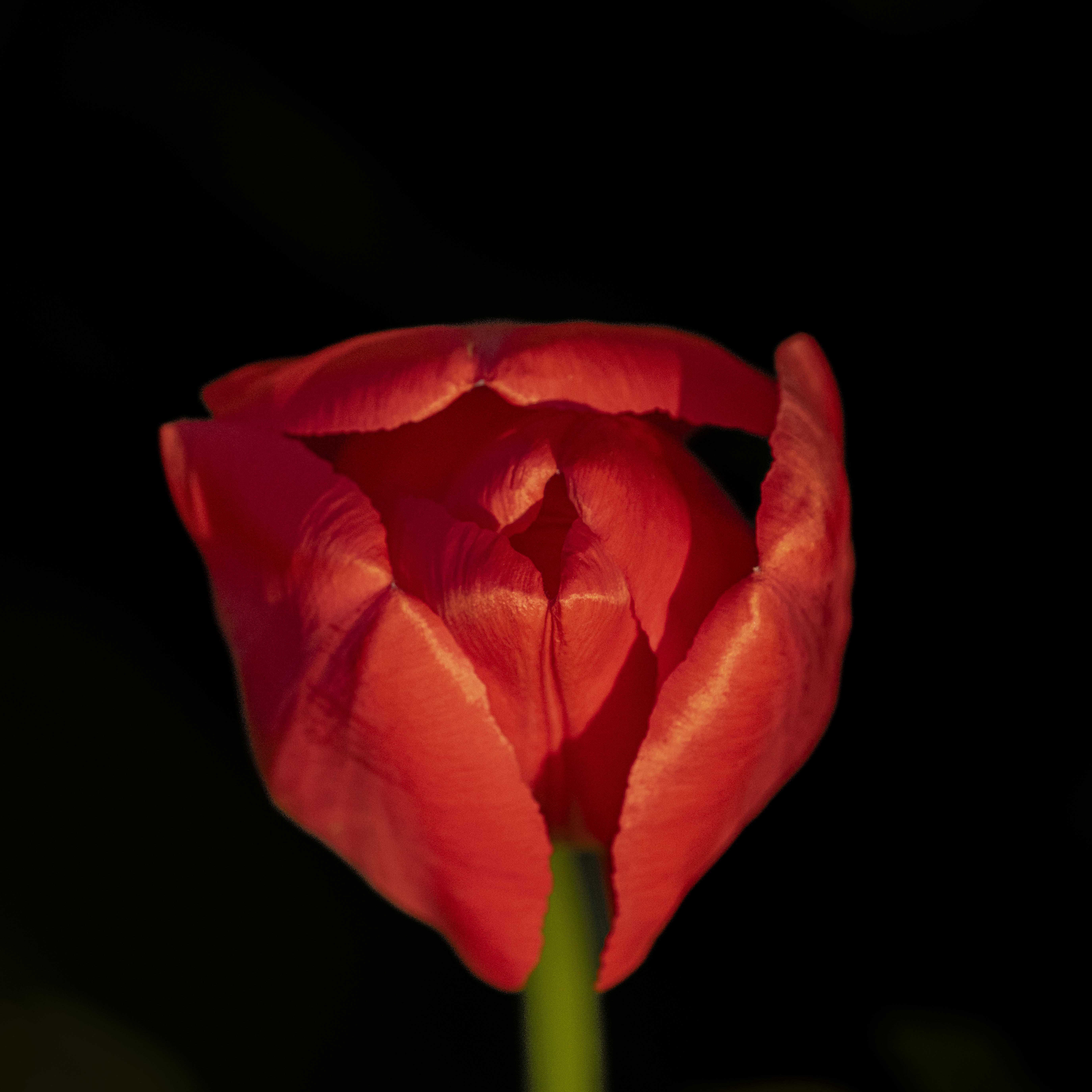
Really nice image. Good composition: Flower down, flower closed but ready to bloom in the center, and gradation until young (baby) flower on the top.
I fully agree with the comment of Dan.
The flower is beautiful, and I also like the color of the background. |
Nov 7th |
| 75 |
Nov 22 |
Reply |
Thanks Judy for this nice and pertinent comment and suggestion. I will try to follow them. Good homework to do for me.... |
Nov 7th |
6 comments - 3 replies for Group 75
|
11 comments - 9 replies Total
|