|
| Group |
Round |
C/R |
Comment |
Date |
Image |
| 39 |
Aug 22 |
Reply |
Thanks Jerry for your nice comment. |
Aug 23rd |
| 39 |
Aug 22 |
Comment |
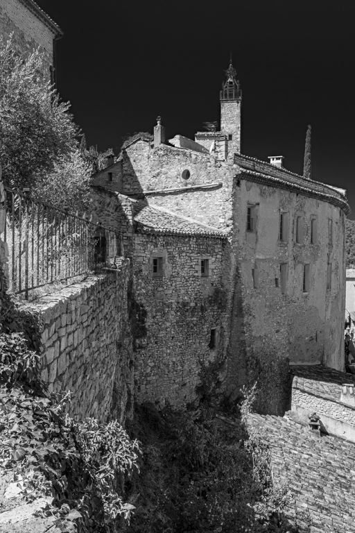
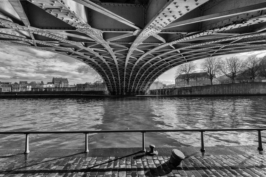
I also like the composition and the silky effect of the water. The water goes in different directions and this gives lines to the picture.
The structure of the stones is present.
Even if some judges don't like it, they should be enough "professional" to appreciate such image and noted it accordingly. This is my humble opinion. |
Aug 17th |
| 39 |
Aug 22 |
Reply |
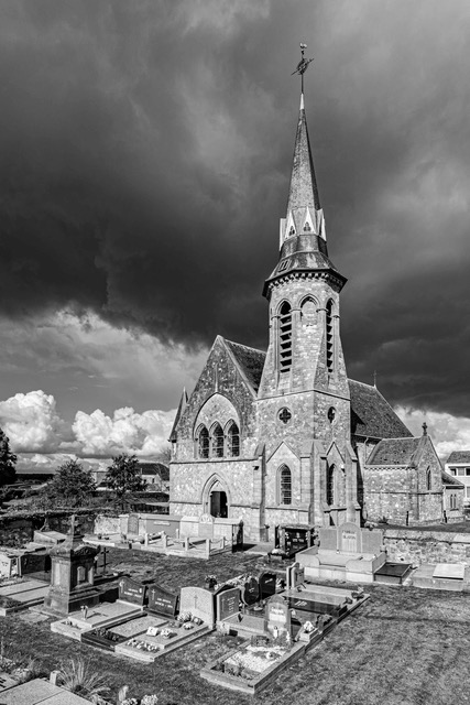
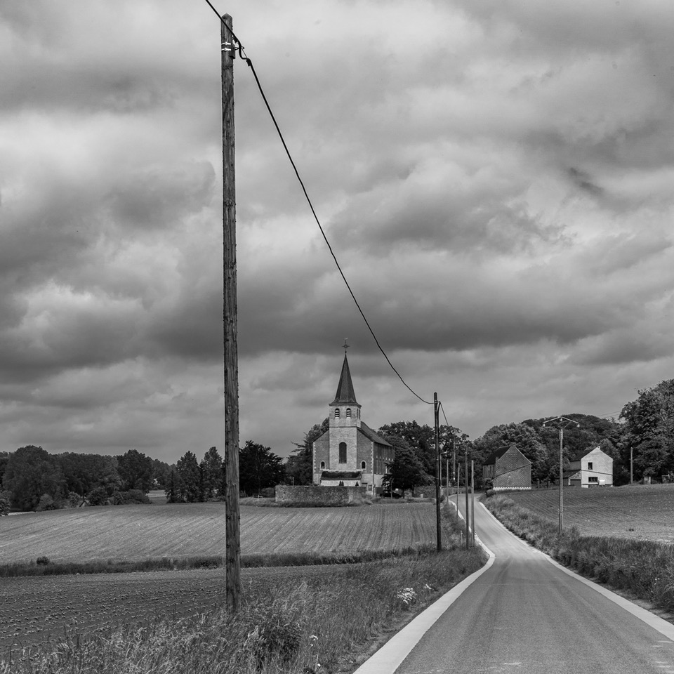
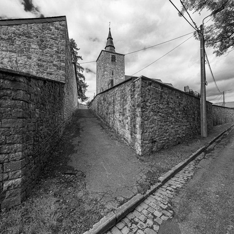
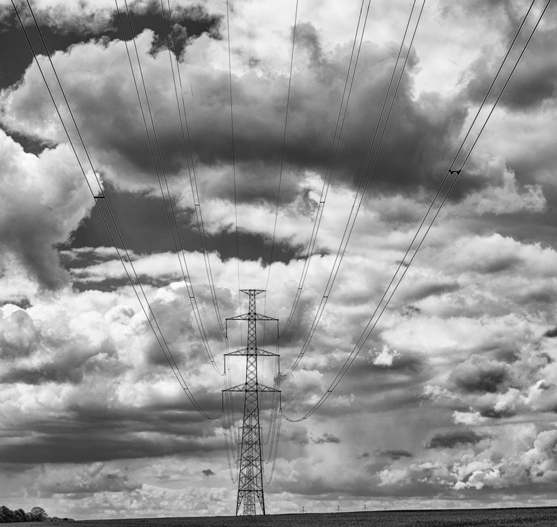
Thanks David for your comment and time to make a new suggestion.
This is indeed a new and interesting possibility, and therefore a new picture. I appreciate this possibility. However the "discontinuity" of the poles (they begin in the middle of the road. From where it comes?) can be disturbing. Maybe without all the poles? It will be again a new picture.
|
Aug 17th |
| 39 |
Aug 22 |
Reply |
Thanks Fran for your comment and your time to try another crop.
As mentioned by Paul and my response to him, that are quite "a lot" of possibilities with these picture. I wasn't aware of it.
In this case, a vertical frame is a good choice as the church and the poles are vertical. I like your suggestion.
|
Aug 17th |
| 39 |
Aug 22 |
Reply |
Thanks Paul for your comment.
Your analysis show that everyone can see and interpret an image on different ways. My first sight was the 2 poles and the church. I am really happy to read other interpretations.
|
Aug 17th |
| 39 |
Aug 22 |
Reply |
Thanks Kathryn for your nice & relevant comment. Now my eyes are also attracted by the white house and this not the subject of the picture. I will "correct" that. |
Aug 17th |
| 39 |
Aug 22 |
Comment |
The direct contact with the eyes is a real success. Wel done.
The light coming from left to right is interesting.
Its look is quite great and impressive. Its fur is sharped.
Good work to cover in B&W. The background is more present in color and disturbs the eyes from the bear. |
Aug 2nd |
| 39 |
Aug 22 |
Comment |
Subjects which cry to be in B&W.
I appreciate the gradient of light (from left to right).
A place with a story that has to be fixed on a picture. Fast & wel done. |
Aug 2nd |
| 39 |
Aug 22 |
Comment |
As usual, thank you for sharing all the possibilities of the iPhone... Amazing.
I am not a specialist of the IR, but I appreciate this picture. A first look, we can imagine a snowed landscape.
All the buildings are sharped (you explained how it has been realized). The car has space around it.
The lights on the foreground allow some interpretation of the place. |
Aug 2nd |
| 39 |
Aug 22 |
Comment |
A really (good) adventure these pictures of fireworks. It was worth going there...
Your camera has really special option and effects. A pleasure when wel mastered.
I really appreciate the composition and the different lights. The explosions are sharped and within a logical composition (a line, small and big ones).
Good job. I never succeeded to take good fireworks pictures.
No problem for the border it can happen (always each time for me...).
|
Aug 2nd |
5 comments - 5 replies for Group 39
|
| 75 |
Aug 22 |
Reply |
Thanks Judy for your message, and for your suggestions.
I also think you cropped too far.
There are a some possibilities with this picture. |
Aug 17th |
| 75 |
Aug 22 |
Reply |
Thanks Marge for your comment. I hope it will be fun to admin the group, but I do hope it will be fun for all the members... |
Aug 17th |
| 75 |
Aug 22 |
Reply |
Thanks Murphy for your comment.
With an original, we cas have a lots a pictures. Your approach is indeed interesting. |
Aug 17th |
| 75 |
Aug 22 |
Reply |
Thanks Charles for your comment.
You are unfortunately right for differents comments: overexposed is difficult to correct, picture of flowers is not easy (I have never imagined it...), ... |
Aug 17th |
| 75 |
Aug 22 |
Reply |
Thanks Dan for your comment.
You are unfortunately right for the dust... |
Aug 17th |
| 75 |
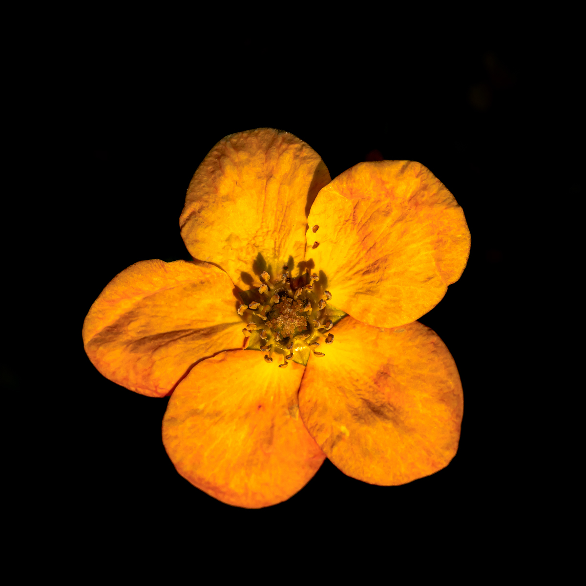
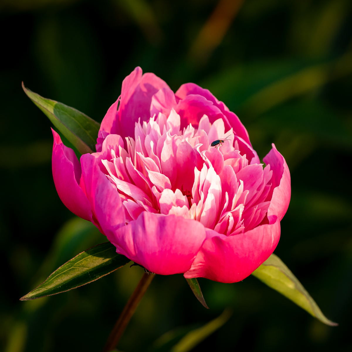
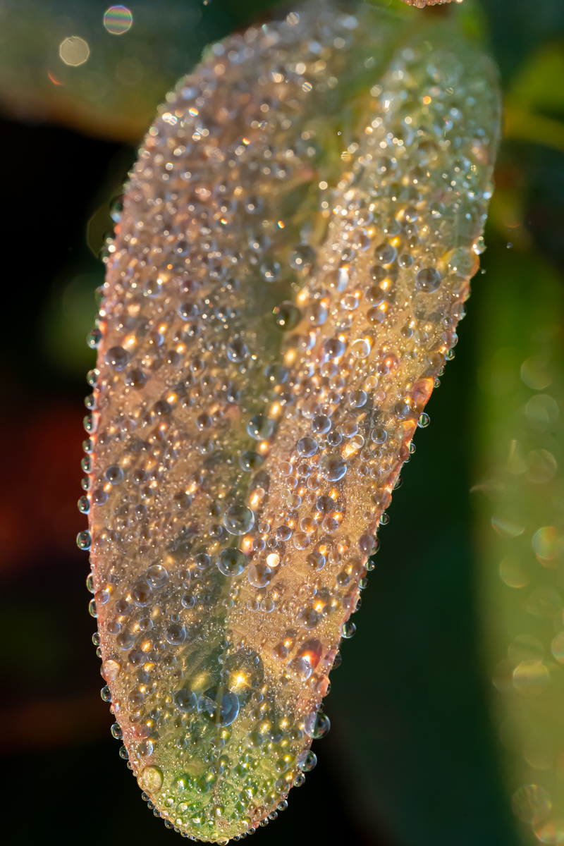
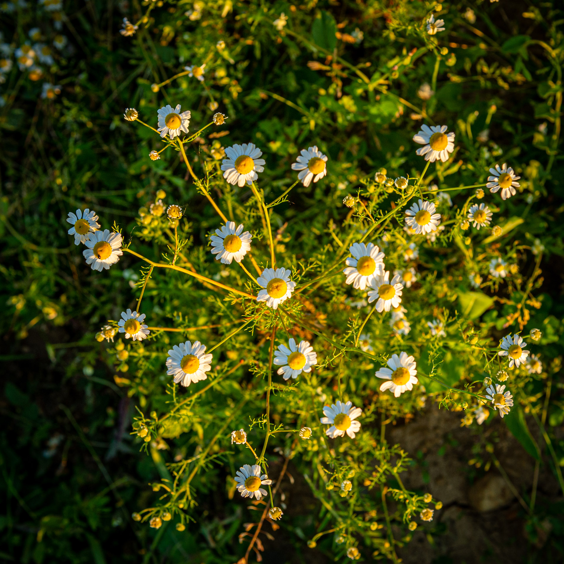
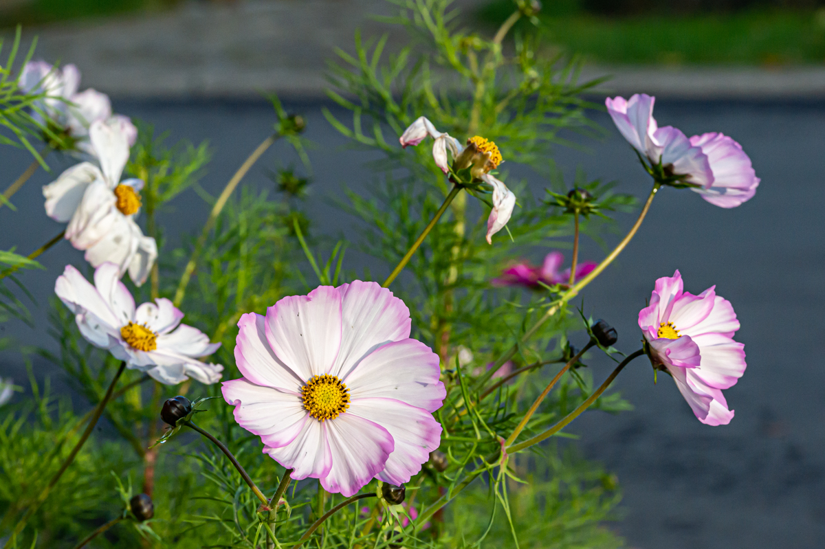
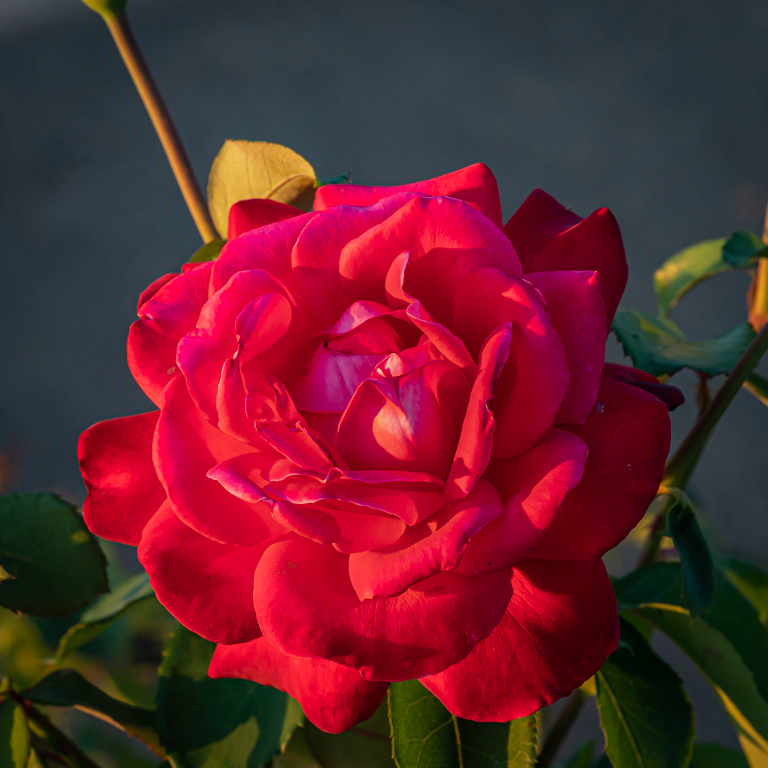
Aug 22 |
Comment |
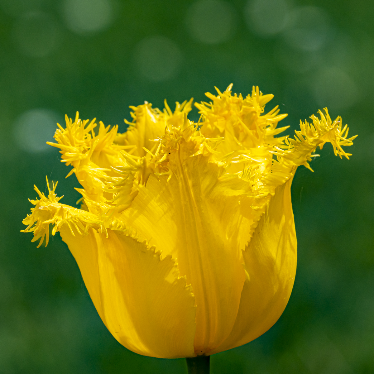
Hello Judy. Welcome in the group and I hope you will enjoy it.
I really appreciate the colors, the composition and the square format. The flower could maybe more centered. Just a suggestion, as with this format the symmetry is quite important (for me...).
There is a lot of work in this image. Well done. The background is almost the same color as the flower and it gives a good (smooth) effect.
The drops of water bring a lot to the image.
On the lower right, there is some "shadow" at the end of the petal, and the transition between the petals and the background is quite white (another color than the rest of the background). It can be disturbing. |
Aug 17th |
| 75 |
Aug 22 |
Reply |
Indeed Marge. The horizontal wins... |
Aug 17th |
| 75 |
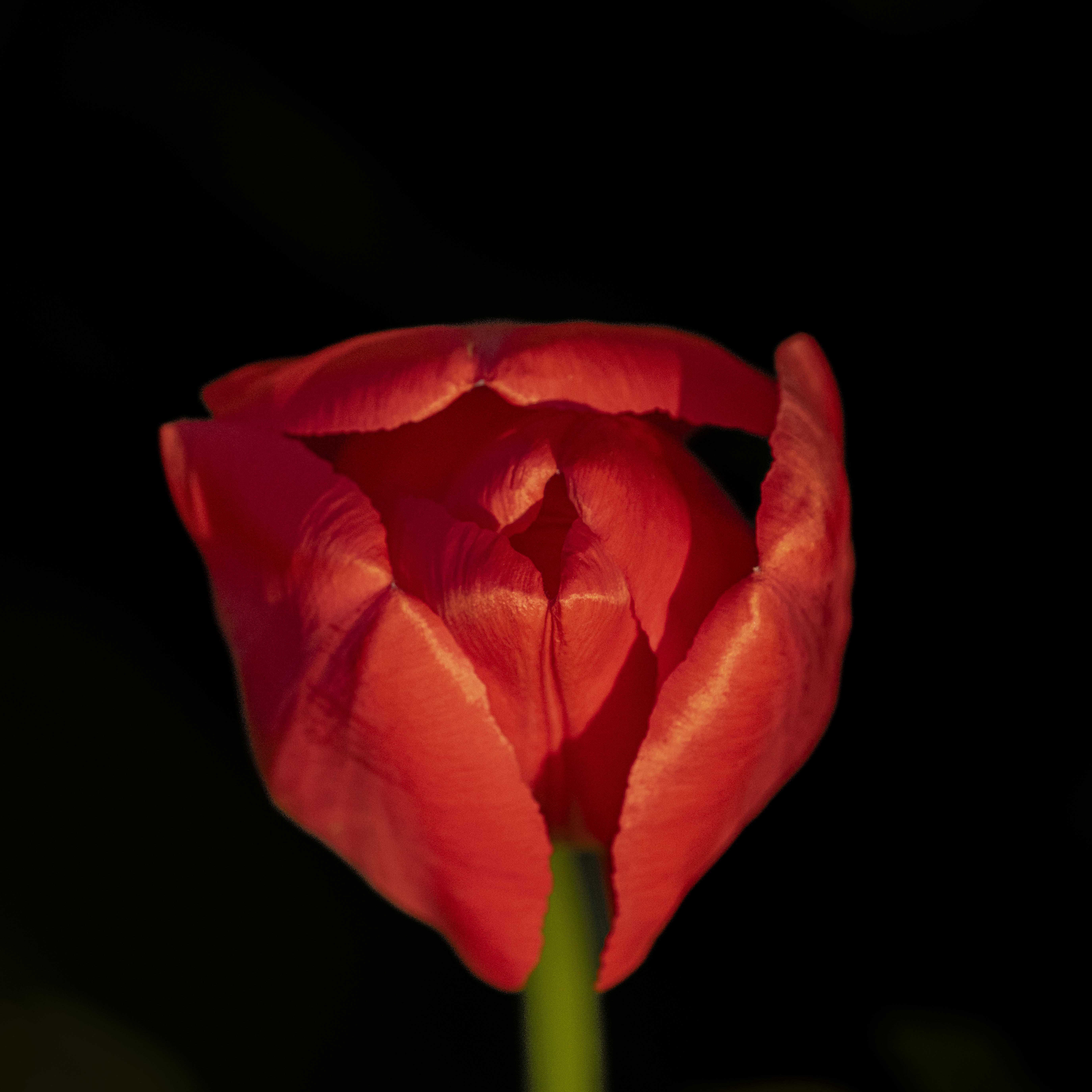
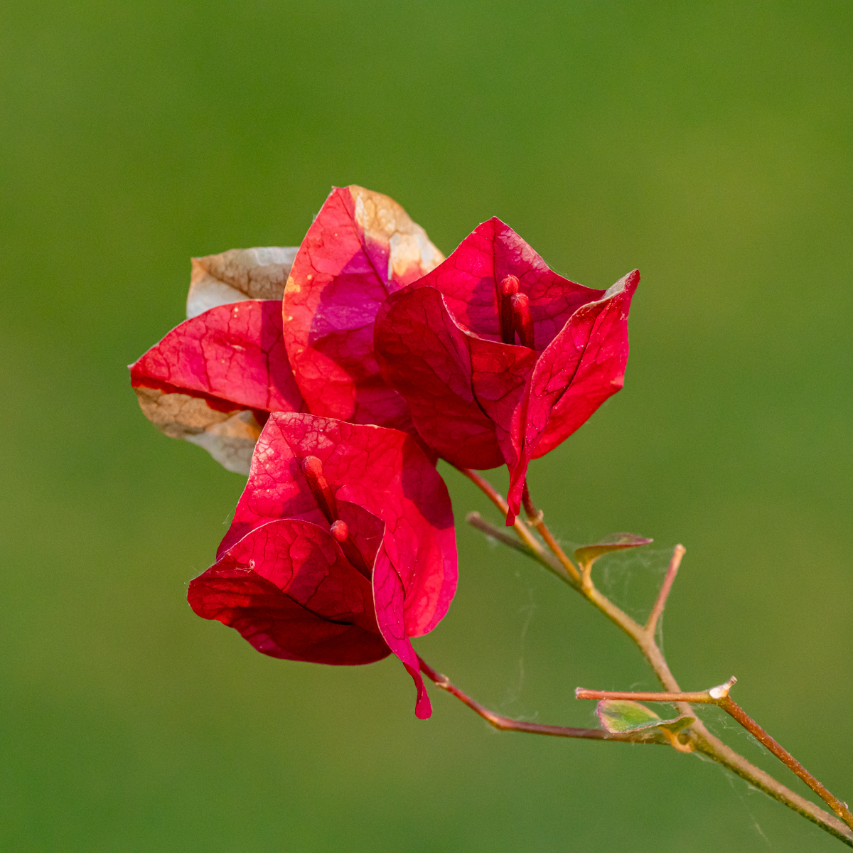
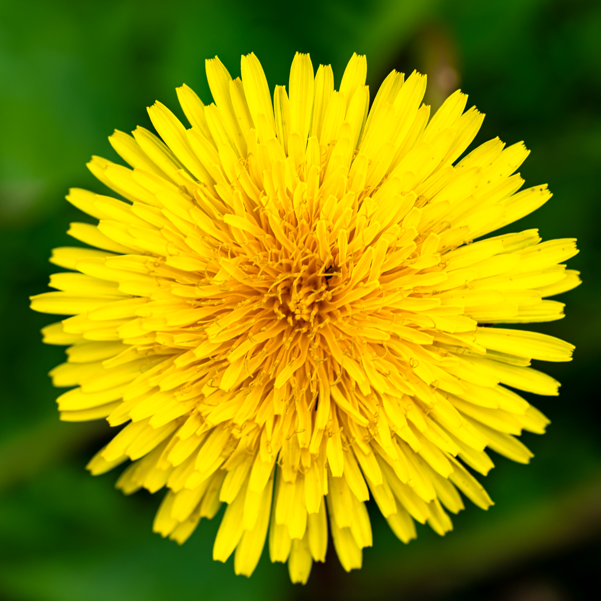
Aug 22 |
Comment |
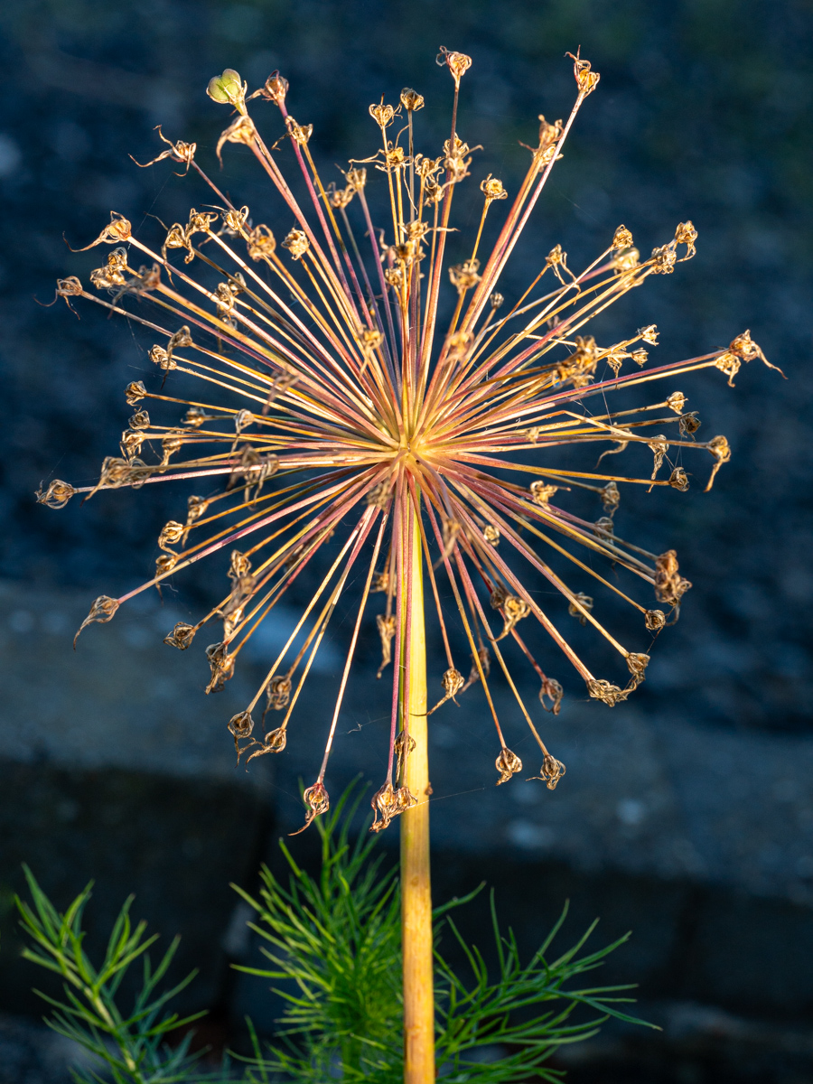
Hello Charles. Welcome into this group, and happy to discuss with you. I hope you will enjoy participating.
Very sharp image, done with a well-mastered technique.... Good job. The subject is well isolated from the background. The contrat of colors increases the lecture and the structure of the flower.
With a circle-shape subject, I like a square format of the picture. However, in this cas, the stems of the flowers bring a lot of information, so this format is adequate.
Well done & thank you again for participating. |
Aug 2nd |
| 75 |
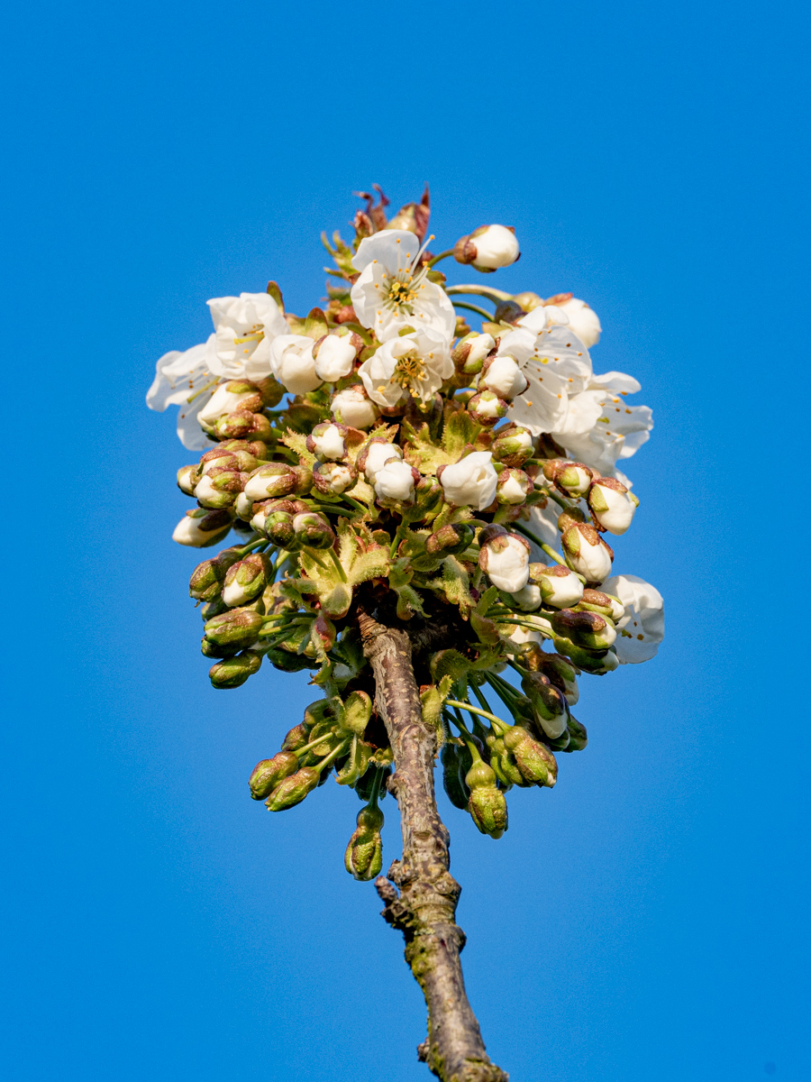
Aug 22 |
Comment |
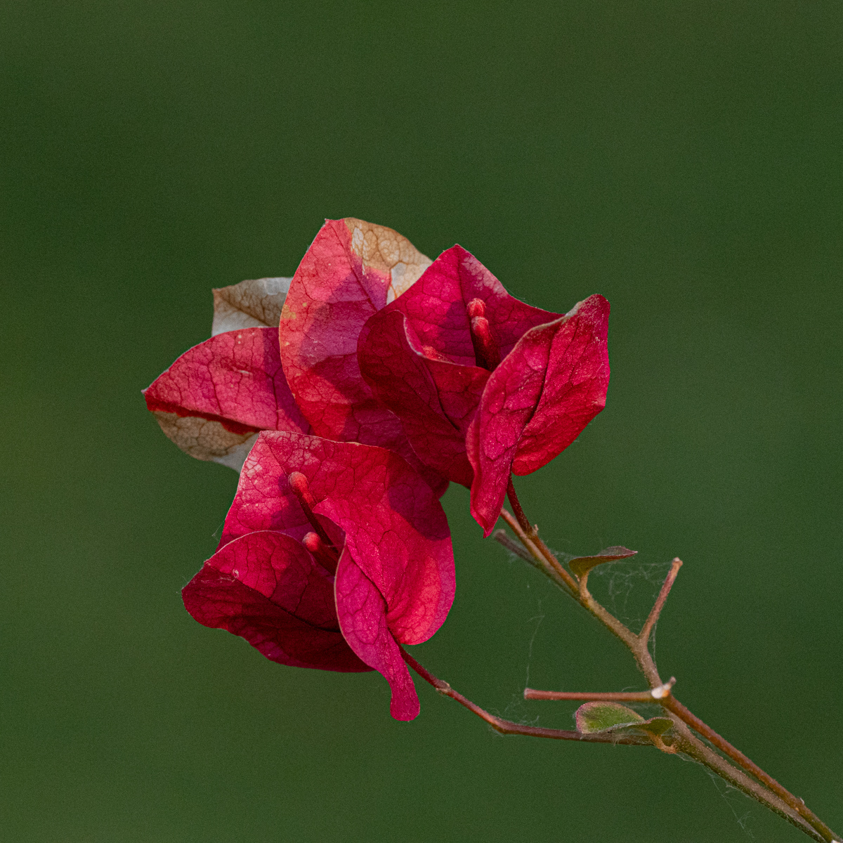
Hello Allen. Welcome into this group, and happy to discuss with you. I hope you will enjoy participating.
Well done for a try of your new macro lens...
I appreciate the composition and the format. The contrast of colors is also well done.
We can see the subject with the drop. Quite amazing this drop. Nature is well done.
I have no answer to your question...
Thank again for participating. |
Aug 2nd |
| 75 |
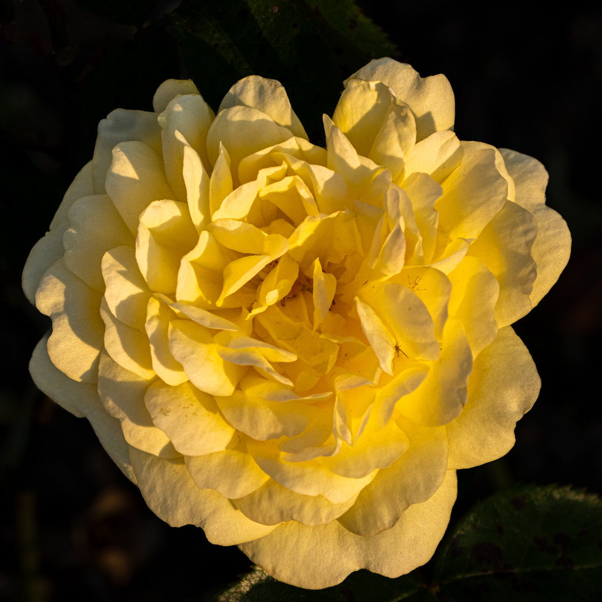
Aug 22 |
Comment |
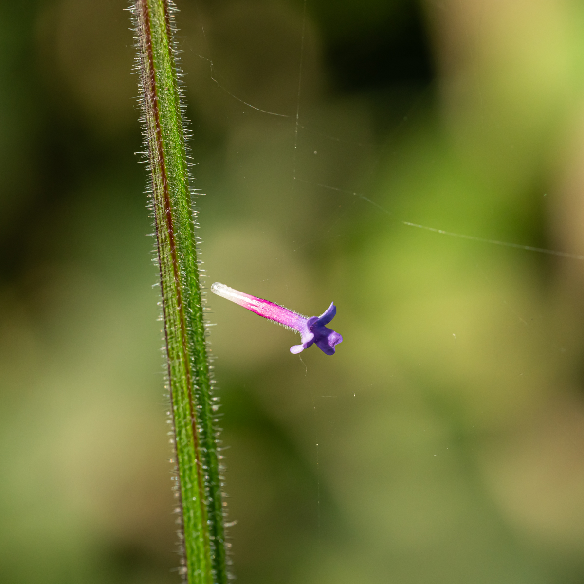
Hello Marge. Welcome into this group, and happy to discuss with you. I hope you will enjoy participating.
I really appreciate the atmosphere of this picture. with the colors and the lines, we can "imagine" some arches or mountains (maybe with a lot of imagination...).
The light gradient (variation) is very nice and creates a smooth atmosphere.
As the central stem of the flower is vertical, I wonder if another format could have been possible (square or portrait). Just an idea.
Thank again for participating in this group. |
Aug 2nd |
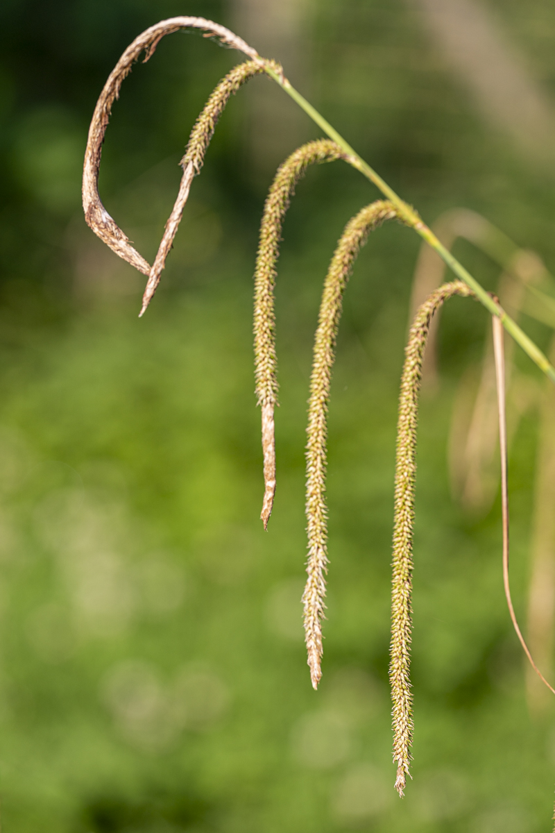
| 75 |
Aug 22 |
Comment |
Hello Dan. Welcome into this group, and happy to discuss with you. I hope you will enjoy participating.
The subject is well isolated from the background, I appreciate it. It is also sharped. We can see the structure of the seed pods.
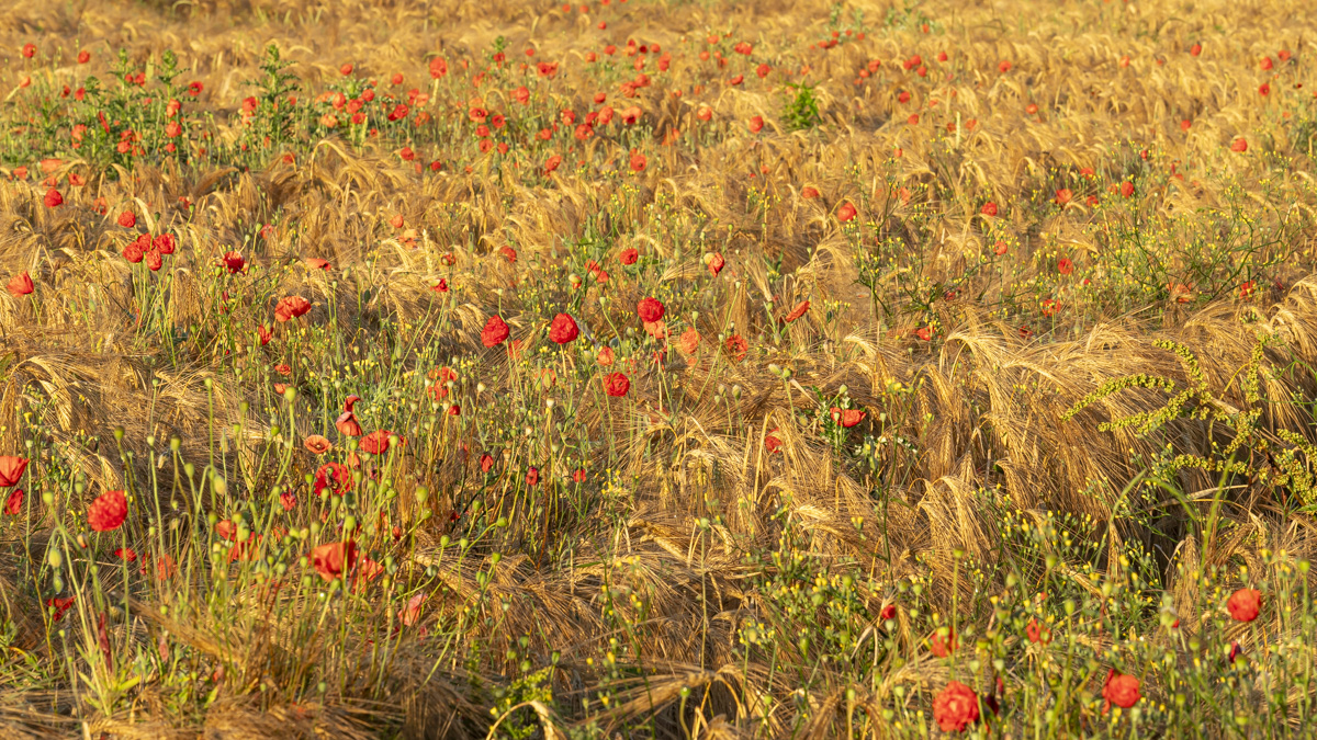
It is your choice to crop it, but I would say it is a little too much panoramic (in this cas with the different flowers) for me. It is just an personal opinion.
Well done & thank you again for participating. |
Aug 2nd |
5 comments - 6 replies for Group 75
|
10 comments - 11 replies Total
|