|
| Group |
Round |
C/R |
Comment |
Date |
Image |
| 39 |
Apr 20 |
Reply |
Hello Arfan.
There is no delay, so no problem at all.
I agree with you with the width, it was also my impression. Now it is confirmed. I noticed it too late..
Thanks and take care. |
Apr 22nd |
| 39 |
Apr 20 |
Comment |
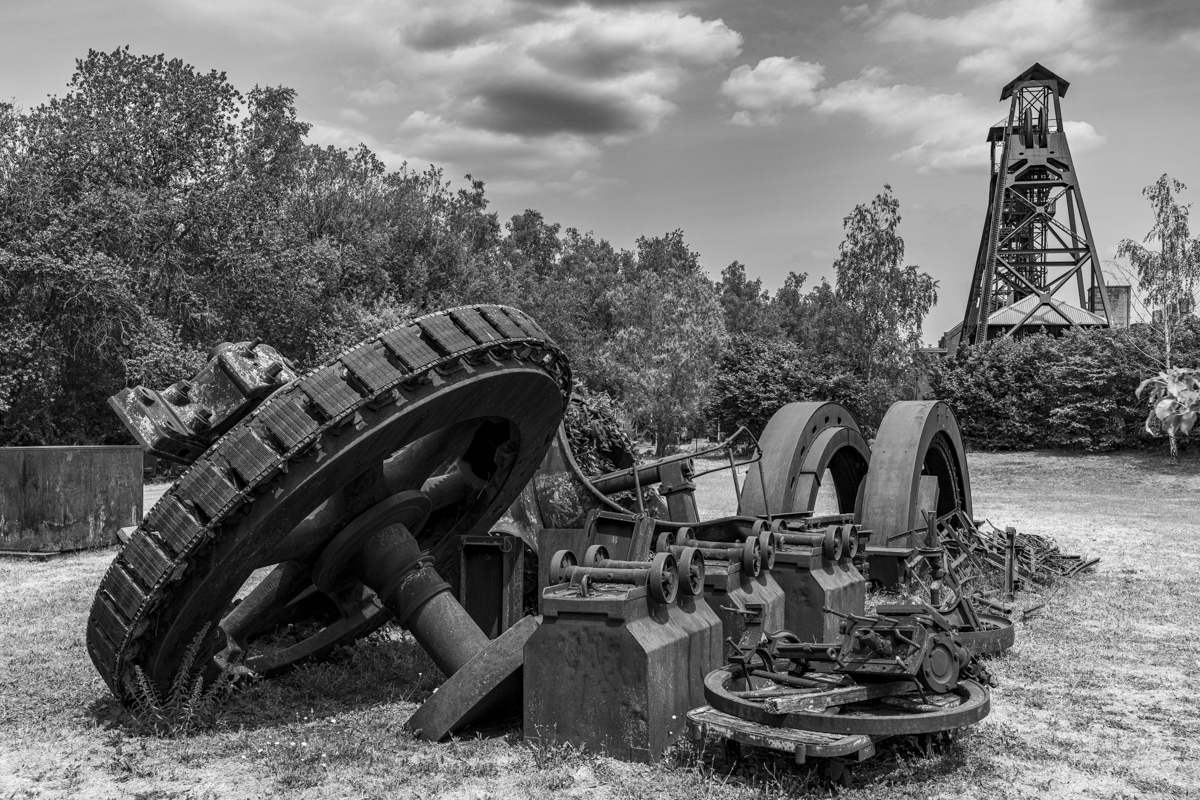
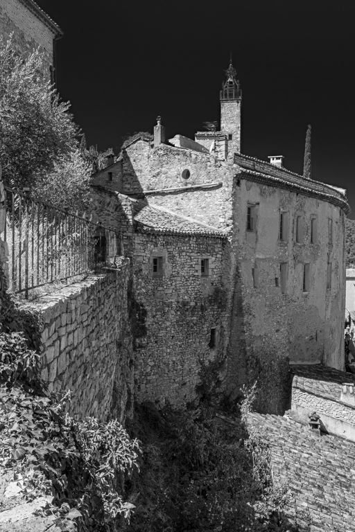
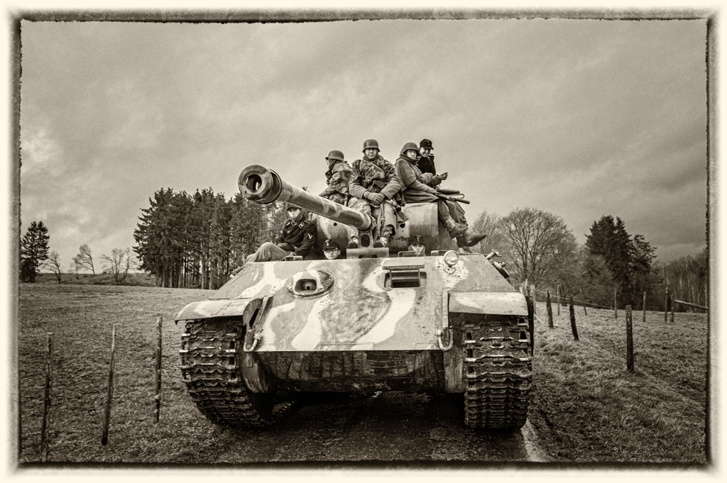
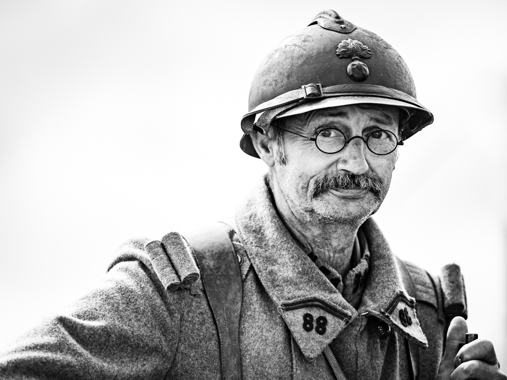
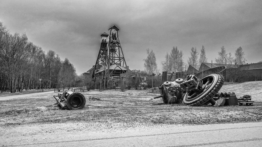
An image with history and a soul. I like this kind of image in B&W, so ok for the B&W. However, I see better the tools (in the tool box) in the color version.
For the light you have a full range of the hue (black, grey and white). Some parts can be darkened locally (fi: the tool box and the board next the top of the barrel). |
Apr 21st |
| 39 |
Apr 20 |
Comment |
Dear all,
I really thank you for your nice and useful comments. I really appreciate all of them, and specially those who took the time to make a proposition of treatment.
Particularly thanks to Larry who spoke about "a strange" software that he opened my curiosity. I have Nik software, but I didn't use Sharpener pro. So I watched Tuto and tried. I learnt something today, so it is a good day.
I was unhappy because there was not enough space on the top... Shame on me. I took the challenge to correct that with PS (I am not a specialist).
Please find a new version, thanks for your advises.
That 's one of the positive point of Internet.
Thanks for your kindness and be careful. |
Apr 9th |
 |
| 39 |
Apr 20 |
Comment |
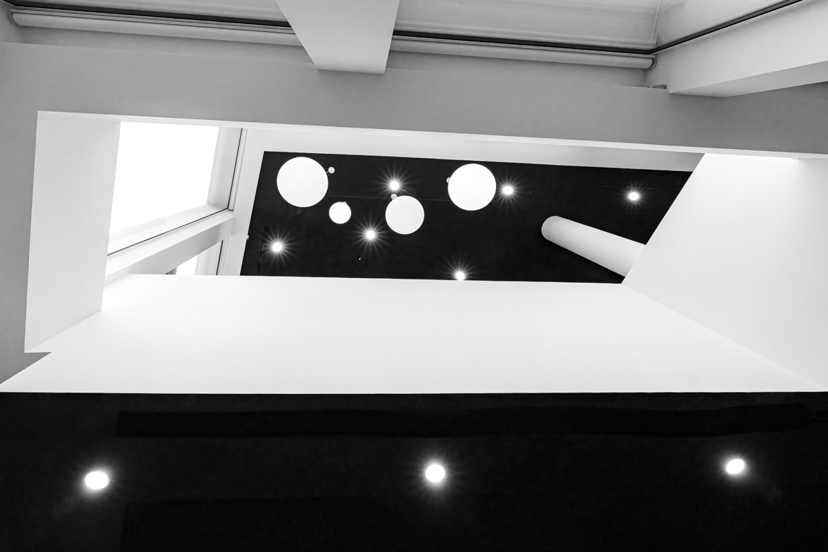
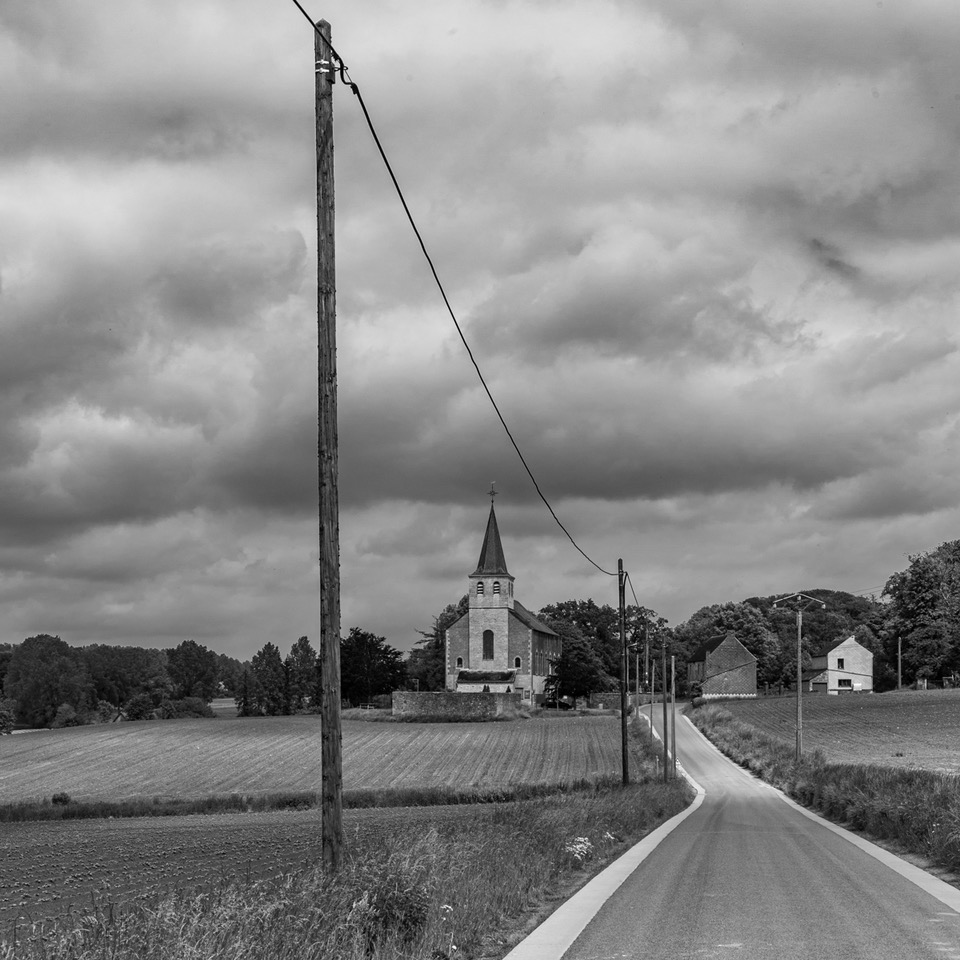
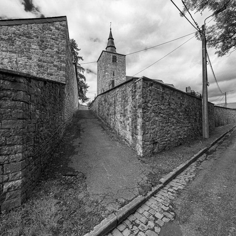
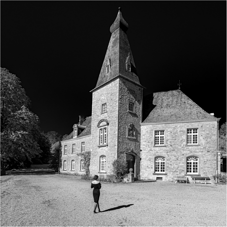
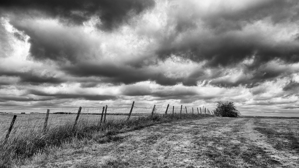
Very beautiful image. I really like the road coming from bottom left corner, the panel (maybe not enough to the left - to find "something"...), the structure of the clouds (left and right).
I think the blacks need to be lowered, specially on the hill on the background.
|
Apr 8th |
| 39 |
Apr 20 |
Comment |
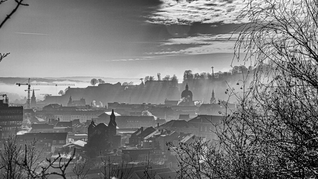
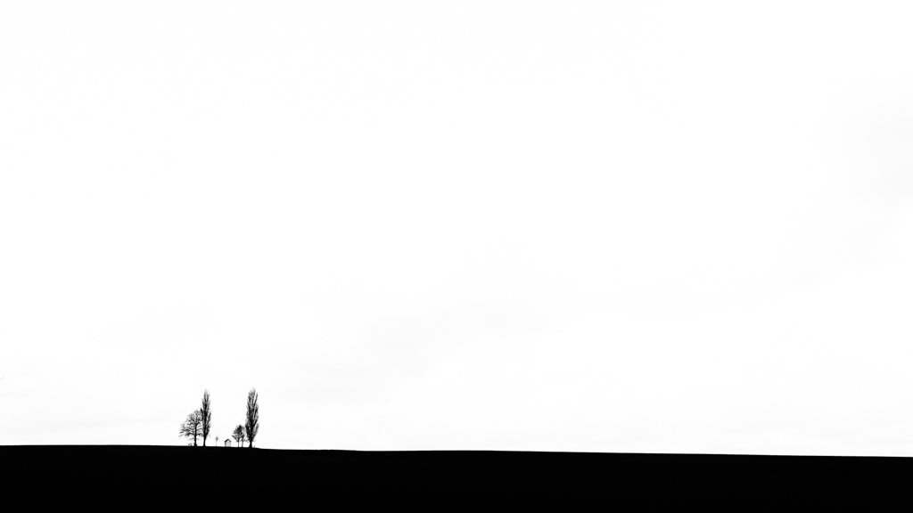
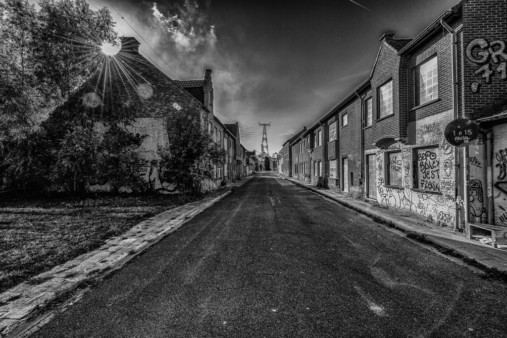
I like the composition (3 parts) and the format of this picture.
The "S" road, with no beginning (hidden by the little "heap of earth") and no end, is very interesting. I really like that.
The mist on the background is beautiful and restful.
Finally, the clouds have structure (kind of lines in the length), and this is part of the good composition.
They are a lot of shades of grey (more than 50...). |
Apr 8th |
| 39 |
Apr 20 |
Comment |
Comments without having read other's comment. I mention that, so you can understand if I have and mentioned a comment that is already written...
Pictures of reflection needs, at my opinion, quiet ripples. You have that, so perfect for you.
However at first sight, I thought (without having read your description), the image is a little (deliberately) blurry, and I like it very much, as the reflection is also a little blurry due to the movement of the water.
So I had an opposite opinion about the ripples, and I came to the same conclusion, I really like the picture for its blurry aspect.
The reflection is bigger than the tree, and it is ok for me, as water takes more area in the picture. |
Apr 8th |
| 39 |
Apr 20 |
Comment |
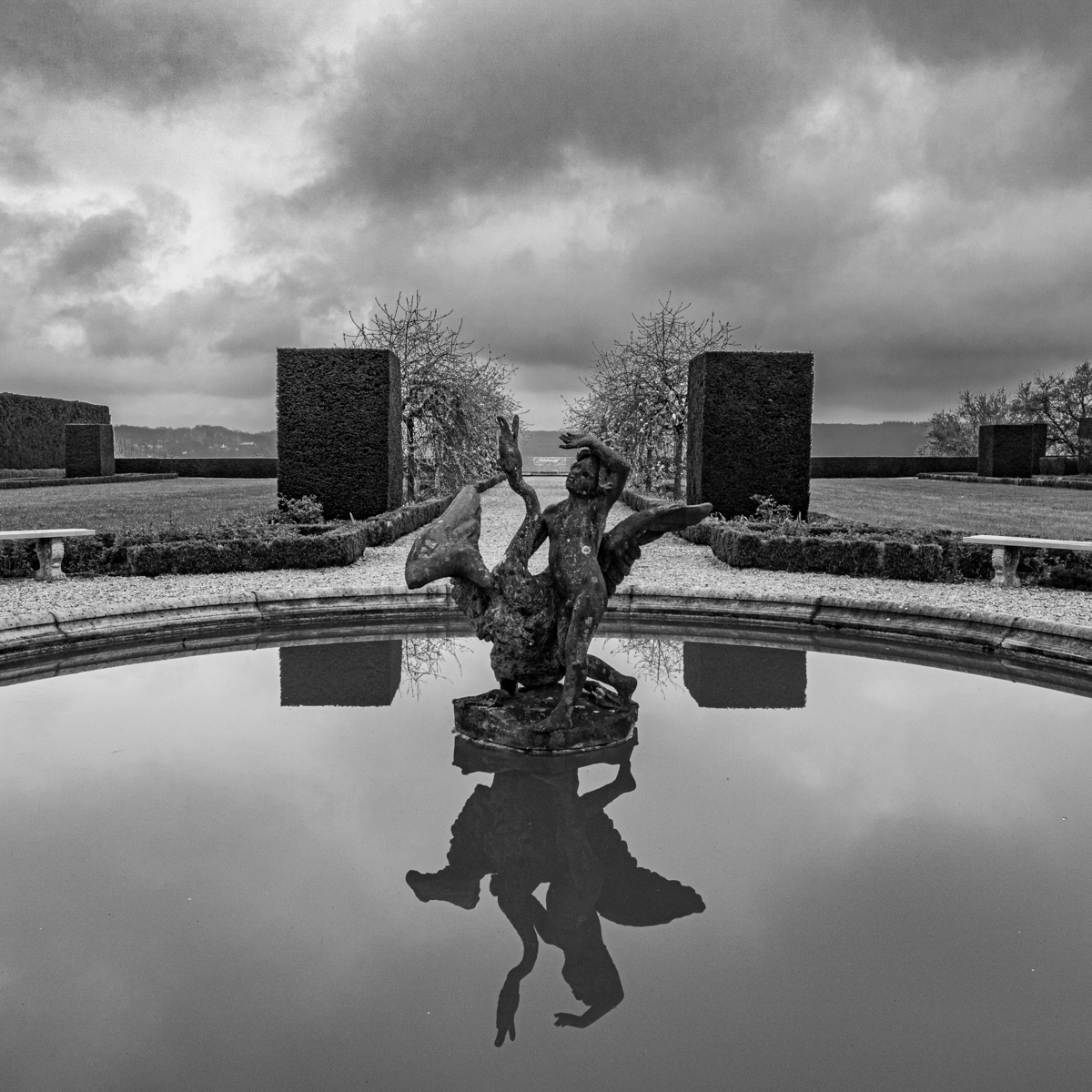
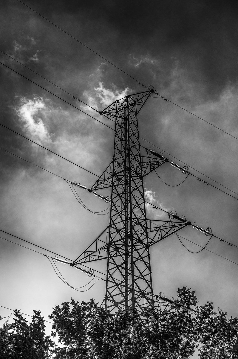
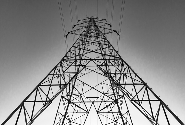
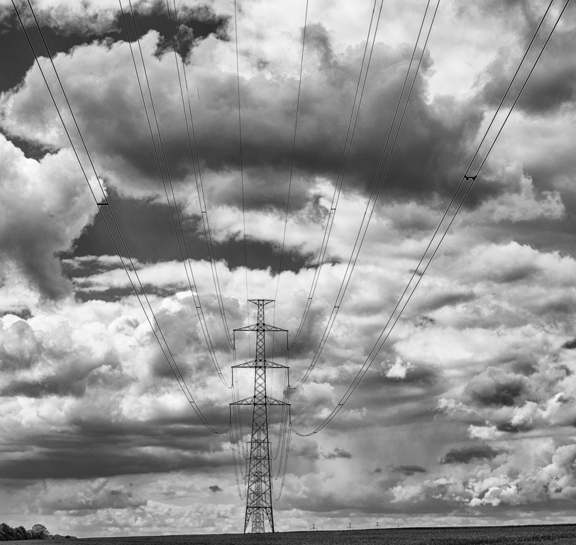
At (very) first sight, we can see (imagine or expect) a symmetrical picture, but it is not, and it is better not. Indeed there is more interest without symmetry, we have to analyze the picture to understand it, and not only to look the image with a symmetrical one.
I really like the "boss" on the top of the pole, and he looks is the ad hoc direction (more space and less birds, so he is waiting for them..., imagination...). |
Apr 8th |
| 39 |
Apr 20 |
Comment |
David, I write my comments without having the other's comments.
You wrote "... composite but I liked it when I did it". For me, this is the most important element in whatever we are doing, namely "to like what we are doing"...
For the (color) picture, some could say the eagle is a classic one. I would answer "maybe, but I would like to take myself such classic, but really beautiful picture". Indeed you have the full wingspan and one eye. So good job.
For the (B&W) picture, I like the idea, but I have a comment on the realization. The jeans and the eagle (alone) would maybe have my preference, but it will be another picture, and here I am disturbed by the "unraveling" pant. It can be a nest for the eagle, but it is too present, for me. The eagle became secondary, and it is not the aim. |
Apr 8th |
| 39 |
Apr 20 |
Reply |
All good.
I will work again the image...
Thanks. |
Apr 8th |
| 39 |
Apr 20 |
Reply |
Hello David,
Thanks a lot for your suggestion. I will try them. The sting "17" is maybe not the most appropriated for this picture. I specially agree with you for the white. |
Apr 8th |
8 comments - 3 replies for Group 39
|
8 comments - 3 replies Total
|