|
| Group |
Round |
C/R |
Comment |
Date |
Image |
| 3 |
Oct 22 |
Comment |
Michael,
These are wonderfully presented and such interesting seed heads. Your light box solution clearly works well.
If I were to rearrange the three, I would have put the least feathery and greenest one in the center. Also, rather than straight across, a little up in the middle? |
Oct 6th |
1 comment - 0 replies for Group 3
|
| 77 |
Oct 22 |
Reply |
Connie,
Thanks so much for your input. I do like your version and will incorporate some of your thoughts about bringing out a little more of the background in my next version. |
Oct 20th |
| 77 |
Oct 22 |
Comment |
I PREFER YOUR SECOND VERSION TOO... |
Oct 18th |
| 77 |
Oct 22 |
Reply |
Denise, I like this version a lot! |
Oct 18th |
| 77 |
Oct 22 |
Comment |
I find this to be a simple, pleasing image. The borders you created are interesting, and in this case I think they are a plus, since the flowers are not especially dramatic.
I'd be tempted to add a bit of purple or green? to the gray flower pot, and to figure out a way to have the flowers on the right side not intersect the frame. |
Oct 10th |
| 77 |
Oct 22 |
Comment |
A colorful, interesting sunrise. I love the poles. If you like the workers, per your title, I'm thinking they could be made more visible, since I can't find them. I prefer the golden color around the original sun, rather than the greener color in the final.
|
Oct 10th |
| 77 |
Oct 22 |
Comment |
Nice, relaxing, early morning scene here. I might crop a little from the top to focus better on the mistiness.
I don't see much difference between the original and processed, so very subtle... Maybe a little more TOPAZ? |
Oct 10th |
| 77 |
Oct 22 |
Comment |
This is a very professional-looking image. You started with a lovely model, and your processing has worked really well to gently add interest to the background. I think the string hanging from the umbrella needs a bit of cloning, and her lap hand seems really long (a wide angle effect, I assume). Given her hair color and the umbrella tones, I wonder how a little more yellow-orange in her lips and skin would work... |
Oct 10th |
| 77 |
Oct 22 |
Reply |
Michael, thanks for your comments and kind words.
Fine art photography (or any other medium) is a difficult thought, IMHO. Our group over the years, has discussed this concept, as well as provided some excellent links. So, one place to start is our Group's bulletin board. |
Oct 6th |
| 77 |
Oct 22 |
Comment |
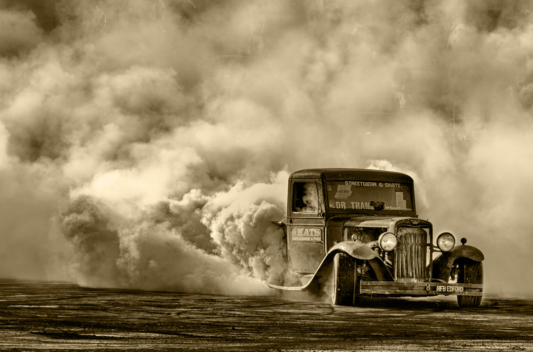
Mary, I quite like this image. Lots of drama and a good story. The B&W conversion works well. A little sepia might also be a good option.
In my opinion, the cars and oblique line at the top distract from the image, so I cropped them away Then I did some more tonal editing to darken parts of the car as well as the whitest smoke on the left. Here's one option... |
Oct 6th |
 |
6 comments - 3 replies for Group 77
|
7 comments - 3 replies Total
|


