|
| Group |
Round |
C/R |
Comment |
Date |
Image |
| 77 |
Sep 22 |
Reply |
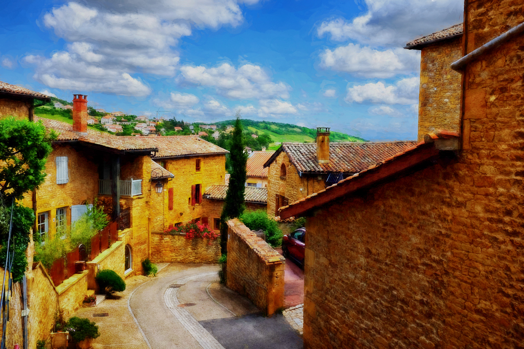
Just noticed the black dog-like bit at the middle far right. I might clone that away... |
Sep 19th |
| 77 |
Sep 22 |
Comment |
This is an attractive image. Darker background would work, IMHO. Also, I would eliminate the small overlaps of the staMPED FLOWERS WITH THE PHOTO and inner frame EDGE. |
Sep 18th |
| 77 |
Sep 22 |
Comment |
This is an interesting treatment and I think it works REALLY well.
Just thought I'd offer a different idea... Your capture would have been an HDR opportunity. Still, one can do it after the fact. Here I selected the sky and inverted the selection to lighten the scene with curves. Then I used NIK HDR to make the non-sky even lighter. This image was put into Topaz Studio 2 and an impression filter was added. Just a different direction to consider... |
Sep 18th |
 |
| 77 |
Sep 22 |
Reply |
I'm with Carol, a little lighter for the center would make the overall image more consistent and more water-color like. |
Sep 18th |
| 77 |
Sep 22 |
Comment |
Looks like we commentator are pretty much on the same page. Great background work-up, but a bigger (or more?) ladybirds ... |
Sep 18th |
| 77 |
Sep 22 |
Comment |
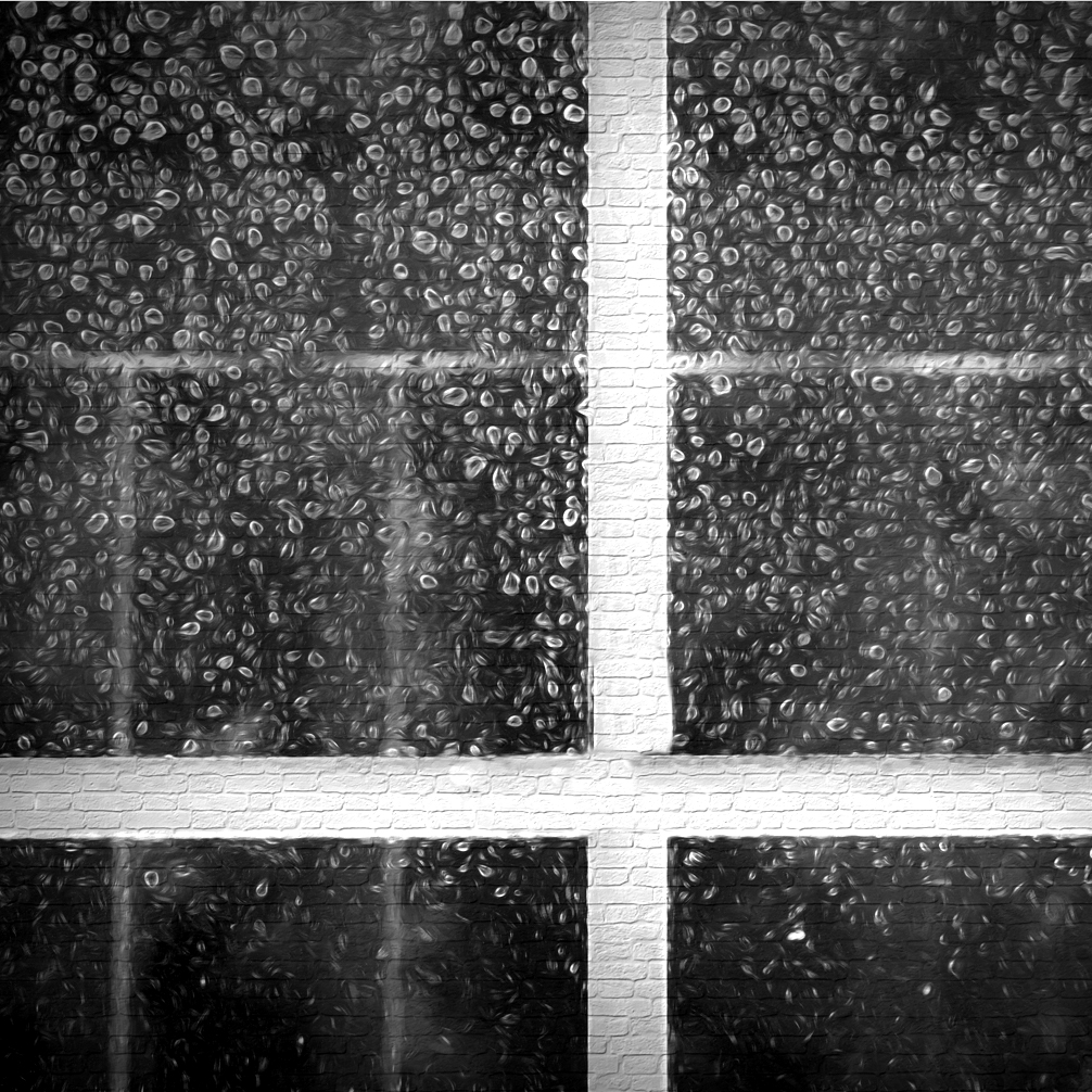
Denise, Congratulations on the retirement! You've been working hard for quite a while, so I'm really pleased for you, and am happy you'll be spending more time with your photography.
This is an interesting image and I'm sure seeing it was part of the fun. I like what you've done here, and agree the bricks do make you look longer. A couple of thoughts: maybe an off-center, square crop? a rotation of 180 degrees? and another layer on top? I added a photo I took of bokeh for this version of your image, primarily to add some more varied tonal range throughout the image.
|
Sep 4th |
 |
| 77 |
Sep 22 |
Comment |
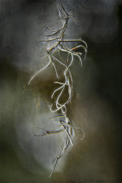
Linda, I can see why you were attracted to this hanging moss with its dangling shape and many branches. On the other hand, its location and limited separation from the background makes it a difficult subject to enhance. Your processing has added some moodiness, but the image histogram stops at the tonal mid-point; there is a lack of lights and whites. I tried to selectively add contrast to the moss using several high-pass sharpening layers, and then masking out the sharpening from the background. The result looks sort of OK on this small image, but it would require a lot of detail work for a print version.
|
Sep 4th |
 |
| 77 |
Sep 22 |
Comment |
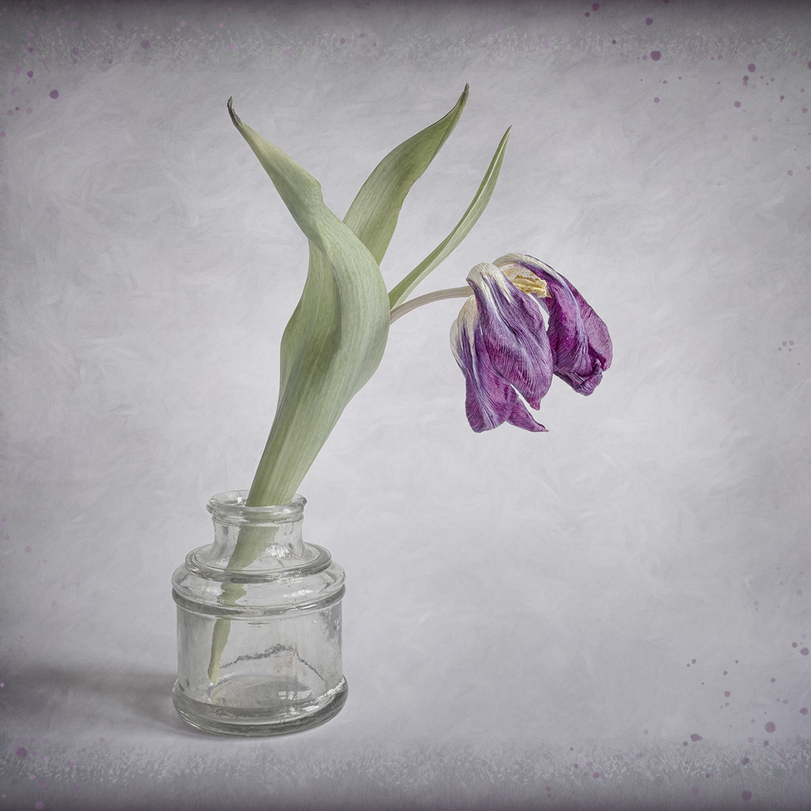
Carol, I love how this faded processing adds quite a bit of interest and emotion to this tulip photo. I especially like the paper-like result on the purples, and the tonal range and texture on the background and photo edges work well. The purple paint dabs were an interesting idea, but in my opinion they draw the eye to the edges, so I might reduce their opacity some more. The highlights on the vase are strong and pull my eye, seemingly making the vase itself the subject.
This version is cropped square, purples are just a tad brighter, and a new layer with a soft white wash was added on top in the soft light blend mode over the vase to soften it.
|
Sep 4th |
 |
| 77 |
Sep 22 |
Reply |
Linda, thanks so much for your comments. They are very helpful and I will use them to make a stronger print.
|
Sep 4th |
6 comments - 3 replies for Group 77
|
6 comments - 3 replies Total
|


